Upgrade to Pro — share decks privately, control downloads, hide ads and more …

CocoaShop - Designing & Planning Your iOS App

CocoaShop - Designing & Planning Your iOS App

Philly CocoaHeads

November 08, 2014
Tweet

More Decks by Philly CocoaHeads

Other Decks in Programming

Transcript

  1. Designing & Planning Your iOS COCOAHEADS WORKSHOP • Settle into

    teams/Introductions/Announcements (30 mins) • Lecture of about creating & nurturing an idea. Understanding markets. Understanding motivation of users. (15mins) • Breakout Session 1: Idea work (15mins of discussion + 15mins of presenting) • Lecture on basic design principles, Apple's HIG, sketching out ideas. (20mins) • Breakout Session 2: Design. (30mins) • Lecture on various techniques for wire-framing and comping. (30mins) • Breakout Session 3: Iterate (45mins) • Teams who want to win $25 iTunes gift card can show their for feedback. (30mins) • Voting for best app work (I'm employing what I call Sketch Battle rules. Its simple. Raise your hand if you like the idea.) (15mins) • Closing statements, Q&A and Thanks. (15 mins)
  2. Introductions 30 mins Introduce yourself and the TAs. Handshake designed

    by <a href="http://www.thenounproject.com/iconify">Scott Lewis</a> from the <a href="http://www.thenounproject.com">Noun Project</a>
  3. [email protected] Kotaro Fujita tomatoboy.co Introduce yourself. Expectation for TAs are

    to provide some context and guidance of what is and may not be possible on the iOS platform. Tomato designed by <a href="http://www.thenounproject.com/marianamargheurita">Mariana Margheurita Fonseca</a> from the <a href="http:// www.thenounproject.com">Noun Project</a>
  4. Take my advice with a grain of salt. A lot

    of which was cooked under a wealth of experience. This will be a workshop in the purest sense. Lecture is meant to spark your imagination & provides some basic guidance on what you can and cannot do on the iOS or Mac platform. Think of your TAs as personal CTOs. They can provide technical points of views and how far reaching an idea might be.
  5. First rule of workshop: We will swear to respect each

    other opinions. Second rule of workshop: We do not to BLATANTLY STEAL each other’s ideas. Third rule of workshop: If its your first time, you must participate.
  6. Idea So you have an idea. Where do you go

    from here? Jony Ive once said “he better than anyone (Steve Jobs) understood that while ideas ultimately can be so powerful, they begin as fragile, barely formed thoughts. So easily missed, so easily compromised, so easily just squished.” Idea designed by <a href="http://www.thenounproject.com/edward">Edward Boatman</a> from the <a href="http://www.thenounproject.com">Noun Project</a>
  7. Elevator Pitch Apple refers this as an app definition statement

    - Can you describe your app in a few sentence or less? - Is it clear what it does? - Does it provide a clearly defined usage?
  8. Purpose Retro Sparkle Docphin Neat 3 apps that I have

    actively worked on that showed up on the app store. Each served distinct design purposes. - Neat app was originally just going to be an extension of their cloud services. It later became the focal point. - Docphin was an app that pull exist web content and provide an easy way to view it on a mobile device. - Retro Sparkle was more of a tool for personal education & advertisement for my company. Most of my version 1.0 apps will act as that conduit for self- expression.
  9. Apple Suggests • List all the features you think users

    will want • Determine who your users are • Filter features list through audience definition • Don’t stop there..
  10. Understand Your Market List your features out: - Look for

    what’s on the market today. - Download your competitor’s apps and review their features. - Figure out what you bring to the app store that’s different (better design, different technology, etc.,.) - See if its profitable.
  11. Personality Profile Determine who your users are: - Getting a

    sense of who your audience is. - Age, Demographic, Politics, Habits.
  12. Path To MVP Filter features list through audience definition: Minimum

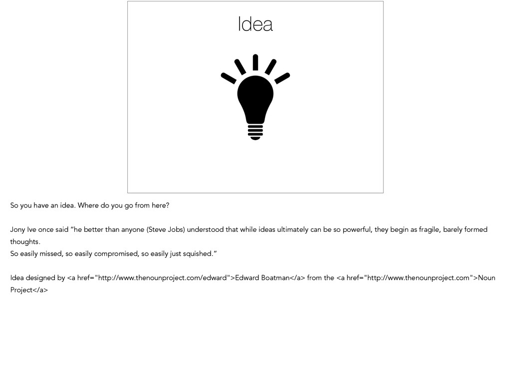
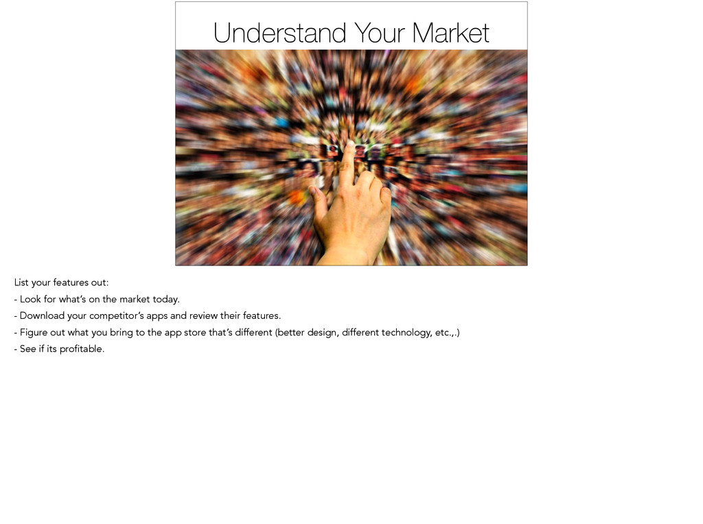
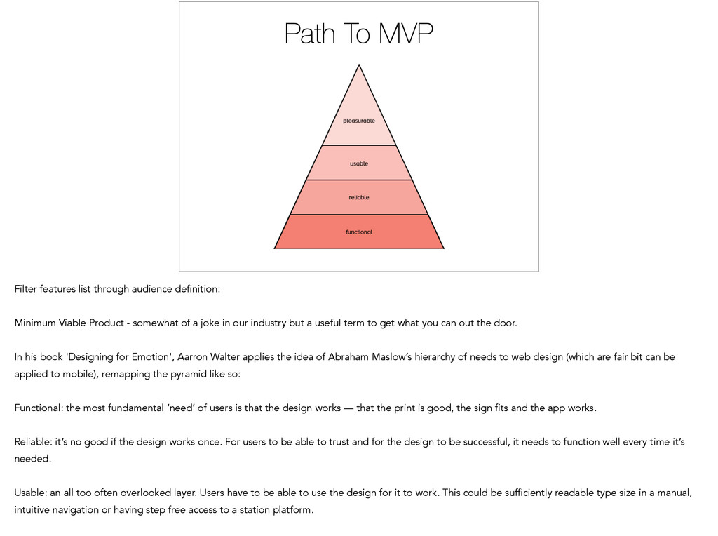
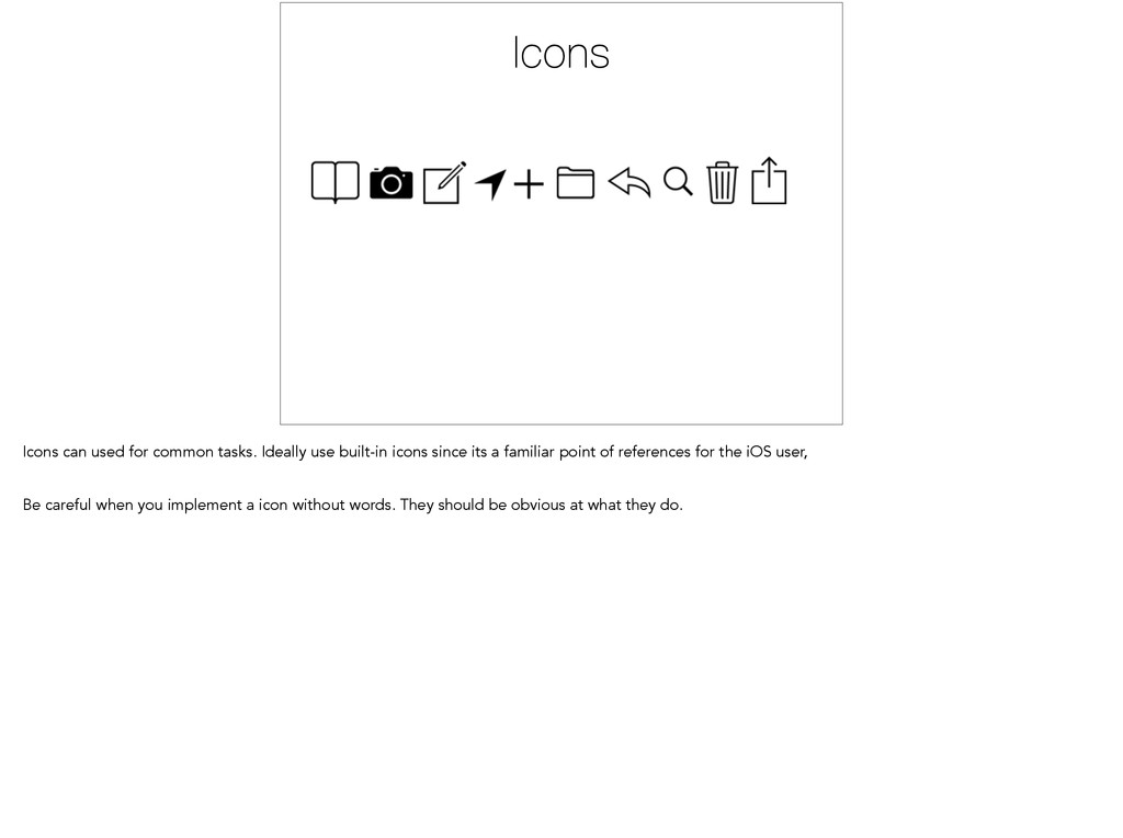
    Viable Product - somewhat of a joke in our industry but a useful term to get what you can out the door. In his book 'Designing for Emotion', Aarron Walter applies the idea of Abraham Maslow’s hierarchy of needs to web design (which are fair bit can be applied to mobile), remapping the pyramid like so: Functional: the most fundamental ‘need’ of users is that the design works — that the print is good, the sign fits and the app works. Reliable: it’s no good if the design works once. For users to be able to trust and for the design to be successful, it needs to function well every time it’s needed. Usable: an all too often overlooked layer. Users have to be able to use the design for it to work. This could be sufficiently readable type size in a manual, intuitive navigation or having step free access to a station platform.
  13. PUSH THE DAMN SAVE BUTTON!!! Don’t stop there: Test your

    idea out with users as soon as possible. It doesn’t have to be a big production but you need to see how people reaction to your designs.
  14. Breakout Session 15 mins to think things thru. 15 mins

    for discussion/feedback. Arcade Game designed by <a href="http://www.thenounproject.com/bravo">Juan Pablo Bravo</a> from the <a href="http:// www.thenounproject.com">Noun Project</a>
  15. Steve Jobs quote. That being said, we are going to

    focus a lot of visual elements to might help you lay out your design.
  16. Balance The distribution of the visual weight of objects, colors,

    texture, and space. If the design was a scale, these elements should be balanced to make a design feel stable. In symmetrical balance, the elements used on one side of the design are similar to those on the other side; in asymmetrical balance, the sides are different but still look balanced. In radial balance, the elements are arranged around a central point and may be similar.
  17. Emphasis The part of the design that catches the viewer’s

    attention. Usually the artist will make one area stand out by contrasting it with other areas. The area could be different in size, color, texture, shape, etc. Call to Action buttons tend to use this to great effects.
  18. RepetitionRepetition Repetition This works with pattern to make the work

    of art seem active. The repetition of elements of design creates unity within the work of art.
  19. Movement The path the viewer’s eye takes through the work

    of art, often to focal areas. Such movement can be directed along lines, edges, shape, and color within the work of art.
  20. Variety Voicemail Keypad Contacts Recents Favorites 1 The use of

    several elements of design to hold the viewer’s attention and to guide the viewer’s eye through and around the work of art.
  21. Unity Voicemail Keypad Contacts Recents Favorites The feeling of harmony

    between all parts of the work of art, which creates a sense of completeness. Proximity Repetition Alignment Continuation
  22. Proportions The feeling of unity created when all parts (sizes,

    amounts, or number) relate well with each other. When drawing the human figure, proportion can refer to the size of the head compared to the rest of the body.
  23. iOS Design Principles Depth Clarity Deference iOS general UI guidelines

    in a nutshell. Deference. The UI helps people understand and interact with the content, but never competes with it. Clarity. Text is legible at every size, icons are precise and lucid, adornments are subtle and appropriate, and a sharpened focus on functionality motivates the design. Depth. Visual layers and realistic motion impart vitality and heighten people’s delight and understanding.
  24. TableViews Tableviews are list views that tends to be the

    general default for most UIs. Great for lists.
  25. Collection Views Collection views are great if you want to

    squeeze a ton of visual assets in one view. Probably more idea for the iPad than the iPhone.
  26. Web Views Webview tends to be used as a replacement

    for native controls. Usually for cross platform purposes.
  27. Gestures Gestures are general in several categories: Tap Drag Pinch/Zoom

    Be careful how you would implement them since they tend to require some education for the users.
  28. Icons Icons can used for common tasks. Ideally use built-in

    icons since its a familiar point of references for the iOS user, Be careful when you implement a icon without words. They should be obvious at what they do.
  29. Animation Animation transitions play an important role in help users

    understand their current place in the app. Be consistent about the to and froms. It also helps add personality to your app. - Communicate status and provide feedback - Enhance the sense of direct manipulation - Help people visualize the results of their actions This in many ways took the place of skeumorphism.
  30. Platform Should you work in iOS or other platform, try

    your best to respect the platform. Take advantage of each platform’s strength and don’t make cheap compromises that piss off that platform’s users. iOS has a ton of interesting technologies to take advantage of. CloudKit, HealthKit, Sprite Kit, Game Center, iAds, etc.,.
  31. Wireframes Don’t focus on color and animation or any major

    details. Focus of the functionality. On flow. On good transitions. This is the way you should sketch out ideas and nothing should be off limits. Its inexpensive and fun.
  32. Sketches Sketches are the easiest and cheapest way to get

    feedback. If you want to keep consistent sizes maybe find a sketch pad with a grid.
  33. Paper Prototyping Another low barrier of work to get done.

    Easy way to get a feel for how it would work.
  34. Wireframe Tools Pen & Paper Balsamiq Omnigraffle Paper Pop Examples

    of wireframing tools. Quick demo of wireframe, balsamic, and maybe Pop.
  35. Breakout Session 30 minutes of working on wireframes and refining

    the idea. Use this time to get feedback from your colleagues and TAs. Exit designed by <a href="http://www.thenounproject.com/Luis">Luis Prado</a> from the <a href="http://www.thenounproject.com">Noun Project</a>
  36. Iterate 30 mins. Design is iterative and interactive. Get constant

    feedback from various sources. Innovation designed by <a href="http://www.thenounproject.com/dayabaran1980">william dayabaran</a> from the <a href="http:// www.thenounproject.com">Noun Project</a>
  37. Color Color can be used to add a mood and

    a sense of branding for your app. They can also highlight certain key points in an app. Use the color wheel to identify each color’s ying and yang. And tertiary color which gives the color a secondary usage.
  38. Typography Typography plays a big role adding the personality of

    your app. San-serif fonts can be deemed more modern and clean. Serif fonts can be looked at as classic and timeline. Most of all, make sure to use text that legible. Usually should not be smaller than 11pts (though tons of apps break that).
  39. Serious Law Firm & Co. Grace Children’s Daycare Choosing fonts

    usually requires understanding context of the copy. Every font has a distinct personality and history. They also have historical significance so be sure to understand to connotations of using a specific font.
  40. Usually best to stick to 1-2 fonts for an app.

    Maintains uniformity and less sloppy.
  41. Comps Comps are general a late stage process. Great for

    clients who want to have a really good idea what the final product would look like. It can be deceiving sometimes because most of the time it won’t look like that because the design is impractical.
  42. Final 3D Model Example: Final 3D model might be completely

    different because of either constrain of the game, producers style changes, or the complexity of the model itself. So never assume that comps are final final.
  43. Comp Tools Photoshop Keynote Sketch Illustrator Briefs Xcode Examples of

    Comp Tools. Quick example of Xcode’s storyboard IF time permits.
  44. Animation Animation is a critical part to an modern iOS

    app. It helps inform the users to a status and general location.
  45. Animation Tools Keynote Origami AfterEffects 3D program Xcode Pop Keynote

    Origami AfterEffects Maya (or any 3D program) Paper and Pen Pop Quick example of Xcode’s storyboard. Quick demo of Keynote and Xcode
  46. Breakout Session 45 minutes of working on wireframes and refining

    the idea. Use this time to get feedback from your colleagues and TAs. Idea designed by <a href="http://www.thenounproject.com/edward">Edward Boatman</a> from the <a href="http://www.thenounproject.com">Noun Project</a>
  47. Future Considerations App Icon Audio Accessibility Marketing Branding Apple App

    Icon Audio Accessibility Branding Marketing Apple Specific Technology Graph designed by <a href="http://www.thenounproject.com/garrett.knoll">Garrett Knoll</a> from the <a href="http:// www.thenounproject.com">Noun Project</a> Brand Identity designed by <a href="http://www.thenounproject.com/caisleydesign">Matt Caisley</a> from the <a href="http:// www.thenounproject.com">Noun Project</a>
  48. Winning! Everyone’s a winner. Voting using Sketch battle rules. Just

    vote if you like it or not. Feedback can be requested post voting. Gift Card designed by <a href="http://www.thenounproject.com/Martin LEBRETON">Martin LEBRETON</a> from the <a href="http:// www.thenounproject.com">Noun Project</a>
  49. [email protected] Kotaro Fujita tomatoboy.co Thank you! Questions? Tomato designed by

    <a href="http://www.thenounproject.com/marianamargheurita">Mariana Margheurita Fonseca</a> from the <a href="http:// www.thenounproject.com">Noun Project</a>