Upgrade to Pro
— share decks privately, control downloads, hide ads and more …
Speaker Deck
Sign up for free
Menu
Search
Features
All features
Private URLs
Password Protection
Custom URLS
Scheduled publishing
Remove Branding
Restrict embedding
Deck Collections
Notes
Features
All features
Private URLs
Password Protection
Custom URLS
Scheduled publishing
Remove Branding
Restrict embedding
Deck Collections
Notes
Explore
Featured decks
Featured speakers
Programming
Technology
Storyboards
Explore
Featured decks
Featured speakers
Programming
Technology
Storyboards
Pricing
Search
Sign in
Sign up for free
20201129WBALT.pdf
Search
unisuke
November 29, 2020
89
0
Share
Embed
Copy iframe code
Copy JS code
Copy link
Start on current slide
20201129WBALT.pdf
unisuke
November 29, 2020
More Decks by unisuke
See All by unisuke
Rustってどんな言語
uni_82
0
180
Verified Software Toolchain C ~Coqを用いたCプログラムの検証~
uni_82
0
97
はじめてのIT勉強会 プリンシプルオブプログラミングPart.3
uni_82
0
170
2021.01はじめてのIT勉強会.pdf
uni_82
0
150
2020.11.26ポートフォリオを素敵にしたい 副代表のゆるゆるLT第1段
uni_82
0
89
はじめてのIT勉強会 プリンシプルオブプログラミング
uni_82
0
240
2020.10.14 はじめての〇〇 超LT会- vol.1 #ultralt
uni_82
0
80
Goconference_20__1_.pdf
uni_82
0
100
はじめてのIT勉強会.pdf
uni_82
0
130
Featured
See All Featured
How Fast Is Fast Enough? [PerfNow 2025]
tammyeverts
3
940
HTML-Aware ERB: The Path to Reactive Rendering @ RubyCon 2026, Rimini, Italy
marcoroth
5
820
B2B Lead Gen: Tactics, Traps & Triumph
marketingsoph
1
280
Organizational Design Perspectives: An Ontology of Organizational Design Elements
kimpetersen
PRO
1
850
Visual Storytelling: How to be a Superhuman Communicator
reverentgeek
2
710
How to make the Groovebox
asonas
2
2.5k
Fantastic passwords and where to find them - at NoRuKo
philnash
53
4k
GraphQLとの向き合い方2022年版
quramy
50
15k
Embracing the Ebb and Flow
colly
88
5.2k
Neural Spatial Audio Processing for Sound Field Analysis and Control
skoyamalab
0
570
GraphQLの誤解/rethinking-graphql
sonatard
75
12k
Side Projects
sachag
456
43k
Transcript
CSSライブラリ めっちゃ素敵だよ Bootstrapはこれだけ、の3つのポイント- 2020.11.29 WBALT
自己紹介 • 上西真由(うにすけ) • 埼玉県出身 • 東北大学工学部電気情報物理工学科3年 • フロントエンドばっかり •
はじめてのIT勉強会副代表 @uniuni__8282 mayu.uenishi.1
みなさんHTML/CSS好きですか
WBAにはフロント好んで 書いている人はいないイメージ...
でもHTML/CSSだけできれば....
こんなの作ってお小遣い稼ぎもできる
ね。HTML/CSS悪くないよね。
そんな私はBootstrap狂愛者なので
みんなにも知って欲しい
CSSライブラリ触ったことない人 and フロントよりバックエンドの方が好きな人 このLTのターゲット
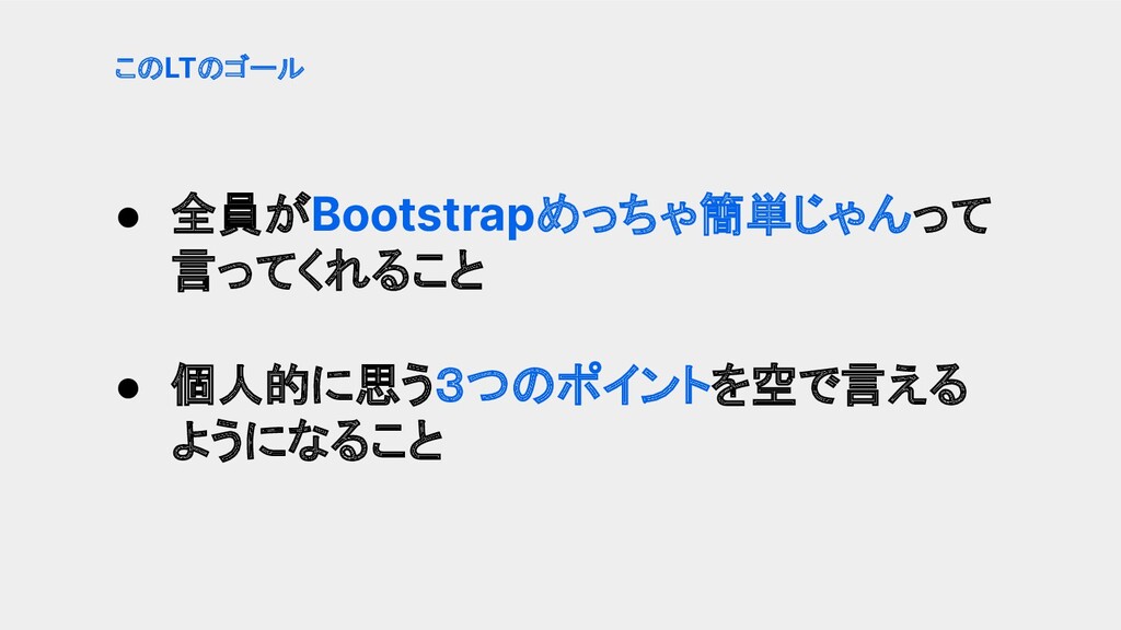
• 全員がBootstrapめっちゃ簡単じゃんって 言ってくれること • 個人的に思う3つのポイントを空で言える ようになること このLTのゴール
※個人的な見解です 早速ですが...3つのポイントって?
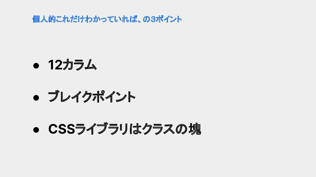
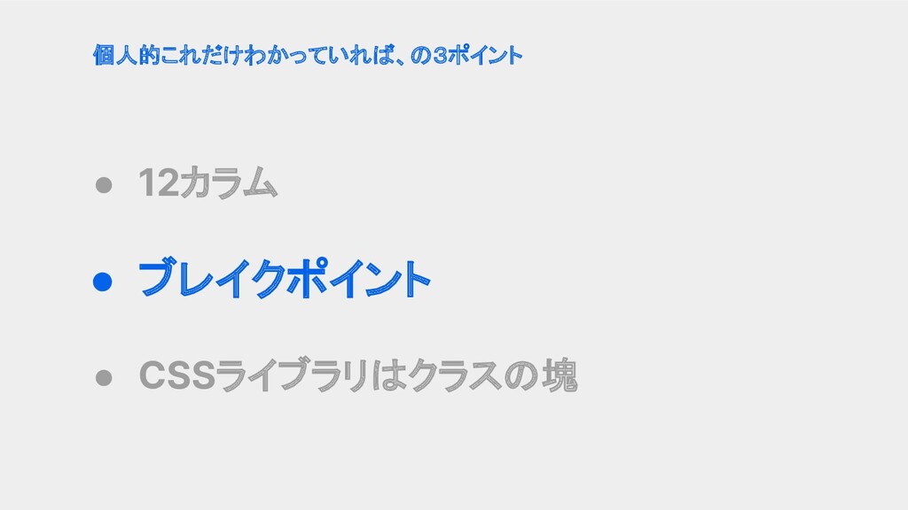
• 12カラム • ブレイクポイント • CSSライブラリはクラスの塊 個人的これだけわかっていれば、の3ポイント
• 12カラム • ブレイクポイント • CSSライブラリはクラスの塊 個人的これだけわかっていれば、の3ポイント
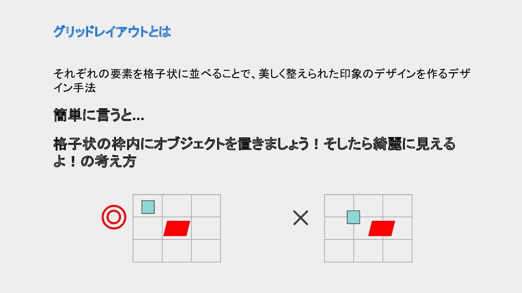
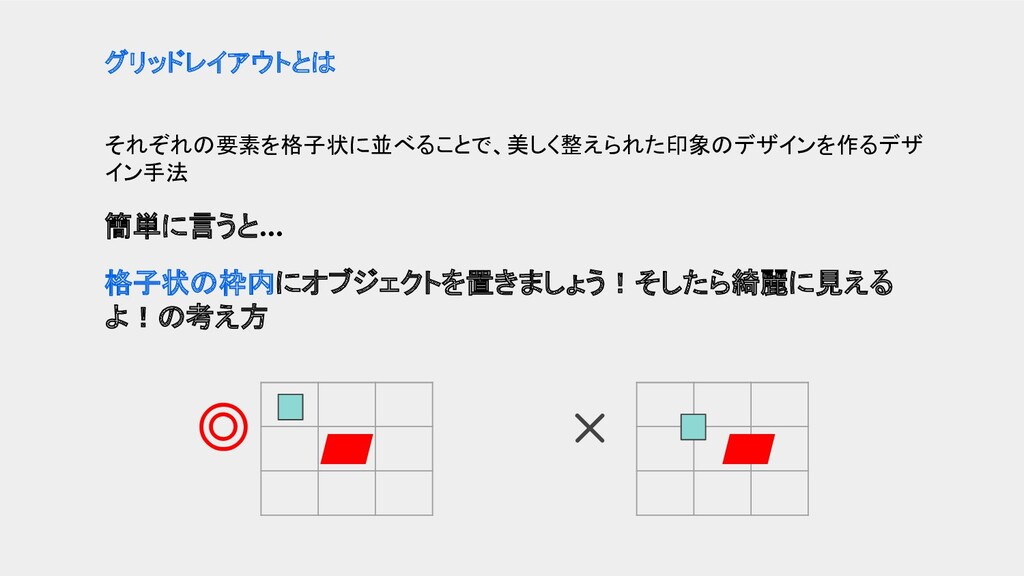
それぞれの要素を格子状に並べることで、美しく整えられた印象のデザインを作るデザ イン手法 簡単に言うと... 格子状の枠内にオブジェクトを置きましょう!そしたら綺麗に見える よ!の考え方 グリッドレイアウトとは ◎ ×
それぞれの要素を格子状に並べることで、美しく整えられた印象のデザインを作るデザ イン手法 簡単に言うと... 格子状の枠内にオブジェクトを置きましょう!そしたら綺麗に見える よ!の考え方 グリッドレイアウトとは ◎ ×
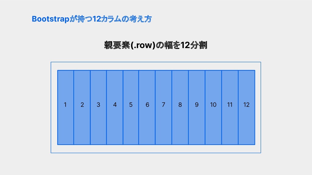
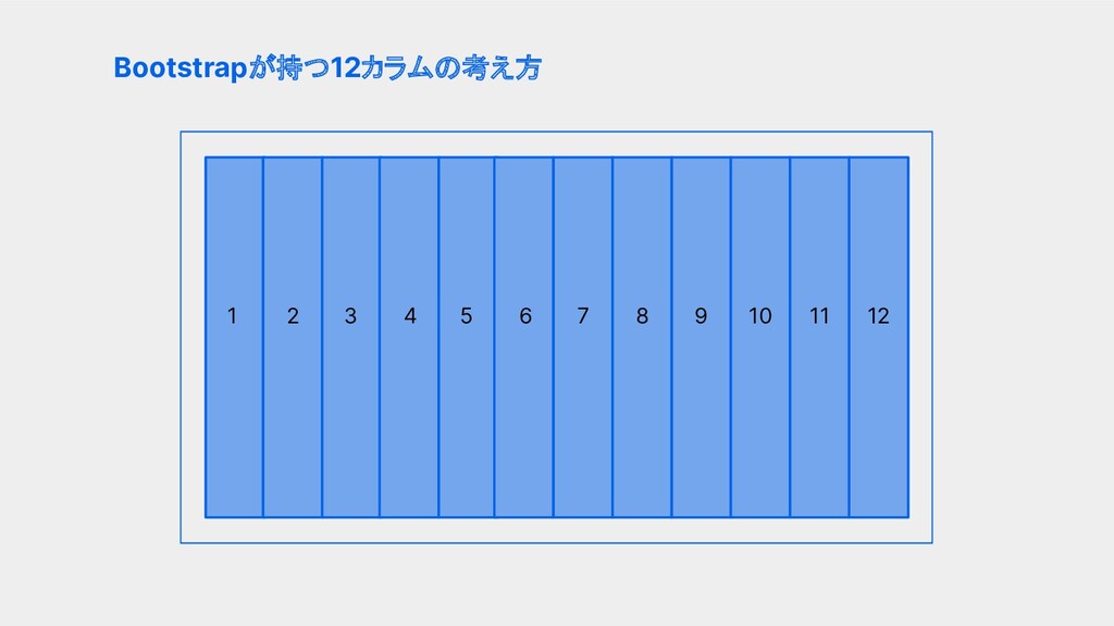
親要素(.row)の幅を12分割 Bootstrapが持つ12カラムの考え方 1 2 6 4 5 3 10 9
8 7 11 12
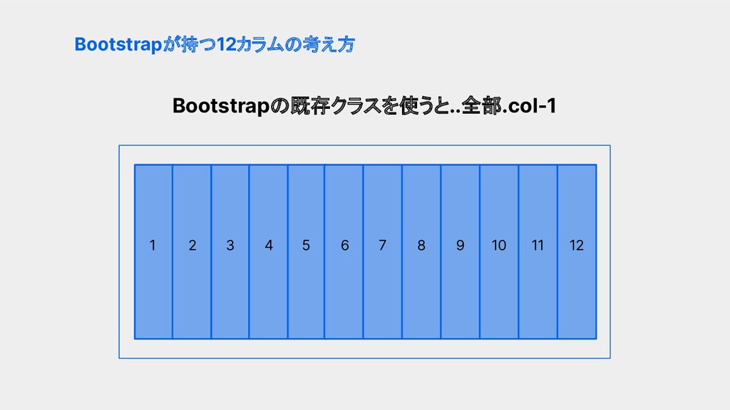
Bootstrapの既存クラスを使うと..全部.col-1 Bootstrapが持つ12カラムの考え方 1 2 6 4 5 3 10 9
8 7 11 12
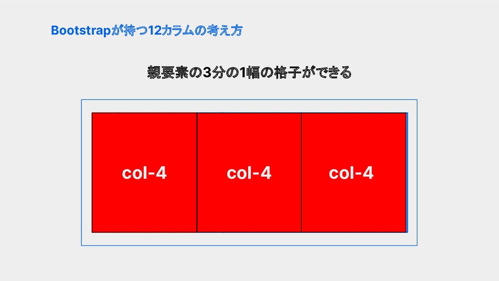
親要素の3分の1幅の格子ができる Bootstrapが持つ12カラムの考え方 col-4 6 5 10 9 8 7 11
12 col-4 col-4 col-4
親要素の4分の1幅の格子ができる Bootstrapが持つ12カラムの考え方 1 2 6 4 5 3 10 9
8 7 11 12 col-3 col-3 col-3 col-3
Bootstrapが持つ12カラムの考え方 1 2 6 4 5 3 10 9 8
7 11 12
• 12カラム のまとめ • ブレイクポイント • CSSライブラリはクラスの塊 個人的これだけわかっていれば、の3ポイント
Bootstrapの既存クラスだけで簡単に ブリッドレイアウトが作れる!
でも...
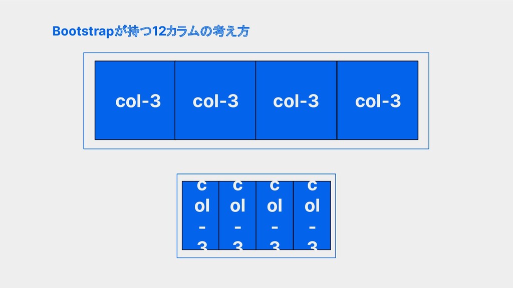
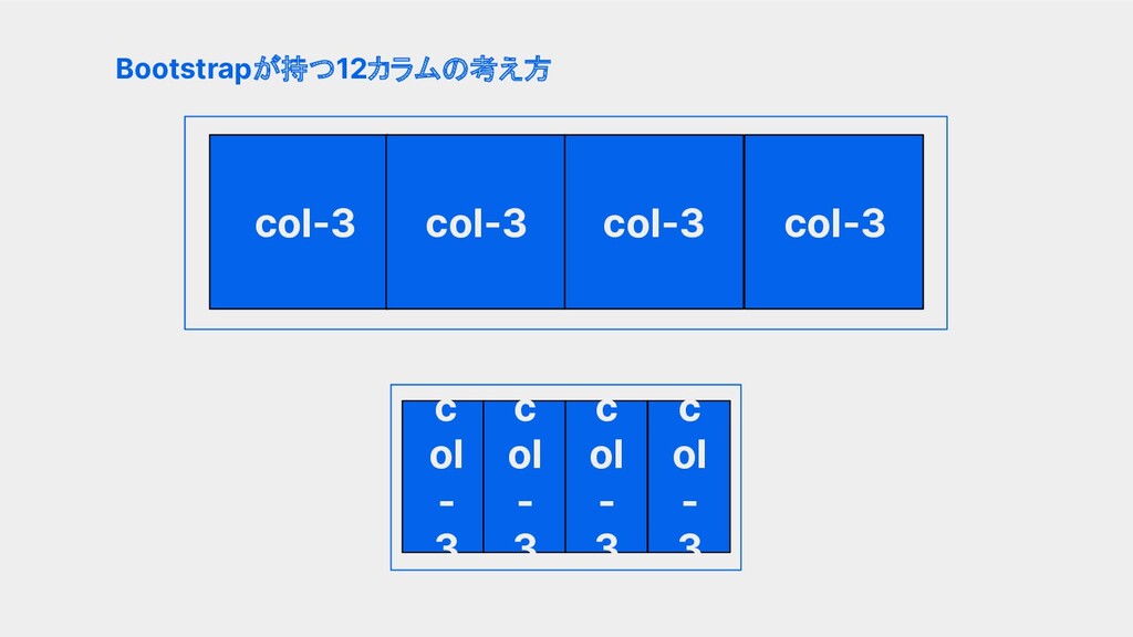
どんな画面幅でも同じグリッド幅使うと レイアウト崩れる...
親要素の4分の1幅の格子ができる Bootstrapが持つ12カラムの考え方 col-3 col-3 col-3 col-3 c ol - 3
c ol - 3 c ol - 3 c ol - 3
そんな時に!!
• 12カラム • ブレイクポイント • CSSライブラリはクラスの塊 個人的これだけわかっていれば、の3ポイント
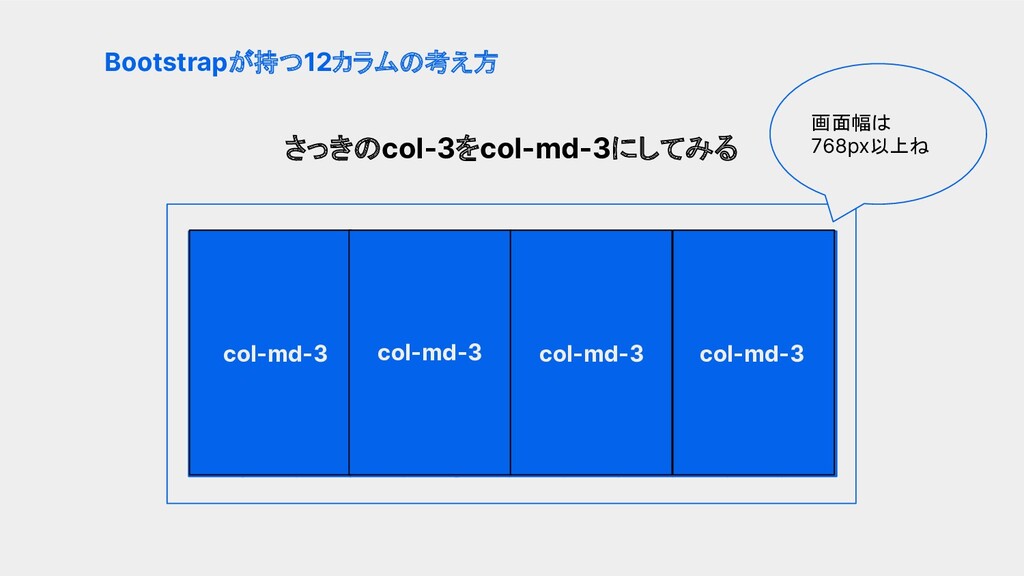
さっきのcol-3をcol-md-3にしてみる Bootstrapが持つ12カラムの考え方 1 2 6 4 5 3 10 9
8 7 11 12 col-md-3 col-md-3 col-md-3 col-md-3 画面幅は 768px以上ね
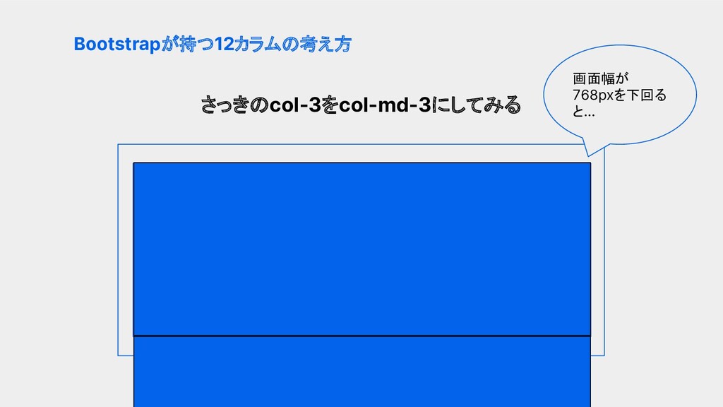
さっきのcol-3をcol-md-3にしてみる Bootstrapが持つ12カラムの考え方 1 2 6 4 5 3 10 9
8 7 11 12 画面幅が 768pxを下回る と...
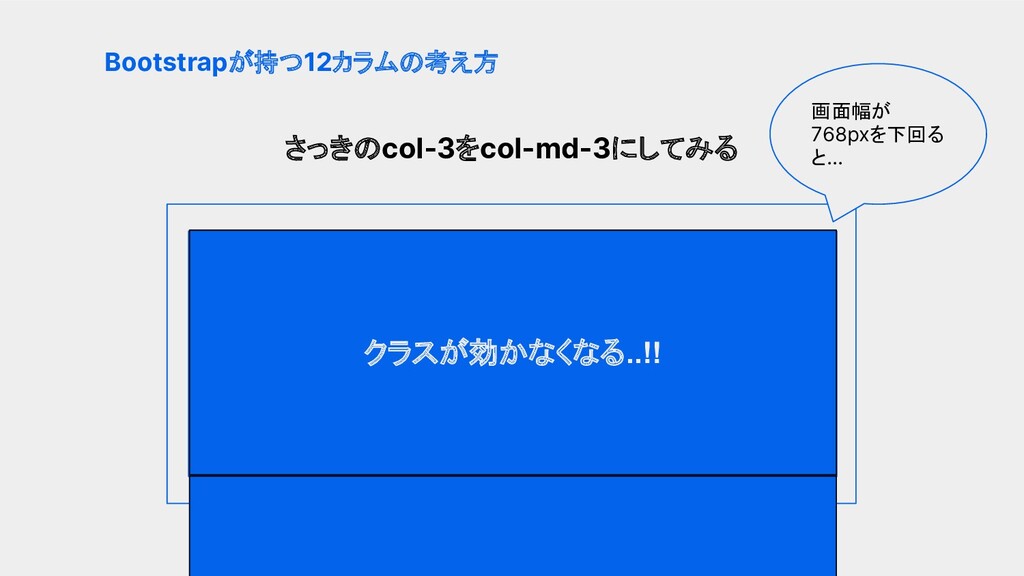
さっきのcol-3をcol-md-3にしてみる Bootstrapが持つ12カラムの考え方 1 2 6 4 5 3 10 9
8 7 11 12 クラスが効かなくなる..!! 画面幅が 768pxを下回る と...
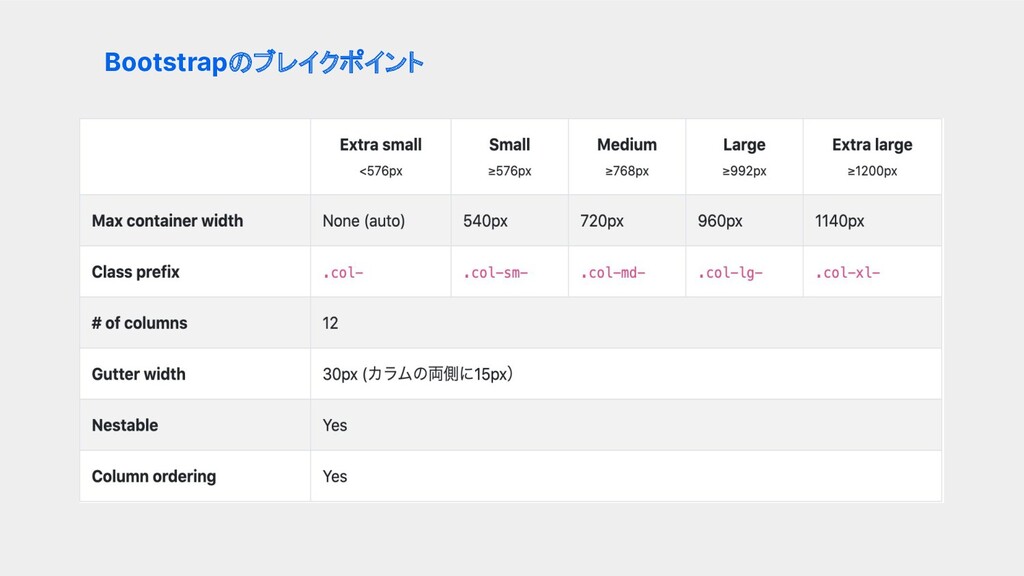
Bootstrapのブレイクポイント
Bootstrapのブレイクポイント col-3 どんな画面幅でもクラスが適用される col-sm-3 576px以上の画面幅でクラスが適用される col-md-3 768px以上の画面幅でクラスが適用される col-lg-3 992px以上の画面幅でクラスが適用される col-xl-3
1200px以上の画面幅でクラスが適用される
親要素の4分の1幅の格子ができる Bootstrapが持つ12カラムの考え方 col-3 col-3 col-3 col-3 c ol - 3
c ol - 3 c ol - 3 c ol - 3
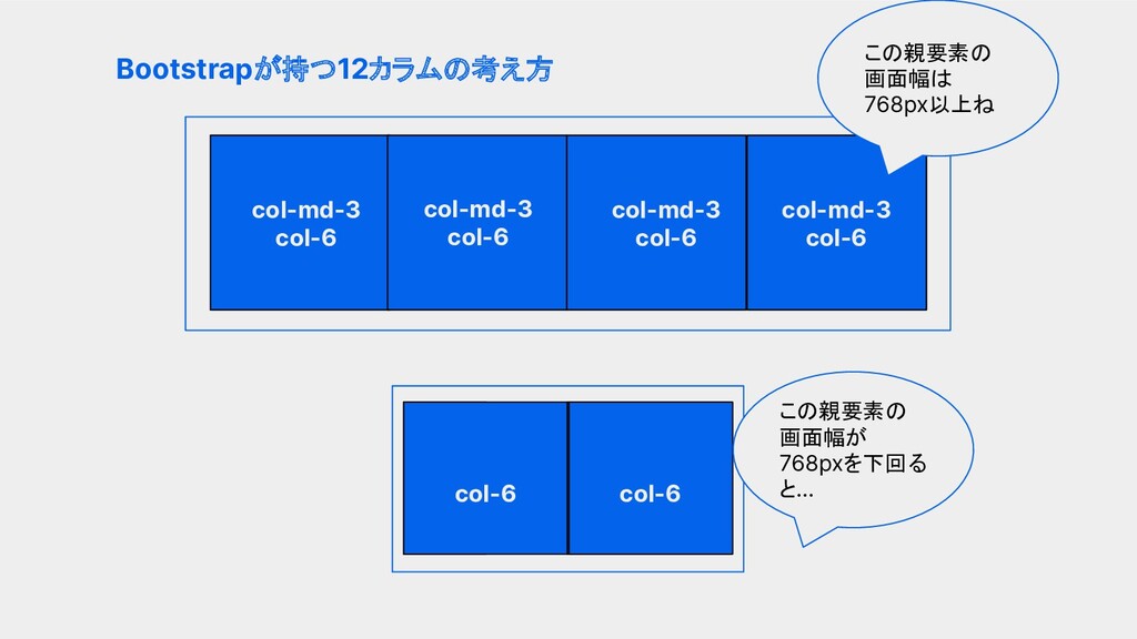
親要素の4分の1幅の格子ができる Bootstrapが持つ12カラムの考え方 col-md-3 col-6 col-md-3 col-6 col-md-3 col-6 col-md-3 col-6
この親要素の 画面幅は 768px以上ね この親要素の 画面幅が 768pxを下回る と... col-6 col-6
• 12カラム • ブレイクポイント のまとめ • CSSライブラリはクラスの塊 個人的これだけわかっていれば、の3ポイント
レスポンシブに対応したグリッドレイア ウトが簡単に作れる!!
ここまでで美しいグリッドレイアウトを再 現できるようになったはず!
あとは格子の中にオブジェクトを置い ていくだけ!!
結局CSS書かなきゃいけないじゃん
書こうと思ったCSSは大体Bootstrap の既存クラスにあるよ
Bootstrapだけでグリッドレイアウトも オブジェクトのデザイン当てもできる..!!
Twitterのフォローお願いします! @uniuni__8282 ご清聴ありがとうございました


 uni_82
 tammyeverts
 marcoroth
 marketingsoph
 kimpetersen
 reverentgeek
 asonas
 philnash
 quramy
 colly
colly
 skoyamalab
 sonatard
 sachag