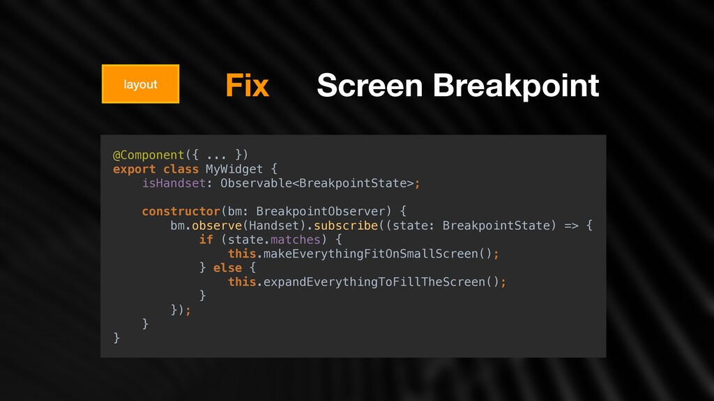
[ ['⽇', '⽉', '⽕', '⽔', '⽊', '⾦', '⼟'], u, ['⽇曜⽇', '⽉曜⽇', '⽕曜⽇', '⽔曜⽇', '⽊曜⽇', '⾦曜⽇', '⼟曜⽇'], ['⽇', '⽉', '⽕', '⽔', '⽊', '⾦', '⼟'] ], u, [ ['1', '2', '3', '4', '5', '6', '7', '8', '9', '10', '11', '12'], [ '1⽉', '2⽉', '3⽉', '4⽉', '5⽉', '6⽉', '7⽉', '8⽉', '9⽉', '10⽉', '11⽉', '12⽉' ], u ], u, [['BC', 'AD'], ['紀元前', '⻄暦'], u], 0, [6, 0], ['y/MM/dd', u, 'y年M⽉d⽇', 'y年M⽉d⽇EEEE'], ['H:mm', 'H:mm:ss', 'H:mm:ss z', 'H時mm分ss秒 zzzz'], ['{1} {0}', u, u, u], ['.', ',', ';', '%', '+', '-', 'E', '×', '‰', '∞', 'NaN', ':'], ['#,##0.###', '#,##0%', '¤#,##0.00', '#E0'], '¥', '⽇本円', {'CNY': ['元', '¥'], 'JPY': ['¥'], 'RON': [u, 'レイ']}, plural ]; export default [ 'ko-KP', [['AM', 'PM'], u, ['য়', 'য়റ']], u, [ ['ੌ', 'ਘ', 'ച', 'ࣻ', 'ݾ', 'Ә', 'ష'], u, ['ੌਃੌ', 'ਘਃੌ', 'ചਃੌ', 'ࣻਃੌ', 'ݾਃੌ', 'Әਃੌ', 'షਃੌ'], ['ੌ', 'ਘ', 'ച', 'ࣻ', 'ݾ', 'Ә', 'ష'] ], u, [ [ '1ਘ', '2ਘ', '3ਘ', '4ਘ', '5ਘ', '6ਘ', '7ਘ', '8ਘ', '9ਘ', '10ਘ', '11ਘ', '12ਘ' ], u, u ], u, [['BC', 'AD'], u, ['ӝਗ', 'ࢲӝ']], 1, [6, 0], ['yy. M. d.', 'y. M. d.', 'y֙ Mਘ dੌ', 'y֙ Mਘ dੌ EEEE'], ['a h:mm', 'a h:mm:ss', 'a hद m࠙ sୡ z', 'a hद m࠙ sୡ zzzz'], ['{1} {0}', u, u, u], ['.', ',', ';', '%', '+', '-', 'E', '×', '‰', '∞', 'NaN', ':'], ['#,##0.###', '#,##0%', '¤#,##0.00', '#E0'], 'KPW', 'ઑࢶ ੋ ҕചҴ ਗ', { 'AUD': ['AU$', '$'], 'JPY': ['JP¥', '¥'], 'RON': [u, 'L'], 'TWD': ['NT$'], 'USD': ['US$', '$'] }, plural ]; export default [ 'ar-EG', [['م' ,'ص'], u, u], [['م' ,'ص'], u, ['ً ءﺎﺴﻣ' ,'ﺎً ﺣﺎﺒﺻ']], [ ['س' ,'ج' ,'خ' ,'ر' ,'ث' ,'ن' ,'ح'], [ 'ﺲﯿﻤﺨﻟا' ,'ءﺎﻌﺑرﻷا' ,'ءﺎﺛﻼﺜﻟا' ,'ﻦﯿﻨﺛﻻا' ,'ﺪﺣﻷا', 'ﺖﺒﺴﻟا' ,'ﺔﻌﻤﺠﻟا' ], u, ['ﺖﺒﺳ' ,'ﺔﻌﻤﺟ' ,'ﺲﯿﻤﺧ' ,'ءﺎﻌﺑرأ' ,'ءﺎﺛﻼﺛ' ,'ﻦﯿﻨﺛإ' ,'ﺪﺣأ'] ], u, [ ['د' ,'ب' ,'ك' ,'س' ,'غ' ,'ل' ,'ن' ,'و' ,'أ' ,'م' ,'ف' ,'ي'], [ 'ﻮﯿﻧﻮﯾ' ,'ﻮﯾﺎﻣ' ,'ﻞﯾﺮﺑأ' ,'سرﺎﻣ' ,'ﺮﯾاﺮﺒﻓ' ,'ﺮﯾﺎﻨﯾ', 'ﺮﺒﻤﺴﯾد' ,'ﺮﺒﻤﻓﻮﻧ' ,'ﺮﺑﻮﺘﻛأ' ,'ﺮﺒﻤﺘﺒﺳ' ,'ﺲﻄﺴﻏأ' ,'ﻮﯿﻟﻮﯾ' ], u ], u, [['م' ,'م.ق'], u, ['يدﻼﯿﻣ' ,'دﻼﯿﻤﻟا ﻞﺒﻗ']], [6 ,5] ,6, ['d\u200f/M\u200f/y', 'dd\u200f/MM\u200f/y', 'd MMMM y', 'EEEE، d MMMM y'], ['h:mm a', 'h:mm:ss a', 'h:mm:ss a z', 'h:mm:ss a zzzz'], ['{1} {0}', u, u, u], [ '.', ',', ';', '\u200e%\u200e', '\u200e+', '\u200e-', 'E', '×', '‰', '∞', @angular/common/locales Don't Forget
 yadong
 elenatanasoiu
 sumedhbala
 jsoizo
 yukikurage
 philipschwarz
 tk3fftk
 suikabar
 cockscomb
 tonkotsuboy_com
 naokihaba
 kotetuco
 maroon1st
 trallard
 lara
lara
 bethany
 davidcarrasco
 cassininazir
 rasagy
 chrisshort
 rkendrick25
 rakko
rakko
 morganepeng
 nikkihalliwell
 marcelosomers
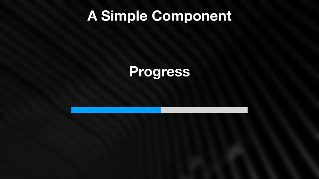
![Simple Component [style.width.%]=“percent” <div class=“fill”> <div class=“background”> @Input() percent =](https://files.speakerdeck.com/presentations/5c7689060b414f429554e24f50caa7aa/slide_6.jpg)
![[style.width.%]=“percent” <div class=“fill”> <div class=“background”> @Input() percent = 0; View](https://files.speakerdeck.com/presentations/5c7689060b414f429554e24f50caa7aa/slide_7.jpg)
![Simple Component @Component({ selector: 'ngx-progress', template: ` <div class="fill" [style.width.%]="progress"></div>](https://files.speakerdeck.com/presentations/5c7689060b414f429554e24f50caa7aa/slide_9.jpg)
![@Component({ template: ` <ngx-select [options]="options"></ngx-select> ` }) export class NgxSelectComponent](https://files.speakerdeck.com/presentations/5c7689060b414f429554e24f50caa7aa/slide_27.jpg)
![Template Driven Model-Driven @Component({ selector: 'app-root', template: ` <ngx-select [options]="options"></ngx-select>](https://files.speakerdeck.com/presentations/5c7689060b414f429554e24f50caa7aa/slide_28.jpg)
![Theme "options": { "styles": [ "src/styles.less" ] } angular.json sass](https://files.speakerdeck.com/presentations/5c7689060b414f429554e24f50caa7aa/slide_31.jpg)
![Theme progress.less progress-theme.less Progress Component styleUrls : [ './progress.less' ]](https://files.speakerdeck.com/presentations/5c7689060b414f429554e24f50caa7aa/slide_33.jpg)
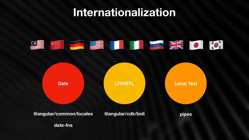
![Internationalization export default [ 'ja', [['午前', '午後'], u, u], u,](https://files.speakerdeck.com/presentations/5c7689060b414f429554e24f50caa7aa/slide_37.jpg)