Share
GDG DevFest 2020 https://gdg-tokyo.connpass.com/event/190079/
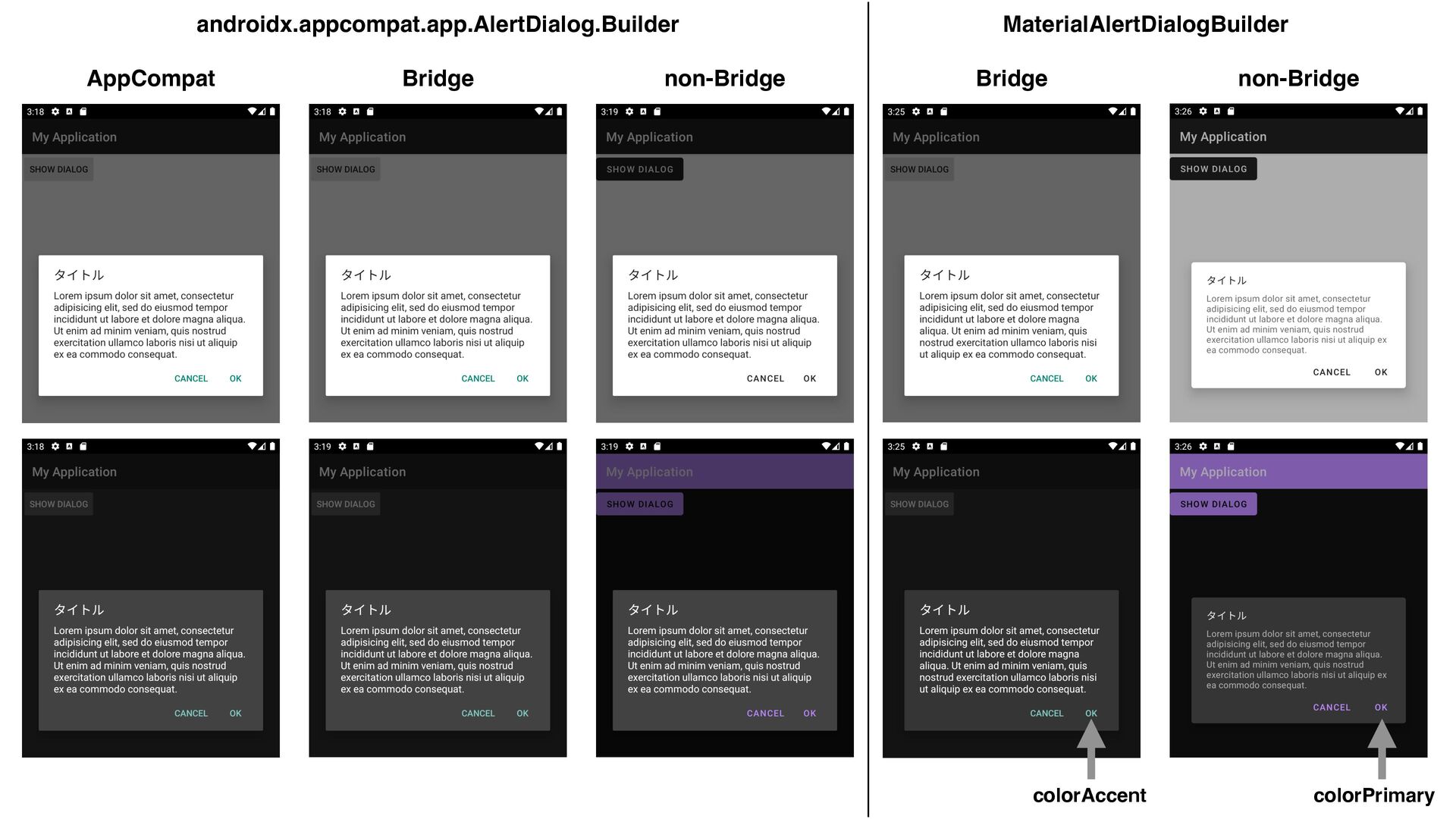
Material Design Components for Android の 1.2.0 がリリースされました。この講演では最新の MDC for Android のカスタマイズ方法について解説します。特に AppCompat とは異なる MDC で定義されている色や shape の attribute について取り上げます。
 yanzm
yanzm
 tamaiyutaro
 kobayashiyorimitsu
 taddy_919
 maf_0521
 odan611
 k_adachi_01
 oomatomo
 kanny
kanny
 iotcomjpadmin
 rince
rince
 ken6377
 naokiakai
 techseoconnect
 denniskardys
 raygrieselhuber
 addyosmani
 axbom
axbom
 chriscoyier
 lemiorhan
 aleyda
 danielanewman
 tammielis
 quramy
 rasmusluckow
![• ThemeOverlay.MaterialComponents.[Light|Dark] Λࢦఆ͢Δ android:theme Λࢦఆ͢Δ <com.google.android.material.textfield.TextInputLayout android:id="@+id/textInputLayout" style="@style/Widget.MaterialComponents.TextInputLayout.FilledBox" ... android:theme="@style/ThemeOverlay.MaterialComponents.Light">](https://files.speakerdeck.com/presentations/155fd6ab059b4ab4aed51deb682f7a15/slide_73.jpg)