Upgrade to Pro — share decks privately, control downloads, hide ads and more …

Q-Q plots: To de-trend, or not to de-trend

adam loy
November 01, 2018
60

Q-Q plots: To de-trend, or not to de-trend

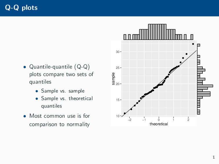
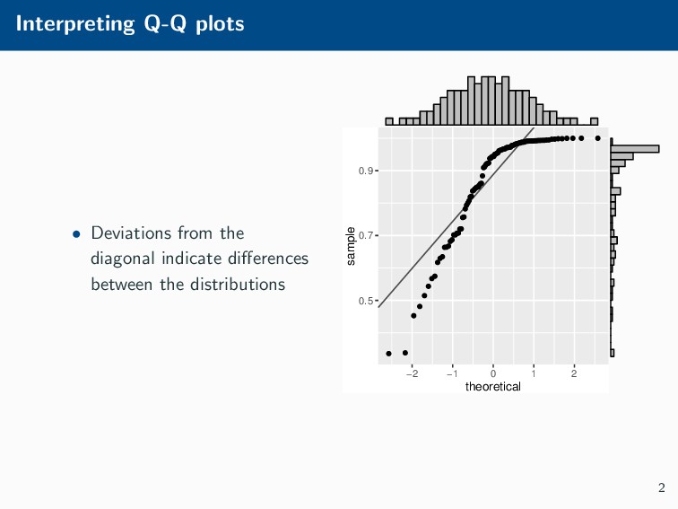
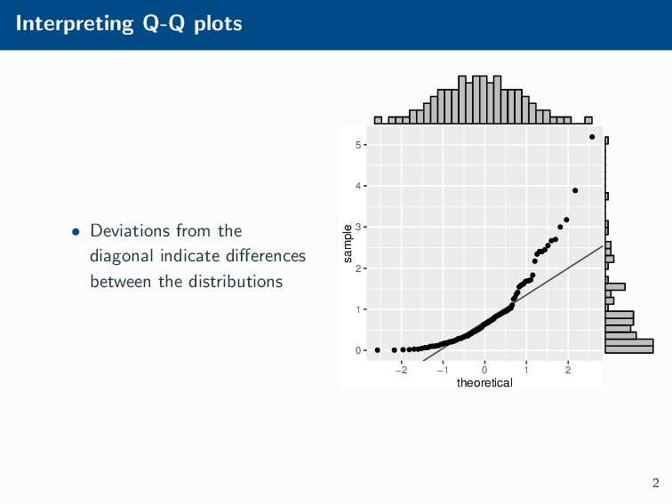
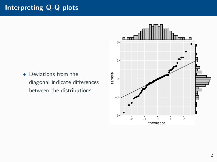
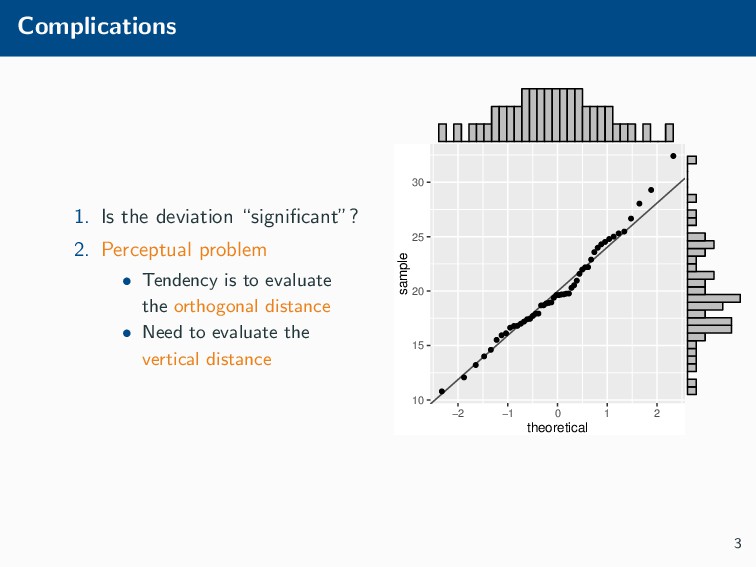
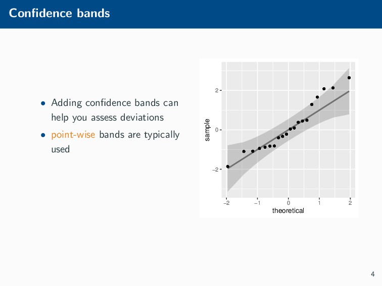
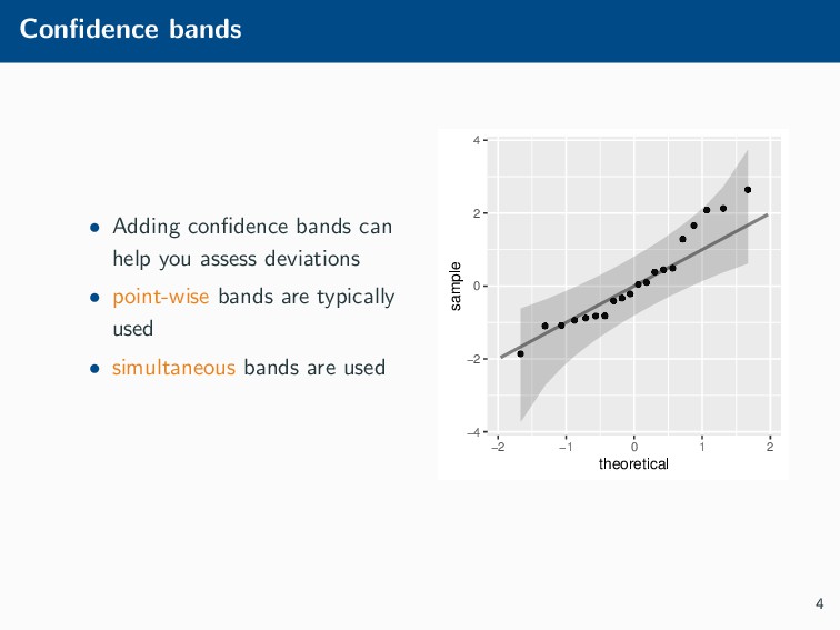
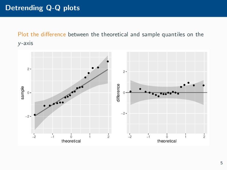
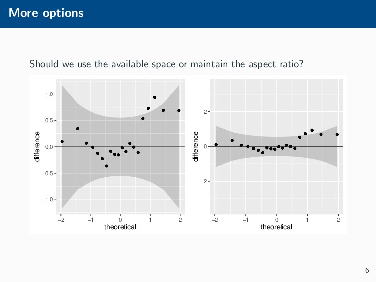
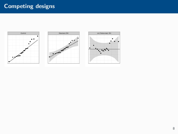
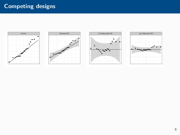
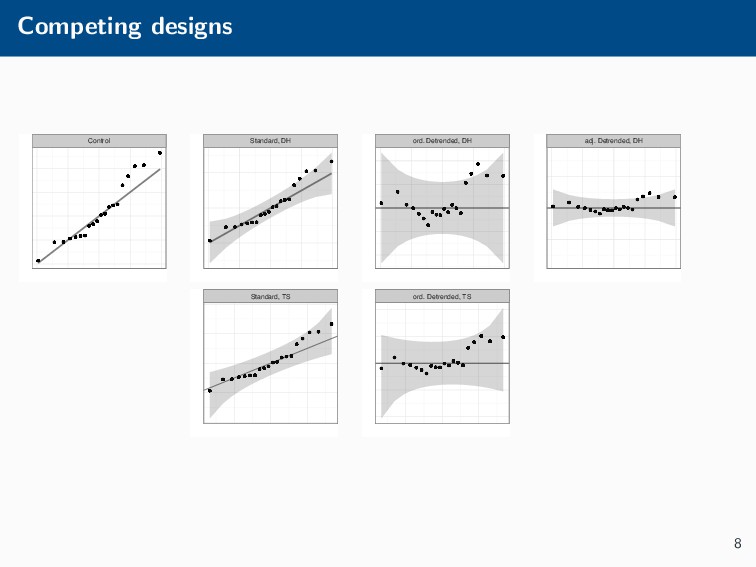
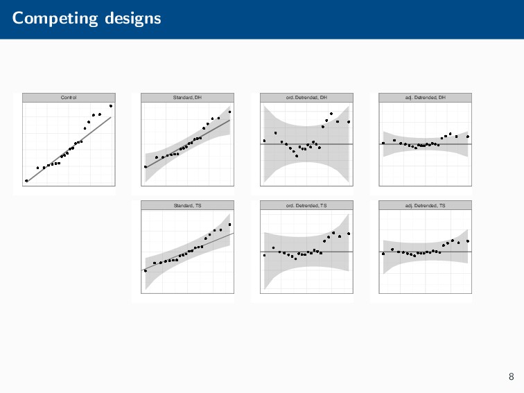
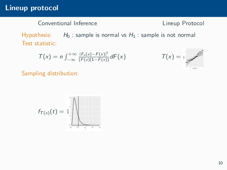
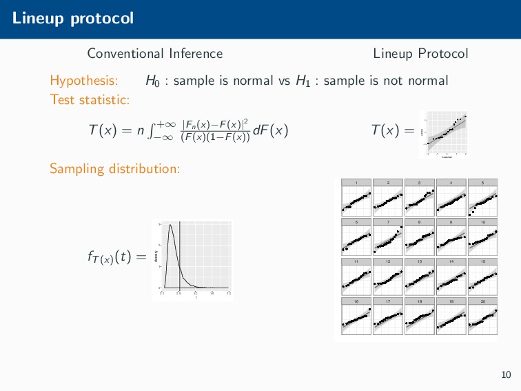
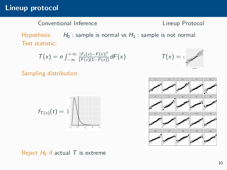
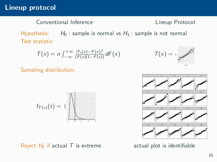
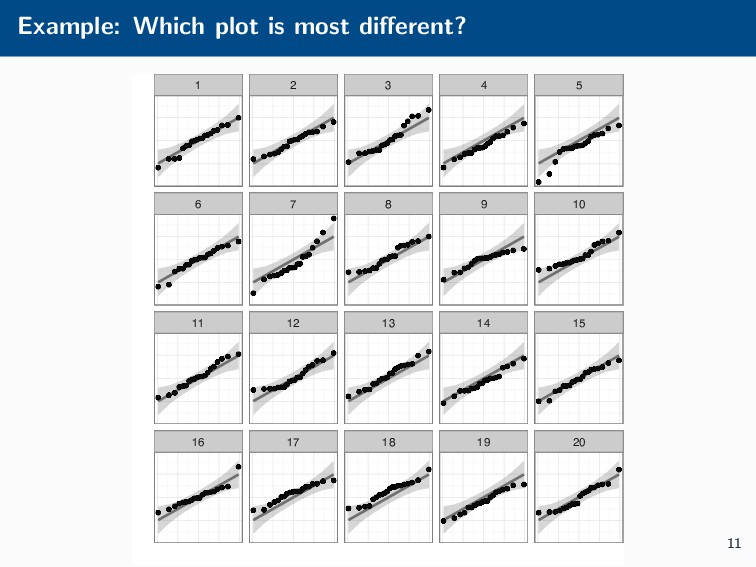
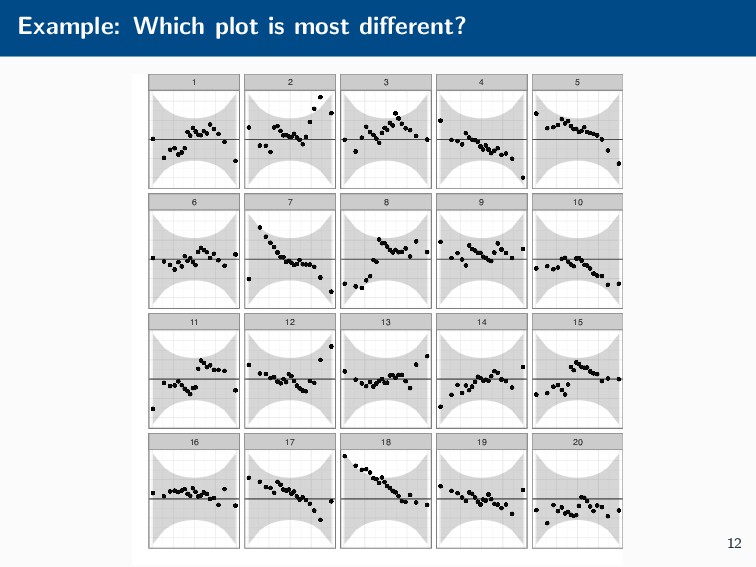
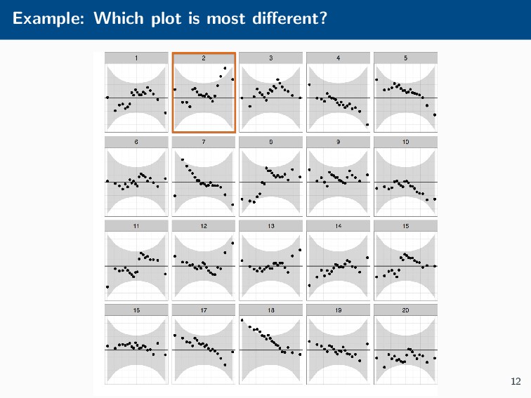
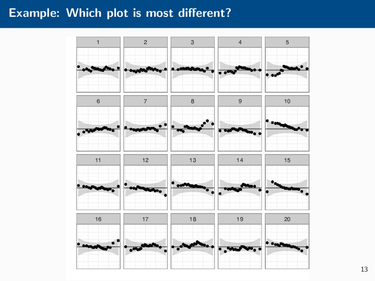
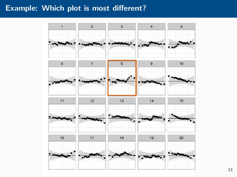
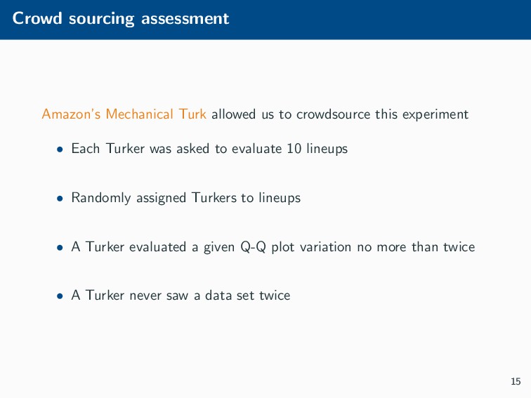
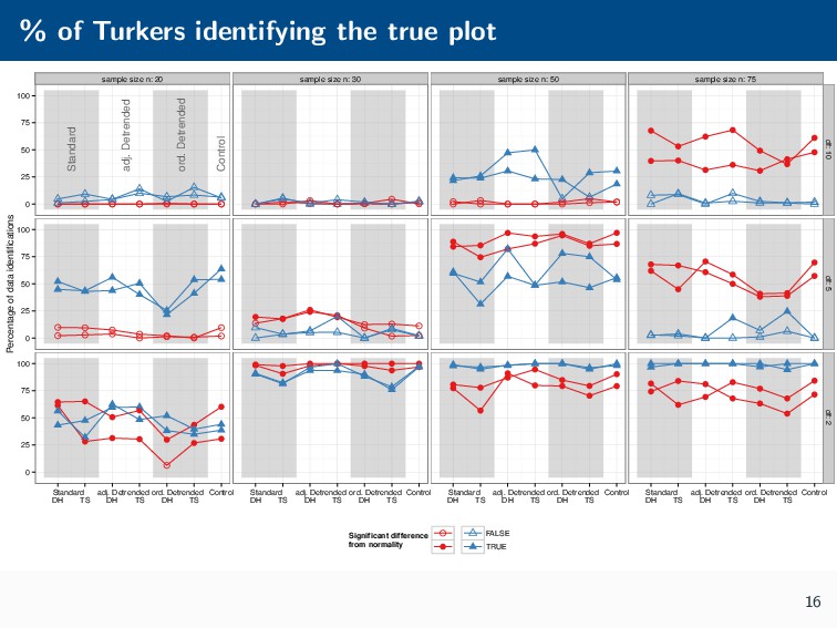
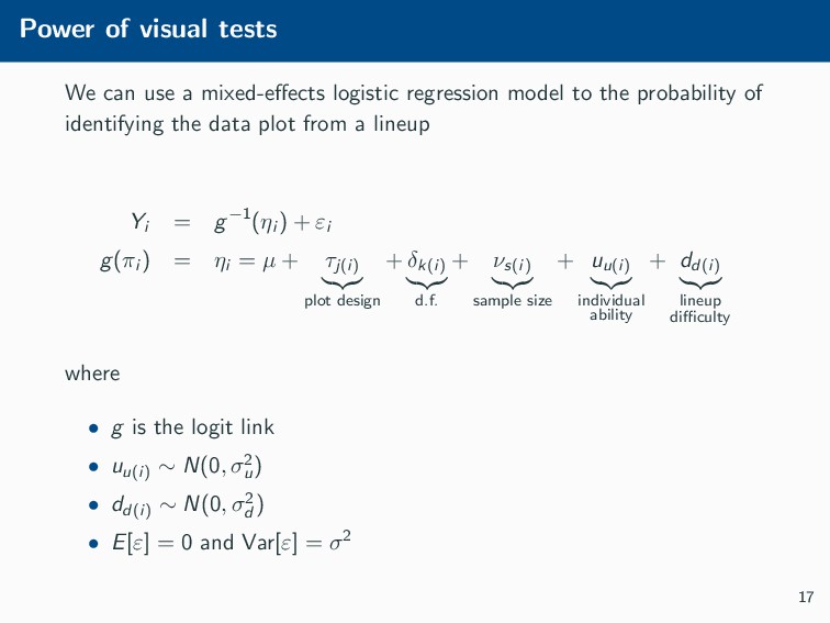
Histograms, scatterplots with smoothers, and other statistical graphics are commonplace in many quantitative courses, and even popular news outlets. While using statistical graphics has become so familiar to many, the process behind the selection and the refinement of statistical graphics is often overlooked. This talk will use the quantile-quantile (Q-Q) plot as an example of how to conduct statistical graphics research. The discussion will include the perceptual problems associated with the standard Q-Q plot often seen in textbooks, possible solutions to this problem, and the experiment used to test these possible solutions.

adam loy

November 01, 2018
Tweet

Transcript

  1. Q-Q plots To de-trend, or not to de-trend Adam Loy

    Macalester College MSCS Seminar November 1, 2018 Carleton College, Department of Mathematics and Statistics
  2. Q-Q plots • Quantile-quantile (Q-Q) plots compare two sets of

    quantiles • Sample vs. sample • Sample vs. theoretical quantiles • Most common use is for comparison to normality 10 15 20 25 30 −2 −1 0 1 2 theoretical sample 1
  3. Interpreting Q-Q plots • Deviations from the diagonal indicate differences

    between the distributions 0.5 0.7 0.9 −2 −1 0 1 2 theoretical sample 2
  4. Interpreting Q-Q plots • Deviations from the diagonal indicate differences

    between the distributions 0 1 2 3 4 5 −2 −1 0 1 2 theoretical sample 2
  5. Interpreting Q-Q plots • Deviations from the diagonal indicate differences

    between the distributions −6 −3 0 3 6 −2 −1 0 1 2 theoretical sample 2
  6. Complications 1. Is the deviation “significant”? 2. Perceptual problem •

    Tendency is to evaluate the orthogonal distance • Need to evaluate the vertical distance 10 15 20 25 30 −2 −1 0 1 2 theoretical sample 3
  7. Confidence bands • Adding confidence bands can help you assess

    deviations • point-wise bands are typically used −2 0 2 −2 −1 0 1 2 theoretical sample 4
  8. Confidence bands • Adding confidence bands can help you assess

    deviations • point-wise bands are typically used • simultaneous bands are used −4 −2 0 2 4 −2 −1 0 1 2 theoretical sample 4
  9. Detrending Q-Q plots Plot the difference between the theoretical and

    sample quantiles on the y-axis −2 0 2 −2 −1 0 1 2 theoretical sample −2 0 2 −2 −1 0 1 2 theoretical difference 5
  10. More options Should we use the available space or maintain

    the aspect ratio? −1.0 −0.5 0.0 0.5 1.0 −2 −1 0 1 2 theoretical difference −2 0 2 −2 −1 0 1 2 theoretical difference 6
  11. Questions • Should we be using de-trended Q-Q plots? •

    Should we use the available space or maintain the aspect ratio? • Do confidence bands help us interpret Q-Q plots? • Are pointwise confidence bands sufficient or do we need simultaneous confidence bands? • Are Q-Q plots even worth the trouble? Why not use a “conventional” test? 7
  12. Competing designs Control Standard, DH ord. Detrended, DH adj. Detrended,

    DH Standard, TS ord. Detrended, TS adj. Detrended, TS 8
  13. Inspiration Classical hypothesis testing provides an established framework for inference.

    1. Formulate two competing hypotheses: H0 and H1 . 2. Choose a test statistic that characterizes the information in the sample relevant to H0 . 3. Determine the sampling distribution of the chosen statistic when H0 is true. 4. Compare the calculated test statistic to the sampling distribution to determine whether it is “extreme.” 9
  14. Lineup protocol Conventional Inference Lineup Protocol Hypothesis: H0 : sample

    is normal vs H1 : sample is not normal Test statistic: 10
  15. Lineup protocol Conventional Inference Lineup Protocol Hypothesis: H0 : sample

    is normal vs H1 : sample is not normal Test statistic: T(x) = n +∞ −∞ |Fn(x)−F(x)|2 (F(x)(1−F(x)) dF(x) 10
  16. Lineup protocol Conventional Inference Lineup Protocol Hypothesis: H0 : sample

    is normal vs H1 : sample is not normal Test statistic: T(x) = n +∞ −∞ |Fn(x)−F(x)|2 (F(x)(1−F(x)) dF(x) T(x) = −2 0 2 −2 −1 0 1 2 theoretical sample 10
  17. Lineup protocol Conventional Inference Lineup Protocol Hypothesis: H0 : sample

    is normal vs H1 : sample is not normal Test statistic: T(x) = n +∞ −∞ |Fn(x)−F(x)|2 (F(x)(1−F(x)) dF(x) T(x) = −2 0 2 −2 −1 0 1 2 theoretical sample Sampling distribution: 10
  18. Lineup protocol Conventional Inference Lineup Protocol Hypothesis: H0 : sample

    is normal vs H1 : sample is not normal Test statistic: T(x) = n +∞ −∞ |Fn(x)−F(x)|2 (F(x)(1−F(x)) dF(x) T(x) = −2 0 2 −2 −1 0 1 2 theoretical sample Sampling distribution: fT(x) (t) = 0 1 2 3 0.0 0.5 1.0 1.5 2.0 t density 10
  19. Lineup protocol Conventional Inference Lineup Protocol Hypothesis: H0 : sample

    is normal vs H1 : sample is not normal Test statistic: T(x) = n +∞ −∞ |Fn(x)−F(x)|2 (F(x)(1−F(x)) dF(x) T(x) = −2 0 2 −2 −1 0 1 2 theoretical sample Sampling distribution: fT(x) (t) = 0 1 2 3 0.0 0.5 1.0 1.5 2.0 t density 1 2 3 4 5 6 7 8 9 10 11 12 13 14 15 16 17 18 19 20 10
  20. Lineup protocol Conventional Inference Lineup Protocol Hypothesis: H0 : sample

    is normal vs H1 : sample is not normal Test statistic: T(x) = n +∞ −∞ |Fn(x)−F(x)|2 (F(x)(1−F(x)) dF(x) T(x) = −2 0 2 −2 −1 0 1 2 theoretical sample Sampling distribution: fT(x) (t) = 0 1 2 3 0.0 0.5 1.0 1.5 2.0 t density 1 2 3 4 5 6 7 8 9 10 11 12 13 14 15 16 17 18 19 20 Reject H0 if actual T is extreme 10
  21. Lineup protocol Conventional Inference Lineup Protocol Hypothesis: H0 : sample

    is normal vs H1 : sample is not normal Test statistic: T(x) = n +∞ −∞ |Fn(x)−F(x)|2 (F(x)(1−F(x)) dF(x) T(x) = −2 0 2 −2 −1 0 1 2 theoretical sample Sampling distribution: fT(x) (t) = 0 1 2 3 0.0 0.5 1.0 1.5 2.0 t density 1 2 3 4 5 6 7 8 9 10 11 12 13 14 15 16 17 18 19 20 Reject H0 if actual T is extreme actual plot is identifiable 10
  22. Example: Which plot is most different? 1 2 3 4

    5 6 7 8 9 10 11 12 13 14 15 16 17 18 19 20 11
  23. Example: Which plot is most different? 1 2 3 4

    5 6 7 8 9 10 11 12 13 14 15 16 17 18 19 20 12
  24. Example: Which plot is most different? 1 2 3 4

    5 6 7 8 9 10 11 12 13 14 15 16 17 18 19 20 13
  25. Simulating data and null plots • Data plots simulated from

    one of 12 t-distributions created from all combinations of d.f. ∈ {2, 5, 10} and n ∈ {20, 30, 50, 75}. • Two data plots generated in each setting • Two sets of 19 null plots were simulated from N(0, 1) for each of the 12 settings. • The 48 lineup data sets were rendered in each of the 7 Q-Q plot variations. 14
  26. Simulating data and null plots • Data plots simulated from

    one of 12 t-distributions created from all combinations of d.f. ∈ {2, 5, 10} and n ∈ {20, 30, 50, 75}. • Two data plots generated in each setting • Two sets of 19 null plots were simulated from N(0, 1) for each of the 12 settings. • The 48 lineup data sets were rendered in each of the 7 Q-Q plot variations. • Need to evaluate 48 × 7 = 336 lineups. 14
  27. Crowd sourcing assessment Amazon’s Mechanical Turk allowed us to crowdsource

    this experiment • Each Turker was asked to evaluate 10 lineups • Randomly assigned Turkers to lineups • A Turker evaluated a given Q-Q plot variation no more than twice • A Turker never saw a data set twice 15
  28. % of Turkers identifying the true plot sample size n:

    20 sample size n: 30 sample size n: 50 sample size n: 75 Standard adj. Detrended ord. Detrended Control 0 25 50 75 100 0 25 50 75 100 0 25 50 75 100 df: 10 df: 5 df: 2 Standard DH TS adj. Detrended DH TS ord. Detrended DH TS Control Standard DH TS adj. Detrended DH TS ord. Detrended DH TS Control Standard DH TS adj. Detrended DH TS ord. Detrended DH TS Control Standard DH TS adj. Detrended DH TS ord. Detrended DH TS Control Percentage of data identifications Significant difference from normality FALSE TRUE 16
  29. Power of visual tests We can use a mixed-effects logistic

    regression model to the probability of identifying the data plot from a lineup Yi = g−1(ηi ) + εi g(πi ) = ηi = µ + τj(i) plot design + δk(i) d.f. + νs(i) sample size + uu(i) individual ability + dd(i) lineup difficulty where • g is the logit link • uu(i) ∼ N(0, σ2 u ) • dd(i) ∼ N(0, σ2 d ) • E[ε] = 0 and Var[ε] = σ2 17
  30. Power of visual tests odds (low, high) design (CI) Control

    1.00 — Standard (DH) 1.11 (0.92, 1.33) Standard (TS) 0.83 (0.67, 1.04) ord. detrended (DH) 0.66 (0.54, 0.79) ord. detrended (TS) 1.03 (0.83, 1.28) adj. detrended (DH) 1.52 (1.22, 1.89) adj. detrended (TS) 1.37 (1.10, 1.70) sample size 20 1.00 — 30 2.92 (0.64, 13.43) 50 20.13 (4.37, 92.77) 75 10.59 (2.29, 49.04) degrees of freedom 2 436.30 (114.26, 1666.09) 5 10.44 (2.80, 38.93) 10 1.00 — 18
  31. Basics & notation • For a lineup of size m

    the type I error is the probability to pick the data plot, if the null hypothesis is true: P(reject H0 | H0 true) = 1/m • Set significance level α to be 1/m for m = 20 we have α = 0.05 • for individual observer: p − value = ≤ 1/m if observer picks the data plot > 1/m if observer picks null plot 19
  32. Visual p-value • Assume we have N independent observers •

    Let X be the number of observers who pick the data plot from a lineup of size m • Under the null hypothesis, X ∼ Binomial(N, 1/m) • If k observers pick the data plot from the lineup, we get an estimate of a visual p-value as p-value = P(X ≥ k) = N i=k N i 1 m i 1 − 1 m N−i 20
  33. Visual p-value • Assume we have N independent observers •

    Let X be the number of observers who pick the data plot from a lineup of size m • Under the null hypothesis, X ∼ Binomial(N, 1/m) • If k observers pick the data plot from the lineup, we get an estimate of a visual p-value as p-value = P(X ≥ k) = N i=k N i 1 m i 1 − 1 m N−i N k p-value 15 3 0.0362 20 4 0.0159 25 4 0.0341 20
  34. Visual tests vs. classical normality tests sample size n: 20

    sample size n: 30 sample size n: 50 sample size n: 75 0.00 0.25 0.50 0.75 1.00 0.00 0.25 0.50 0.75 1.00 0.00 0.25 0.50 0.75 1.00 df: 10 df: 5 df: 2 Std TS Std DH SW AD LF CvM Std TS Std DH SW AD LF CvM Std TS Std DH SW AD LF CvM Std TS Std DH SW AD LF CvM p−value Significant difference from normality FALSE TRUE 21
  35. Visual tests vs. normality tests Standard (TS/DH) SW AD LF

    CvM reject N(0, S2) 17 / 14 8 5 5 4 • 24 non-normal data sets • Standard normality tests reject, at most 8 • Visual tests reject far more 22
  36. Summary • Lineup tests are better at detecting deviations from

    normality than classical normality tests • Adjusted detrended Q-Q plots are the most powerful variation • The traditional pointwise confidence band is typically more powerful than tail sensitive, but not significantly • qqplotr: an R package to make adjusted detrended Q-Q plots is available on CRAN: install.packages("qqplotr") 23
  37. Future work • Investigate the power to detect other forms

    of non-normality and how the power of Q-Q plots compares to P-P plots • Investigate how different estimates of the variance impact the power of Q-Q plots • Determine how to automate evaluation and compare it’s power to human evaluation 24
  38. References I S. Aldor-Noiman, L. D. Brown, A. Buja, W.

    Rolke, and R. A. Stine. The power to see: A new graphical test of normality. The American Statistician, 67(4):249–260, 2013. A. Buja, D. Cook, H. Hofmann, M. Lawrence, E.-K. Lee, D. F. Swayne, and H. Wickham. Statistical inference for exploratory data analysis and model diagnostics. Philosophical Transactions of the Royal Society A: Mathematical, Physical and Engineering Sciences, 367(1906):4361–4383, 2009. 25
  39. References II J. Heer and M. Bostock. Crowdsourcing graphical perception:

    using mechanical turk to assess visualization design. In Proceedings of the 28th international conference on Human factors in computing systems, CHI ´ 10, pages 203–212, New York, NY, USA, 2010. ACM. H. Hofmann, L. Follett, M. Majumder, and D. Cook. Graphical tests for power comparison of competing designs. IEEE Transactions on Visualization and Computer Graphics, 18(12):2441–2448, 2012. 26
  40. References III R. Kosara and C. Ziemkiewicz. Do mechanical turks

    dream of square pie charts? In Proceedings of the 3rd BELIV’10 Workshop: BEyond Time and Errors: Novel evaLuation Methods for Information Visualization, BELIV ’10, pages 63–70, New York, NY, USA, 2010. ACM. M. Majumder, H. Hofmann, and D. Cook. Validation of visual statistical inference, applied to linear models. Journal of the American Statistical Association, 108(503):942–956, 2013. 27