Upgrade to Pro
— share decks privately, control downloads, hide ads and more …
Speaker Deck
Features
Speaker Deck
PRO
Sign in
Sign up for free
Search
Search
Forefront Leeds - Andy Fitch - 18/11/2013
Search
andyfitch
November 18, 2013
Programming
250
1
Share
Forefront Leeds - Andy Fitch - 18/11/2013
A Mobile-first, OOCSS approach to Responsive Web Design
andyfitch
November 18, 2013
Other Decks in Programming
See All in Programming
ふりがな Deep Dive try! Swift Tokyo 2026
watura
0
240
運転動画を検索可能にする〜Cosmos-Embed1とDatabricks Vector Searchで〜/cosmos-embed1-databricks-vector-search
studio_graph
1
440
JOAI2026 1st solution - heron0519 -
heron0519
0
150
「Linuxサーバー構築標準教科書」を読んでみた #ツナギメオフライン.7
akase244
0
1.4k
Swift Concurrency Type System
inamiy
1
550
AI時代のエンジニアリングの原則 / Engineering Principles in the AI Era
haru860
0
620
10 Tips of AWS ~Gen AI on AWS~
licux
5
470
ルールルルルルRubyの中身の予備知識 ── RubyKaigiの前に予習しなイカ?
ydah
1
210
CursorとClaudeCodeとCodexとOpenCodeを実際に比較してみた
terisuke
1
490
レガシーPHP転生 〜父がドメインエキスパートだったのでDDD+Claude Codeでチート開発します〜
panda_program
0
1.1k
Offline should be the norm: building local-first apps with CRDTs & Kotlin Multiplatform
renaudmathieu
0
230
ハーネスエンジニアリングとは?
kinopeee
13
6.2k
Featured
See All Featured
New Earth Scene 8
popppiees
3
2.1k
The Art of Delivering Value - GDevCon NA Keynote
reverentgeek
16
1.9k
Game over? The fight for quality and originality in the time of robots
wayneb77
1
160
Agile that works and the tools we love
rasmusluckow
331
21k
Templates, Plugins, & Blocks: Oh My! Creating the theme that thinks of everything
marktimemedia
31
2.8k
Build your cross-platform service in a week with App Engine
jlugia
234
18k
Ecommerce SEO: The Keys for Success Now & Beyond - #SERPConf2024
aleyda
1
1.9k
Navigating the Design Leadership Dip - Product Design Week Design Leaders+ Conference 2024
apolaine
0
280
職位にかかわらず全員がリーダーシップを発揮するチーム作り / Building a team where everyone can demonstrate leadership regardless of position
madoxten
62
53k
Balancing Empowerment & Direction
lara
6
1.1k
YesSQL, Process and Tooling at Scale
rocio
174
15k
エンジニアに許された特別な時間の終わり
watany
106
240k
Transcript
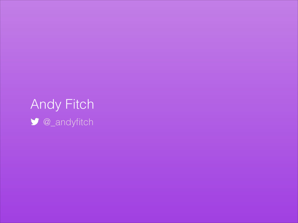
Andy Fitch @_andyfitch
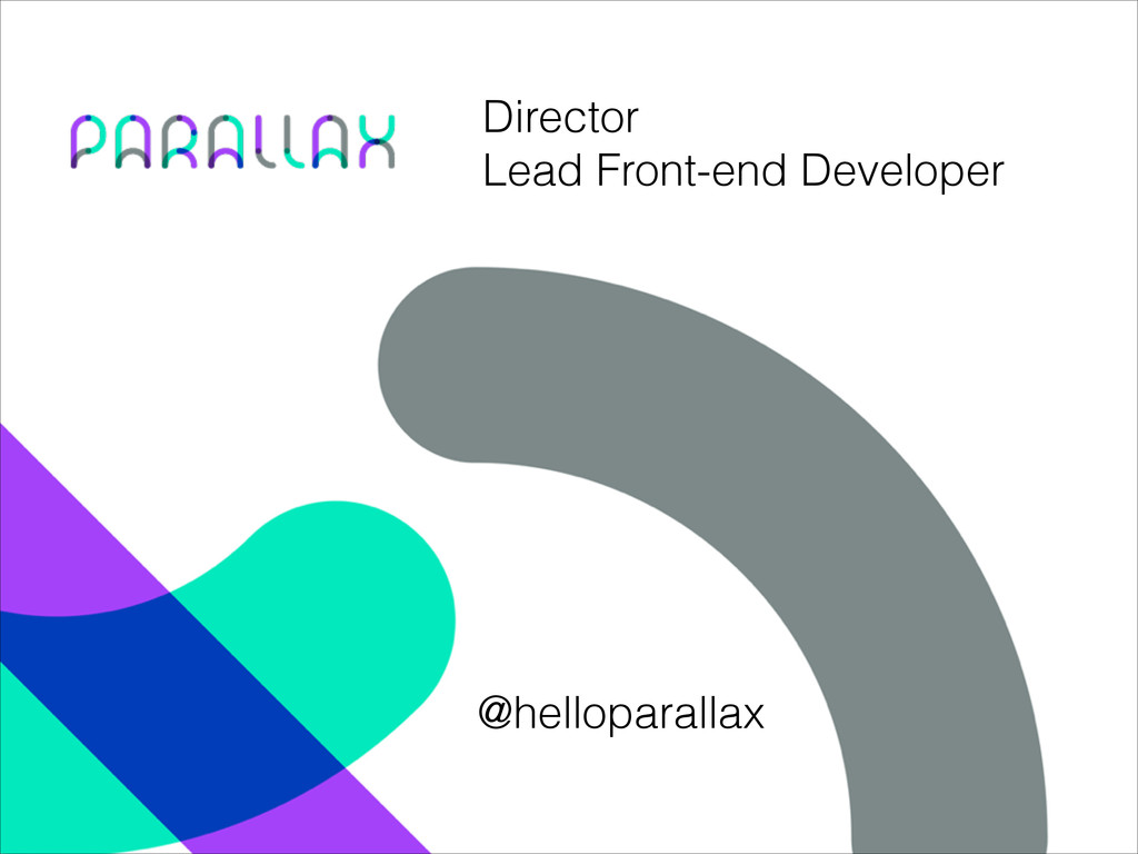
Director Lead Front-end Developer @helloparallax
So what’s involved with running a digital agency?
None
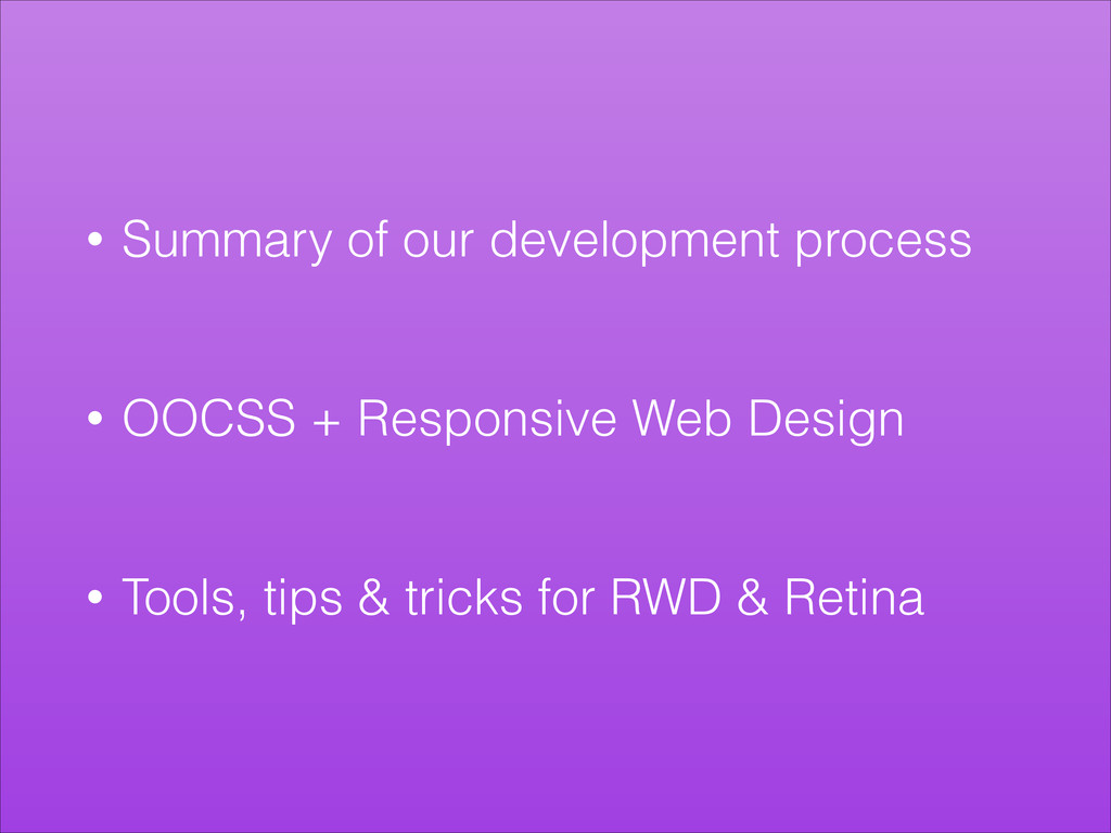
• Summary of our development process ! ! • OOCSS
+ Responsive Web Design ! ! • Tools, tips & tricks for RWD & Retina
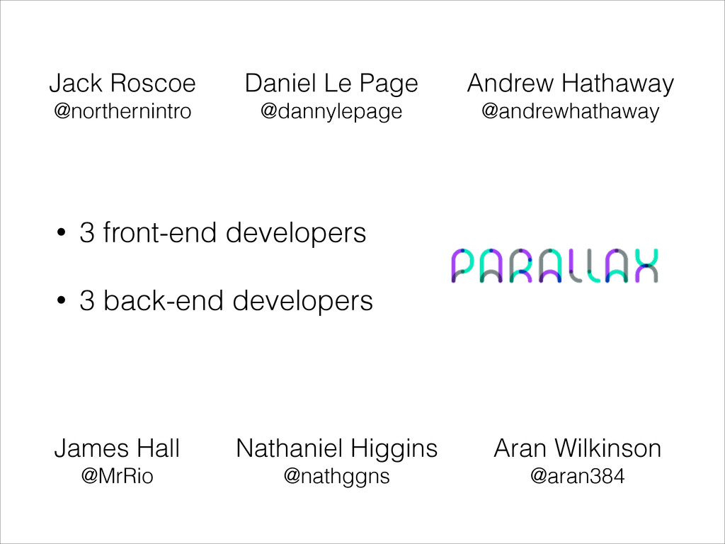
• 3 front-end developers ! • 3 back-end developers Andrew
Hathaway @andrewhathaway Daniel Le Page @dannylepage Jack Roscoe @northernintro James Hall @MrRio Aran Wilkinson @aran384 Nathaniel Higgins @nathggns
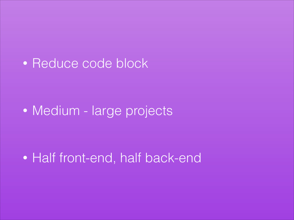
• Reduce code block ! ! • Medium - large
projects ! ! • Half front-end, half back-end
So what do front-end developers do?
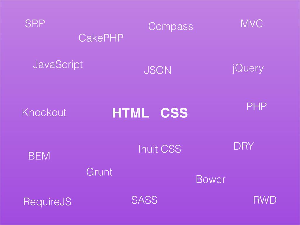
HTML CSS Grunt Bower Compass CakePHP Inuit CSS JSON BEM
RWD MVC DRY SRP JavaScript SASS PHP jQuery Knockout RequireJS
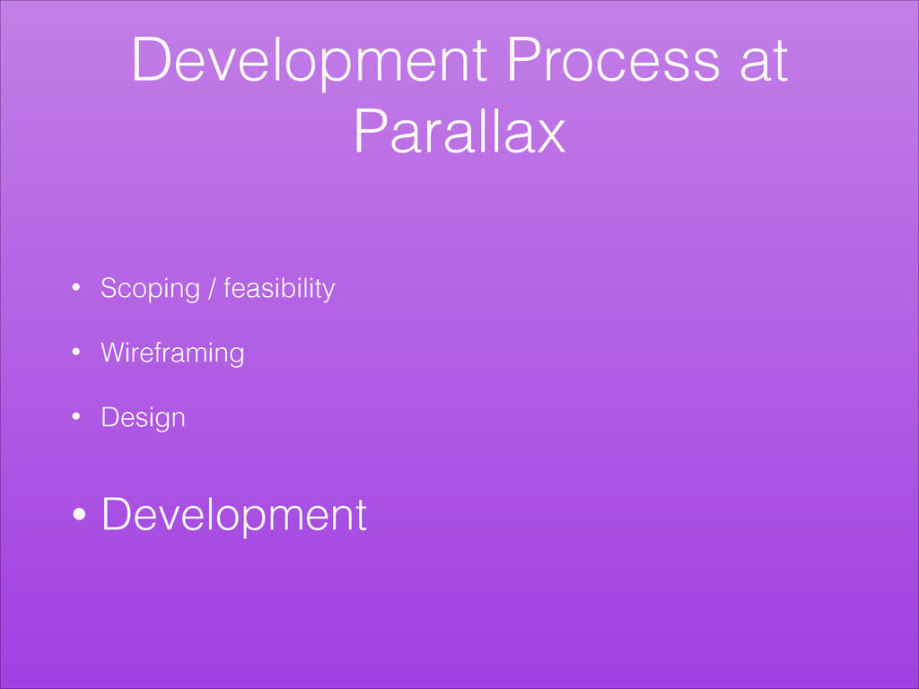
Development Process at Parallax • Scoping / feasibility ! •
Wireframing ! • Design ! • Development
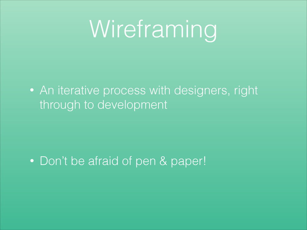
Wireframing • An iterative process with designers, right through to
development • Don’t be afraid of pen & paper!
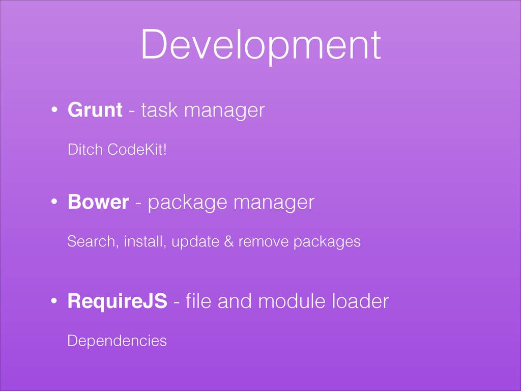
Development
None
Development • Bower - package manager ! Search, install, update
& remove packages • Grunt - task manager ! Ditch CodeKit! • RequireJS - file and module loader ! Dependencies
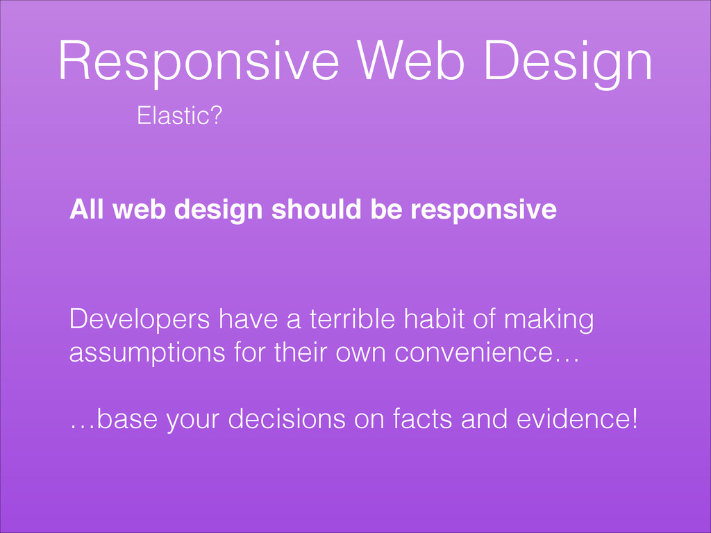
Responsive Web Design Developers have a terrible habit of making
assumptions for their own convenience… ! …base your decisions on facts and evidence! All web design should be responsive Elastic?
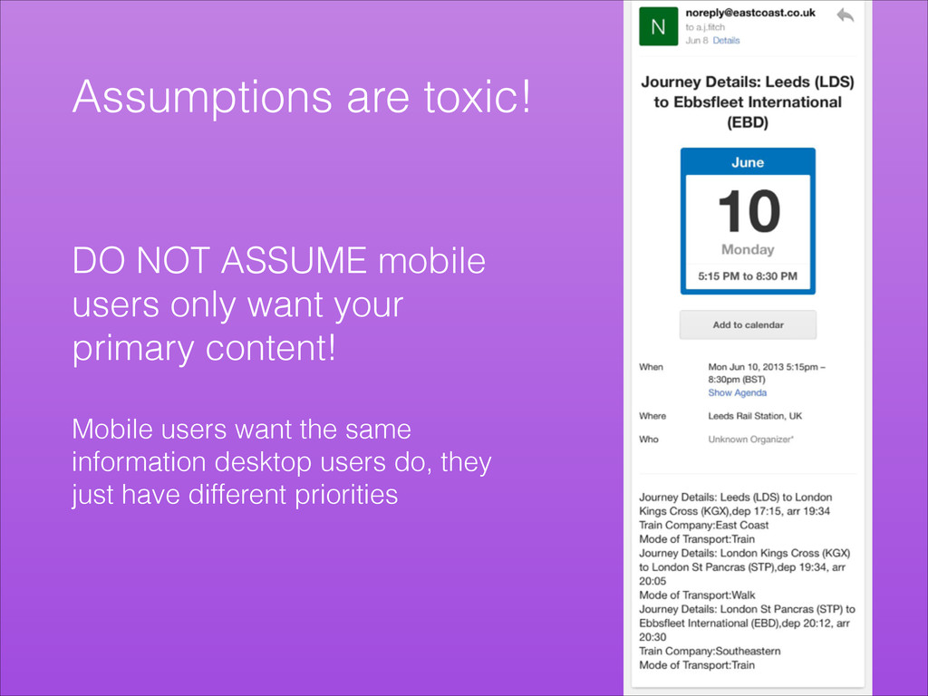
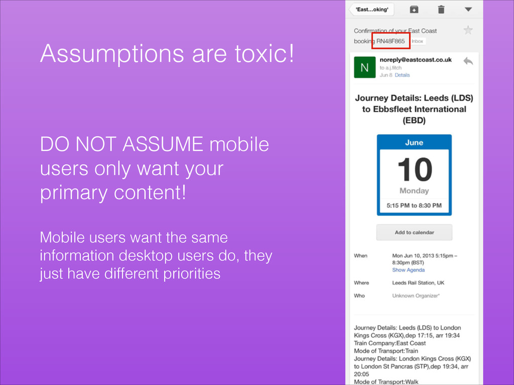
Assumptions are toxic! DO NOT ASSUME mobile users only want
your primary content! ! Mobile users want the same information desktop users do, they just have different priorities
Assumptions are toxic! DO NOT ASSUME mobile users only want
your primary content! ! Mobile users want the same information desktop users do, they just have different priorities
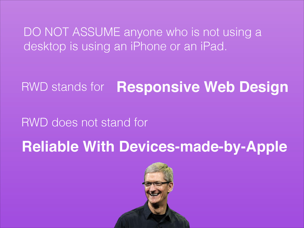
DO NOT ASSUME anyone who is not using a desktop
is using an iPhone or an iPad. ! RWD stands for Responsive Web Design RWD does not stand for Reliable With Devices-made-by-Apple
DO NOT ASSUME your flashy retina users have flashy internet
connections! !
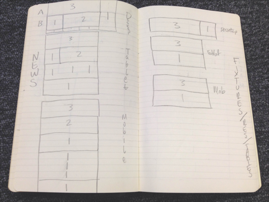
Planning! • Draw your layouts ! ! • Mobile first
• Schema ! ! • Framework
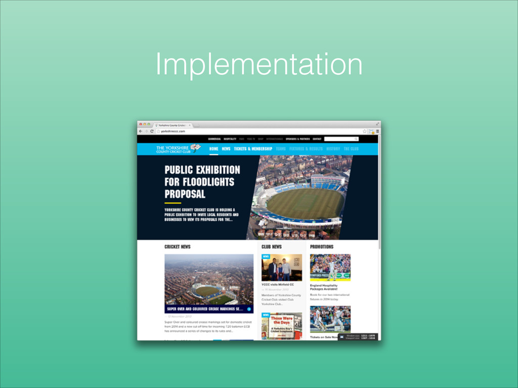
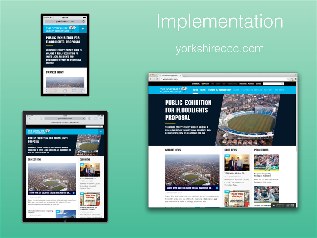
Implementation
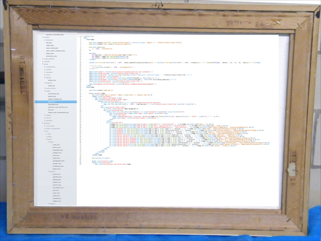
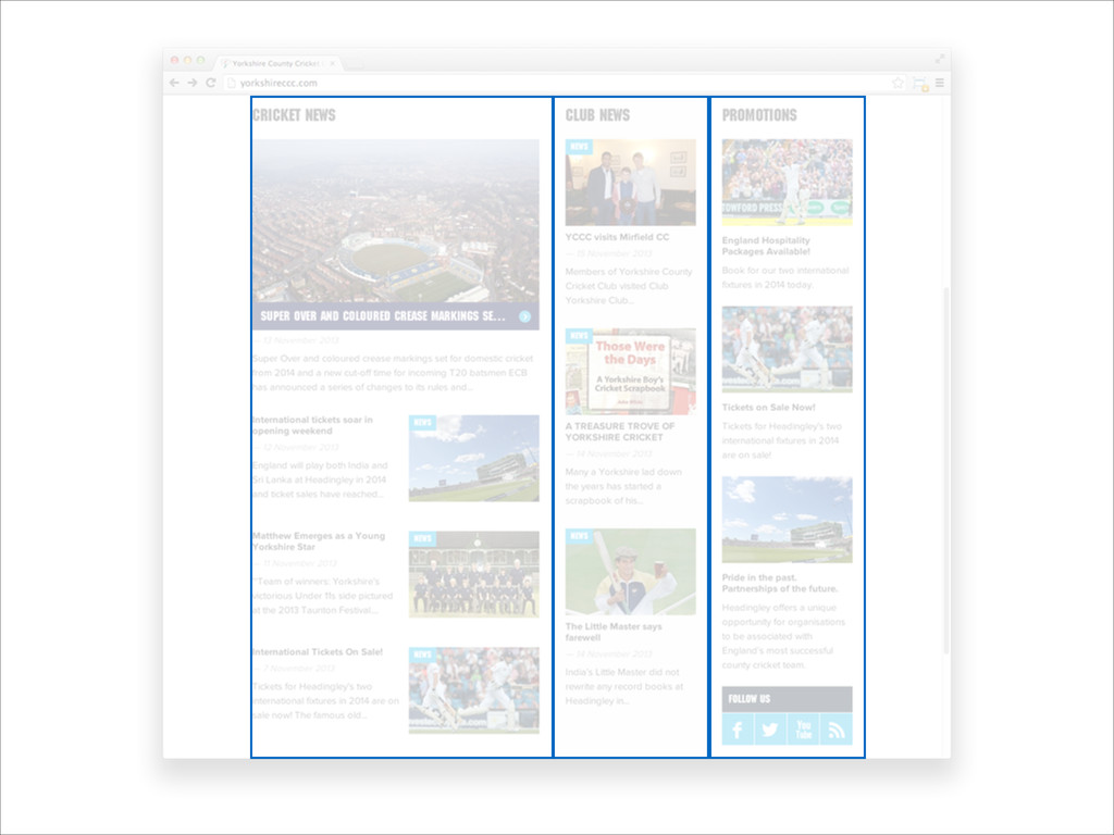
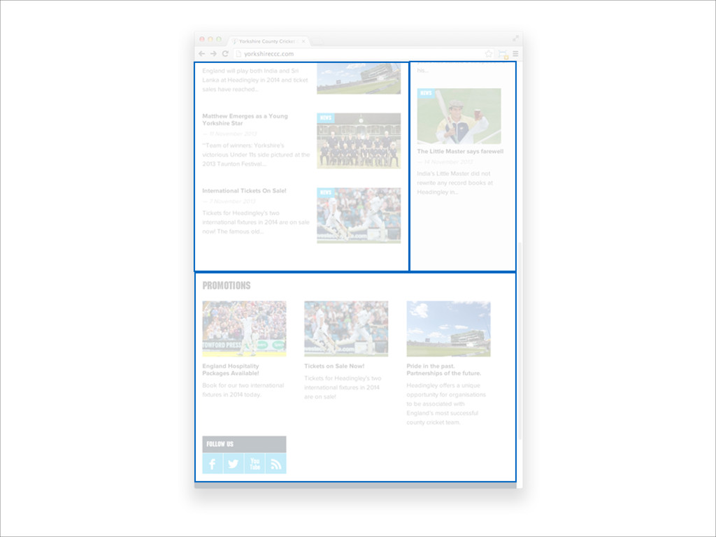
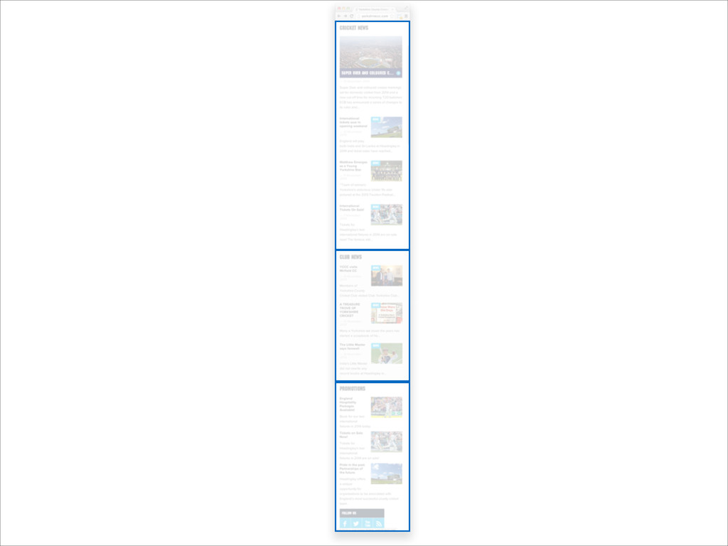
Implementation yorkshireccc.com
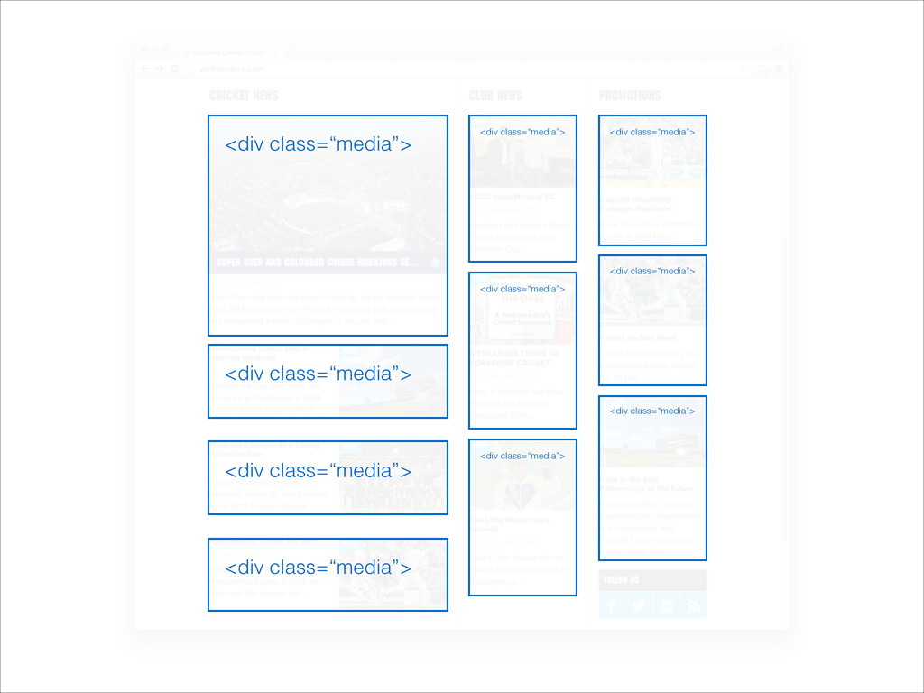
• Abstracted code is lovely, generic, reusable code ! •
Objects ! • Rapid development ! • Helpers <div class=“media”> <div class=“media”> <div class=“media”> <div class=“media”> <div class=“media”> <div class=“media”> <div class=“media”> <div class=“media”> <div class=“media”> <div class=“media”>
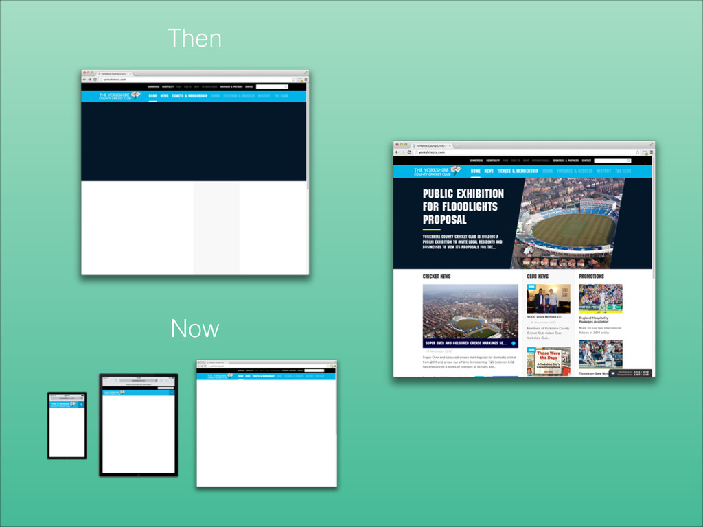
Then Now
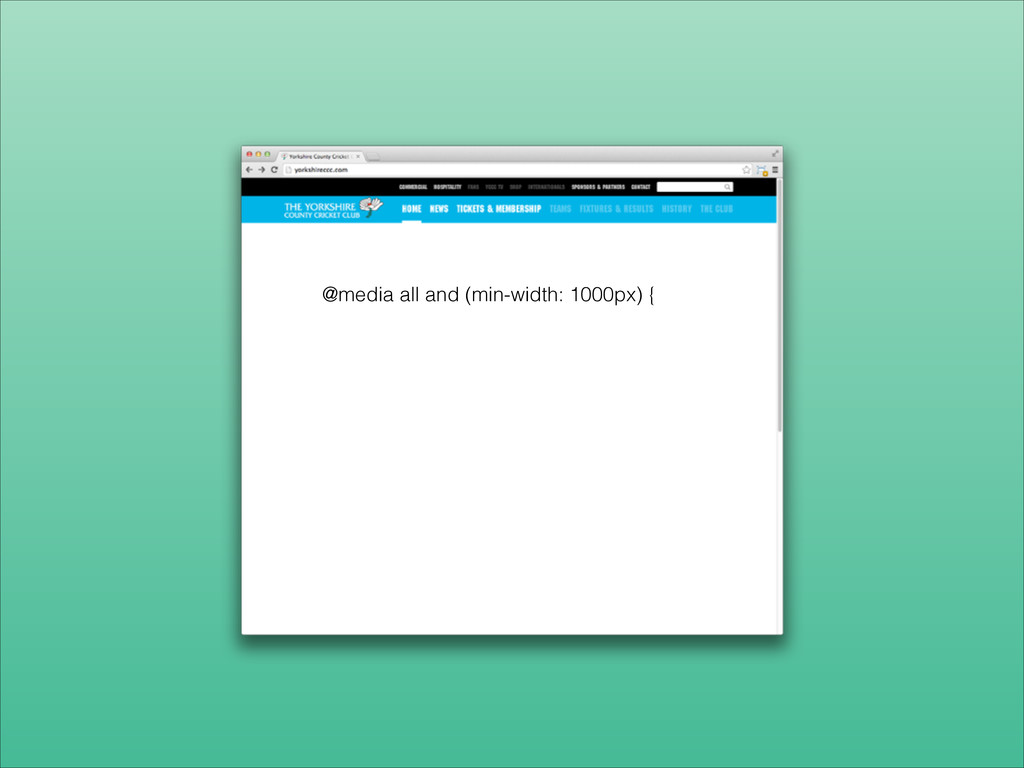
@media all and (min-width: 1000px) {
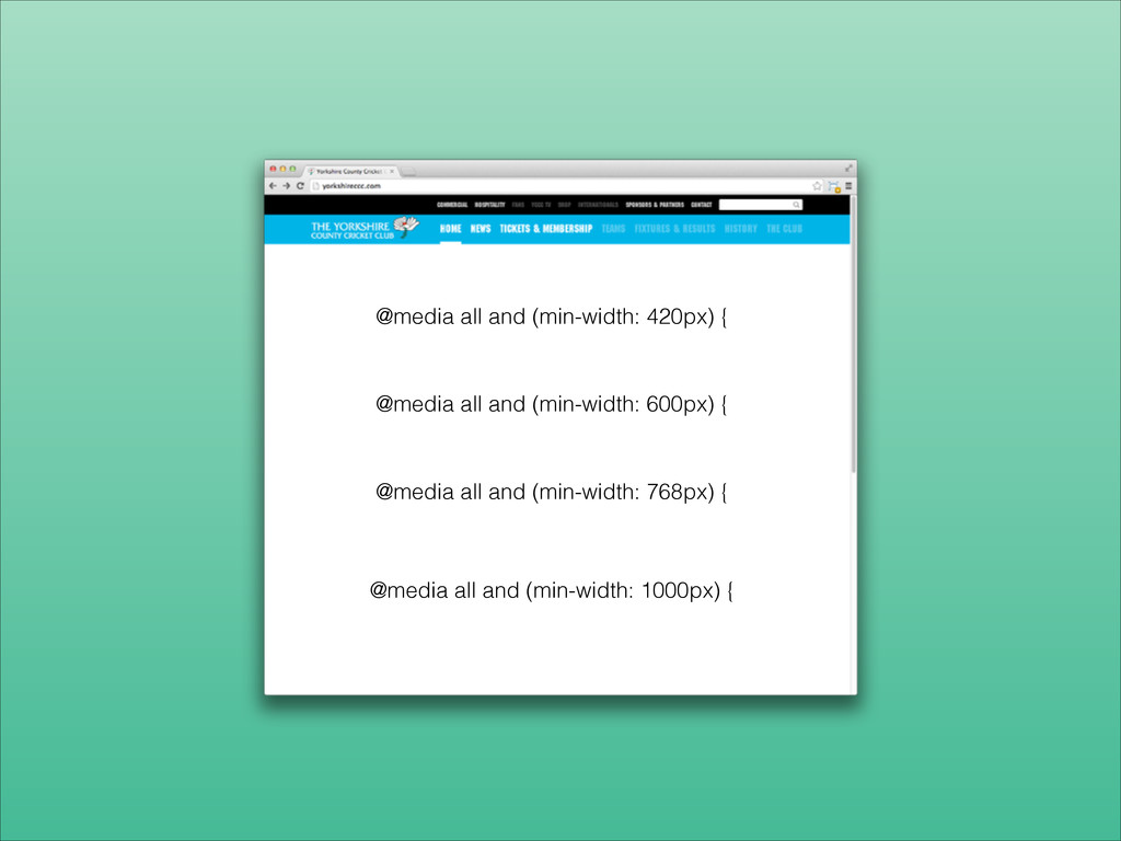
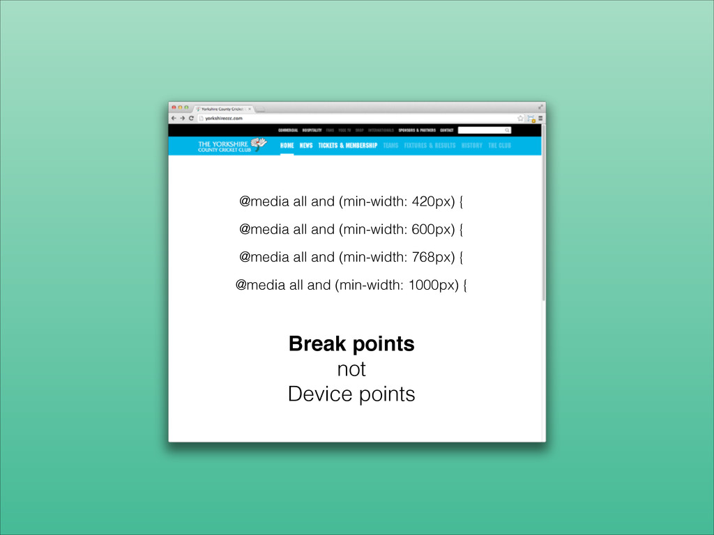
@media all and (min-width: 1000px) { @media all and (min-width:
768px) { @media all and (min-width: 600px) { @media all and (min-width: 420px) {
@media all and (min-width: 1000px) { @media all and (min-width:
768px) { @media all and (min-width: 600px) { @media all and (min-width: 420px) { Break points! not Device points
None
None
None
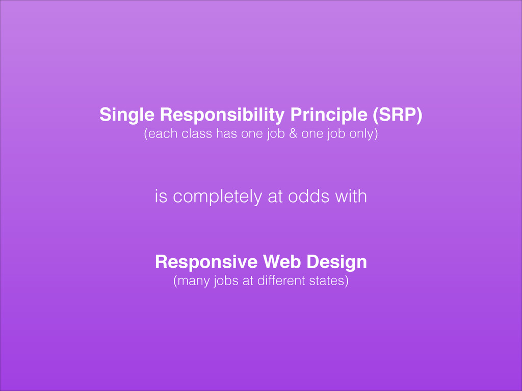
Single Responsibility Principle (SRP)! (each class has one job &
one job only) ! ! is completely at odds with ! ! Responsive Web Design! (many jobs at different states)
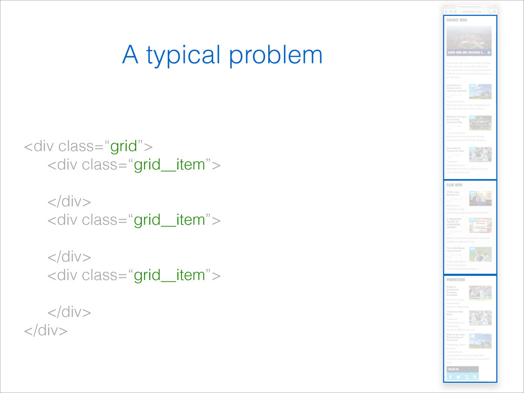
<div class=“grid”> <div class=“grid__item”> </div> <div class=“grid__item”> </div> <div class=“grid__item”>
</div> </div> A typical problem
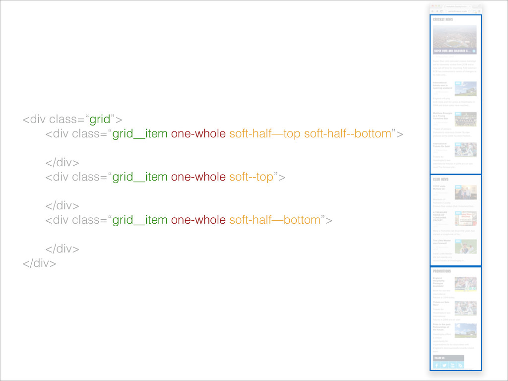
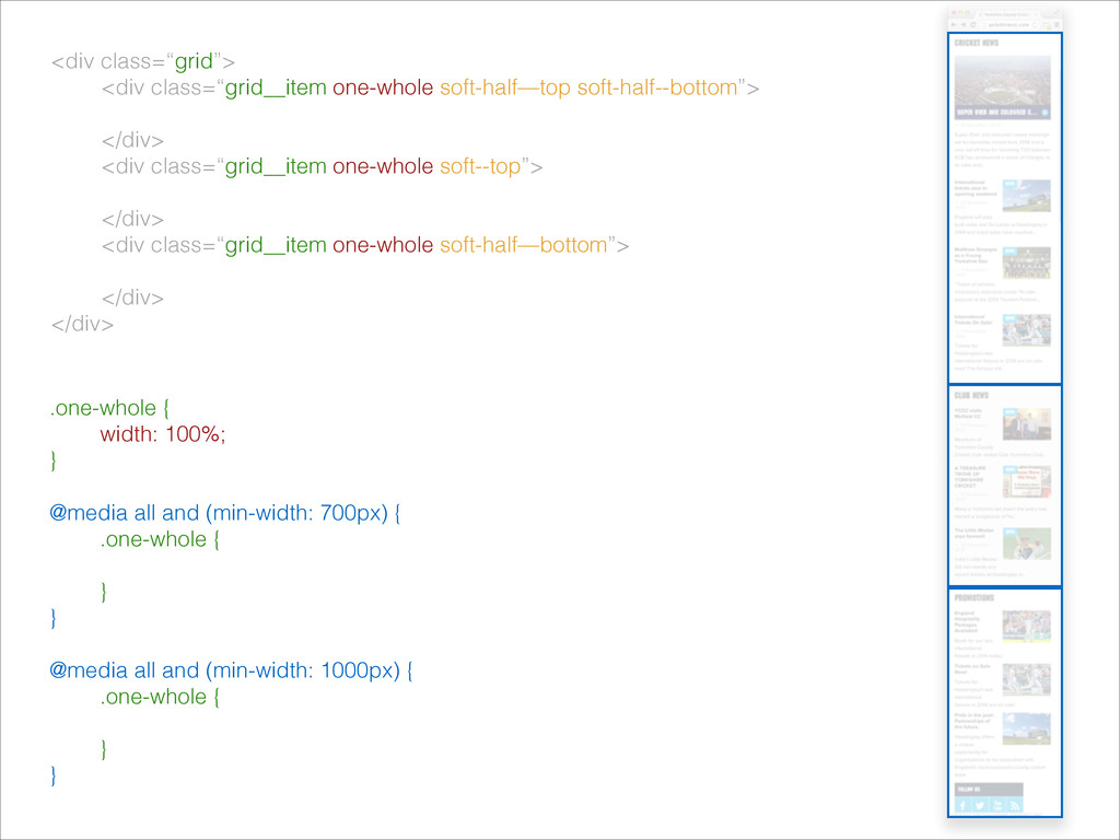
<div class=“grid”> <div class=“grid__item one-whole soft-half—top soft-half--bottom”> </div> <div class=“grid__item
one-whole soft--top”> </div> <div class=“grid__item one-whole soft-half—bottom”> </div> </div>
.one-whole { width: 100%; } ! @media all and (min-width:
700px) { .one-whole { ! } } ! @media all and (min-width: 1000px) { .one-whole { } } <div class=“grid”> <div class=“grid__item one-whole soft-half—top soft-half--bottom”> </div> <div class=“grid__item one-whole soft--top”> </div> <div class=“grid__item one-whole soft-half—bottom”> </div> </div>
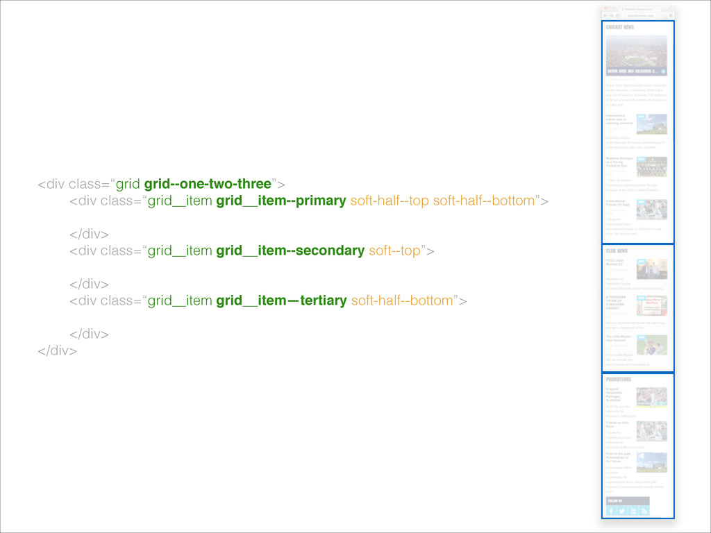
<div class=“grid grid--one-two-three”> <div class=“grid__item grid__item--primary soft-half--top soft-half--bottom”> </div> <div
class=“grid__item grid__item--secondary soft--top”> </div> <div class=“grid__item grid__item—tertiary soft-half--bottom”> </div> </div>
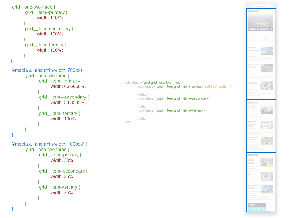
<div class=“grid grid--one-two-three”> <div class=“grid__item grid__item--primary soft-half--bottom”> </div> <div class=“grid__item
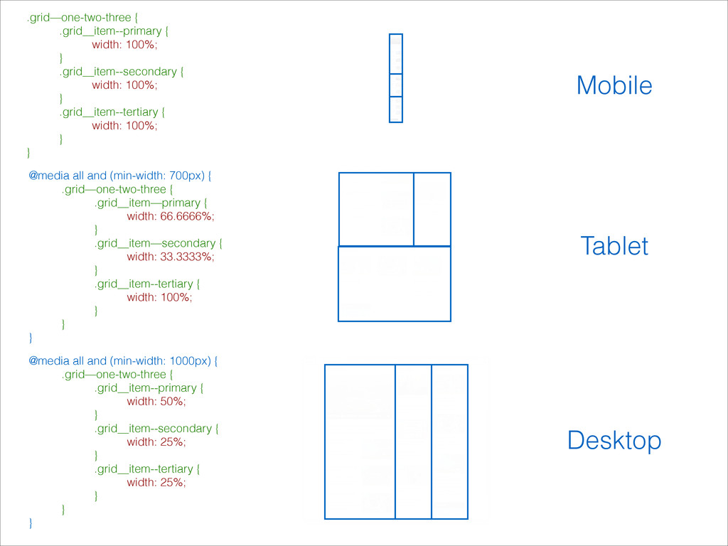
grid__item--secondary”> </div> <div class=“grid__item grid__item—tertiary”> </div> </div> .grid—one-two-three { .grid__item--primary { width: 100%; } .grid__item--secondary { width: 100%; } .grid__item--tertiary { width: 100%; } } @media all and (min-width: 700px) { .grid—one-two-three { .grid__item—primary { width: 66.6666%; } .grid__item—secondary { width: 33.3333%; } .grid__item--tertiary { width: 100%; } } } @media all and (min-width: 1000px) { .grid—one-two-three { .grid__item--primary { width: 50%; } .grid__item--secondary { width: 25%; } .grid__item--tertiary { width: 25%; } } }
.grid—one-two-three { .grid__item--primary { width: 100%; } .grid__item--secondary { width:
100%; } .grid__item--tertiary { width: 100%; } } @media all and (min-width: 700px) { .grid—one-two-three { .grid__item—primary { width: 66.6666%; } .grid__item—secondary { width: 33.3333%; } .grid__item--tertiary { width: 100%; } } } @media all and (min-width: 1000px) { .grid—one-two-three { .grid__item--primary { width: 50%; } .grid__item--secondary { width: 25%; } .grid__item--tertiary { width: 25%; } } } Mobile Tablet Desktop
.grid--one-two-two
Stack Similarities, Group Differences ! github.com/andyfitch/ssgd-rwd
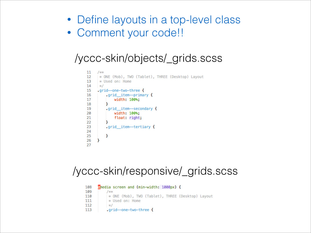
• Define layouts in a top-level class • Comment your
code!! /yccc-skin/objects/_grids.scss /yccc-skin/responsive/_grids.scss
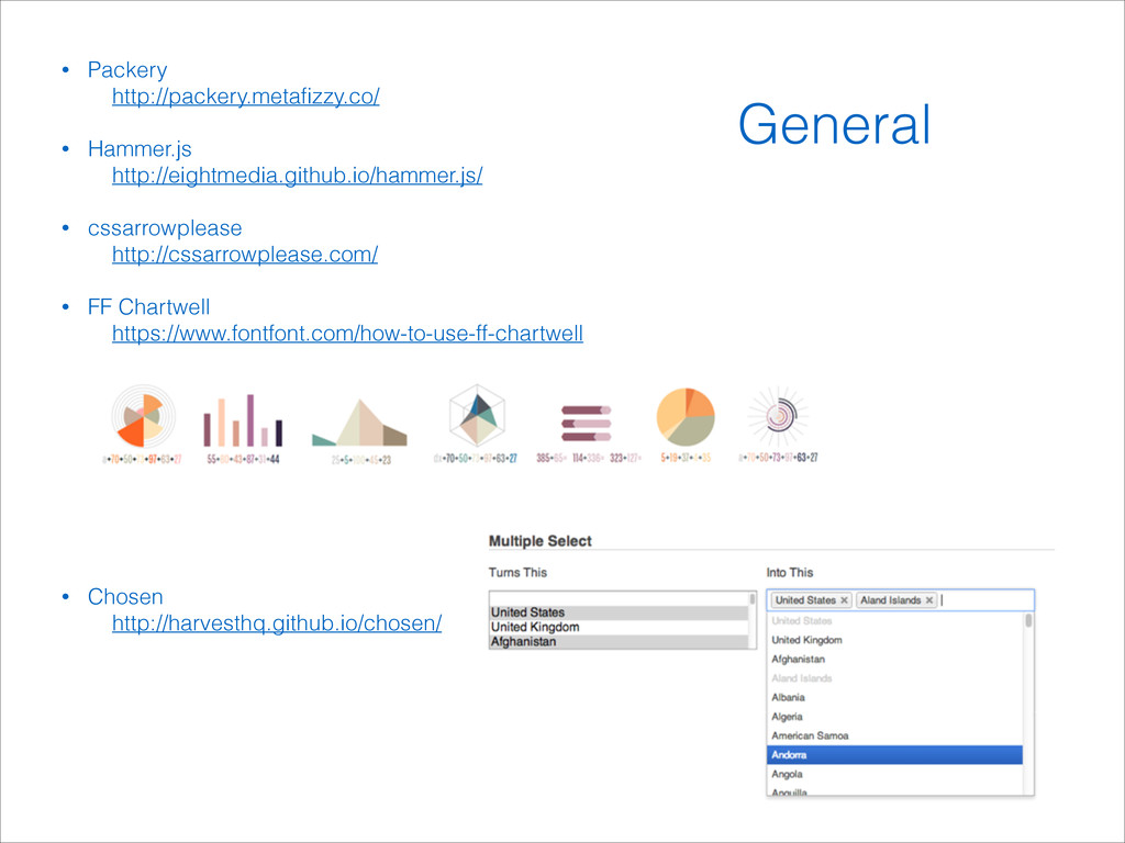
• Packery http://packery.metafizzy.co/ ! • Hammer.js http://eightmedia.github.io/hammer.js/ ! • cssarrowplease
http://cssarrowplease.com/ ! • FF Chartwell https://www.fontfont.com/how-to-use-ff-chartwell ! ! ! ! ! ! ! ! ! • Chosen http://harvesthq.github.io/chosen/ General
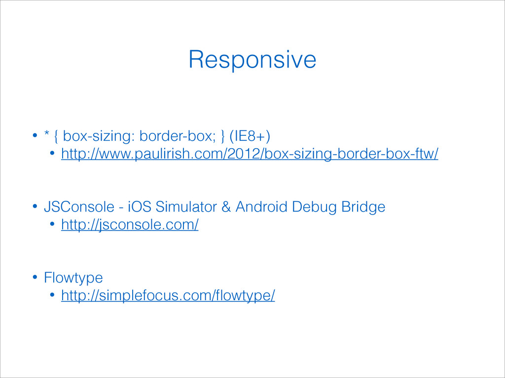
• * { box-sizing: border-box; } (IE8+) • http://www.paulirish.com/2012/box-sizing-border-box-ftw/ !
! • JSConsole - iOS Simulator & Android Debug Bridge • http://jsconsole.com/ ! ! • Flowtype • http://simplefocus.com/flowtype/ Responsive
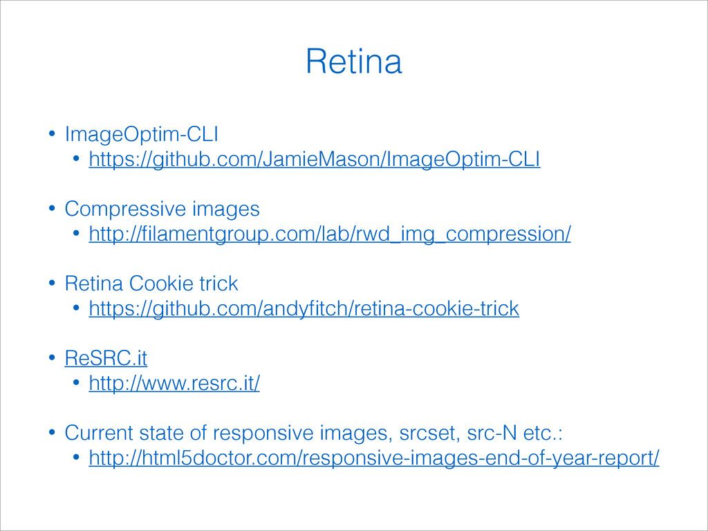
• ImageOptim-CLI • https://github.com/JamieMason/ImageOptim-CLI ! • Compressive images • http://filamentgroup.com/lab/rwd_img_compression/
! • Retina Cookie trick • https://github.com/andyfitch/retina-cookie-trick ! • ReSRC.it • http://www.resrc.it/ ! • Current state of responsive images, srcset, src-N etc.: • http://html5doctor.com/responsive-images-end-of-year-report/ Retina
Andy Fitch @_andyfitch Thank you!
 watura
.jpg) studio_graph
studio_graph
 heron0519
 akase244
 inamiy
 haru860
 licux
licux
 ydah
ydah
 terisuke
 panda_program
 renaudmathieu
 kinopeee
 popppiees
 reverentgeek
 wayneb77
 rasmusluckow
 marktimemedia
 jlugia
 aleyda
 apolaine
 madoxten
 lara
lara
 rocio
rocio
 watany