Upgrade to Pro
— share decks privately, control downloads, hide ads and more …
Speaker Deck
Features
Speaker Deck
PRO
Sign in
Sign up for free
Search
Search
Building websites for HiDPI devices
Search
Vinay M
March 23, 2013
Technology
5.2k
5
Share
Embed
Copy iframe code
Copy JS code
Copy link
Start on current slide
Building websites for HiDPI devices
Presented at front end meetup Singapore
Vinay M
March 23, 2013
More Decks by Vinay M
See All by Vinay M
DRY css with Sass
artminister
1
150
CSS Best Practices
artminister
6
320
Other Decks in Technology
See All in Technology
ruby.wasmとPicoRuby.wasmに対応した仮想DOMライブラリを作ってる話 #kaigieffect_kaigi
sue445
PRO
0
150
SRE Next 2026 何でも屋からの脱却
bto
0
760
10年目を迎えた「ABEMA」がどのように AI 活用を推進して、AI 駆動開発にシフトしているのか / How ABEMA, entering its 10th year, is promoting the use of AI and shifting toward AI-driven development
miyukki
0
150
CDKで書くECSのベストプラクティス、 改めて考え直す2026 #cdkconf2026
makies
1
490
Devsumi 2026 Summer 人もAIも使える共通基盤を事業の加速装置にする~デザインシステム運用に学ぶ組織レバレッジ~ 渡辺 凌央
legalontechnologies
PRO
0
150
最適な自走を最小限の支援で — M&Aで拡大する組織で少人数SREが挑んだ1年 / SRE NEXT 2026
genda
0
1.3k
ガバナンスの「ちょうどいい落とし所」を探れ!開発スピードを妨げない運用判断の勘所 / SRE NEXT 2026
genda
1
160
Empower GenAI with Agile - あなたのアジャイルが生成AIのバフになる仕組み
hageyahhoo
1
190
AIと共生する開発者プラットフォーム:バクラクのモノレポ×マイクロサービス基盤
sakajunquality
2
3.6k
AI Agent SaaS を支える自社仮想化基盤への挑戦と実運用 / ai-agent-saas-virtualization
flatt_security
2
3.9k
AI時代の開発生産性は、個人技からチーム設計へ
moongift
PRO
3
2k
Oracle Base Database Service 技術詳細
oracle4engineer
PRO
15
110k
Featured
See All Featured
A designer walks into a library…
pauljervisheath
211
24k
Ten Tips & Tricks for a 🌱 transition
stuffmc
0
150
Applied NLP in the Age of Generative AI
inesmontani
PRO
4
2.4k
DevOps and Value Stream Thinking: Enabling flow, efficiency and business value
helenjbeal
1
260
The Impact of AI in SEO - AI Overviews June 2024 Edition
aleyda
5
1.1k
Dealing with People You Can't Stand - Big Design 2015
cassininazir
367
27k
Become a Pro
speakerdeck
PRO
31
6k
The SEO identity crisis: Don't let AI make you average
varn
0
510
We Have a Design System, Now What?
morganepeng
55
8.2k
A Guide to Academic Writing Using Generative AI - A Workshop
ks91
PRO
1
350
New Earth Scene 8
popppiees
3
2.4k
Organizational Design Perspectives: An Ontology of Organizational Design Elements
kimpetersen
PRO
1
760
Transcript
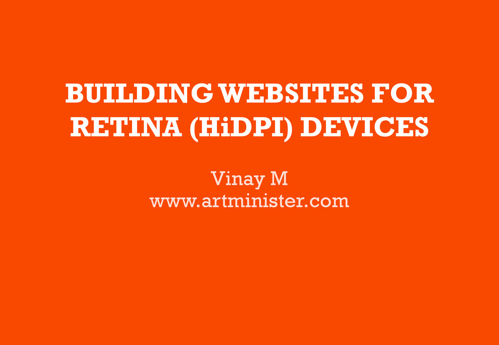
BUILDING WEBSITES FOR RETINA (HiDPI) DEVICES Vinay M www.artminister.com
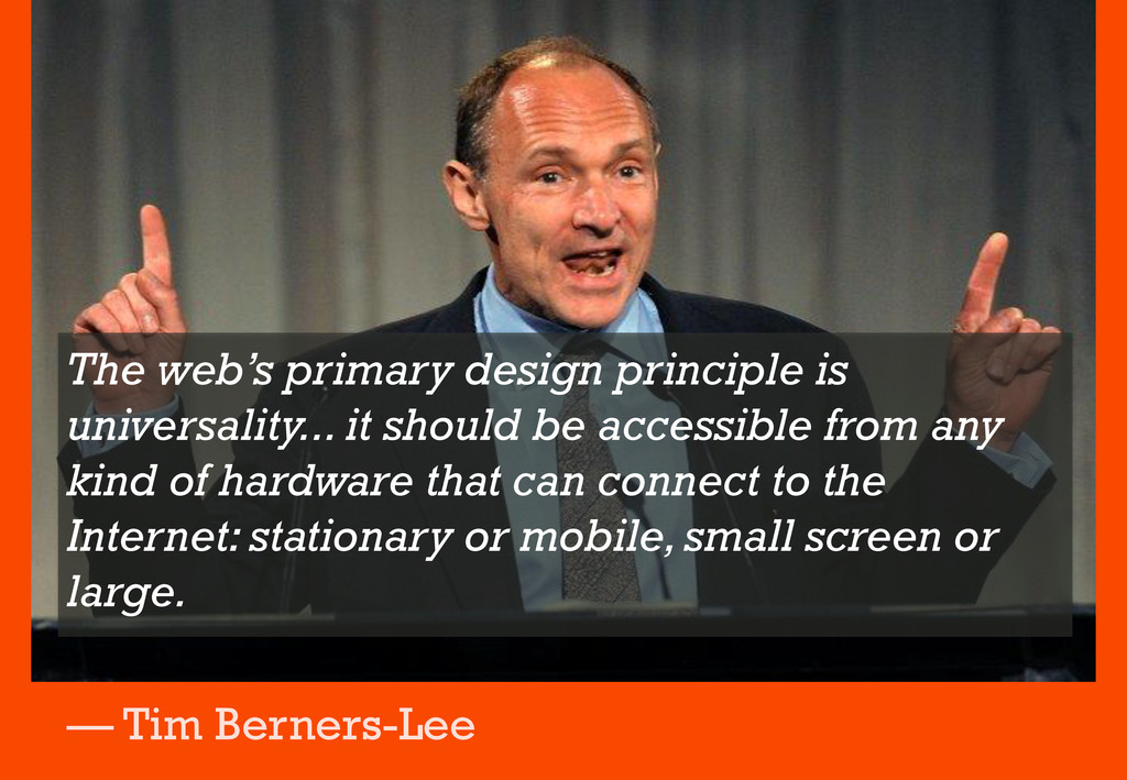
The web’s primary design principle is universality... it should be
accessible from any kind of hardware that can connect to the Internet: stationary or mobile, small screen or large. — Tim Berners-Lee
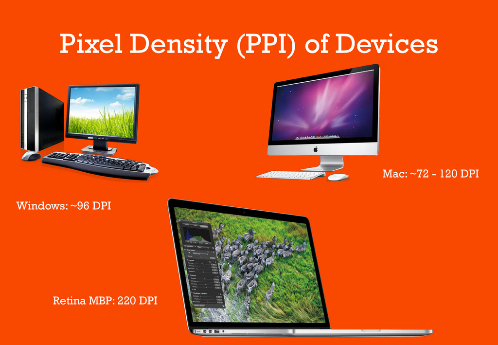
Pixel Density (PPI) of Devices Windows: ~96 DPI Mac: ~72
- 120 DPI Retina MBP: 220 DPI
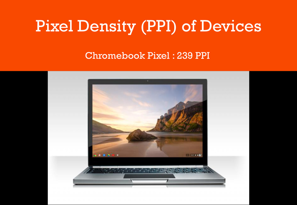
Pixel Density (PPI) of Devices Chromebook Pixel : 239 PPI
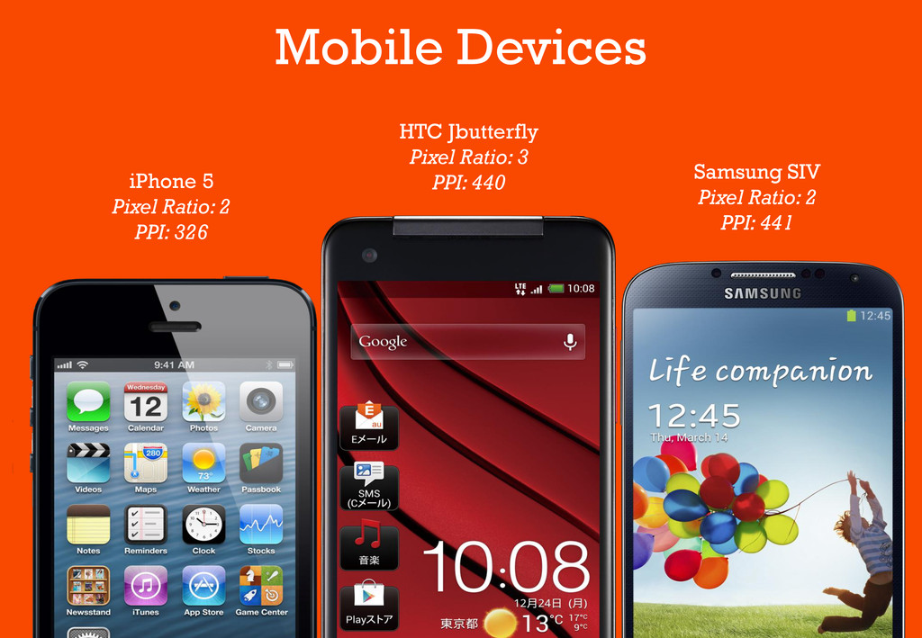
HTC Jbutterfly Pixel Ratio: 3 PPI: 440 Samsung SIV Pixel
Ratio: 2 PPI: 441 iPhone 5 Pixel Ratio: 2 PPI: 326 Mobile Devices
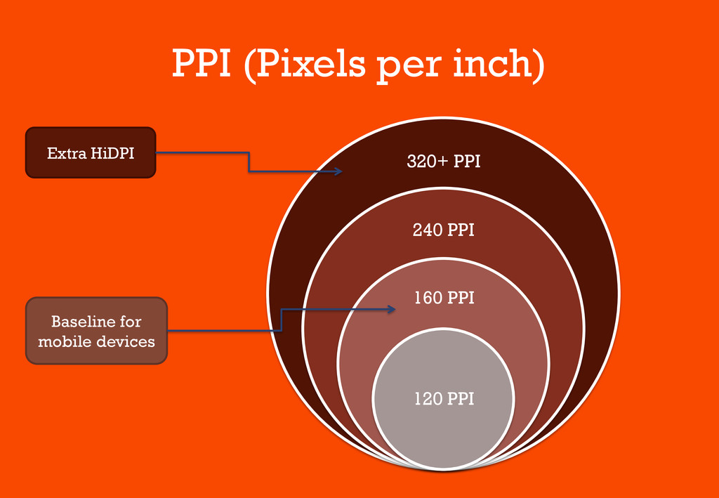
PPI (Pixels per inch) 320+ PPI 240 PPI 160 PPI
120 PPI Extra HiDPI Baseline for mobile devices
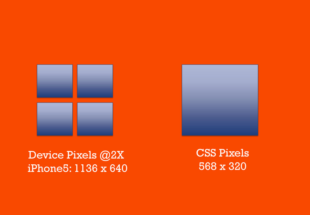
CSS Pixels 568 x 320 Device Pixels @2X iPhone5: 1136
x 640
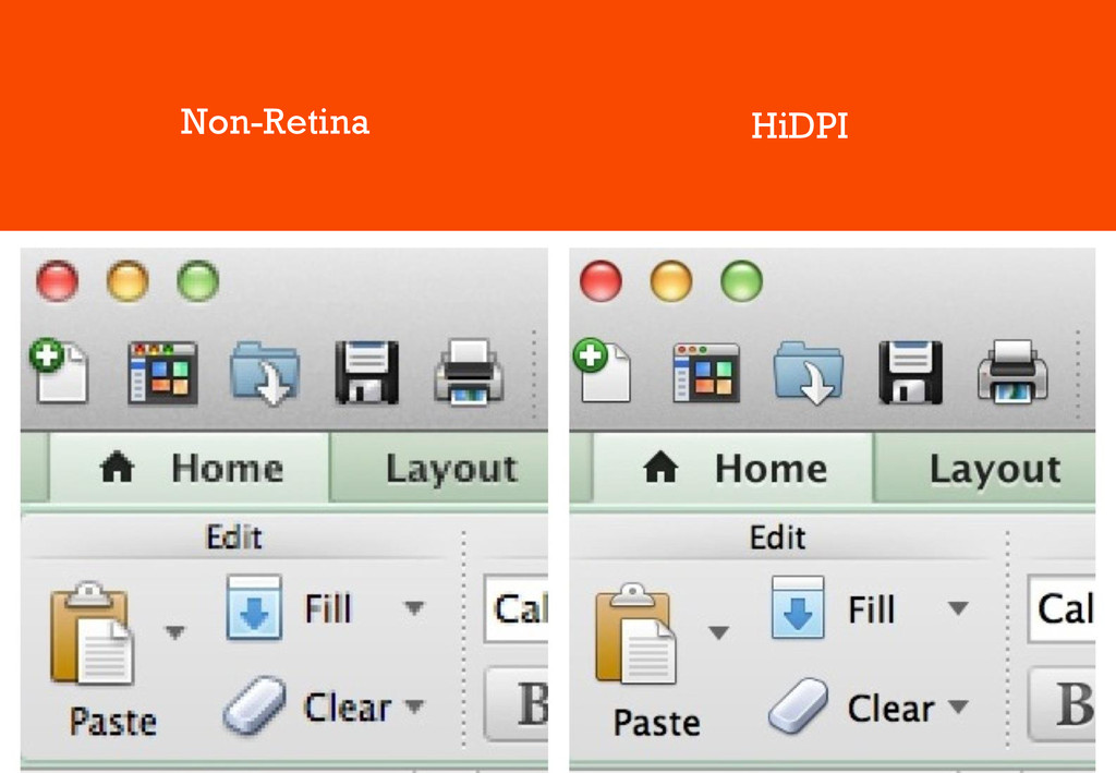
Non-Retina HiDPI
High DPI • Greater pixel density • Physical Resolution is
higher (2x) • Content Resolution is constant • Content Scale is higher (2x)
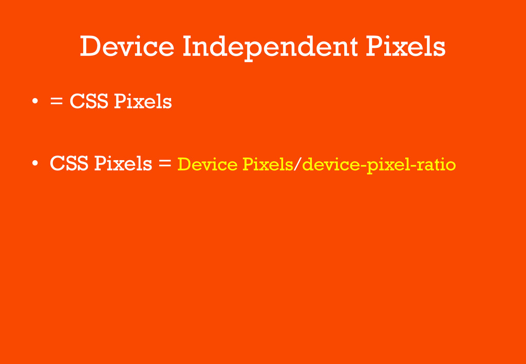
Device Independent Pixels • = CSS Pixels • CSS Pixels
= Device Pixels/device-pixel-ratio
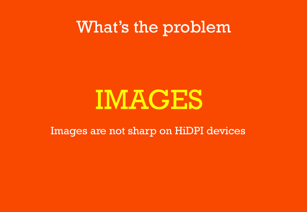
What’s the problem IMAGES Images are not sharp on HiDPI
devices
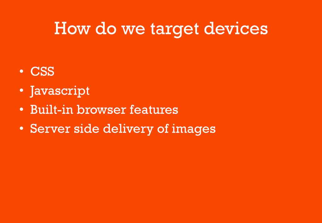
How do we target devices • CSS • Javascript •
Built-in browser features • Server side delivery of images
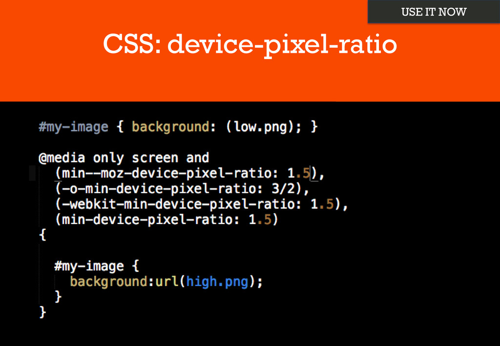
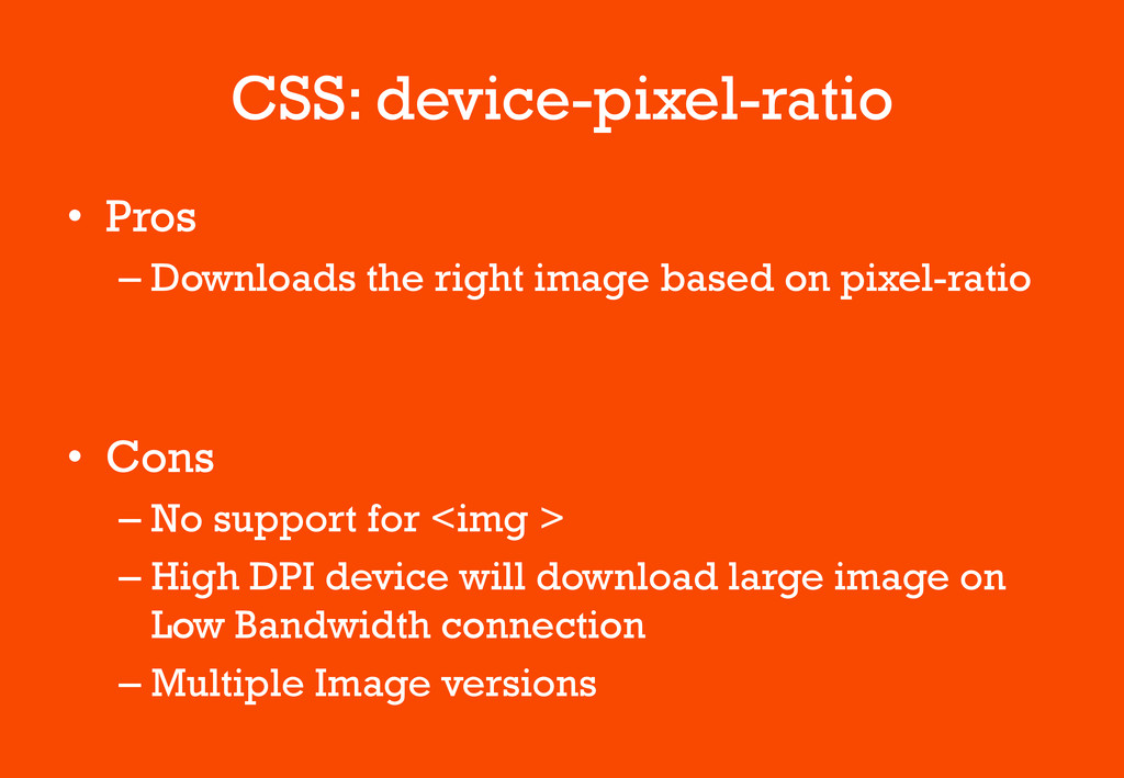
CSS: device-pixel-ratio USE IT NOW
CSS: device-pixel-ratio • Pros – Downloads the right image based
on pixel-ratio • Cons – No support for <img > – High DPI device will download large image on Low Bandwidth connection – Multiple Image versions
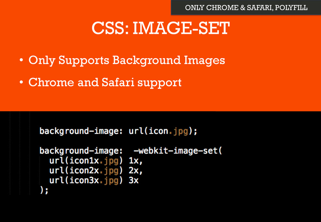
CSS: IMAGE-SET • Only Supports Background Images • Chrome and
Safari support ONLY CHROME & SAFARI, POLYFILL
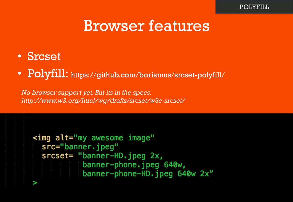
Browser features • Srcset • Polyfill: https://github.com/borismus/srcset-polyfill/ No browser support
yet. But its in the specs. http://www.w3.org/html/wg/drafts/srcset/w3c-srcset/ POLYFILL
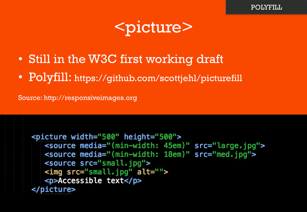
<picture> • Still in the W3C first working draft •
Polyfill: https://github.com/scottjehl/picturefill Source: http://responsiveimages.org POLYFILL
Other Image Tweeks • Background-size: • Compress 2x images –
Webp: https://developers.google.com/speed/webp/
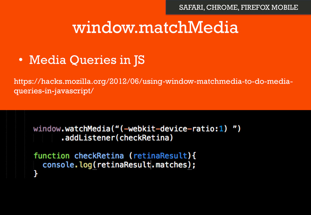
Javacript • Window.devicePixelRatio
window.matchMedia • Media Queries in JS https://hacks.mozilla.org/2012/06/using-window-matchmedia-to-do-media- queries-in-javascript/ SAFARI, CHROME,
FIREFOX MOBILE
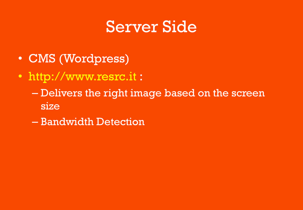
Server Side • CMS (Wordpress) • http://www.resrc.it : – Delivers
the right image based on the screen size – Bandwidth Detection
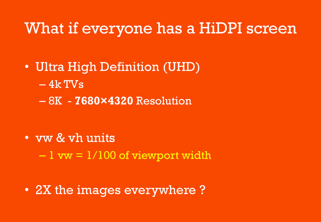
What if everyone has a HiDPI screen • Ultra High
Definition (UHD) – 4k TVs – 8K - 7680×4320 Resolution • vw & vh units – 1 vw = 1/100 of viewport width • 2X the images everywhere ?
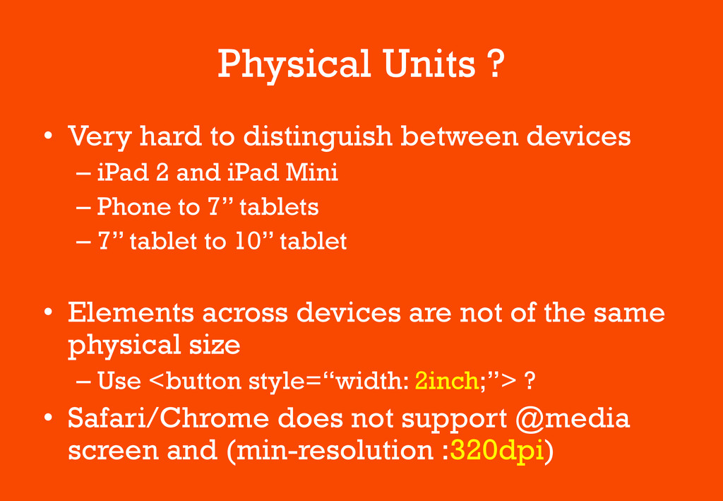
Physical Units ? • Very hard to distinguish between devices
– iPad 2 and iPad Mini – Phone to 7’’ tablets – 7’’ tablet to 10’’ tablet • Elements across devices are not of the same physical size – Use <button style=“width: 2inch;”> ? • Safari/Chrome does not support @media screen and (min-resolution :320dpi)
To Consider for HiDPI • Eliminate Images + Use CSS3
• Web fonts for icons • SVG • Use image-set and srcset • Use Viewport units – vw, vh
Thank You • Slides: https://speakerdeck.com/artminister • Many thanks to –
Micheal Cheng (@coderkungfu) – Hackerspace SG • Calling for speakers
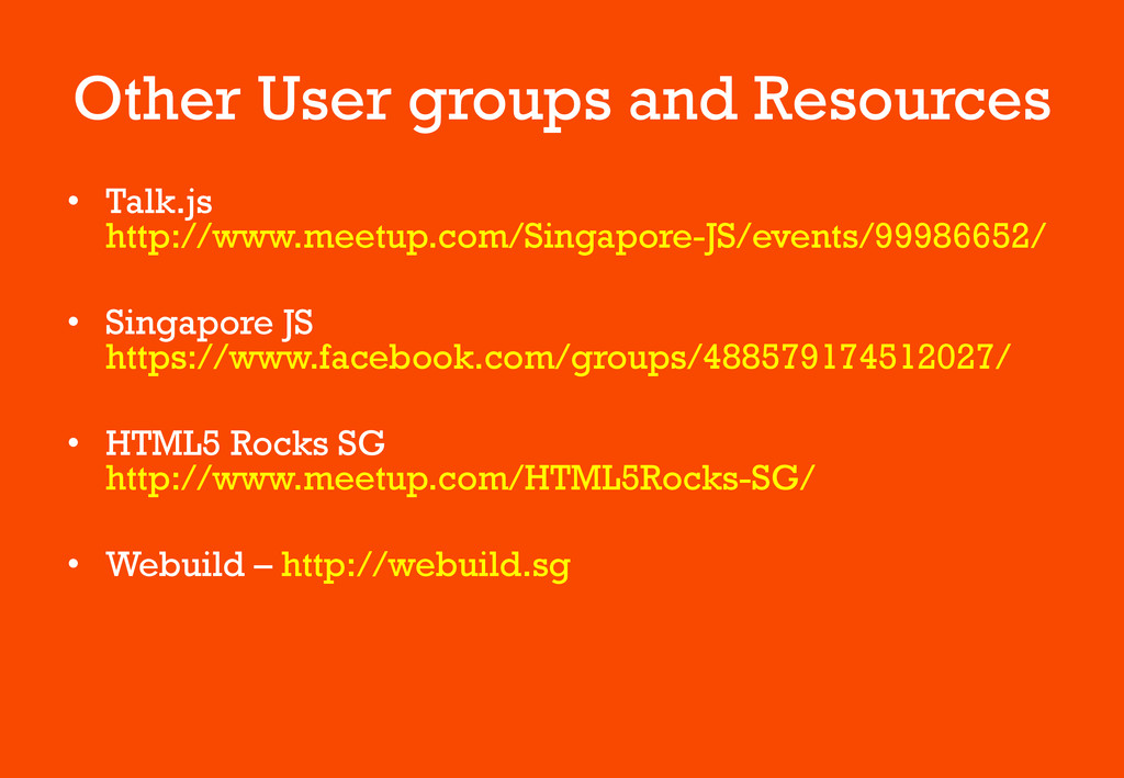
Other User groups and Resources • Talk.js http://www.meetup.com/Singapore-JS/events/99986652/ • Singapore
JS https://www.facebook.com/groups/488579174512027/ • HTML5 Rocks SG http://www.meetup.com/HTML5Rocks-SG/ • Webuild – http://webuild.sg
 artminister
 sue445
 bto
bto
 miyukki
 makies
 legalontechnologies
 genda
genda
 hageyahhoo
 sakajunquality
 flatt_security
 moongift
 oracle4engineer
 pauljervisheath
 stuffmc
 inesmontani
.png) helenjbeal
helenjbeal
 aleyda
 cassininazir
 speakerdeck
 varn
varn
 morganepeng
 ks91
ks91
 popppiees
 kimpetersen