Upgrade to Pro — share decks privately, control downloads, hide ads and more …

Why "Your" Website Sucks

Lisa
December 04, 2015

Why "Your" Website Sucks

Lisa

December 04, 2015
Tweet

More Decks by Lisa

Other Decks in Design

Transcript

  1. •  Accessibility •  e.g. Those who are visually impaired cannot

    navigate your site with assisNve technologies (screen readers, speech recogniNon) •  It assumes all users are not visually or hearing impaired •  Too many cooks in the kitchen •  Development is dictated by those who have an idea on how the site should work/ look as opposed to how the user engages with the site •  It does not remember those who have already visited the site •  Cookies, and other technologies, can be deployed to remember if you’ve been to that site or not. •  e.g Sites that conNnually use popups to remind you to sign up for this, sign up for that even though you have visited the site a million Nmes •  No contact informaNon, address, or hours •  Lack of navigaNon bar •  Branding and design is inconsistent with the rest of the site •  Your site is not responsive or mobilized •  URLs do not tell the user what site/page they are on •  The landing page is too long •  Does not uNlize breadcrumbs
  2. •  AutomaNc image sliders, or carousels, are the pox on

    those who uses it •  AutomaNc image sliders are typically placed on the front page with “important” images/content that rotates in a single space •  Roughly 1% of users click on one of those features •  It poorly represents content on the page •  Carousels do not meet accessibility requirements
  3. •  Flash is not supported on (most) mobile devices – 

    As of October 2014, 64% of Americans own a smartphone and as of January 2014, 42% of Americans own a tablet* •  Using Flash means you’re losing over 50% of your web traffic •  Flash is not indexed by Google •  It is more expensive to develop •  It is a proprietary so`ware, owned by Adobe, which means your end users will have to use a plugin to view the content •  Flash is dead, long live Flash *h7p://www.pewinternet.org/fact-sheets/mobile-technology-fact-sheet/
  4. •  Content is slap dashed across the landing page • 

    Content is repeated •  Inconsistent font sizes and colors •  It’s too distracNng •  Content and imagery are in compeNNon with each other •  Not enough white space –  White space (negaNve space) is space that is unmarked by content or images
  5. •  Content is outdated and irrelevant •  Social media content

    is not/under uNlized •  Design is outmoded •  It’s not designed for modern browsers – Internet Explorer is dead. Long live Internet Explorer. •  It does not use redirects – Clicking on an old link automaNcally takes you to the correct page rather giving you a 404
  6. •  Mobilized means the site can be viewed easily on

    a smartphone or tablet –  Remember, 64% of Americans have a smartphone and 42% of Americans have a tablet •  Responsive means the site will remain as designed when the browser is resized •  Mobile and responsive sites can adhere to accessibility standards •  Be careful of creaNng a mobile app (as opposed to making your website mobile) due to reasons above
  7. •  PDFs are a proprietary format (Again, Adobe) •  They

    cannot be mobilized or responsive •  Are not HTML subsNtutes •  This is not saNre: •  They cannot be indexed by search engines •  Content cannot be measured –  e.g. How users are accessing and using the informaNon •  They cannot be updated or reused without creaNng a new PDF
  8. Websites Evaluated •  Weil Cornell Medical College – h7p://library.med.cornell.edu/ •  Lane

    Medical Library, Stanford – h7ps://lane.stanford.edu/ •  Harvey Crushing / John Hay Whitney Medical Library – h7p://library.medicine.yale.edu/
  9. Good Points •  Branding is consistent with the medical college’s

    site and the library’s child pages •  Search box is easily found •  Contact informaNon is on the landing page •  A summary of the blog/news feed is on the landing page •  Library services are on the landing page •  It has a list of related links within the Cornell network
  10. Good Points •  Branding and design is consistent with the

    medical college •  Contact and locaNon are easily found on the landing page •  Search box is prominent •  News/blog is prominent on the landing page •  Quick access to popular materials
  11. Good Points •  Single scroll •  Responsive and mobilized • 

    Contact informaNon/hours readily available on the landing page •  Search and navigaNon bars are easily available •  Links to Yale sites within their network •  Good use of white space •  InformaNon does not compete for a7enNon
  12. To Sum •  2 out of 3 sites used red/white

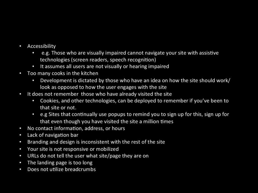
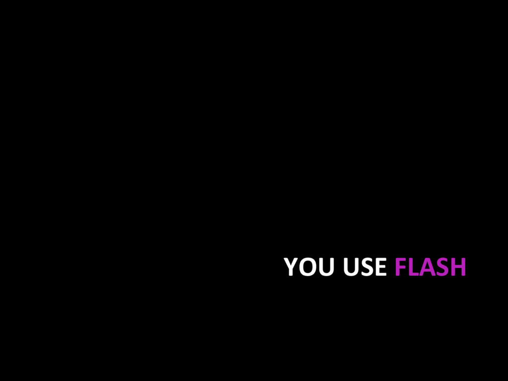
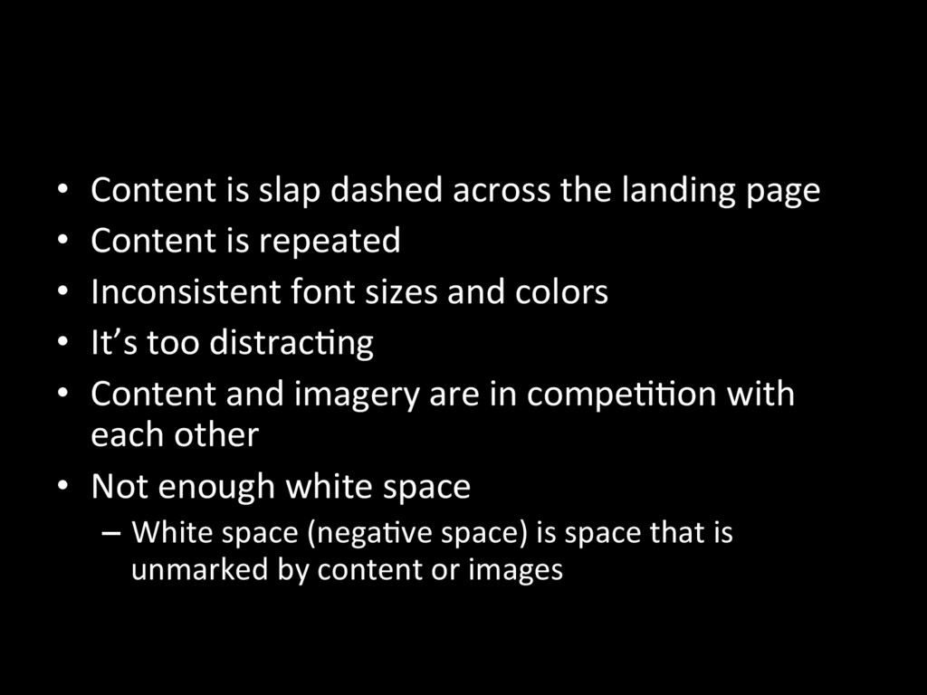
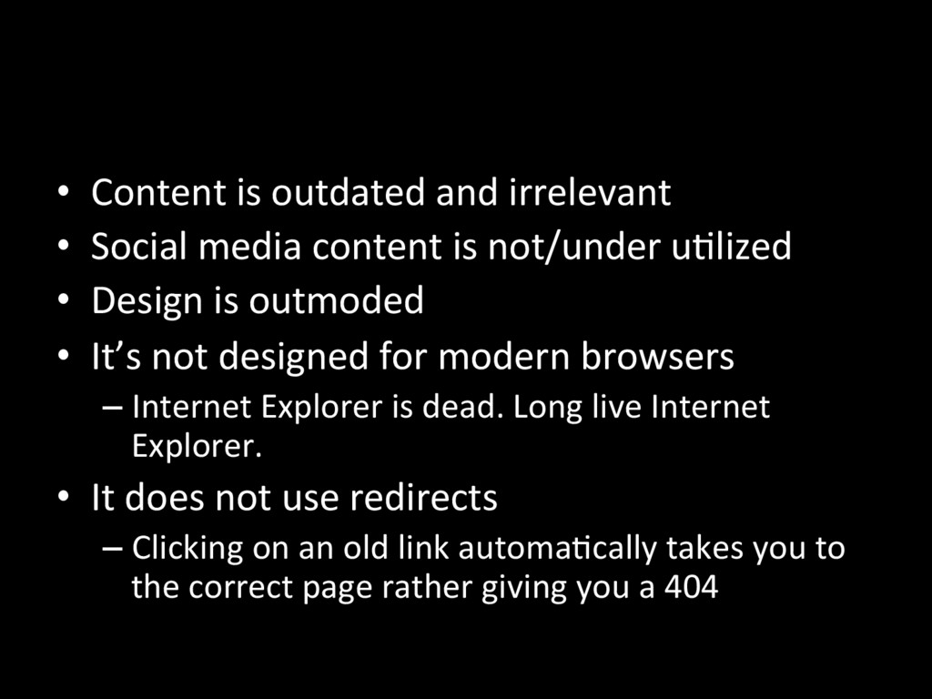
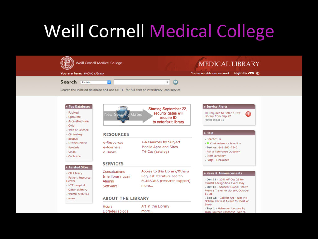
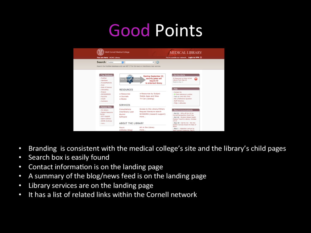
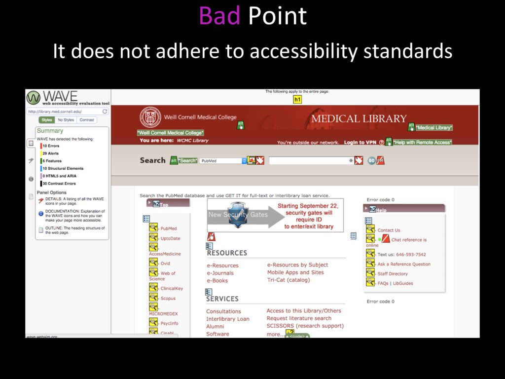
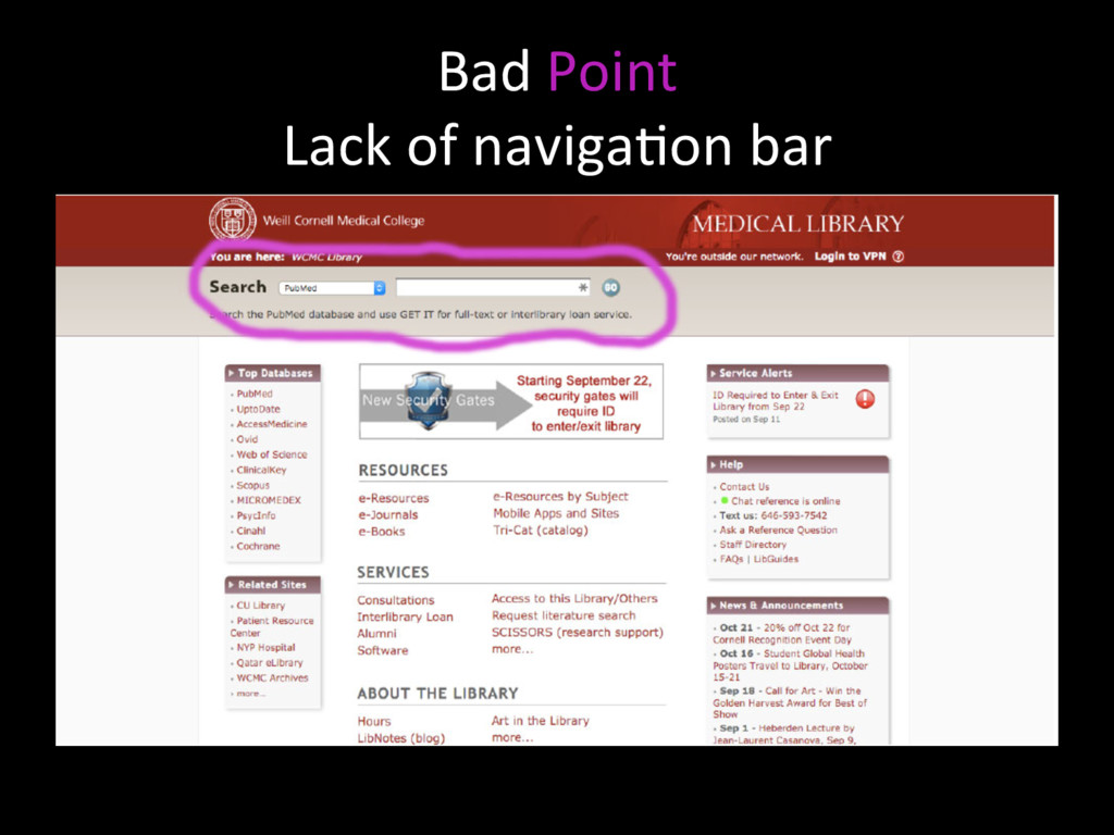
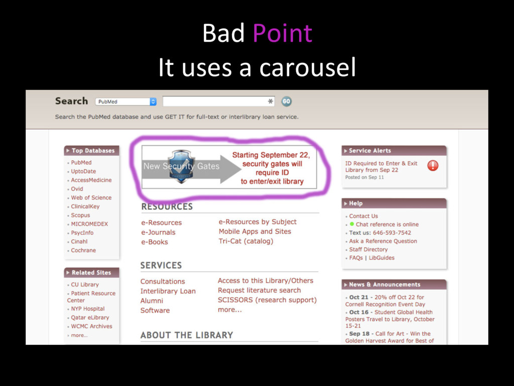
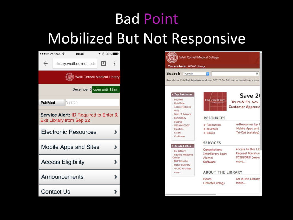
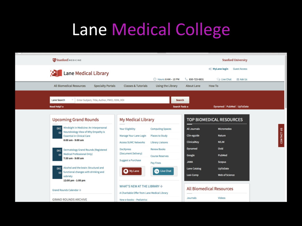
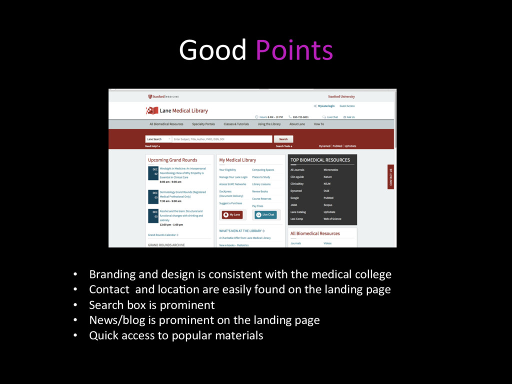
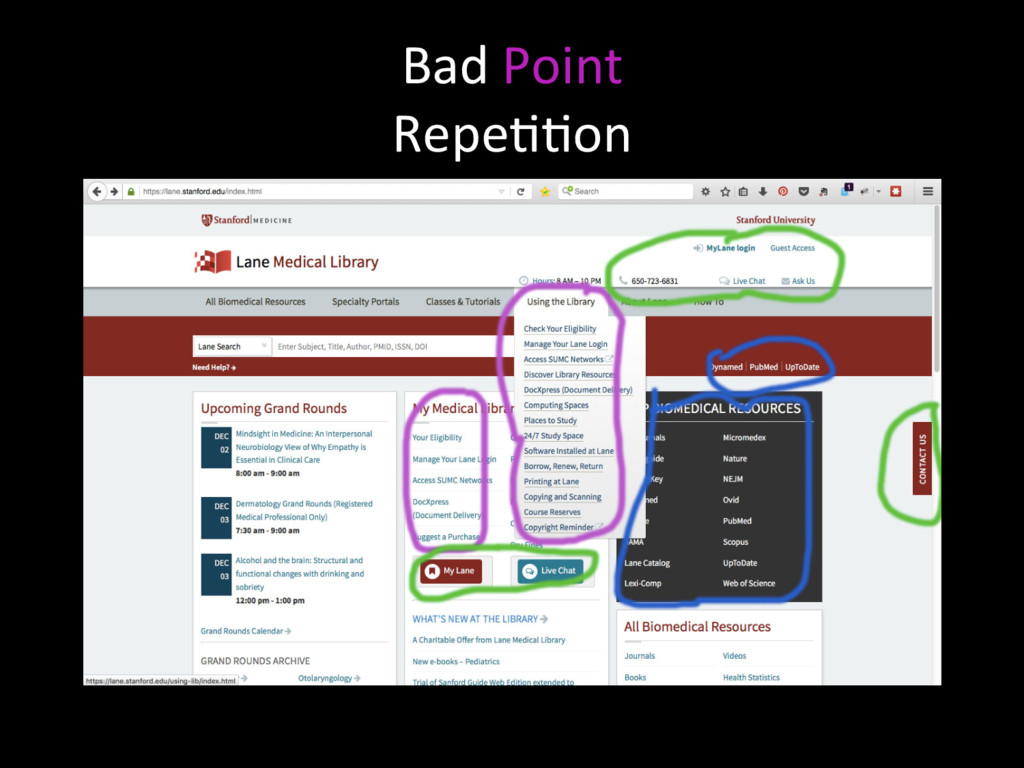
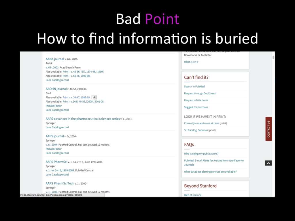
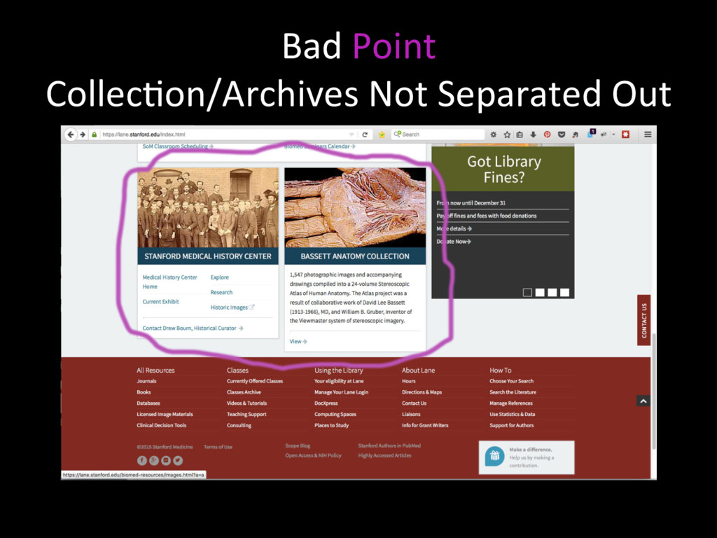
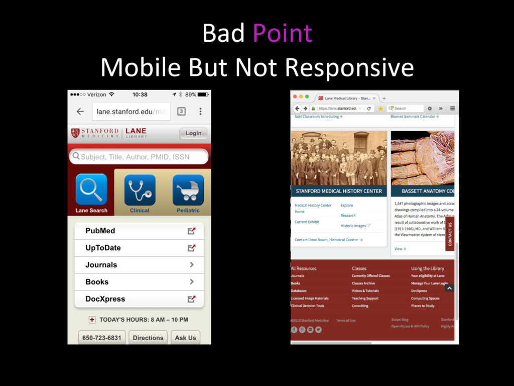
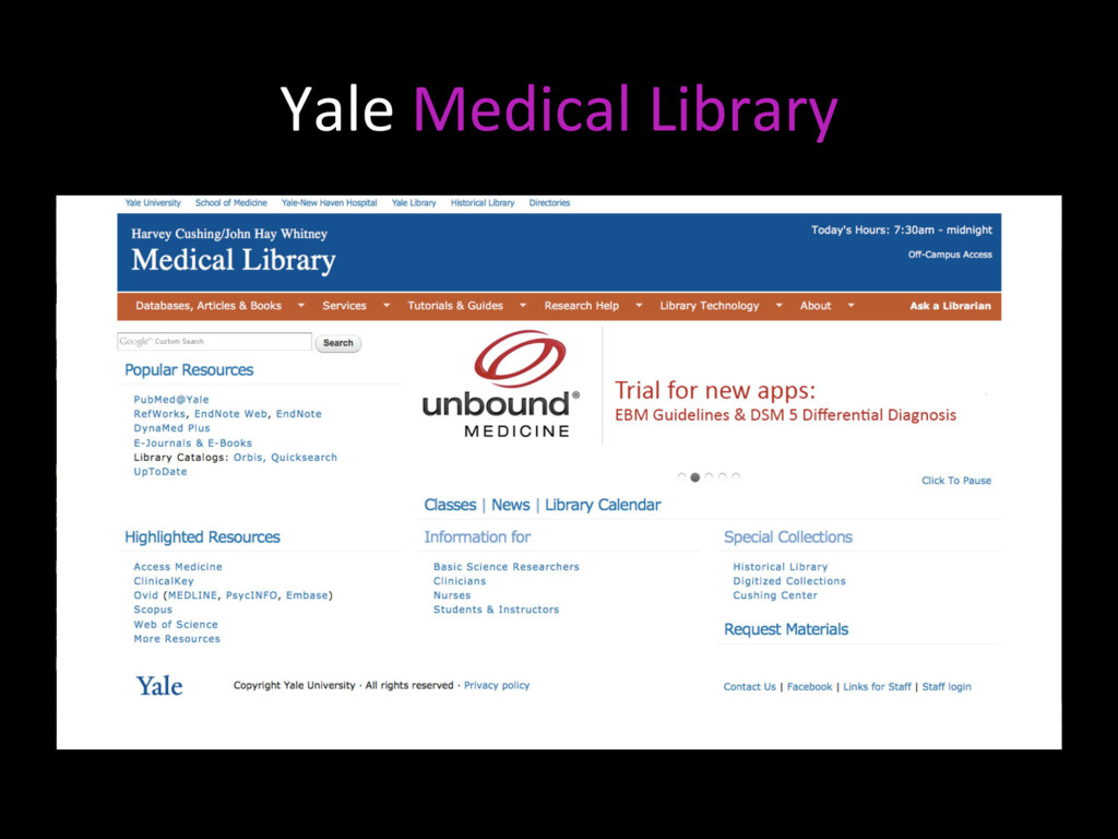
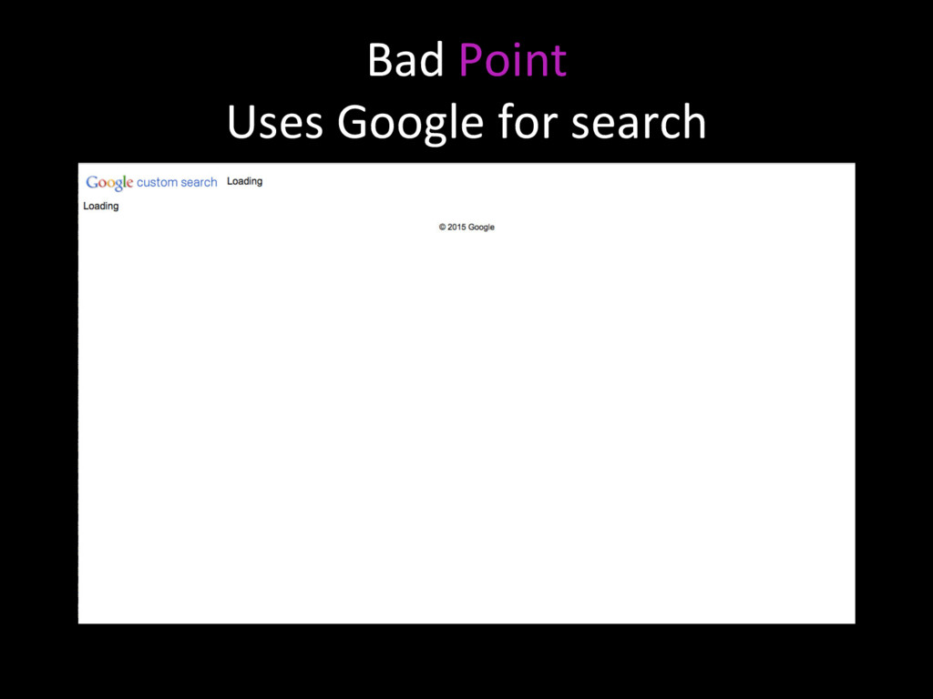
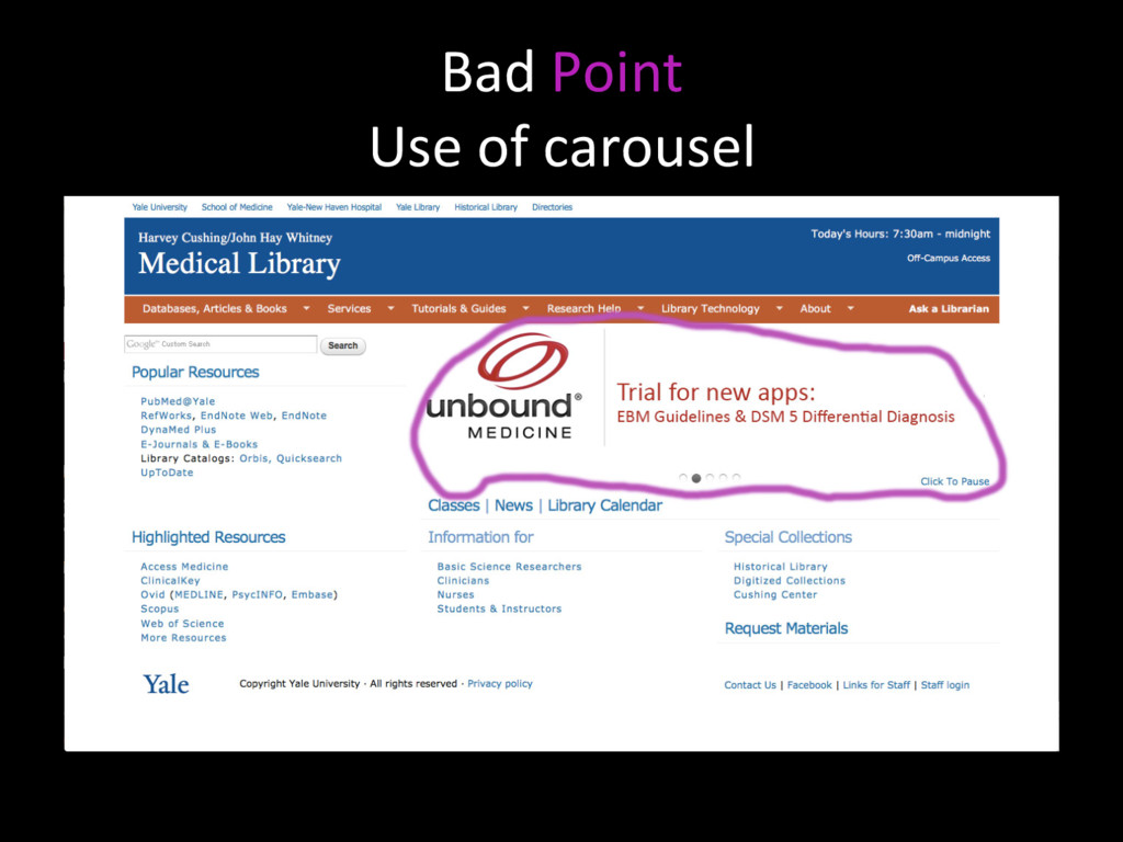
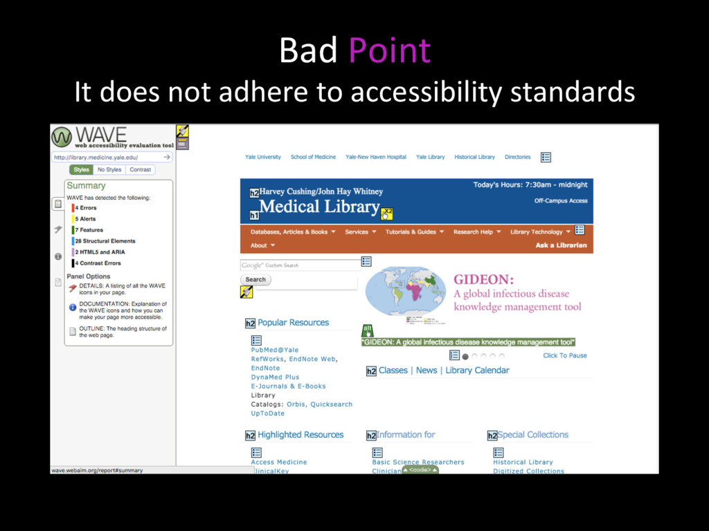
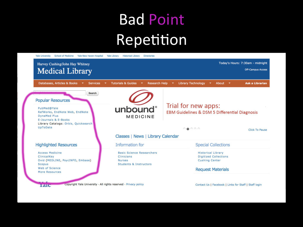
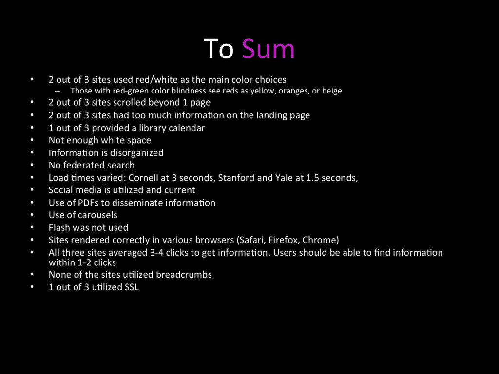
    as the main color choices –  Those with red-green color blindness see reds as yellow, oranges, or beige •  2 out of 3 sites scrolled beyond 1 page •  2 out of 3 sites had too much informaNon on the landing page •  1 out of 3 provided a library calendar •  Not enough white space •  InformaNon is disorganized •  No federated search •  Load Nmes varied: Cornell at 3 seconds, Stanford and Yale at 1.5 seconds, •  Social media is uNlized and current •  Use of PDFs to disseminate informaNon •  Use of carousels •  Flash was not used •  Sites rendered correctly in various browsers (Safari, Firefox, Chrome) •  All three sites averaged 3-4 clicks to get informaNon. Users should be able to find informaNon within 1-2 clicks •  None of the sites uNlized breadcrumbs •  1 out of 3 uNlized SSL