Upgrade to Pro
— share decks privately, control downloads, hide ads and more …
Speaker Deck
Features
Speaker Deck
PRO
Sign in
Sign up for free
Search
Search
Let your data SPEAK!
Search
Sponsored
·
SiteGround - Reliable hosting with speed, security, and support you can count on.
→
btel
September 03, 2012
Programming
2.7k
1
Share
Embed
Copy iframe code
Copy JS code
Copy link
Start on current slide
Let your data SPEAK!
Beginning data visualization in Python
btel
September 03, 2012
Other Decks in Programming
See All in Programming
「AIで開発し、AIを届ける」をEvalでつなぐ 〜AIネイティブに始めるプロダクト開発の実践〜 / Connecting "Develop with AI, deliver AI" with Eval
rkaga
4
5.5k
OSもどきOS
arkw
0
600
ふつうのFeature Flag実践入門
irof
8
4.2k
LLMによるContent Moderationの本番運用の裏側と品質担保への挑戦
suikabar
3
800
Oxcを導入して開発体験が向上した話
yug1224
4
350
作って学ぶ、 JSX (TSX) ランタイムの基本
syumai
7
1.7k
Semantic Version 単位で戦略を柔軟に変えて、パッケージアップデートを自動化する
daitasu
1
320
A2UI という光を覗いてみる
satohjohn
1
170
AI時代のUIはどこへ行く?その2!
yusukebe
22
7.6k
ローカルLLMでどこまでコードが書けるか -拡張版 / How much code can be written on a local LLM Extended
kishida
12
4.5k
そのテスト、説明できますか?~LWテスト戦略FW~のご紹介
nakahara
0
180
Hatena Engineer Seminar #37「言語モデルの活用に関する研究」
slashnephy
0
370
Featured
See All Featured
For a Future-Friendly Web
brad_frost
183
10k
個人開発の失敗を避けるイケてる考え方 / tips for indie hackers
panda_program
123
22k
Code Reviewing Like a Champion
maltzj
528
40k
Code Review Best Practice
trishagee
74
20k
From Legacy to Launchpad: Building Startup-Ready Communities
dugsong
0
240
How to Build an AI Search Optimization Roadmap - Criteria and Steps to Take #SEOIRL
aleyda
1
2.1k
My Coaching Mixtape
mlcsv
0
160
Highjacked: Video Game Concept Design
rkendrick25
PRO
1
400
Hiding What from Whom? A Critical Review of the History of Programming languages for Music
tomoyanonymous
2
870
The Invisible Side of Design
smashingmag
301
52k
Ethics towards AI in product and experience design
skipperchong
2
320
A brief & incomplete history of UX Design for the World Wide Web: 1989–2019
jct
2
400
Transcript
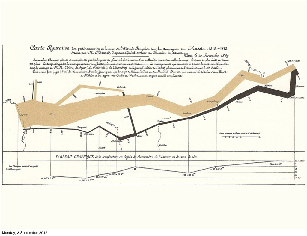
Let your data SPEAK! Introduction to data visualization Bartosz Telenczuk
Kiel, 2012 Monday, 3 September 2012
Monday, 3 September 2012
Monday, 3 September 2012
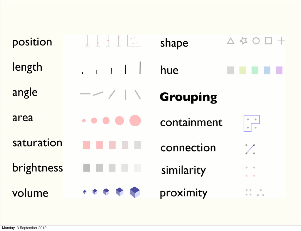
position length angle area saturation brightness volume shape hue Grouping
containment connection similarity proximity Monday, 3 September 2012
Monday, 3 September 2012
Monday, 3 September 2012
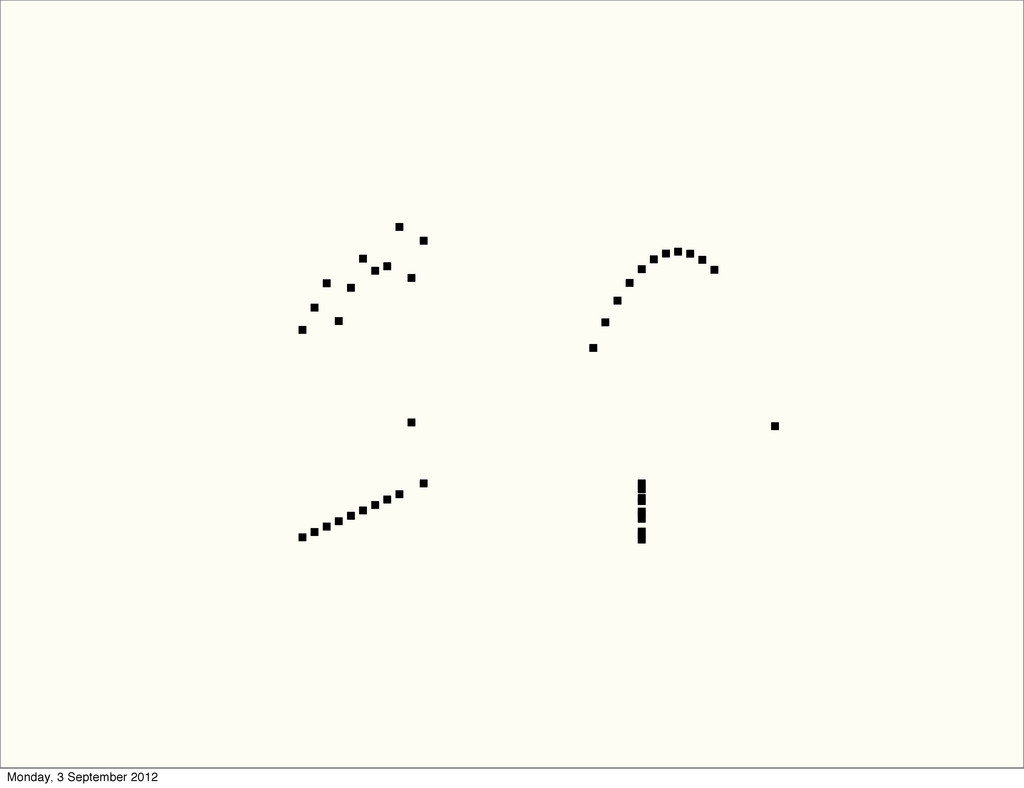
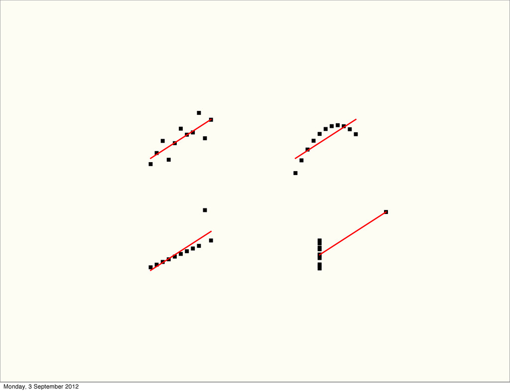
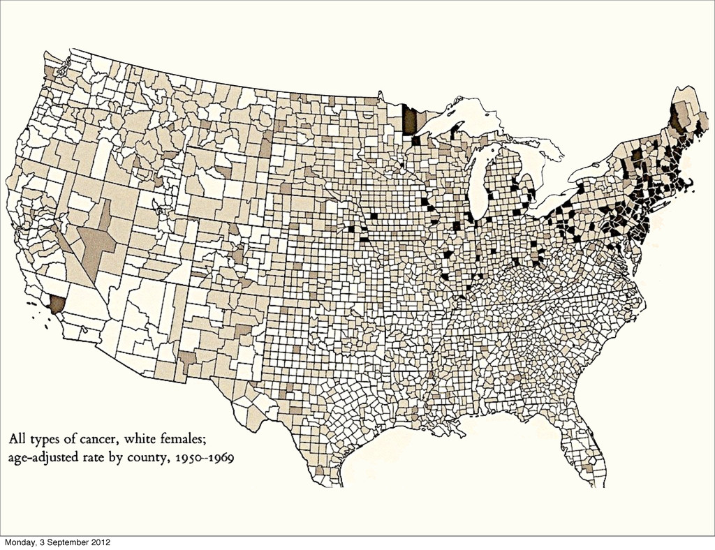
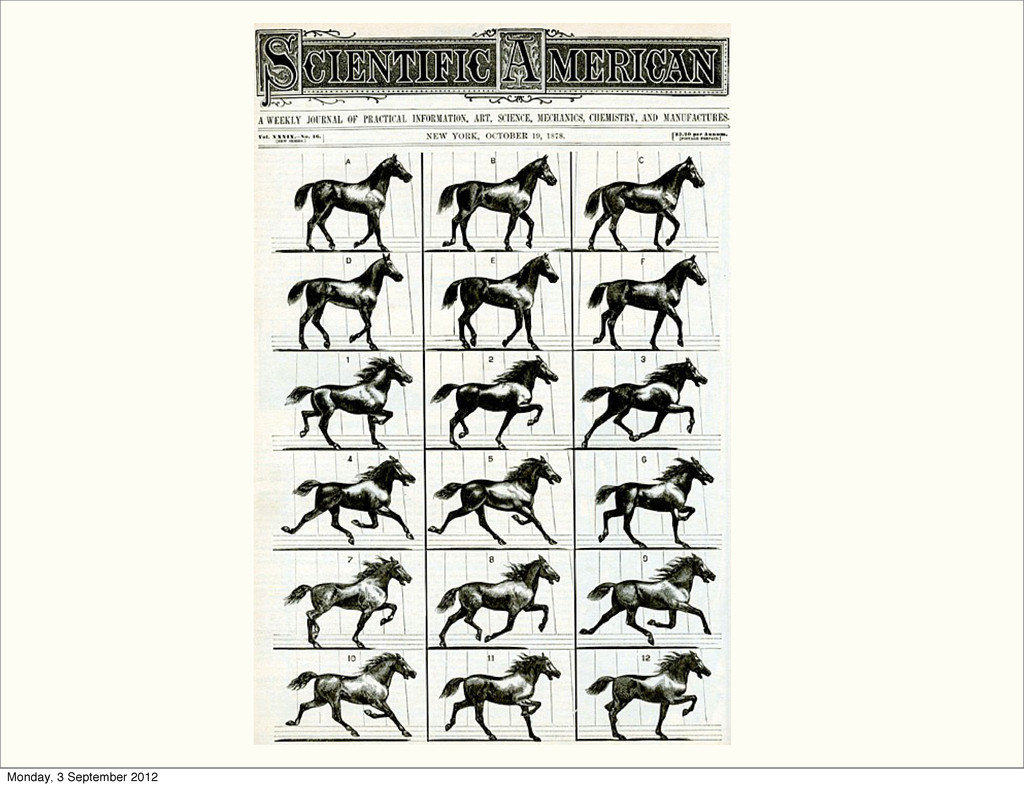
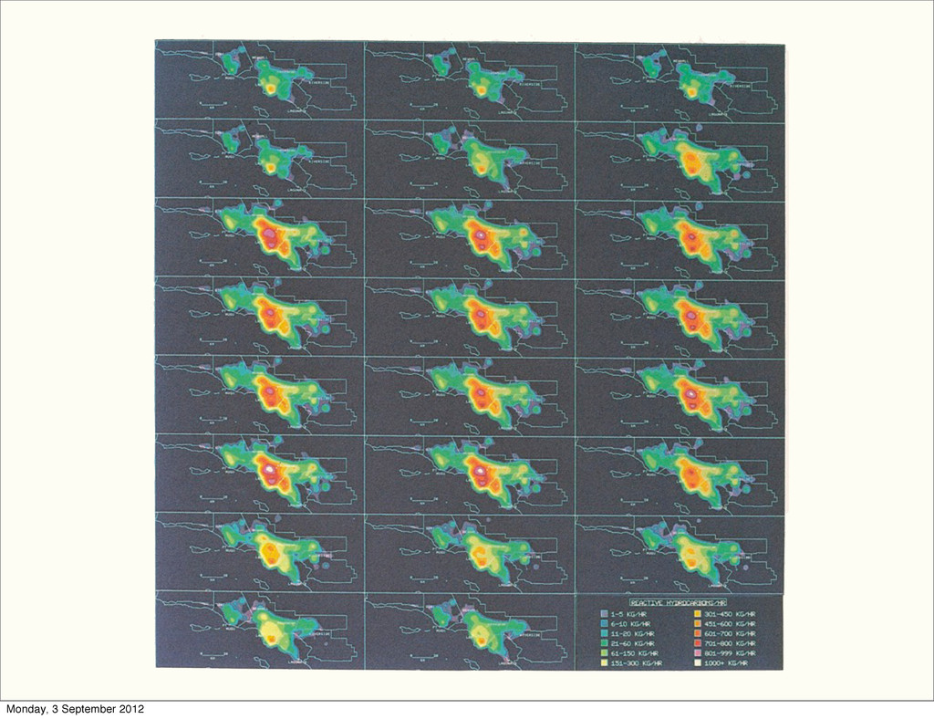
Visualization design principles Monday, 3 September 2012
Monday, 3 September 2012
Monday, 3 September 2012
Monday, 3 September 2012
Monday, 3 September 2012
Monday, 3 September 2012
Monday, 3 September 2012
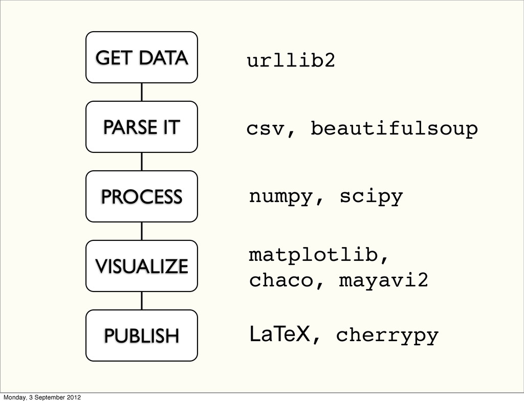
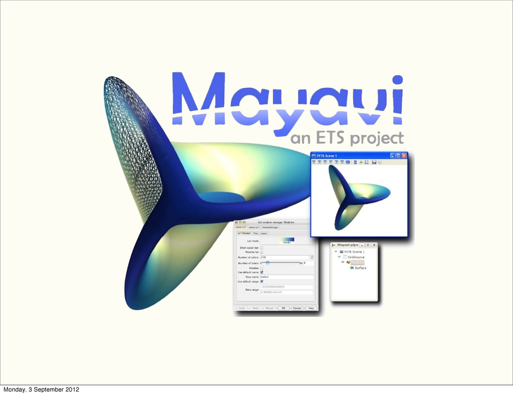
Tools Monday, 3 September 2012
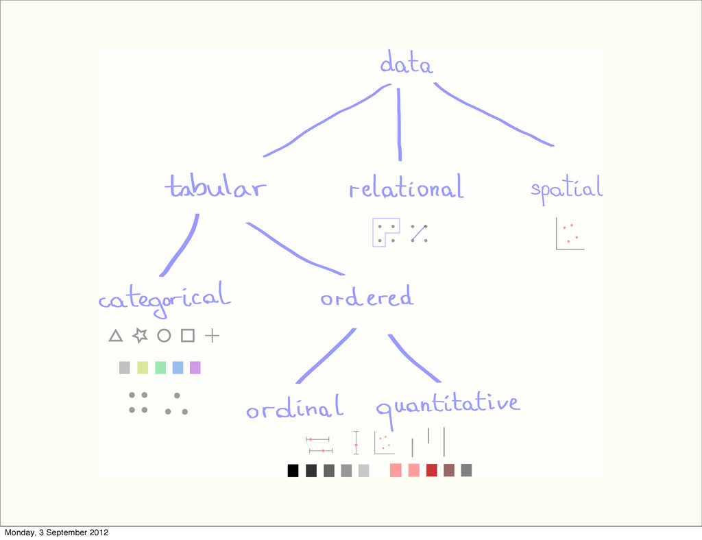
GET DATA PARSE IT PROCESS VISUALIZE PUBLISH urllib2 csv, beautifulsoup
numpy, scipy matplotlib, chaco, mayavi2 LaTeX, cherrypy Monday, 3 September 2012
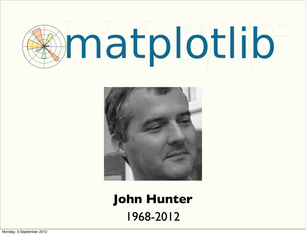
John Hunter 1968-2012 Monday, 3 September 2012
Monday, 3 September 2012
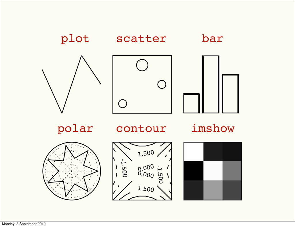
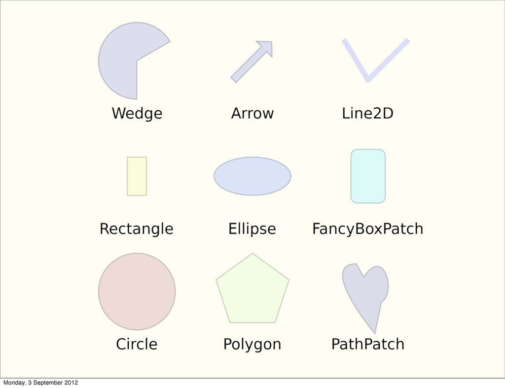
plot scatter bar polar contour imshow Monday, 3 September 2012
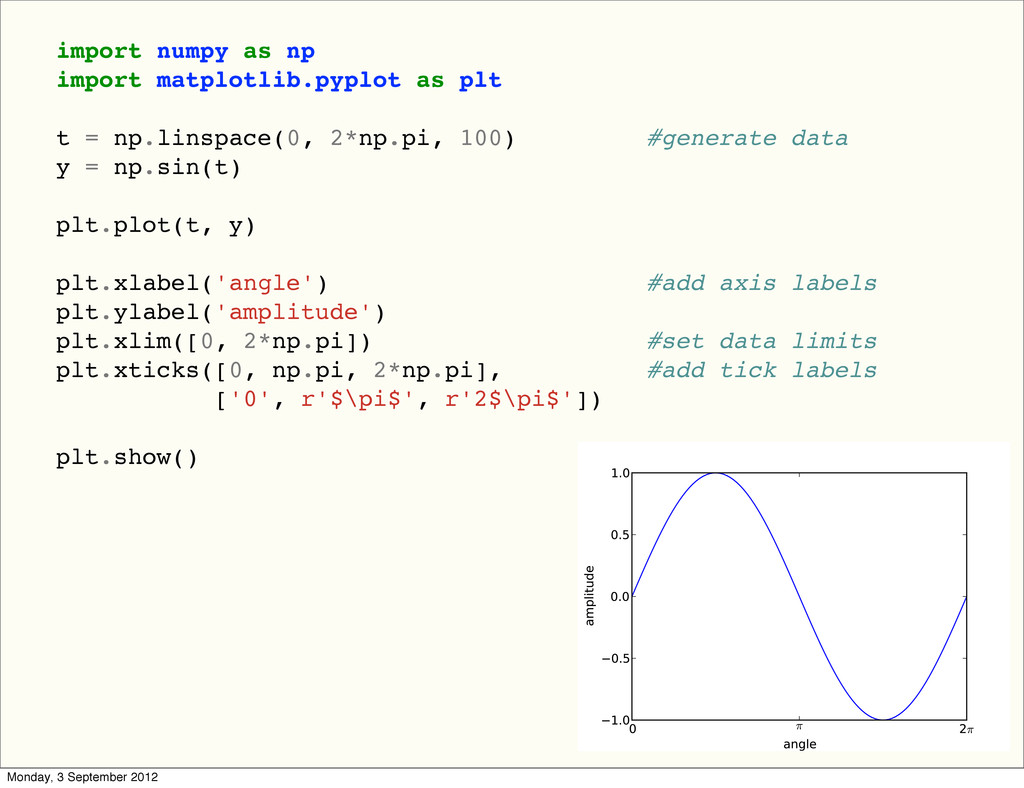
import numpy as np import matplotlib.pyplot as plt t =
np.linspace(0, 2*np.pi, 100) #generate data y = np.sin(t) plt.plot(t, y) plt.xlabel('angle') #add axis labels plt.ylabel('amplitude') plt.xlim([0, 2*np.pi]) #set data limits plt.xticks([0, np.pi, 2*np.pi], #add tick labels ['0', r'$\pi$', r'2$\pi$']) plt.show() #show plot Monday, 3 September 2012
Monday, 3 September 2012
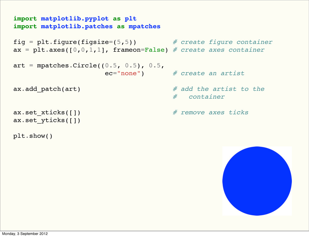
import matplotlib.pyplot as plt import matplotlib.patches as mpatches fig =
plt.figure(figsize=(5,5)) # create figure container ax = plt.axes([0,0,1,1], frameon=False) # create axes container art = mpatches.Circle((0.5, 0.5), 0.5, ec="none") # create an artist ax.add_patch(art) # add the artist to the # container ax.set_xticks([]) # remove axes ticks ax.set_yticks([]) plt.show() Monday, 3 September 2012
Monday, 3 September 2012
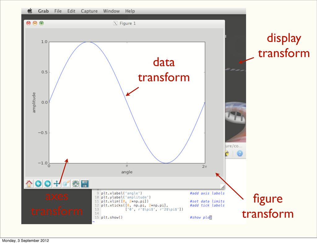
display transform data transform axes transform figure transform Monday, 3
September 2012
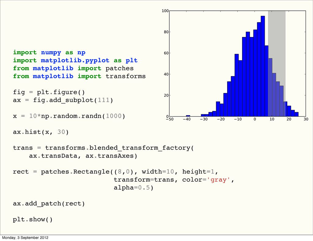
import numpy as np import matplotlib.pyplot as plt from matplotlib
import patches from matplotlib import transforms fig = plt.figure() ax = fig.add_subplot(111) x = 10*np.random.randn(1000) ax.hist(x, 30) trans = transforms.blended_transform_factory( ax.transData, ax.transAxes) rect = patches.Rectangle((8,0), width=10, height=1, transform=trans, color='gray', alpha=0.5) ax.add_patch(rect) plt.show() Monday, 3 September 2012
Interactivity Monday, 3 September 2012
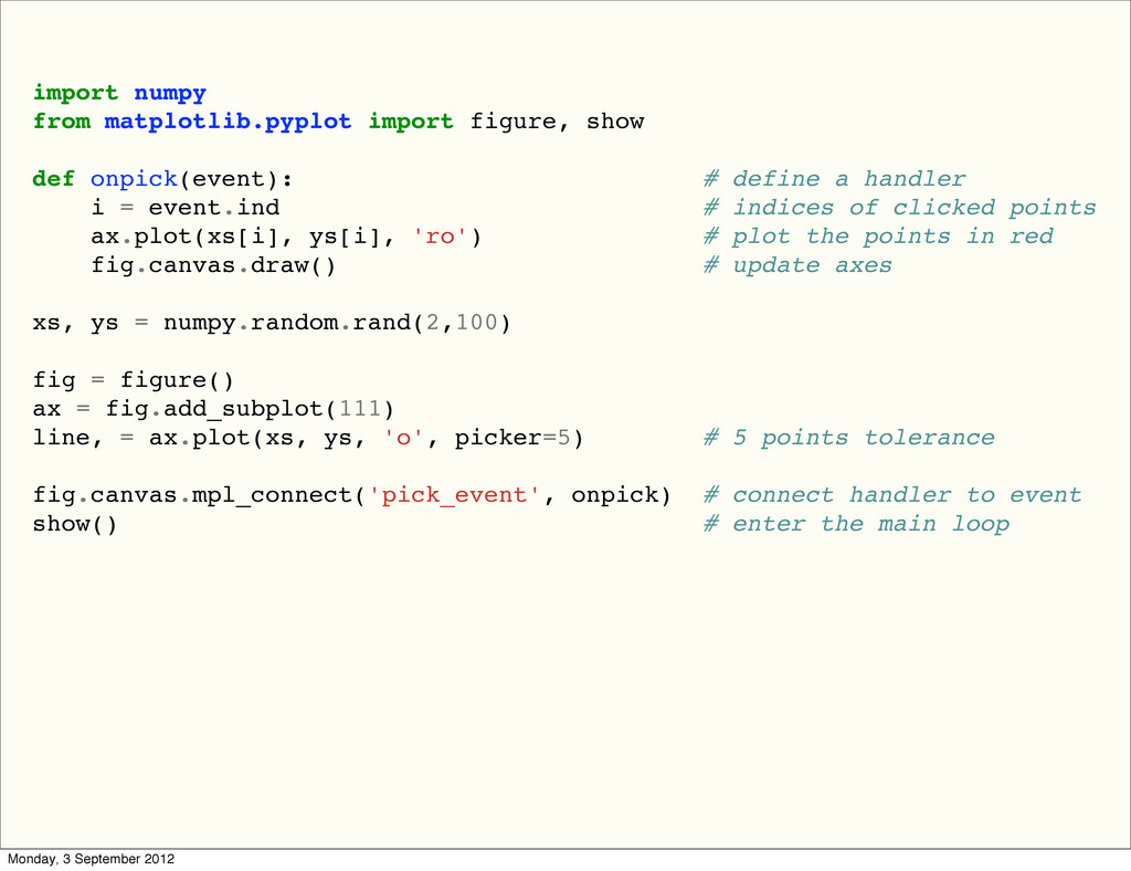
import numpy from matplotlib.pyplot import figure, show def onpick(event): #
define a handler i = event.ind # indices of clicked points ax.plot(xs[i], ys[i], 'ro') # plot the points in red fig.canvas.draw() # update axes xs, ys = numpy.random.rand(2,100) fig = figure() ax = fig.add_subplot(111) line, = ax.plot(xs, ys, 'o', picker=5) # 5 points tolerance fig.canvas.mpl_connect('pick_event', onpick) # connect handler to event show() # enter the main loop Monday, 3 September 2012
Monday, 3 September 2012
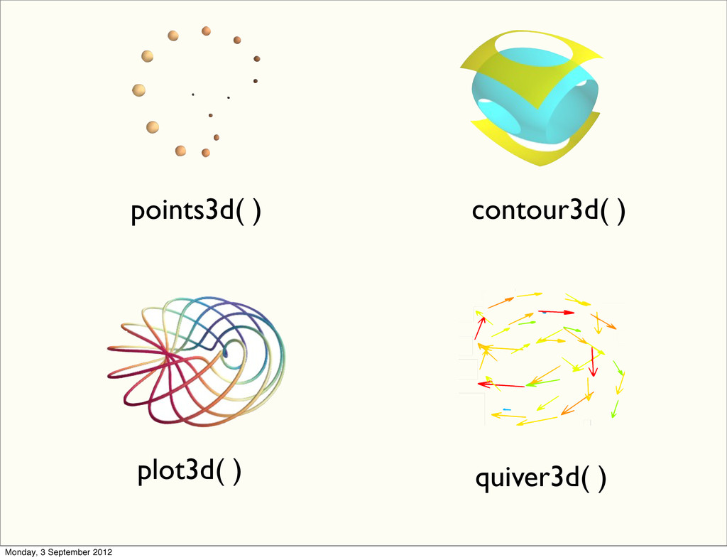
points3d( ) contour3d( ) quiver3d( ) plot3d( ) Monday, 3
September 2012
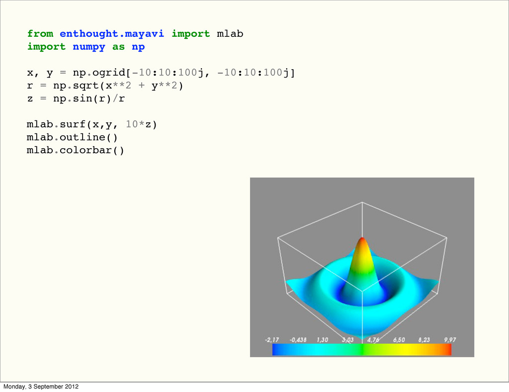
from enthought.mayavi import mlab import numpy as np x, y
= np.ogrid[-10:10:100j, -10:10:100j] r = np.sqrt(x**2 + y**2) z = np.sin(r)/r mlab.surf(x,y, 10*z) mlab.outline() mlab.colorbar() Monday, 3 September 2012
Monday, 3 September 2012