Upgrade to Pro
— share decks privately, control downloads, hide ads and more …
Speaker Deck
Features
Speaker Deck
PRO
Sign in
Sign up for free
Search
Search
CSS Layout w/ HTML5 & CSS3
Search
Sponsored
·
Your Podcast. Everywhere. Effortlessly.
Share. Educate. Inspire. Entertain. You do you. We'll handle the rest.
→
Cesar
August 14, 2015
Programming
110
2
Share
Embed
Copy iframe code
Copy JS code
Copy link
Start on current slide
CSS Layout w/ HTML5 & CSS3
Cesar
August 14, 2015
More Decks by Cesar
See All by Cesar
Webpack
cesar2535
1
480
Front-End workflows
cesar2535
0
99
Other Decks in Programming
See All in Programming
1B+ /day規模のログを管理する技術
broadleaf
0
130
【SRE NEXT 2026 Lunch Session】一人目専任SREの立ち上げを加速する ― AIと進めたオンボーディングで2分を0.04秒にした話
pkshadeck
PRO
0
2.3k
吝嗇家のためのAI活用 / AI development for miser - ChatGPT + Issue Driven Development
tooppoo
0
180
The Bowling Game - From Imperative to Functional Programming - Part 1
philipschwarz
PRO
0
310
Claude Opus 4.6以後の受託開発エンジニアの変化(Claude Code開発ノウハウ大公開スペシャルbyクラスメソッド)
iidatakuma
1
590
ECSアプリログをFireLensでコスト削減しようとしたけど諦めた話 in Fargate×Node.js
akihisaikeda
2
4.2k
技術記事、 専門家としてのプログラマ、 言語化
mizchi
14
7.4k
OSINT for SRE: 学術論文とポストモーテムから探る システム障害の共通パターン / SRE NEXT 2026
tomoyk
1
3.5k
どこまでゆるくて許されるのか
tk3fftk
0
470
Haskell/Servantを通してWebミドルウェアを捉え直す
pizzacat83
1
480
その問い、本当に正しいですか?AI時代のエンジニアに必要な哲学と認知科学 / ai-philosophy-cognitive-science
minodriven
14
6.8k
Mujeres en SEO Summit 2026 - Greatest Disaster Hits en Web Performance
guaca
0
240
Featured
See All Featured
Digital Projects Gone Horribly Wrong (And the UX Pros Who Still Save the Day) - Dean Schuster
uxyall
1
1.9k
XXLCSS - How to scale CSS and keep your sanity
sugarenia
249
1.3M
実際に使うSQLの書き方 徹底解説 / pgcon21j-tutorial
soudai
PRO
201
75k
SEO for Brand Visibility & Recognition
aleyda
0
4.6k
AI in Enterprises - Java and Open Source to the Rescue
ivargrimstad
0
1.4k
Breaking role norms: Why Content Design is so much more than writing copy - Taylor Woolridge
uxyall
0
340
Become a Pro
speakerdeck
PRO
31
6k
[SF Ruby Conf 2025] Rails X
palkan
2
1.2k
AI: The stuff that nobody shows you
jnunemaker
PRO
8
820
Organizational Design Perspectives: An Ontology of Organizational Design Elements
kimpetersen
PRO
1
760
What’s in a name? Adding method to the madness
productmarketing
PRO
24
4.1k
Lightning talk: Run Django tests with GitHub Actions
sabderemane
0
220
Transcript
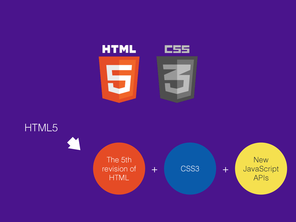
CSS Layout WITH
HTML5 The 5th revision of HTML CSS3 New JavaScript APIs
+ +
CSS3
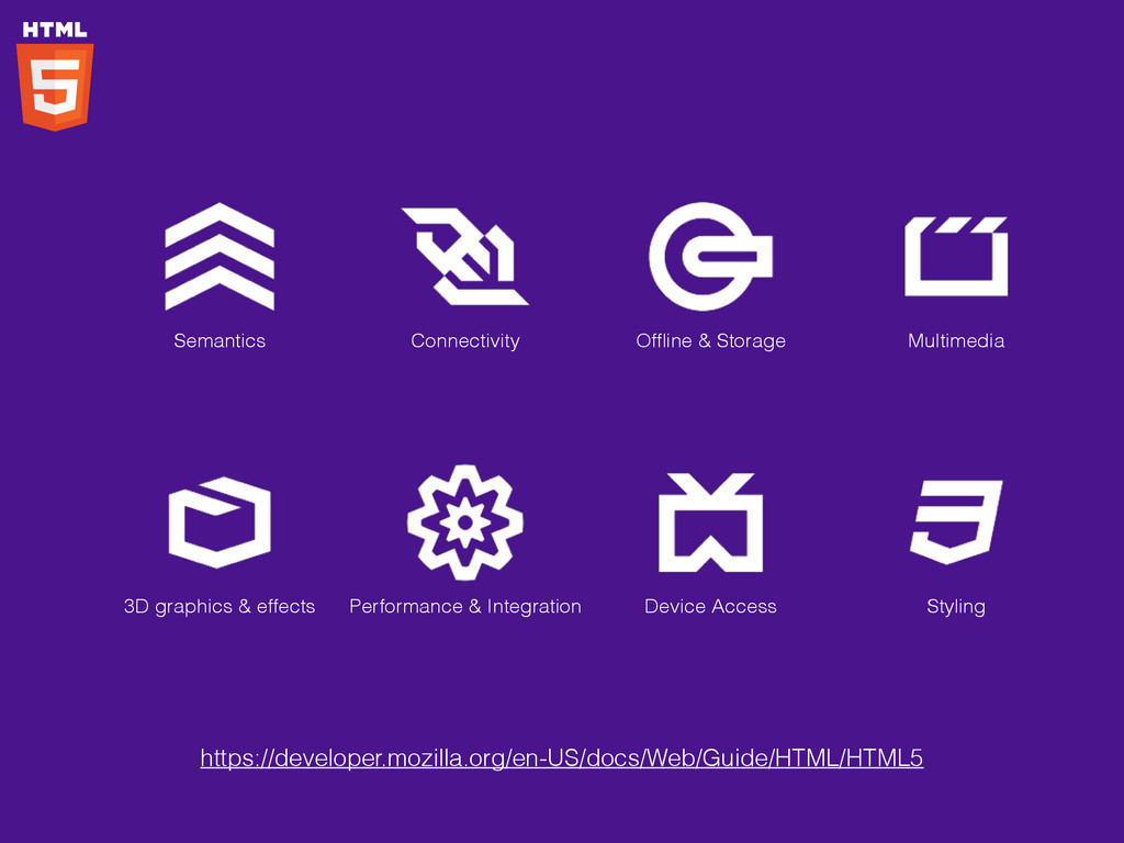
https://en.wikipedia.org/wiki/HTML5
Semantics Connectivity Offline & Storage Multimedia 3D graphics & effects
Performance & Integration Device Access Styling https://developer.mozilla.org/en-US/docs/Web/Guide/HTML/HTML5
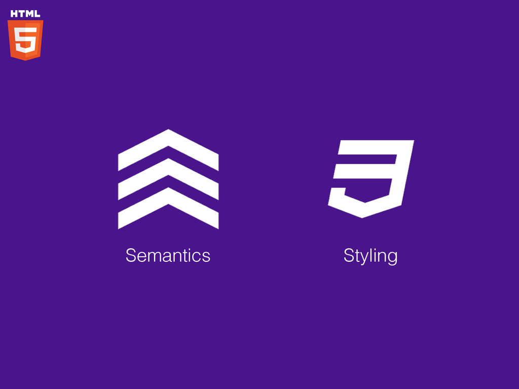
Semantics Styling
Semantics Styling <header>, <footer>, <article>, <section>, <aside>, <nav>, <figure>, <audio>,
<video>, …
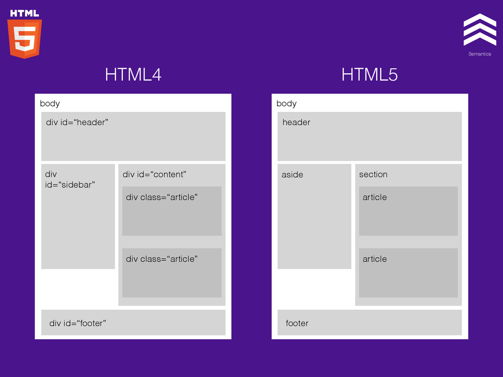
Semantics Styling body div id=“header” div id=“sidebar” div id=“content” div
class=“article” div class=“article” div id=“footer” body header aside section article article footer HTML4 HTML5
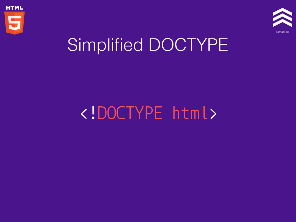
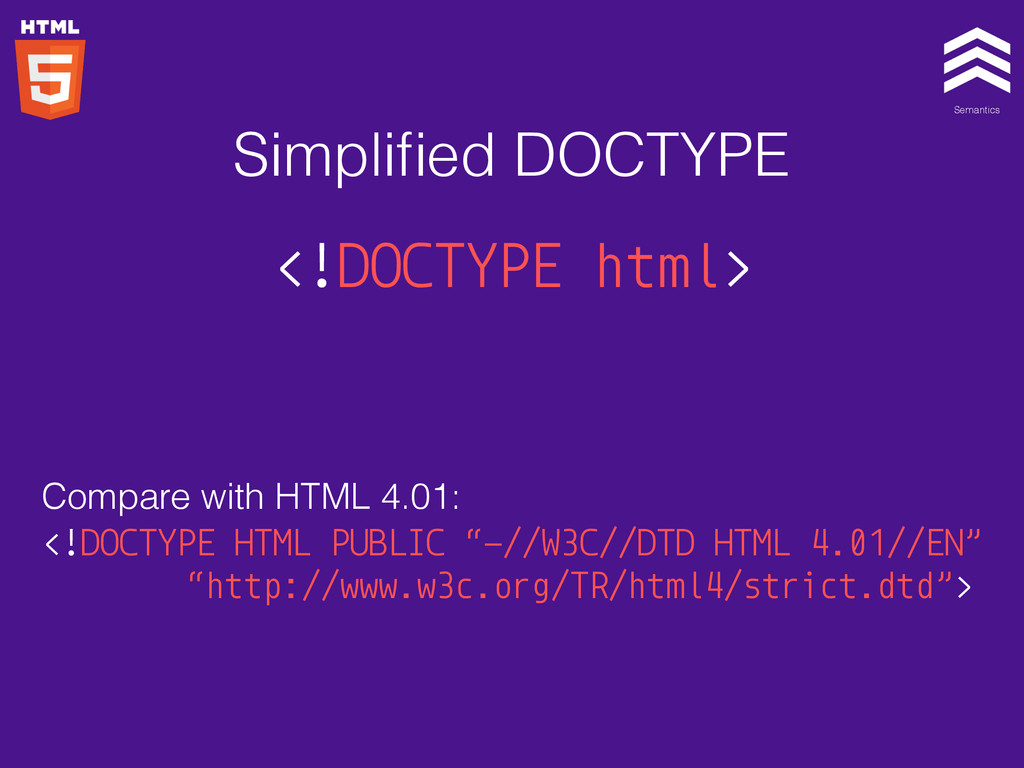
Semantics Styling <!DOCTYPE html> Simplified DOCTYPE
Semantics Styling <!DOCTYPE html> Compare with HTML 4.01: <!DOCTYPE HTML
PUBLIC “-//W3C//DTD HTML 4.01//EN” “http://www.w3c.org/TR/html4/strict.dtd”> Simplified DOCTYPE
Semantics Styling
Semantics Styling
Semantics Styling
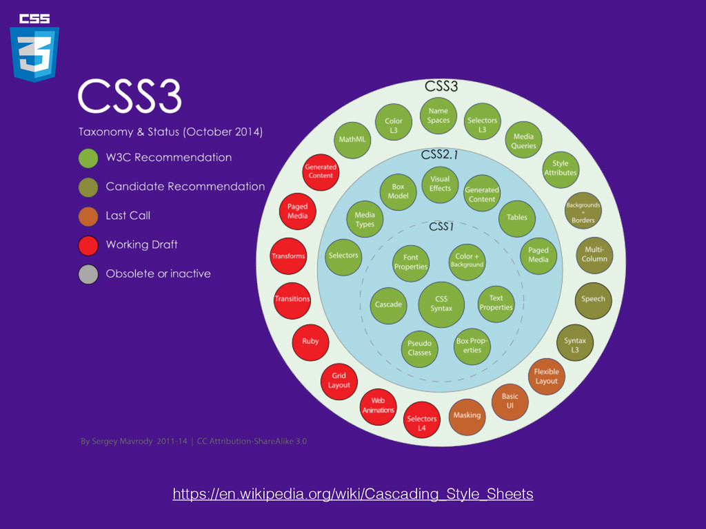
https://en.wikipedia.org/wiki/Cascading_Style_Sheets
• Selector • Box Model • Backgrounds & Border •
Text Effects • 2D/3D Transformations • Animations • Multiple Column Layout
box-radius: 5px; Box radius
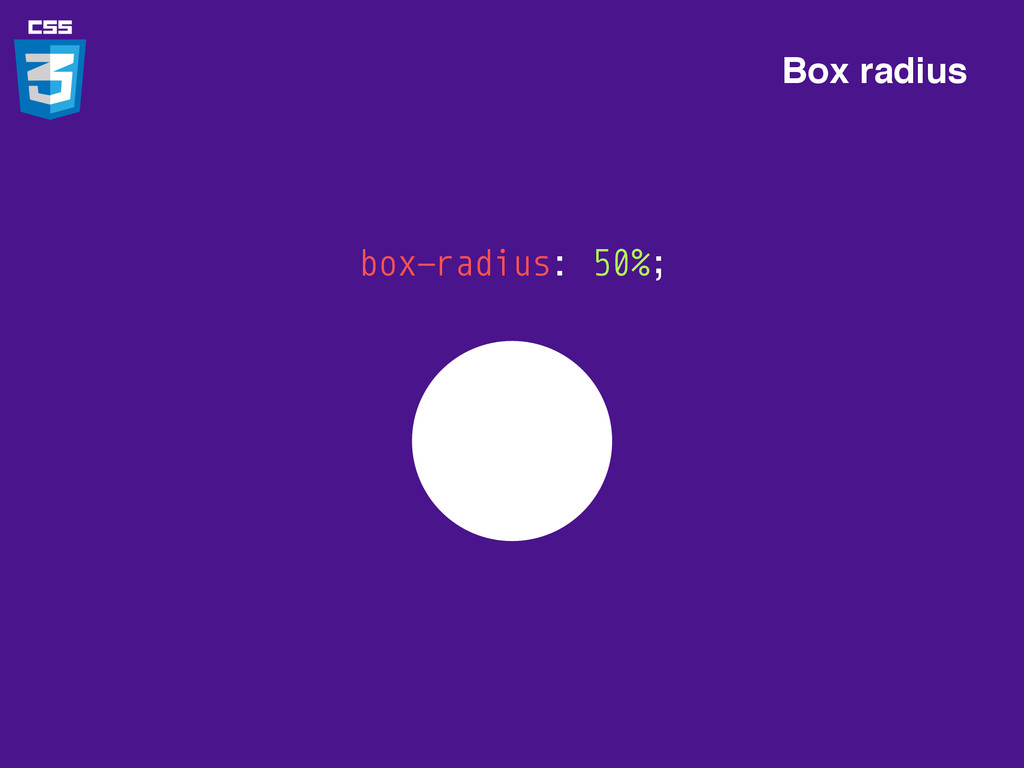
box-radius: 50%; Box radius
box-shadow: 1px 1px 0px pink; Box shadow
box-shadow: 1px 1px 0px pink, -1px -1px 0px green; Box
shadow
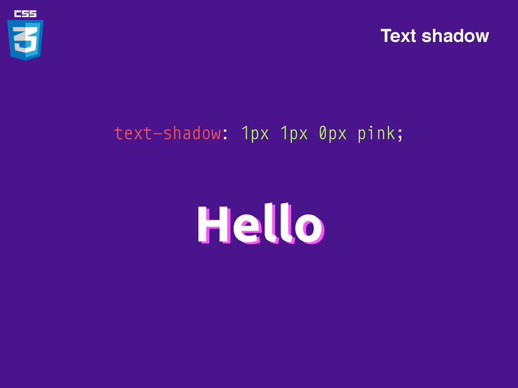
text-shadow: 1px 1px 0px pink; Hello Hello Text shadow
h1:before, h1:after { content: “*”; color: pink; } *Hello* Pseudo
elements
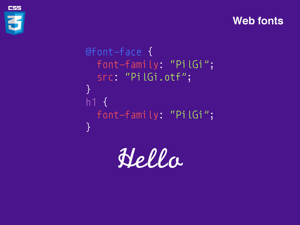
@font-face { font-family: “PilGi”; src: “PilGi.otf”; } h1 { font-family:
“PilGi”; } Hello Web fonts
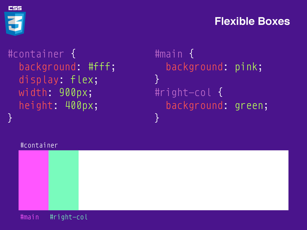
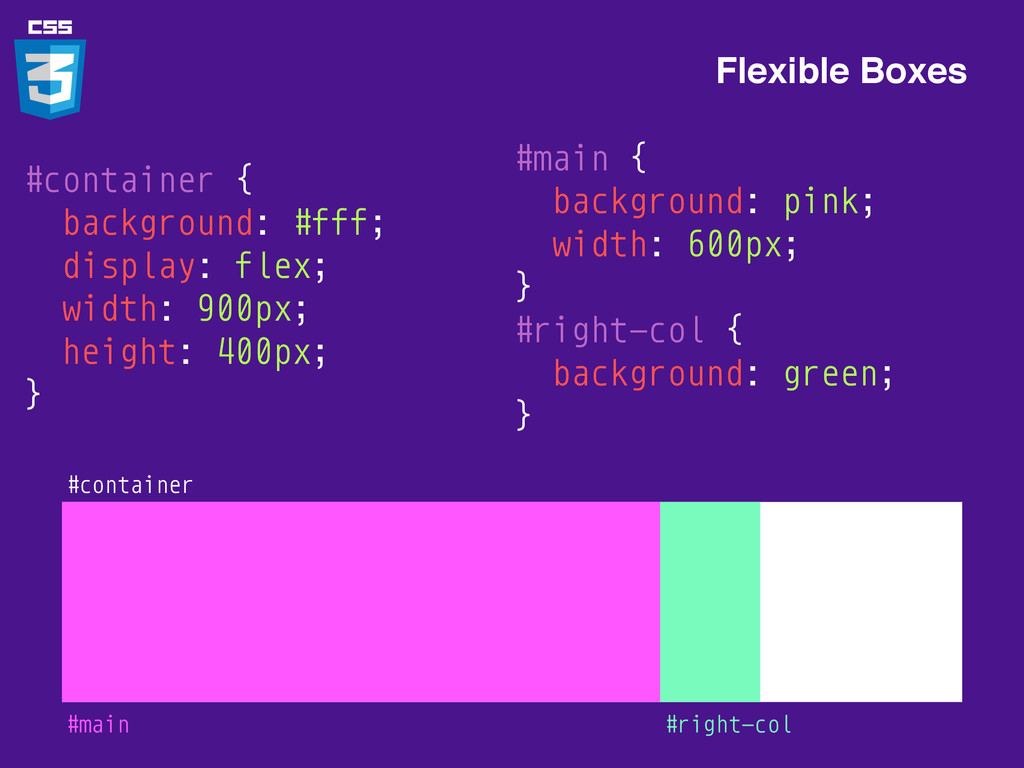
#container { background: #fff; display: flex; width: 900px; height: 400px;
} Flexible Boxes #container
Flexible Boxes #container #main { background: pink; } #right-col {
background: green; } #main #right-col #container { background: #fff; display: flex; width: 900px; height: 400px; }
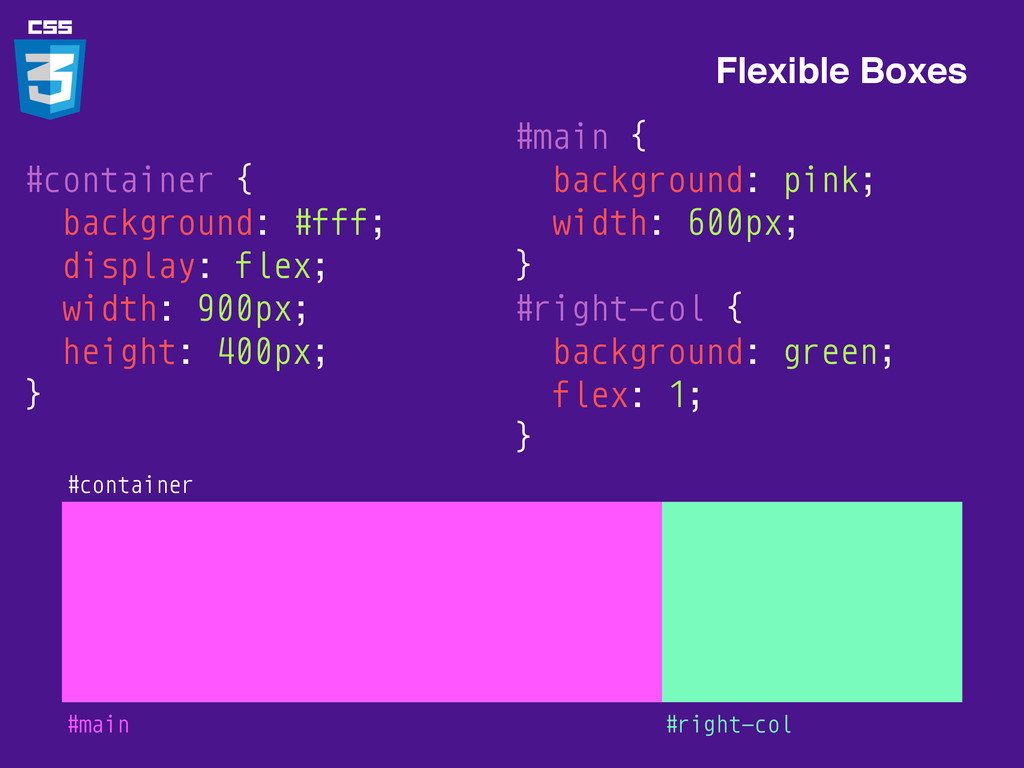
Flexible Boxes #container #main { background: pink; width: 600px; }
#right-col { background: green; } #main #right-col #container { background: #fff; display: flex; width: 900px; height: 400px; }
Flexible Boxes #container #main { background: pink; width: 600px; }
#right-col { background: green; flex: 1; } #main #right-col #container { background: #fff; display: flex; width: 900px; height: 400px; }
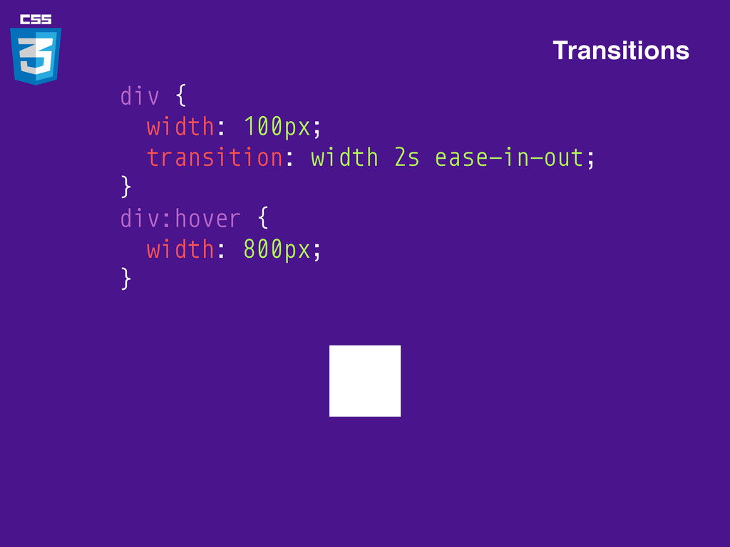
Transitions div { width: 100px; } div:hover { width: 800px;
}
Transitions div { width: 100px; } div:hover { width: 800px;
}
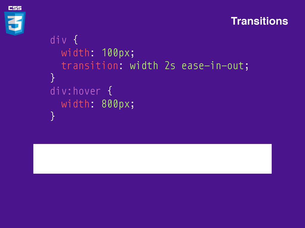
Transitions div { width: 100px; transition: width 2s ease-in-out; }
div:hover { width: 800px; }
Transitions div { width: 100px; transition: width 2s ease-in-out; }
div:hover { width: 800px; }
Transforms Hi div { transform: rotate(45deg); }
Don’t forget vendor prefixes -webkit-transform: rotate(45deg); -moz-transform: rotate(45deg); -ms-transform: rotate(45deg);
-o-transform: rotate(45deg); transform: rotate(45deg);
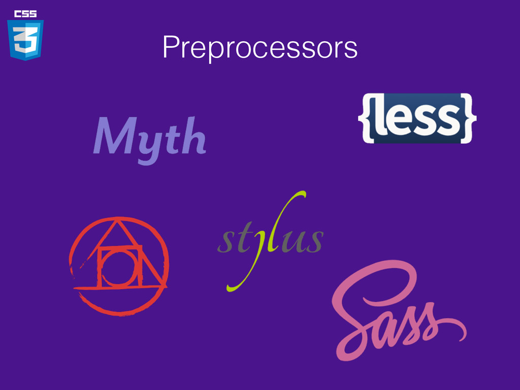
Preprocessors
Preprocessors .css .css .styl .sass .scss .less Myth Less Sass
Stylus Postcss
Preprocessors
Question?
CSS Layout
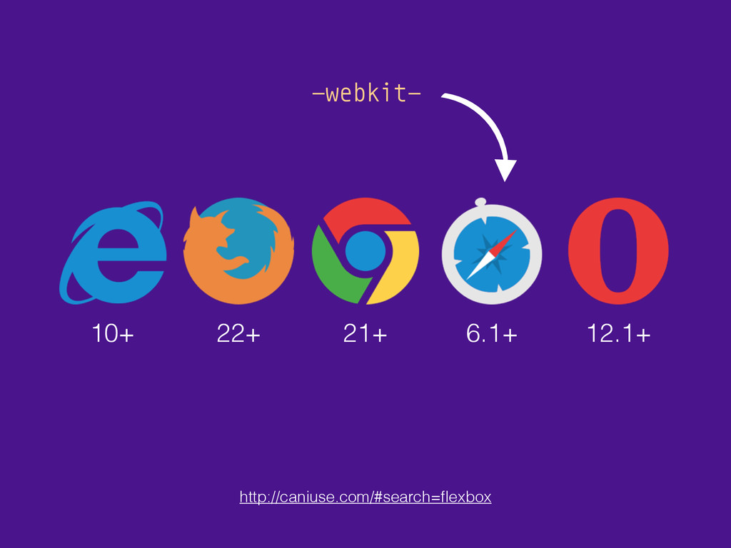
FLEXBOX
10+ 22+ 21+ 6.1+ 12.1+ http://caniuse.com/#search=flexbox -webkit-
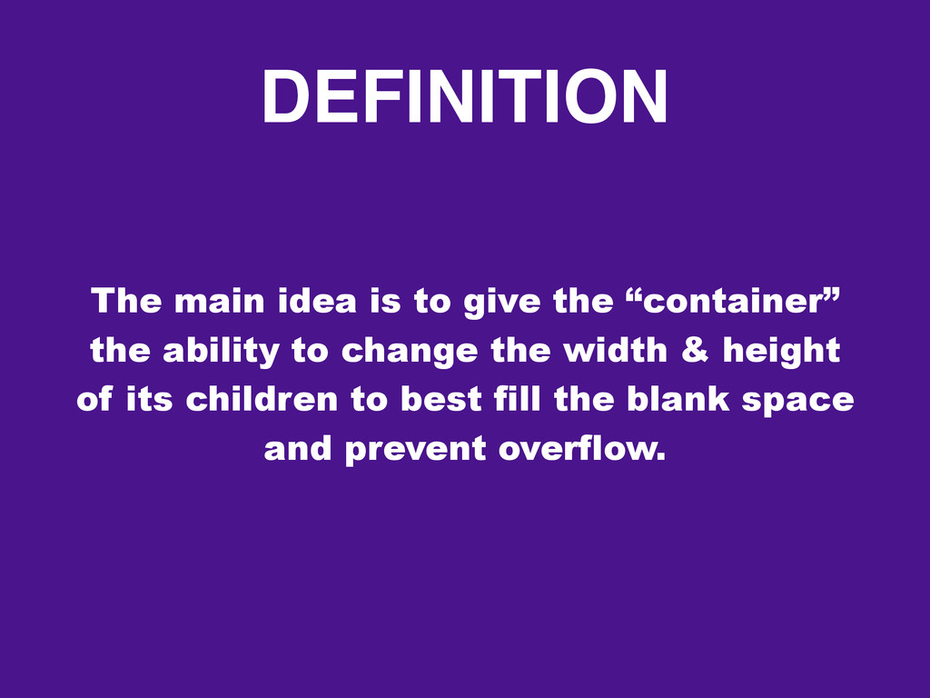
DEFINITION The main idea is to give the “container” the
ability to change the width & height of its children to best fill the blank space and prevent overflow.
TERMINOLOGY Flex Container 1 2 3 Flex Items
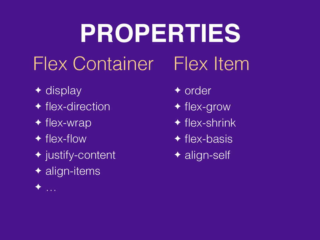
PROPERTIES Flex Container Flex Item ✦ display ✦ flex-direction ✦
flex-wrap ✦ flex-flow ✦ justify-content ✦ align-items ✦ … ✦ order ✦ flex-grow ✦ flex-shrink ✦ flex-basis ✦ align-self
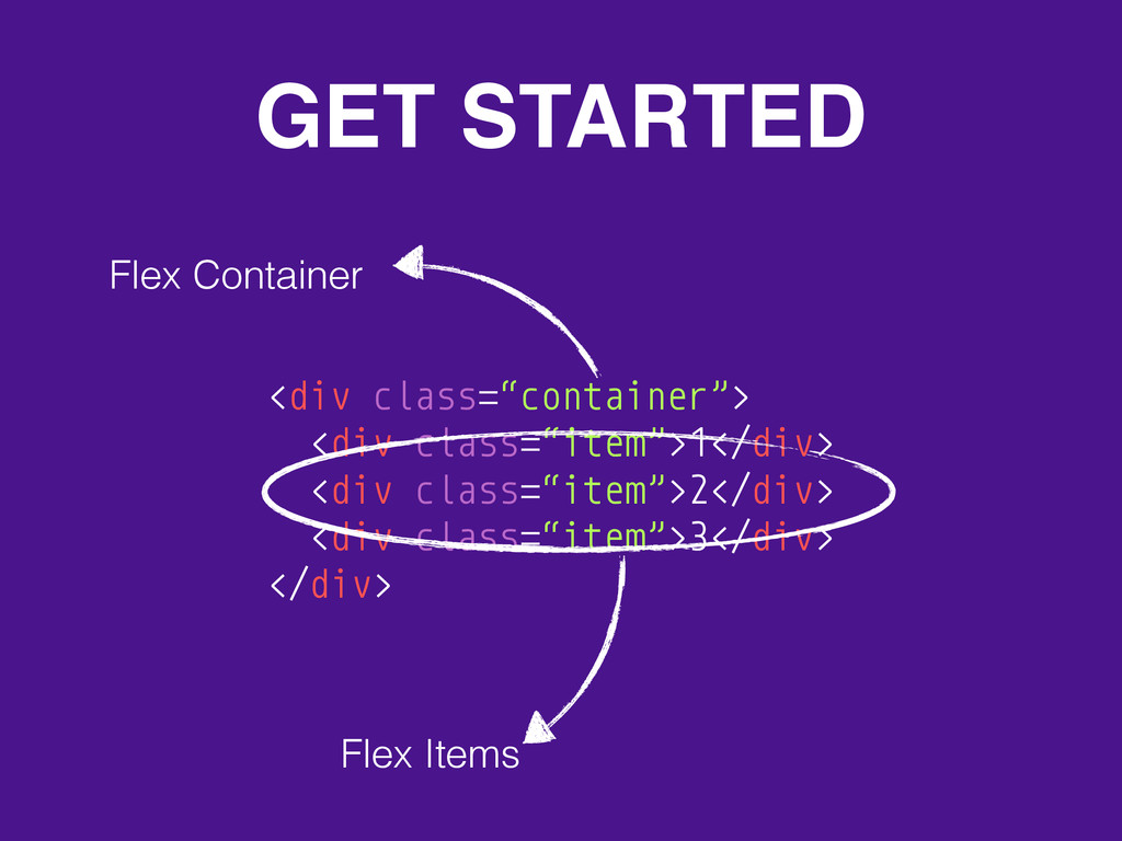
GET STARTED <div class=“container”> <div class=“item”>1</div> <div class=“item”>2</div> <div class=“item”>3</div>
</div> Flex Items Flex Container
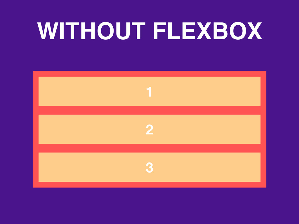
WITHOUT FLEXBOX 1 2 3
WITH FLEXBOX .container { display: flex; } 1 2 3
FLEX-CONTAINER PROPERTIES
flex-direction 1 2 3 row default 3 2 1 row-reverse
flex-direction 1 2 3 column 3 2 1 column-reverse
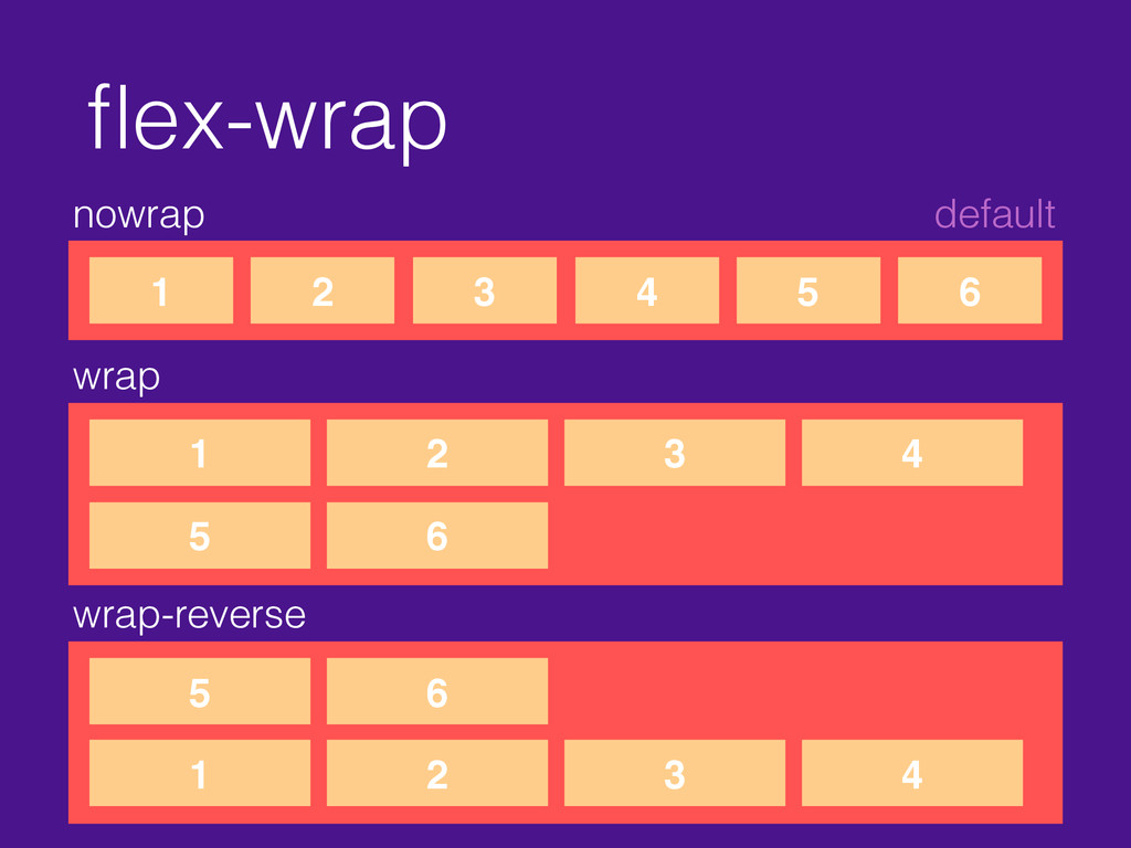
flex-wrap nowrap default 1 2 3 4 5 6 wrap
1 2 3 4 5 6 wrap-reverse 1 2 3 4 5 6
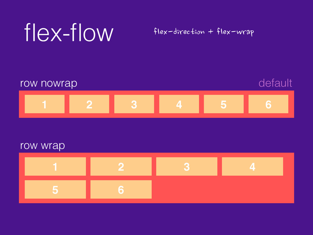
flex-flow row nowrap default 1 2 3 4 5 6
flex-direction
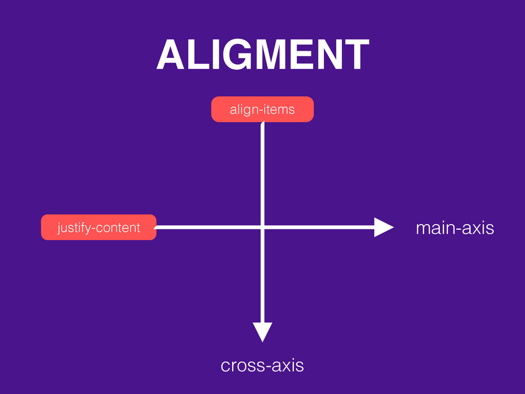
ALIGMENT align-items justify-content cross-axis main-axis
justify-content flex-start default 1 2 3 4 flex-end 1 2
3 4
justify-content center 1 2 3 4
justify-content space-between 1 2 3 4 space-around 1 2 3
4
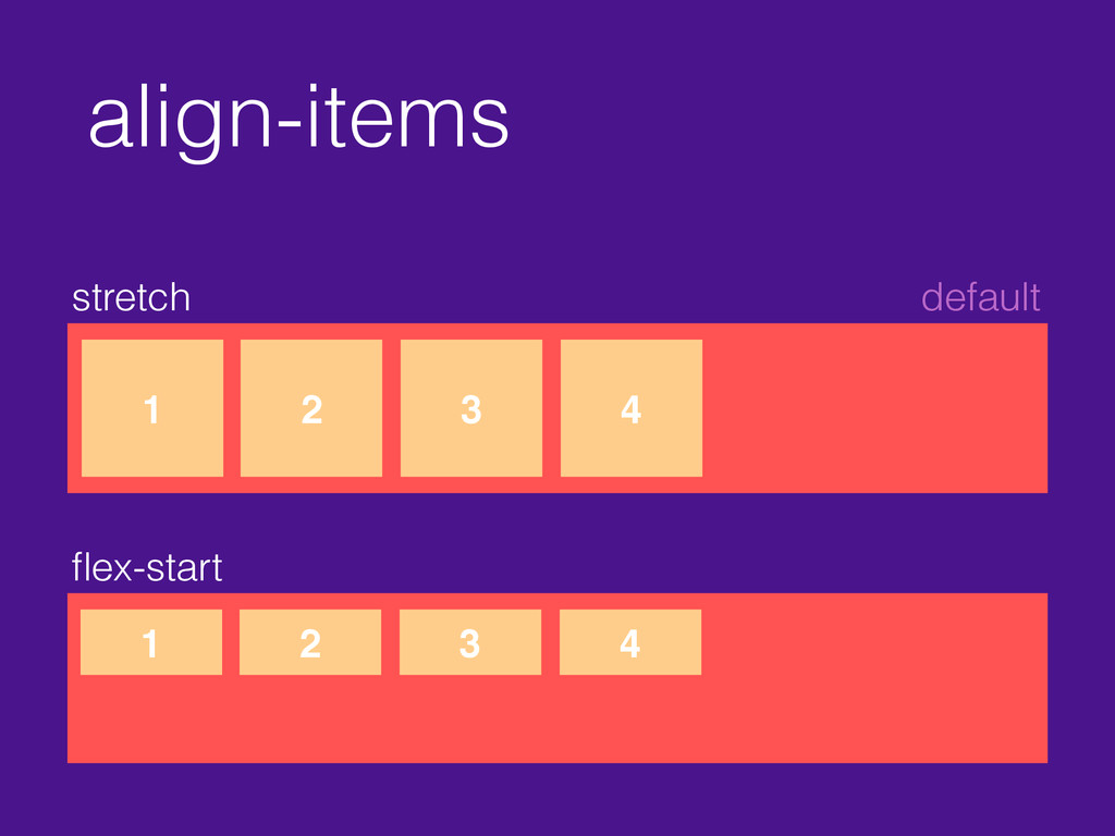
align-items stretch default 1 2 3 4 flex-start 1 2
3 4
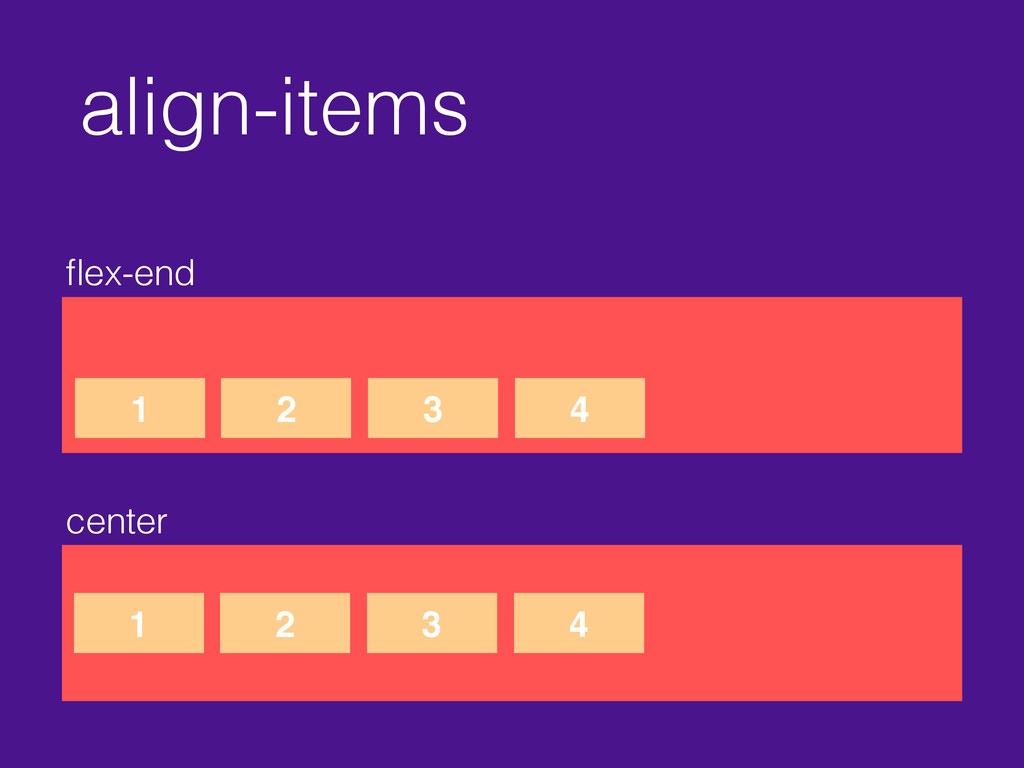
align-items flex-end center 1 2 3 4 1 2 3
4
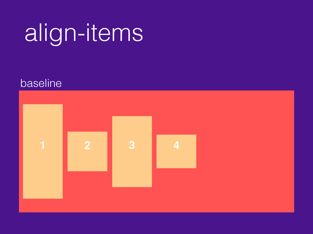
align-items baseline 1 2 3 4
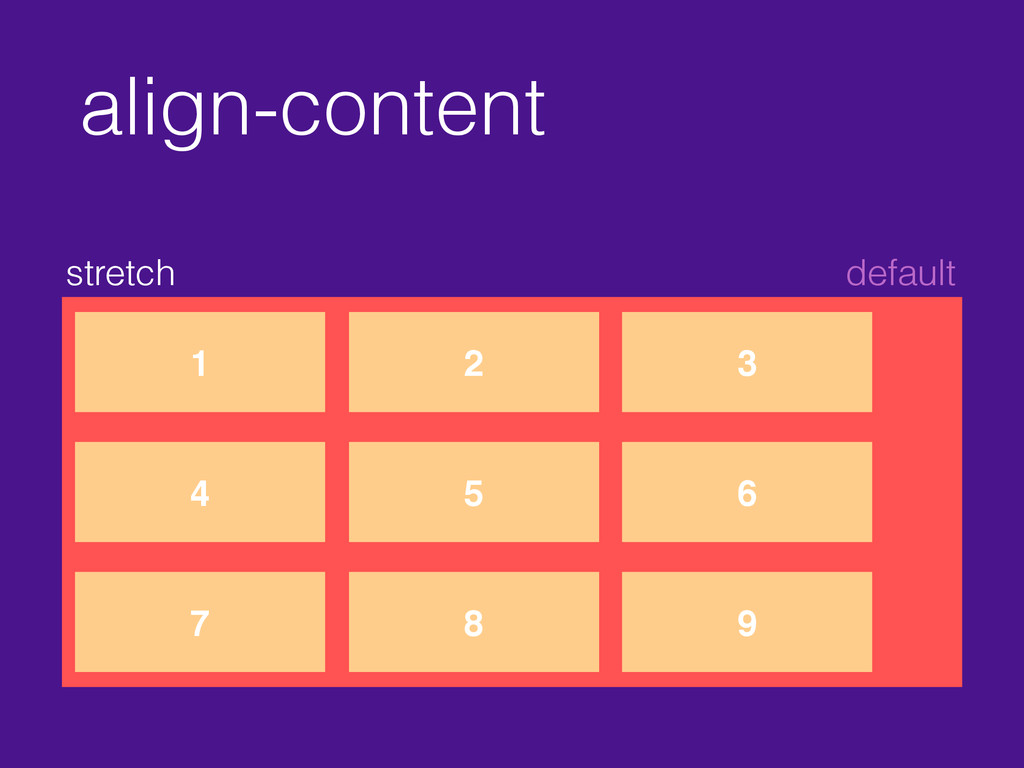
align-content stretch default 1 2 3 4 5 6 7
8 9
align-content flex-start 1 2 3 4 5 6 7 8
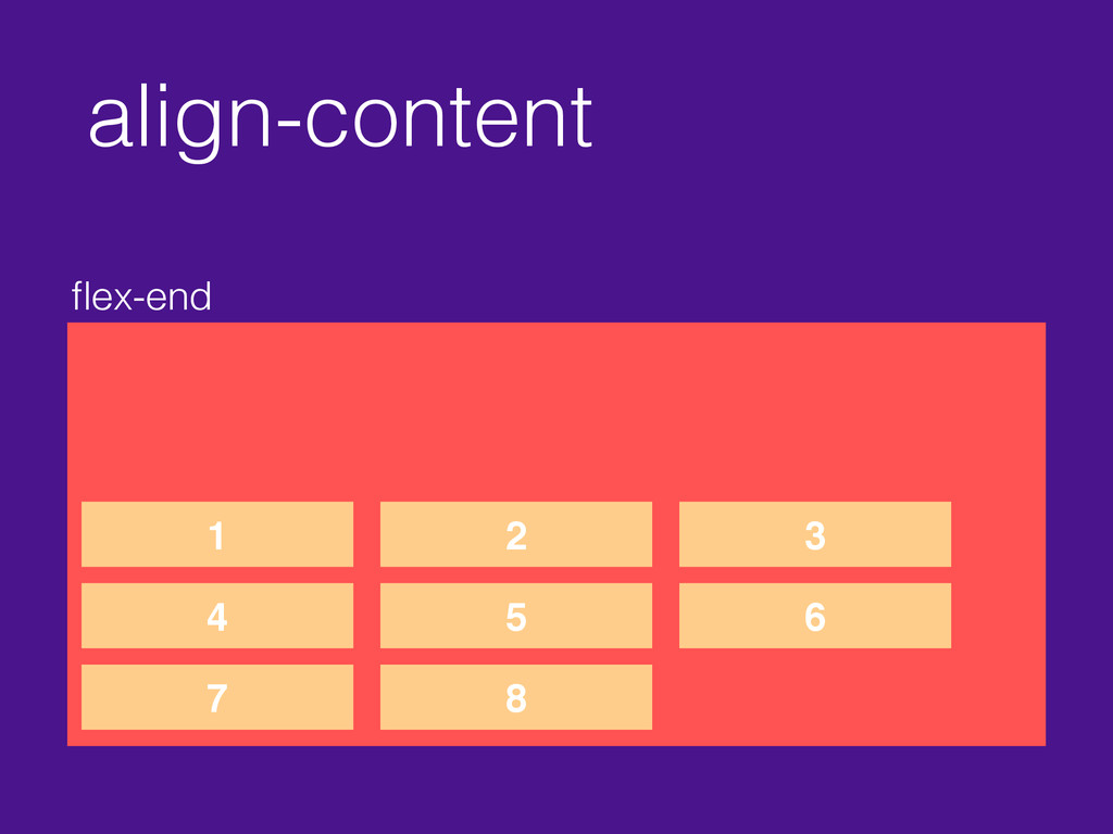
align-content flex-end 1 2 3 4 5 6 7 8
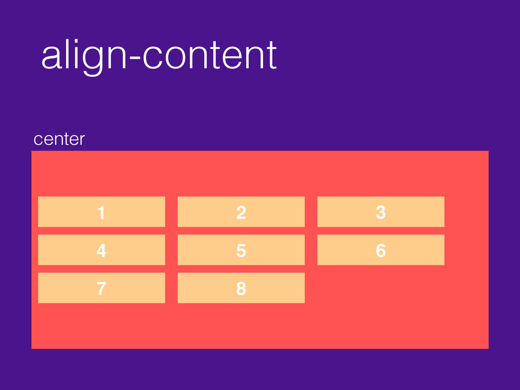
align-content center 1 2 3 4 5 6 7 8
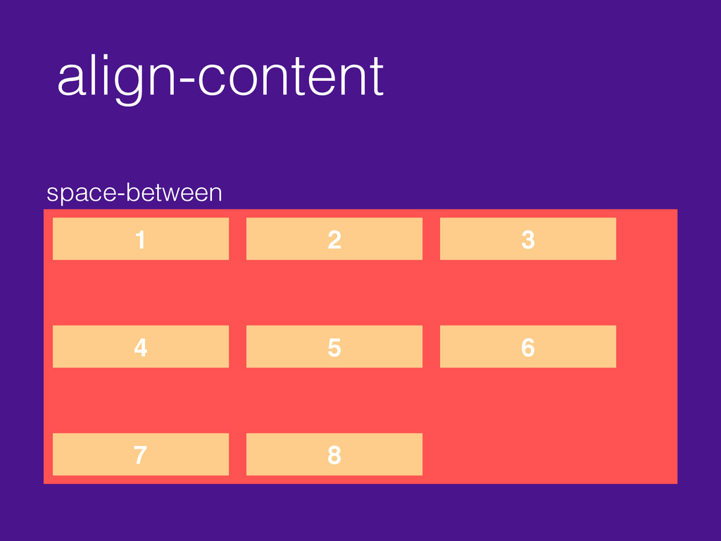
align-content space-between 1 2 3 4 5 6 7 8
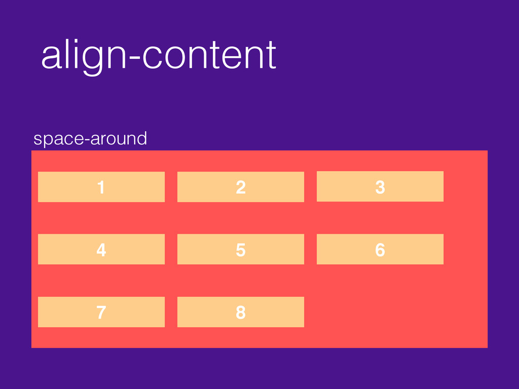
align-content space-around 1 2 3 4 5 6 7 8
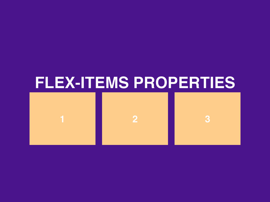
1 2 3 FLEX-ITEMS PROPERTIES
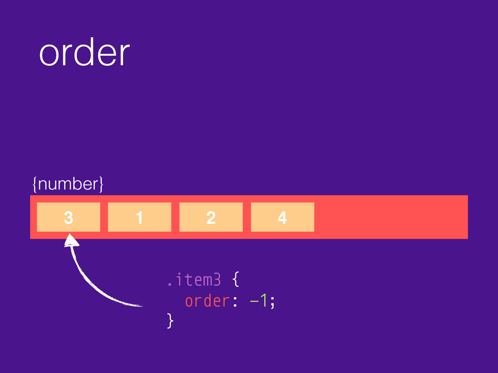
order {number} 3 1 2 4 .item3 { order: -1;
}
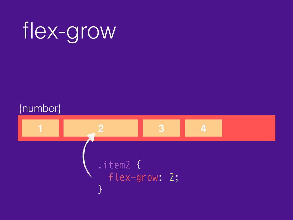
flex-grow {number} 1 2 3 4 .item2 { flex-grow: 2;
}
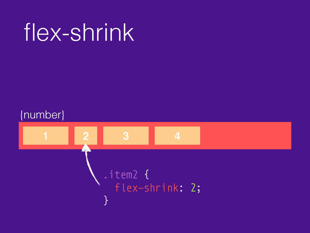
flex-shrink {number} 1 2 3 4 .item2 { flex-shrink: 2;
}
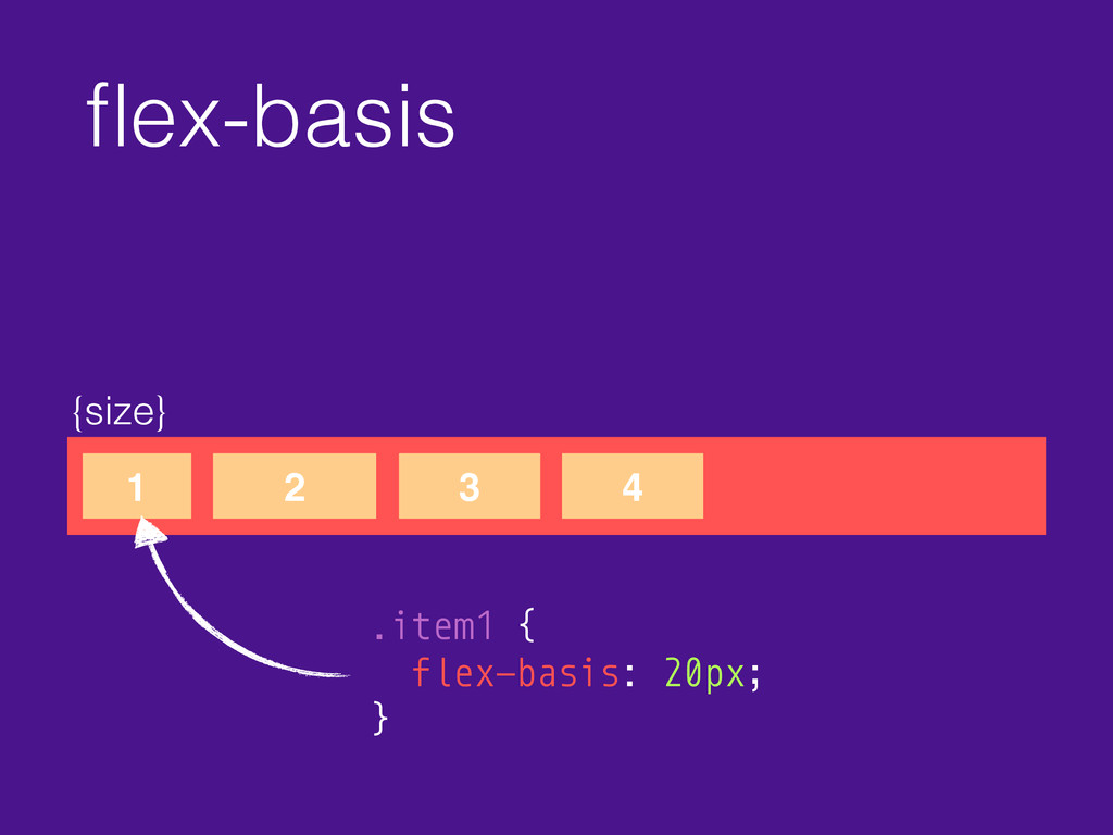
flex-basis {size} 1 2 3 4 .item1 { flex-basis: 20px;
}
flex {number} 1 2 3 4 .item { flex: 0
1 auto; } flex-grow
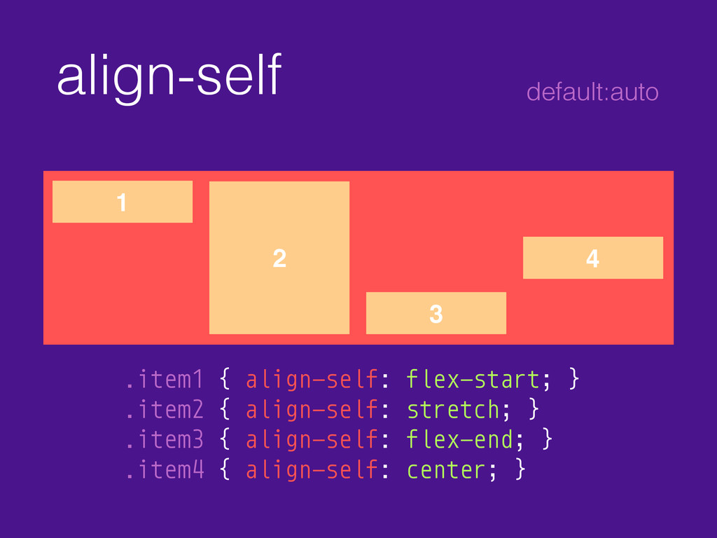
align-self 1 2 3 4 .item1 { align-self: flex-start; }
.item2 { align-self: stretch; } .item3 { align-self: flex-end; } .item4 { align-self: center; } default:auto
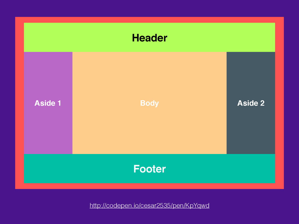
Header Footer Body Aside 1 Aside 2 http://codepen.io/cesar2535/pen/KpYqwd
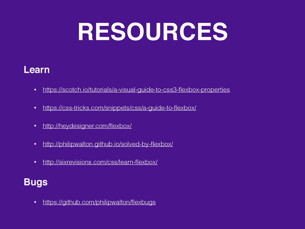
RESOURCES Learn • https://scotch.io/tutorials/a-visual-guide-to-css3-flexbox-properties • https://css-tricks.com/snippets/css/a-guide-to-flexbox/ • http://heydesigner.com/flexbox/ • http://philipwalton.github.io/solved-by-flexbox/
• http://sixrevisions.com/css/learn-flexbox/ Bugs • https://github.com/philipwalton/flexbugs
Question? THANK!
 cesar2535
 broadleaf
 pkshadeck
 tooppoo
 philipschwarz
 iidatakuma
 akihisaikeda
 mizchi
 tomoyk
 tk3fftk
 pizzacat83
 minodriven
 guaca
guaca
 uxyall
 sugarenia
 soudai
 aleyda
 ivargrimstad
 speakerdeck
 palkan
 jnunemaker
 kimpetersen
 productmarketing
 sabderemane