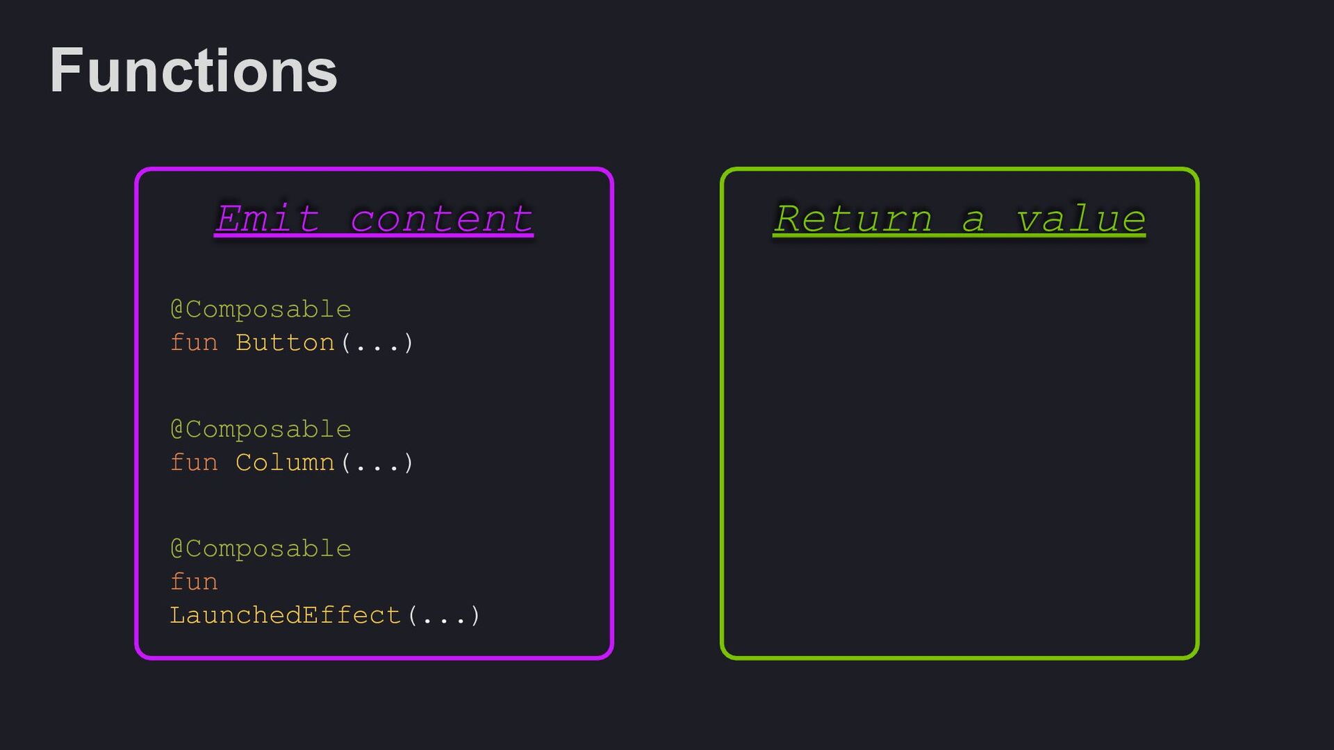
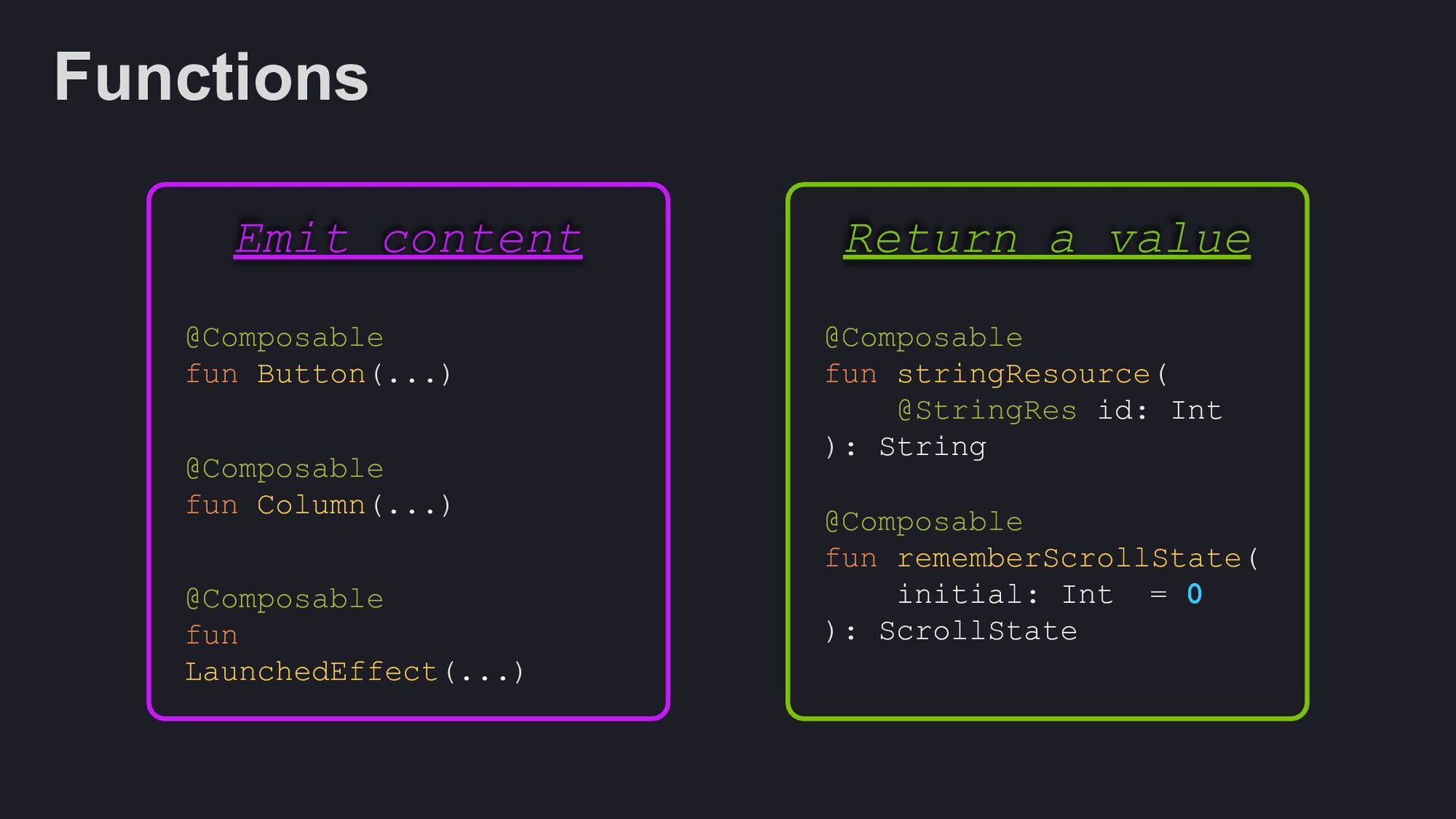
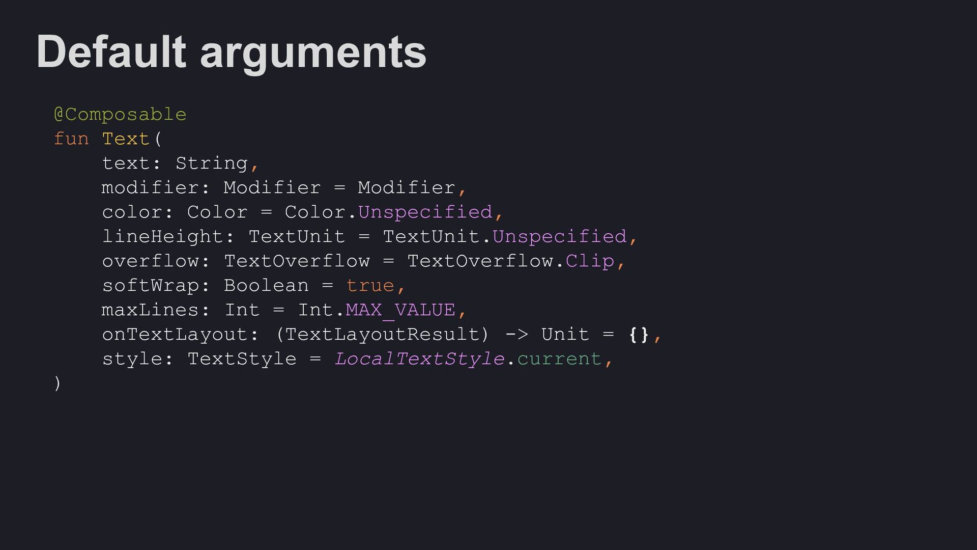
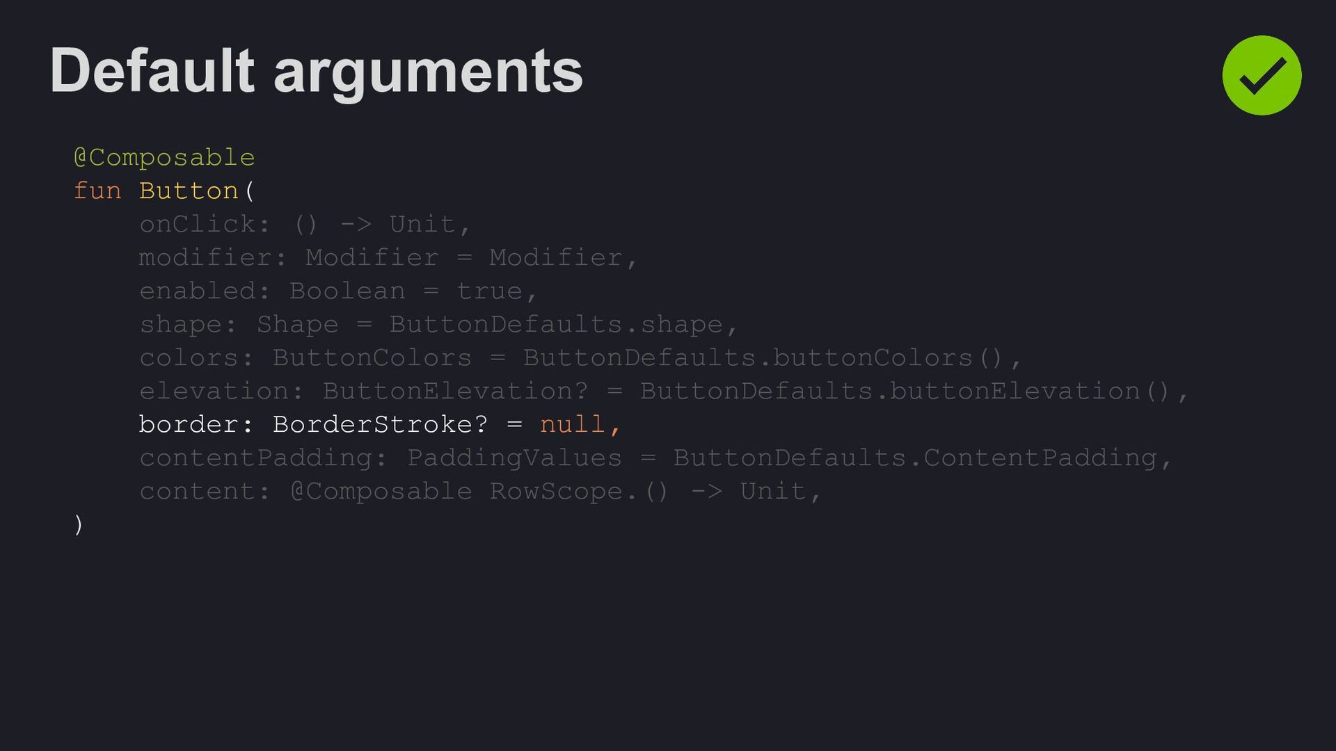
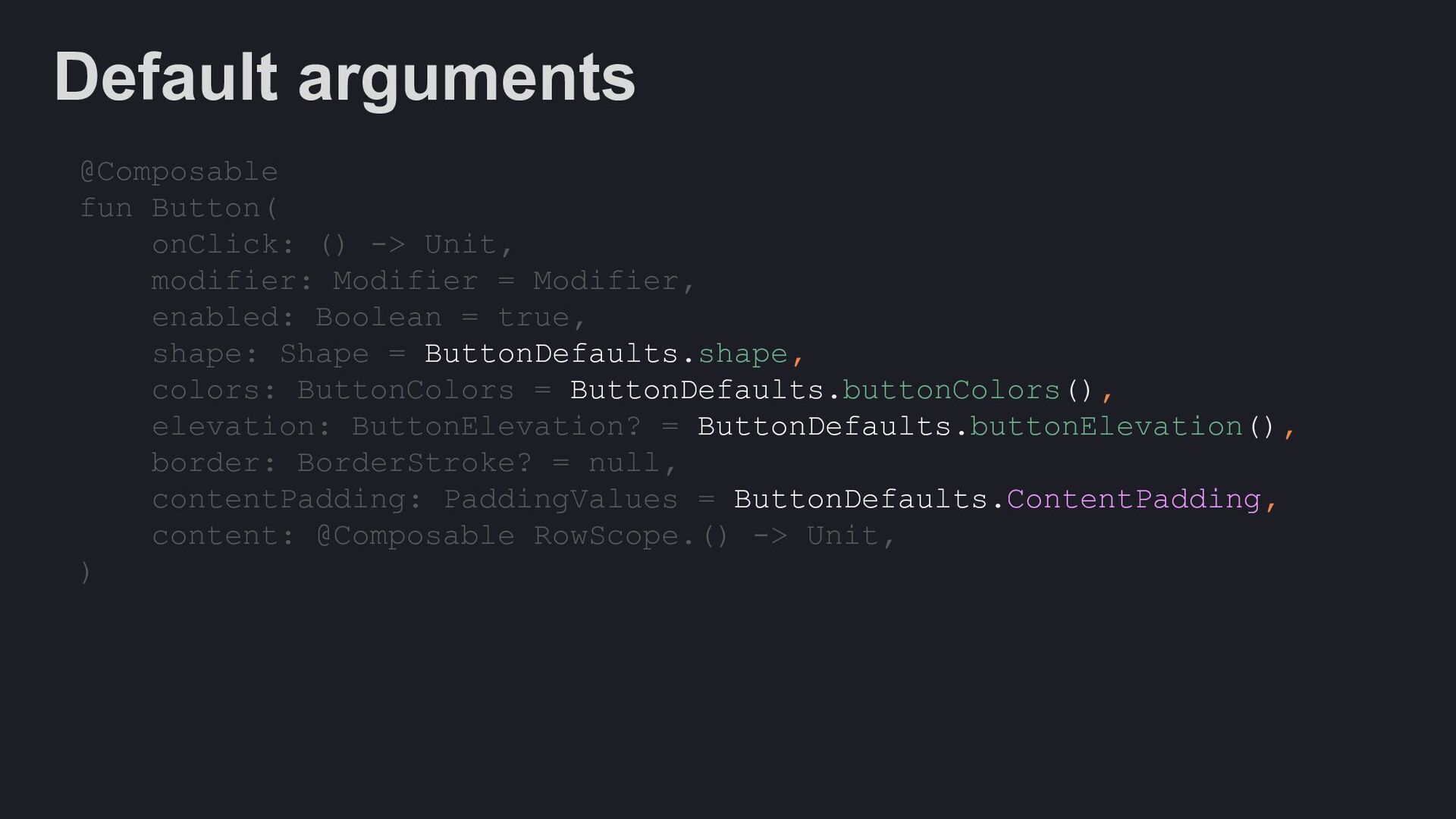
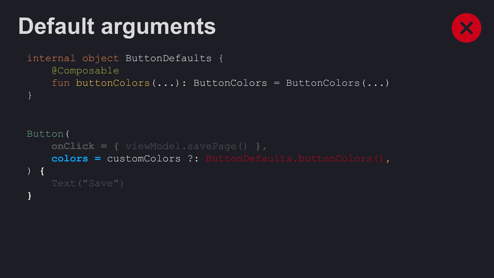
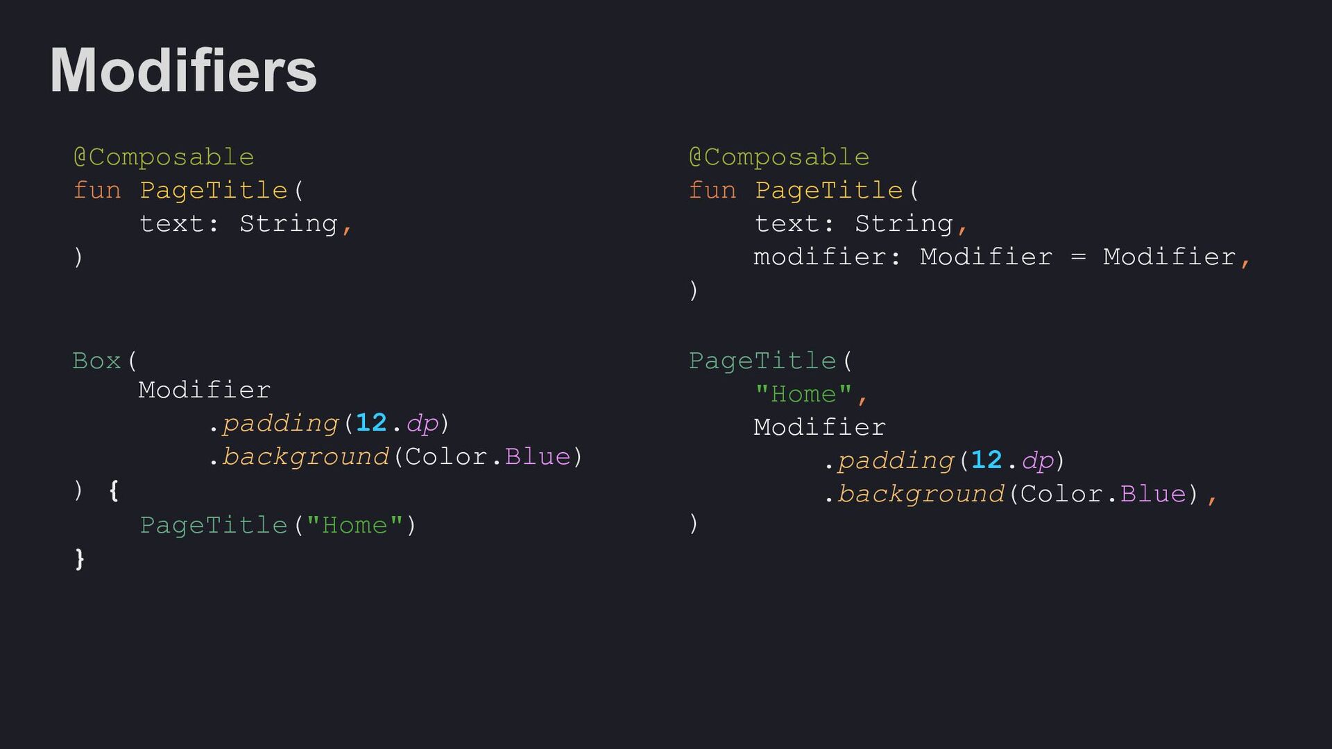
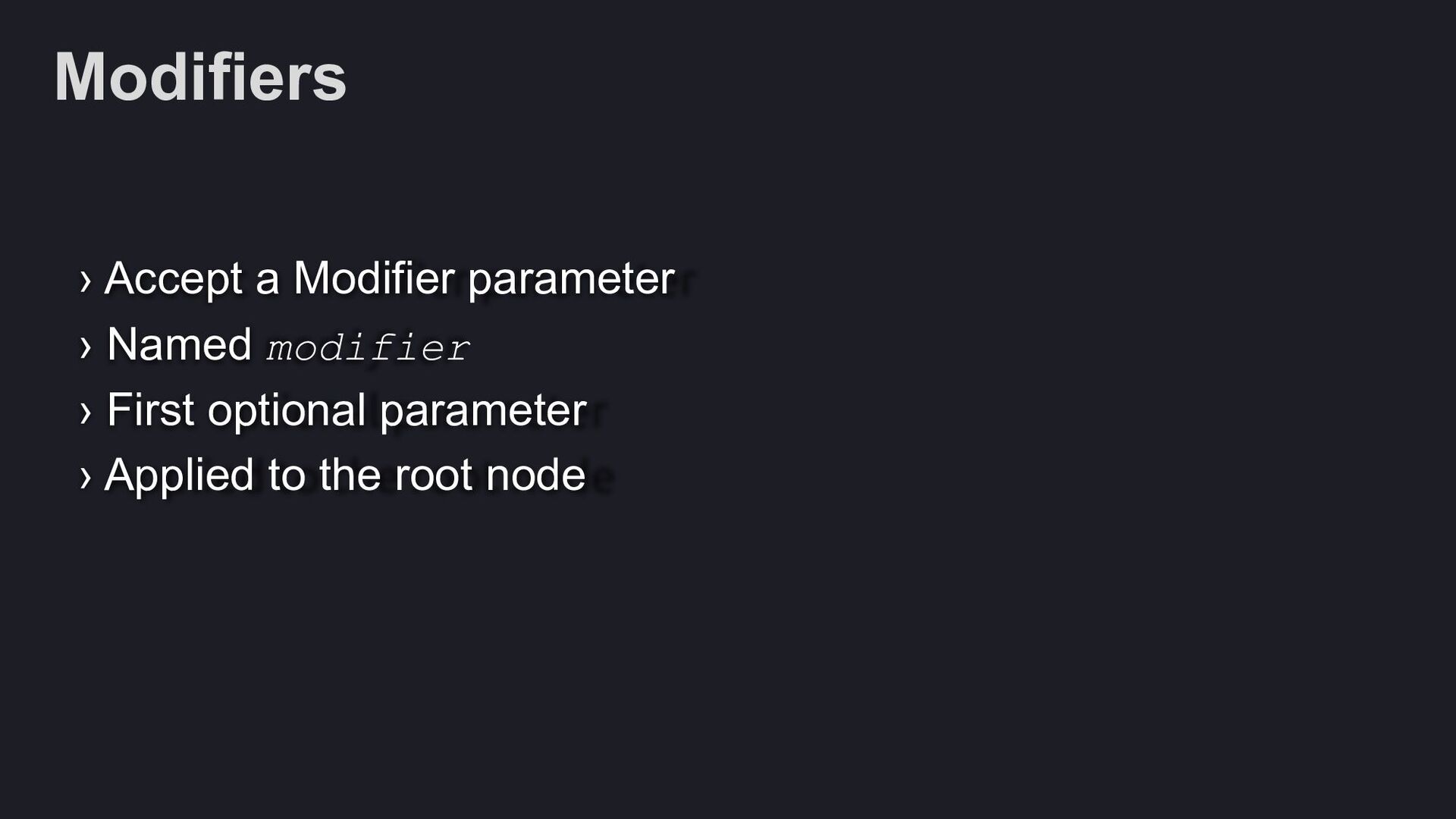
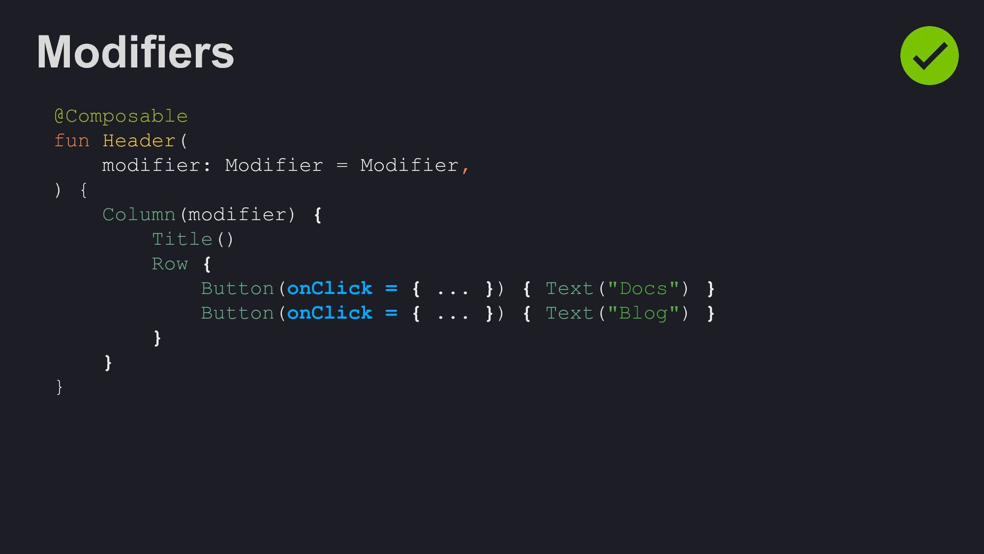
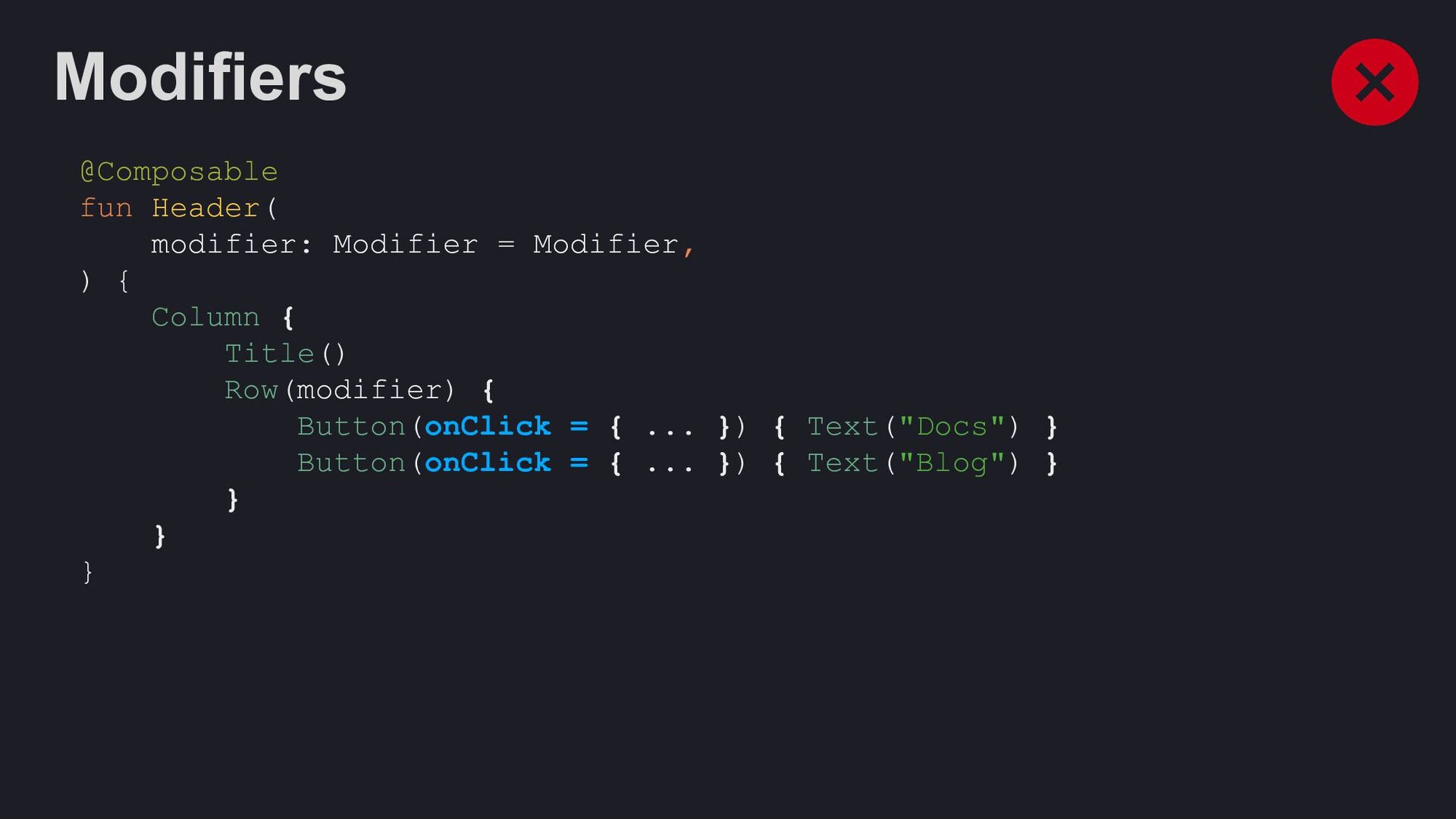
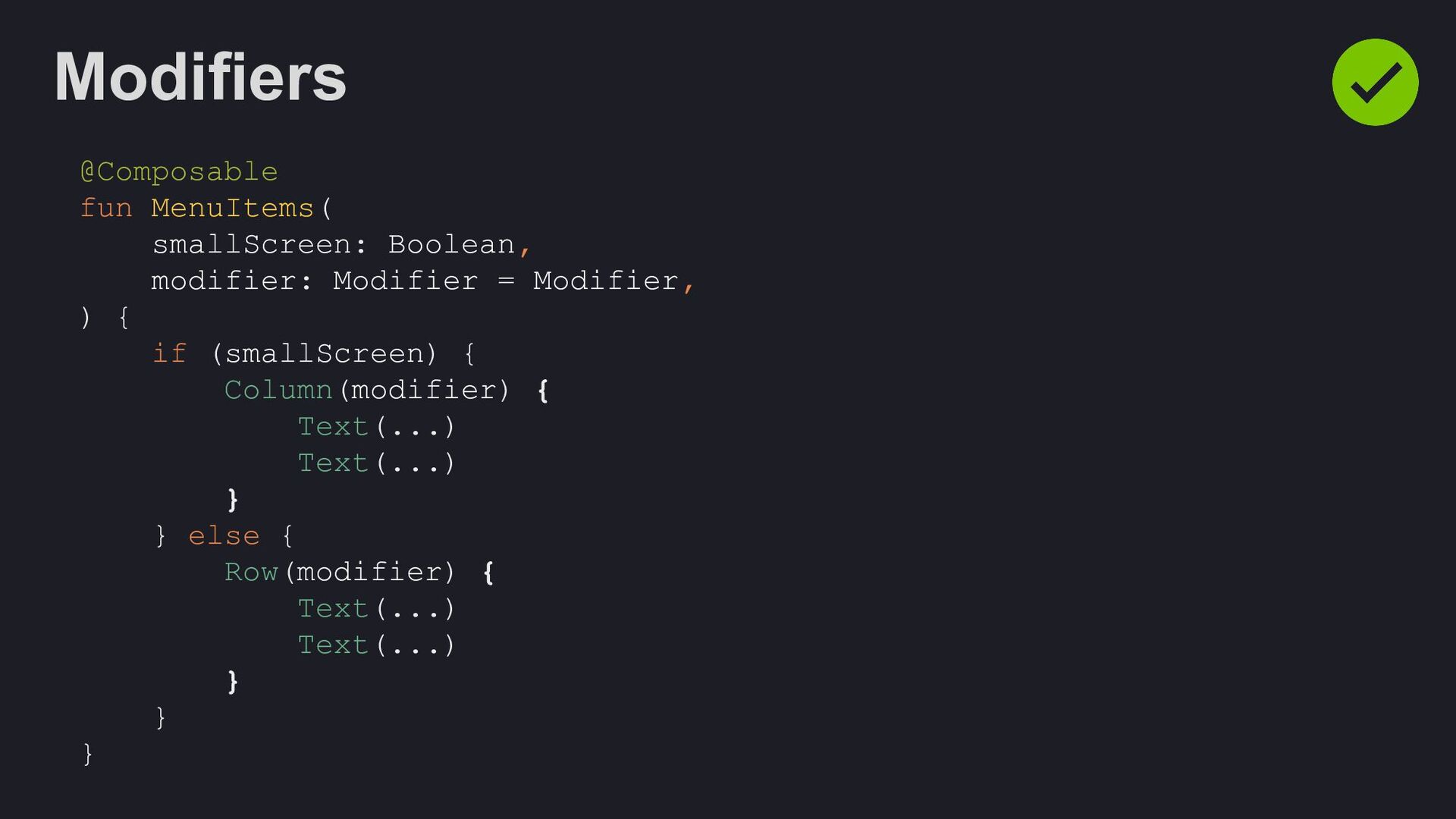
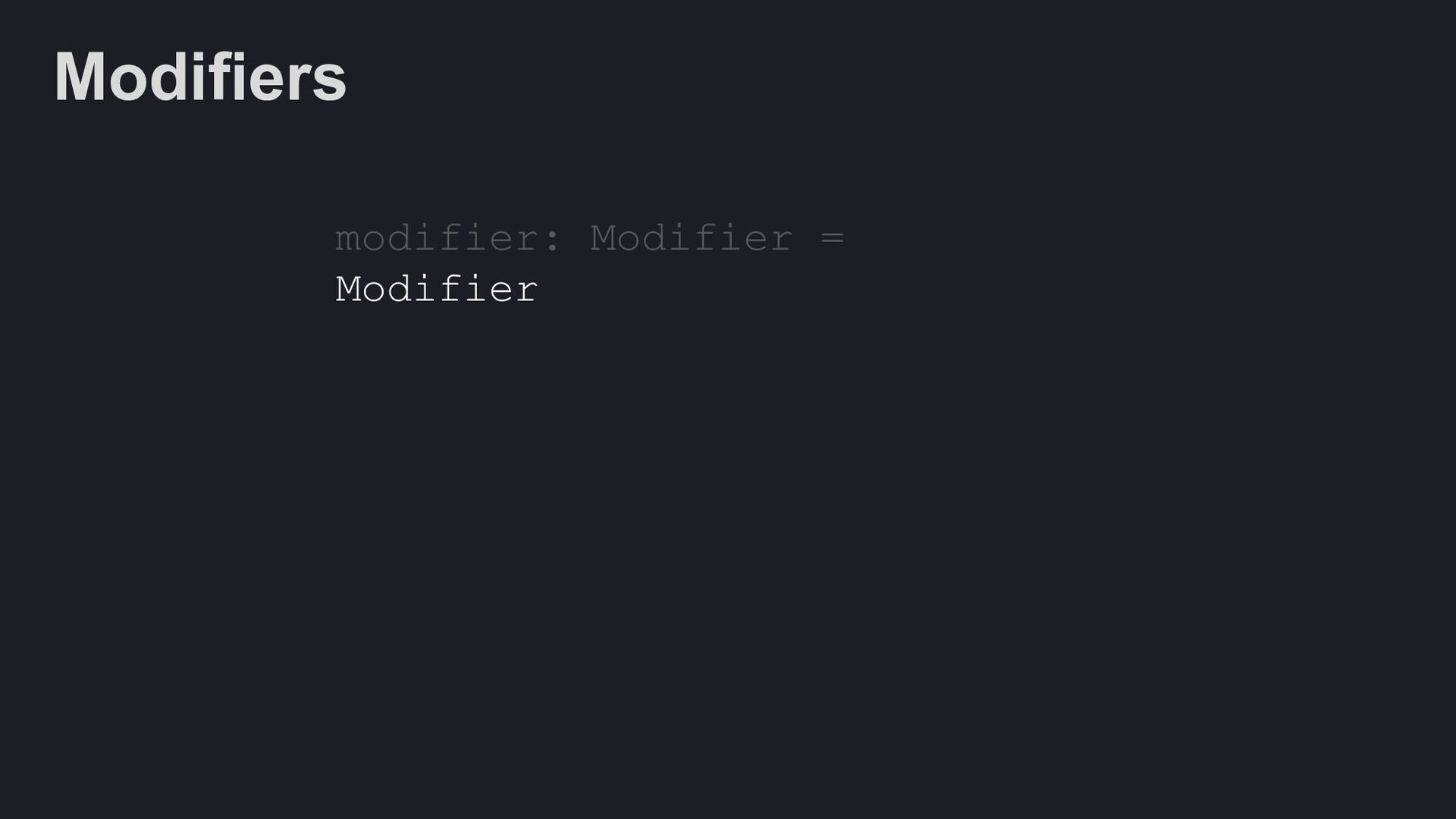
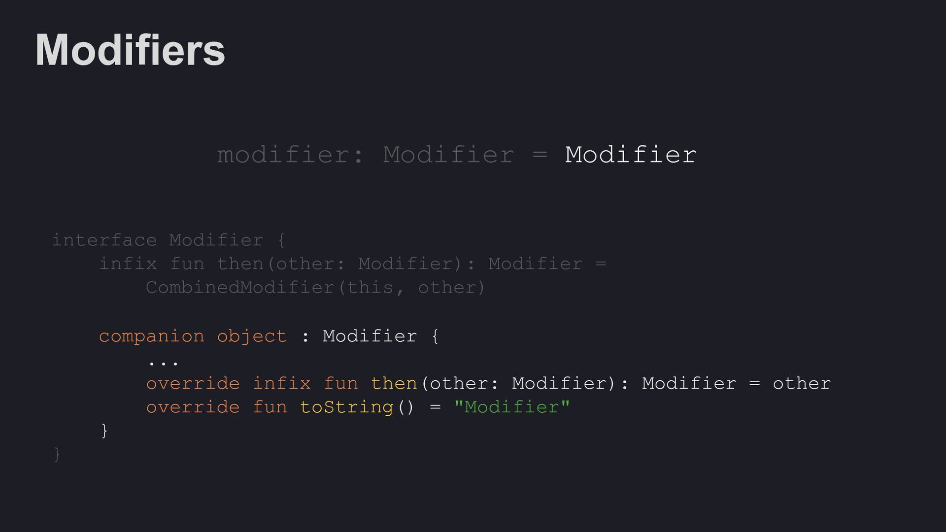
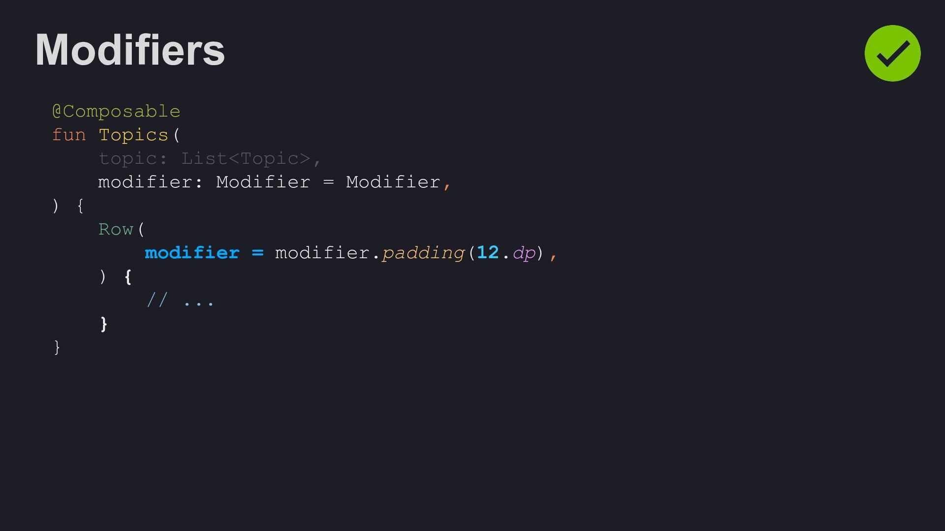
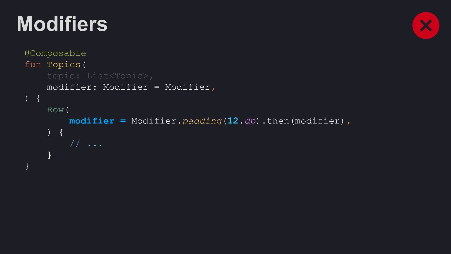
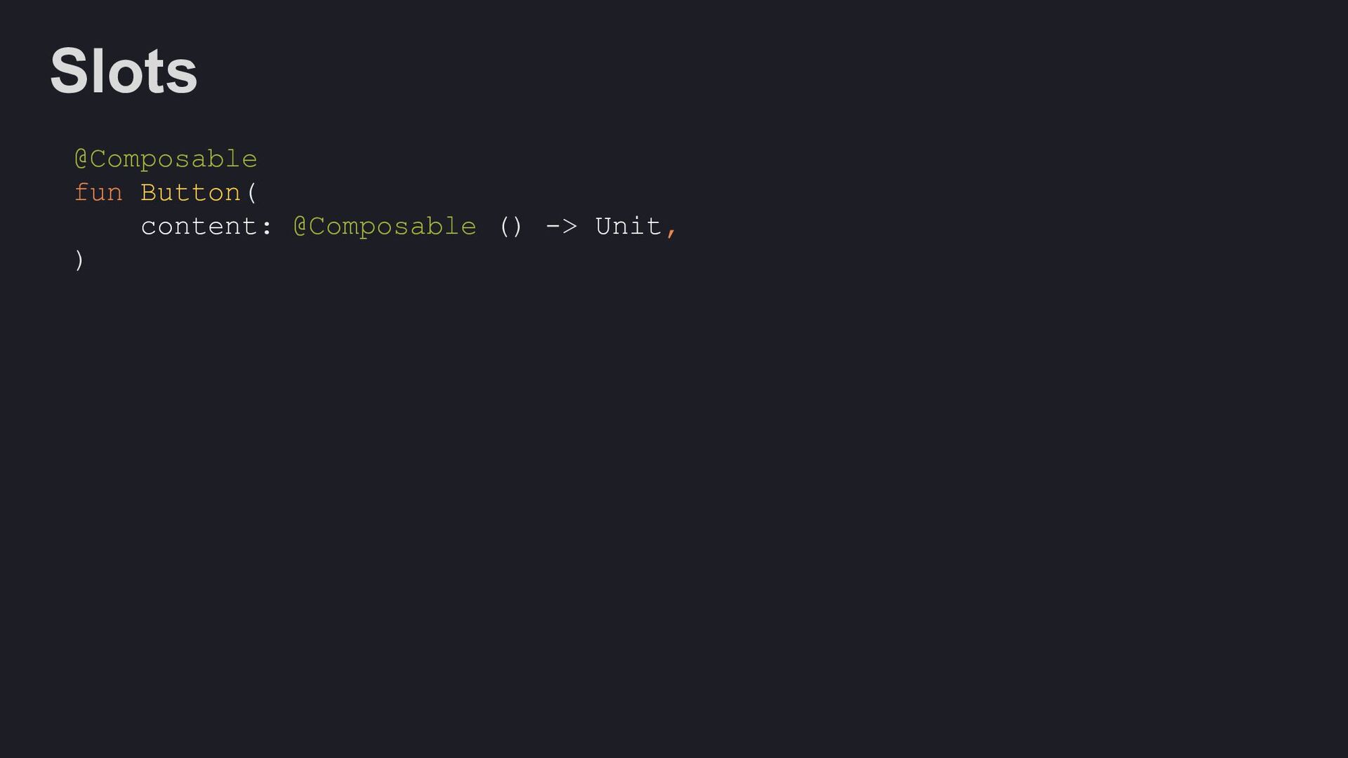
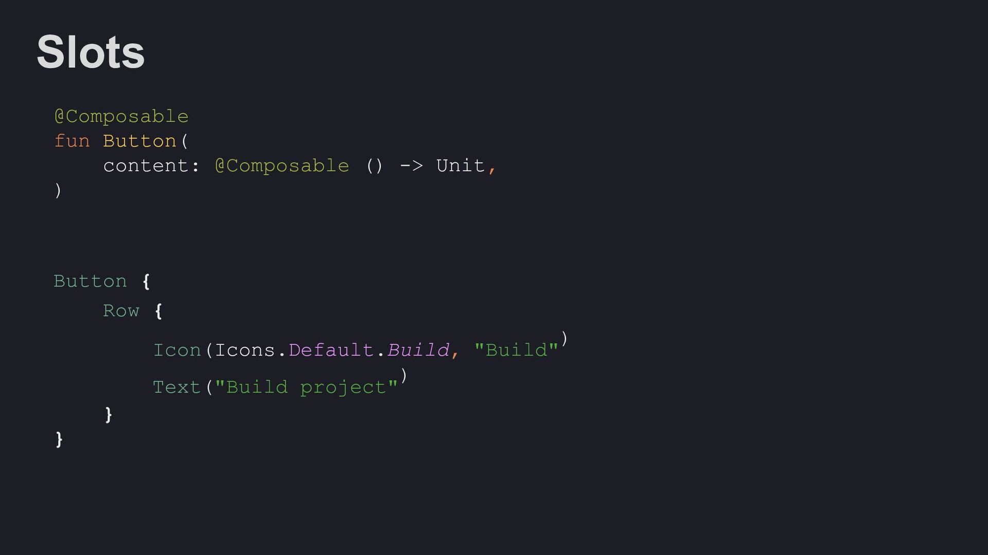
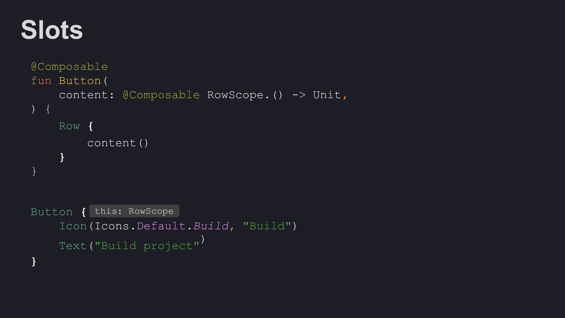
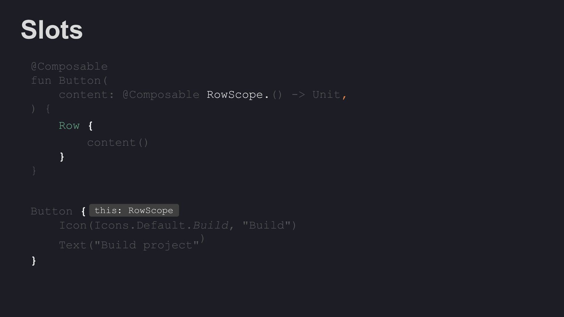
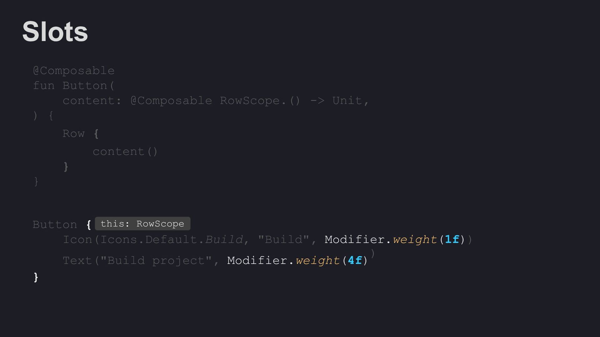
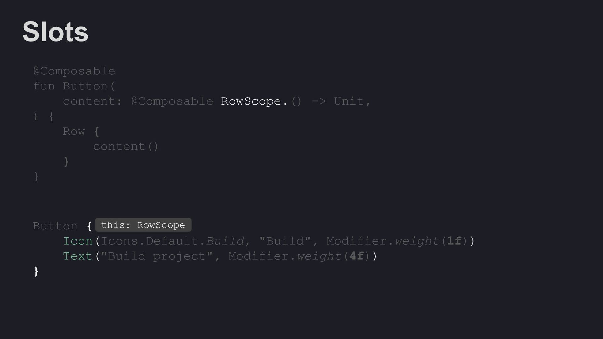
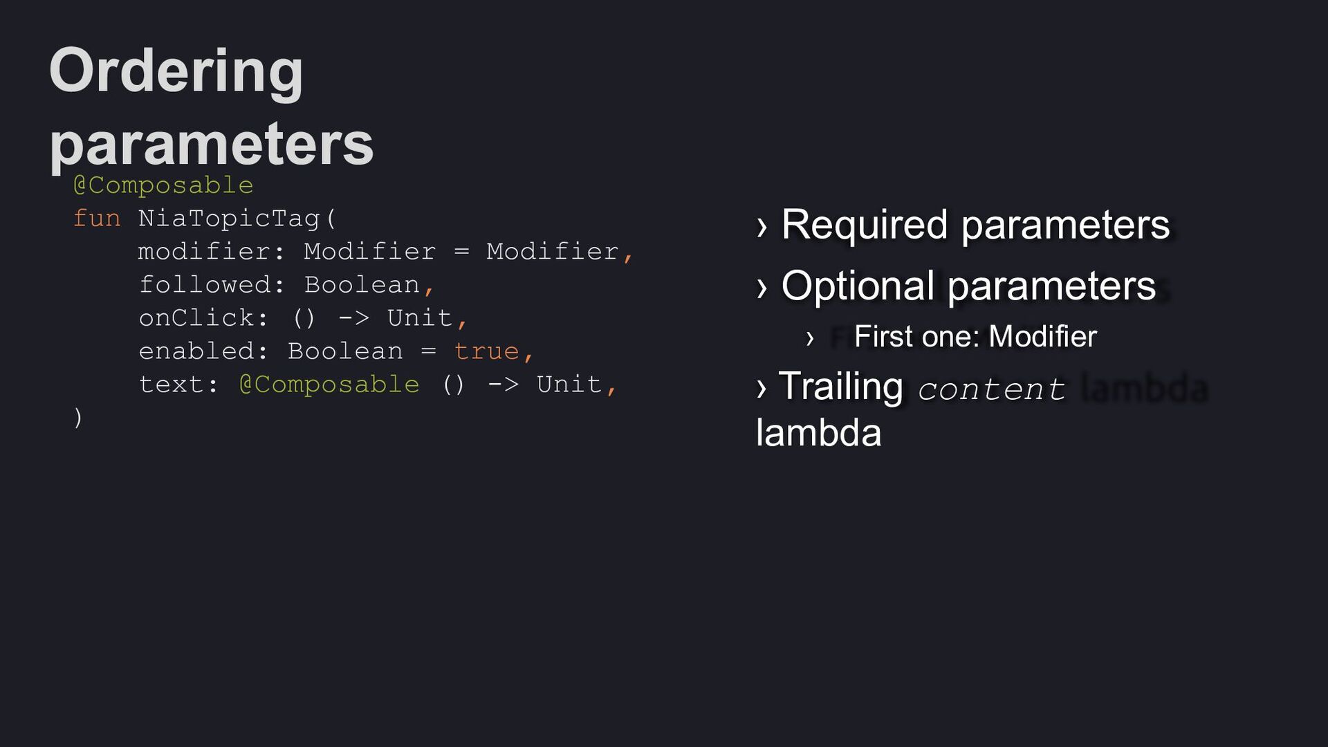
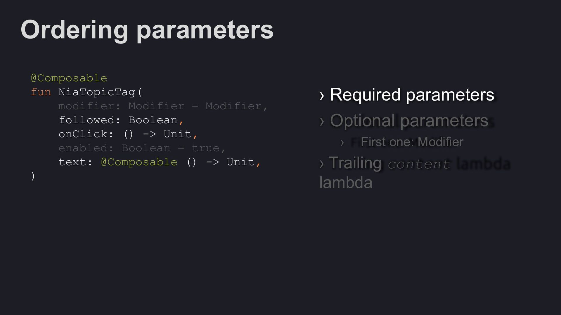
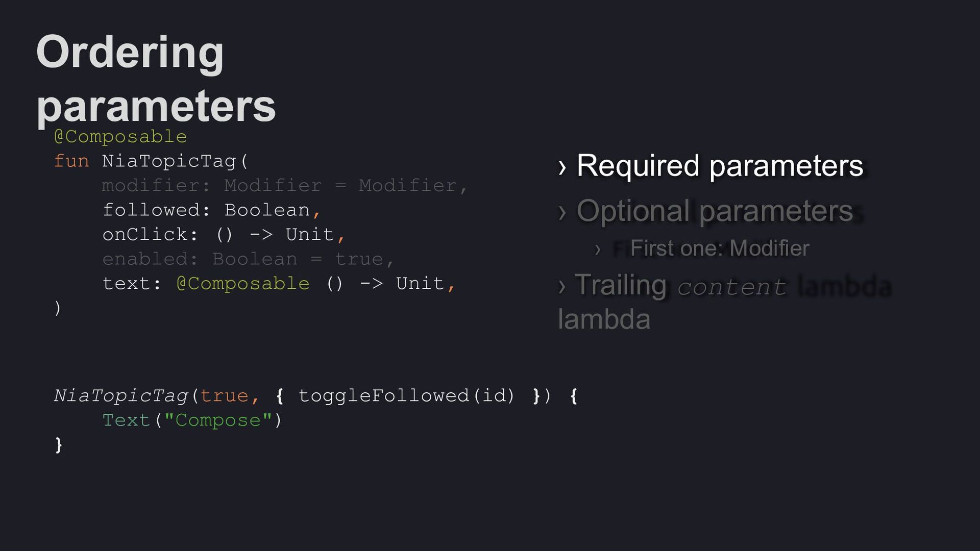
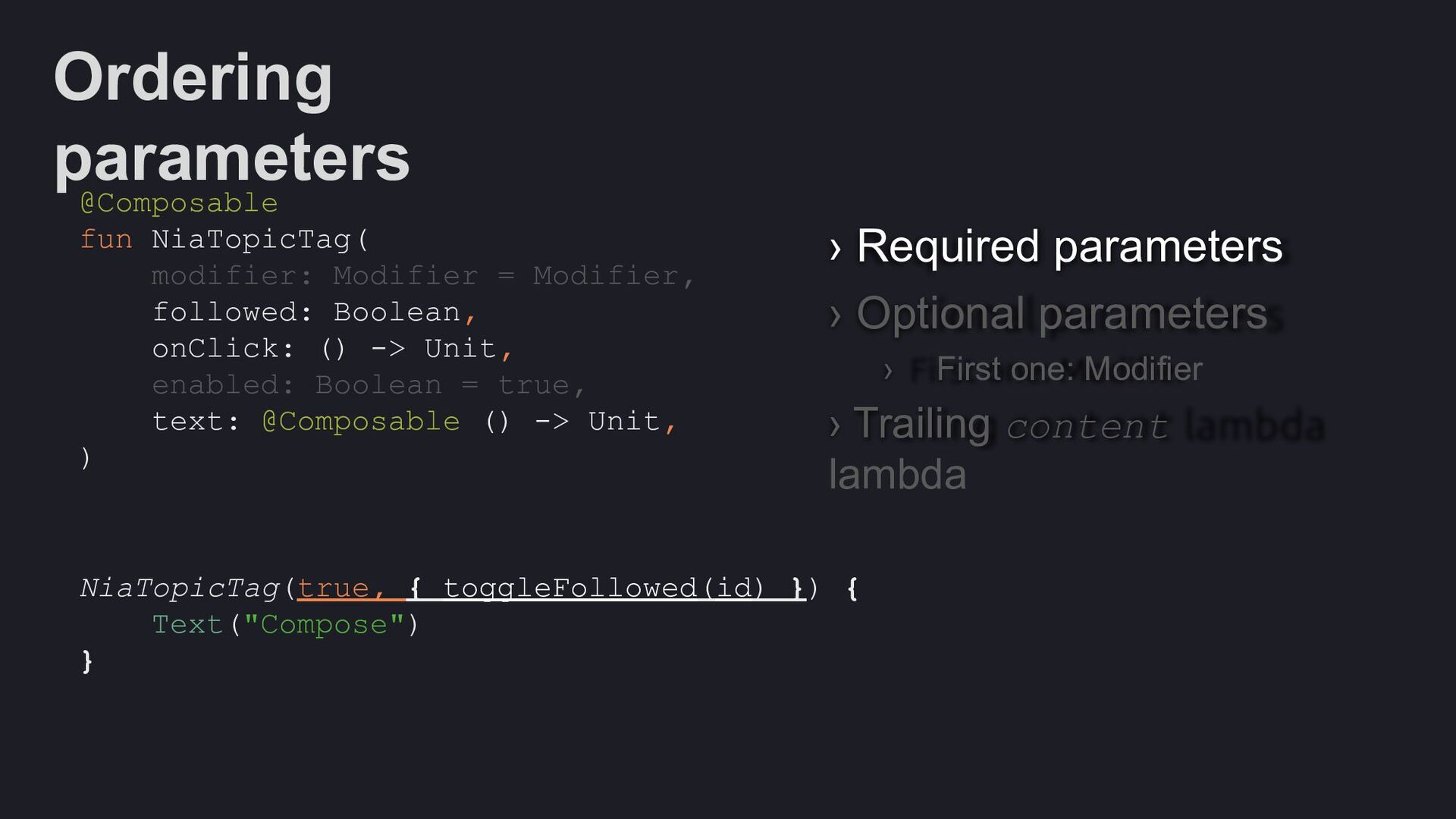
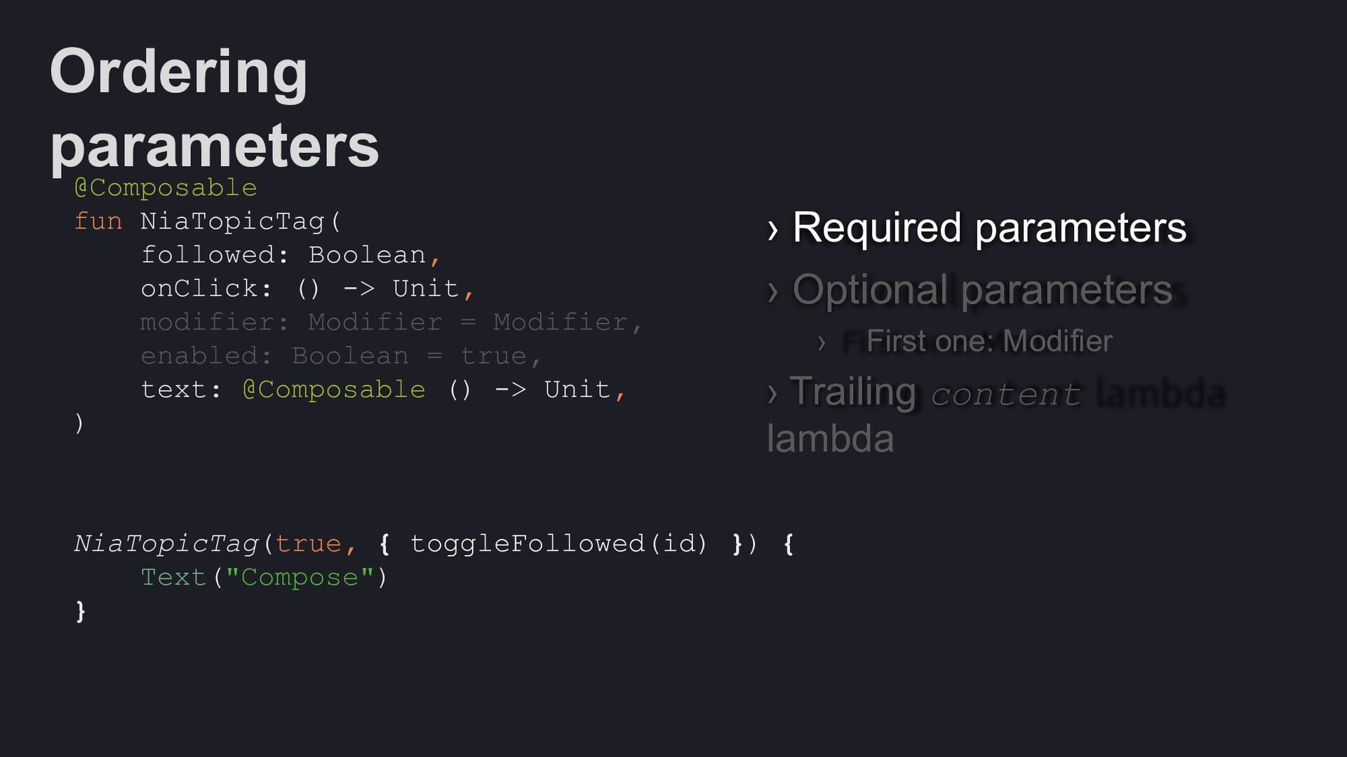
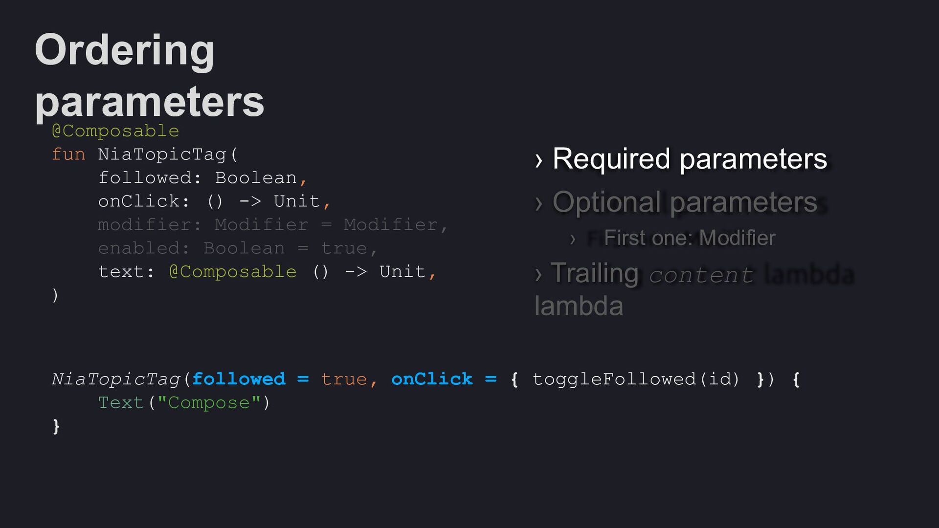
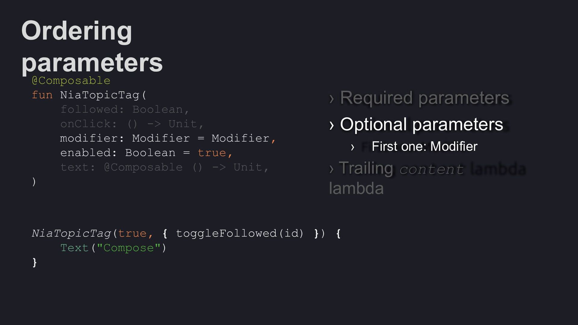
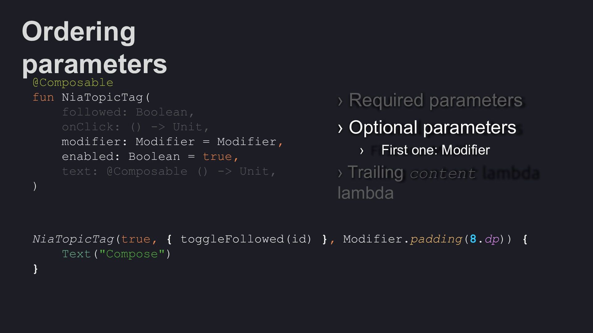
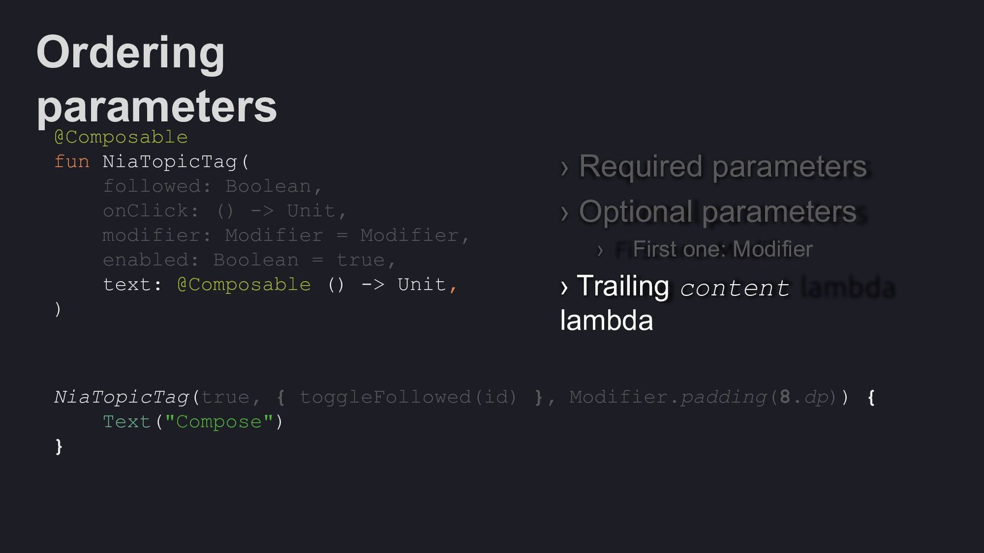
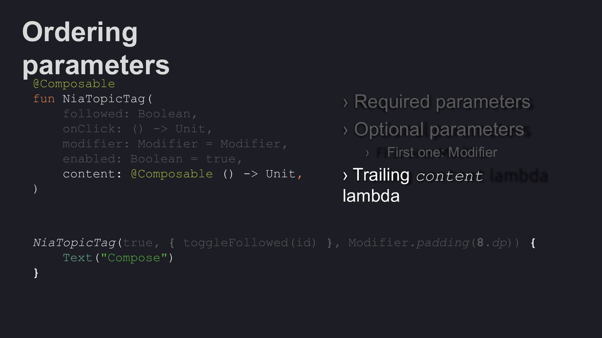
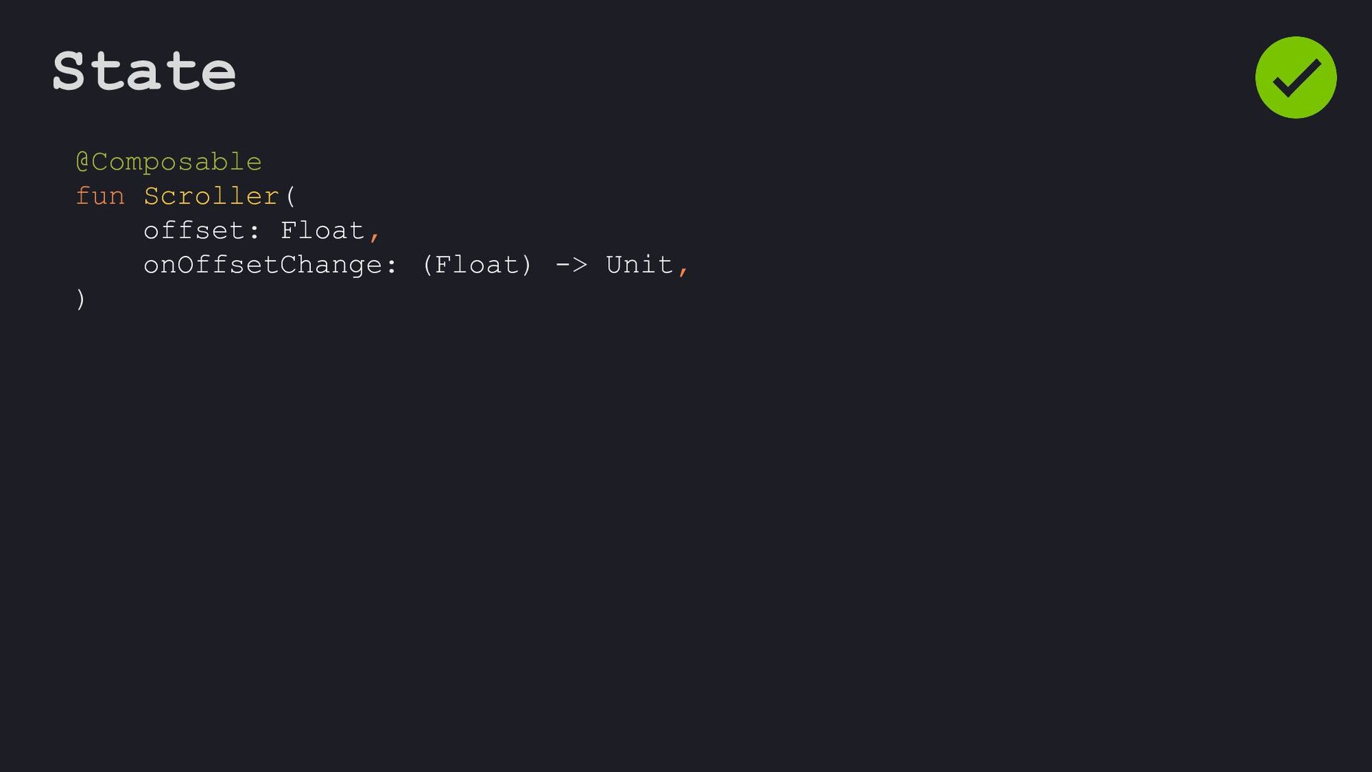
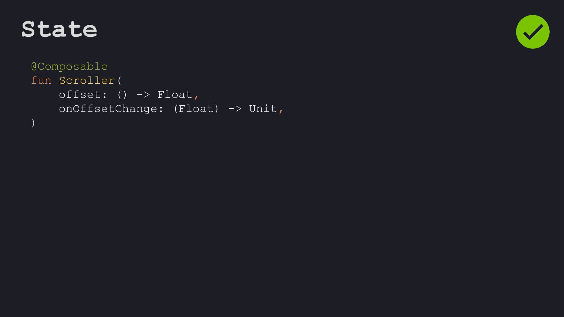
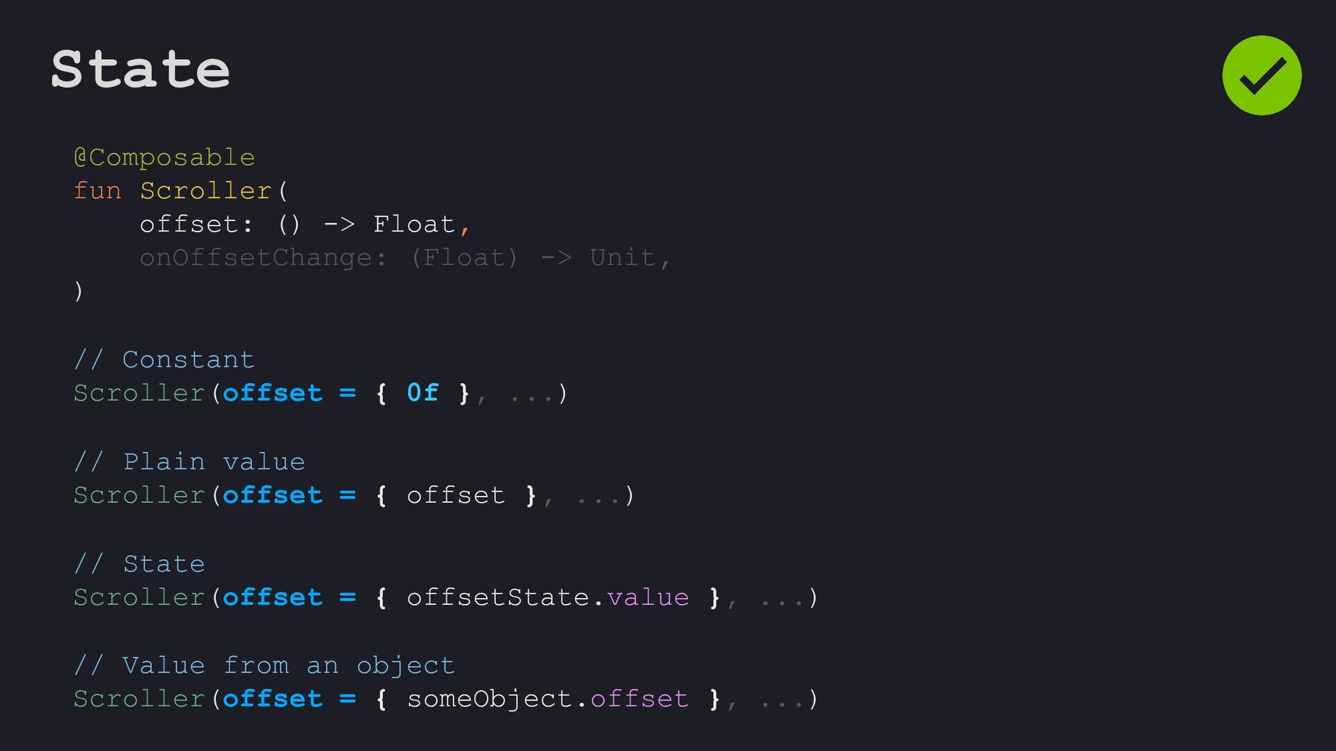
Modifier = Modifier, enabled: Boolean = true, shape: Shape = ButtonDefaults.shape, colors: ButtonColors = ButtonDefaults.buttonColors(), elevation: ButtonElevation? = ButtonDefaults.buttonElevation(), border: BorderStroke? = null, contentPadding: PaddingValues = ButtonDefaults.ContentPadding, content: @Composable RowScope.() -> Unit, )
 devbrian
 bryan
bryan
 jonyablonski
 productmarketing
 charlesmeaden
 baasie
 aleyda
 cassininazir
 rasmusluckow
 ianozsvald
.png) helenjbeal
helenjbeal
 tammyeverts