Share
Embed
Sizes Matter! - How to handle different screen sizes on Android (using Jetpack Compose)
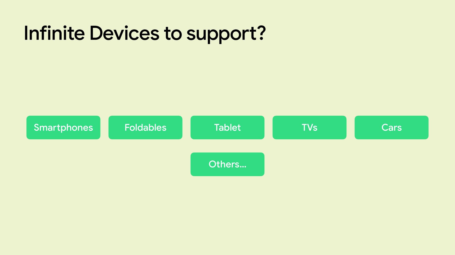
Nowadays, the variety of Android devices proliferates: smartphones, tablets, foldables, desktops, TVs, watches, even cars and we as Android developers are faced with the challenge of supporting all (or almost all) of these types of form factories.
android:screenOrientation="portrait"'s time is (or should be) over.
In this talk we will learn about window size classes, what they are, how they are defined and how they can help us solve the thorny problem of not knowing in advance the space on which an app will run.
Furthermore, there will be a live coding part of what I explained during the talk.
Fabio Catinella
April 26, 2025
Transcript
67 slides
-
Fabio Catinella Senior Android Developer @ Var Group Sizes matter!
How to handle di ff erent screen sizes on Android (using Jetpack Compose) -
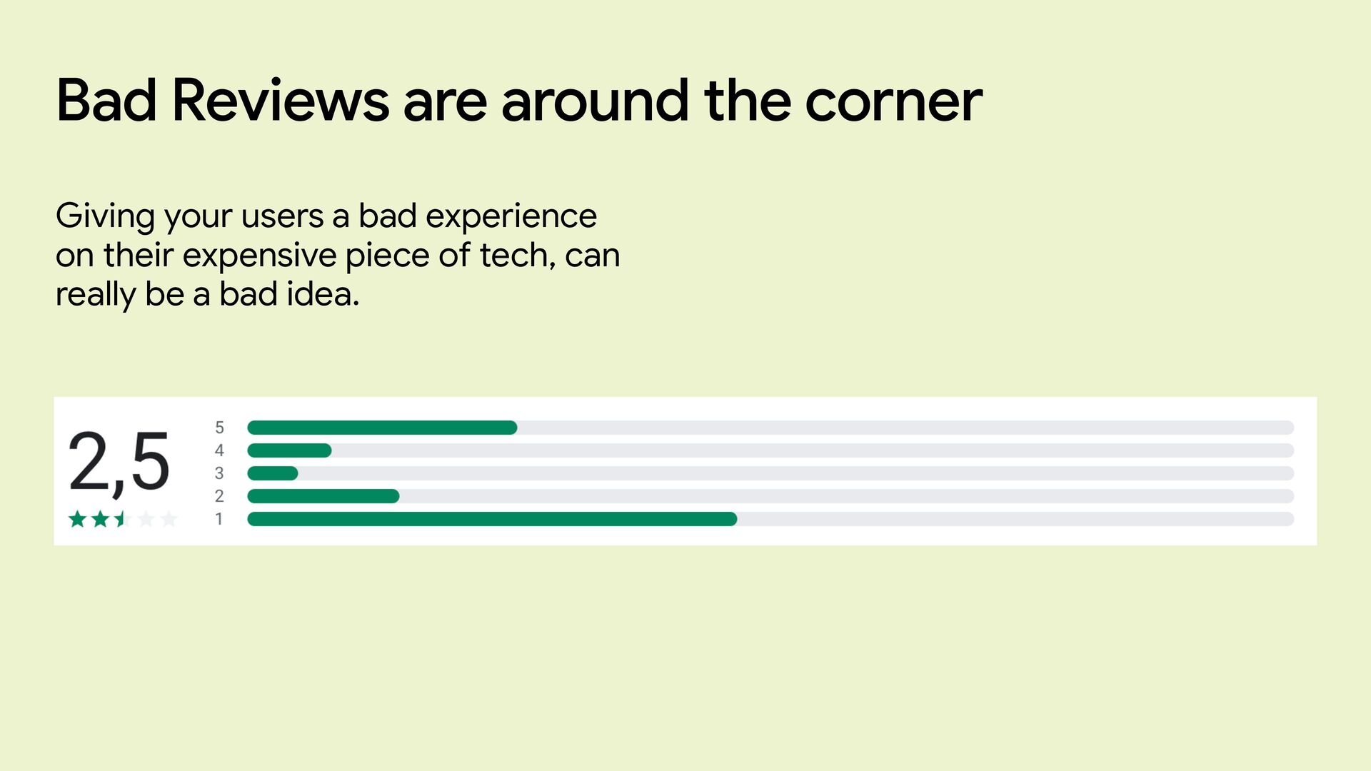
Bad Reviews are around the corner Giving your users a
bad experience on their expensive piece of tech, can really be a bad idea. -
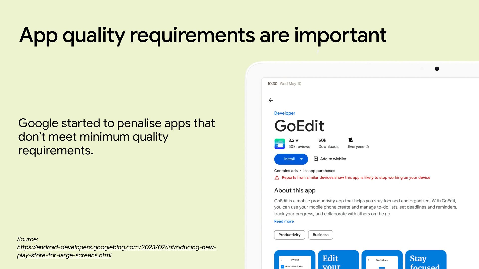
App quality requirements are important Google sta rt ed to
penalise apps that don’t meet minimum quality requirements. Source: h tt ps://android-developers.googleblog.com/2023/07/introducing-new- play-store-for-large-screens.html -
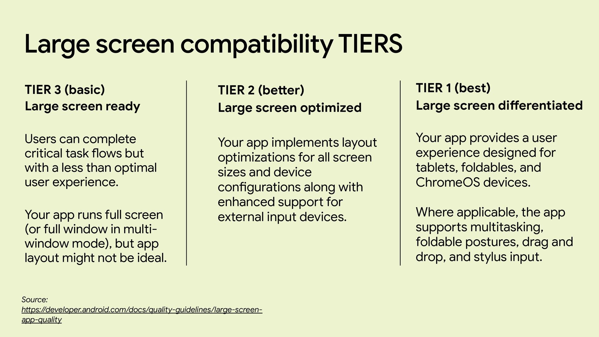
Large screen compatibility TIERS Source: h tt ps://developer.android.com/docs/quality-guidelines/large-screen- app-quality TIER
3 (basic) Large screen ready Users can complete critical task fl ows but with a less than optimal user experience. Your app runs full screen (or full window in multi- window mode), but app layout might not be ideal. TIER 2 (be tt er) Large screen optimized Your app implements layout optimizations for all screen sizes and device con fi gurations along with enhanced suppo rt for external input devices. TIER 1 (best) Large screen di ff erentiated Your app provides a user experience designed for tablets, foldables, and ChromeOS devices. Where applicable, the app suppo rt s multitasking, foldable postures, drag and drop, and stylus input. -
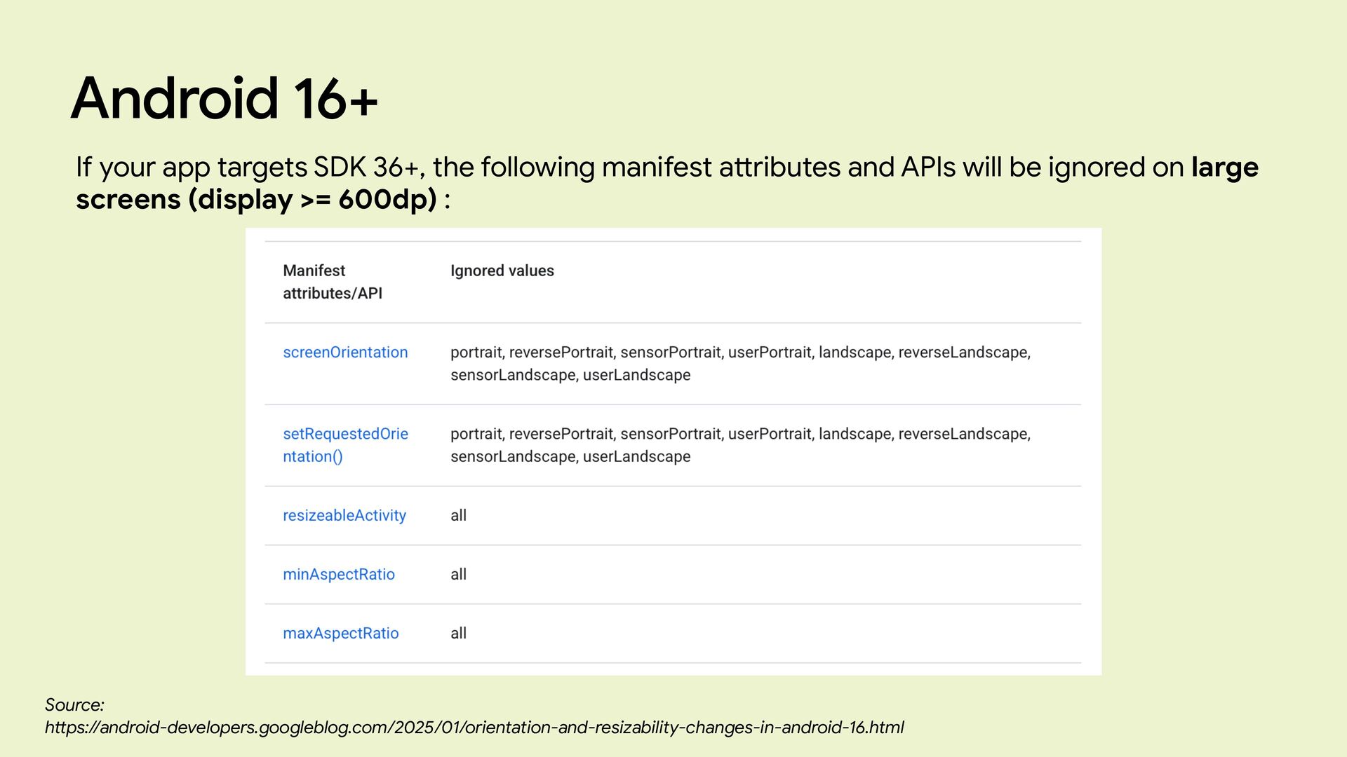
Android 16+ If your app targets SDK 36+, the following
manifest a tt ributes and APIs will be ignored on large screens (display >= 600dp) : Source: h tt ps://android-developers.googleblog.com/2025/01/orientation-and-resizability-changes-in-android-16.html -
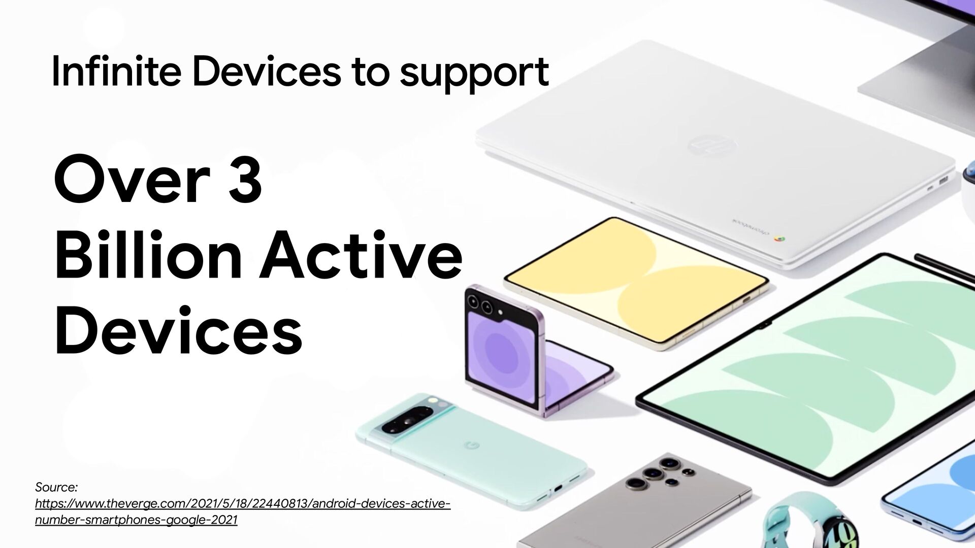
Infinite Devices to support Over 3 Billion Active Devices Source:
h tt ps://www.theverge.com/2021/5/18/22440813/android-devices-active- number-sma rt phones-google-2021 -
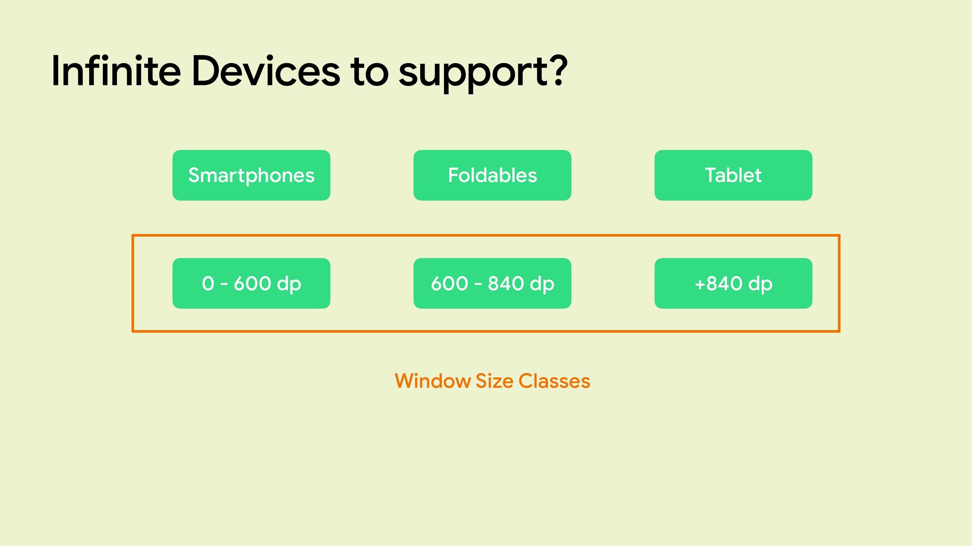
Infinite Devices to support? Sma rt phones Foldables Tablet 0
- 600 dp 600 - 840 dp +840 dp Window Size Classes -
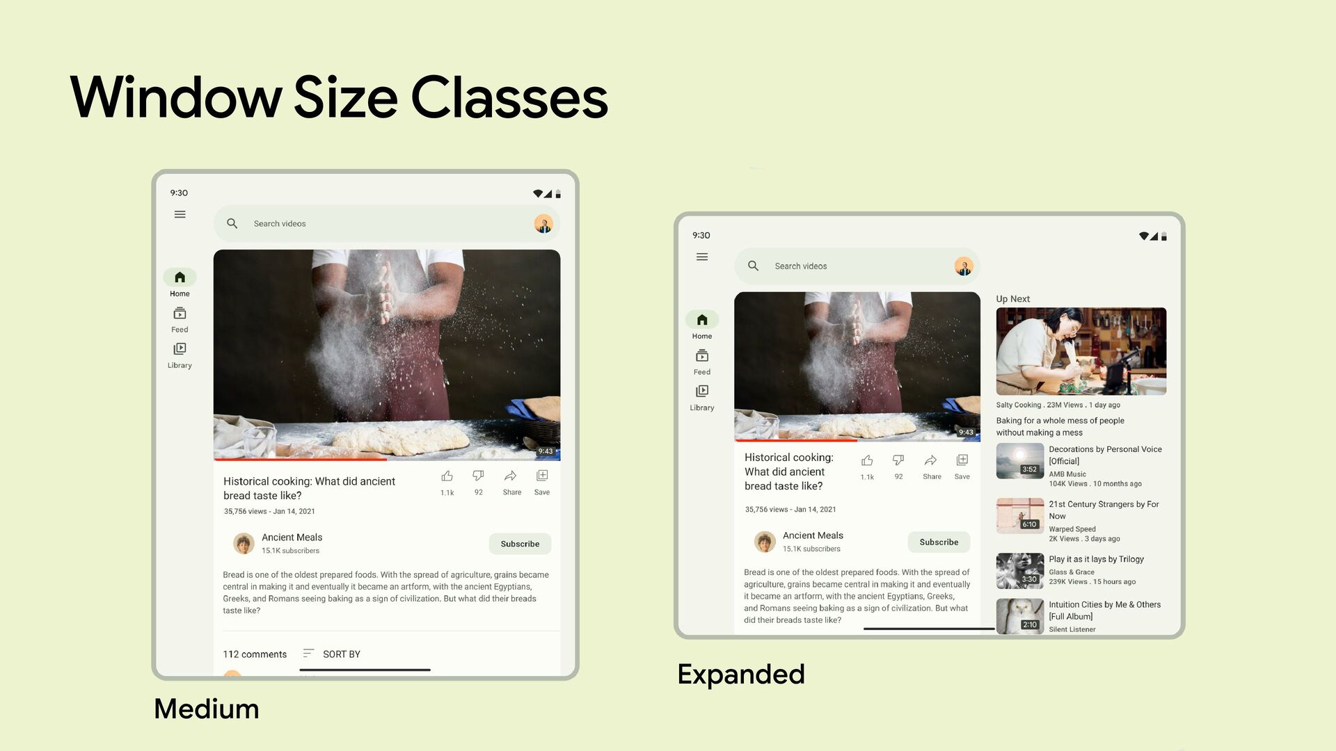
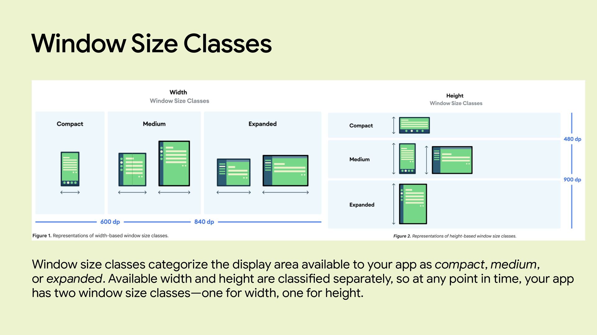
Window Size Classes Rather than designing for an ever increasing
number of display sizes, focusing on window size classes ensures layouts work across a range of devices. Compact Medium Expanded Source: h tt ps://developer.android.com/guide/topics/large-screens/suppo rt -di ff erent-screen-sizes -
Window Size Classes Window size classes categorize the display area
available to your app as compact, medium, or expanded. Available width and height are classi fi ed separately, so at any point in time, your app has two window size classes—one for width, one for height. -
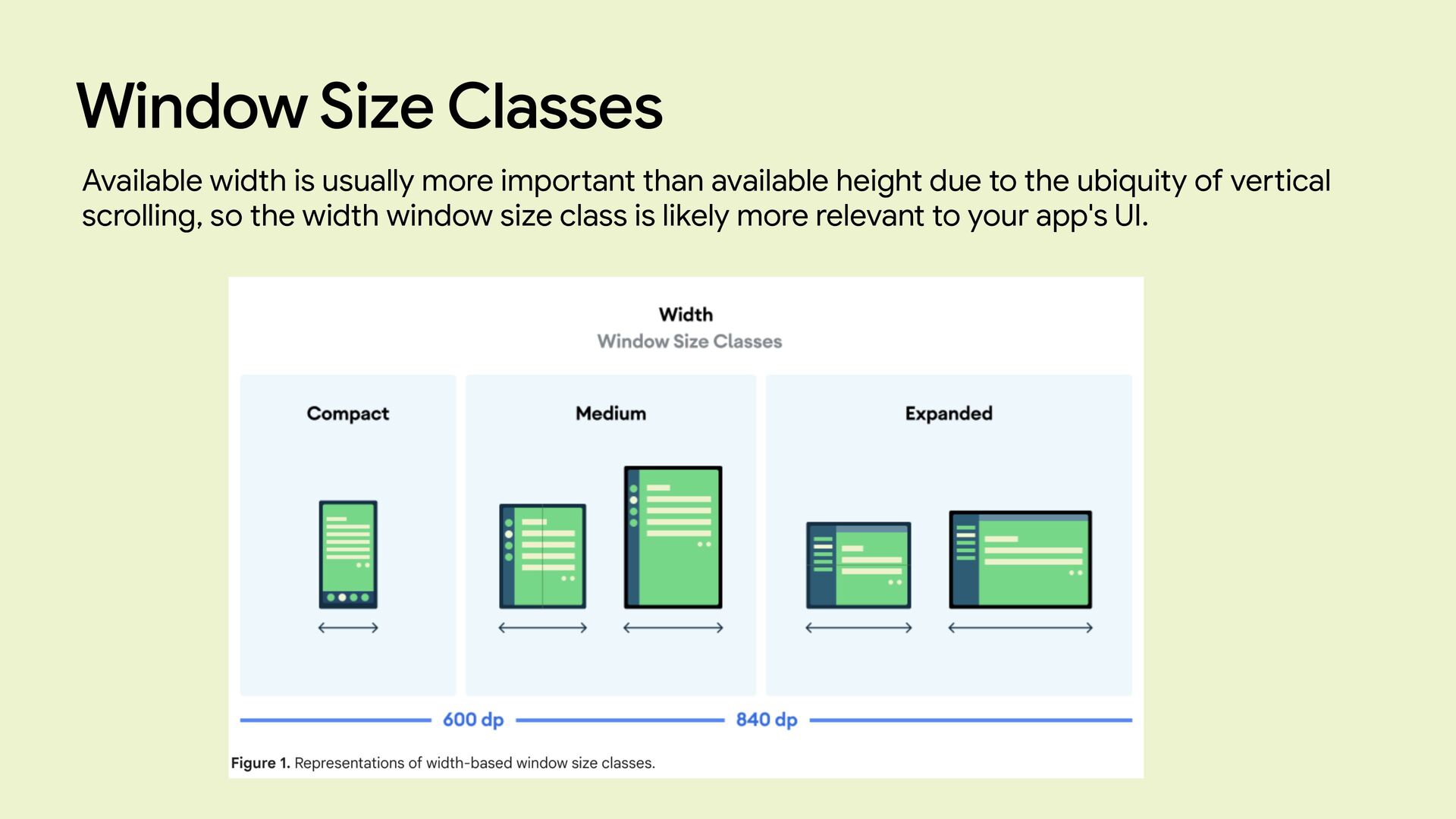
Window Size Classes Available width is usually more impo rt
ant than available height due to the ubiquity of ve rt ical scrolling, so the width window size class is likely more relevant to your app's UI. -
The Master Plan Use the current WindowWidthSizeClass to either show
a type of UI or another Let’s try it -
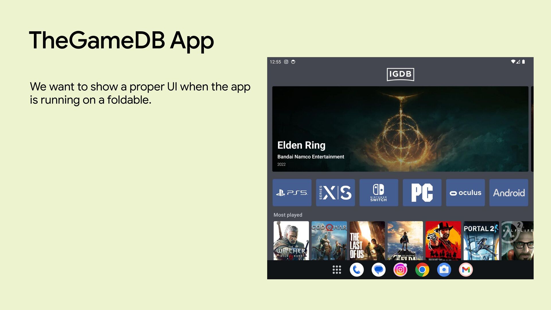
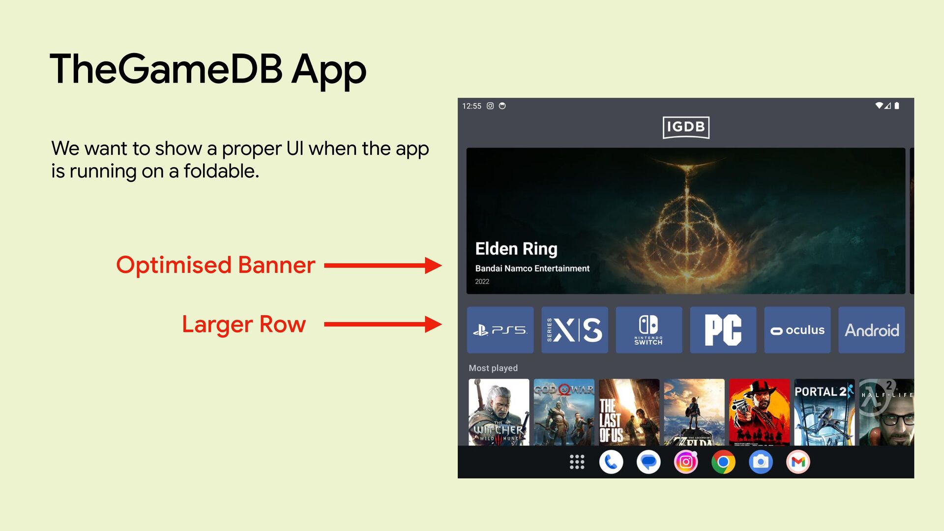
TheGameDB App Just a simple app the uses the IGDB
apis to display game infos. -
TheGameDB App We want to show a proper UI when
the app is running on a foldable. -
TheGameDB App We want to show a proper UI when
the app is running on a foldable. Optimised Banner Larger Row -
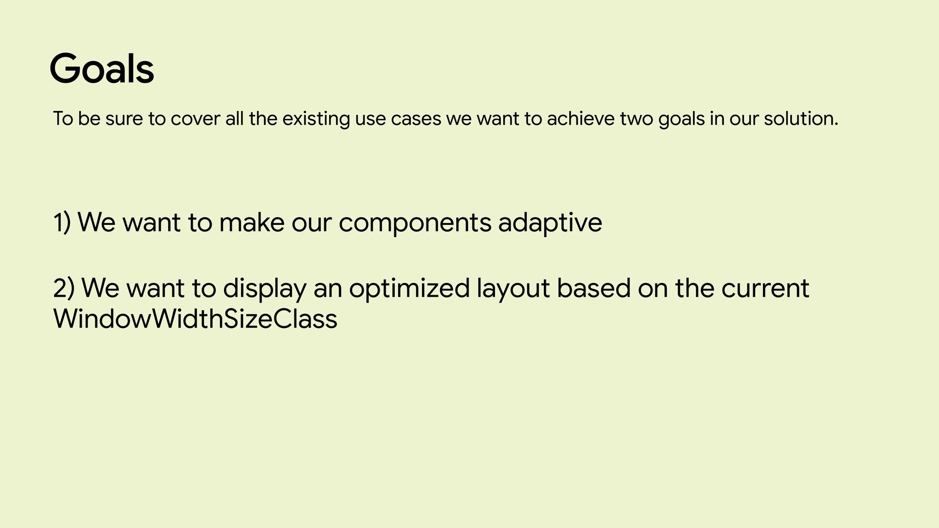
Goals 1) We want to make our components adaptive 2)
We want to display an optimized layout based on the current WindowWidthSizeClass To be sure to cover all the existing use cases we want to achieve two goals in our solution. -
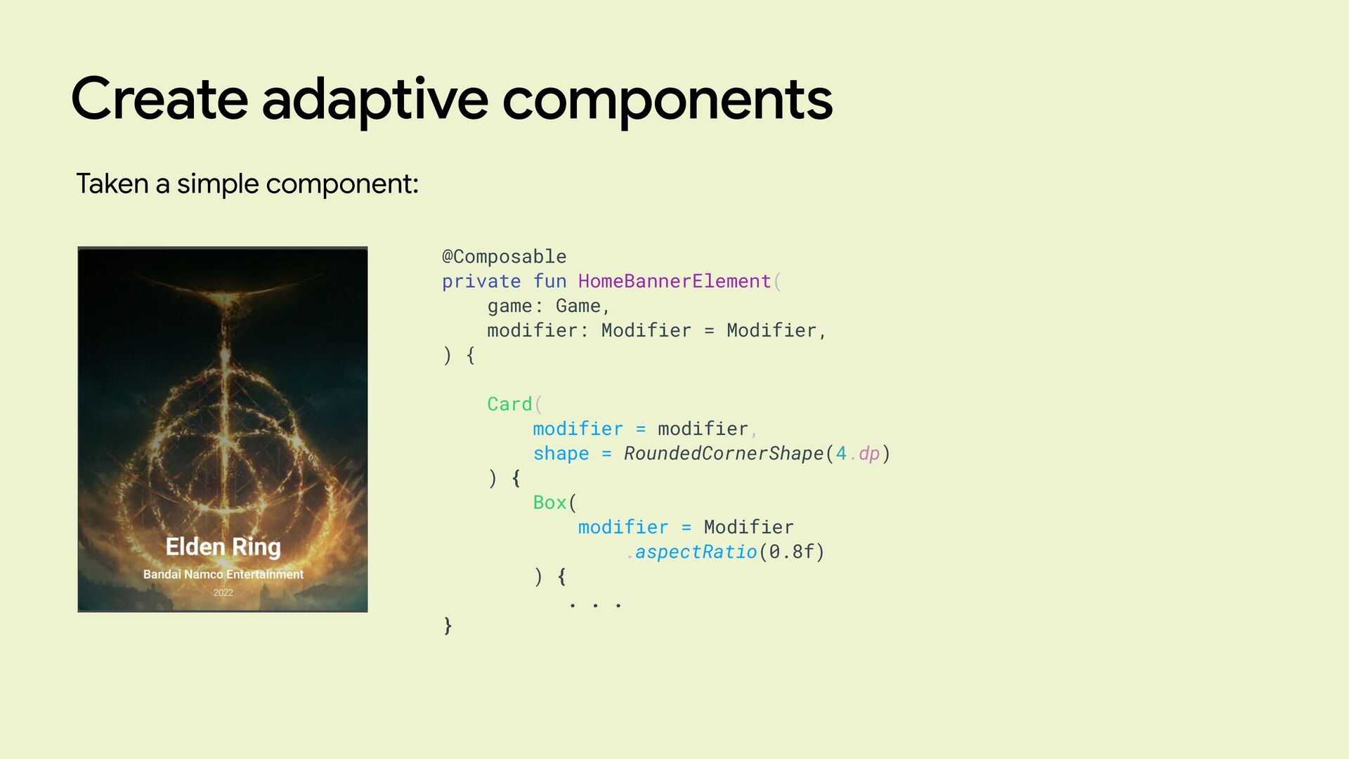
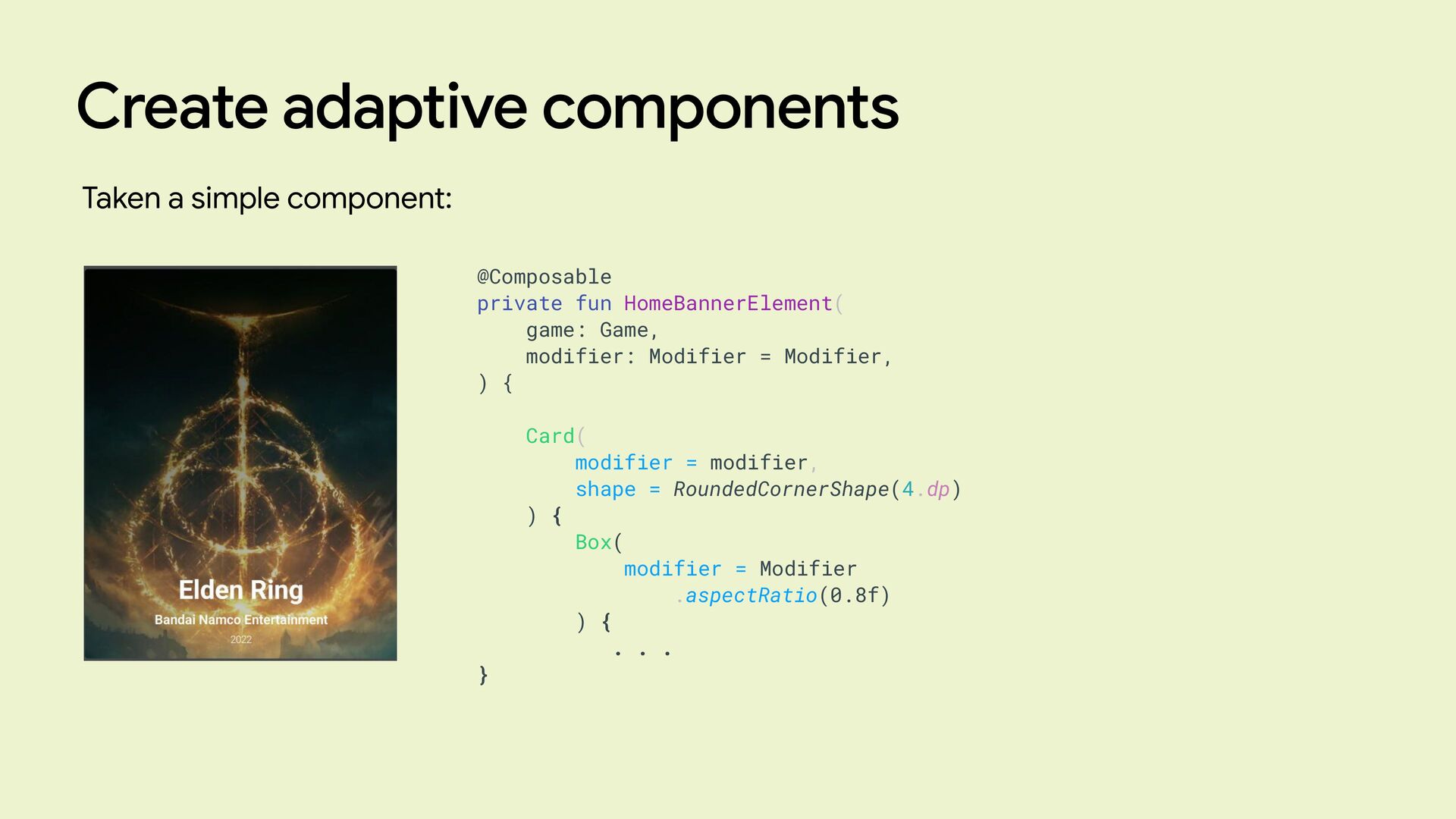
Create adaptive components Taken a simple component: @Composable private fun
HomeBannerElement( game: Game, modifier: Modifier = Modifier, ) { Card( modifier = modifier, shape = RoundedCornerShape(4.dp) ) { Box( modifier = Modifier .aspectRatio(0.8f) ) { . . . } -
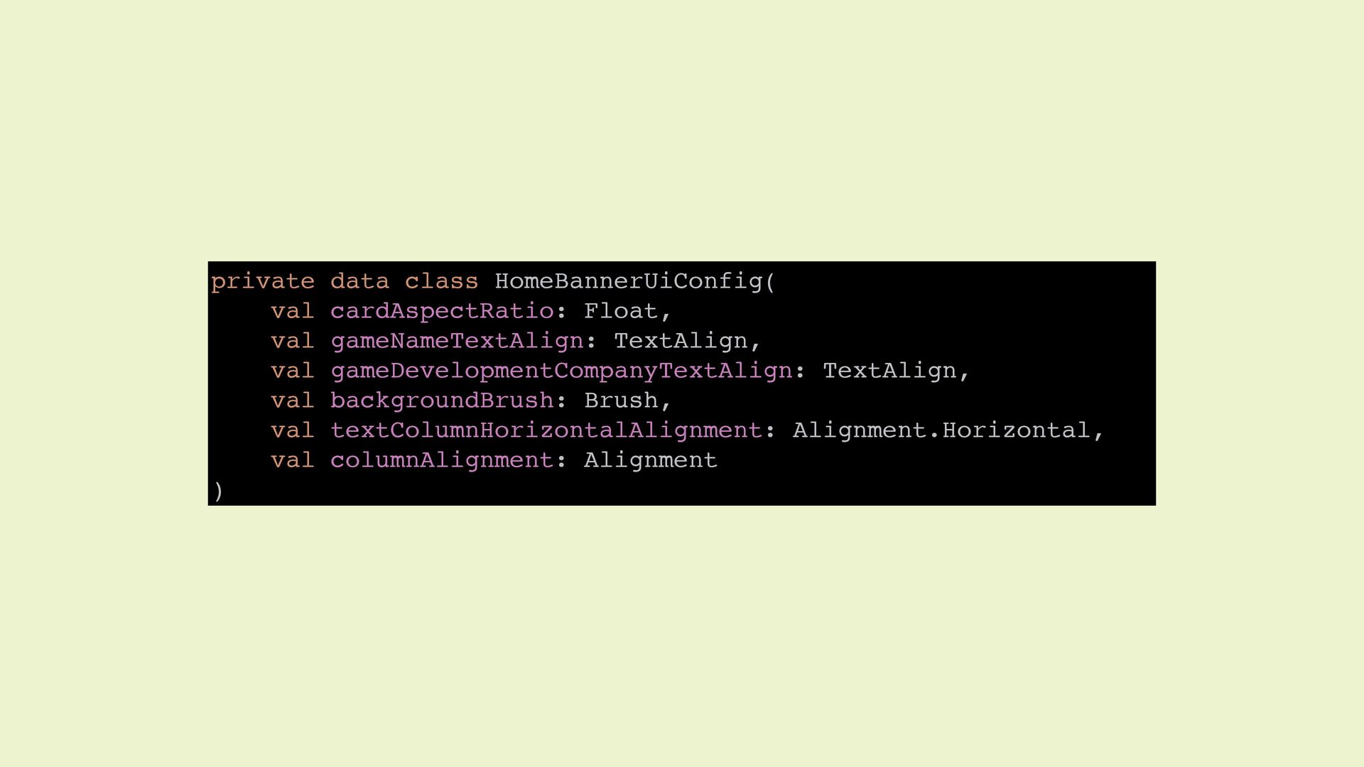
private data class HomeBannerUiConfig( val cardAspectRatio: Float, val gameNameTextAlign: TextAlign,
val gameDevelopmentCompanyTextAlign: TextAlign, val backgroundBrush: Brush, val textColumnHorizontalAlignment: Alignment.Horizontal, val columnAlignment: Alignment ) -
Create adaptive components Taken a simple component: @Composable private fun
HomeBannerElement( game: Game, modifier: Modifier = Modifier, ) { Card( modifier = modifier, shape = RoundedCornerShape(4.dp) ) { Box( modifier = Modifier .aspectRatio(0.8f) ) { . . . } -
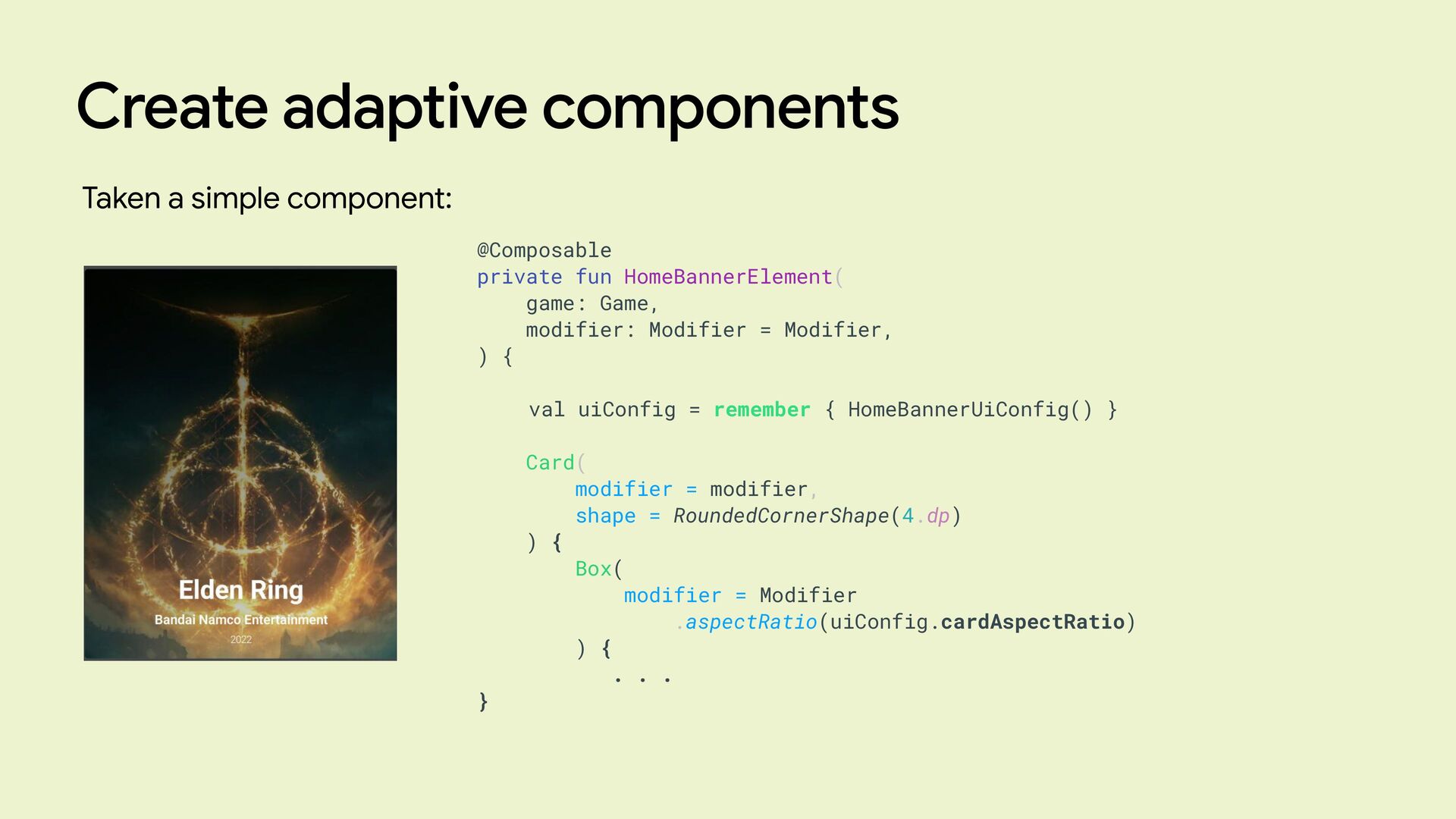
Create adaptive components Taken a simple component: @Composable private fun
HomeBannerElement( game: Game, modifier: Modifier = Modifier, ) { val uiConfig = remember { HomeBannerUiConfig() } Card( modifier = modifier, shape = RoundedCornerShape(4.dp) ) { Box( modifier = Modifier .aspectRatio(uiConfig.cardAspectRatio) ) { . . . } -
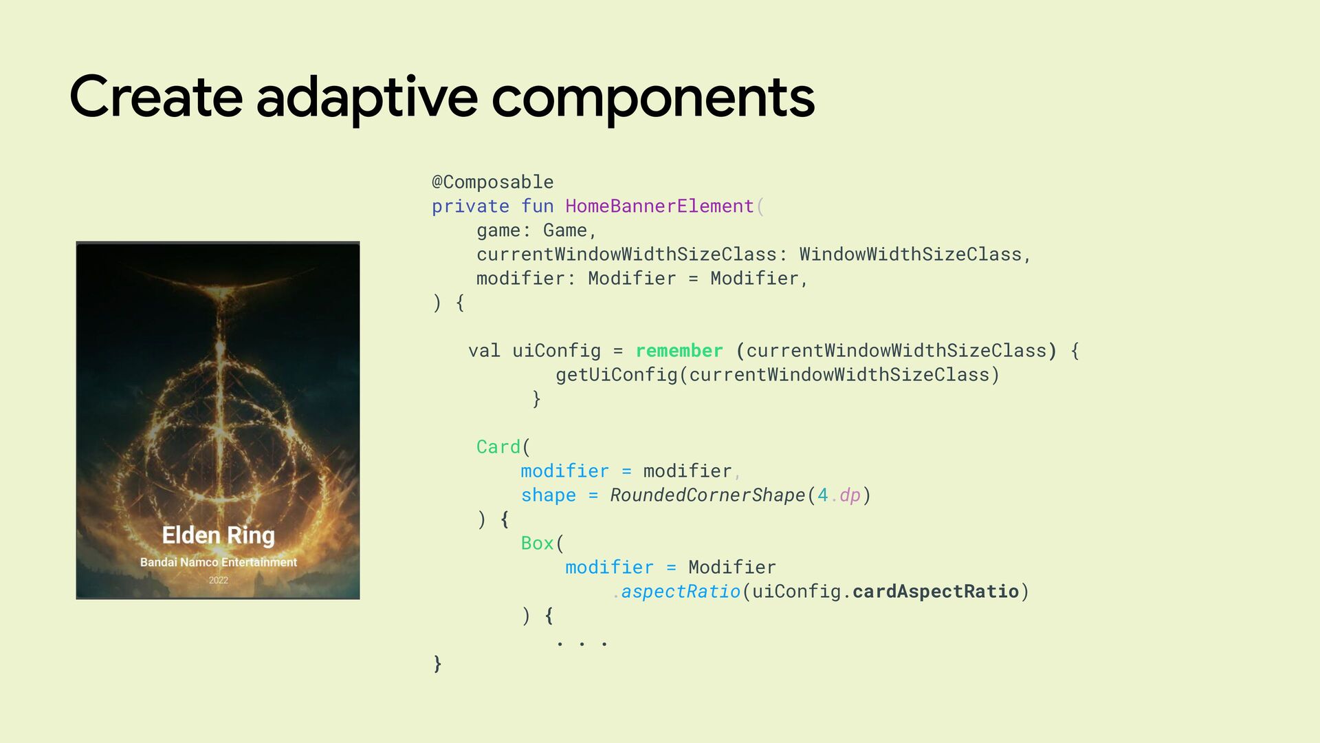
Create adaptive components @Composable private fun HomeBannerElement( game: Game, currentWindowWidthSizeClass:
WindowWidthSizeClass, modifier: Modifier = Modifier, ) { val uiConfig = remember (currentWindowWidthSizeClass) { getUiConfig(currentWindowWidthSizeClass) } Card( modifier = modifier, shape = RoundedCornerShape(4.dp) ) { Box( modifier = Modifier .aspectRatio(uiConfig.cardAspectRatio) ) { . . . } -
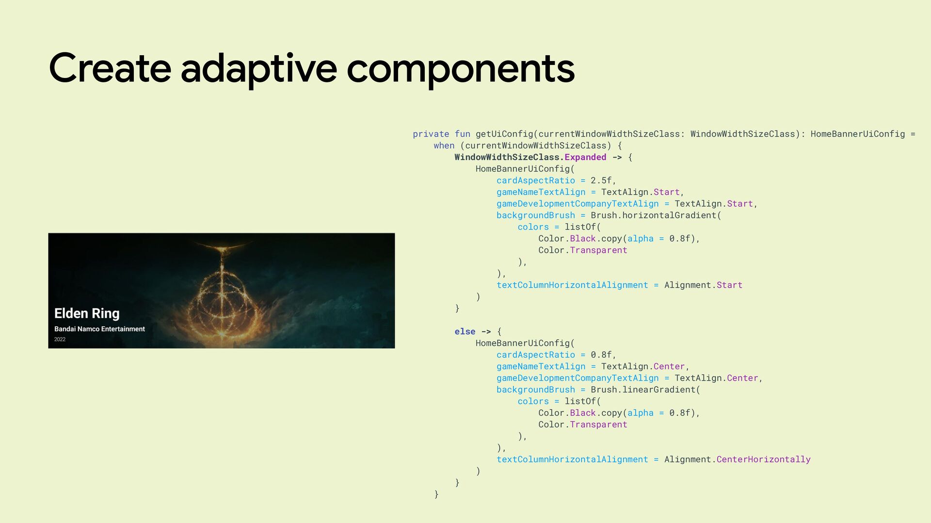
Create adaptive components private fun getUiConfig(currentWindowWidthSizeClass: WindowWidthSizeClass): HomeBannerUiConfig = when
(currentWindowWidthSizeClass) { WindowWidthSizeClass.Expanded -> { HomeBannerUiConfig( cardAspectRatio = 2.5f, gameNameTextAlign = TextAlign.Start, gameDevelopmentCompanyTextAlign = TextAlign.Start, backgroundBrush = Brush.horizontalGradient( colors = listOf( Color.Black.copy(alpha = 0.8f), Color.Transparent ), ), textColumnHorizontalAlignment = Alignment.Start ) } else -> { HomeBannerUiConfig( cardAspectRatio = 0.8f, gameNameTextAlign = TextAlign.Center, gameDevelopmentCompanyTextAlign = TextAlign.Center, backgroundBrush = Brush.linearGradient( colors = listOf( Color.Black.copy(alpha = 0.8f), Color.Transparent ), ), textColumnHorizontalAlignment = Alignment.CenterHorizontally ) } } -
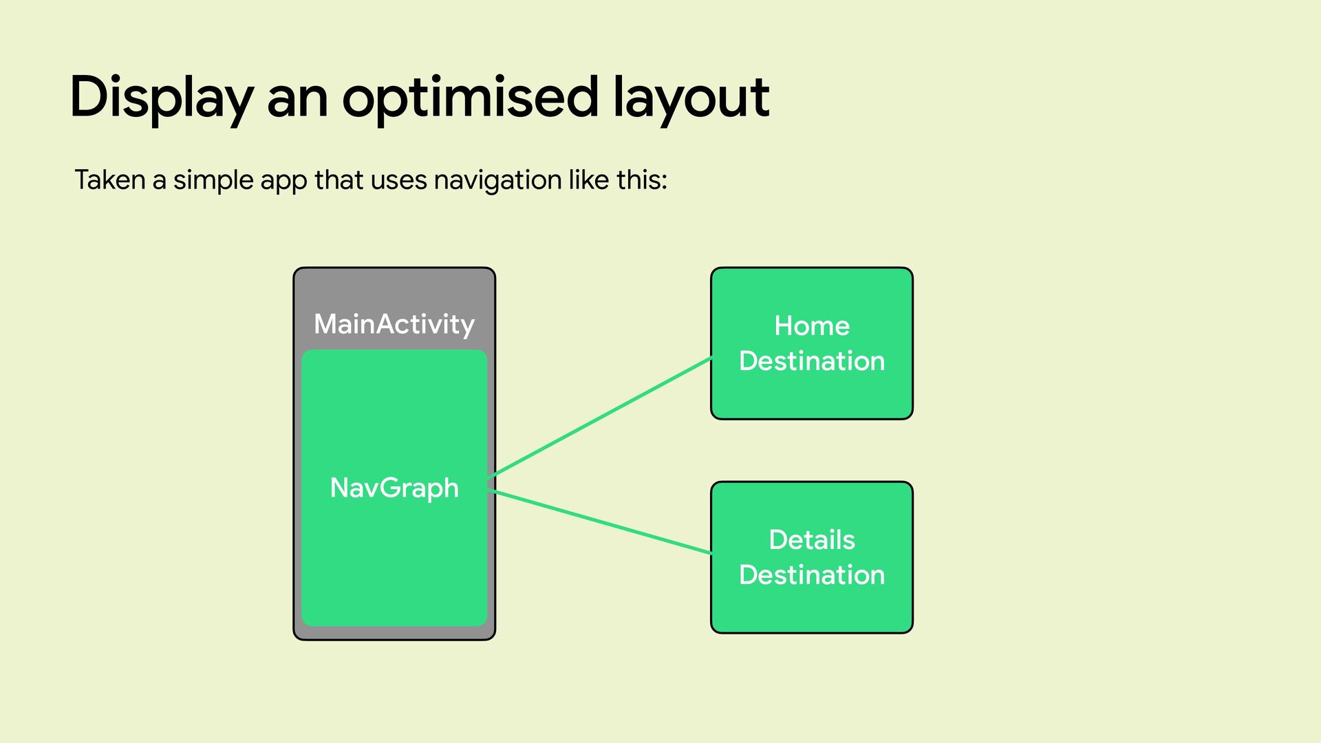
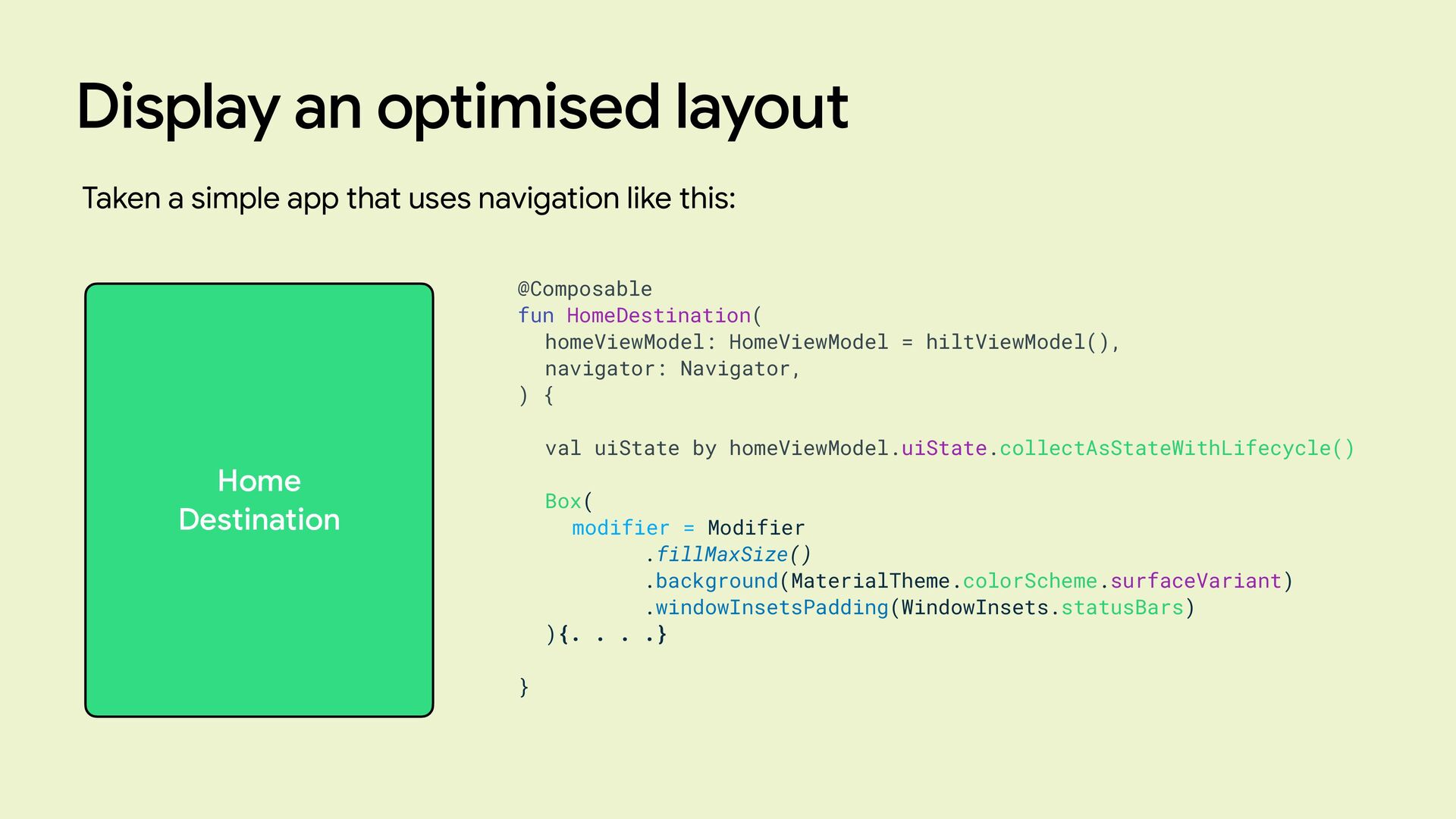
Display an optimised layout Taken a simple app that uses
navigation like this: Home Destination Details Destination MainActivity NavGraph -
Display an optimised layout Taken a simple app that uses
navigation like this: Home Destination @Composable fun HomeDestination( homeViewModel: HomeViewModel = hiltViewModel(), navigator: Navigator, ) { val uiState by homeViewModel.uiState.collectAsStateWithLifecycle() Box( modifier = Modifier .fillMaxSize() .background(MaterialTheme.colorScheme.surfaceVariant) .windowInsetsPadding(WindowInsets.statusBars) ){. . . .} } -
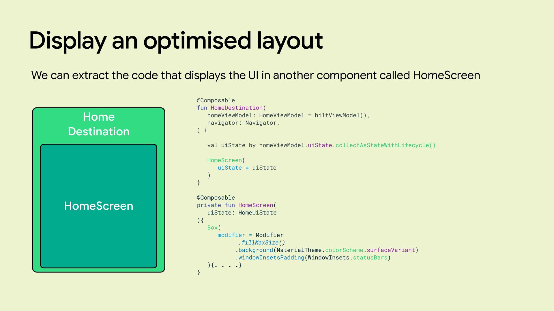
Display an optimised layout We can extract the code that
displays the UI in another component called HomeScreen Home Destination @Composable fun HomeDestination( homeViewModel: HomeViewModel = hiltViewModel(), navigator: Navigator, ) { val uiState by homeViewModel.uiState.collectAsStateWithLifecycle() HomeScreen( uiState = uiState ) } @Composable private fun HomeScreen( uiState: HomeUiState ){ Box( modifier = Modifier .fillMaxSize() .background(MaterialTheme.colorScheme.surfaceVariant) .windowInsetsPadding(WindowInsets.statusBars) ){. . . .} } HomeScreen -
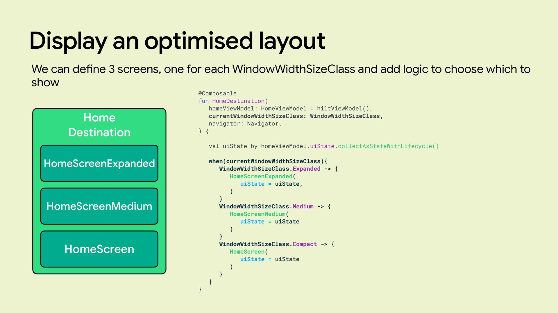
Display an optimised layout We can de fi ne 3
screens, one for each WindowWidthSizeClass and add logic to choose which to show Home Destination @Composable fun HomeDestination( homeViewModel: HomeViewModel = hiltViewModel(), currentWindowWidthSizeClass: WindowWidthSizeClass, navigator: Navigator, ) { val uiState by homeViewModel.uiState.collectAsStateWithLifecycle() when(currentWindowWidthSizeClass){ WindowWidthSizeClass.Expanded -> { HomeScreenExpanded( uiState = uiState, ) } WindowWidthSizeClass.Medium -> { HomeScreenMedium( uiState = uiState ) } WindowWidthSizeClass.Compact -> { HomeScreen( uiState = uiState ) } } } HomeScreenExpanded HomeScreenMedium HomeScreen -
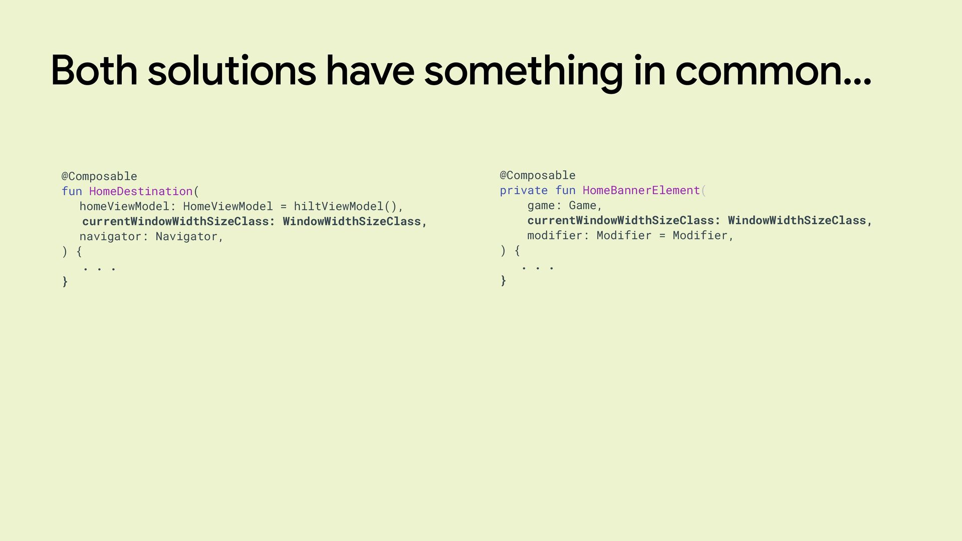
Both solutions have something in common… @Composable private fun HomeBannerElement(
game: Game, currentWindowWidthSizeClass: WindowWidthSizeClass, modifier: Modifier = Modifier, ) { . . . } @Composable fun HomeDestination( homeViewModel: HomeViewModel = hiltViewModel(), currentWindowWidthSizeClass: WindowWidthSizeClass, navigator: Navigator, ) { . . . } -
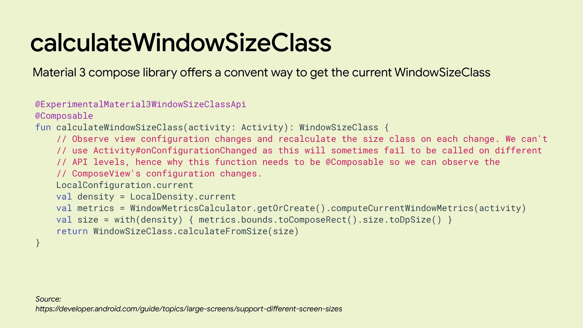
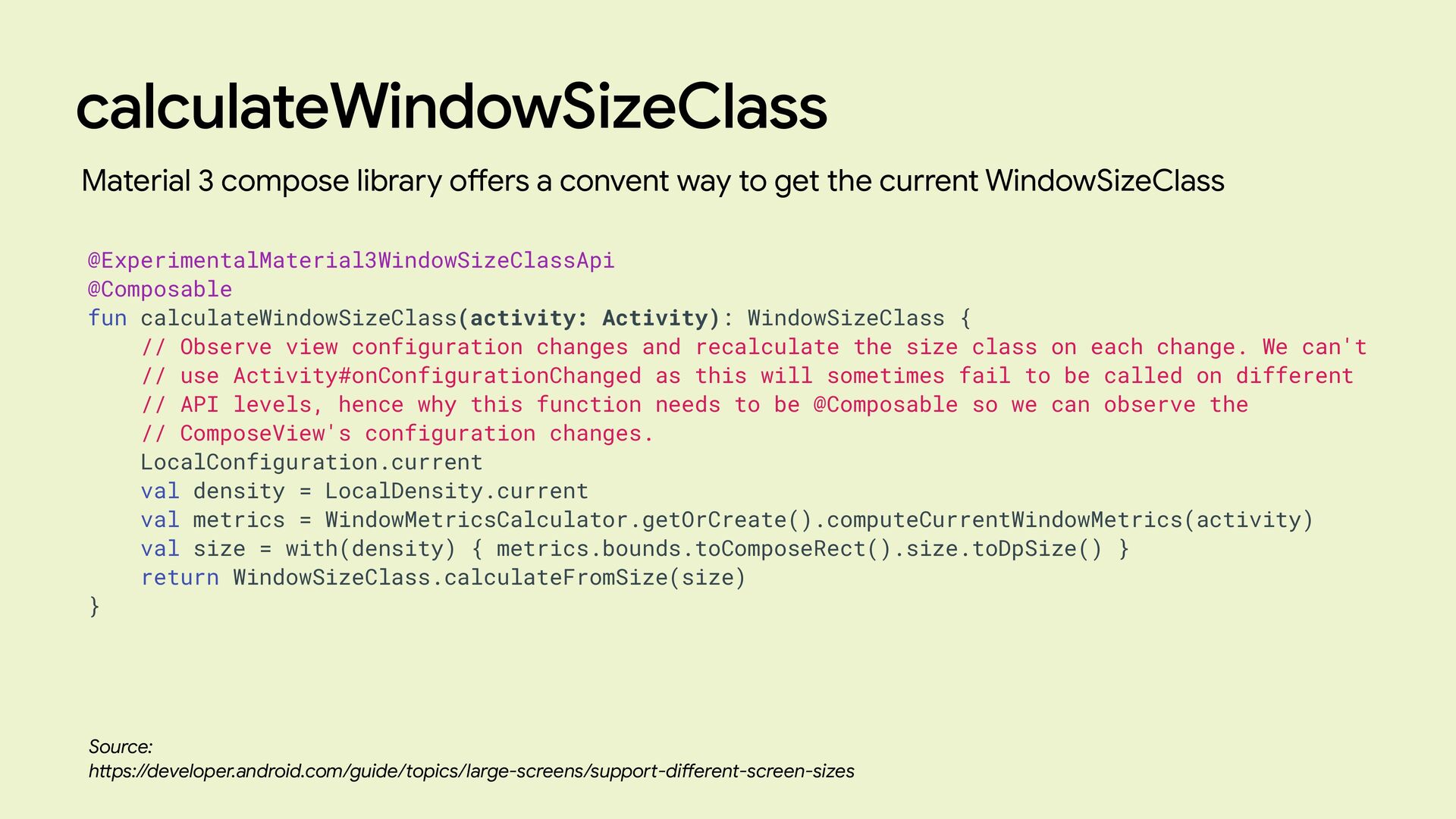
calculateWindowSizeClass Source: h tt ps://developer.android.com/guide/topics/large-screens/suppo rt -di ff erent-screen-sizes Material
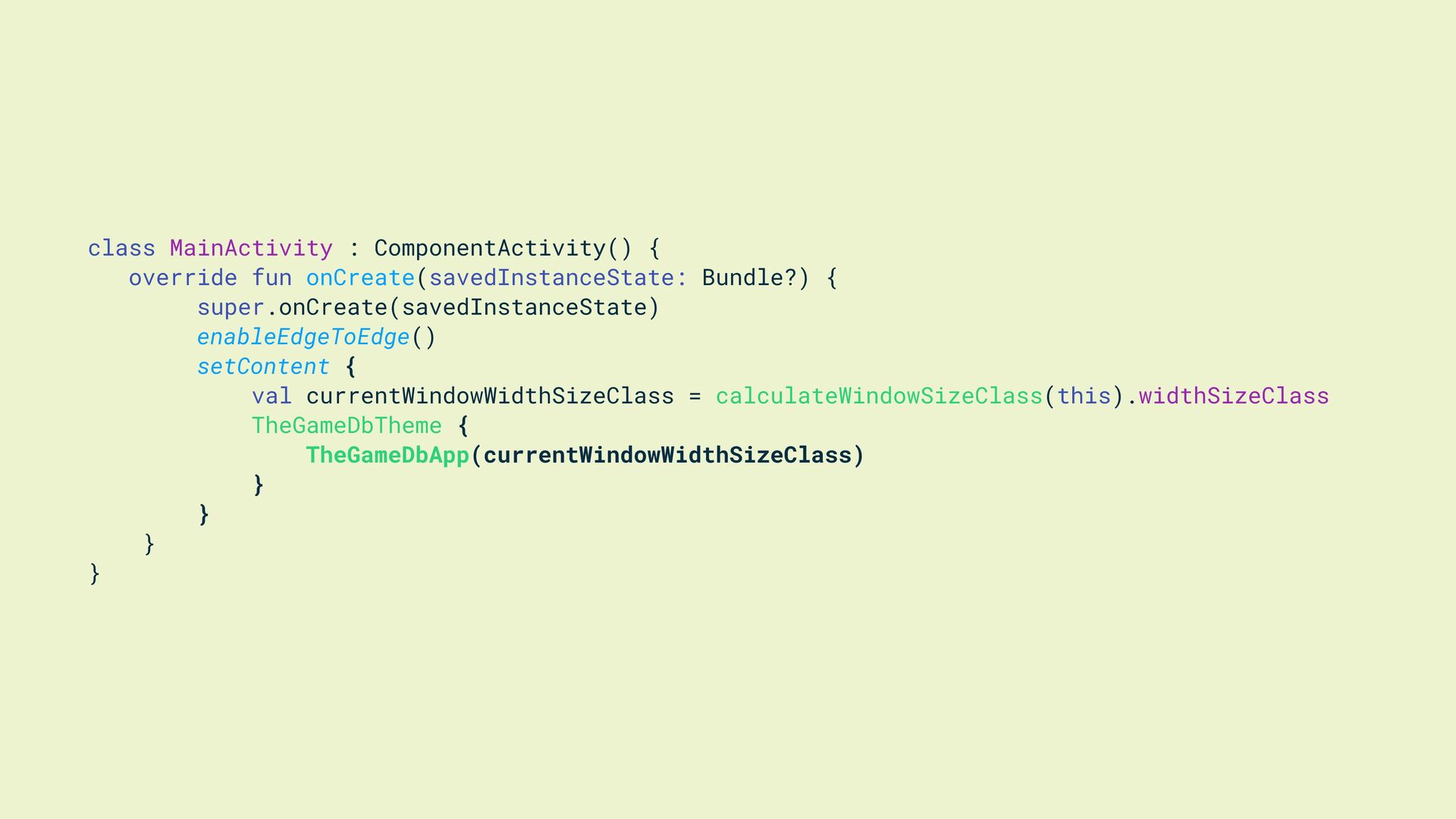
3 compose library o ff ers a convent way to get the current WindowSizeClass @ExperimentalMaterial3WindowSizeClassApi @Composable fun calculateWindowSizeClass(activity: Activity): WindowSizeClass { // Observe view configuration changes and recalculate the size class on each change. We can't // use Activity#onConfigurationChanged as this will sometimes fail to be called on different // API levels, hence why this function needs to be @Composable so we can observe the // ComposeView's configuration changes. LocalConfiguration.current val density = LocalDensity.current val metrics = WindowMetricsCalculator.getOrCreate().computeCurrentWindowMetrics(activity) val size = with(density) { metrics.bounds.toComposeRect().size.toDpSize() } return WindowSizeClass.calculateFromSize(size) } -
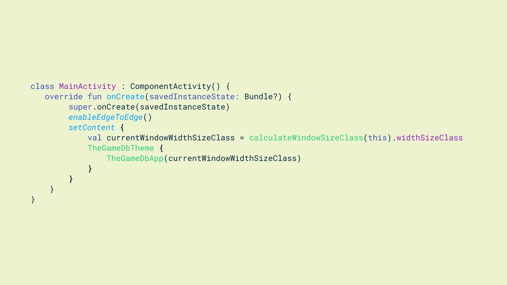
class MainActivity : ComponentActivity() { override fun onCreate(savedInstanceState: Bundle?) {
super.onCreate(savedInstanceState) enableEdgeToEdge() setContent { val currentWindowWidthSizeClass = calculateWindowSizeClass(this).widthSizeClass TheGameDbTheme { TheGameDbApp(currentWindowWidthSizeClass) } } } } -
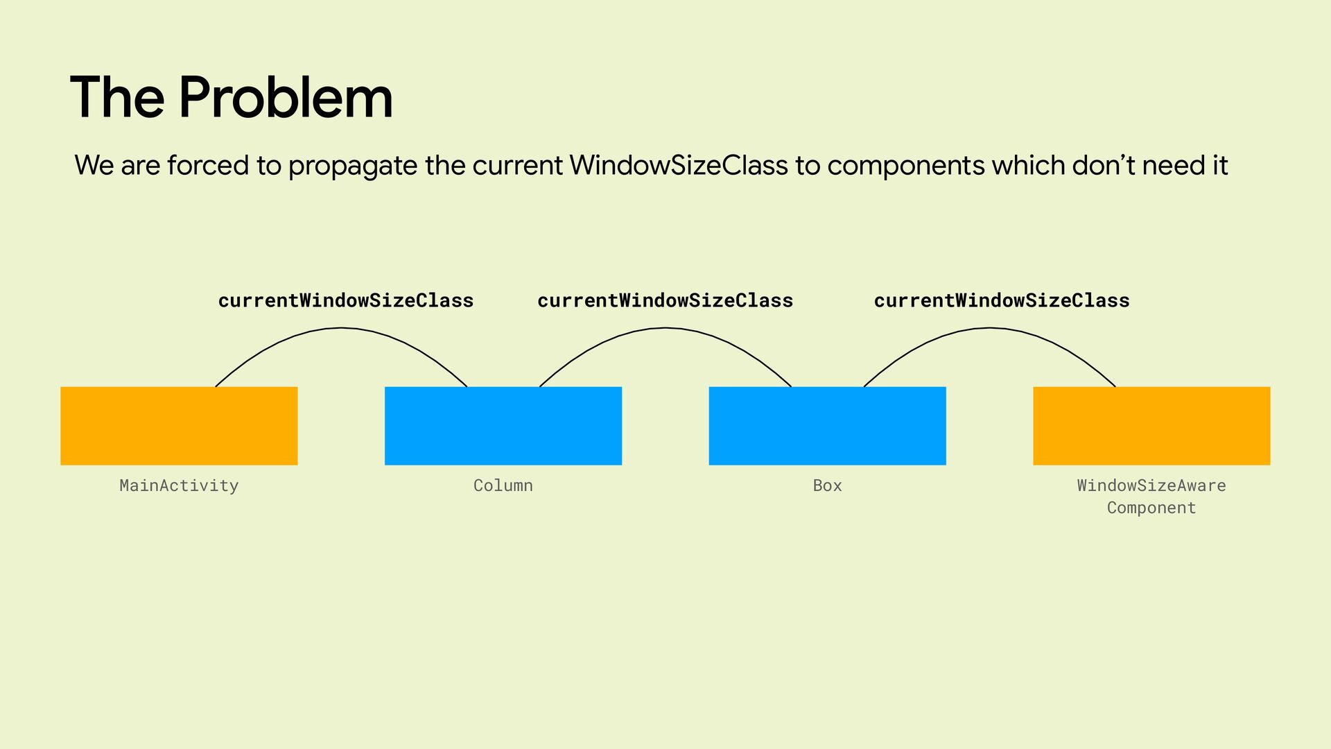
The Problem We are forced to propagate the current WindowSizeClass
to components which don’t need it MainActivity Column Box WindowSizeAware Component currentWindowSizeClass currentWindowSizeClass currentWindowSizeClass -
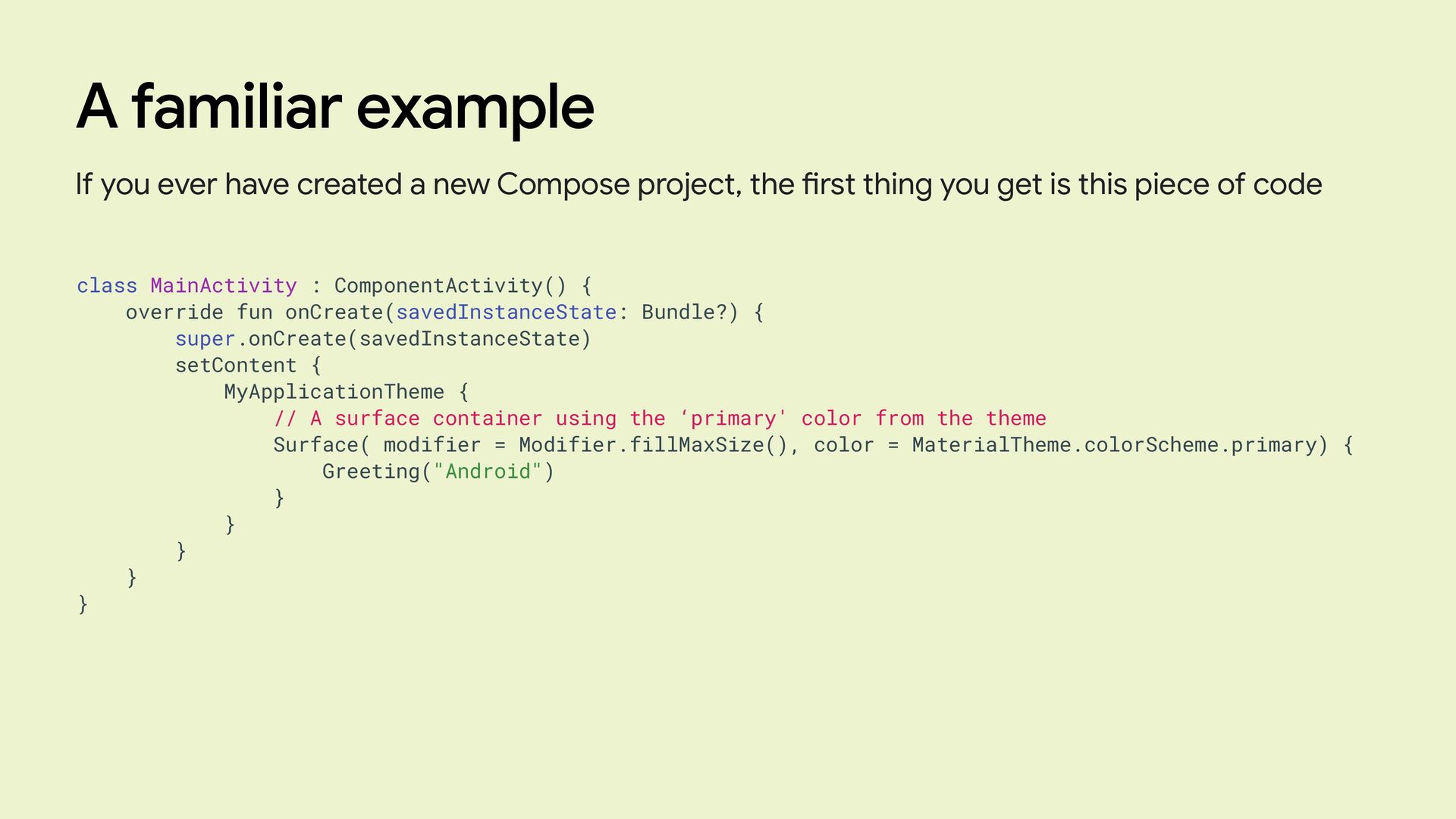
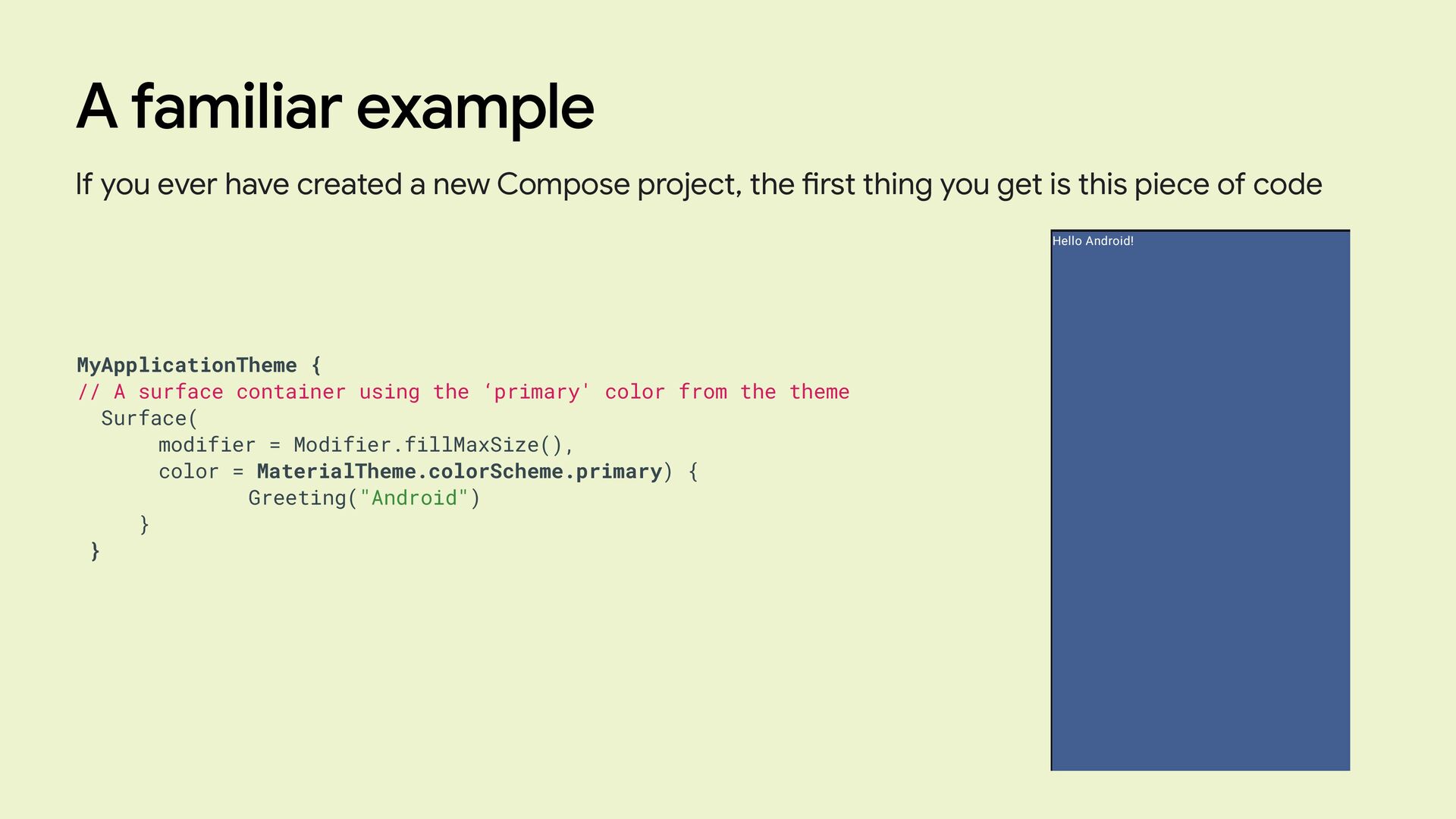
A familiar example If you ever have created a new
Compose project, the fi rst thing you get is this piece of code class MainActivity : ComponentActivity() { override fun onCreate(savedInstanceState: Bundle?) { super.onCreate(savedInstanceState) setContent { MyApplicationTheme { // A surface container using the ‘primary' color from the theme Surface( modifier = Modifier.fillMaxSize(), color = MaterialTheme.colorScheme.primary) { Greeting("Android") } } } } } -
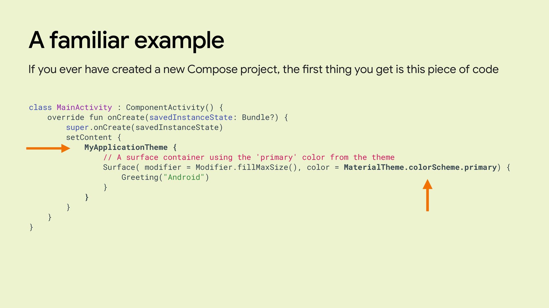
A familiar example If you ever have created a new
Compose project, the fi rst thing you get is this piece of code class MainActivity : ComponentActivity() { override fun onCreate(savedInstanceState: Bundle?) { super.onCreate(savedInstanceState) setContent { MyApplicationTheme { // A surface container using the 'primary' color from the theme Surface( modifier = Modifier.fillMaxSize(), color = MaterialTheme.colorScheme.primary) { Greeting("Android") } } } } } -
A familiar example If you ever have created a new
Compose project, the fi rst thing you get is this piece of code MyApplicationTheme { // A surface container using the ‘primary' color from the theme Surface( modifier = Modifier.fillMaxSize(), color = MaterialTheme.colorScheme.primary) { Greeting("Android") } } -
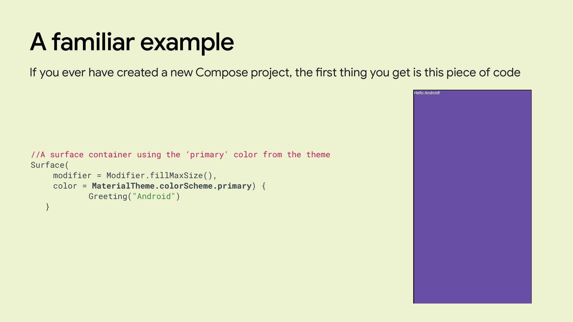
A familiar example If you ever have created a new
Compose project, the fi rst thing you get is this piece of code //A surface container using the ‘primary' color from the theme Surface( modifier = Modifier.fillMaxSize(), color = MaterialTheme.colorScheme.primary) { Greeting("Android") } -
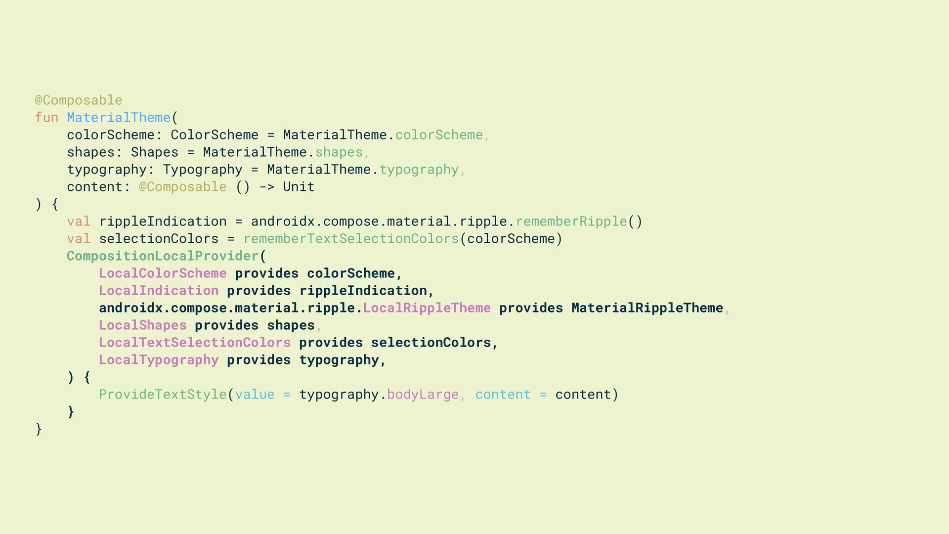
@Composable fun MaterialTheme( colorScheme: ColorScheme = MaterialTheme.colorScheme, shapes: Shapes =
MaterialTheme.shapes, typography: Typography = MaterialTheme.typography, content: @Composable () -> Unit ) { val rippleIndication = androidx.compose.material.ripple.rememberRipple() val selectionColors = rememberTextSelectionColors(colorScheme) CompositionLocalProvider( LocalColorScheme provides colorScheme, LocalIndication provides rippleIndication, androidx.compose.material.ripple.LocalRippleTheme provides MaterialRippleTheme, LocalShapes provides shapes, LocalTextSelectionColors provides selectionColors, LocalTypography provides typography, ) { ProvideTextStyle(value = typography.bodyLarge, content = content) } } -
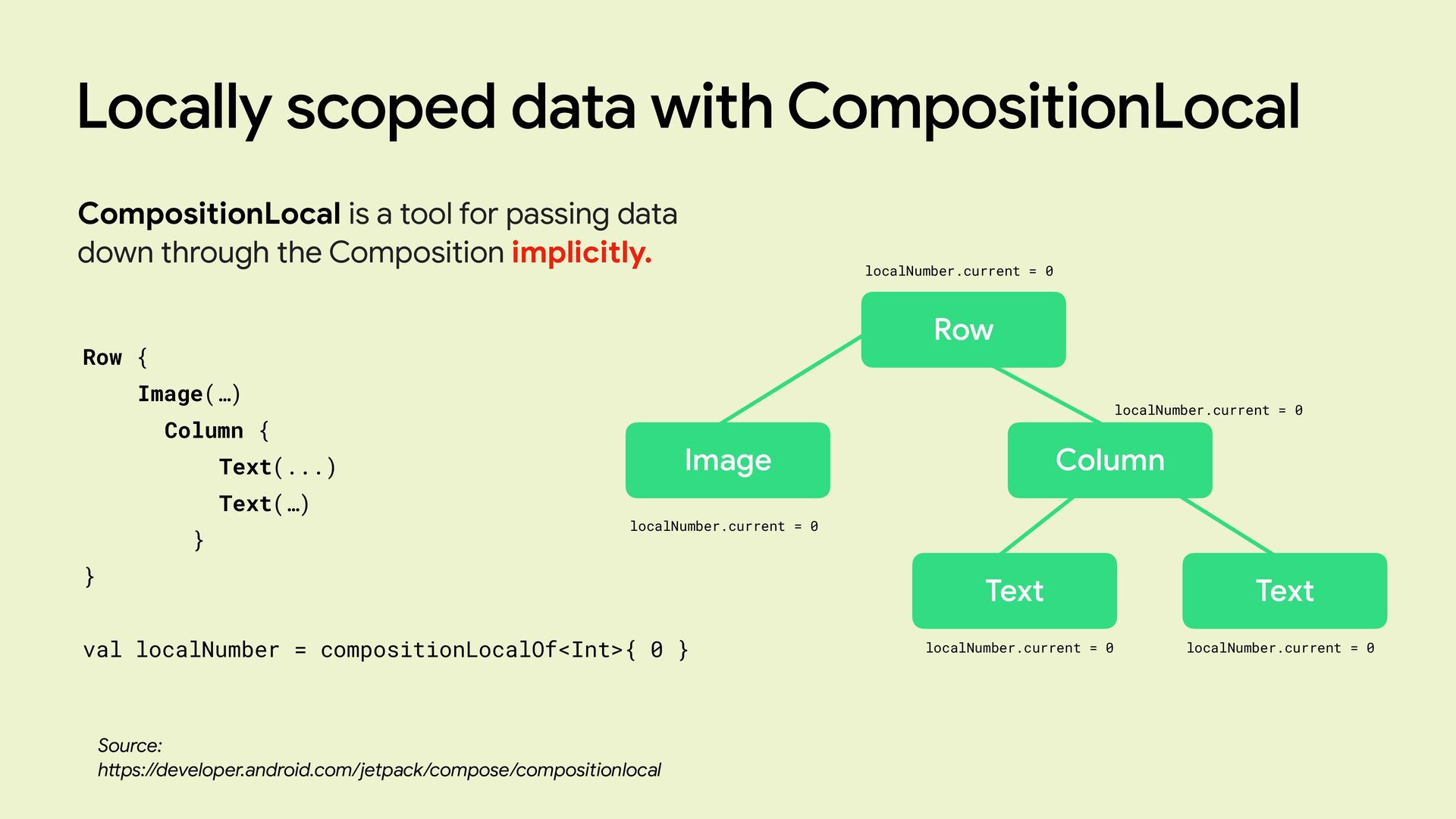
Locally scoped data with CompositionLocal Source: h tt ps://developer.android.com/jetpack/compose/compositionlocal CompositionLocal
is a tool for passing data down through the Composition implicitly. -
Locally scoped data with CompositionLocal Source: h tt ps://developer.android.com/jetpack/compose/compositionlocal CompositionLocal
is a tool for passing data down through the Composition implicitly. Row { Image(…) Column { Text(...) Text(…) } } val localNumber = compositionLocalOf<Int>{ 0 } Row Image Column Text Text localNumber.current = 0 localNumber.current = 0 localNumber.current = 0 localNumber.current = 0 localNumber.current = 0 -
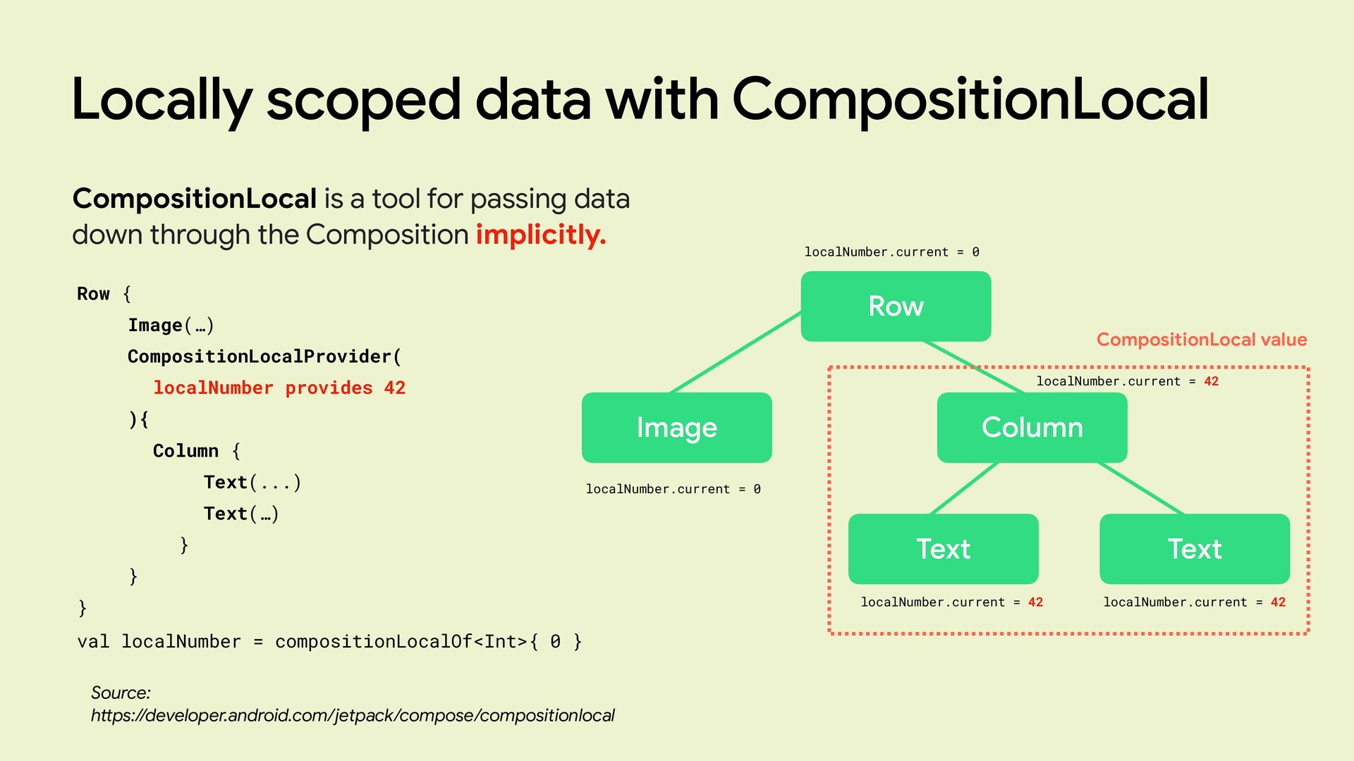
Locally scoped data with CompositionLocal Source: h tt ps://developer.android.com/jetpack/compose/compositionlocal CompositionLocal
is a tool for passing data down through the Composition implicitly. Row Image Column Text Text CompositionLocal value localNumber.current = 0 localNumber.current = 42 localNumber.current = 0 localNumber.current = 42 localNumber.current = 42 Row { Image(…) CompositionLocalProvider( localNumber provides 42 ){ Column { Text(...) Text(…) } } } val localNumber = compositionLocalOf<Int>{ 0 } -
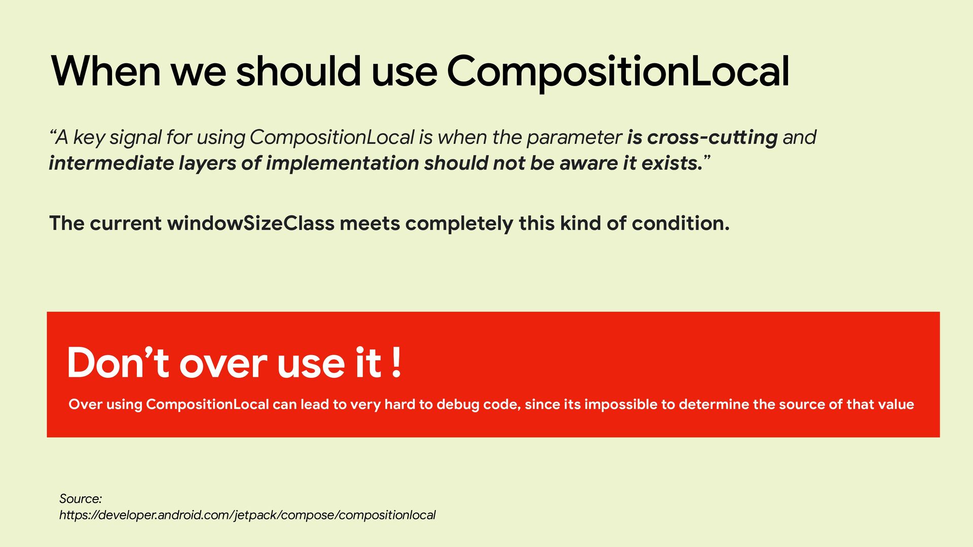
When we should use CompositionLocal “A key signal for using
CompositionLocal is when the parameter is cross-cu tt ing and intermediate layers of implementation should not be aware it exists.” Don’t over use it ! Over using CompositionLocal can lead to very hard to debug code, since its impossible to determine the source of that value The current windowSizeClass meets completely this kind of condition. Source: h tt ps://developer.android.com/jetpack/compose/compositionlocal -
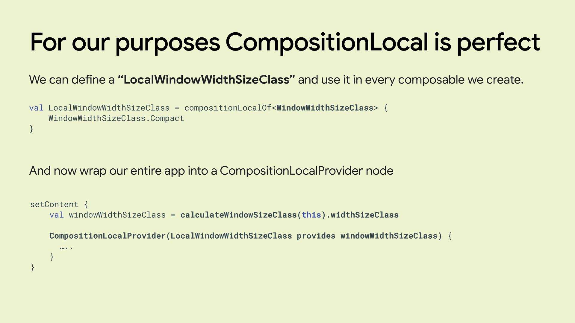
For our purposes CompositionLocal is perfect We can de fi
ne a “LocalWindowWidthSizeClass” and use it in every composable we create. val LocalWindowWidthSizeClass = compositionLocalOf<WindowWidthSizeClass> { WindowWidthSizeClass.Compact } And now wrap our entire app into a CompositionLocalProvider node setContent { val windowWidthSizeClass = calculateWindowSizeClass(this).widthSizeClass CompositionLocalProvider(LocalWindowWidthSizeClass provides windowWidthSizeClass) { ….. } } -
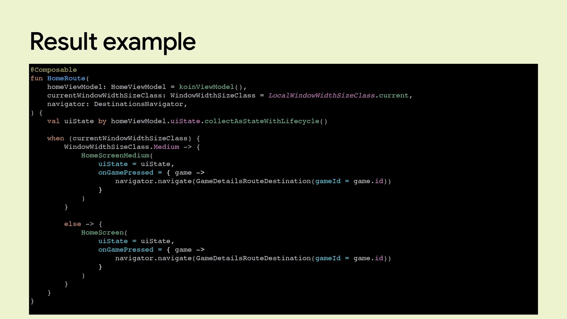
Result example @Composable fun HomeRoute( homeViewModel: HomeViewModel = koinViewModel(), currentWindowWidthSizeClass:
WindowWidthSizeClass = LocalWindowWidthSizeClass.current, navigator: DestinationsNavigator, ) { val uiState by homeViewModel.uiState.collectAsStateWithLifecycle() when (currentWindowWidthSizeClass) { WindowWidthSizeClass.Medium -> { HomeScreenMedium( uiState = uiState, onGamePressed = { game -> navigator.navigate(GameDetailsRouteDestination(gameId = game.id)) } ) } else -> { HomeScreen( uiState = uiState, onGamePressed = { game -> navigator.navigate(GameDetailsRouteDestination(gameId = game.id)) } ) } } } -
Conclusions • Handle all types of screen sizes is not
trivial • WindowSizeClass comes in help • CompositionLocalOf helps us using WindowsSizeClasses in an easy way -
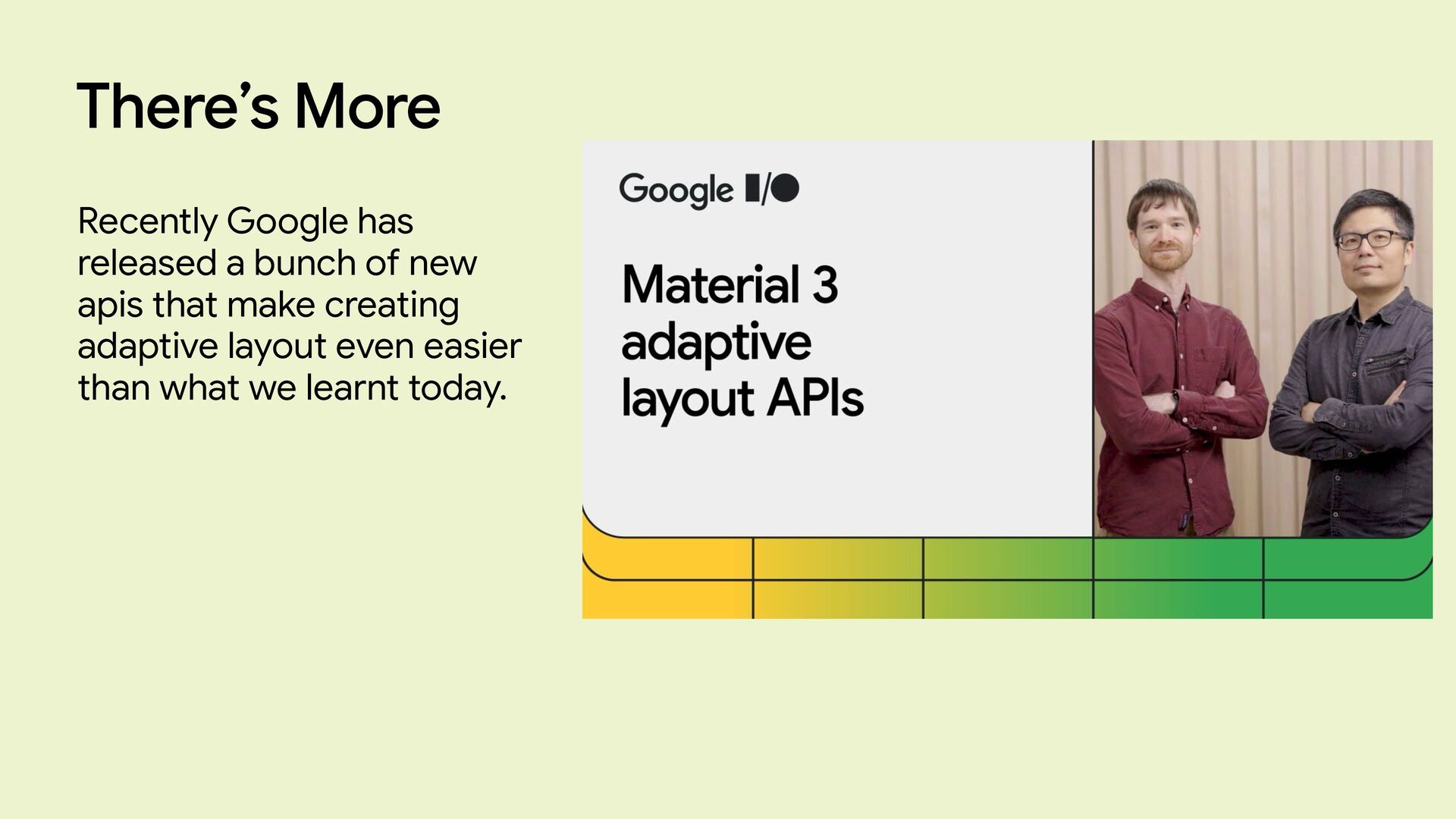
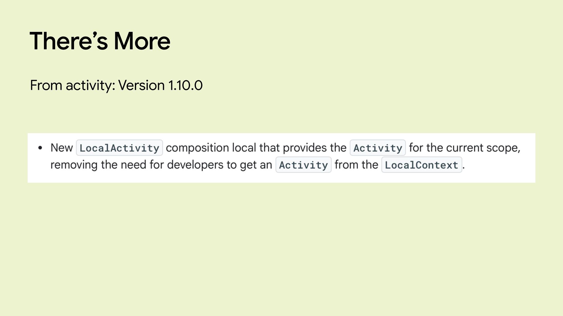
There’s More Recently Google has released a bunch of new
apis that make creating adaptive layout even easier than what we learnt today.