Upgrade to Pro — share decks privately, control downloads, hide ads and more …

Android Design patterns

giorgioventuri
February 03, 2012

Android Design patterns

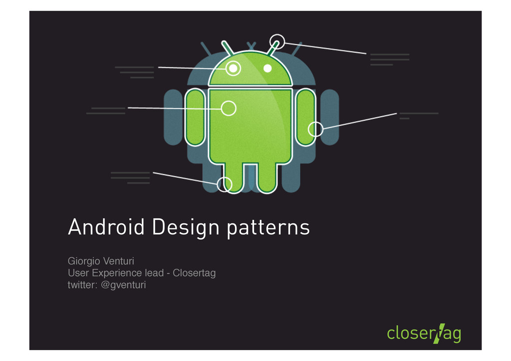
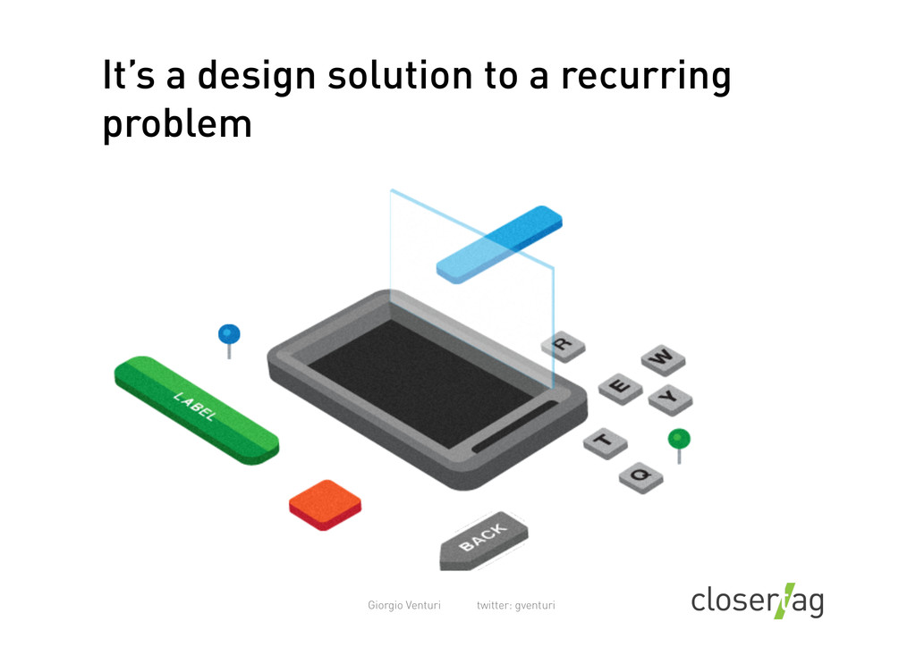
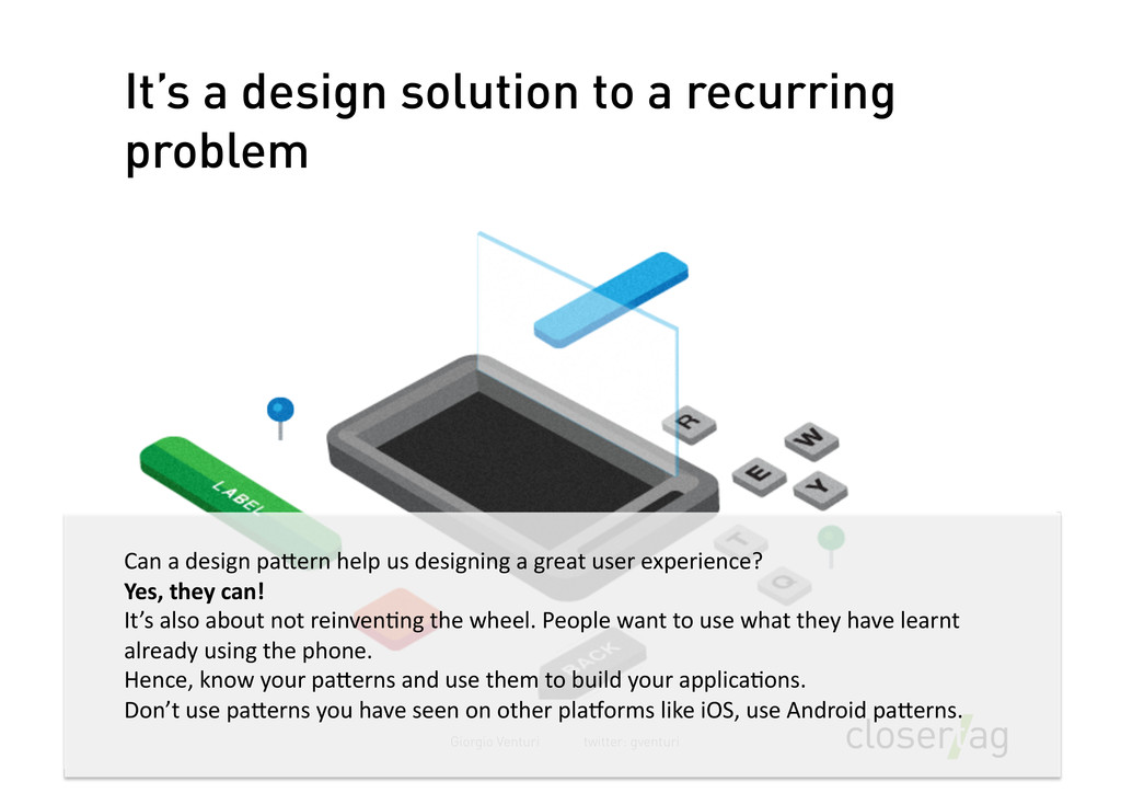
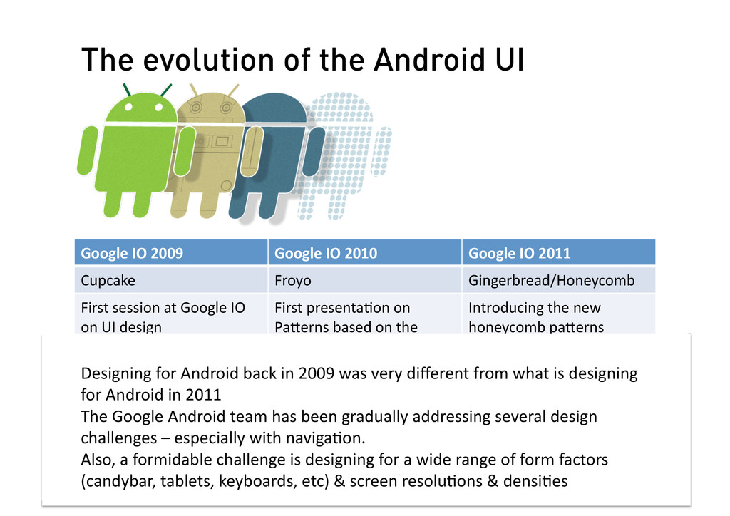
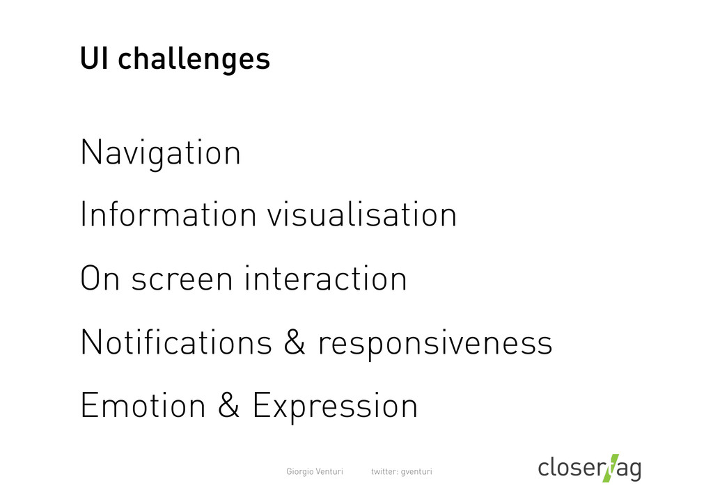
Android apps have been heavily criticised in the past due to poor user experience. One of the reasons why this happened is lack of solid & consistent UI patterns.
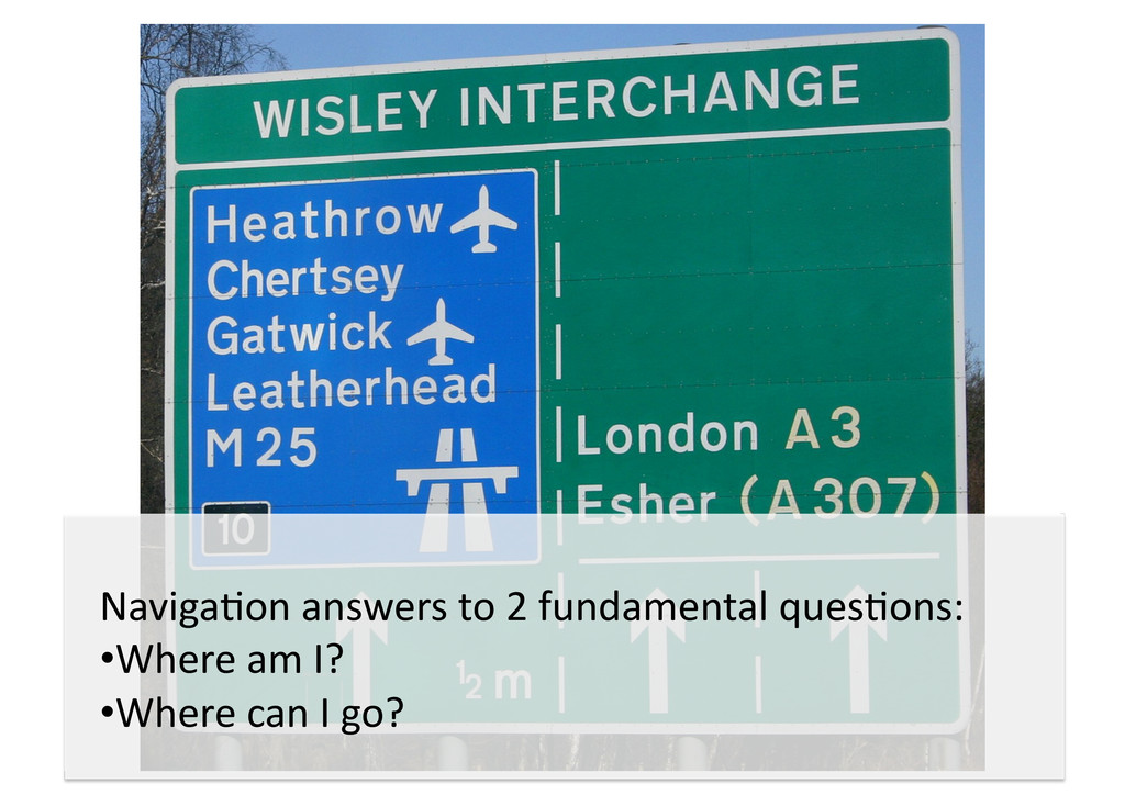
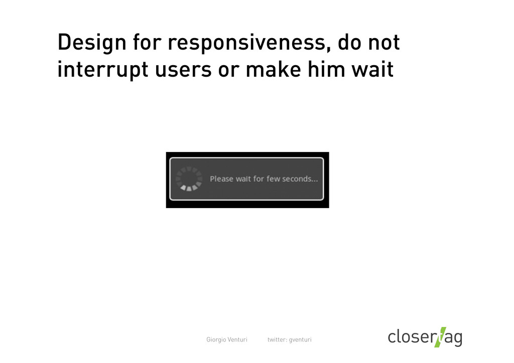
For example, how do you navigate between the different sections of the app? How do you provide visual feedback avoiding interrupting the user?

The goal of this session is to look at some of the emerging best practices on the Android Market and analyse best practices in navigation, fluid & responsive interaction and information visualisation.

giorgioventuri

February 03, 2012
Tweet

Other Decks in Design

Transcript

  1. Giorgio Venturi twitter: gventuri Who am I? Information Architecture, User

    research Founder of Closertag, design agency designing for Android since early 2009 One of the lead UX architects for the Skype application in 2010
  2. Giorgio Venturi twitter: gventuri Five layers of user experience Value

    proposition Structure Behaviour Code Visual design
  3. Giorgio Venturi twitter: gventuri Five layers of user experience Value

    proposition Structure Behaviour Code Visual design User  experience  can  be  decomposed  into  its  five  building   components.       However,  users  will  experience  all  those  layers  as  a  whole  –  not   separately.     You  won’t  have  a  great  user  experience  unless  you  address  these  five   layers  holis?cally  
  4. Giorgio Venturi twitter: gventuri It’s a design solution to a

    recurring problem Can  a  design  paAern  help  us  designing  a  great  user  experience?       Yes,  they  can!     It’s  also  about  not  reinven?ng  the  wheel.  People  want  to  use  what  they  have  learnt   already  using  the  phone.       Hence,  know  your  paAerns  and  use  them  to  build  your  applica?ons.       Don’t  use  paAerns  you  have  seen  on  other  plaGorms  like  iOS,  use  Android  paAerns.    
  5. Giorgio Venturi twitter: gventuri The evolution of the Android UI

    Google  IO  2009   Google  IO  2010   Google  IO  2011   Cupcake   Froyo   Gingerbread/Honeycomb   First  session  at  Google  IO   on  UI  design   First  presenta?on  on   PaAerns  based  on  the   TwiAer  app   Introducing  the  new   honeycomb  paAerns   Hypertext  nav   No?fica?ons   Sharing  Intents   Ac?on  bar  v1   Quick  ac?on/contact   Search  filters   Ac?on  bar  v2   Carousels   Only  normal,  mid-­‐density   screens   Support  for  mul?ple  screen   sizes   Fluid  design:   Fragments  
  6. Giorgio Venturi twitter: gventuri The evolution of the Android UI

    Google  IO  2009   Google  IO  2010   Google  IO  2011   Cupcake   Froyo   Gingerbread/Honeycomb   First  session  at  Google  IO   on  UI  design   First  presenta?on  on   PaAerns  based  on  the   TwiAer  app   Introducing  the  new   honeycomb  paAerns   Hypertext  nav   No?fica?ons   Sharing  Intents   Ac?on  bar  v1   Quick  ac?on/contact   Search  filters   Ac?on  bar  v2   Carousels   Only  normal,  mid-­‐density   screens   Support  for  mul?ple  screen   sizes   Fluid  design:   Fragments   Designing  for  Android  back  in  2009  was  very  different  from  what  is  designing   for  Android  in  2011     The  Google  Android  team  has  been  gradually  addressing  several  design   challenges  –  especially  with  naviga?on.     Also,  a  formidable  challenge  is  designing  for  a  wide  range  of  form  factors   (candybar,  tablets,  keyboards,  etc)  &  screen  resolu?ons  &  densi?es      
  7. Giorgio Venturi twitter: gventuri UI challenges Navigation Information visualisation On

    screen interaction Notifications & responsiveness Emotion & Expression
  8. Naviga?on  answers  to  2  fundamental  ques?ons:     •  Where

     am  I?     •  Where  can  I  go?    
  9. Giorgio Venturi twitter: gventuri Use shallow structures !""#$%&'&% %&'&%$( %)*+,*-$

    .)-& /!"0$)..$ %)123&! 0),*$ ',&4 0),*$ ',&4 0),*$ ',&4
  10. Giorgio Venturi twitter: gventuri Use shallow structures !""#$%&'&% %&'&%$( %)*+,*-$

    .)-& /!"0$)..$ %)123&! 0),*$ ',&4 0),*$ ',&4 0),*$ ',&4 General  rule:     Mobile  applica?ons  should  have  a  shallow  hierarchy  &  be   light  on  func?onality.       If  possible,  try  simplifying  &  reducing  the  amount  of  func?on   the  app  has;  don’t  try  adding  several  nested  features.  
  11. Giorgio Venturi twitter: gventuri Shun deep hierarchies !"#$%#&' ("&) *(

    +,-.'"(('!"*#/0),1 )23),#"!'"(( -4),4%)5' ("&) ,--3'!)4)! !)4)!'6 !)4)!'7
  12. Giorgio Venturi twitter: gventuri Shun deep hierarchies !"#$%#&' ("&) *(

    +,-.'"(('!"*#/0),1 )23),#"!'"(( -4),4%)5' ("&) ,--3'!)4)! !)4)!'6 !)4)!'7 Some?mes  this  is  just  not  possible  (e.g.  Facebook,  Linkedin,  etc).     In  these  case,  consider  the  most  important  view  or  feature  in  your   app  (e.g.  contacts  view  in  Skype,  Feed  for  Facebook,  etc)  and  make   user  land  on  that  screen.     Allow  then  people  can  go  to  the  overview  screen,  by  using  the  ac?on   bar  (see  next  slides)  
  13. Giorgio Venturi twitter: gventuri Up and back in Android Contacts

      Compose  email   Contact  details   Inbox  
  14. Giorgio Venturi twitter: gventuri Contacts   Compose  email   Contact

     details   Inbox   Back   Back   Up   From  Honeycomb  moving  forward:   -­‐  SYSTEM  BACK  navigates  history  between  related  screens       -­‐  APPLICATION  UP  navigates  hierarchy  within  a  single  app   This  issue  has  been  discussed  at  length  in:     Designing  and  ImplemenIng  Android  UIs  for  Phones  and  Tablets,  Google  IO  2011   This  has  been  a  great  area  of  concern  as  the  back  buAon  brings  you  back  in  the  history  stack  
  15. Giorgio Venturi twitter: gventuri Action bar Up to HOME SCREEN

    + BRANDING Introduced  at  Google  Io  2010  with  the  TwiAer  app,  it  quickly  spread  to  other  apps   (but  it  is  far  from  being  ubiquitous)  
  16. Giorgio Venturi twitter: gventuri Tabs They  expose  main  func?onality  &

     views.  They  help  building  a  mental  model  of  the   app.  They  show  you  where  you  are  and  where  you  can  go.       You  can  use  icons,  labels  or  a  mix  of  both  according  to  screen  sizes.     You  can’t  go  wrong  with  tabs  really,  they  have  been  here  since  1996  and  they  are   here  to  stay.    
  17. Giorgio Venturi twitter: gventuri Dashboards Entrypoint  screen  into  the  main

     views.     It  was  made  popular  by  Facebook  on  iOS.     We  don’t  par?cularly  like  this  approach,  it’s  a  bit  lazy  &  it  is  also  an  excuse  for  feature  bloat.       The  main  problem  is  that  if  your  app  has  a  dominant  view  (e.g.  contacts)  it  will  make  it  one   step  further  &  it  adds  an  extra  level  in  the  naviga?on.  It  hides  informa?on.     In  fact  twiAer  has  recently  removed  the  dashboard  and  gone  back  to  tabs  view  –  for  good.    
  18. Giorgio Venturi twitter: gventuri Honeycomb action bar General organization Action

    Bar ๏ App icon ๏ View details ๏ Action buttons 31 Home icon View details Action buttons WHERE I AM? WHAT CAN I SEE? WHAT CAN I DO HERE? It  works  par?cularly  well  with  large  screens  &  tablets  -­‐    as  you  can  imagine.  This   approach  is  discussed  in     Designing  and  ImplemenIng  Android  UIs  for  Phones  and  Tablets,   Google  IO  2011    
  19. Giorgio Venturi twitter: gventuri Action bar on large and small

    screens Phones and smaller screens Action Bar 39
  20. Giorgio Venturi twitter: gventuri Carousel tabs Aka  ‘sliding  tabs’  

      They  are  used  to  pivot  between  different  views  in  the  same  category  –  for  example   browsing  your  circles,  or  filtering  between  different  sec?ons  in  the  market  –   featured,  top  paid,  free,  etc.     The  beauty  is  that  users  can  either  tap  or  swipe  (on  any  part  of  the  screen)     Recent  research  from  N&N  Group  claims  that  people  DO  GET  swiping.  
  21. Giorgio Venturi twitter: gventuri Custom navigation Nobody  is  going  to

     give  you  a  prize  for  re-­‐inven?ng  basic  naviga?on.       Linkedin  for  example  is  trying  to  reinvent  the  wheel  by  having  a  custom  swipe   gesture  on  the  ac?on  bar.     There’s  another  problem  with  this  screen:  the  ?les  beneath  seem  a  image  carousel   –  but  they  are  not.  
  22. Giorgio Venturi twitter: gventuri Custom navigation - Spotify SPOTIFY  is

     using  a  naviga?on  metaphor  from  Cupcake,  the  ‘tray’.       While  the  tray  used  to  be  part  of  the  framework,  it  has  now  become  obsolete  from   2.1+  onwards     Avoid  using  the  tray  from  now  on  
  23. Giorgio Venturi twitter: gventuri Portrait dominant or fluid? ?  

    Un?l  Android  1.6,  OS  had  a  fluid  behaviour.     Unfortunately,  it  is  not  very  efficient  &  to  design  the  app  twice.     If  you  have  a  limited  set  of  resources,  to  design  the  app  for  one  orienta?on  only    
  24. Giorgio Venturi twitter: gventuri Consider the primary use of the

    app Make  sure  you  understand  where  your  applica?on  is  going  to  be  used  most  when   deciding  the  primary  orienta?on.     With  laid  back  interac?on,  make  landscape  the  primary  view     With  ‘on  the  move’  interac?on  (e.g.  loca?on  based  services),  s?ck  to  portrait   orienta?on.    
  25. Giorgio Venturi twitter: gventuri Lists Display Name Latest activity Display

    Name Latest activity Display Name Latest activity A Me +1234567890123 Display Name Latest activity Display Name Latest activity Display Name Latest activity Display Name Latest activity B Contacts Only contacts with phones Sort list by First name View contact names as First name, surname Import contacts Import/export contacts Export contacts To local storage Recent activities Enabled Display options Import/export contacts Display Name Latest activity Display Name Latest activity Display Name Latest activity A B Docking headers They can dock at the top of the viewport when scrolling down. Header Call to Action Context Quick scroll Should be used to position the user quickly in a section of the list. Toggle Contacts Display status
  26. Giorgio Venturi twitter: gventuri Use of fragments Before  the  release

     of  honeycomb,  you  had  to  develop  completely  separate  views  to   take  advantage  of  increased  real  estate  on  tablets.       Now  you  can  use  fragments.     In  general,  fragments  can  be  used  to  have  several  views  into  one  screen  and  it  brings   increased  usability.  Think  Gmail.       –  Combine  a  list  and  a  detail  view  for  browsing  tasks    –  Consolidate  mul?ple  related  phone  screens  into  a  single  compound  view     –  Avoid  excessively  long  line  lengths   Panes  to  the  right  should  generally  present  more  content  or  details  for  items  selected   in  the  panes  on  the  lek.   This  topic  is  a  presenta?on  in  itself,  so  I  won’t  indulge  on  this  topic,  check  the  other   references  
  27. Giorgio Venturi twitter: gventuri Toolbars & Actions frames Fixed  ac?ons

     frame  at  the  boAom,  allows  users  to  quickly  execute  an  ac?on  with   no  scrolling.  
  28. Giorgio Venturi twitter: gventuri Modal dialogues There’s  way  too  many

     dialogues  in  Android,  this  one  is  especially  threatening.     If  you  have  to  use  them,  the  posi?ve  call  to  ac?on  is  always  on  the  lek  
  29. Giorgio Venturi twitter: gventuri Forms: use tooltips | Enter Username

    i username must be minimum 6 characters Tool?ps  allow  the  user  to  avoid  making  errors  –  especially  useful  in  registra?on   forms  
  30. Giorgio Venturi twitter: gventuri Toast notifications from androidpatterns.com When  no

     response  is  required  at  all  from  the  user.     It  can  appear  on  top  of  any  user  ac?vity  or  app  –  not  necessarily  the  app  that   originated  it  
  31. Giorgio Venturi twitter: gventuri Status bar notification Use  this  when

     ac?on  is  applicable  .  E.g.  previewing  the  uploaded  image  
  32. Giorgio Venturi twitter: gventuri Develop a visual language The  quality

     of  your  visual  language  is  a  strong  cue  towards  the  quality  of  your   applica?on!     Spend  ?me  developing  a  peculiar,  dis?nc?ve  visual  language  including  ?les,   markers,  buAon,  etc.  
  33. Giorgio Venturi twitter: gventuri Take care in designing your icons

    Purchase  decisions  are  made  on  an  impulse.     A  well  designed  icon  &  logo  can  make  the  difference  between  success  and  failure  if   you  are  on  the  market.     It  will  work  also  work  wonders  on  the  ac?on  bar…  
  34. Giorgio Venturi twitter: gventuri Use of splash screens Not  compulsory,

     but  it  is  especially  useful  to  show  while  app  preloads  libraries,   collec?ons,  caching  loca?on  etc.  –  beAer  having  users  wait  in  the  first  seconds,   rather  than  once  they  start  interac?ng.     It’s  also  a  good  opportunity  to  reinforce  your  branding  
  35. Giorgio Venturi twitter: gventuri Design strategies Understand who’s it for,

    go and talk to them Involve a designer (or two) Prototype & test Analytics