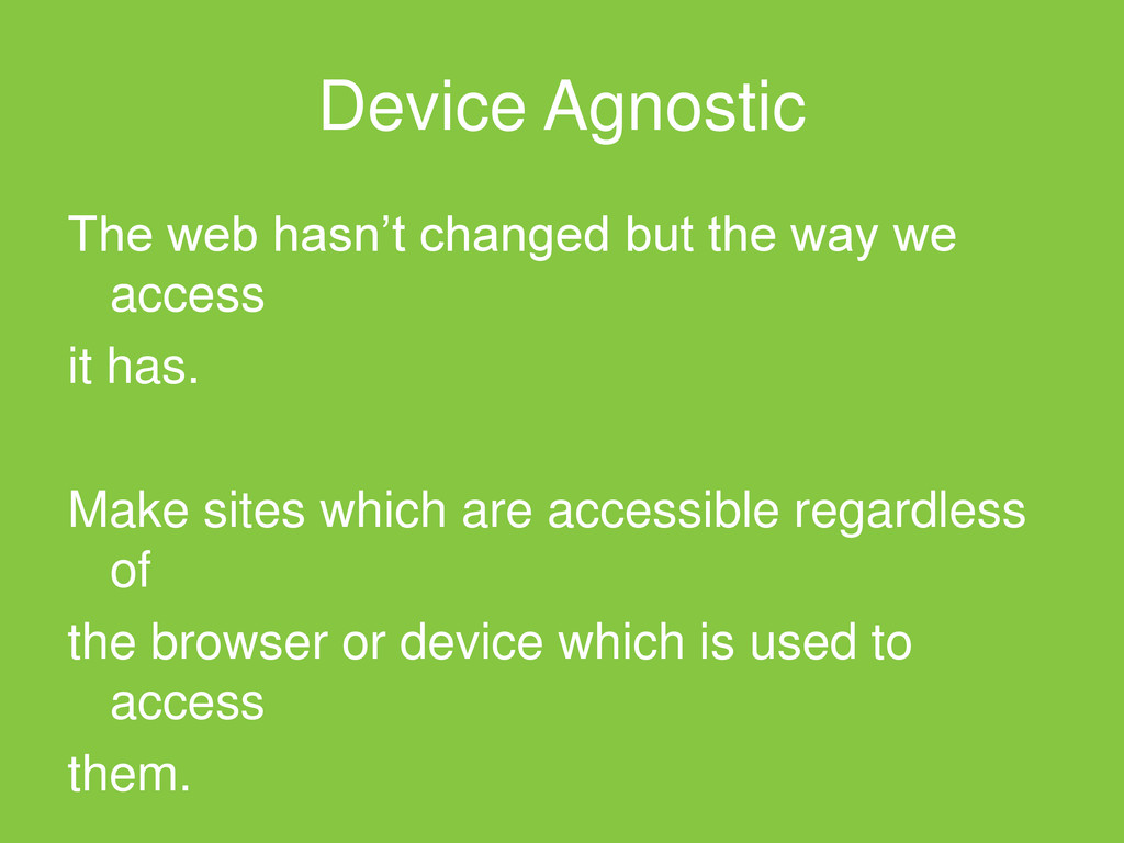
for all of these devices Impossible to test across all these hundreds of devices and operating systems. A device agnostic approach is required, a responsive approach.
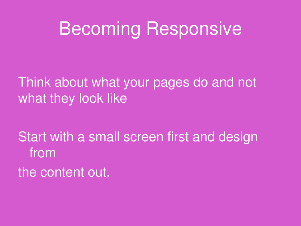
default – we’ve attempted to make it fixed for years by applying strict constraints. Hangover from print days, by making fixed designs it gives us greater control and eases development.
web’s greatest strength, and we’ve been ignoring it for too long. It’s time to embrace it by creating responsive designs which are as device agnostic as possible.
and start designing for everyone. Users shouldn’t have to adapt to your site, your site should adapt to them. Large screen and small should be given an optimal experience
 nakahara
 kkamegawa
 har1101
 blueswen
 masuda220
 x5gtrn
 guaca
guaca
 chiroruxx
 tonkotsuboy_com
 kajitack
 andpad
 k1mu21
 tmiket
 geoffreycrofte
 yeseniaperezcruz
 emna__ayadi
 nikkihalliwell
 brad_frost
 badams
 jacobtomlinson
 jmmastey
 stephaniewalter
 jct
jct
 inesmontani