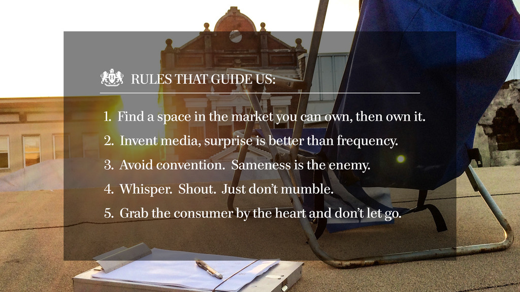
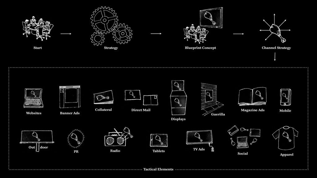
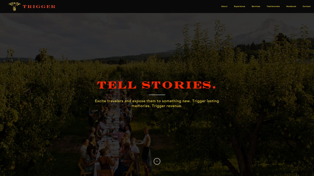
market you can own, then own it. 2. Invent media, surprise is better than frequency. 4. Whisper. Shout. Just don’t mumble. 3. Avoid convention. Sameness is the enemy. 5. Grab the consumer by the heart and don’t let go.
brand strategy, and a creative brand foundation that we like to call Blueprint Creative. This allows us to help build the foundation of the brand, ensuring a consistent approach throughout all executions. ! However, as we understand this is not always a viable part of a web development project, we condense the creative development into the design of the site.
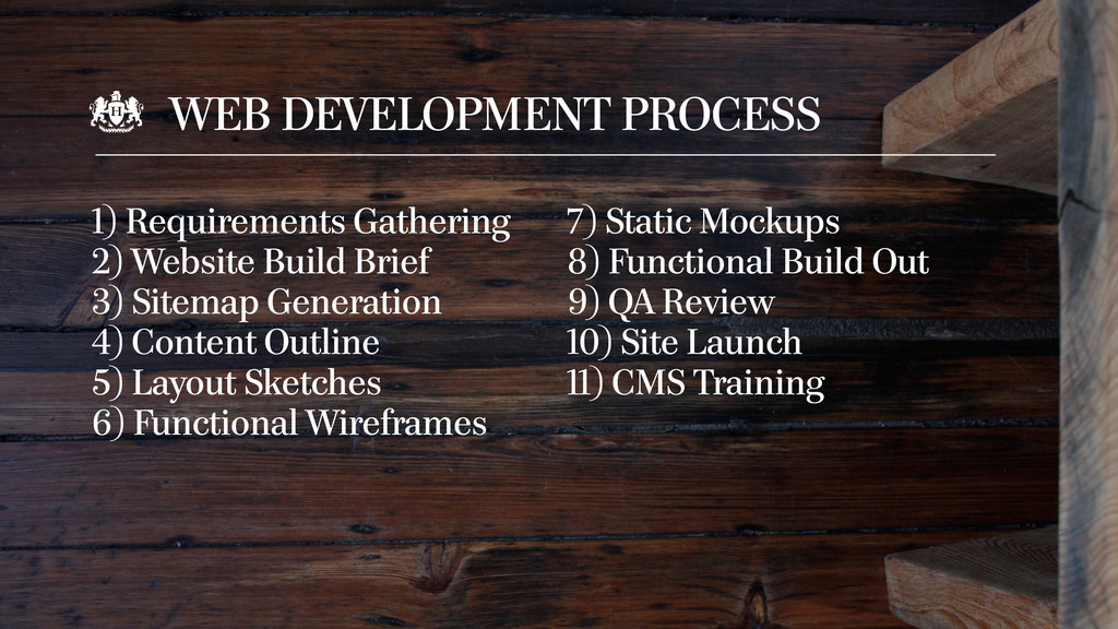
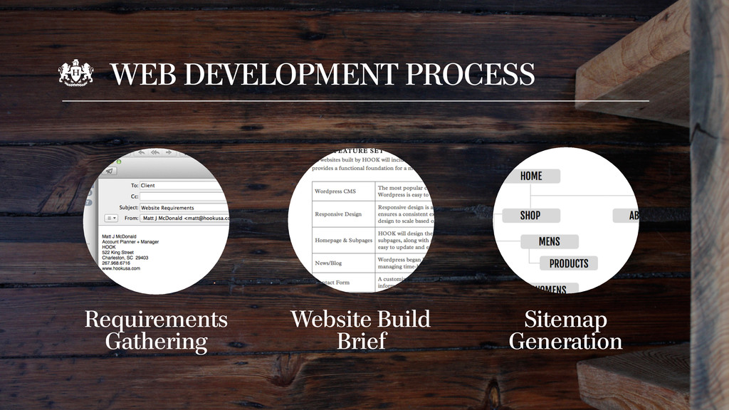
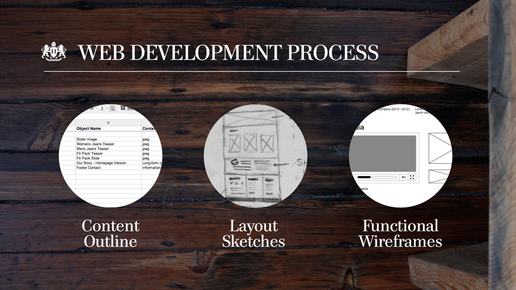
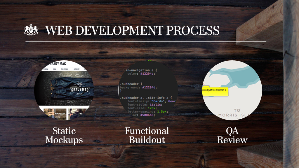
sea of sameness. We aim to change that. Every site we build is designed to set our clients apart, connect with audiences, and drive revenue, exposure, or awareness. ! Our eleven-step website process is strategically designed to take you from concept to completion and deliver a site that is both engaging and effective.
foundation in establishing goals for your new website. These goals act as guideposts throughout the design and development process and ultimately deliver a web solution that everyone can be proud of.
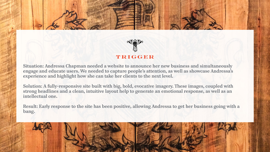
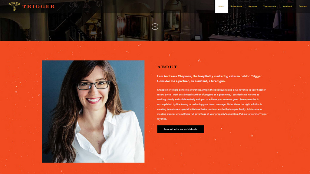
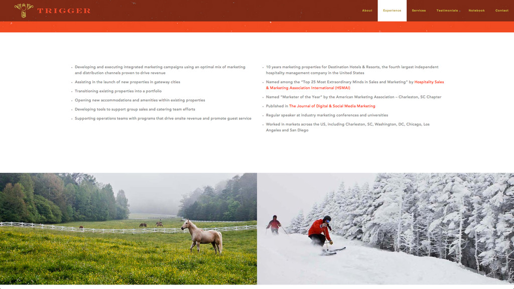
announce her new business and simultaneously engage and educate users. We needed to capture people’s attention, as well as showcase Andressa’s experience and highlight how she can take her clients to the next level. ! Solution: A fully-responsive site built with big, bold, evocative imagery. These images, coupled with strong headlines and a clean, intuitive layout help to generate an emotional response, as well as an intellectual one. ! Result: Early response to the site has been positive, allowing Andressa to get her business going with a bang.
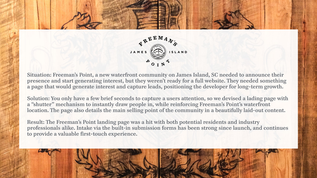
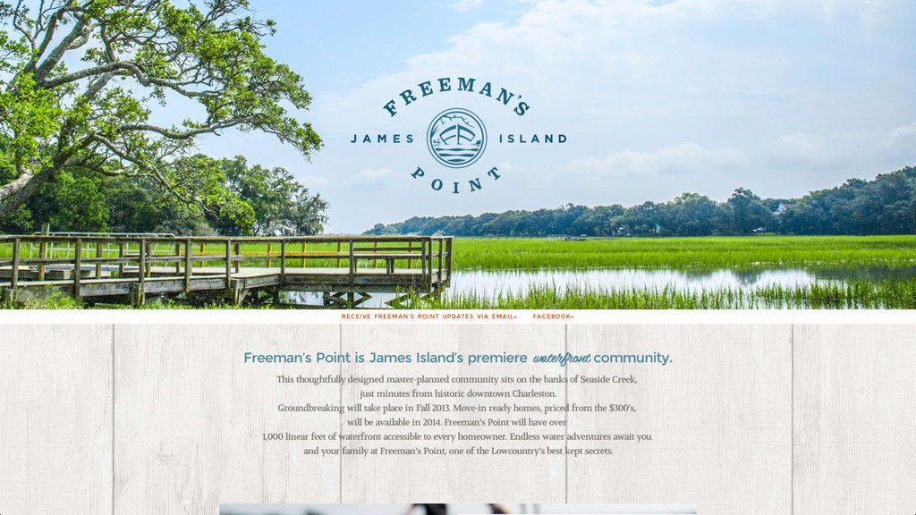
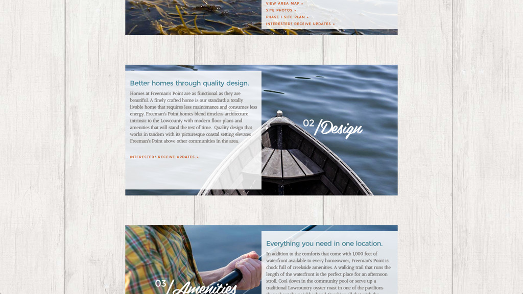
James Island, SC needed to announce their presence and start generating interest, but they weren’t ready for a full website. They needed something a page that would generate interest and capture leads, positioning the developer for long-term growth. ! Solution: You only have a few brief seconds to capture a users attention, so we devised a lading page with a “shutter” mechanism to instantly draw people in, while reinforcing Freeman’s Point’s waterfront location. The page also details the main selling point of the community in a beautifully laid-out content. ! Result: The Freeman’s Point landing page was a hit with both potential residents and industry professionals alike. Intake via the built-in submission forms has been strong since launch, and continues to provide a valuable first-touch experience.
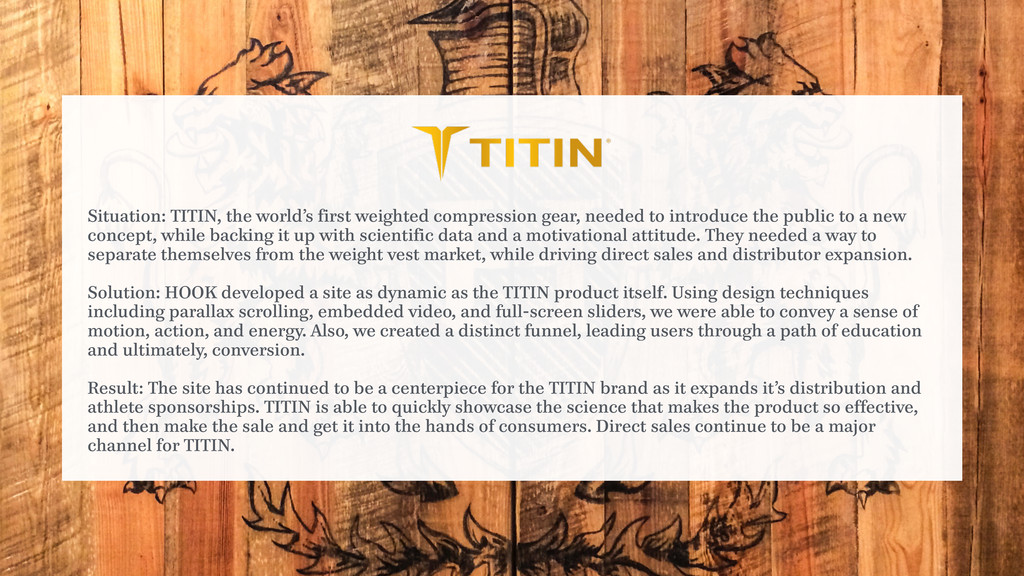
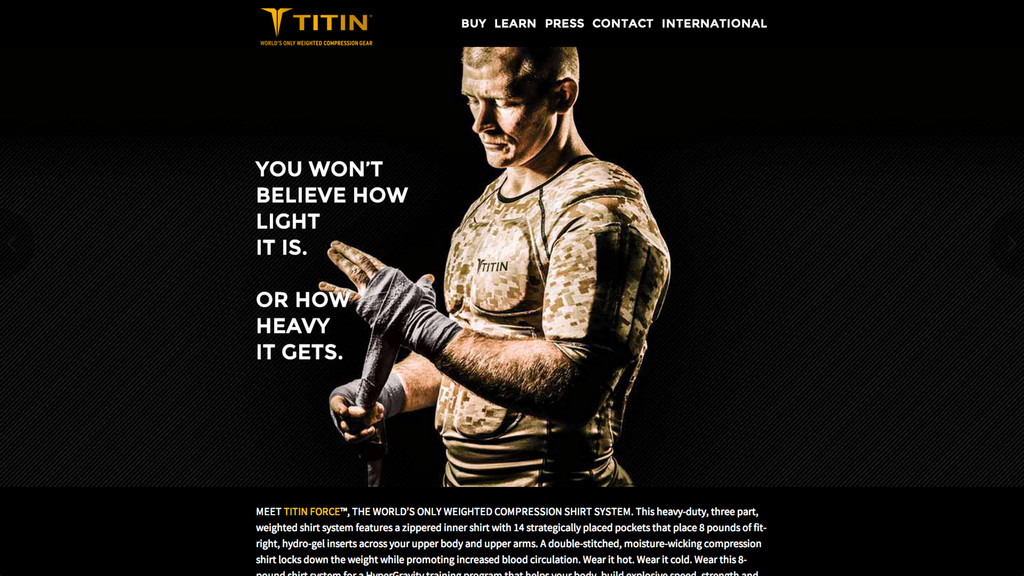
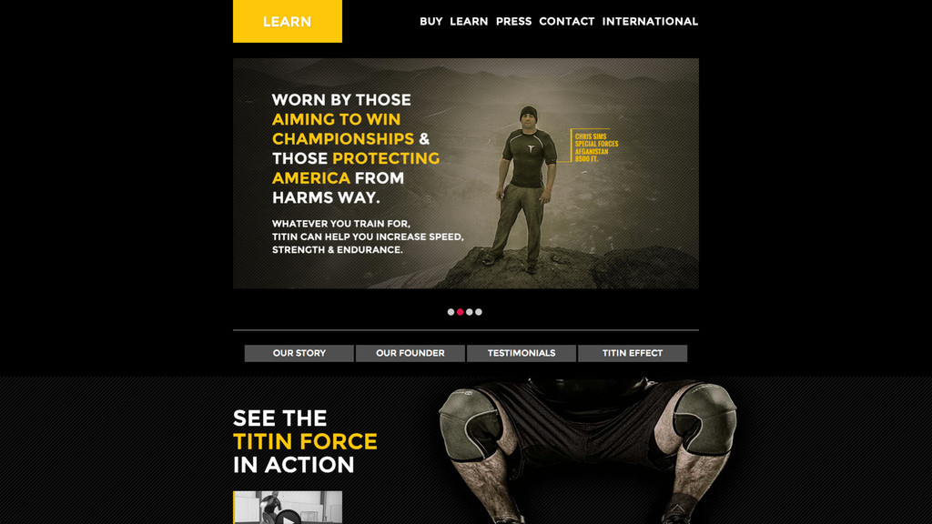
needed to introduce the public to a new concept, while backing it up with scientific data and a motivational attitude. They needed a way to separate themselves from the weight vest market, while driving direct sales and distributor expansion. ! Solution: HOOK developed a site as dynamic as the TITIN product itself. Using design techniques including parallax scrolling, embedded video, and full-screen sliders, we were able to convey a sense of motion, action, and energy. Also, we created a distinct funnel, leading users through a path of education and ultimately, conversion. ! Result: The site has continued to be a centerpiece for the TITIN brand as it expands it’s distribution and athlete sponsorships. TITIN is able to quickly showcase the science that makes the product so effective, and then make the sale and get it into the hands of consumers. Direct sales continue to be a major channel for TITIN.
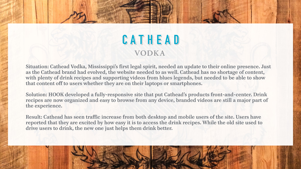
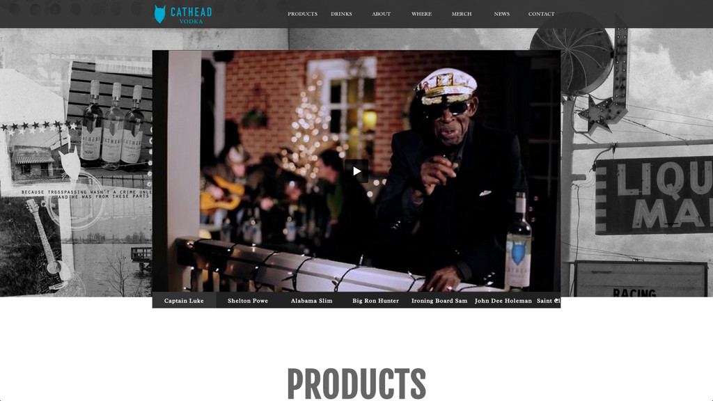
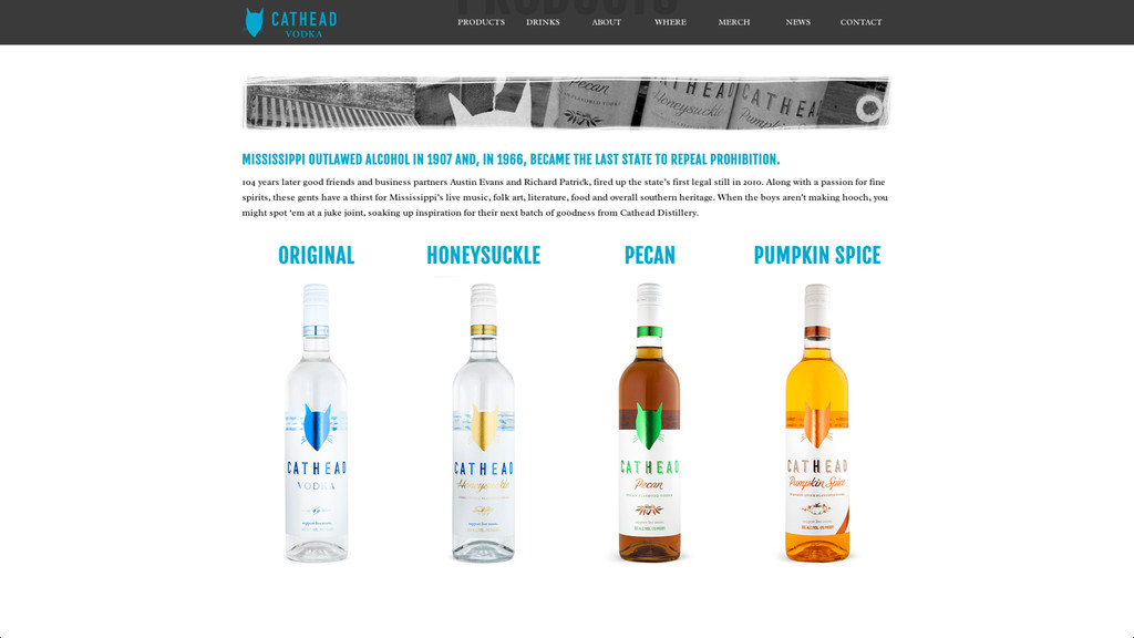
an update to their online presence. Just as the Cathead brand had evolved, the website needed to as well. Cathead has no shortage of content, with plenty of drink recipes and supporting videos from blues legends, but needed to be able to show that content off to users whether they are on their laptops or smartphones. ! Solution: HOOK developed a fully-responsive site that put Cathead’s products front-and-center. Drink recipes are now organized and easy to browse from any device, branded videos are still a major part of the experience. ! Result: Cathead has seen traffic increase from both desktop and mobile users of the site. Users have reported that they are excited by how easy it is to access the drink recipes. While the old site used to drive users to drink, the new one just helps them drink better.
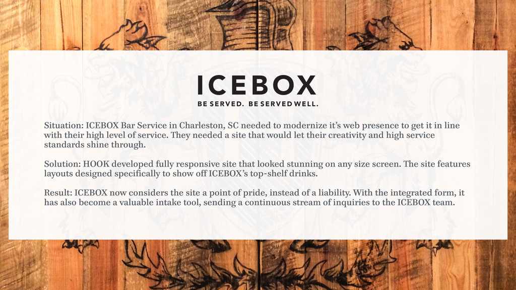
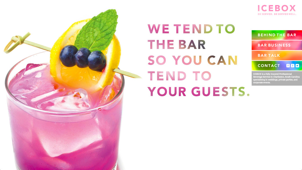
to modernize it’s web presence to get it in line with their high level of service. They needed a site that would let their creativity and high service standards shine through. ! Solution: HOOK developed fully responsive site that looked stunning on any size screen. The site features layouts designed specifically to show off ICEBOX’s top-shelf drinks. ! Result: ICEBOX now considers the site a point of pride, instead of a liability. With the integrated form, it has also become a valuable intake tool, sending a continuous stream of inquiries to the ICEBOX team.
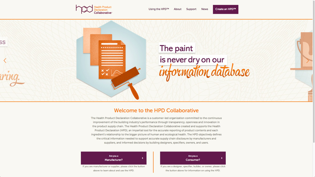
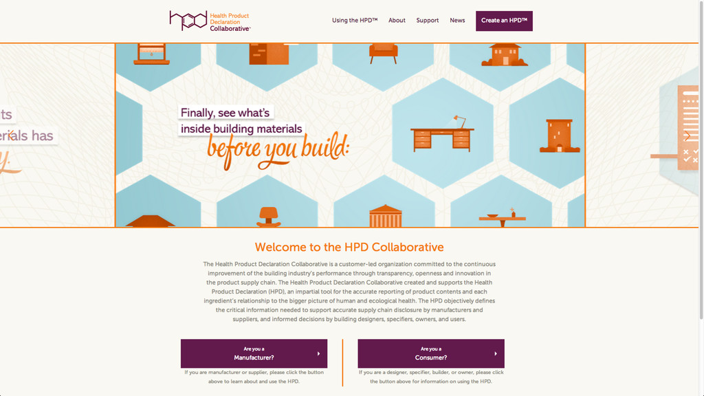
to quickly establish who they are (a customer-led organization committed to the continuous improvement of the building industry’s environmental and health performance) and why it’s important to two different audiences. With the website serving as the primary touchpoint, it needed to be clear and compelling, while serving the right content to the right audience. ! Solution: We developed the HPDC website with a dual funnel, complete with unique versions of creative, that could immediately route users into one path or the other depending on whether they were producers or consumers. ! Result: Adoption of the HPD Standard has been steadily growing since the deployment of the new branding and website. Users can now find relevant information quickly and easily, leading to a smoother on-boarding process, as well as a decrease in process abandonment.
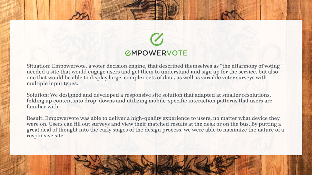
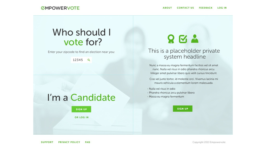
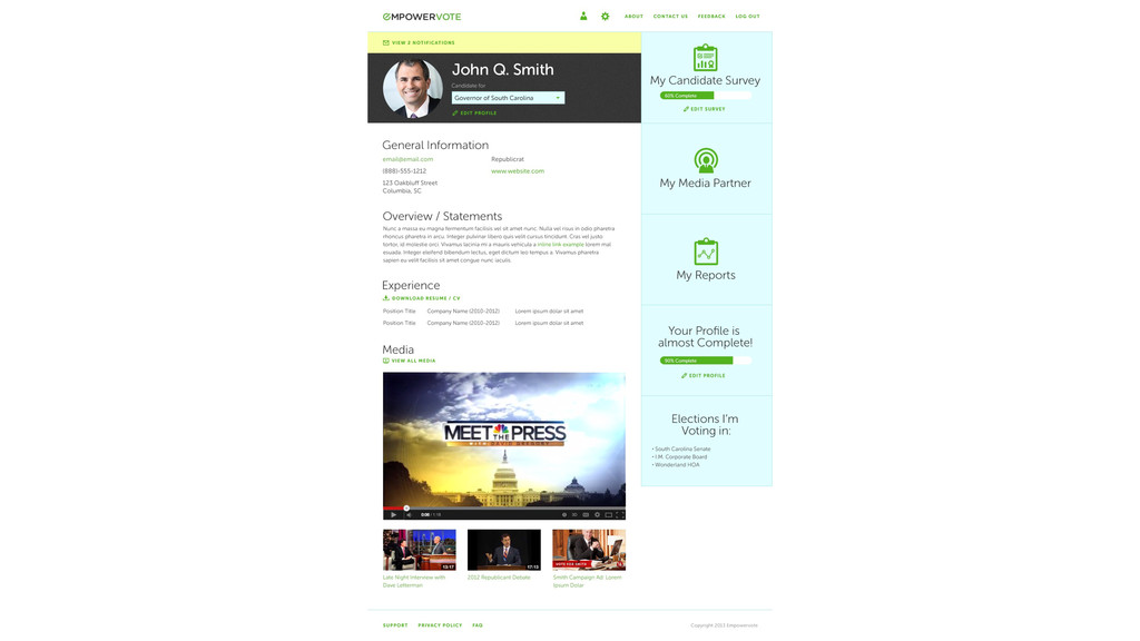
themselves as “the eHarmony of voting” needed a site that would engage users and get them to understand and sign up for the service, but also one that would be able to display large, complex sets of data, as well as variable voter surveys with multiple input types. ! Solution: We designed and developed a responsive site solution that adapted at smaller resolutions, folding up content into drop-downs and utilizing mobile-specific interaction patterns that users are familiar with. ! Result: Empowervote was able to deliver a high-quality experience to users, no matter what device they were on. Users can fill out surveys and view their matched results at the desk or on the bus. By putting a great deal of thought into the early stages of the design process, we were able to maximize the nature of a responsive site.
 eitanlees
 aleyda
 aemeredith
 reverentgeek
 retrage
 gr2m
gr2m
 baasie
 speakerdeck
 akihiro_kokubo
 katiecoart
 codingconduct
 wayneb77
![OR IS IT? [email protected] | 267.968.6716](https://files.speakerdeck.com/presentations/c4e75a90bcf6013154653e3152fb88ad/slide_46.jpg)