Upgrade to Pro — share decks privately, control downloads, hide ads and more …

Go Responsive with Magento

Hrvoje Jurišić
September 17, 2013

Go Responsive with Magento

My talk from Magento Developers Paradise 2013 in Palma de Mallorca

Hrvoje Jurišić

September 17, 2013
Tweet

More Decks by Hrvoje Jurišić

Other Decks in Design

Transcript

  1. “You don’t get to decide which platform or device your

    customers use to access your content: they do.” Karen McGrane @karenmcgrane
  2. people access the web from their mobile devices 1.2 billion

    Globally Source: Trinity Digital Marketing
  3. Native app 1. Access to device hardware 2. Works offline

    3. Fast performance 4. Monetization 5. Personalization
  4. Native app 1. Works only on one platform 2. Higher

    maintenance costs 3. Requires user action 4. App store approval process
  5. Responsive site 1. Use same code and content 2. Device

    agnostic 3. Single URL 4. Future ready
  6. Responsive web design means designing your website so that it

    responds to users environment based on screen size, platform or orientation.
  7. “Responsive web design isn’t your site working on phones and

    tablets. It’ s about your site working everywhere.” Scott Kellum @ScottKellum
  8. Content out, Mobile first design "Content precedes design. Design in

    the absence of content is not design, it's decoration."
  9. • Embrace mobile constraints to focus • Prioritize what really

    matters • Use mobile capabilities to innovate http://bradfrostweb.com/blog/web/mobile-first-responsive-web-design/
  10. • Content Based Mockups • Out with the Photoshop •

    Move quickly into Browser • Develop a Design System http://vimeo.com/45915667 http://styletil.es/ http://medium.com/what-i-learned-today/270048a88c70
  11. .main { width: 1000px; margin: 0 auto; } .col-main {

    margin-left: 30px; width: 750px; float: left; } .col-left { float: left; width: 220px; } .main { width: 100% max-width: 1000px; margin: 0 auto; } .col-main { margin-left: 3%; width: 75%; float: left; } .col-left { float: left; width: 22%; }
  12. When fluid layouts and adaptive content don’t work in harmony

    anymore, it is time to make a larger shift in layout.
  13. <link rel = "stylesheet" type = "text/css" media = "screen

    and (min-width: 480px)" href = "style-480.css" />
  14. header product image description images gallery footer add to cart

    form share buttons custom block header title product image images gallery share buttons title description add to cart
  15. • Mobile first! • Generic layouts don’t work • Use

    One Column page layout • Create your custom templates
  16. REARRANGING CONTENT .wrap { display: table; } @media screen and

    (min-width: 600px) { .navigation { display: table-header-group; } }
  17. Responsive navigation patterns 1. DO NOTHING APPROACH 2. FOOTER ANCHOR

    3. SELECT MENU 4. TOGGLE 5. OFF CANVAS http://bradfrost.github.io/this-is-responsive/patterns.html#navigation
  18. BACKGROUND IMAGES .logo { background: url(images/logo.png) no-repeat; } @media screen

    and (min-width: 400px) { .logo { background: url(logo-big.png) no-repeat; } }
  19. CONTENT IMAGES 1. Multiple image sources 2. Single image source

    aka server side solution 3. Native solution 4. One image to rule them all 5. SVG 6. Icon fonts
  20. 1. Multiple image sources - possible to serve different images

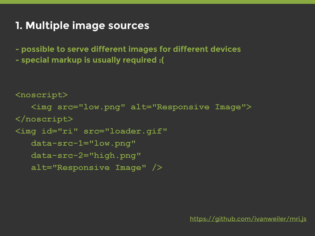
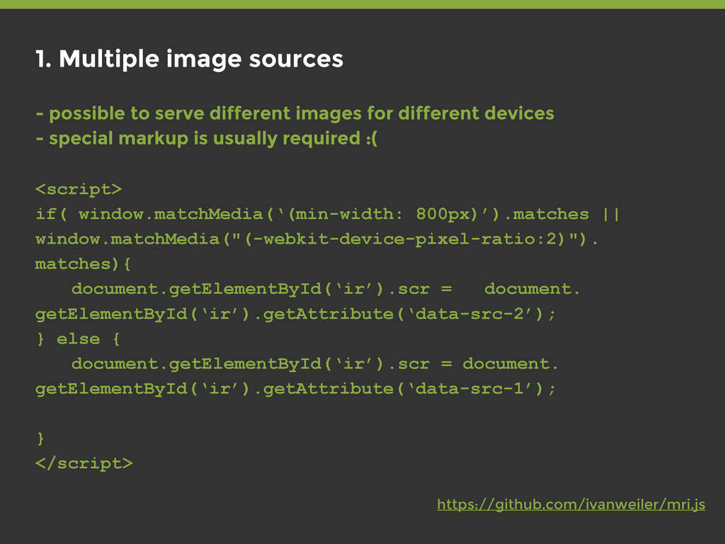
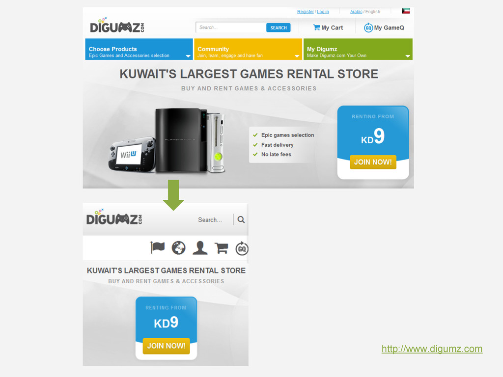
    for different devices - special markup is usually required :( <noscript> <img src="low.png" alt="Responsive Image"> </noscript> <img id="ri" src="loader.gif" data-src-1="low.png" data-src-2="high.png" alt="Responsive Image" /> https://github.com/ivanweiler/mri.js
  21. 1. Multiple image sources - possible to serve different images

    for different devices - special markup is usually required :( <script> if( window.matchMedia(‘(min-width: 800px)’).matches || window.matchMedia("(-webkit-device-pixel-ratio:2)"). matches){ document.getElementById(‘ir’).scr = document. getElementById(‘ir’).getAttribute(‘data-src-2’); } else { document.getElementById(‘ir’).scr = document. getElementById(‘ir’).getAttribute(‘data-src-1’); } </script> https://github.com/ivanweiler/mri.js
  22. 2. Single image source aka server side solution - markup

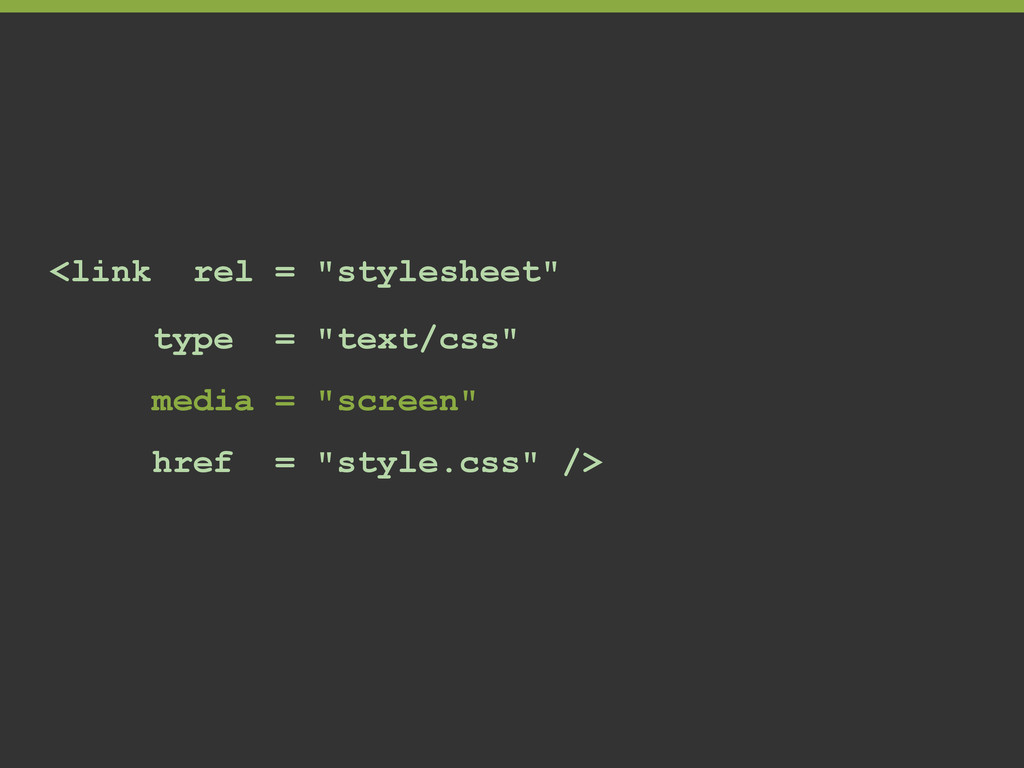
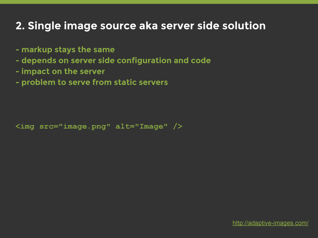
    stays the same - depends on server side configuration and code - impact on the server - problem to serve from static servers <img src="image.png" alt="Image" /> http://adaptive-images.com/
  23. 3. Native solution SRCSET ATTRIBUTE <img alt="The Breakfast Combo" src="banner.jpeg"

    srcset="banner-HD.jpeg 2x, banner-phone.jpeg 500w, banner-phone-HD.jpeg 500w 2x"> http://responsiveimages.org/ http://www.w3.org/html/wg/drafts/srcset/w3c-srcset/
  24. 3. Native solution SRCSET ATTRIBUTE <img alt="The Breakfast Combo" src="banner.jpeg"

    srcset="banner-HD.jpeg 2x, banner-phone.jpeg 100w, banner-phone-HD.jpeg 100w 2x"> webkit implementation <img src="low-res.jpg" srcset="high-res.jpg 2x"> www.webkit.org
  25. 3. Native solution <picture> ELEMENT <picture width="500" height="500"> <source media="(min-width:

    45em)" src="large.jpg"> <source media="(min-width: 18em)" src="med.jpg"> <source src="small.jpg"> <img src="small.jpg" alt=""> <p>Accessible text</p> </picture> http://github.com/scottjehl/picturefill http://picture.responsiveimages.org/
  26. 4. One image to rule them all • Design for

    suitable average • Create 1.5x image for all resolutions. • “Compressive images” http://filamentgroup.com/lab/rwd_img_compression/ http://dbushell.com
  27. 5. SVG • Use SVG where you can • Resolution

    independent images • Use Modernizr to detect if browser supports svg, and provide .png fallback http://dbushell.com/2013/02/04/a-primer-to-front-end-svg-hacking/
  28. 6. Icon fonts • Fonts are resolution independent • You

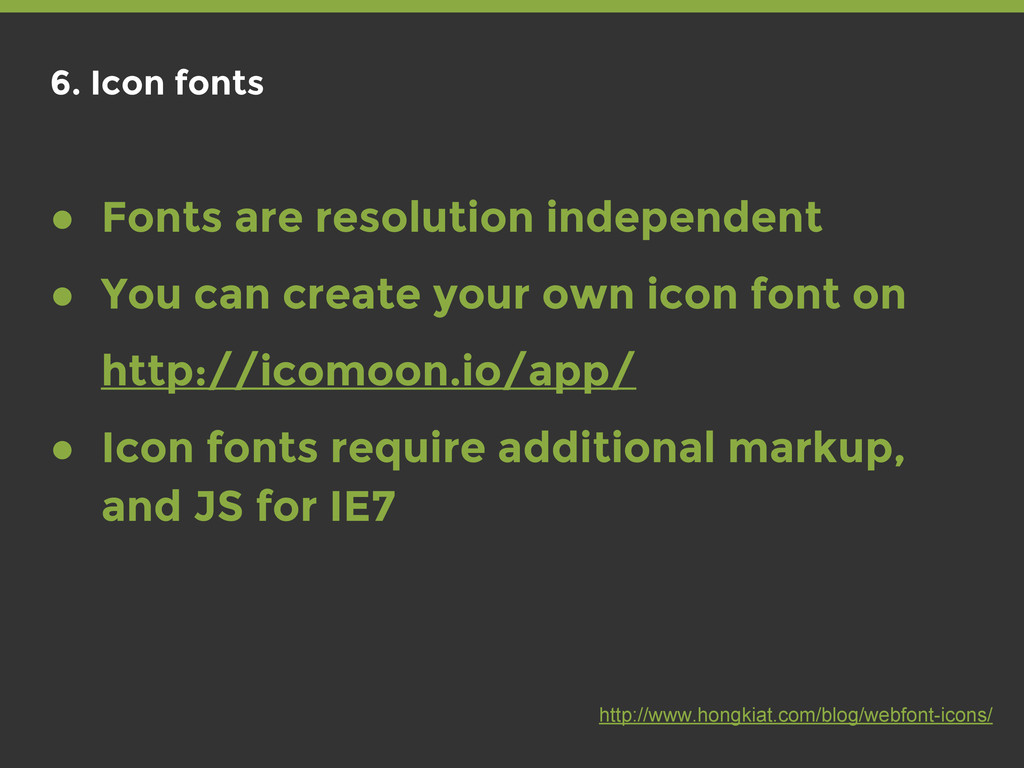
    can create your own icon font on http://icomoon.io/app/ • Icon fonts require additional markup, and JS for IE7 http://www.hongkiat.com/blog/webfont-icons/
  29. WEB FORMS - inputs are pain on mobile - reduce

    number of required inputs - make your forms linear
  30. RESPONSIVE TABLES - the fancy way @media only screen and

    (max-width: 760px) { /* Force table to not be like tables anymore */ table, thead, tbody, th, td, tr { display: block; } /* Hide table headers (but not display: none;, for accessibility) */ thead tr { position: absolute; top: -9999px; left: -9999px; } tr { border: 1px solid #ccc; } td { /* Behave like a "row" */ border: none; border-bottom: 1px solid #eee; position: relative; padding-left: 50%; }
  31. RESPONSIVE TABLES - the fancy way td:before { /* Now

    like a table header */ position: absolute; /* Top/left values mimic padding */ top: 6px; left: 6px; width: 45%; padding-right: 10px; white-space: nowrap; } /* Label the data */ td:nth-of-type(1):before { content: "First Name"; } td:nth-of-type(2):before { content: "Last Name"; } ..... ..... }
  32. RESPONSIVE TABLES - the usual way <div class="table-wrapper"> <table> <tr>

    <td>Property</td> <td>Value</td> </tr> </table> </div> .table-wrapper { overflow: auto; } table { min-width: 100%; /* DON’T set width: 100% */ }
  33. The top eCommerce sites in the world are 22% slower

    than they were last year. http://www.yottaa.com
  34. 80-90% of the end-user response time is spent on the

    frontend. Start there. http://www.stevesouders.com Steve Sounders @sounders
  35. 1. Reduce http requests - use css sprites - use

    icon fonts - merge javascript - merge css
  36. 3. Minify Javascript and CSS - removing comments and white

    space - smaller files - additional 5% reduce on gzip-ed files
  37. 6. Async load Javascript - JS blocks downloads - Load

    it asynchronous <script async src="resource.js"></script>
  38. 7. CSS at the top - CSS blocks rendering -

    render page progressively - load it early. in the <head>
  39. 8. Use Content Delivery Network - Deploys content across multiple

    servers - servers distributed across multiple locations - closer to user, faster delivery
  40. 10. Use DNS pre-fetching - 20-120 ms for DNS to

    lookup the IP address - No download until lookup is completed <link href="//my.domain.com" rel="dns-prefetch" />
  41. 12. Use conditional loading - load assets only when you

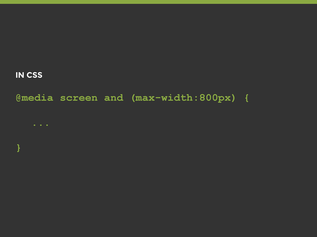
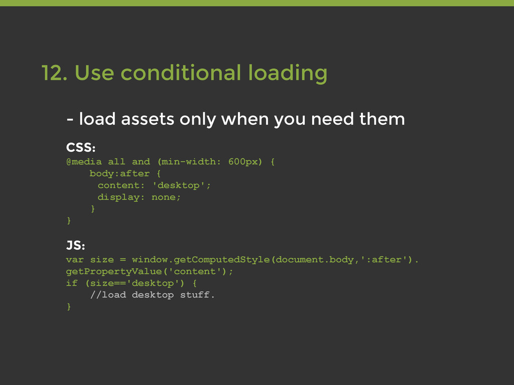
    need them CSS: @media all and (min-width: 600px) { body:after { content: 'desktop'; display: none; } } JS: var size = window.getComputedStyle(document.body,':after'). getPropertyValue('content'); if (size=='desktop') { //load desktop stuff. }
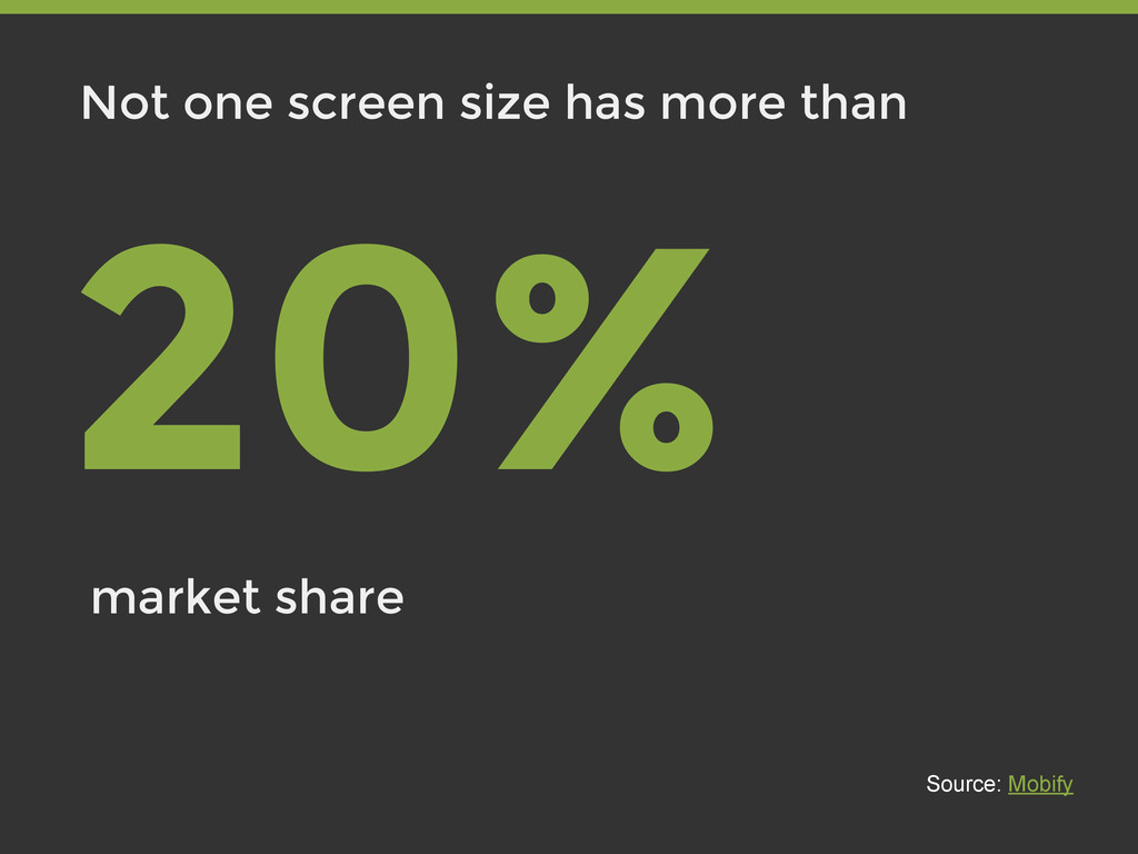
  42. 13. Use far future header expires - cache files on

    client side - no request is made - problems with file updates <link rel="stylesheet" href="style.css?v2323" type="text/css" />
  43. Numbers after rewamp 267% - mobile traffic 265% - mobile

    revenue 178% - mobile conversion rate