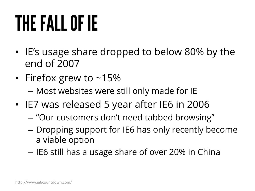
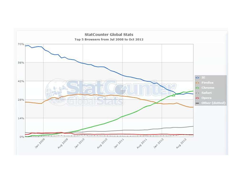
end of 2007 • Firefox grew to ~15% – Most websites were still only made for IE • IE7 was released 5 year after IE6 in 2006 – ”Our customers don’t need tabbed browsing” – Dropping support for IE6 has only recently become a viable option – IE6 still has a usage share of over 20% in China http://www.ie6countdown.com/
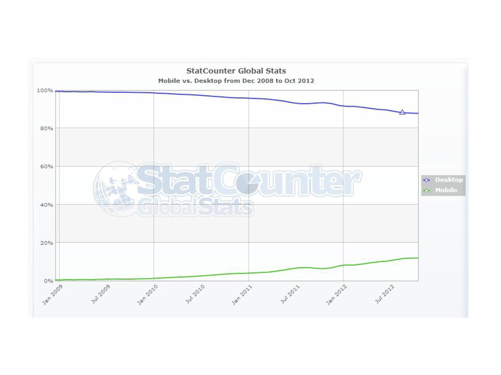
are getting better, faster and cheaper • Tablets replacing desktop? • Since mid-2011 people spend more time on their mobile devices than on their PCs • By 2013 Gartner predicts more people will use mobile devices to get online than PCs http://mashable.com/2011/12/16/mobile-website-tips/
first is the idea that websites and apps should be designed and built for mobile first and other device types second http://www.lukew.com/ff/entry.asp?933
what is important • Just because desktop screens are larger doesn’t mean you need to fill them with unimportant things – Sometimes this referred to as “adding value” • Only add things that are actually important to the user
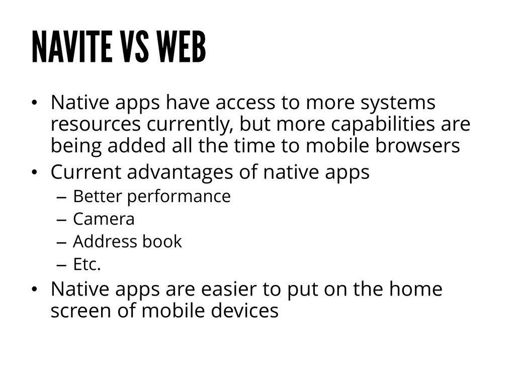
but more capabilities are being added all the time to mobile browsers • Current advantages of native apps – Better performance – Camera – Address book – Etc. • Native apps are easier to put on the home screen of mobile devices
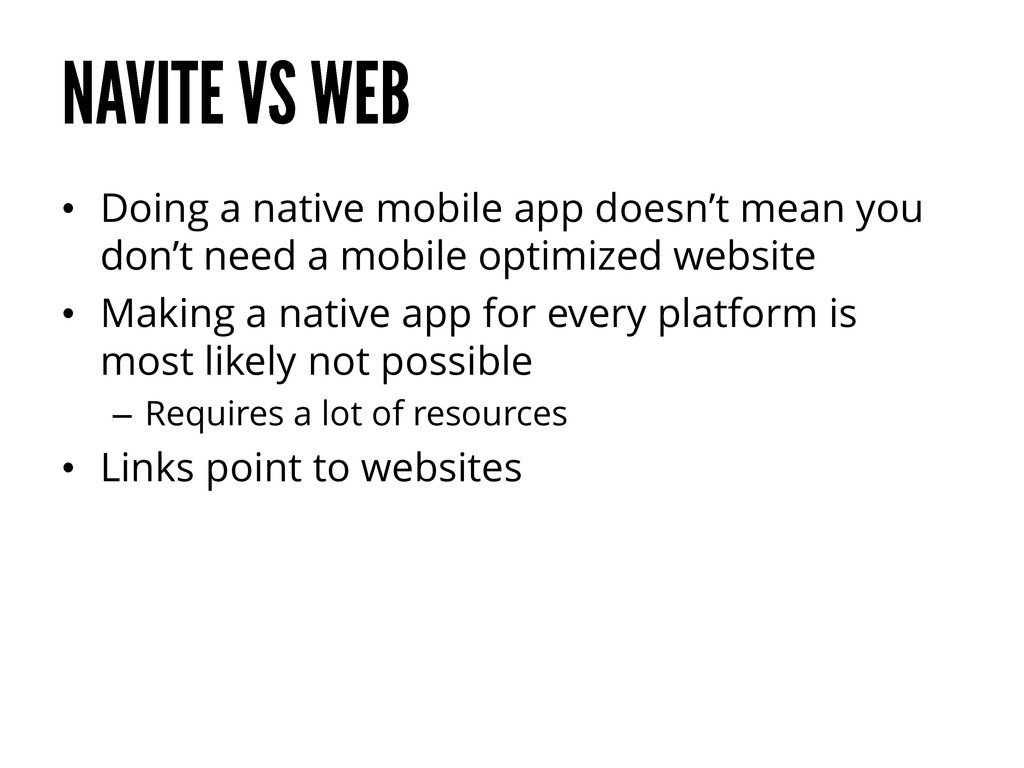
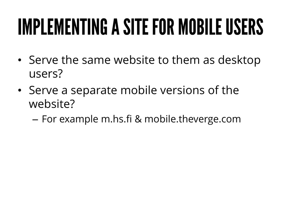
need a mobile optimized website • Making a native app for every platform is most likely not possible – Requires a lot of resources • Links point to websites
too much on HTML5 as opposed to native” Mark Zuckerberg http://techcrunch.com/2012/09/11/mark-zuckerberg-our-biggest-mistake-with-mobile-was-betting-too-much-on-html5/
amounts of navigation • Get people the information they need first • Relevant and well-placed navigation allows users to explore other parts of the site without taking over too much of the screen
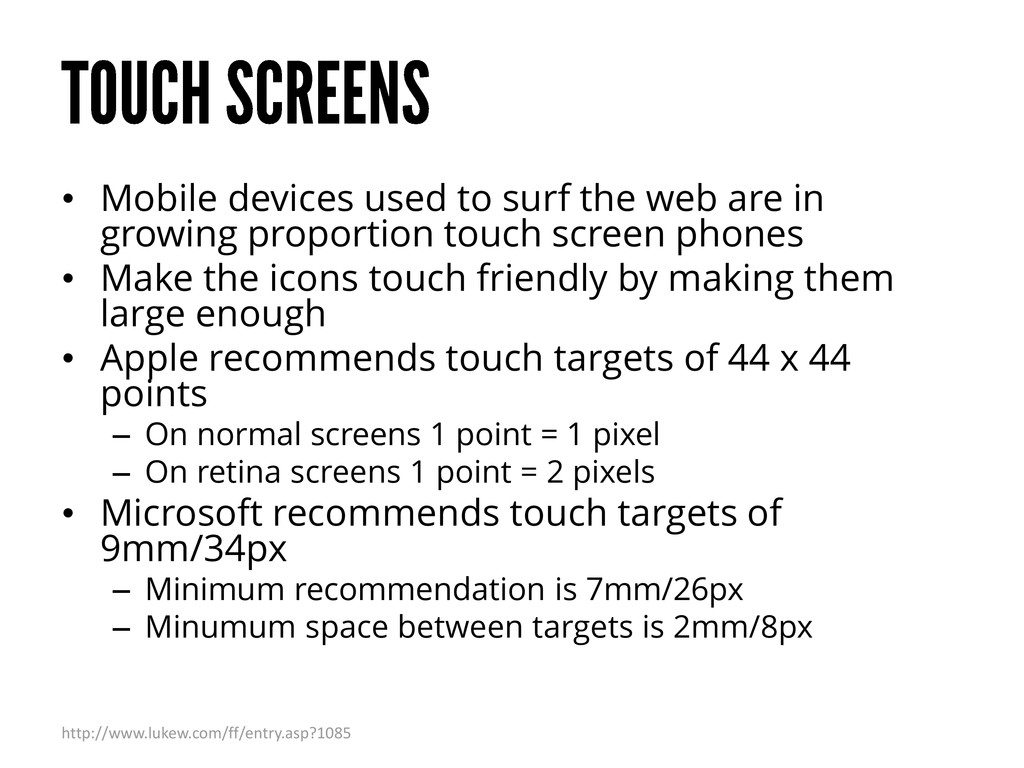
growing proportion touch screen phones • Make the icons touch friendly by making them large enough • Apple recommends touch targets of 44 x 44 points – On normal screens 1 point = 1 pixel – On retina screens 1 point = 2 pixels • Microsoft recommends touch targets of 9mm/34px – Minimum recommendation is 7mm/26px – Minumum space between targets is 2mm/8px http://www.lukew.com/ff/entry.asp?1085
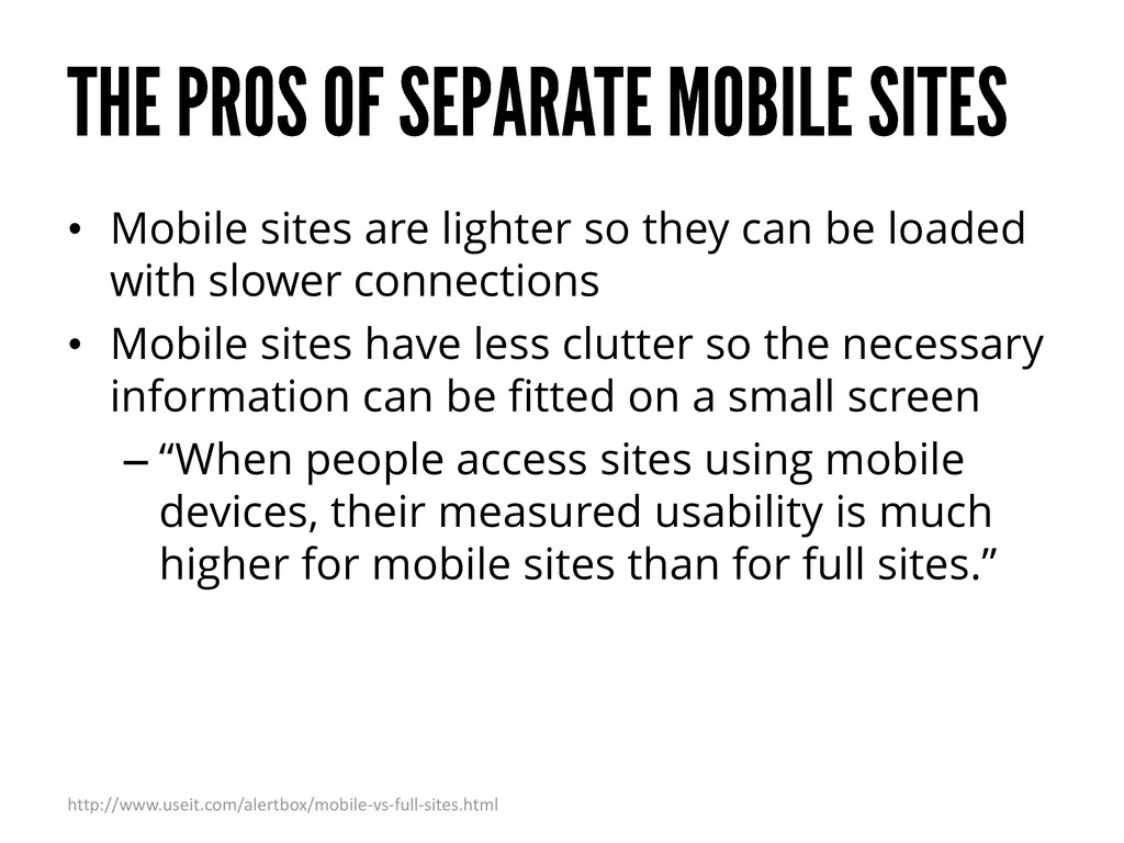
with slower connections • Mobile sites have less clutter so the necessary information can be fitted on a small screen – “When people access sites using mobile devices, their measured usability is much higher for mobile sites than for full sites.” http://www.useit.com/alertbox/mobile-vs-full-sites.html
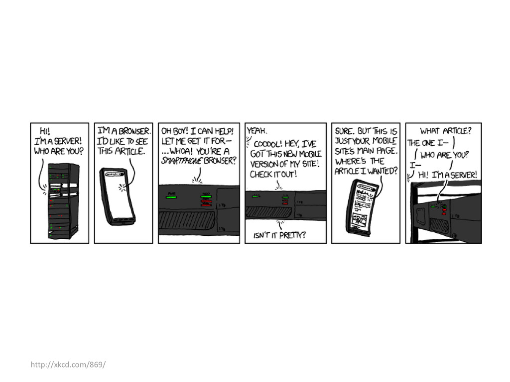
the regular site – With mobile usage growing so fast, can you really leave some users without all the features? • Is it useful to have the same content in two different places? – Sending a link to the mobile site will usually take you to the mobile version even on a desktop http://mobile.smashingmagazine.com/2012/04/19/why-we-shouldnt-make-separate-mobile-websites/
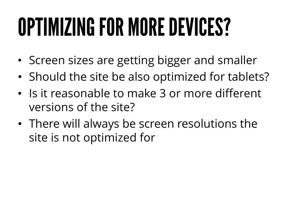
the site be also optimized for tablets? • Is it reasonable to make 3 or more different versions of the site? • There will always be screen resolutions the site is not optimized for
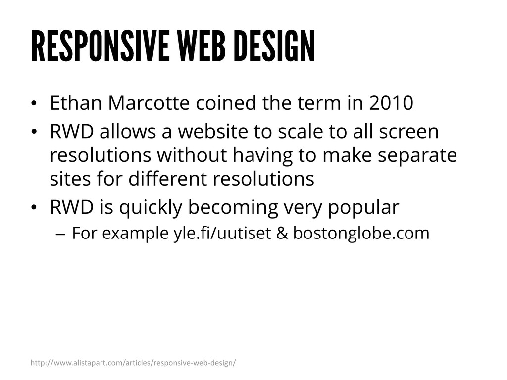
allows a website to scale to all screen resolutions without having to make separate sites for different resolutions • RWD is quickly becoming very popular – For example yle.fi/uutiset & bostonglobe.com http://www.alistapart.com/articles/responsive-web-design/
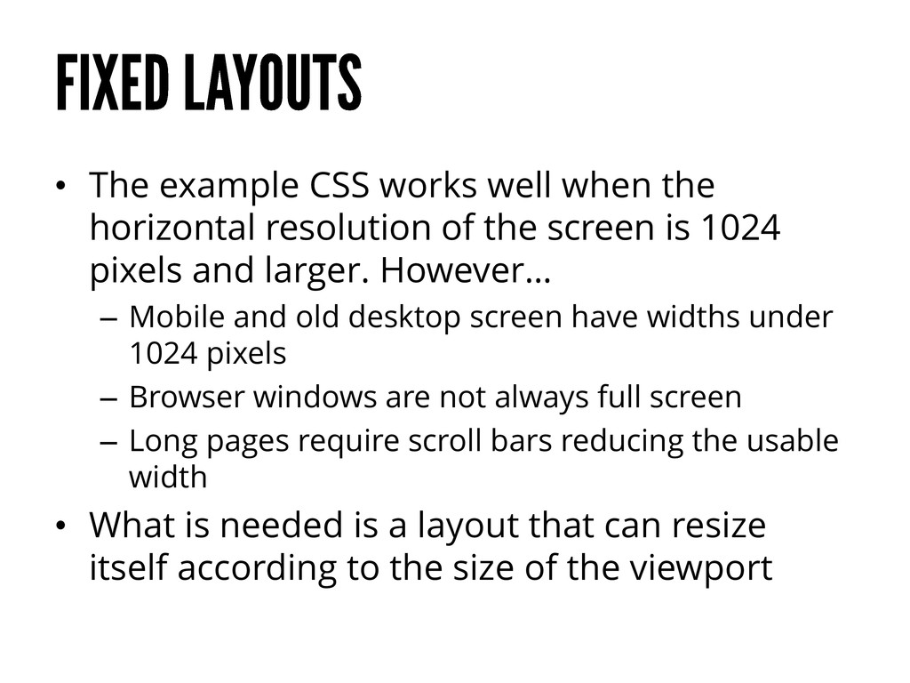
of the screen is 1024 pixels and larger. However… – Mobile and old desktop screen have widths under 1024 pixels – Browser windows are not always full screen – Long pages require scroll bars reducing the usable width • What is needed is a layout that can resize itself according to the size of the viewport
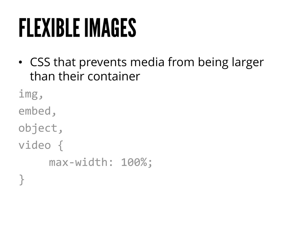
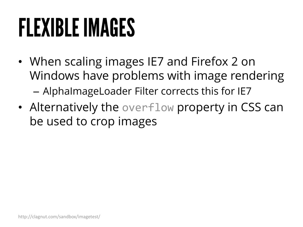
have problems with image rendering – AlphaImageLoader Filter corrects this for IE7 • Alternatively the overflow property in CSS can be used to crop images http://clagnut.com/sandbox/imagetest/
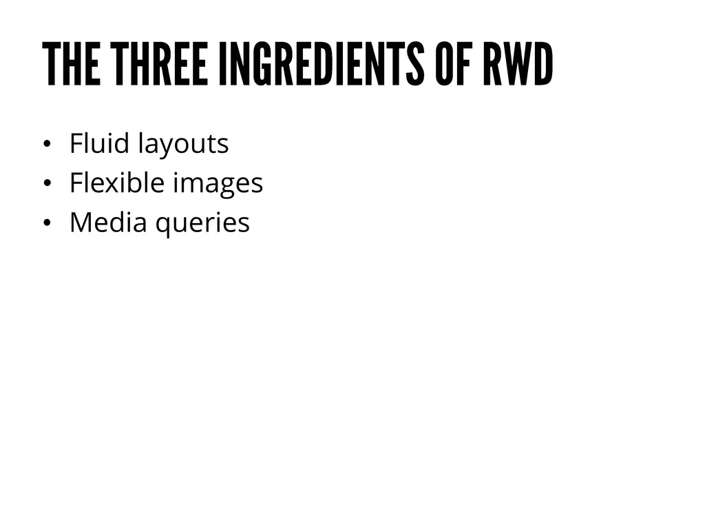
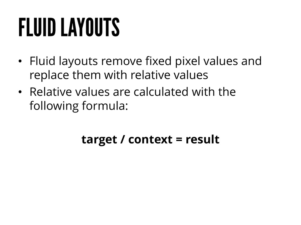
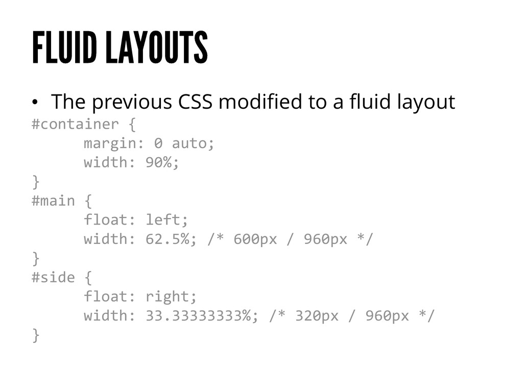
layouts and flexible images • At some point though the site will still break • No design scales well beyond the context for which it was designed for • Different CSS is needed for the different contexts
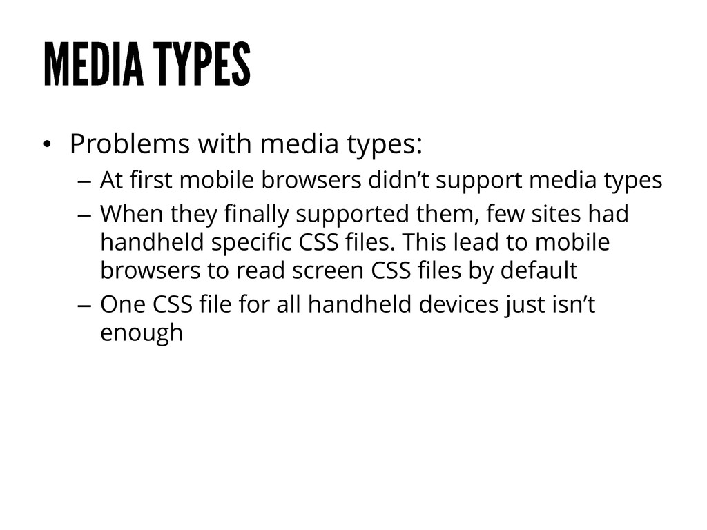
CSS needs of different devices • The different types were – Screen – Print – Handheld – All • Browsers were suppose to identify with one of these types and be served a different CSS file depending on the type
didn’t support media types – When they finally supported them, few sites had handheld specific CSS files. This lead to mobile browsers to read screen CSS files by default – One CSS file for all handheld devices just isn’t enough
for different viewport sizes and other conditions • Changes to the CSS should be made either when the layout breaks or if the layout seems too spacious or tight • It is also normal to use media queries to hide certain elements when going to smaller viewports
While RWD is growing in popularity it is not automatically always the right solution • Decide on a case by case basis http://www.lukew.com/ff/entry.asp?1390 http://www.lukew.com/ff/entry.asp?1631
responsive. They don’t care if it’s a separate mobile site. They don’t care if it’s just a plain ol’ desktop site. They do give a shit if they can’t get done what they need to get done. They do give a shit when your site takes 20 seconds to load. They do care when interactions are awkward and broken.” Brad Frost http://bradfrostweb.com/blog/web/responsive-web-design-missing-the-point/
much information on a mobile screen as it is on a desktop • On the other hand, do desktop users need much more information than mobile users? • Think mobile first
Design websites and apps mobile first • Embrace the restrictions of mobile devices – Focus on what is really important to the users • Making native apps can make the experience of services even better, but people will still also use the mobile site
 janimakela
 csswizardry
 shosira
 xtone
xtone
 tararira
 mhand01
 designer_no_pon
 securecat
 lynteo
 chiilog
 garyuten
 nttcom
 happy_ferret153
 aleyda
 baasie
 hannesfritz
 kimpetersen
 trallard
 eileencodes
 frankvandijk
 chriscoyier
 holman
 tammyeverts
 katarinadahlin
![Jani Mäkelä @janimakela [email protected]](https://files.speakerdeck.com/presentations/509a2606ecc0de000202f4b7/slide_54.jpg)