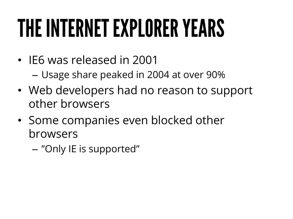
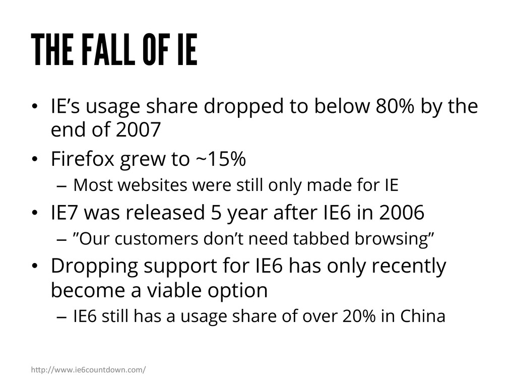
– Usage share peaked in 2004 at over 90% • Web developers had no reason to support other browsers • Some companies even blocked other browsers – ”Only IE is supported”
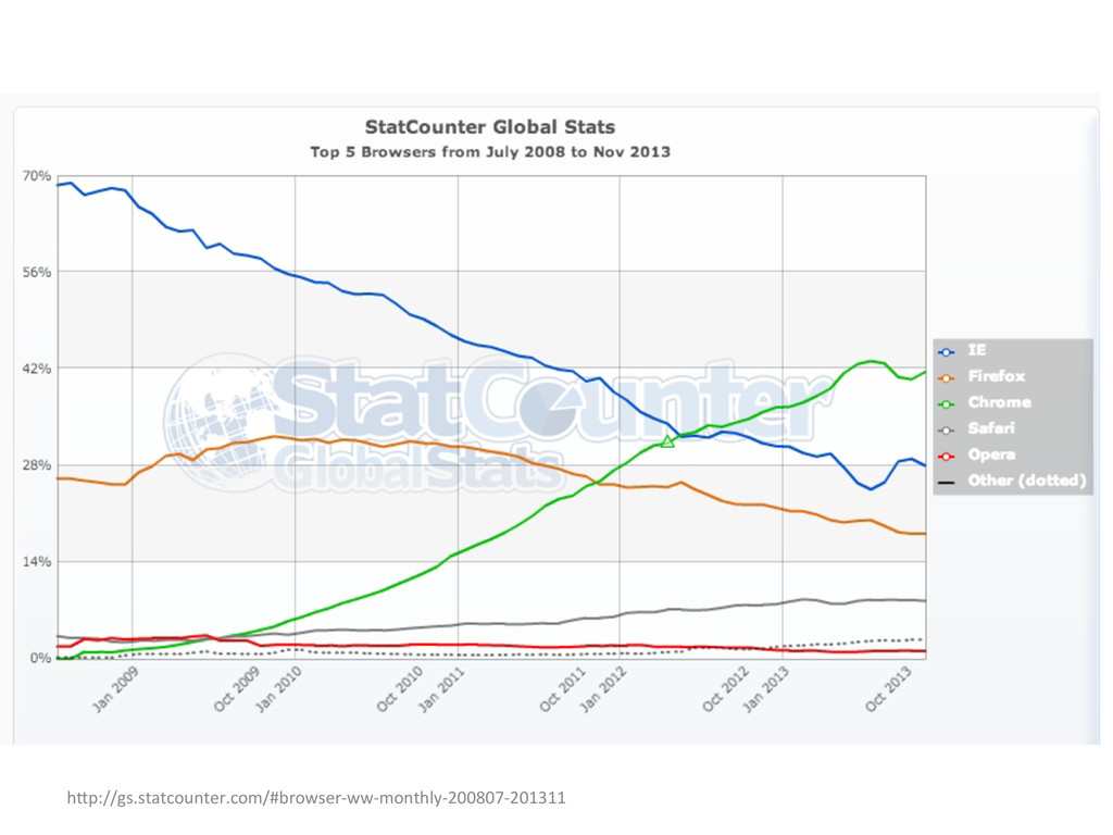
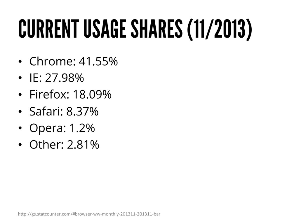
below 80% by the end of 2007 • Firefox grew to ~15% – Most websites were still only made for IE • IE7 was released 5 year after IE6 in 2006 – ”Our customers don’t need tabbed browsing” • Dropping support for IE6 has only recently become a viable option – IE6 still has a usage share of over 20% in China h"p://www.ie6countdown.com/
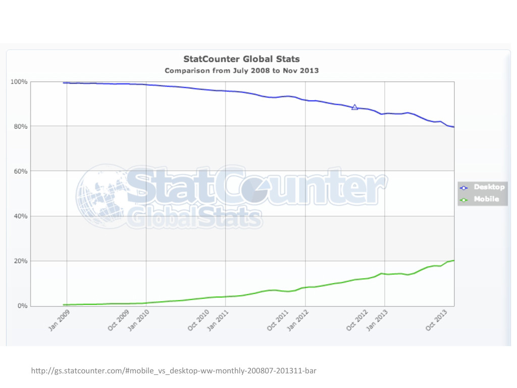
fast – Since mid-2011 people spend more time on their mobile devices than on their PCs – In 2011 Gartner predicted that by 2013 more people will use mobile devices to get online than PCs – At the current growth rate mobile usage will overtake desktop browsing in about 5 years • Mobile only users – Phones and tablets are replacing desktops h"p://mashable.com/2011/12/16/mobile-‐website-‐Eps/ h"p://blogs.hbr.org/2013/05/the-‐rise-‐of-‐the-‐mobile-‐only-‐us/
• Mobile first is the idea that websites and apps should be designed and built for mobile first and other device types second h"p://www.lukew.com/ff/entry.asp?933
on what is important • Just because desktop screens are larger doesn’t mean you need to fill them with unimportant things – Only add things that are actually important to the user • The mobile version of your website is essentially a priority list
systems resources currently, but more capabilities are being added all the time to mobile browsers • Current advantages of native apps – Better performance – Camera – Address book – Etc. • Native apps are easier to put on the home screen of mobile devices
mean you don’t need a mobile optimized website • Making a native app for every platform is most likely not possible – Requires a lot of resources • Links point to websites
too much on HTML5 as opposed to native” Mark Zuckerberg h"p://techcrunch.com/2012/09/11/mark-‐zuckerberg-‐our-‐biggest-‐mistake-‐with-‐mobile-‐was-‐beNng-‐too-‐much-‐on-‐html5/
most possible people with the least effort; native apps are the best way to create the best possible experience.” John Gruber h"p://daringfireball.net/2013/04/web_apps_naEve_apps
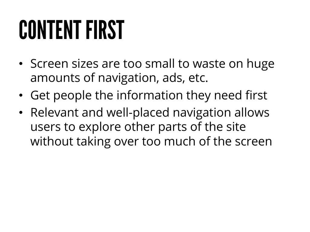
on huge amounts of navigation, ads, etc. • Get people the information they need first • Relevant and well-placed navigation allows users to explore other parts of the site without taking over too much of the screen
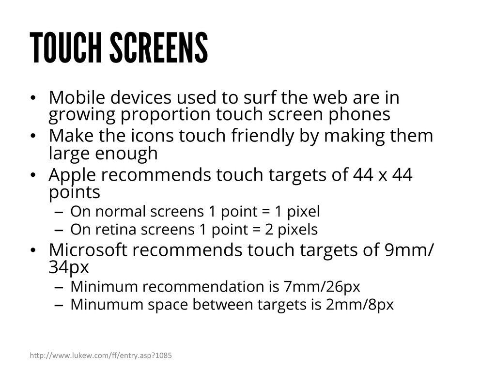
are in growing proportion touch screen phones • Make the icons touch friendly by making them large enough • Apple recommends touch targets of 44 x 44 points – On normal screens 1 point = 1 pixel – On retina screens 1 point = 2 pixels • Microsoft recommends touch targets of 9mm/ 34px – Minimum recommendation is 7mm/26px – Minumum space between targets is 2mm/8px h"p://www.lukew.com/ff/entry.asp?1085
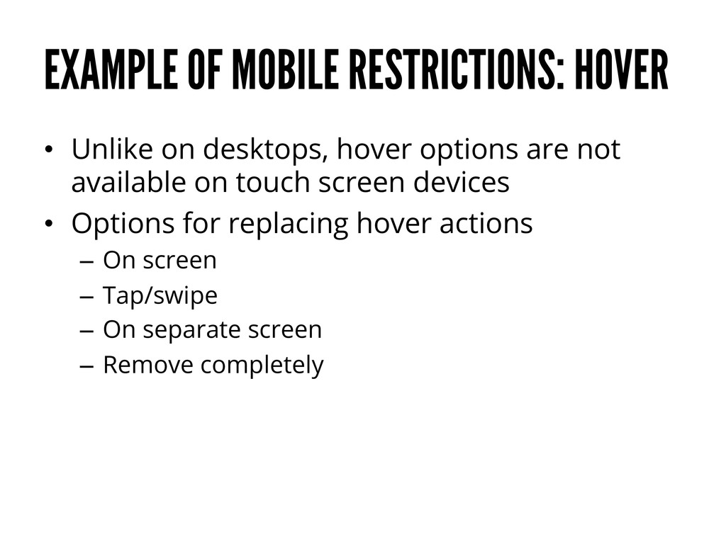
options are not available on touch screen devices • Options for replacing hover actions – On screen – Tap/swipe – On separate screen – Remove completely
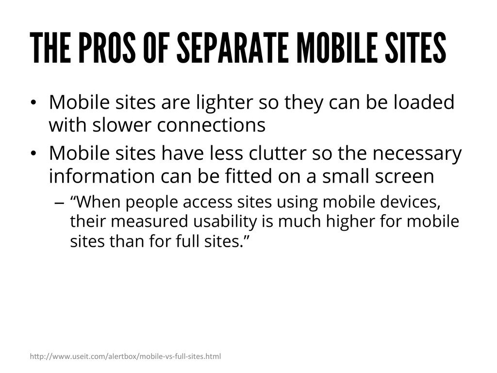
lighter so they can be loaded with slower connections • Mobile sites have less clutter so the necessary information can be fitted on a small screen – “When people access sites using mobile devices, their measured usability is much higher for mobile sites than for full sites.” h"p://www.useit.com/alertbox/mobile-‐vs-‐full-‐sites.html
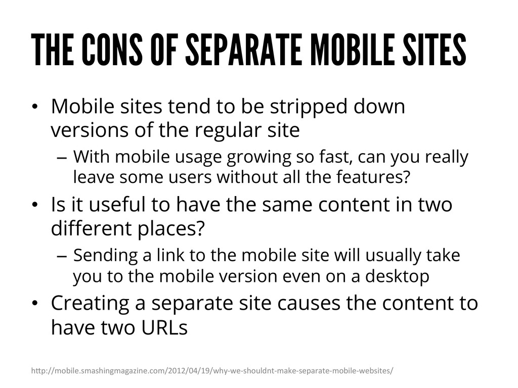
tend to be stripped down versions of the regular site – With mobile usage growing so fast, can you really leave some users without all the features? • Is it useful to have the same content in two different places? – Sending a link to the mobile site will usually take you to the mobile version even on a desktop • Creating a separate site causes the content to have two URLs h"p://mobile.smashingmagazine.com/2012/04/19/why-‐we-‐shouldnt-‐make-‐separate-‐mobile-‐websites/
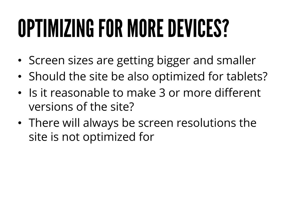
bigger and smaller • Should the site be also optimized for tablets? • Is it reasonable to make 3 or more different versions of the site? • There will always be screen resolutions the site is not optimized for
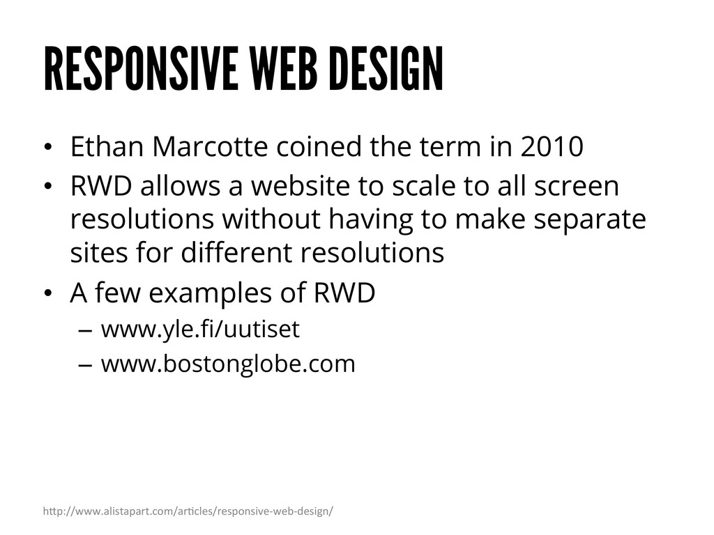
2010 • RWD allows a website to scale to all screen resolutions without having to make separate sites for different resolutions • A few examples of RWD – www.yle.fi/uutiset – www.bostonglobe.com h"p://www.alistapart.com/arEcles/responsive-‐web-‐design/
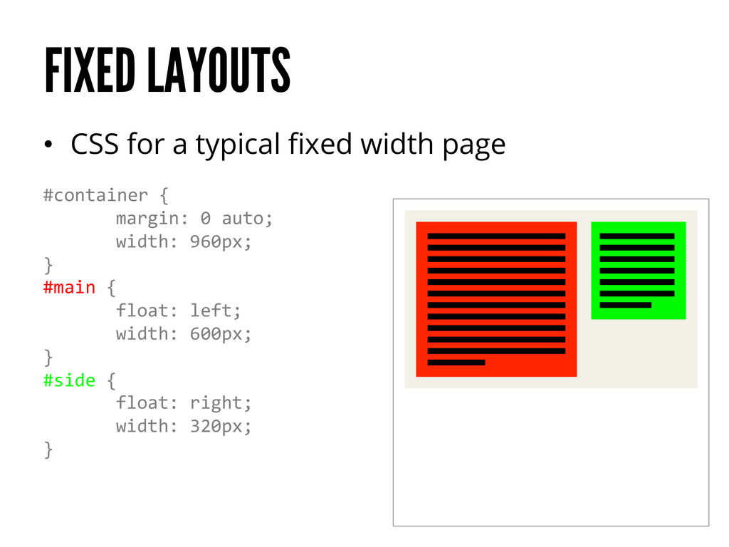
horizontal resolution of the screen is 1024 pixels and larger. However… – Mobile and old desktop screen typically have widths under 1024 pixels – Browser windows are not always full screen – Long pages require scroll bars reducing the usable width • What is needed is a layout that can resize itself according to the size of the viewport
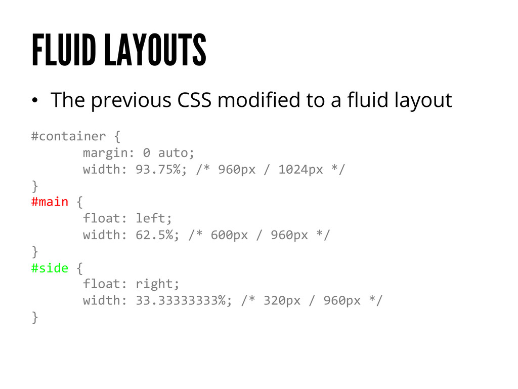
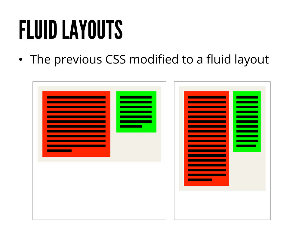
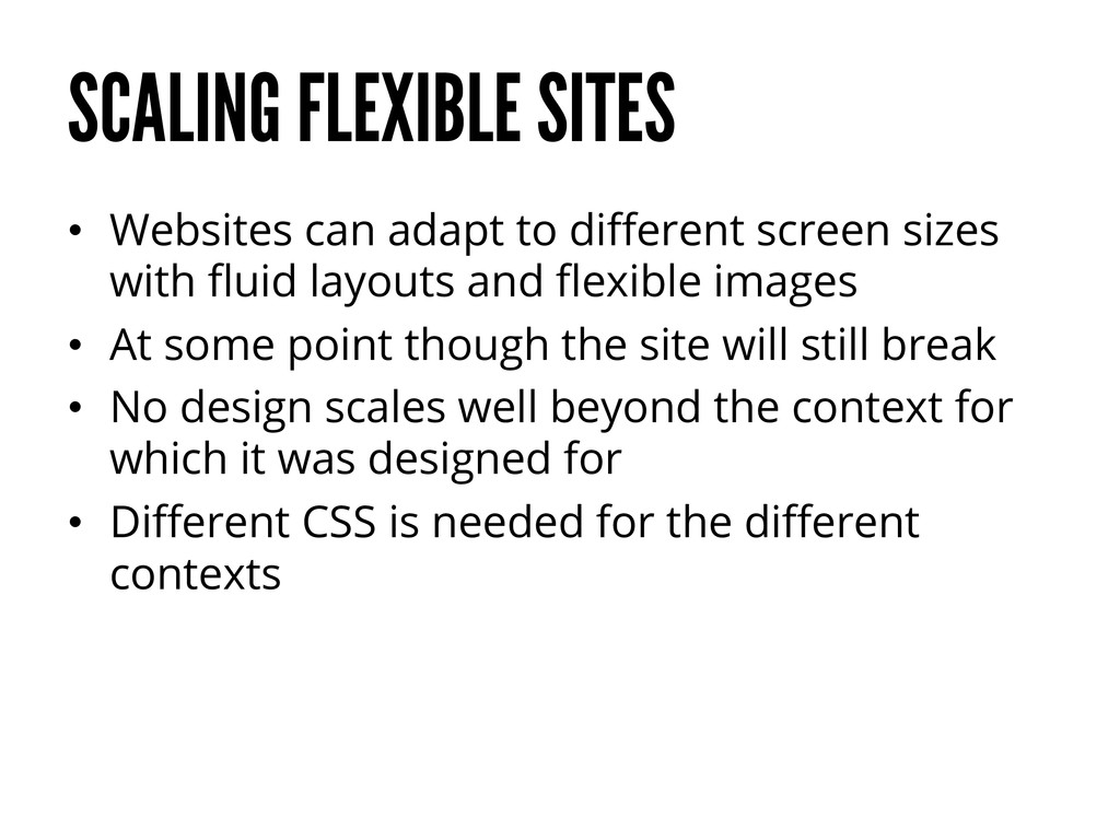
sizes with fluid layouts and flexible images • At some point though the site will still break • No design scales well beyond the context for which it was designed for • Different CSS is needed for the different contexts
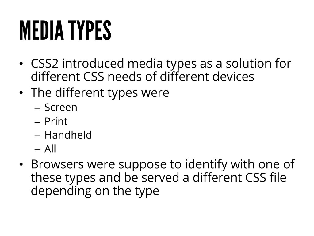
for different CSS needs of different devices • The different types were – Screen – Print – Handheld – All • Browsers were suppose to identify with one of these types and be served a different CSS file depending on the type
support media types • When they finally supported them, few sites had handheld specific CSS files. This lead to mobile browsers to read screen CSS files by default • One CSS file for all handheld devices just isn’t enough
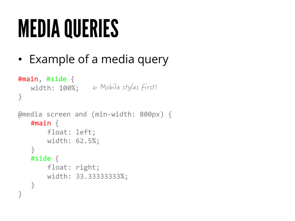
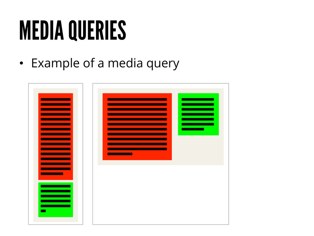
CSS3 introduced media queries • Each media query consists of two parts – A media type – A query consisting of a feature and a value wrapped in parentheses
website’s CSS for different viewport sizes and other conditions • Changes to the CSS should be made either when the layout breaks or if the layout seems too spacious or tight • It is also normal to use media queries to hide certain elements when going to smaller viewports – This should be used conservatively
devices, it’s about supporting all devices • Lack of mobile users is not a reason to not do RWD – Lack of RWD may be a reason why mobile users don’t come to your site – “If you build it they will come” h"p://www.smashingmagazine.com/2013/10/30/selling-‐responsive-‐website-‐design/
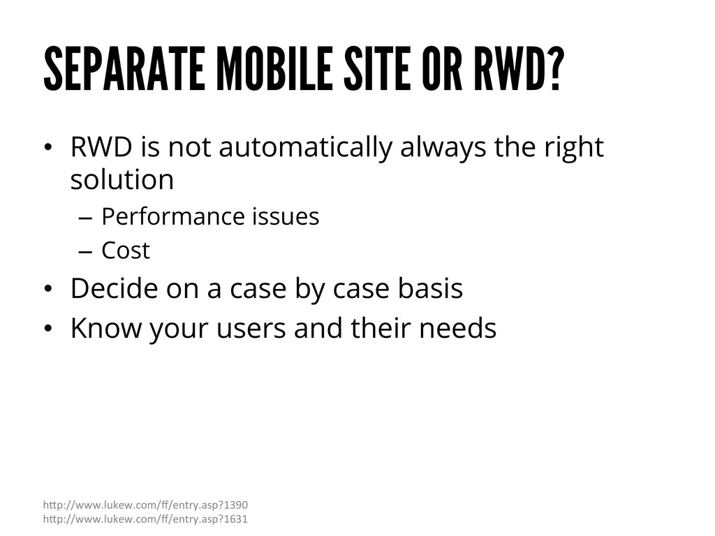
always the right solution – Performance issues – Cost • Decide on a case by case basis • Know your users and their needs h"p://www.lukew.com/ff/entry.asp?1390 h"p://www.lukew.com/ff/entry.asp?1631
responsive. They don’t care if it’s a separate mobile site. They don’t care if it’s just a plain ol’ desktop site. They do give a shit if they can’t get done what they need to get done. They do give a shit when your site takes 20 seconds to load. They do care when interactions are awkward and broken.” Brad Frost h"p://bradfrostweb.com/blog/web/responsive-‐web-‐design-‐missing-‐the-‐point/
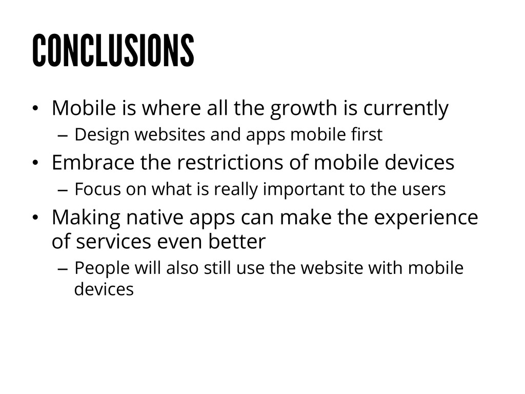
– Design websites and apps mobile first • Embrace the restrictions of mobile devices – Focus on what is really important to the users • Making native apps can make the experience of services even better – People will also still use the website with mobile devices
 janimakela
 kenichiota0711
 a2k
a2k
 lynteo
 garyuten
 saka2jp
 visional_engineering_and_design
 shosira
 sevendex
 happy_ferret153
 moco1013
 deadlinepoet
 kspace
 addyosmani
 ryanjones
 aleyda
 stephenakadiri
 mongodb
 stephaniewalter
 caitiem20
 axbom
axbom
 tmiket
 varn
varn
 mza
mza
 tammyeverts
![THANK YOU! Jani Mäkelä @janimakela [email protected]](https://files.speakerdeck.com/presentations/d03707a02ce601312d7f2658b910d553/slide_59.jpg)