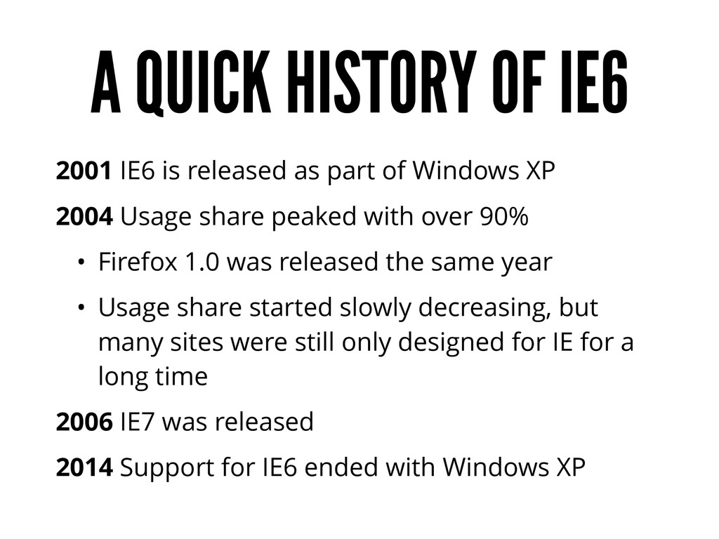
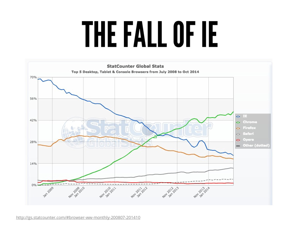
part of Windows XP 2004 Usage share peaked with over 90% • Firefox 1.0 was released the same year • Usage share started slowly decreasing, but many sites were still only designed for IE for a long time 2006 IE7 was released 2014 Support for IE6 ended with Windows XP
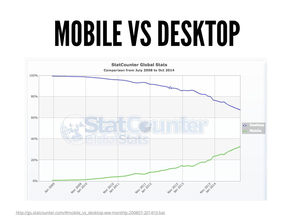
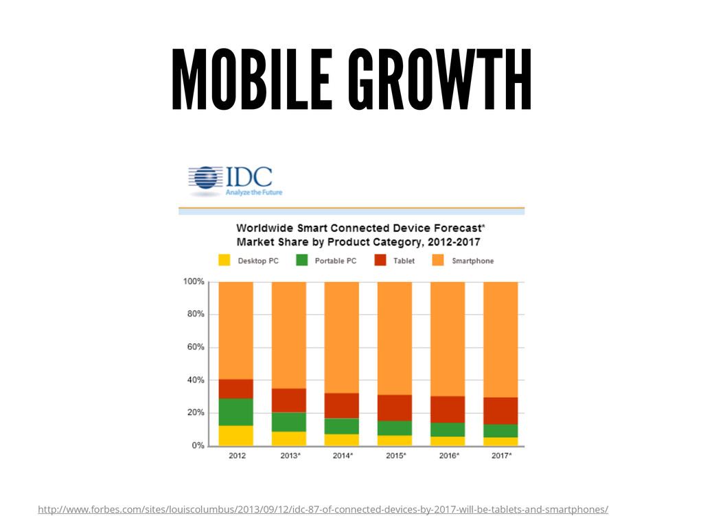
their mobile devices than on their PCs At the current rate of growth, mobile web usage will overtake desktop browsing globally in a few years By 2020 80% of the adults on earth will have a smartphone http://mashable.com/2011/12/16/mobile-website-tips/ http://ben-evans.com/benedictevans/2014/10/28/presentation-mobile-is-eating-the-world
don’t use traditional desktop computers for online access • Especially in developing countries “They can just use their desktop computer to do that.” http://blogs.hbr.org/2013/05/the-rise-of-the-mobile-only-us/
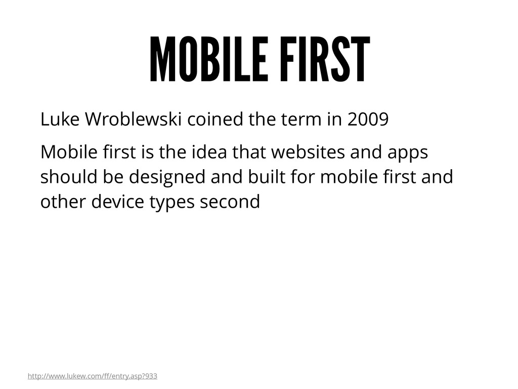
first is the idea that websites and apps should be designed and built for mobile first and other device types second http://www.lukew.com/ff/entry.asp?933
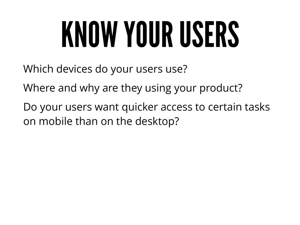
what’s important Just because desktop screens are larger doesn’t mean you need to fill them with unimportant things Only add things that are actually important to the user The mobile version of your website is essentially a priority list
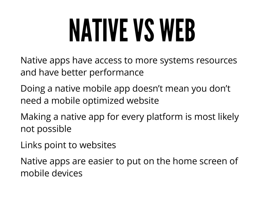
resources and have better performance Doing a native mobile app doesn’t mean you don’t need a mobile optimized website Making a native app for every platform is most likely not possible Links point to websites Native apps are easier to put on the home screen of mobile devices
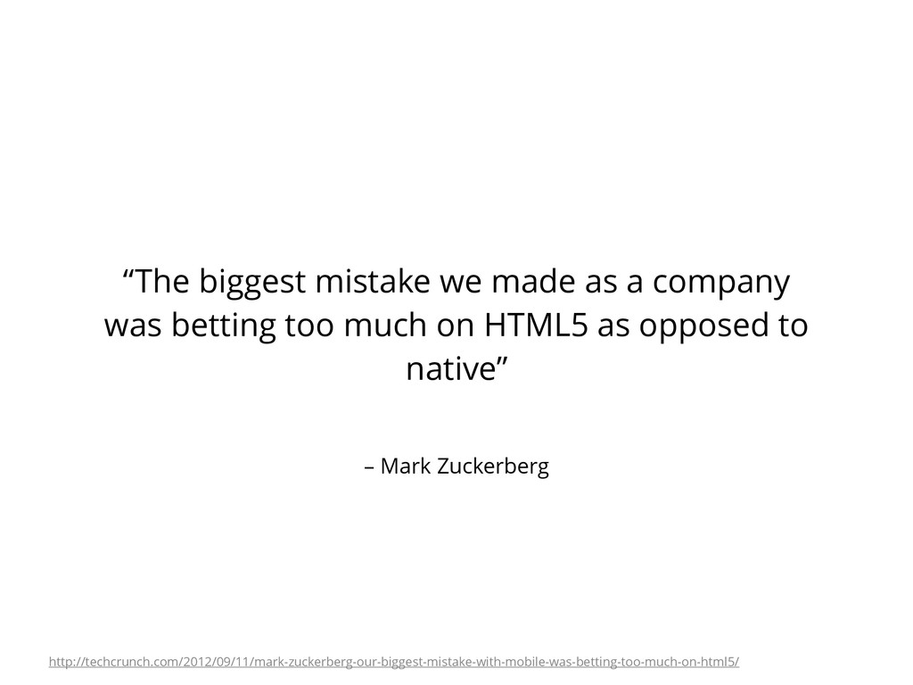
company was betting too much on HTML5 as opposed to native” http://techcrunch.com/2012/09/11/mark-zuckerberg-our-biggest-mistake-with-mobile-was-betting-too-much-on-html5/
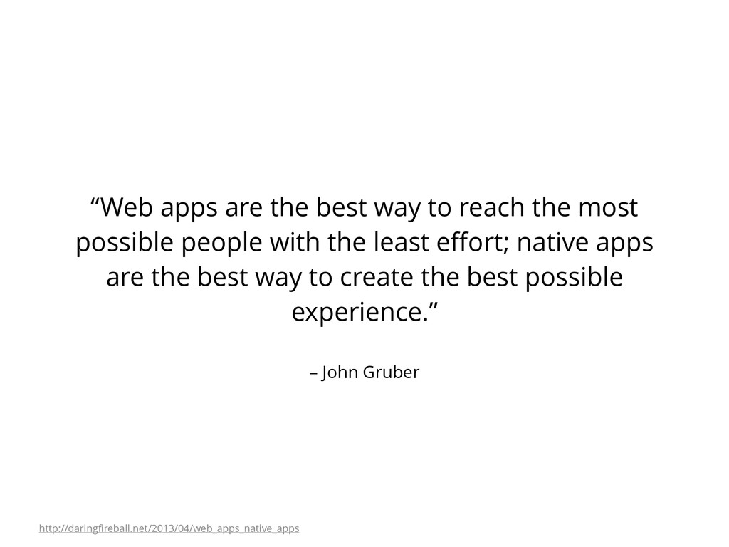
reach the most possible people with the least effort; native apps are the best way to create the best possible experience.” http://daringfireball.net/2013/04/web_apps_native_apps
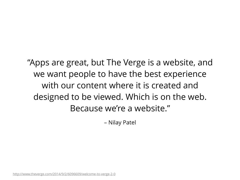
a website, and we want people to have the best experience with our content where it is created and designed to be viewed. Which is on the web. Because we’re a website.” http://www.theverge.com/2014/9/2/6096609/welcome-to-verge-2-0
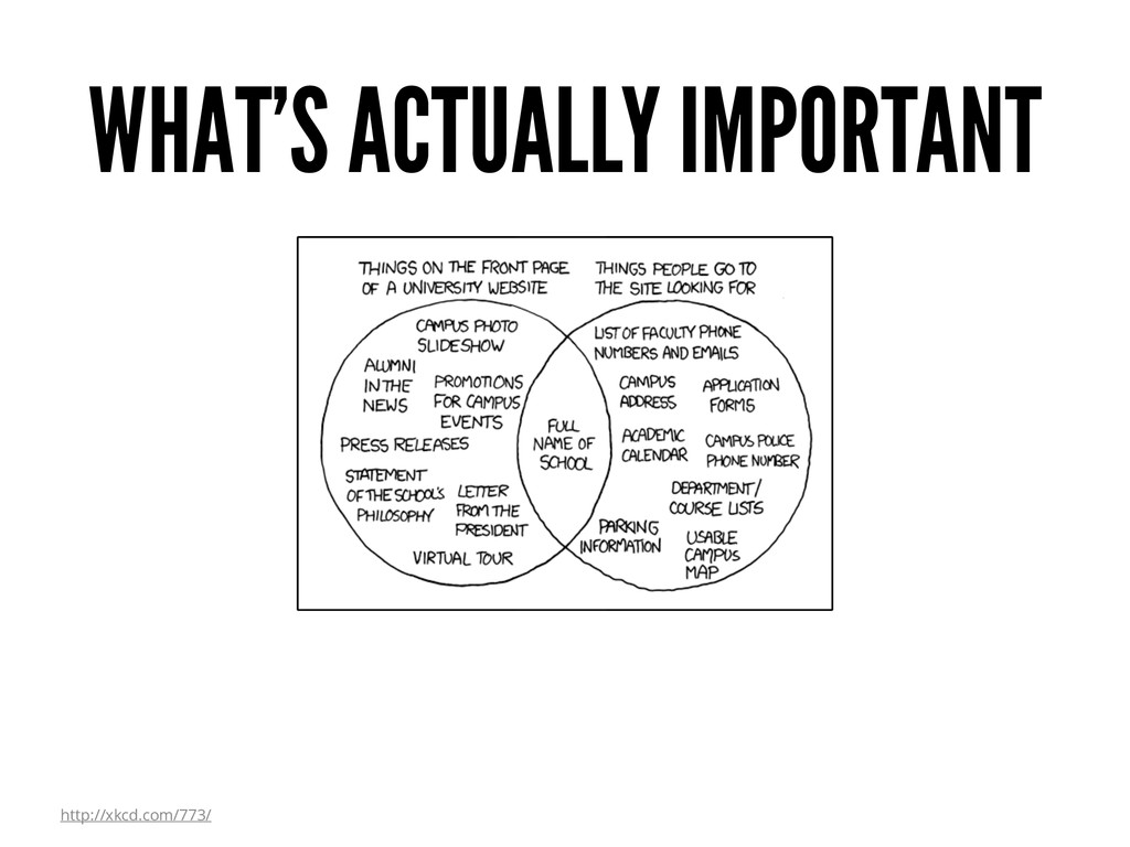
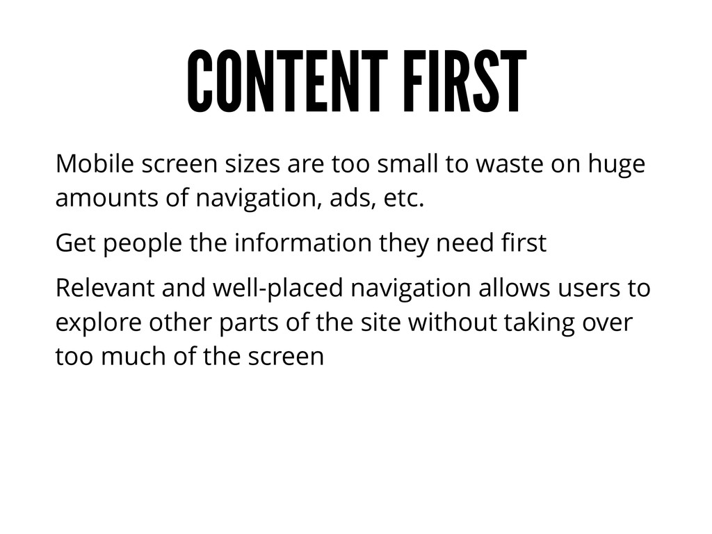
on huge amounts of navigation, ads, etc. Get people the information they need first Relevant and well-placed navigation allows users to explore other parts of the site without taking over too much of the screen
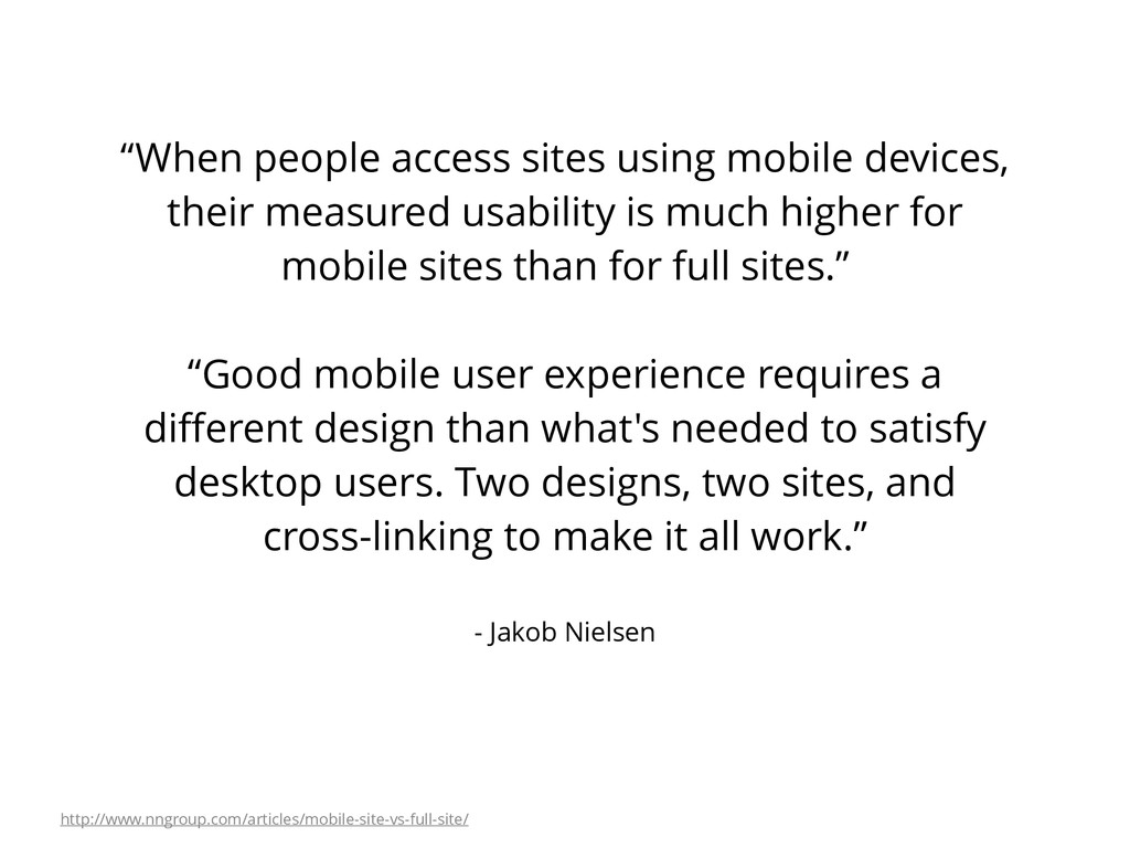
their measured usability is much higher for mobile sites than for full sites.” “Good mobile user experience requires a different design than what's needed to satisfy desktop users. Two designs, two sites, and cross-linking to make it all work.” http://www.nngroup.com/articles/mobile-site-vs-full-site/
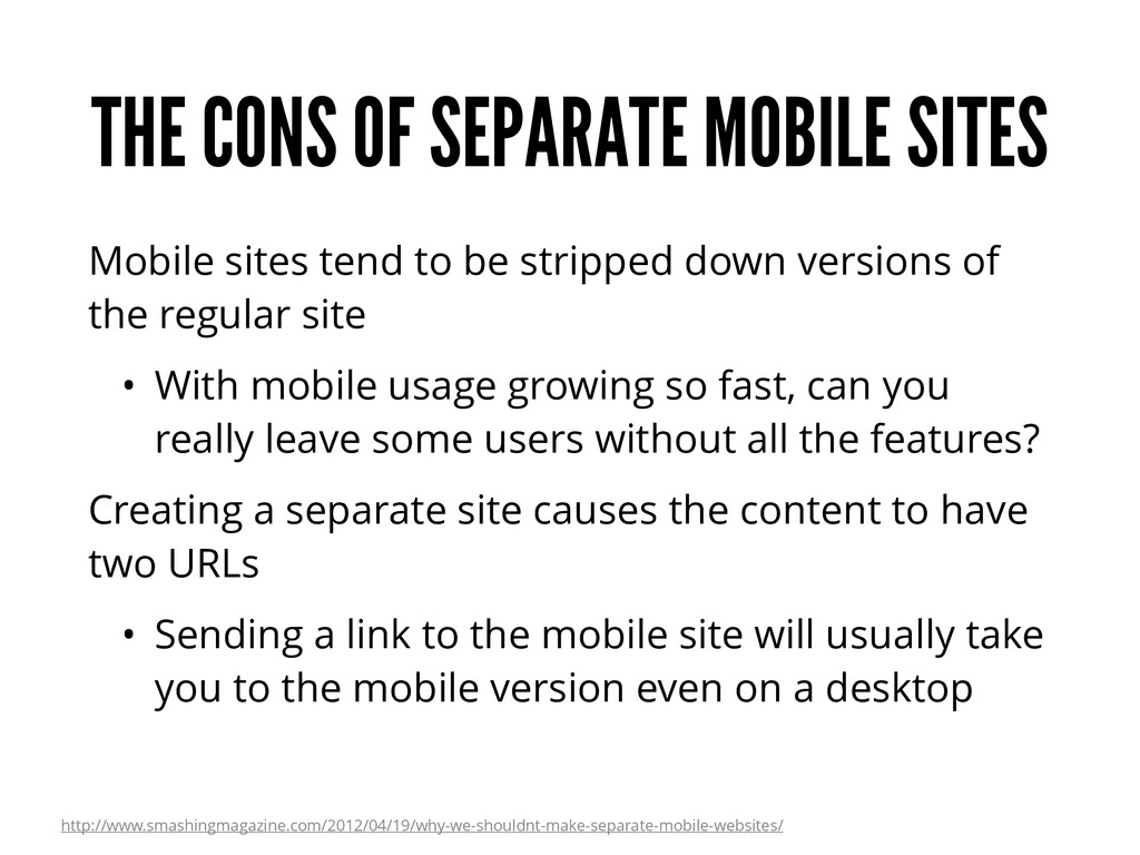
be stripped down versions of the regular site • With mobile usage growing so fast, can you really leave some users without all the features? Creating a separate site causes the content to have two URLs • Sending a link to the mobile site will usually take you to the mobile version even on a desktop http://www.smashingmagazine.com/2012/04/19/why-we-shouldnt-make-separate-mobile-websites/
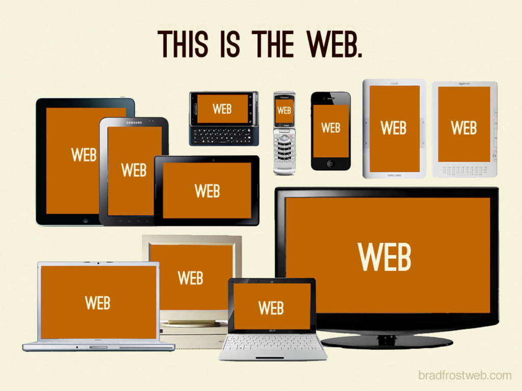
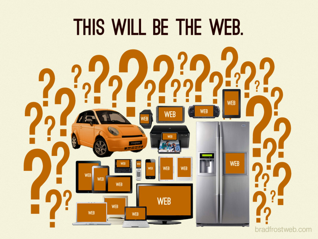
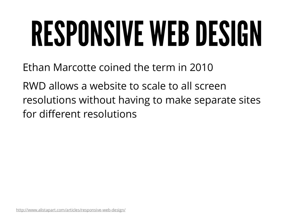
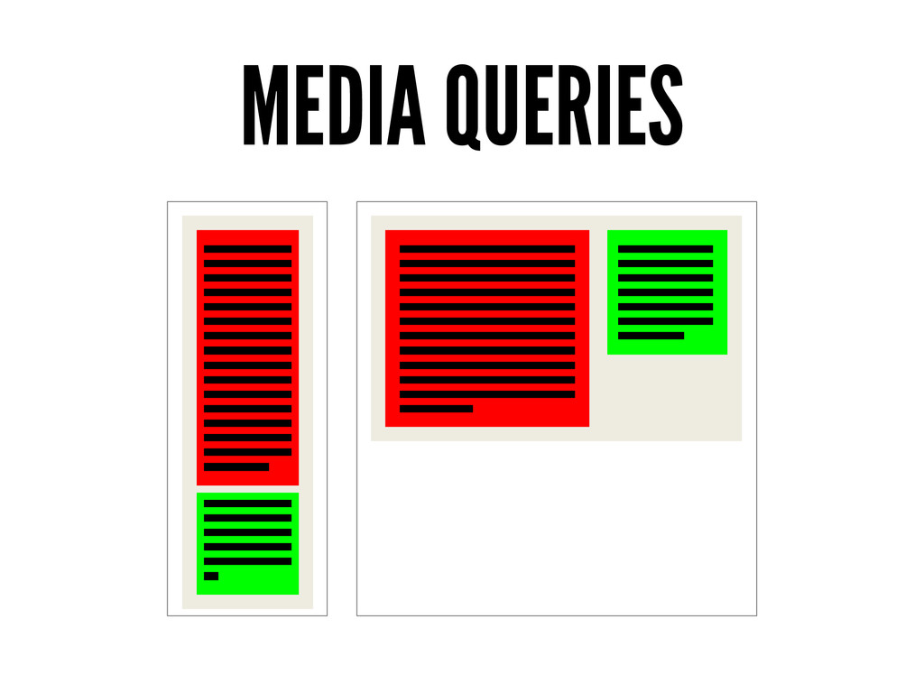
RWD allows a website to scale to all screen resolutions without having to make separate sites for different resolutions http://www.alistapart.com/articles/responsive-web-design/
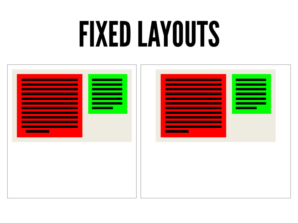
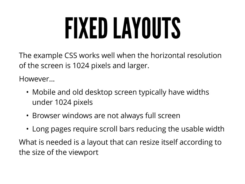
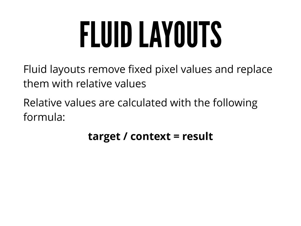
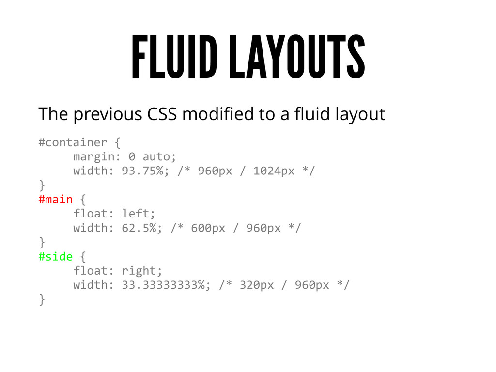
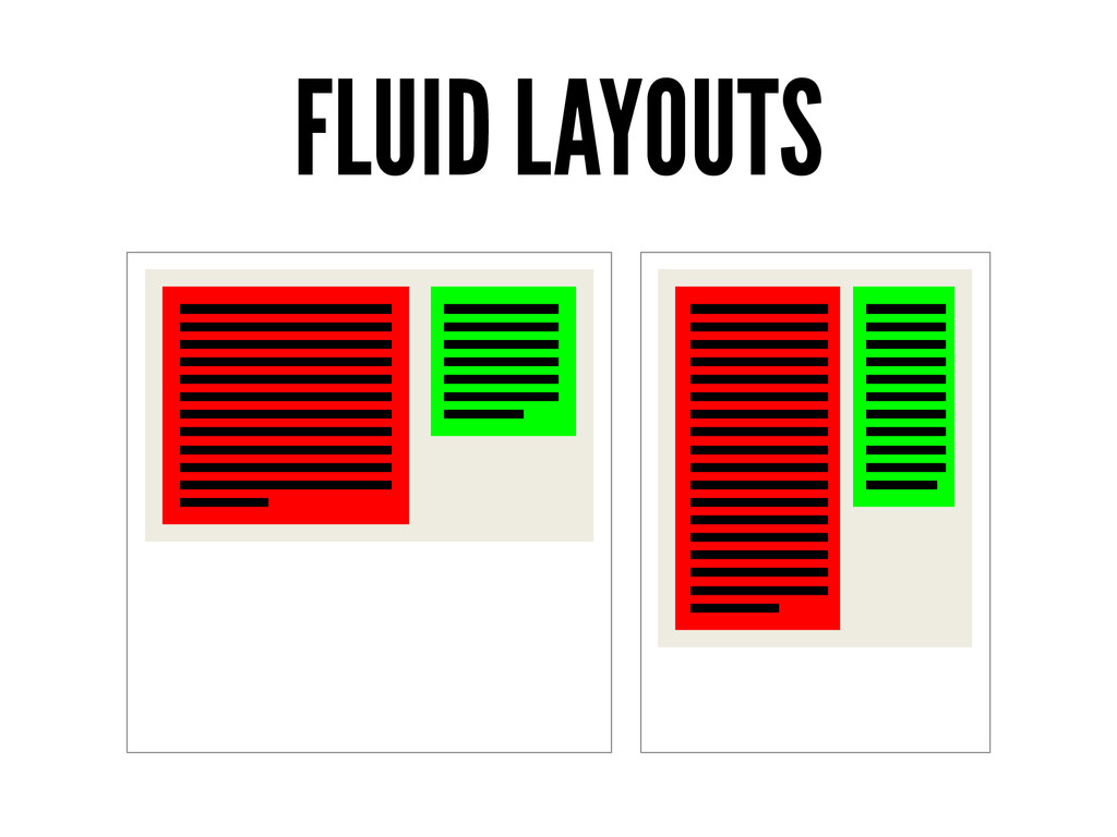
resolution of the screen is 1024 pixels and larger. However… • Mobile and old desktop screen typically have widths under 1024 pixels • Browser windows are not always full screen • Long pages require scroll bars reducing the usable width What is needed is a layout that can resize itself according to the size of the viewport
different CSS needs of different devices The different types were • Screen • Print • Handheld • All Browsers were suppose to identify with one of these types and be served a different CSS file depending on the type
media types When they finally supported them, few sites had handheld specific CSS files. This lead to mobile browsers to read screen CSS files by default One CSS file for all handheld devices just isn’t enough
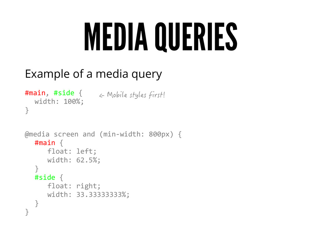
introduced media queries Media queries are used to adapt the CSS for different viewport sizes and other conditions Each media query consists of two parts 1. A media type 2. A query consisting of a feature and a value
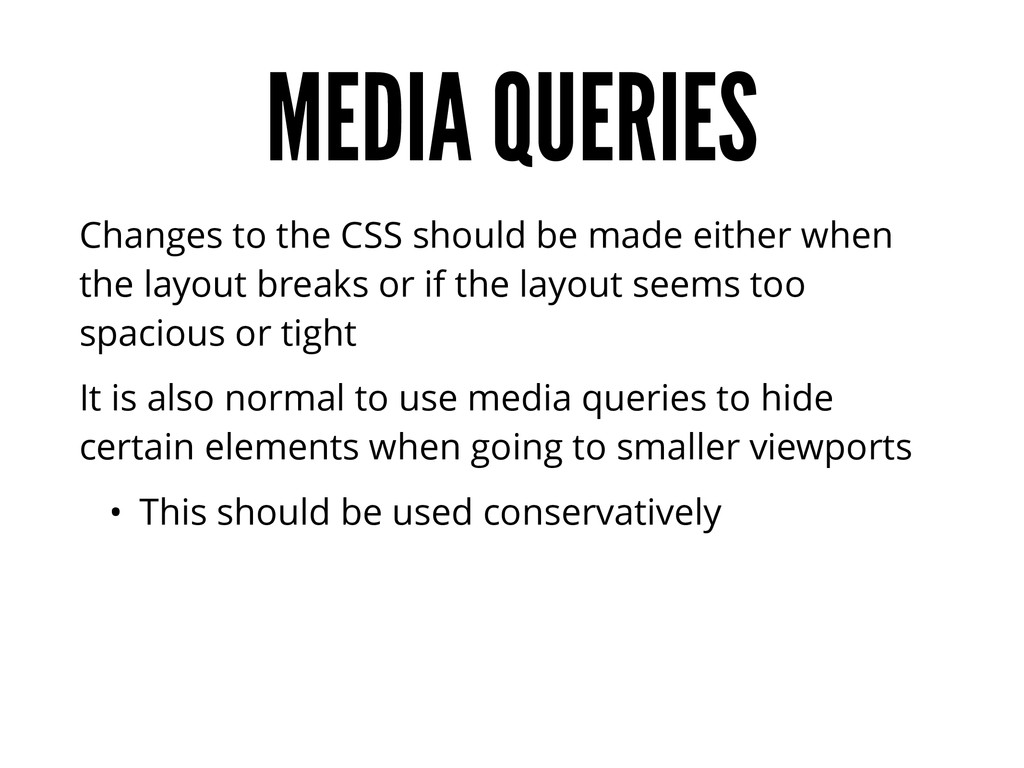
when the layout breaks or if the layout seems too spacious or tight It is also normal to use media queries to hide certain elements when going to smaller viewports • This should be used conservatively
it’s about supporting all devices Lack of mobile users is not a reason to not do RWD Lack of RWD may be a reason why mobile users don’t come to your site “If you build it they will come” http://www.smashingmagazine.com/2013/10/30/selling-responsive-website-design/
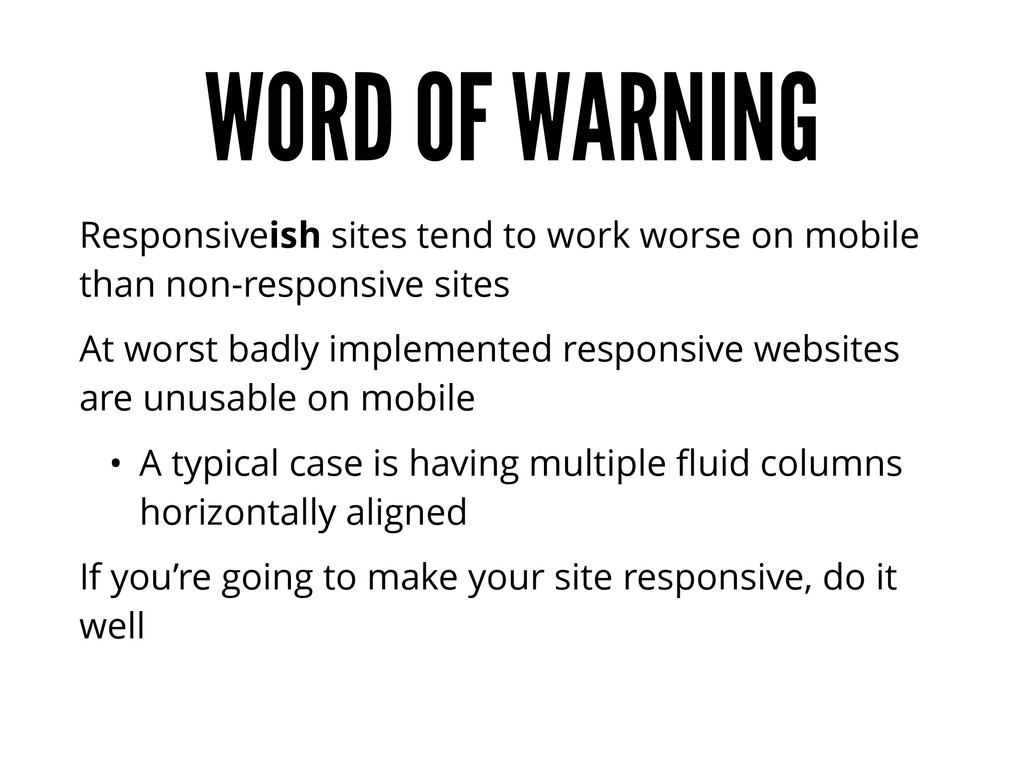
mobile than non-responsive sites At worst badly implemented responsive websites are unusable on mobile • A typical case is having multiple fluid columns horizontally aligned If you’re going to make your site responsive, do it well
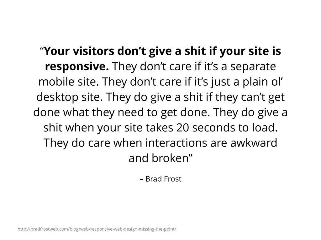
your site is responsive. They don’t care if it’s a separate mobile site. They don’t care if it’s just a plain ol’ desktop site. They do give a shit if they can’t get done what they need to get done. They do give a shit when your site takes 20 seconds to load. They do care when interactions are awkward and broken” http://bradfrostweb.com/blog/web/responsive-web-design-missing-the-point/
 janimakela
 hjmkth
 kenichiota0711
 keita_yoshikawa
 lynteo
 a2k
a2k
 lw
lw
 teba_eleven
 yuri_ohashi
 karad
karad
 hikarutakase
 bebe
bebe
 akashhashmi
 pedronauck
 jonyablonski
 jct
jct
 afnizarnur
 tammyeverts
 irinanazarova
 apolaine
 denniskardys
 aleyda
 schroneko
 jdejongh
![THANKS! @janimakela [email protected]](https://files.speakerdeck.com/presentations/306da7204c76013268194ae983a8a7e9/slide_56.jpg)