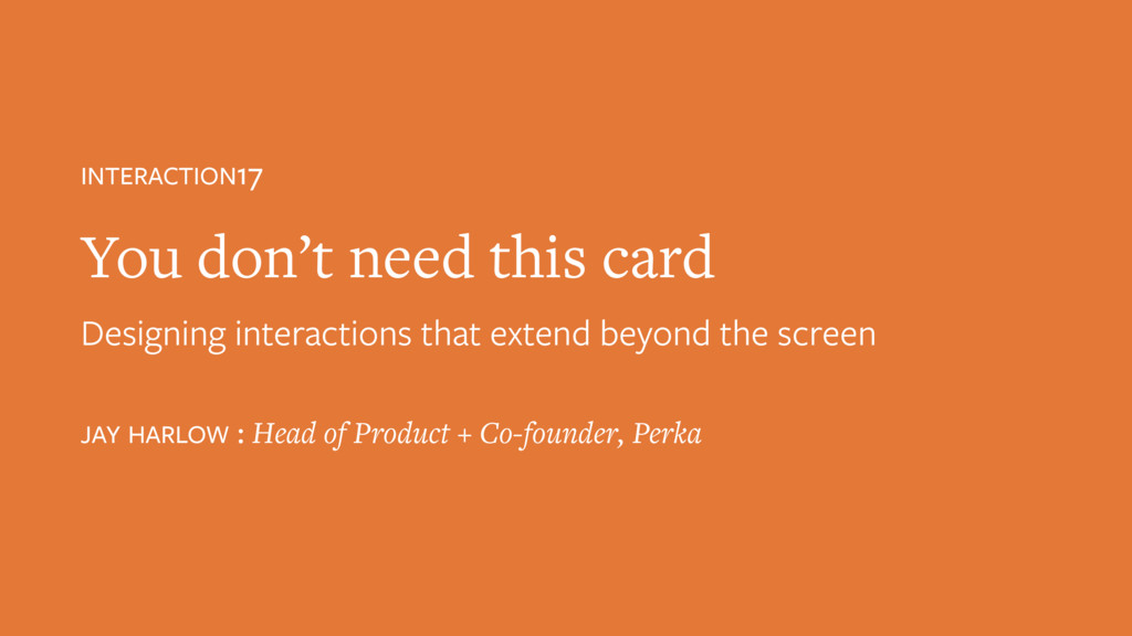
Presented at Interaction17 in NYC, Feb 8, 2017 #IxD17 #IxDA
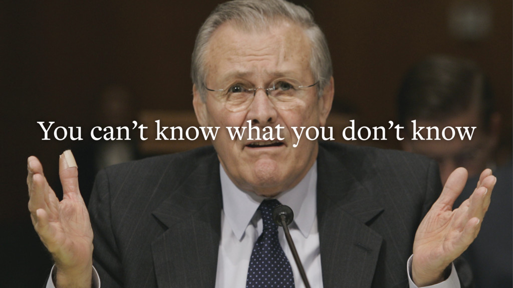
2. If I ask you to imagine a technology in a small business context, you’ll probably imagine somewhere like this: International-Brooklyn Style. Pendant lights. Cupcakes. There are 6M small businesses in the US, each as unique as the people who started them—who are, by nature, not ordinary people.
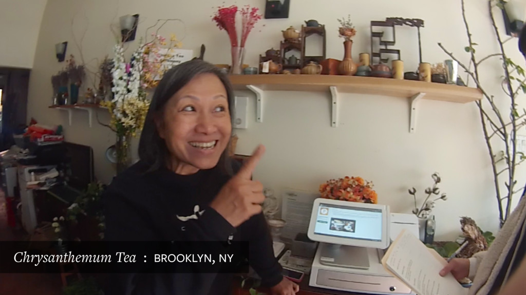
3. This is Angel, she’s got a lot of passions, and she combined them all into one business. She sells tea, performs formal tea ceremonies, does flower arrangements, makes ice cream, and her own soap.
4. Martin Barber shop combines an old-fashioned barber shop and evangelical Christianity, into a sort of micro-church.
5. Shahrouk is a Persian immigrant who sells Confirmation + Quinceañera gowns to Downtown LA’s Mexican-American community.
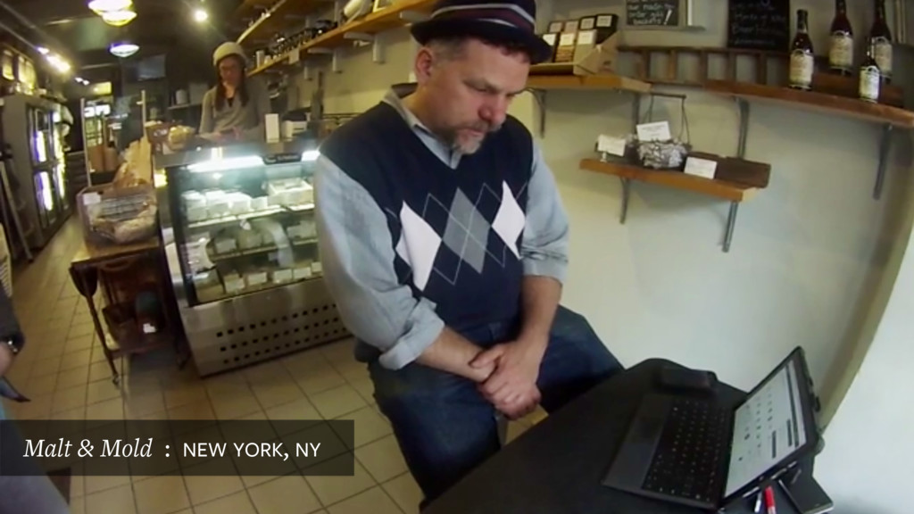
6. They’re getting by however they can. Kevin at Malt & Mold in NYC, uses a folding table and a keg as his office.
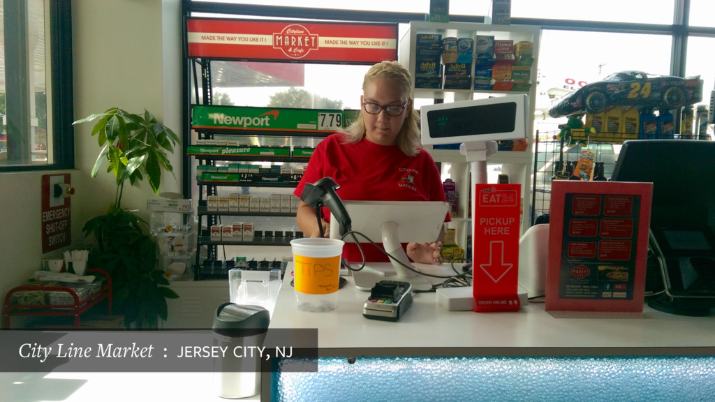
7. Their reality is chaotic, not picture-perfect. Often full of clutter, with lots of point of sale devices and signage. Each is a real, physical, specific context.
8. This is the world we work in at Perka.
9. Here’s our design team. Their job, along with PM, engineering, QA, and support—is to facilitate the relationship between all of these uniquely weird small businesses and all of their weird, unique customers
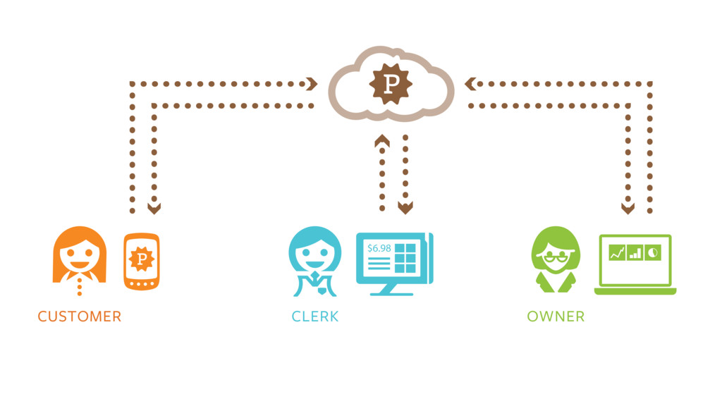
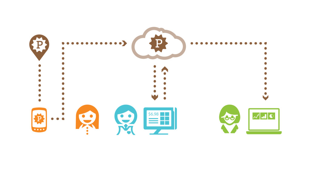
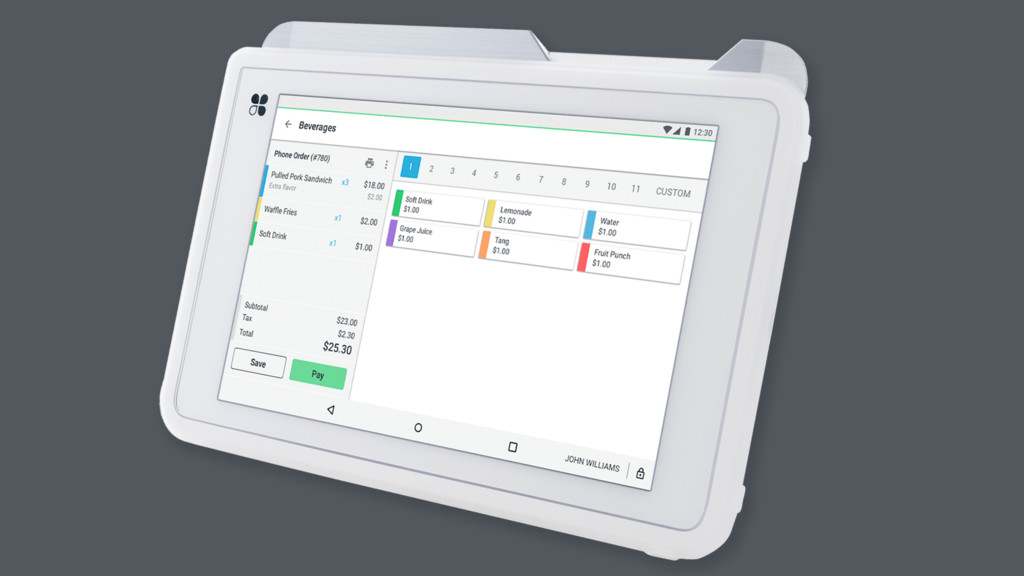
10. This is what that system looks like • A customer phone connects to the Perka server • That server tells the clerk’s POS so the customer can be associated to their order • The POS reports back to the server, which logs activity on a dashboard That’s how the devices interact, but there’s already a context around it
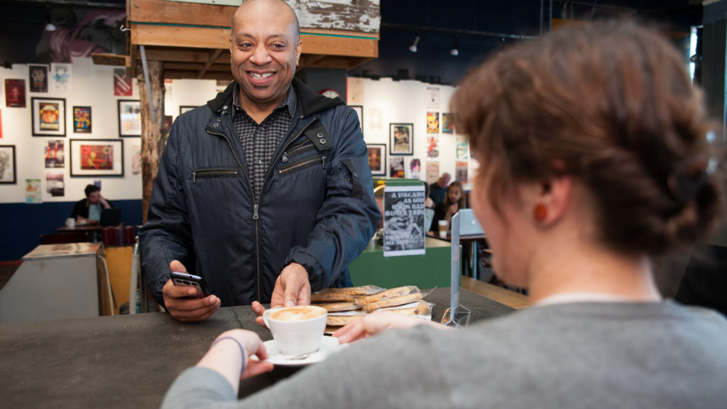
11. There’s an actual conversation around an exchange of goods. Outside of NYC, eye contact. • To facilitate this, Perka asks you to introduce yourself (this is John, from our Portland team). • He’s got his phone in his hand, but it’s not the focus of his attention. • It’s enabling, but not in the way of his conversation. This is good, but can we get the phone out of the way completely? That device has a lot of contextual information available to it, can we automate the whole process?
12. Automation, like this sign, is an old and mysterious thing. Appears in ancient Greek, Jewish, Chinese texts — can we make something to act on our behalf?
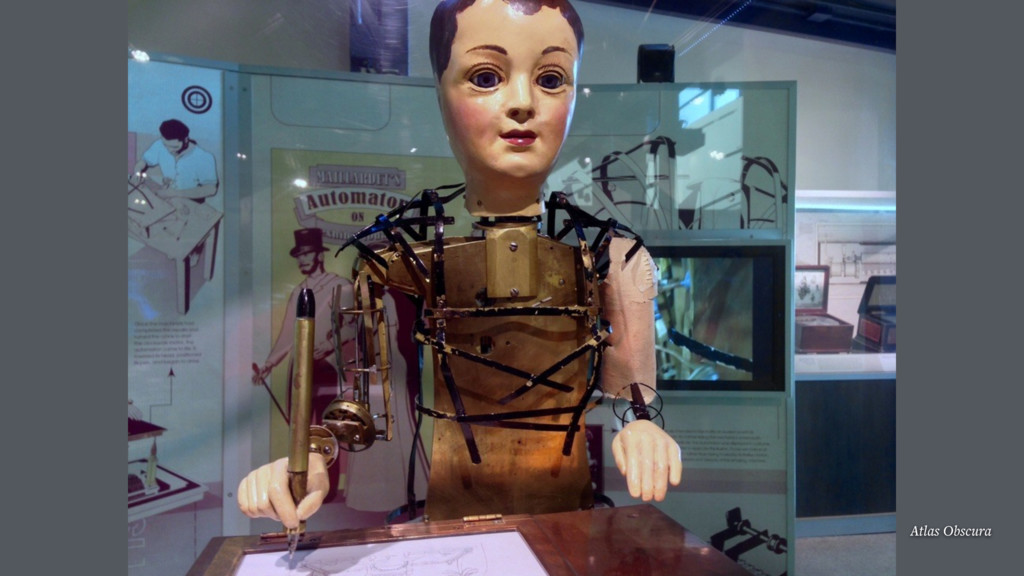
13. “Automation” comes from automaton — became popular in 17th century Can execute simple programs, stored on changeable gears Maillardet can draw 4 pictures and write 3 poems. It can also haunt your nightmares. It’s a black box. Passive, phenomenological, no interface.
14. What happens when things go wrong? Cliff Kuang, Fast Company — When we hide complexity, “we also lose the ability to control how things work, to take them apart, and to question the assumptions that guided their creation.”
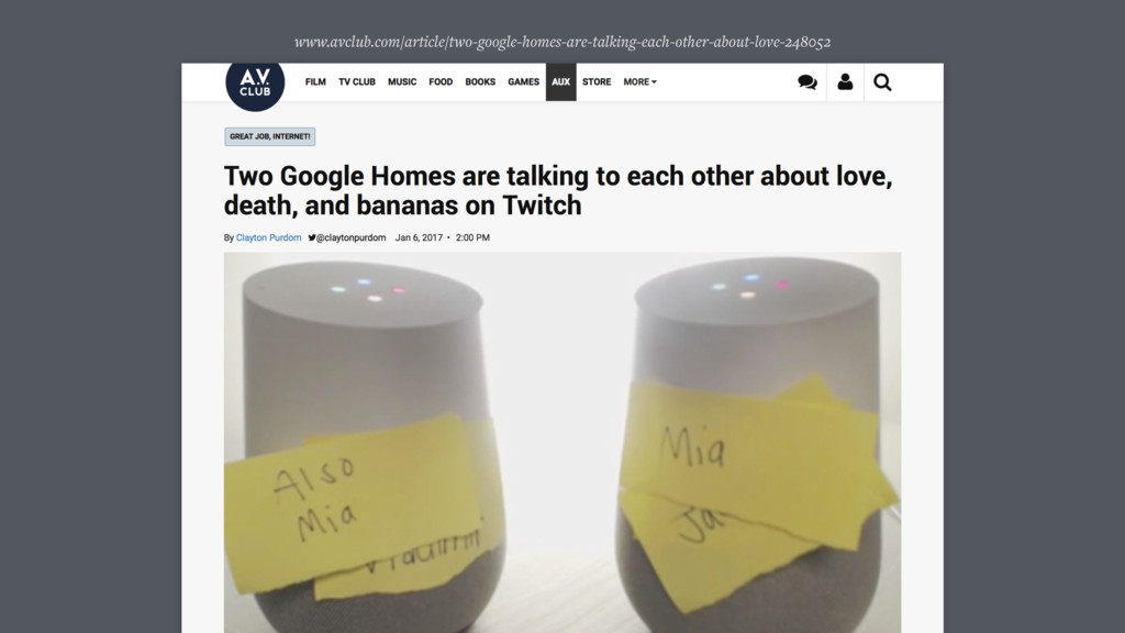
15. We can end up with unexpected results
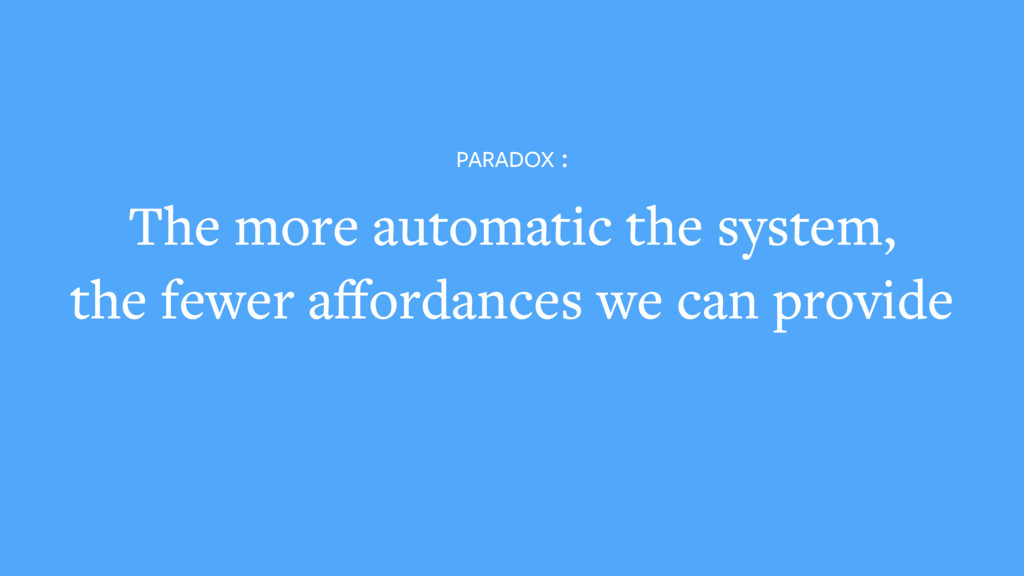
16. Sort of a paradox — the more we automate a system, the less interface we have available to us. We lose all of the affordances and cues by which we can give a user valuable information. Interface can help us answer some pretty important questions…
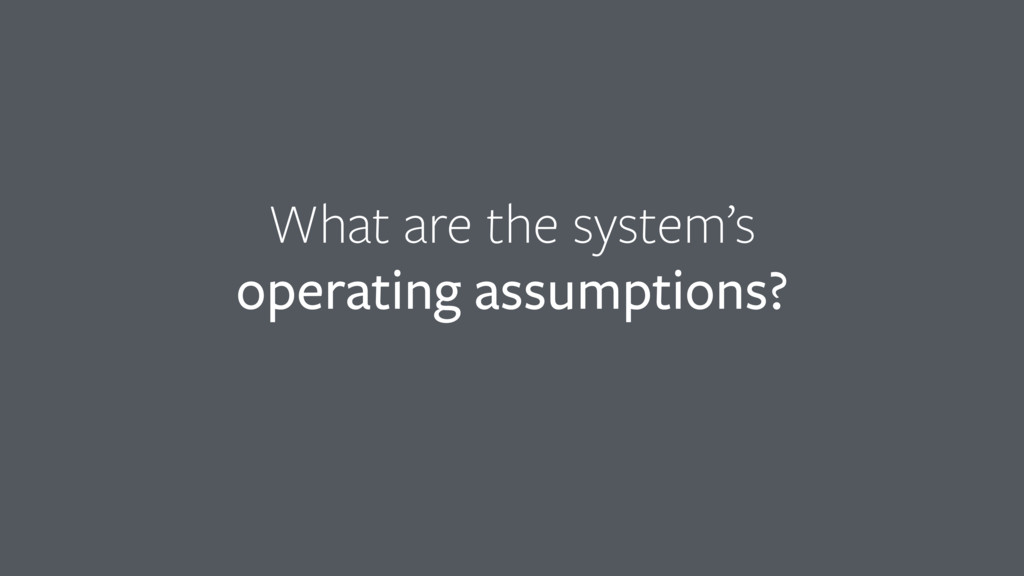
17. What are the system’s operating assumptions? Interface can help us understand the conditions in which the system is meant to function
18. Why is NYC steam heat is so hot? Why don’t our thermostats work?
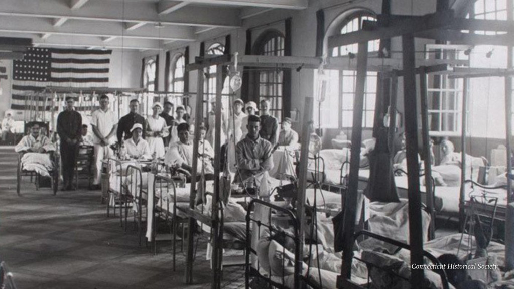
19. Steam systems were put in during the 1920s, after the 1918 flu. Notice windows are open for fresh air — systems were calibrated for open windows Meanwhile window insulation has gotten better. Operating assumptions were different.
20. What is going to happen? Interface can help us know what to expect from the output
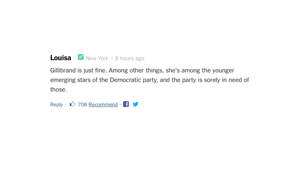
21. What does “recommend” mean in the New York Times comments section? Will it post this on Facebook and Twitter? Did I connect them?
22. What did happen? Interface can help us understand what a system did on our behalf
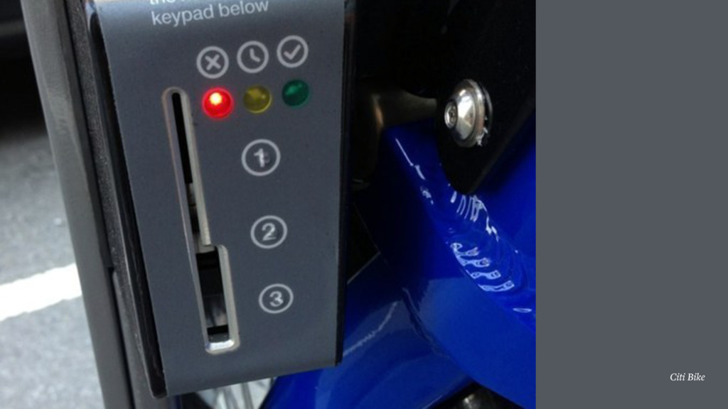
23. Reduced interface limits our ability to communicate state accurately + synchronously. Citibike has three lights. What does red mean when returning? System can communicate via push, text, email — but rental window is 3 hours, so a misunderstood error state means the system can’t tell you until it’s too late.
24. Why did it happen? And when something behaves unexpectedly, interface can help us understand why it happened.
25. Facebook generated slideshow doesn’t help us understand why it chose these photos to assemble When a system can’t convey why it behaved in a certain way, it can feel weird, even creepy.
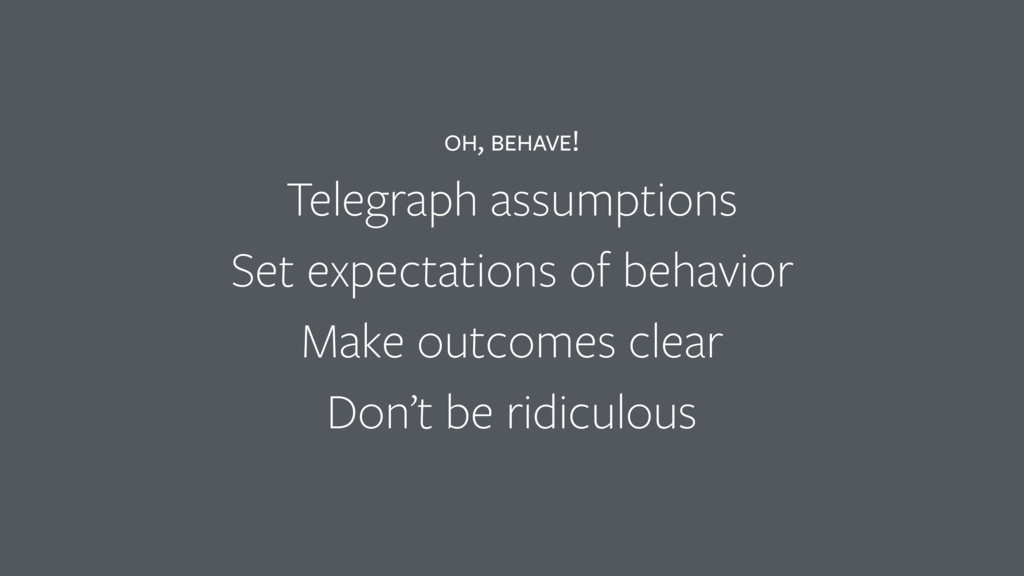
26. For an automated system or feature to feel as if it’s behaving correctly, it needs to: 1. Telegraph its assumptions 2. Set appropriate expectations 3. Make outcomes clear 4. Make “why” obvious
27. Returning to this moment… can we automate this? Yes… with limited success. • Our team has tried lots of “micro-automations” to try to reduce friction in helpful ways • These are particularly useful in merchant/clerk side tools, because they’re super busy I’m going to show you 3 examples from the customer side of this interaction, and tell you what our team learned from trying to automate them in the service of the off-screen interaction
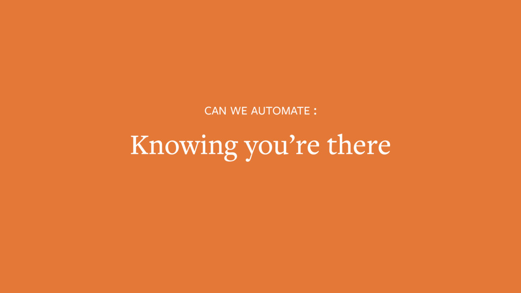
28. First micro-automation: are you here? From the beginning of Perka, we’ve wanted to automatically know when a customer is at a merchant
29. Perka operates on a check in model, like a lot of location-based services. • John has to check in by clicking this button. • Before that, he has to remember to check in, get his phone out, unlock it, find the app, launch app, load app, find this merchant, find the button, tap the button. Getting rid of this button would get rid of a lot of work for John.
30. At the time we started, there was an exciting new technology: BLE beacons! (Which as you can see by this illustration is a technology which lets businesss people to remotely control a zombie invasion)
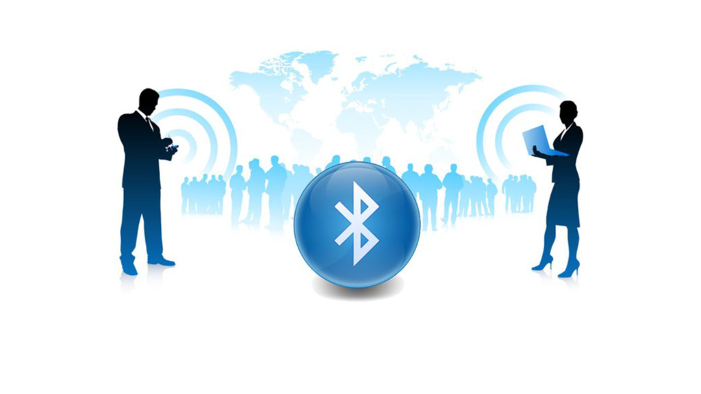
31. So, we built one. Lots of fancy over-engineered features, sexy industrial design, shipping logistics.
32. When we insert into our system diagram, the beacon does the work for the customer It calls the server directly, so the customer can simply talk to the clerk.
33. Of course we want to let a user know what happened, so we send a helpful push notification. But… we need a few permissions for this — Push, Location. And… we have to ask for those before we can communicate the value. Which… limits our ability to set our operating assumptions.
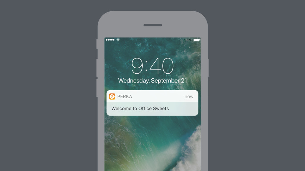
34. Once permissions are granted, we need them to stay enabled • But… what if the user turned it off and doesn’t remember? • Doesn’t remember that they didn’t turn it back on? • What if you don’t have cell service, or the merchant’s wi-fi is out? If it doesn’t work, we have no way to tell you that it failed.
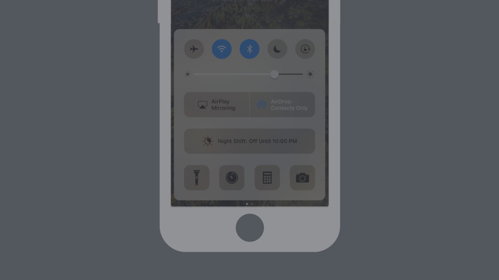
35. The user can’t know what they don’t know. The failure state is the same as null state. And… if it fails once, how can we count on it to work next time? To be sure, the user still needs to check to make sure it worked, and we’re right back where we started, with the phone in the hand.
36. When it inevitably doesn’t work, who will we blame? Attribution Bias: When something goes wrong for us, we blame external situations. Most users are going to blame the system or the clerk for the trouble. A few users will blame themselves. Either way is bad.
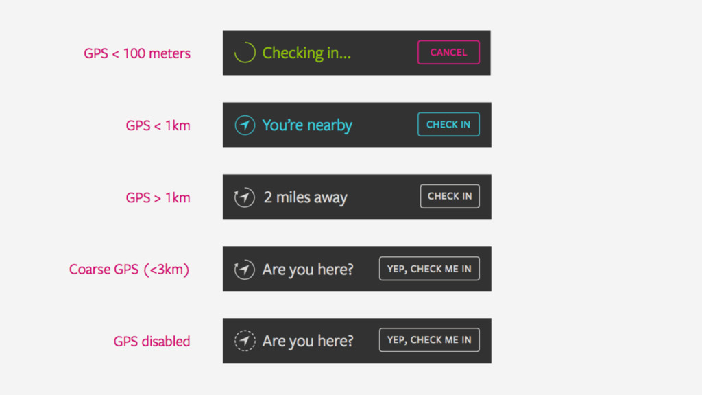
37. But since we have a bunch of smart people who designed and built this, it worked! So we removed button in favor of some other feature (more on that later) and provide feedback that “You’re Here” • But… what if I’m not? I could have walked by, or be upstairs (most frequent places are near you) • In those cases, there’s no way to understand why it incorrectly says this. So, it seems broken, and I lose trust again. • And, complications for the clerk: We used to remove people from the “Here now” list after the transaction. Now, how do we handle people who are still here? How do we know for sure when you’ve left —it all has to work perfectly twice. • Also, turns out there was some utility in that button for some people who liked to check in early Each of these are solvable problems… but is it worth the effort?
38. Or, we could make a choice to only deal in the “known knowns” Automate, but don’t be presumptuous — If we know that we know, go for it Otherwise, give them a way to manually check in.
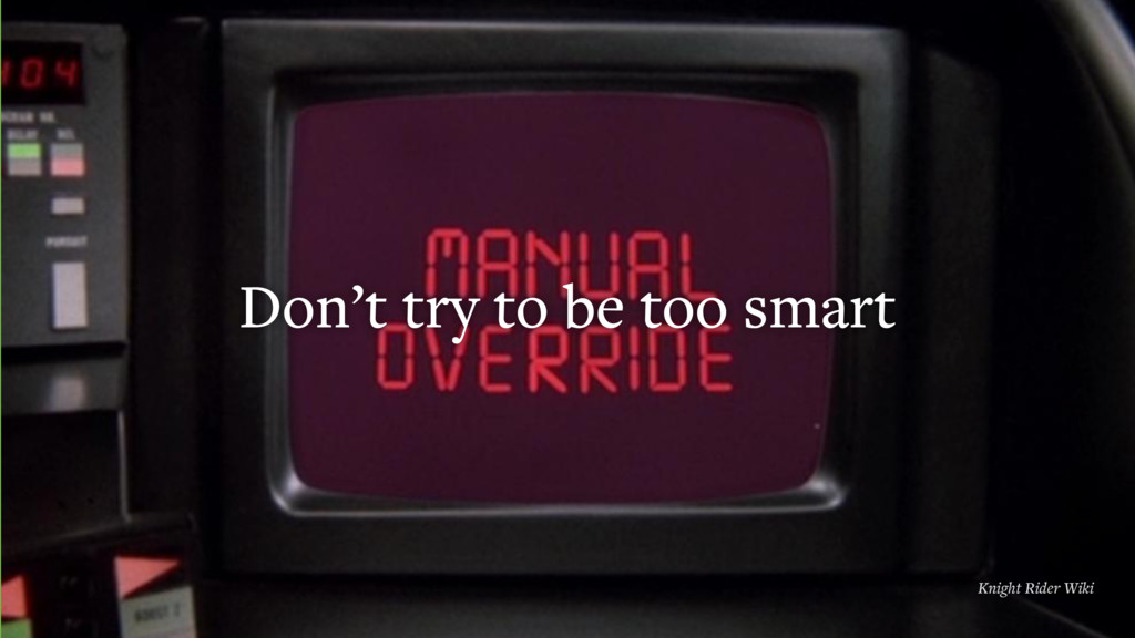
39. Lesson: Don’t try to be too smart • Only claim to know what we know. • Help when we can, but not at the risk of breaking trust. • Leave a manual override.
40. Second micro-automation: enrollment • Customer needs to get an app, which takes too long to do in the middle of buying something, maybe with a line behind you. • And, doing it after the transaction and going back to the register is awkward and unworkable.
41. Our first pilot merchant had a great hack: write the app name on the back of their punchcards, and let customers bring it back in for credit with the app. • So, we actually created a “you don’t need this card” for them to use, with instructions on the back to get the app
42. • When we joined First Data, we were able to work with our sister company Clover. They make an open POS that enables us to integrate into the transaction itself. • Now we could know what people ordered + automatically determine what perks or discounts they were eligible for on a given purchase • And, we get a printer
43. We automated the “you don’t need this” cards with “claim code” receipts. • These gave us a way to pre-enroll a user, automatically assign credit to a stub user, that can be claimed later by scanning in-app at a convenient time. • They worked! Activation shot way up…
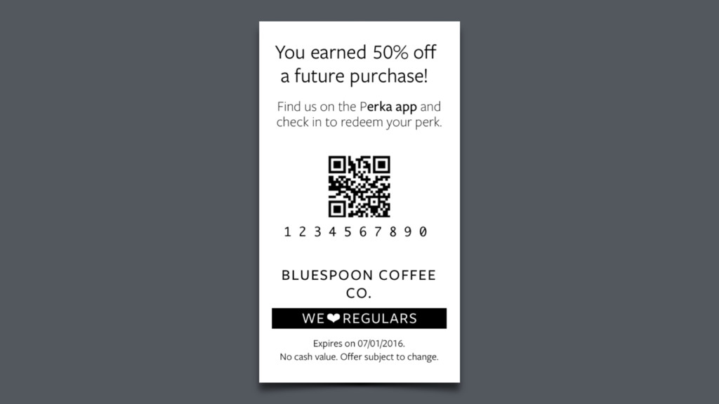
44. …but so did problems. Because we taught people on their first interaction to get the app to scan a code, they thought that’s what the app did. To these users, Perka was a code-scanning app used after the transaction.
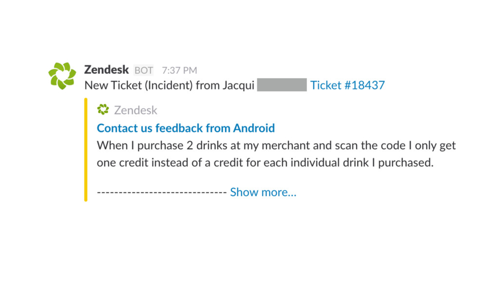
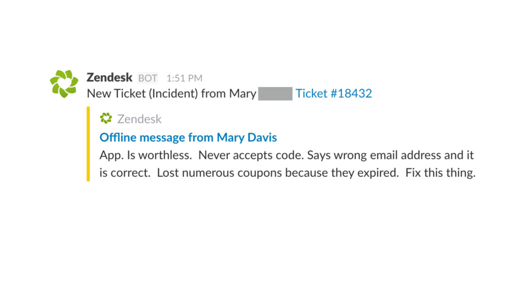
45. And… because they didn’t have to do it right then, people started stockpiling the codes and forgot about them.
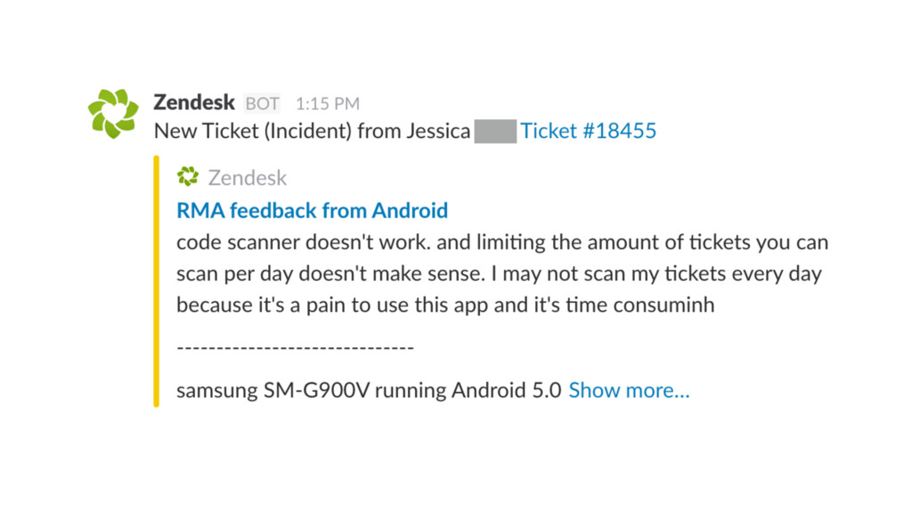
46. And… since the we didn’t require a verbal interaction, clerks became disengaged, just handing out codes. That led to extra codes lying around… which led to fraud… which led to rate limits… which led to more problems…
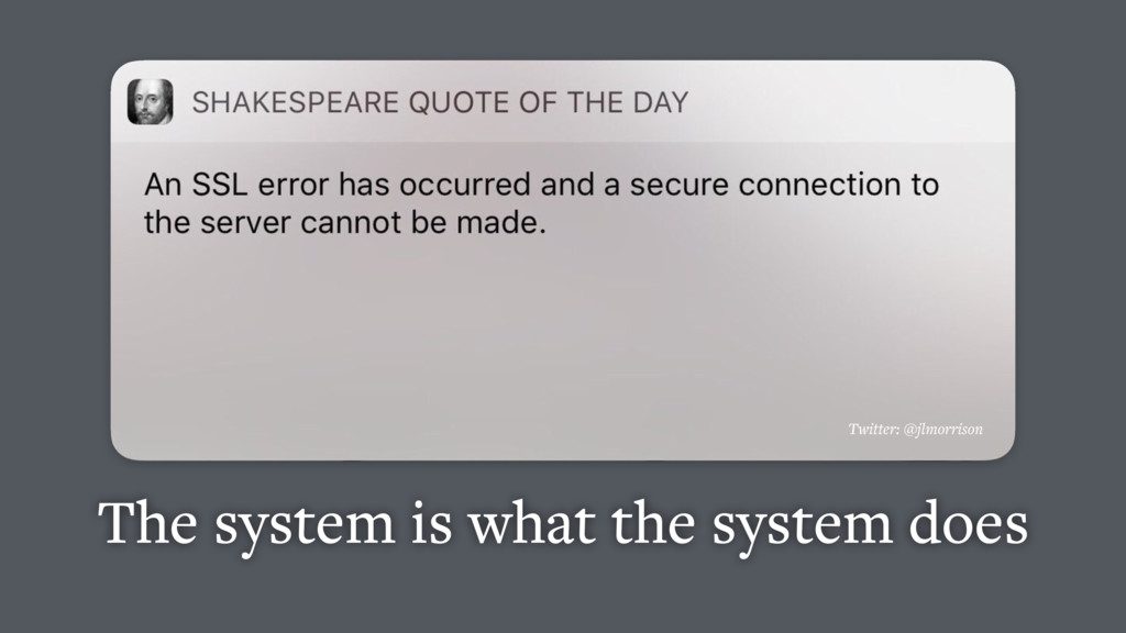
47. The system is what the system does Lesson: The system is what the system does. It doesn’t matter what it should do. Whatever your product teaches the user to do, what it says, how it fails, is what it is to the user.
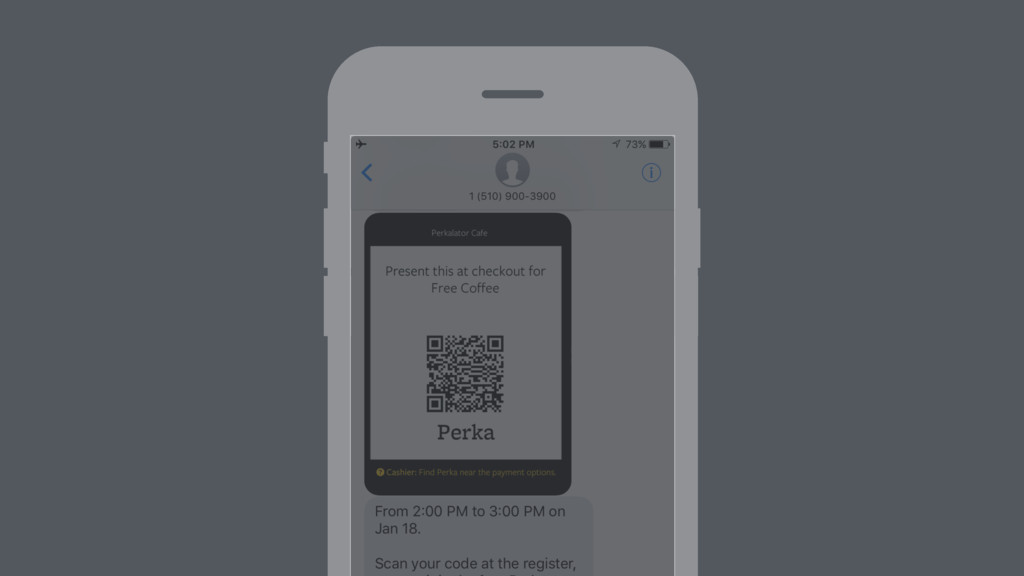
48. The goal of the receipt isn’t to “get the app,” it’s to enroll in the service. Receipts are effective at this — let’s let them do their job without the app. Let’s let you text a code instead.
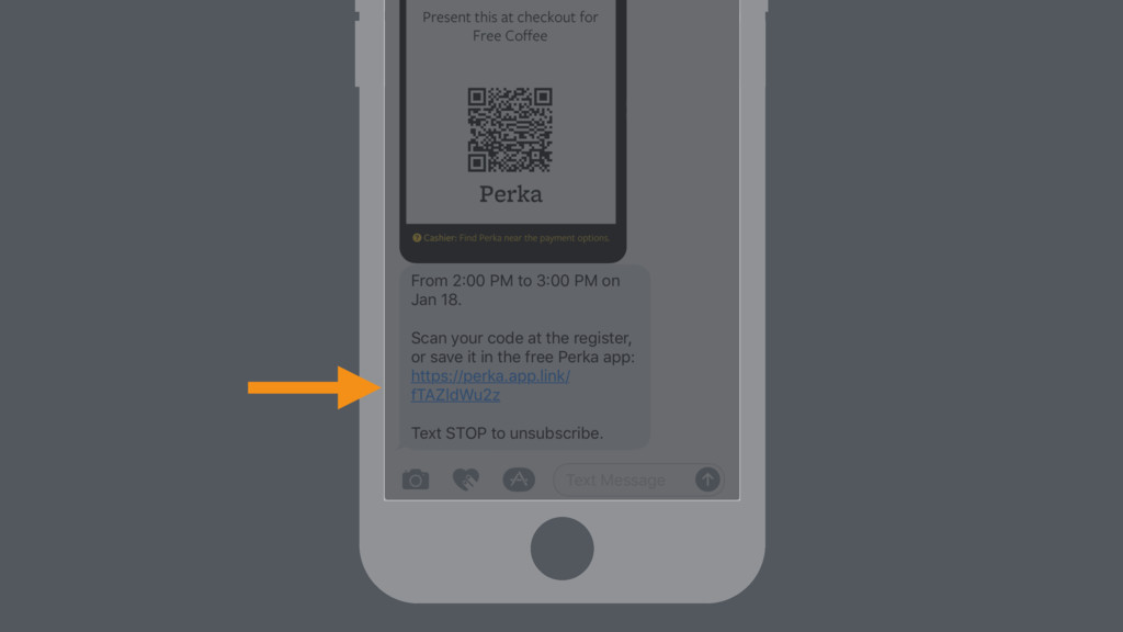
49. We’ll send you back a coupon to show the clerk, no app. Clerk training is built-in. The key is: you can continue to participate this way as long as you like.
50. At a point, you might want to make this more convenient… A deep-link is there if/when you’re ready to graduate to the app, already enrolled
51. Don’t ask for a leap of faith Lesson: Don’t ask for everything up front. • It’s better to see the path clearly than the goal.
52. Let’s make things easier in small pieces, giving clear hand-holds at each step. • Let’s let users stay where they’re comfortable until they’re ready to turn the corner.
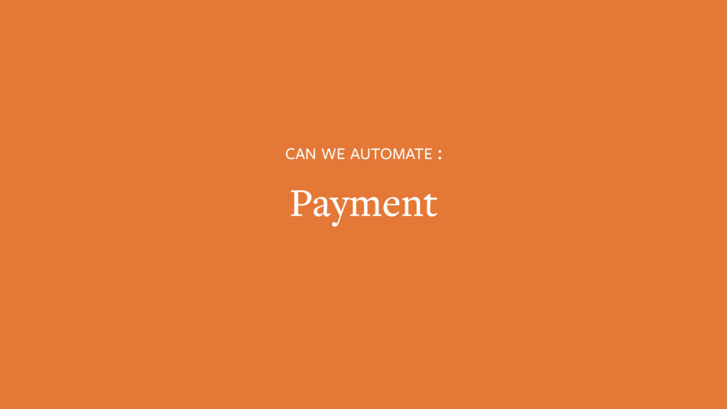
53. Third micro-automation: the payment itself We’re part of a payments company, and integrated with a POS. But… • Lots of wallets out there, nobody is asking for another one • Payments industry is crazy right now: Dip, swipe, tap, when? Let’s not make this worse.
54. • Natural temptation: ask for a user’s credit card at sign-up • No leaps of faith • We can extend payment as an option once user already knows how the system works • Not required, but when they’re ready, it removes a step and gets them there faster
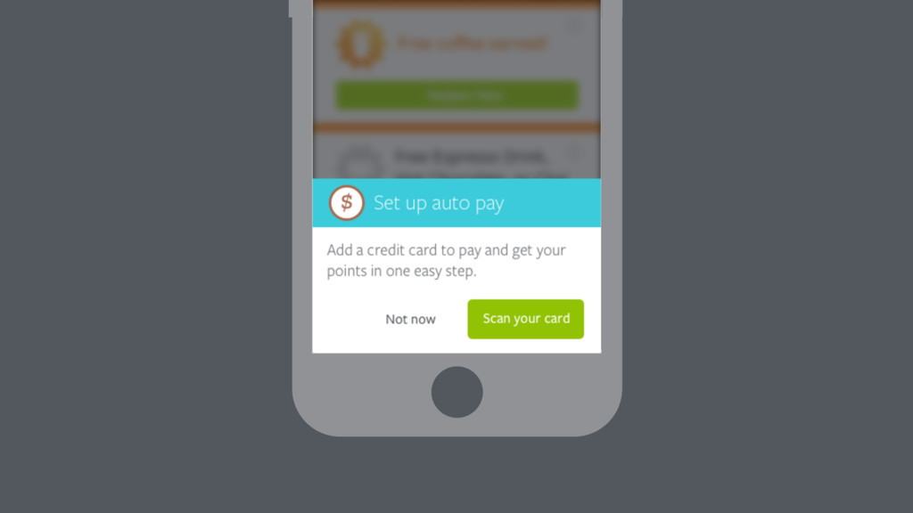
55. [ Demo ]
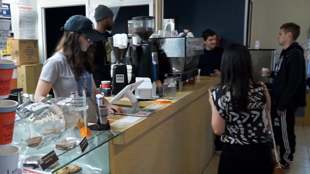
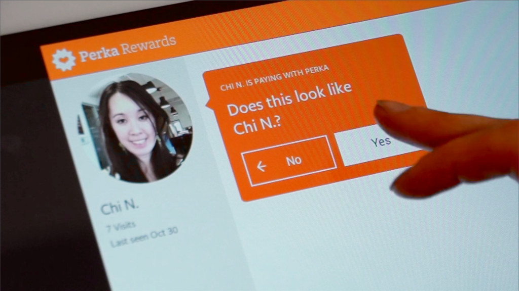
56. Works on top of the real, verbal interaction Customer still does exactly what they were already doing The clerk does too… they’re asked one easy question: to confirm photo
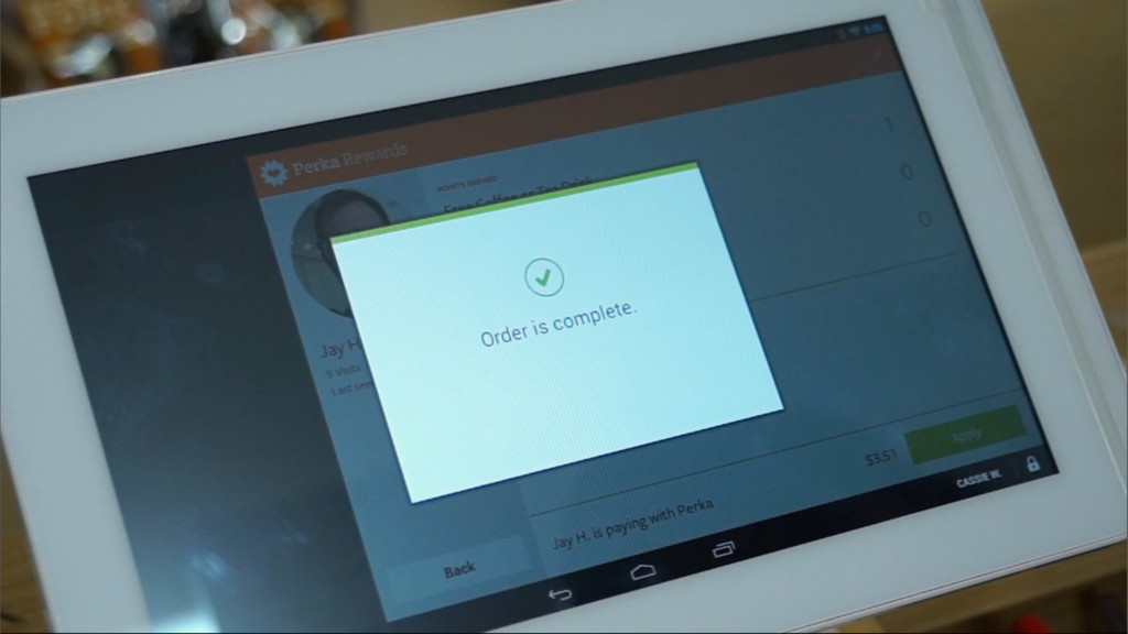
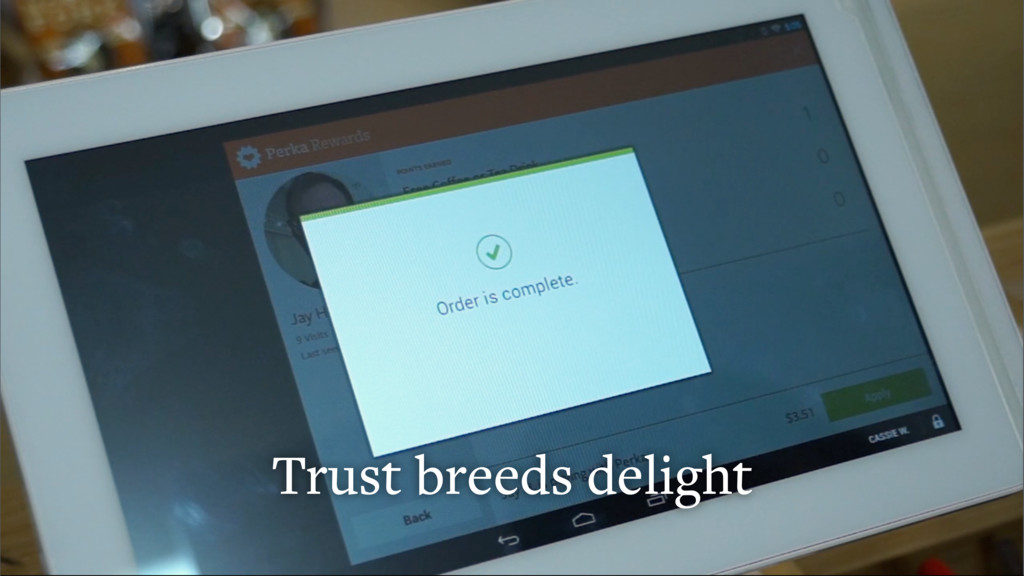
57. …and they end up in the same place they would have if it were manual Simply skips a step of selecting payment type, which makes their job easier
58. How did users feel about it? We thought they’d be concerned with security or privacy. But they weren’t. We’d already built trust.
59. Lesson: Delight requires trust Because we built Autopay on top of an existing behavior: • Users understood our assumptions • Their expectations were set • They knew what happened, and why
60. I’ll leave it here: When automating our products and services, let’s remember to be honest with ourselves and our users • There’s been lots of exciting conversation this week about Automation, CUI, AI • But when looking to evaluate new tech in the service of a product, I think it’s imperative that we ask ourselves a few questions:
61. Why are we doing it? Does this approach solve a real problem or are we trying to be too smart? Are we in love with the idea or the solution?
62. Is the solution any better than what we’re seeking to fix? Does automating something truly make life easier, or does it just make it harder for the user to understand? Is the gain in friction worth the loss of clarity in interface?
63. Is it worth it? For the user and for us as designers and builders? Would our time be better spent improving other areas of the experience? Hopefully some of our experiences at Perka are useful when considering how and when to smooth out friction in your products + services.