Upgrade to Pro — share decks privately, control downloads, hide ads and more …

Compose-ing a Design System at Deezer

Jean-Baptiste VINCEY
April 27, 2023
470

Compose-ing a Design System at Deezer

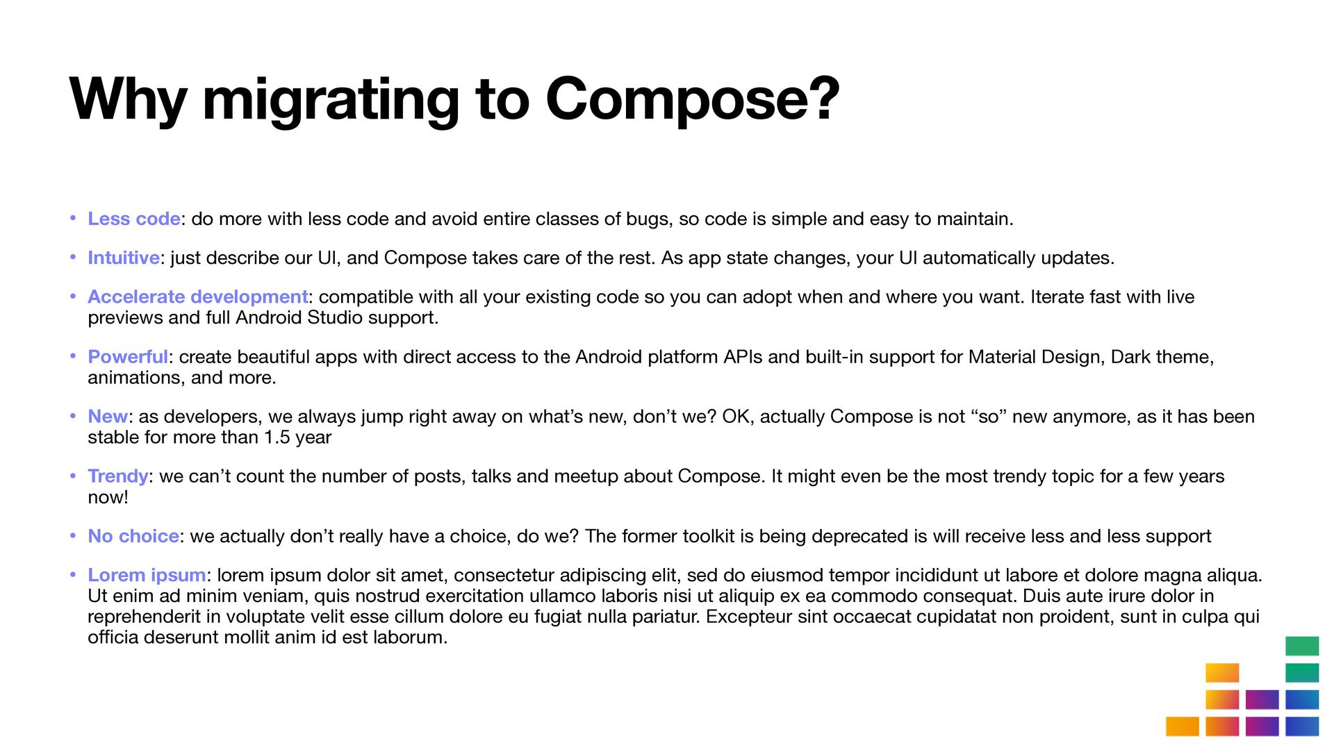
Since Jetpack Compose went stable almost 2 years ago, the enthusiasm for this technology has continued to increase, and its adoption for new projects is a no-brainer. However introducing Compose in a very large and long existing codebase is another story.

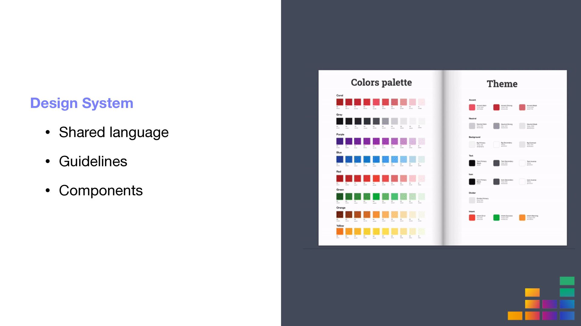
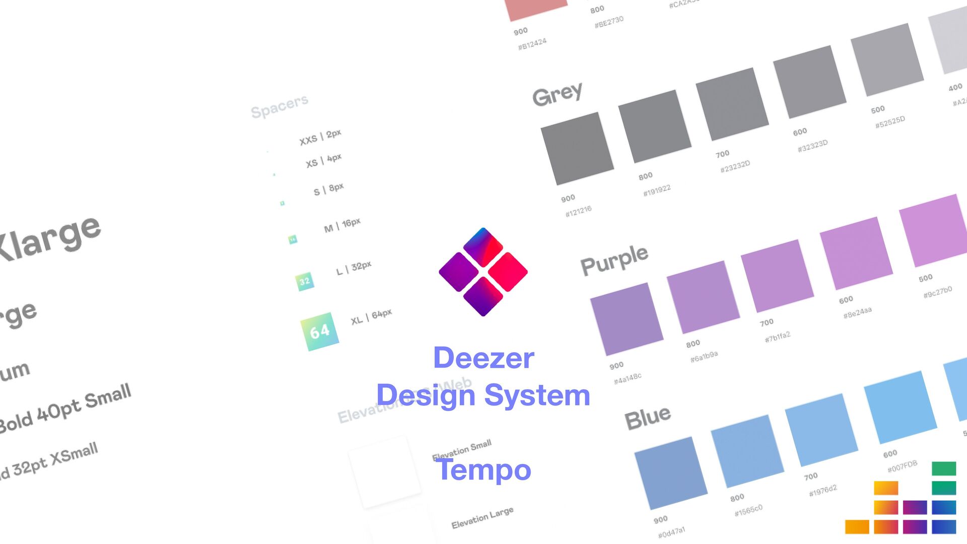
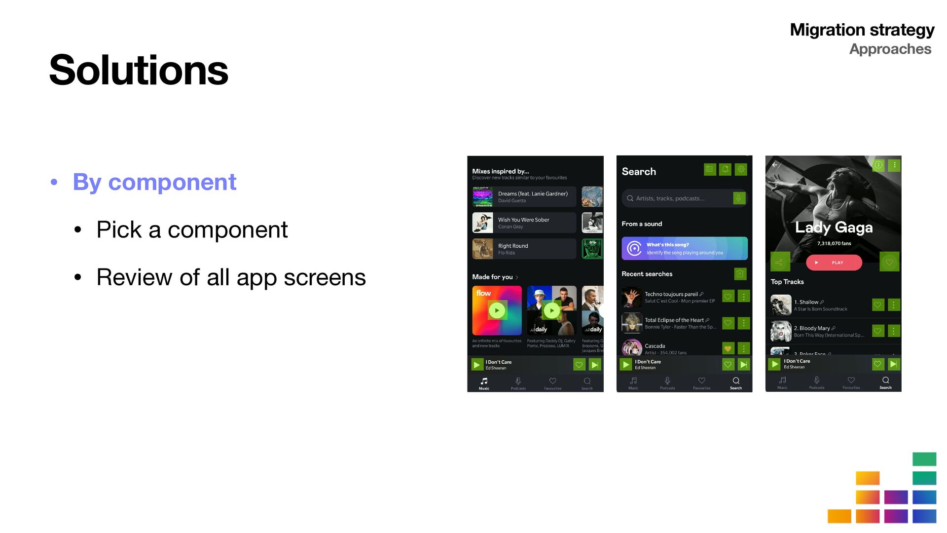
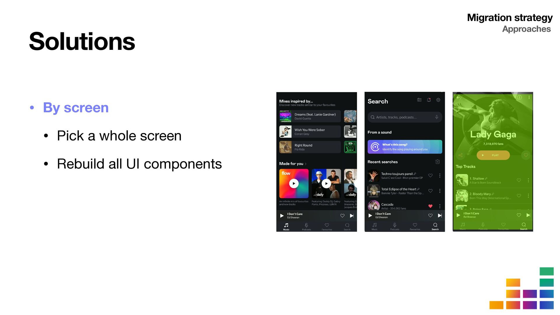
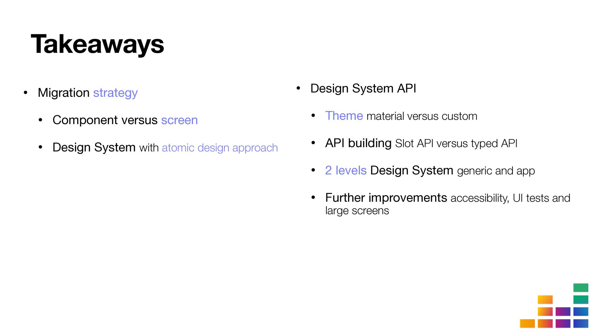
At Deezer, we have been working with a Design System for several years now to enhance productivity and consistency. The synergy between Design System and Compose, thanks to composition, seemed a huge opportunity for us to accelerate future developments while creating delightful new experiences. Therefore we established a strategy to migrate our Design System and use Compose in new features, as well as migrate the existing ones. Here are the different steps:
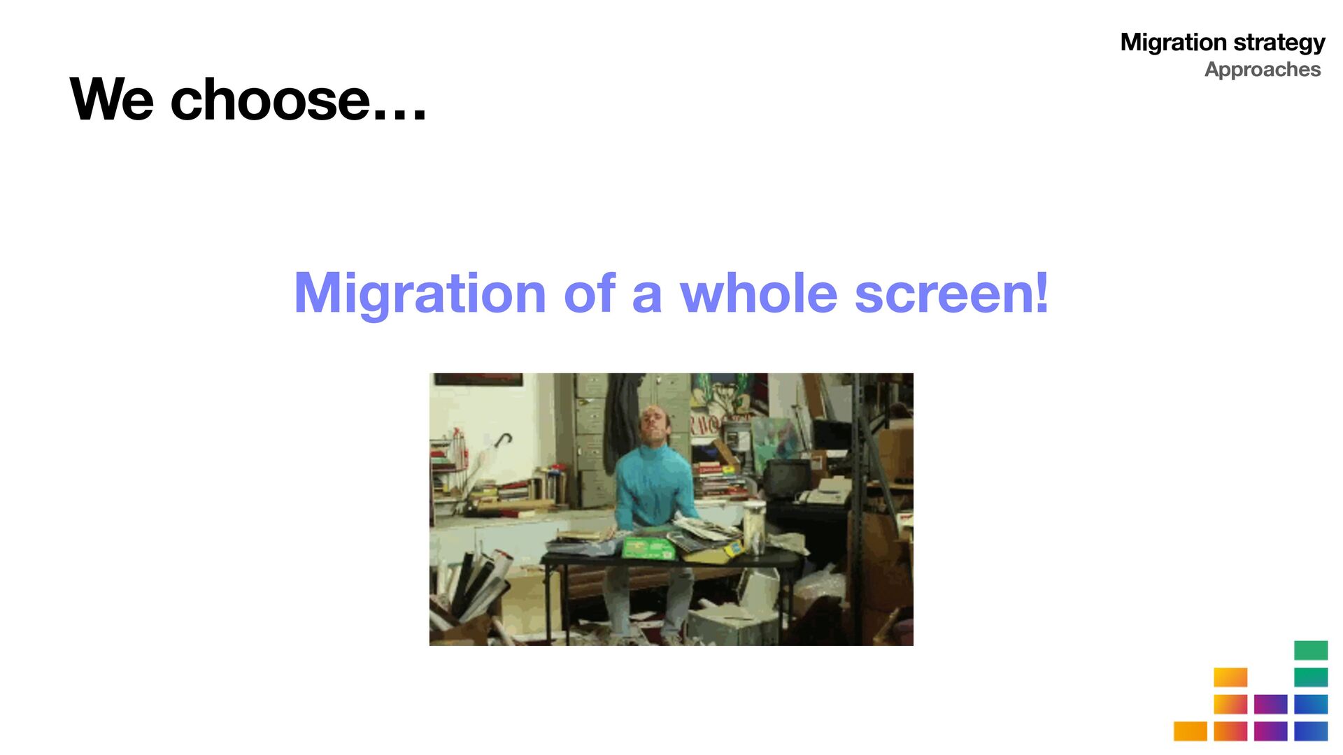
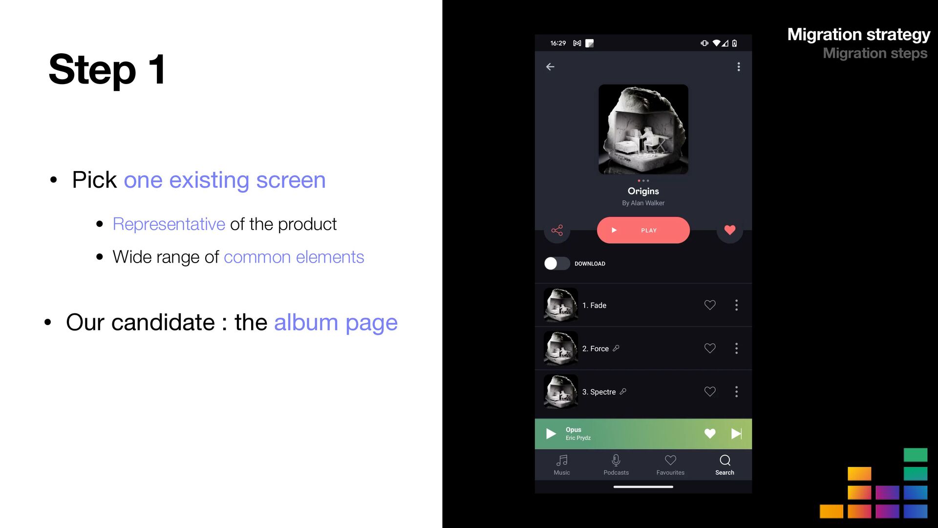
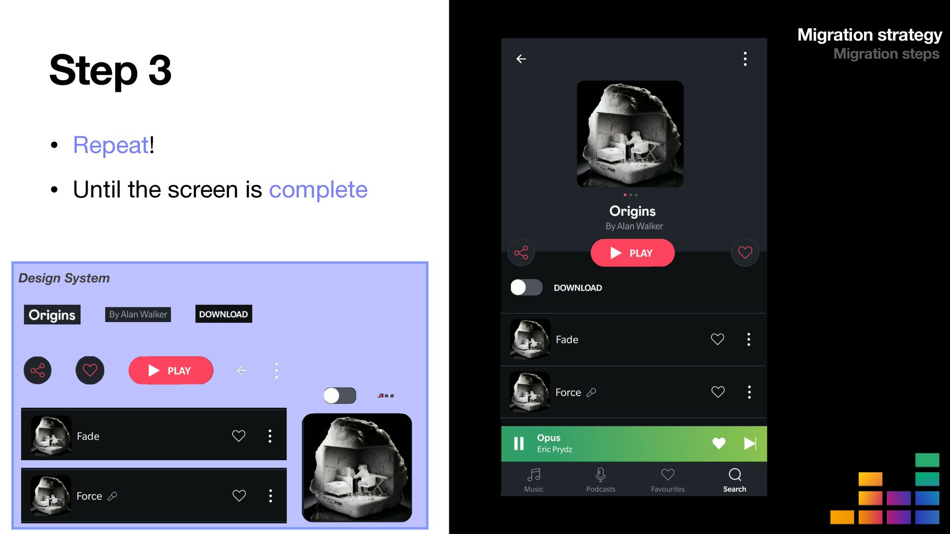
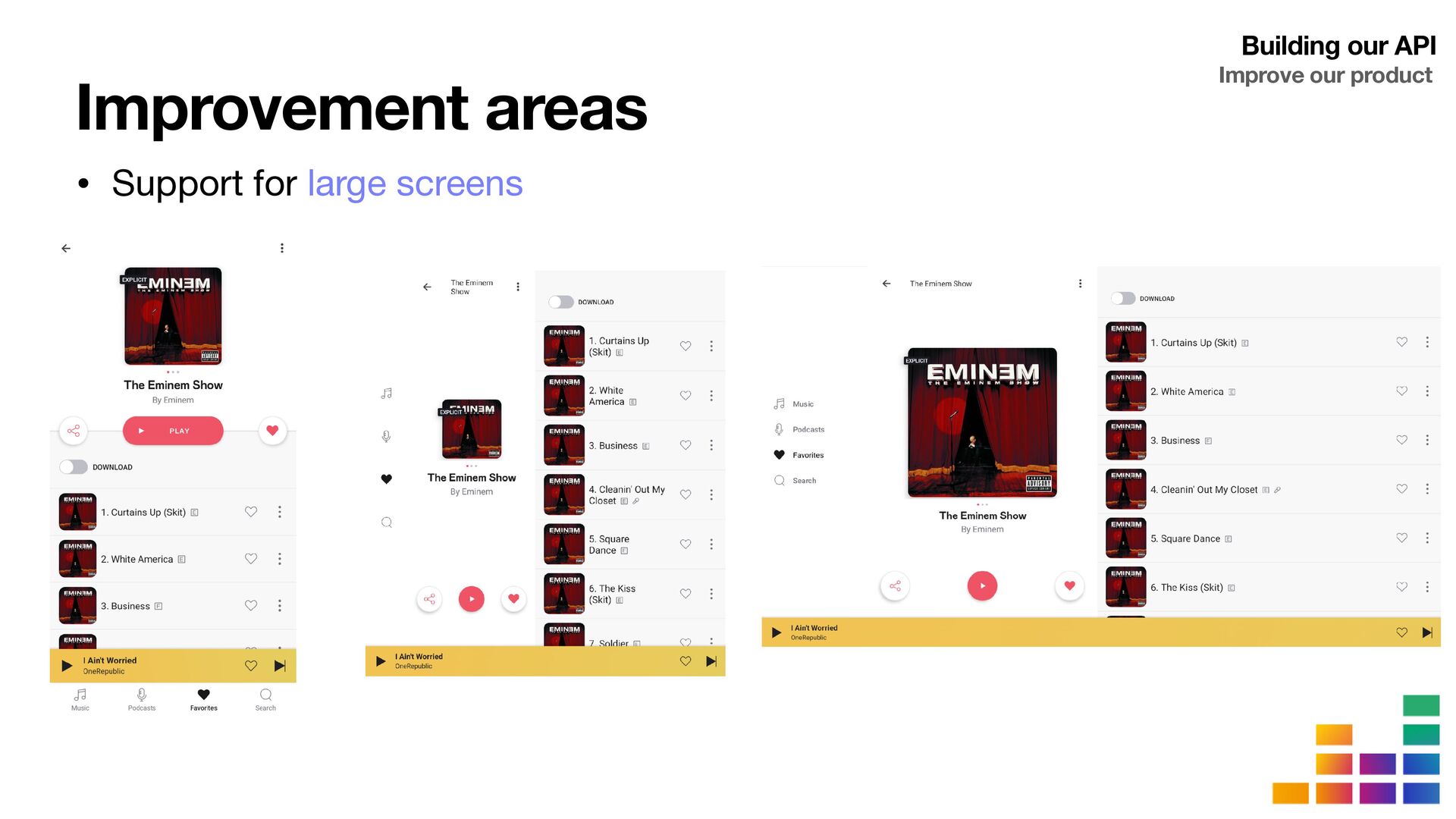
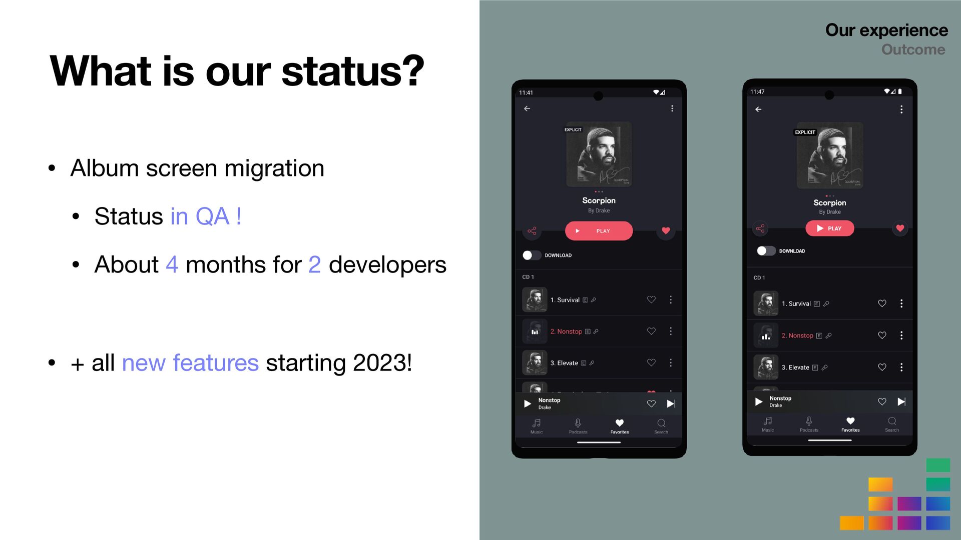
Migrating an existing page entirely to get acquainted with the new paradigms introduced by Compose
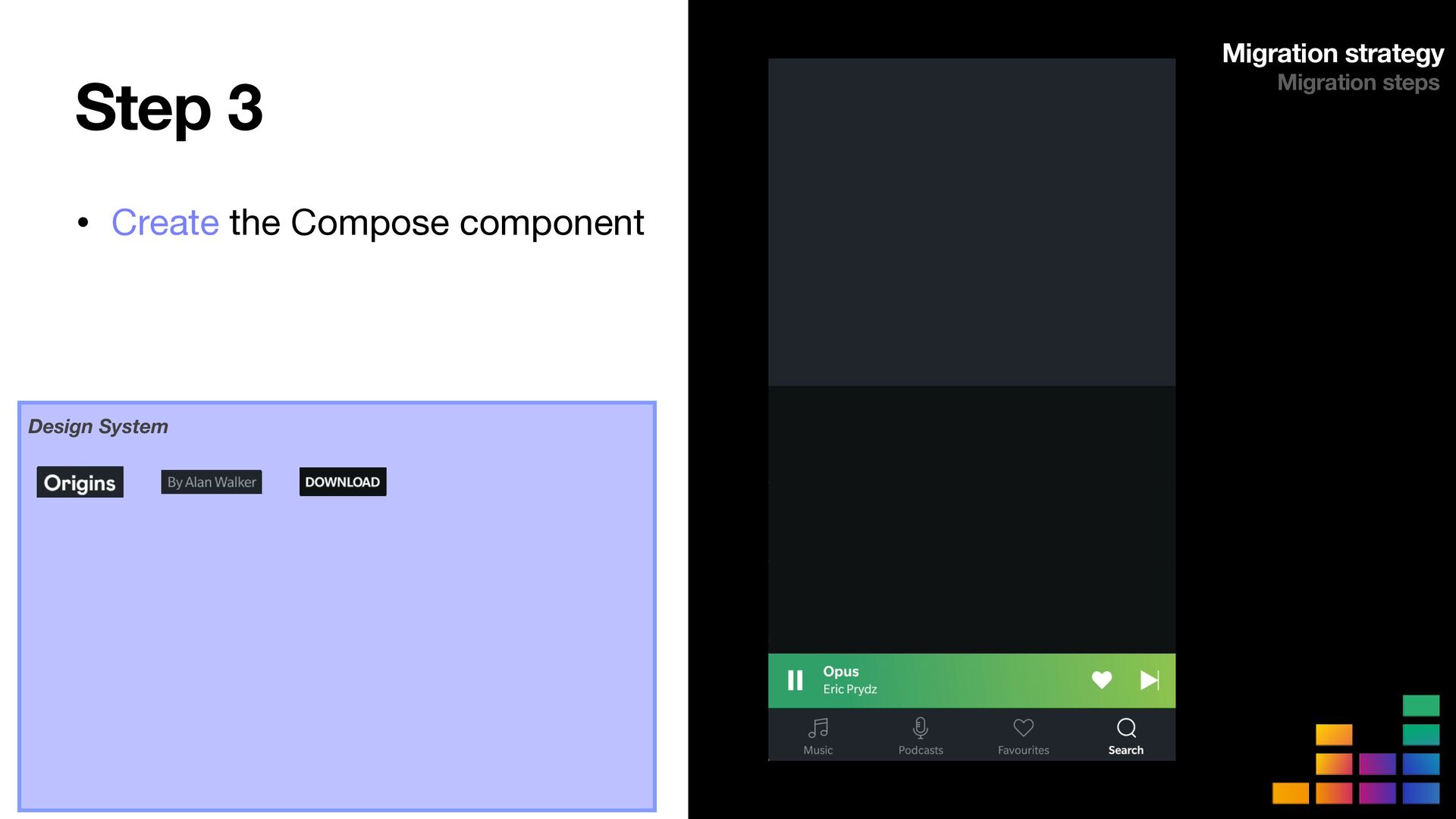
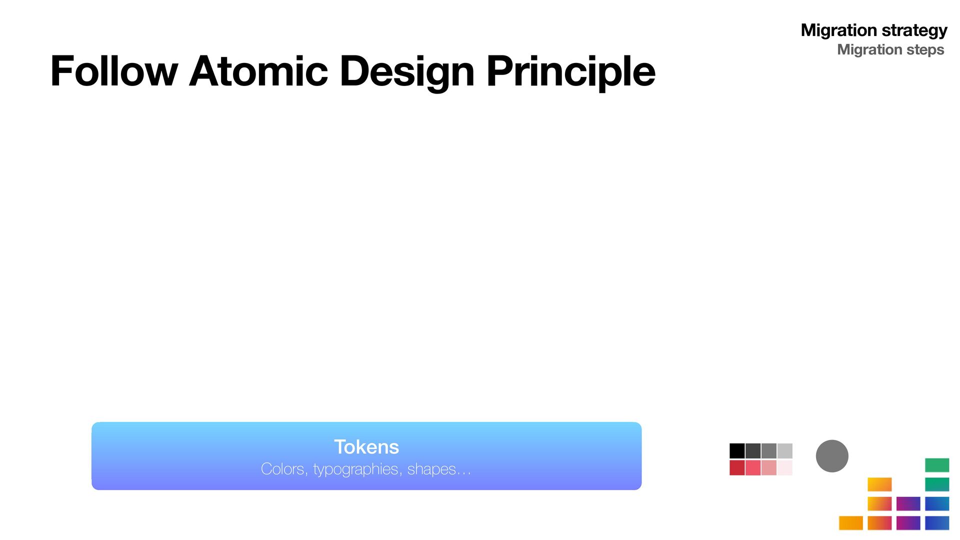
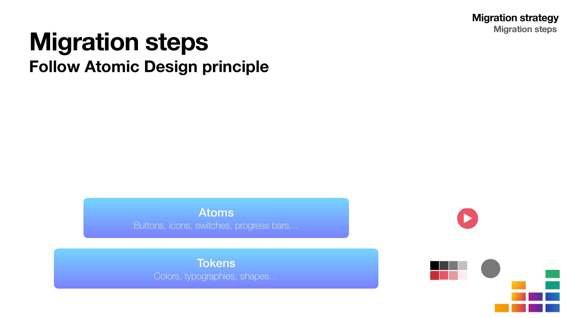
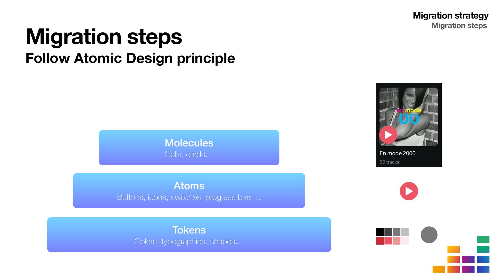
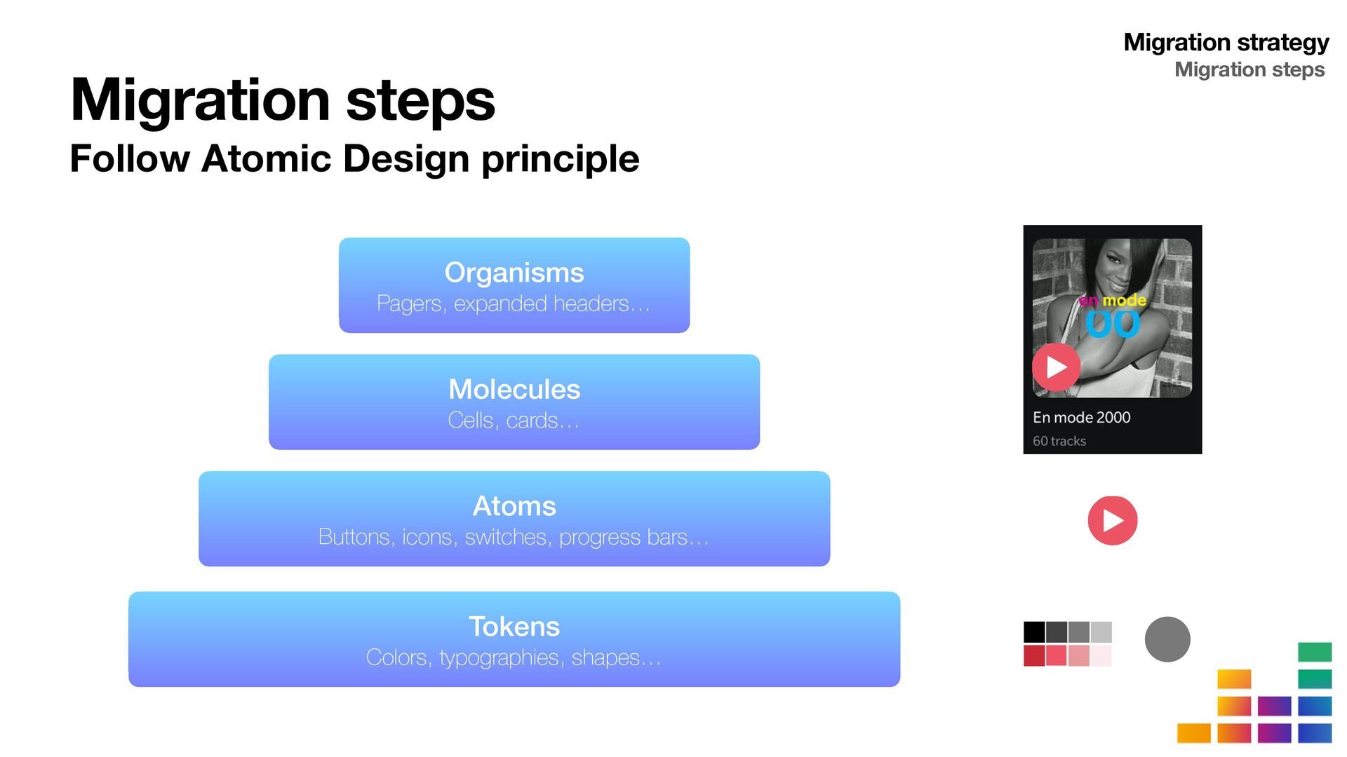
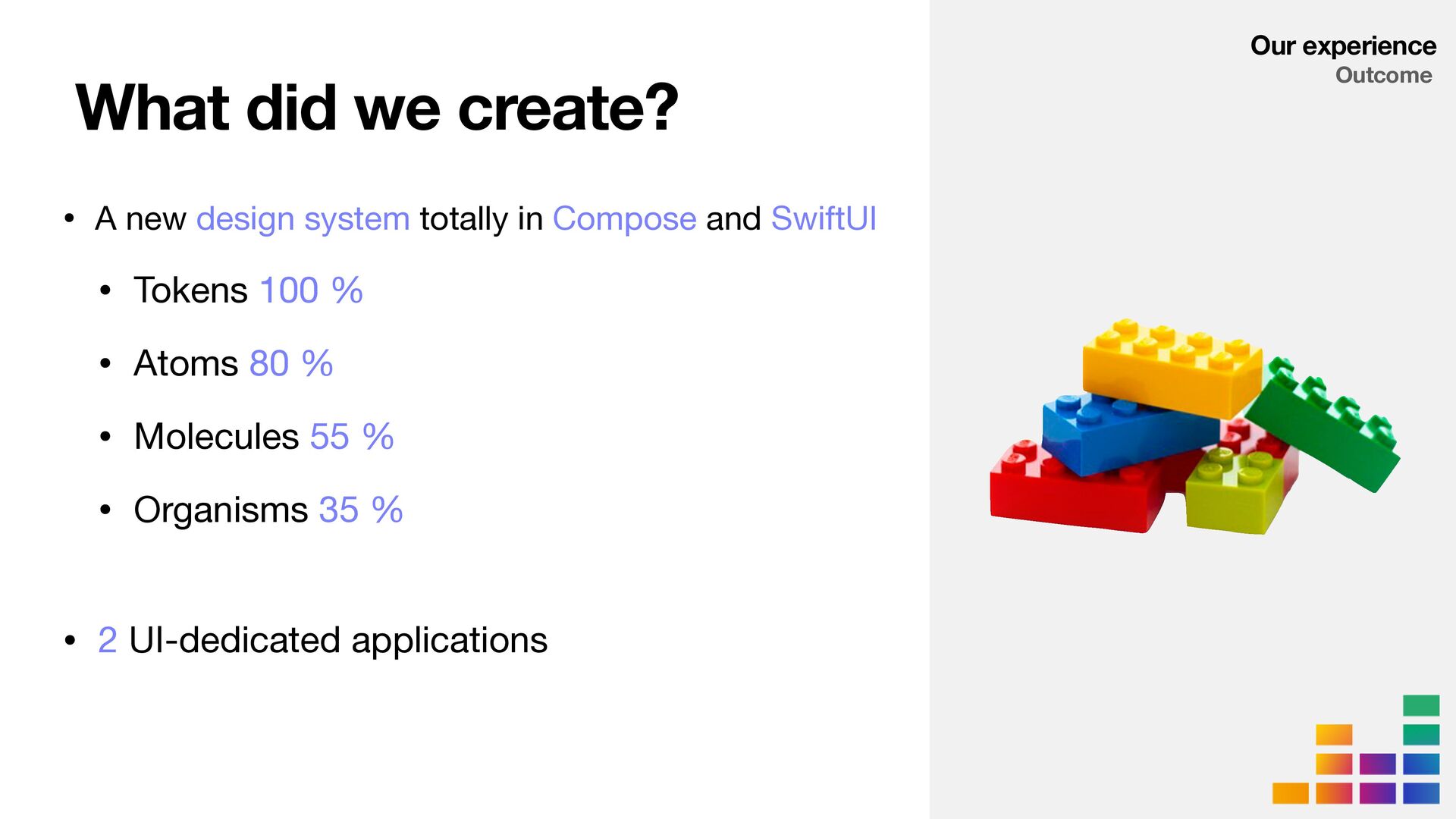
Defining a roadmap to initiate a new Compose Design System following Atomic Design principles
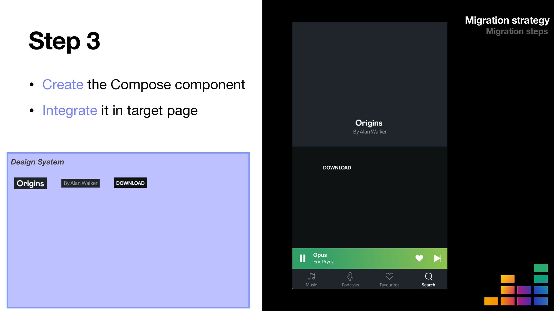
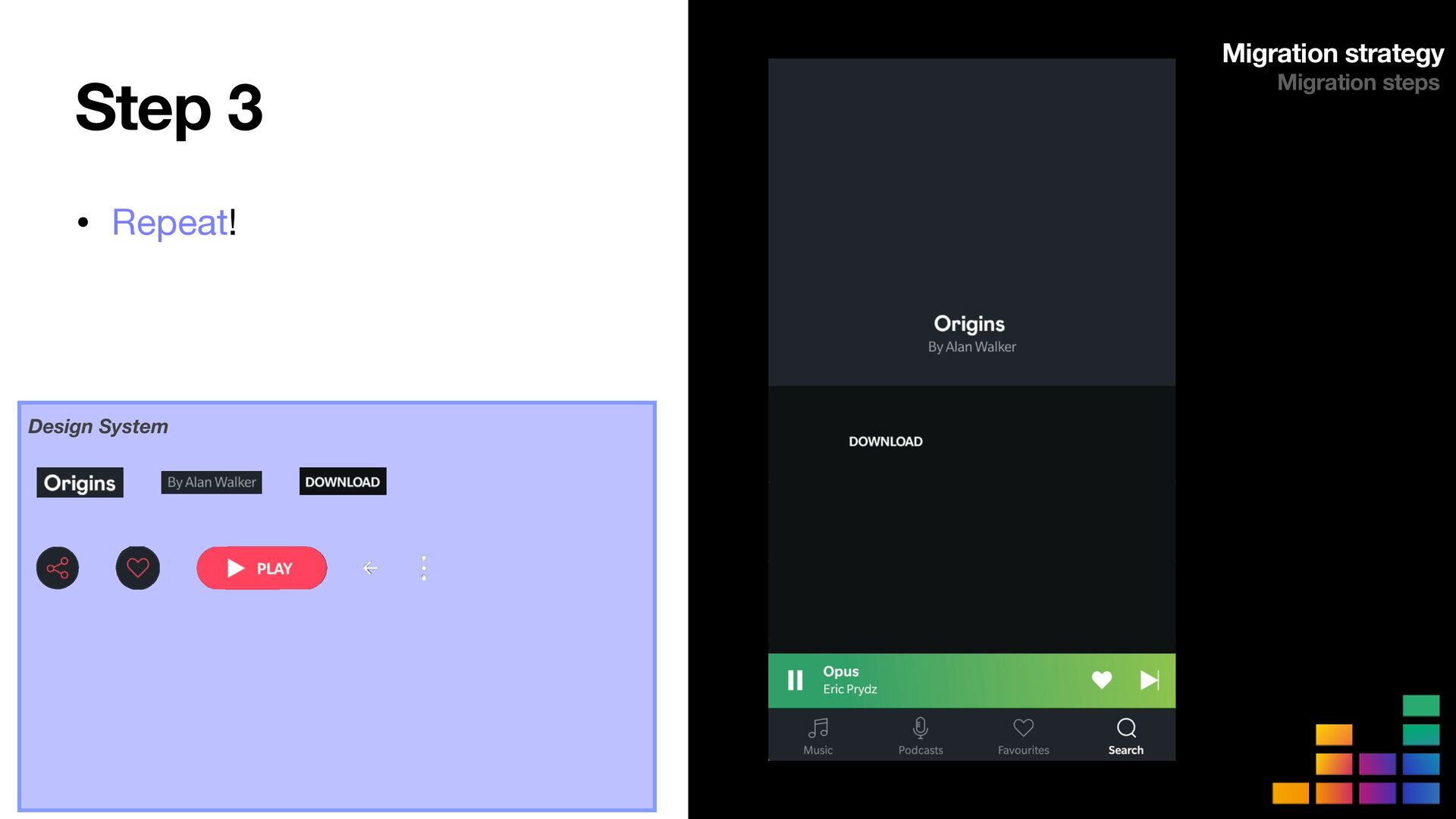
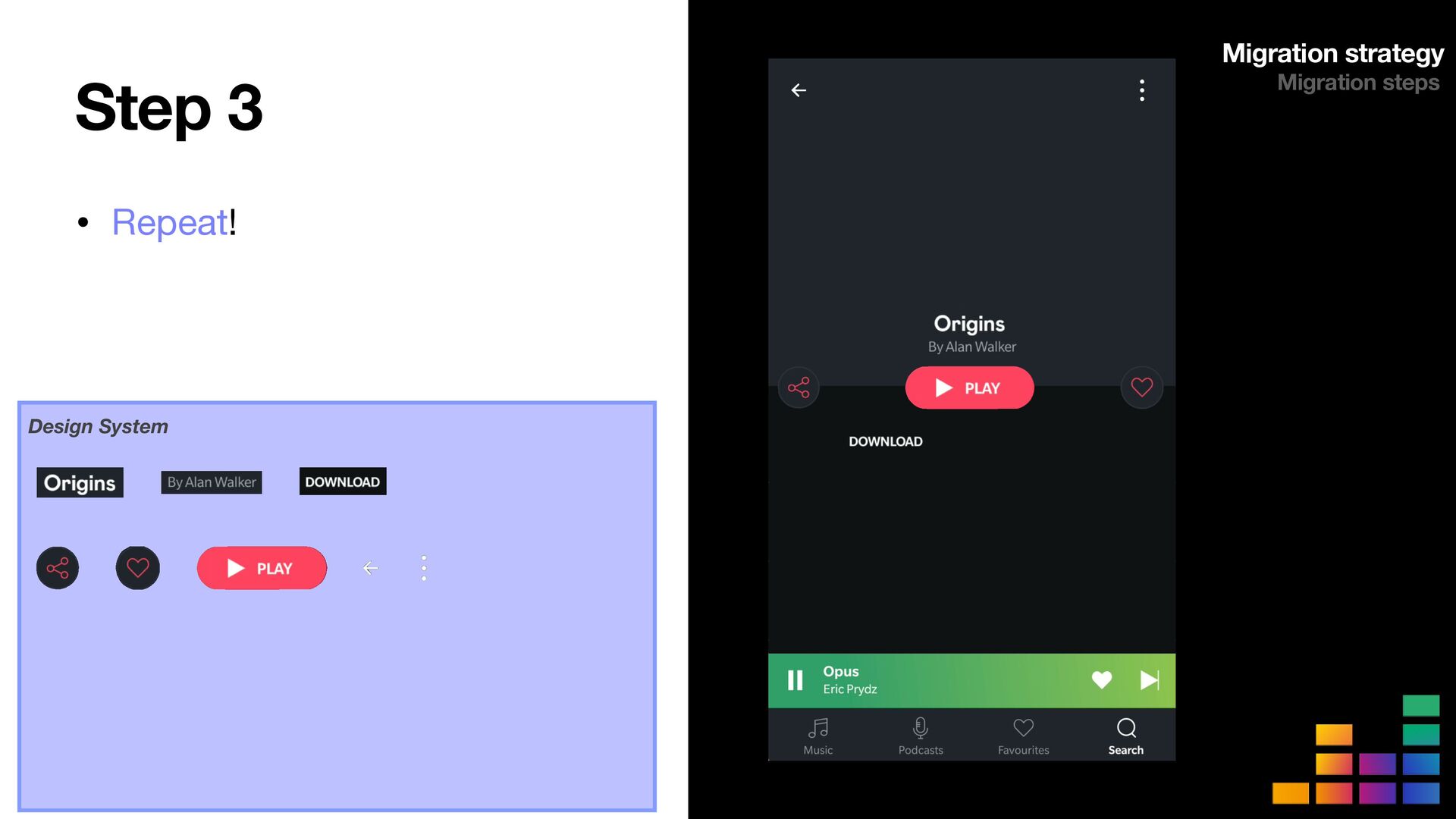
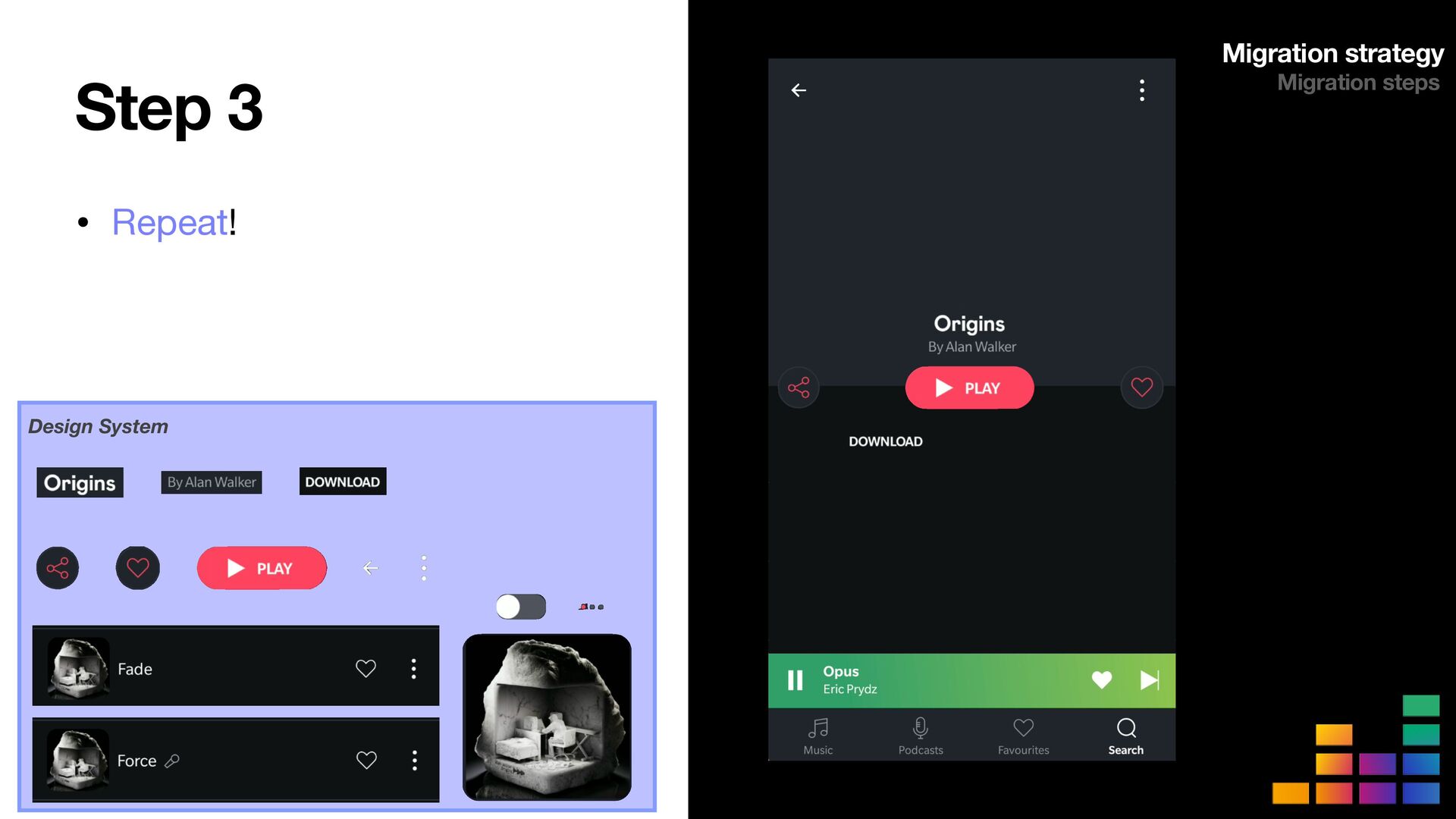
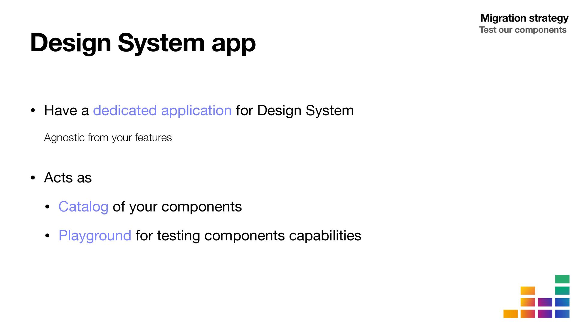
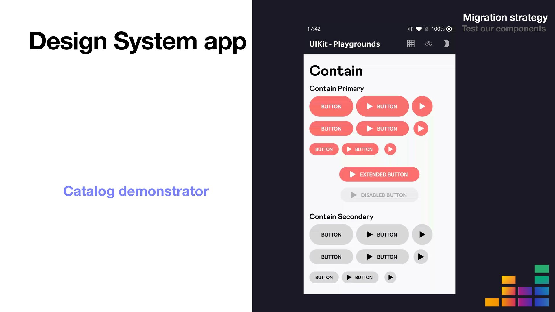
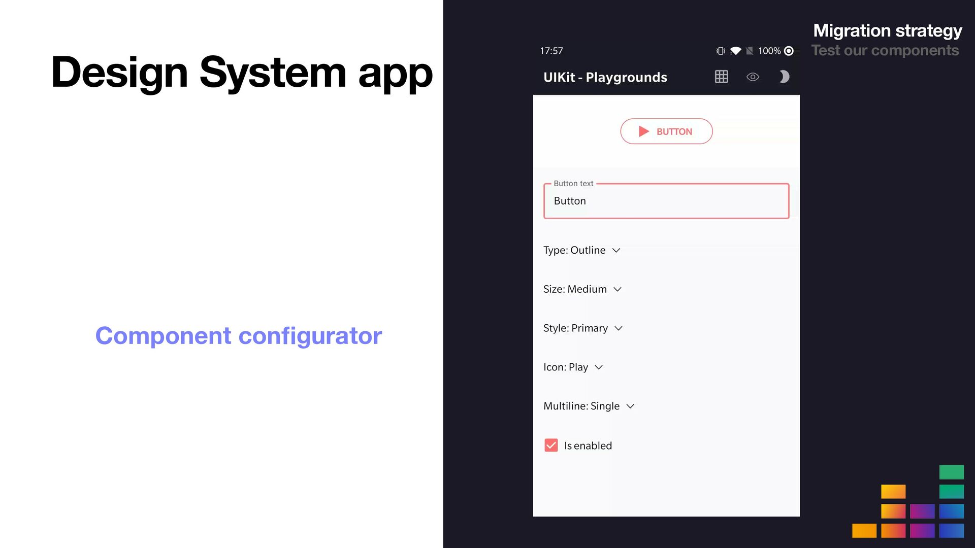
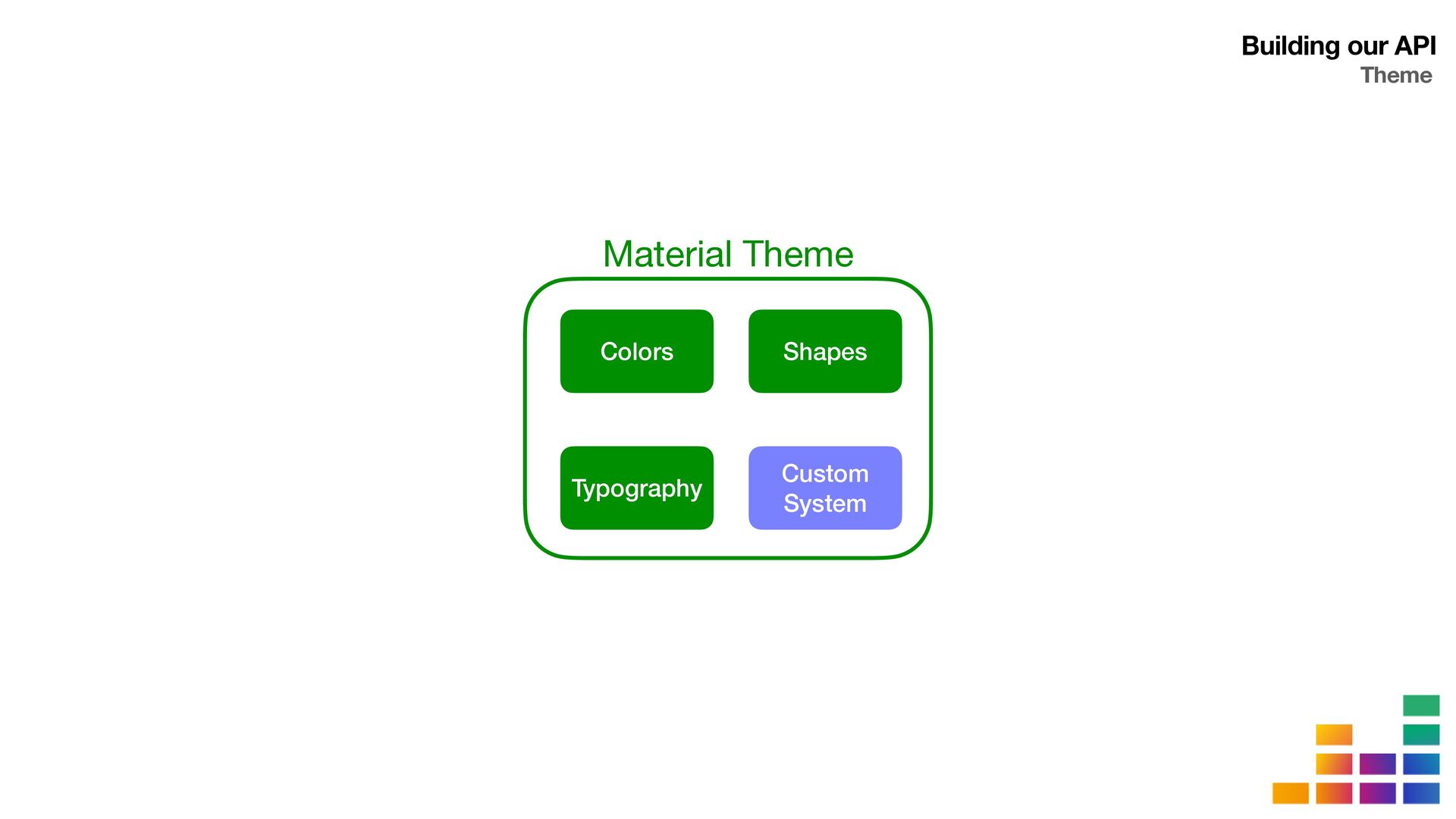
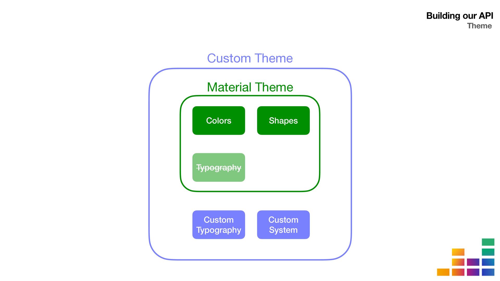
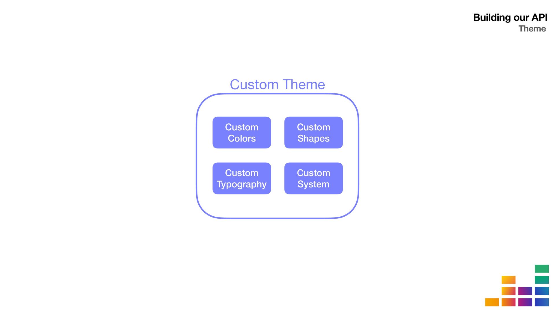
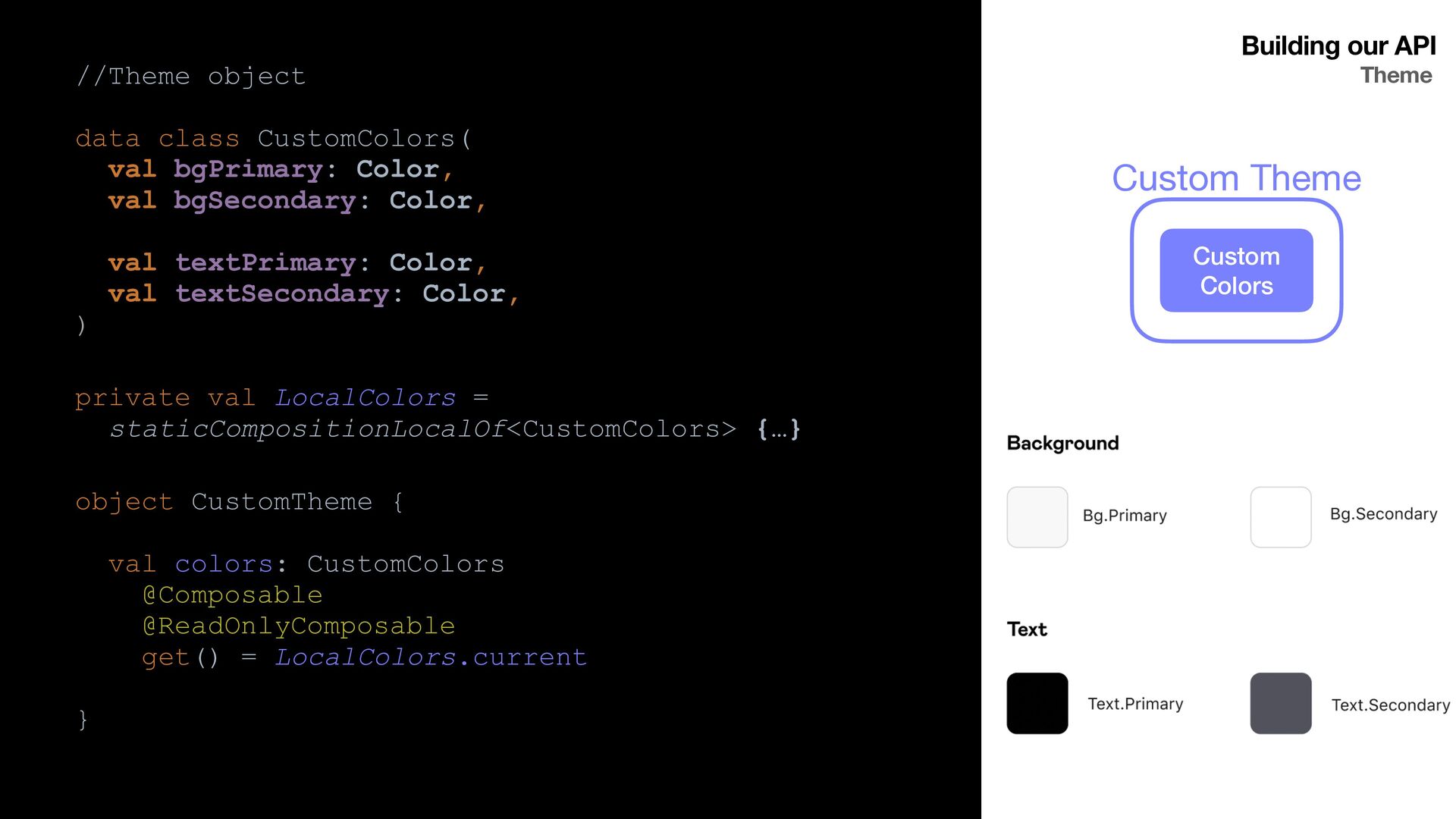
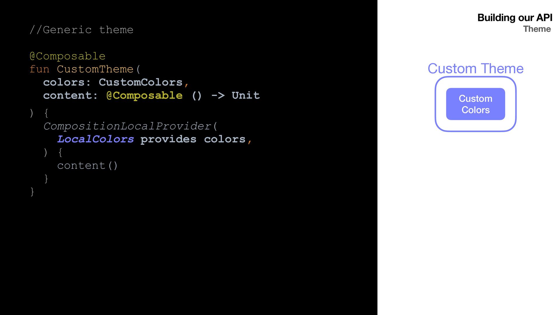
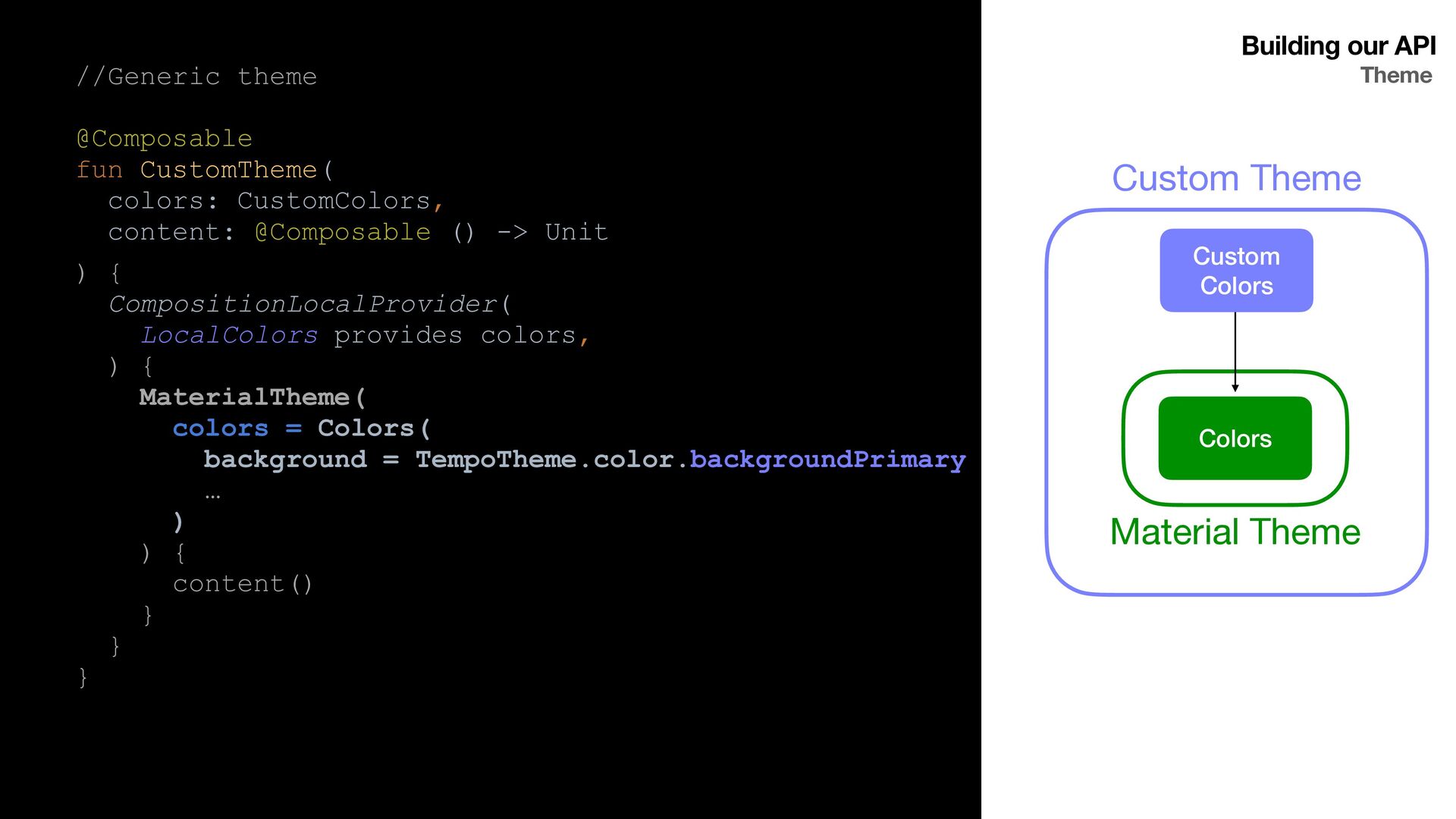
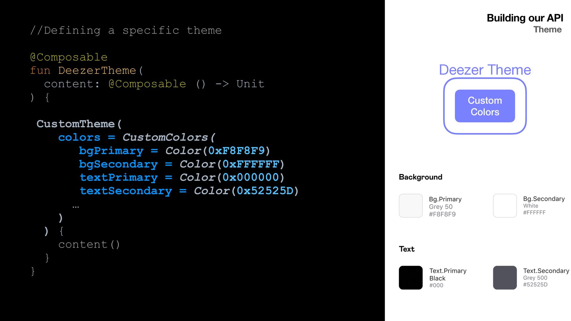
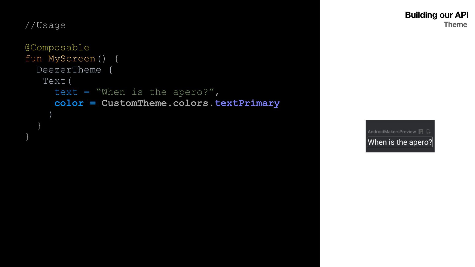
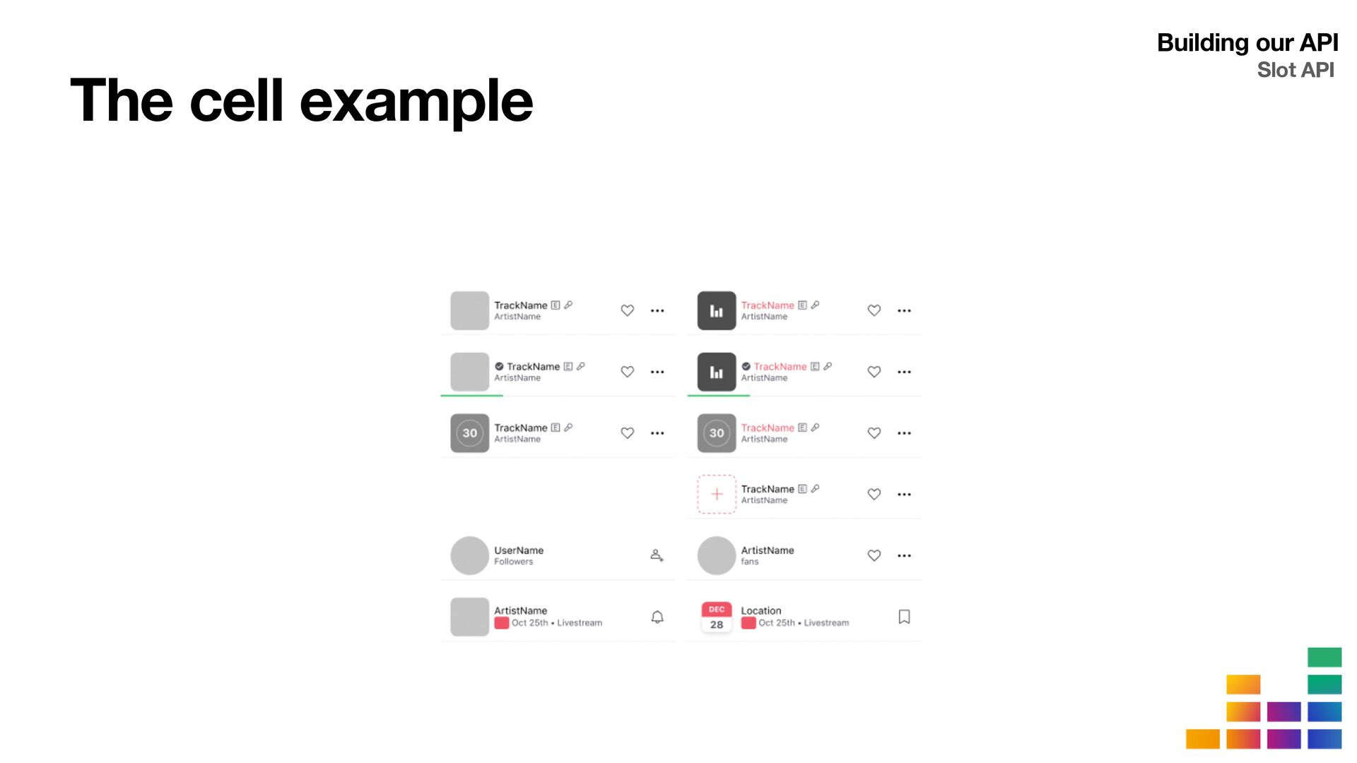
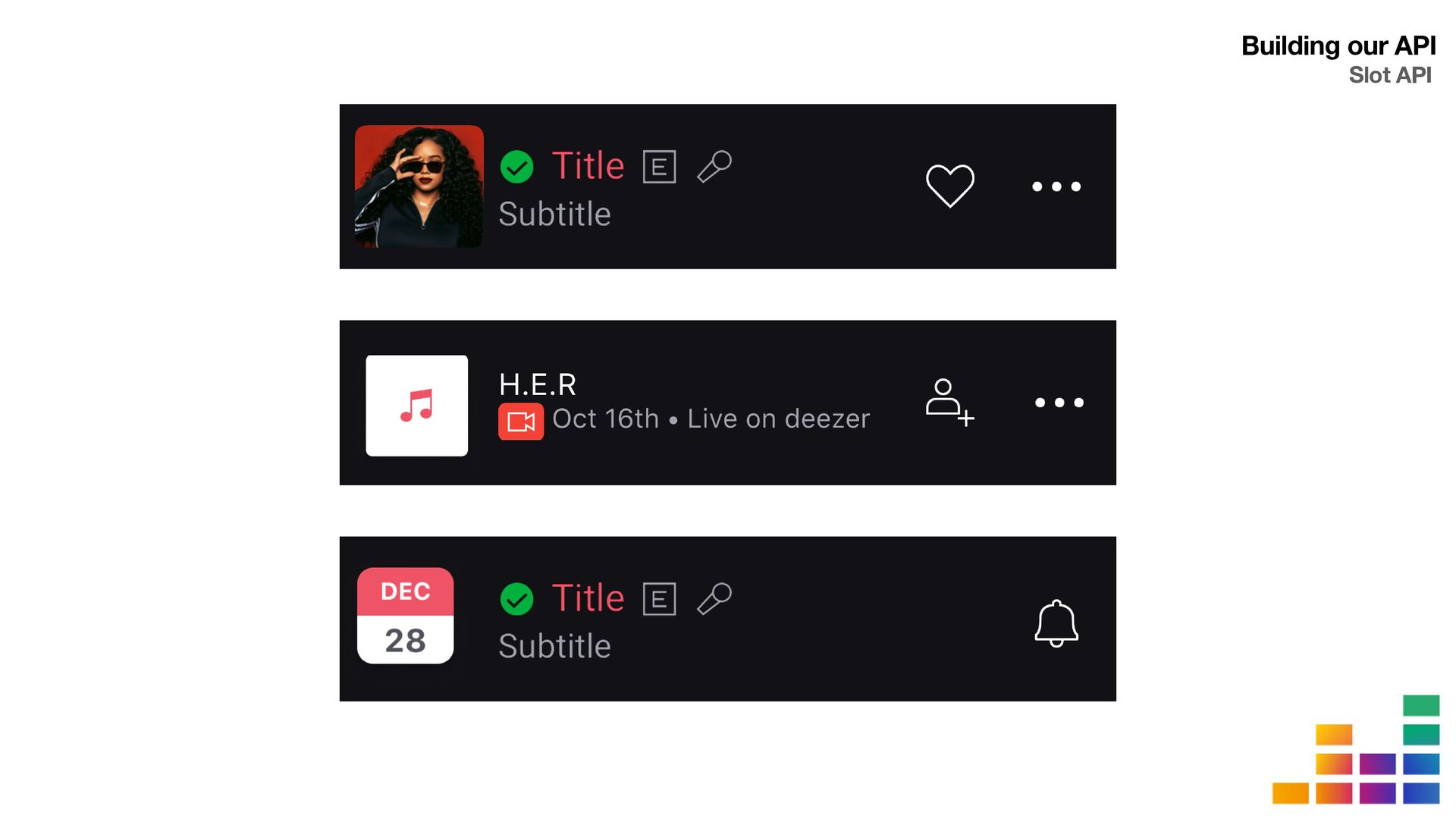
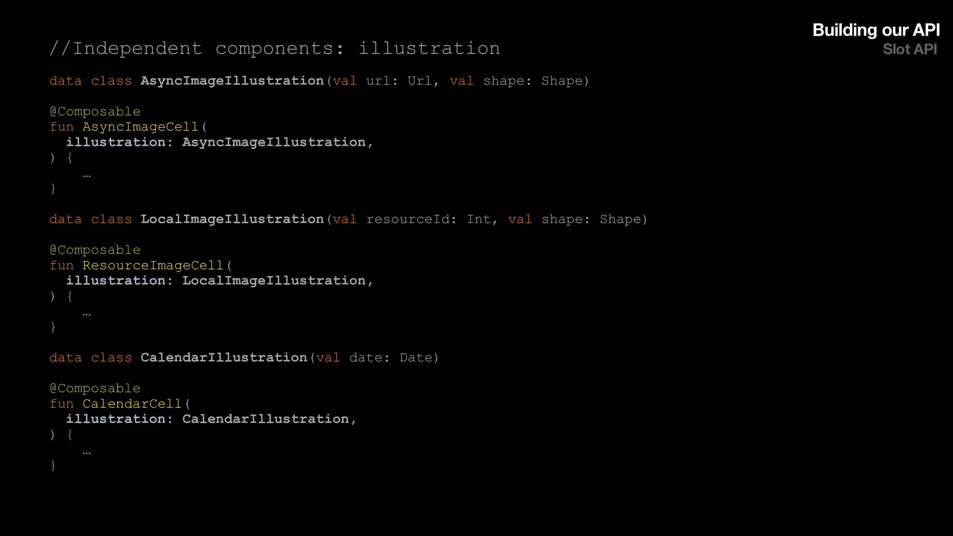
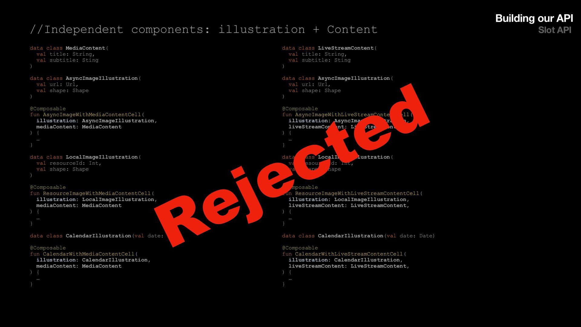
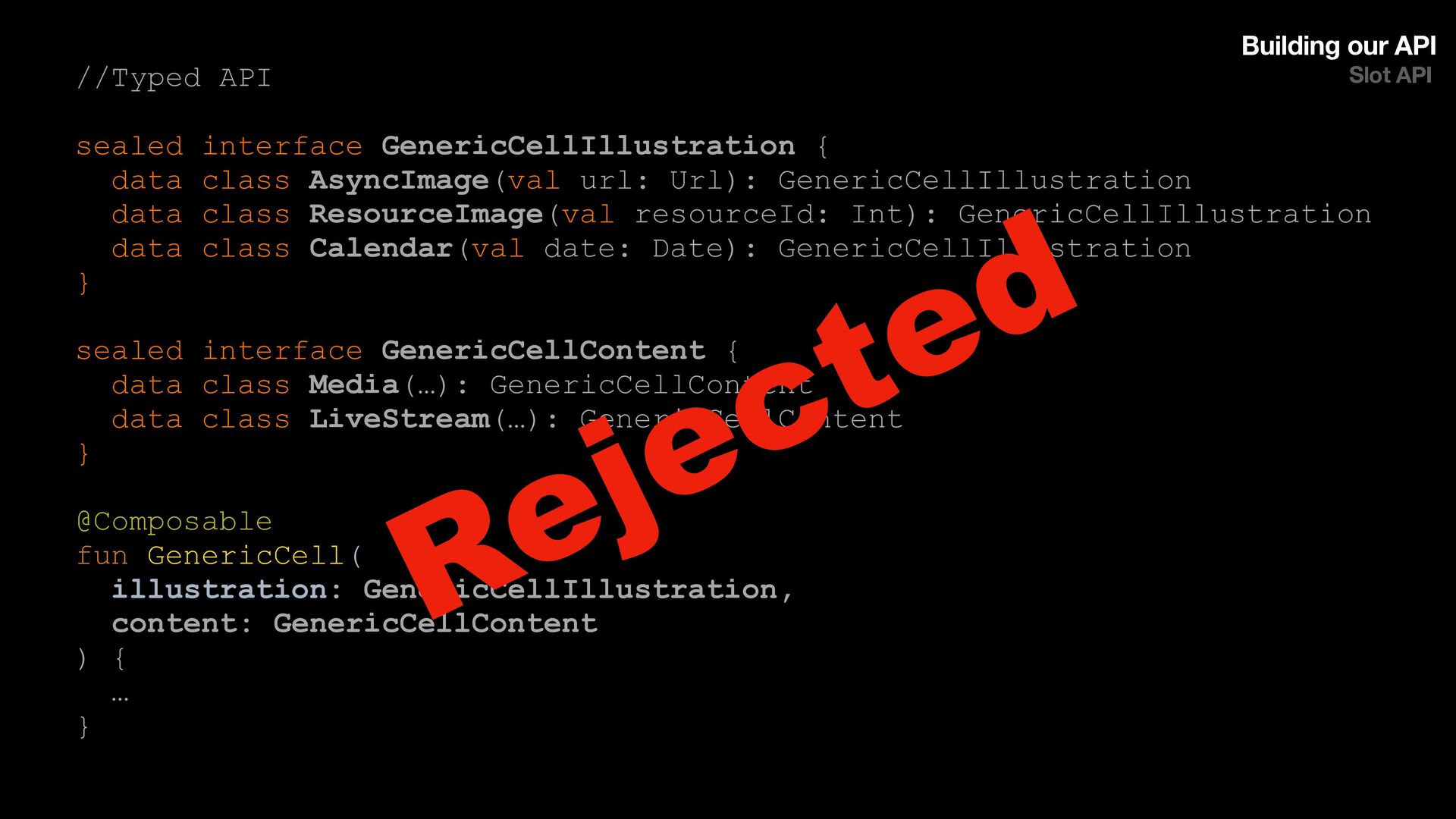
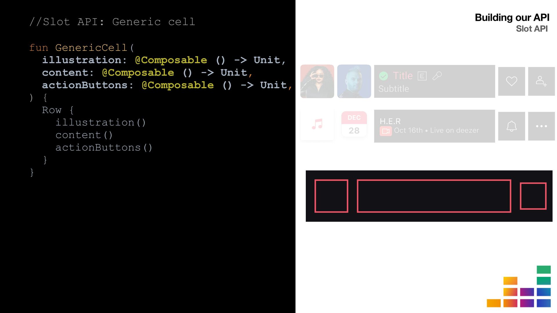
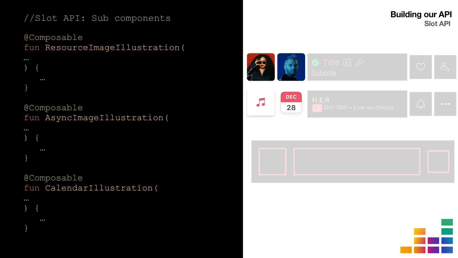
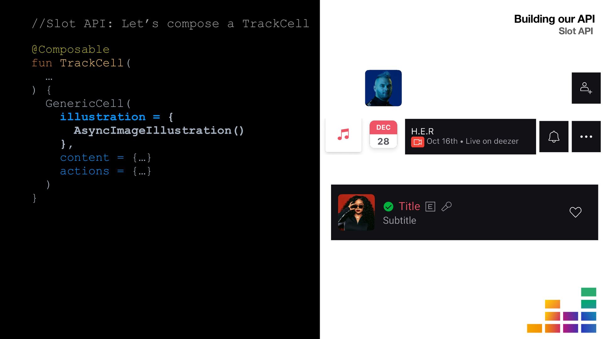
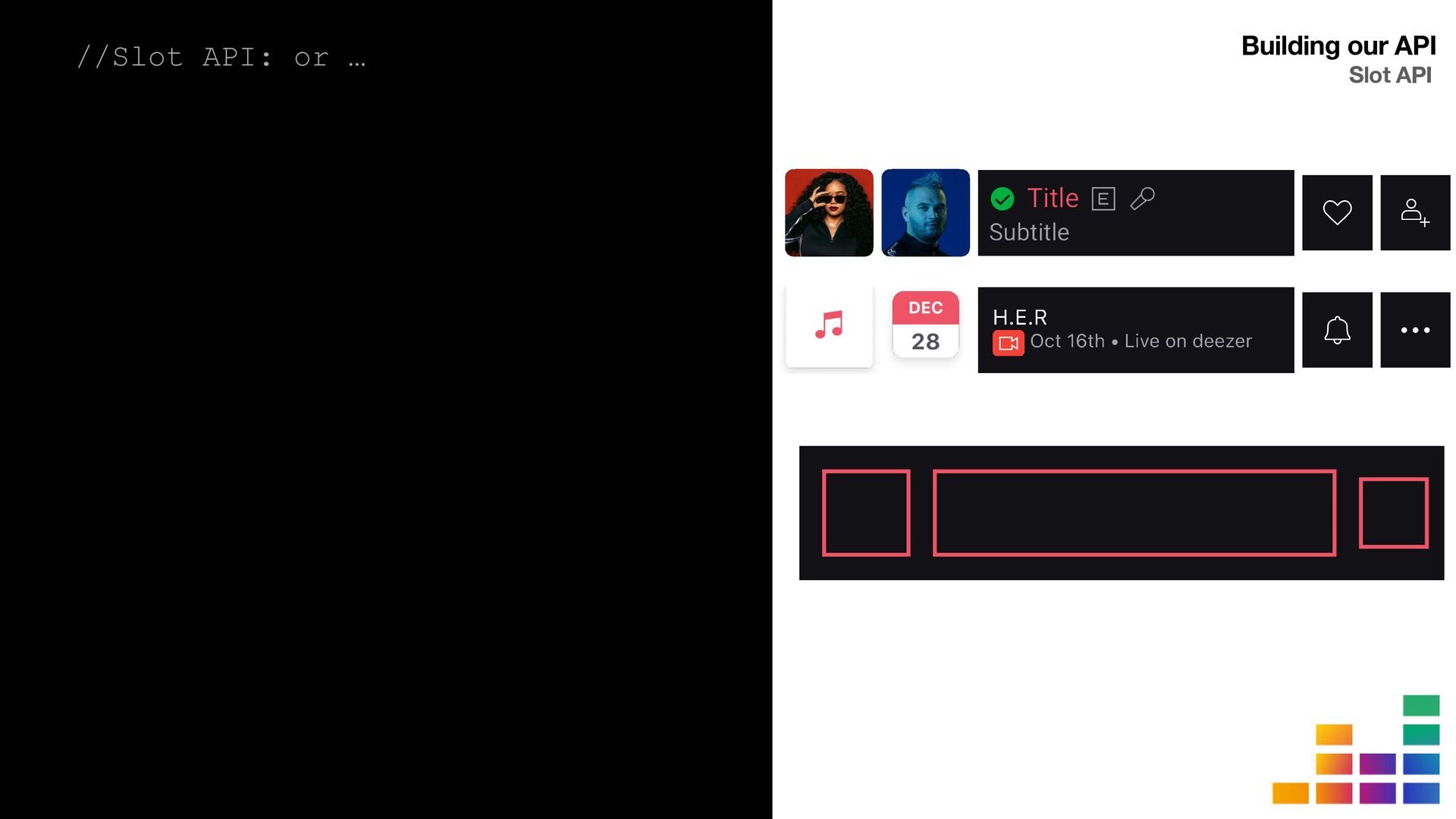
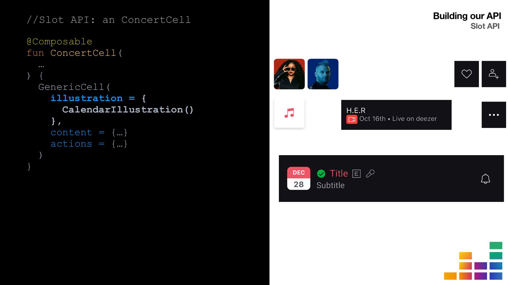
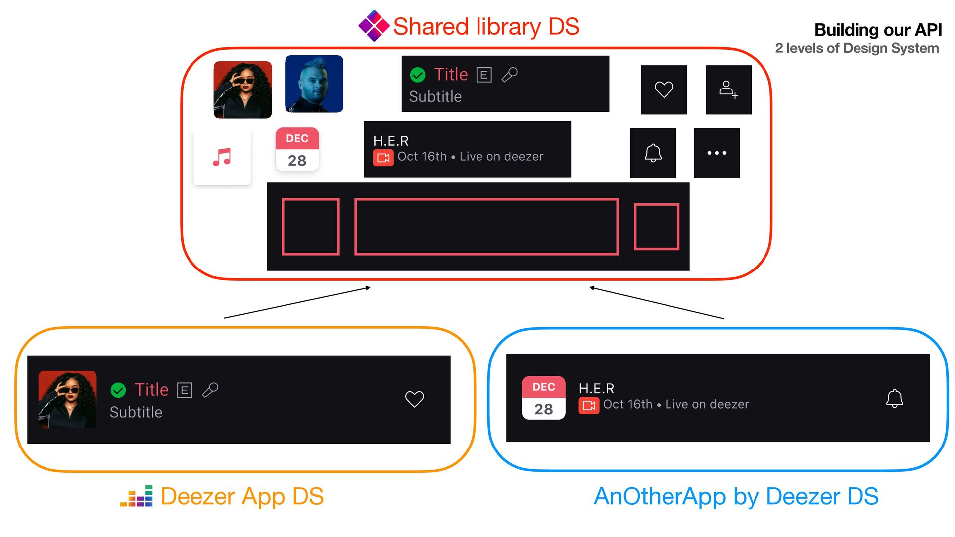
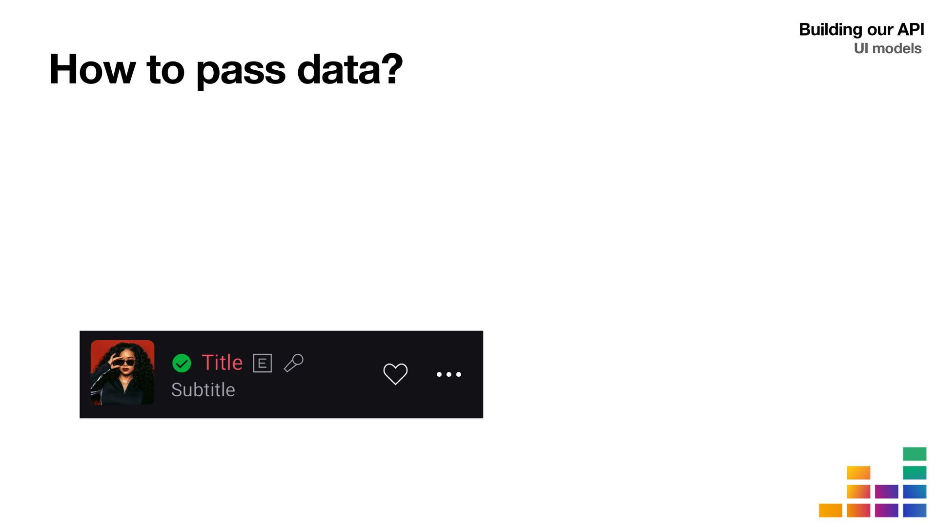
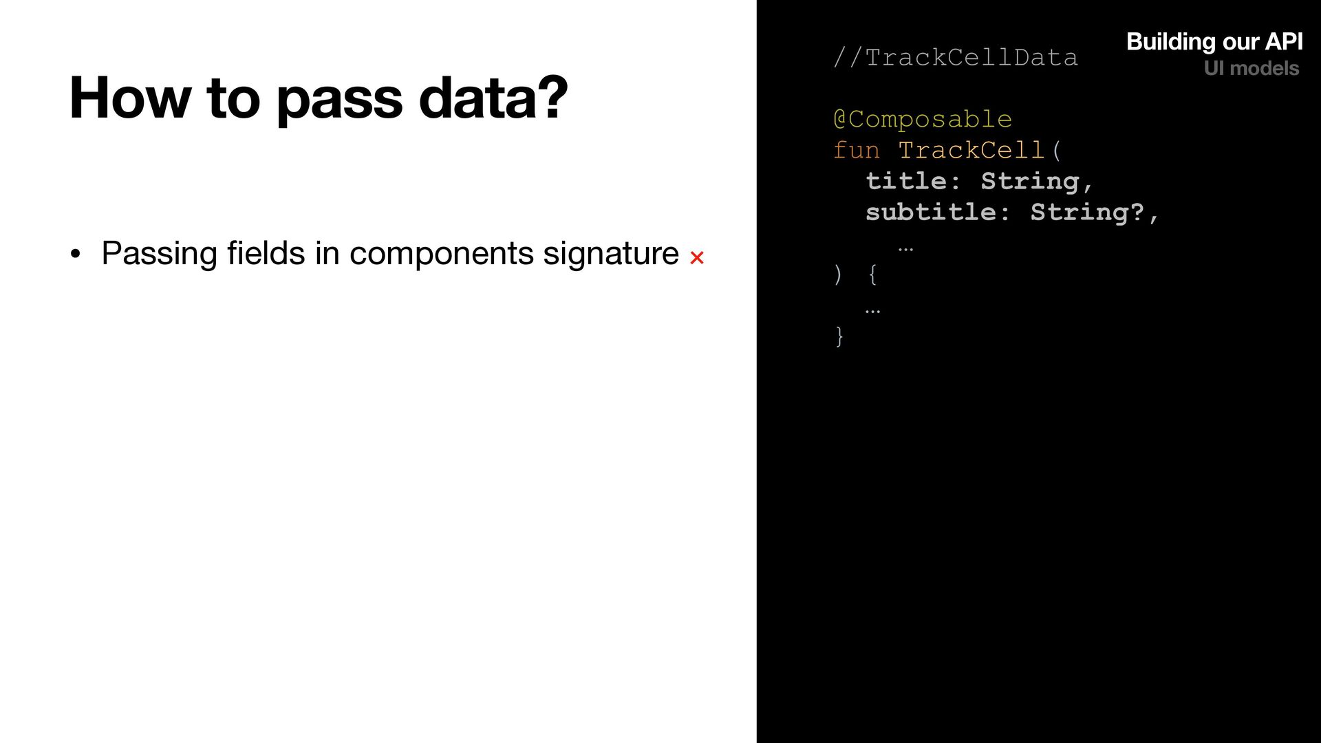
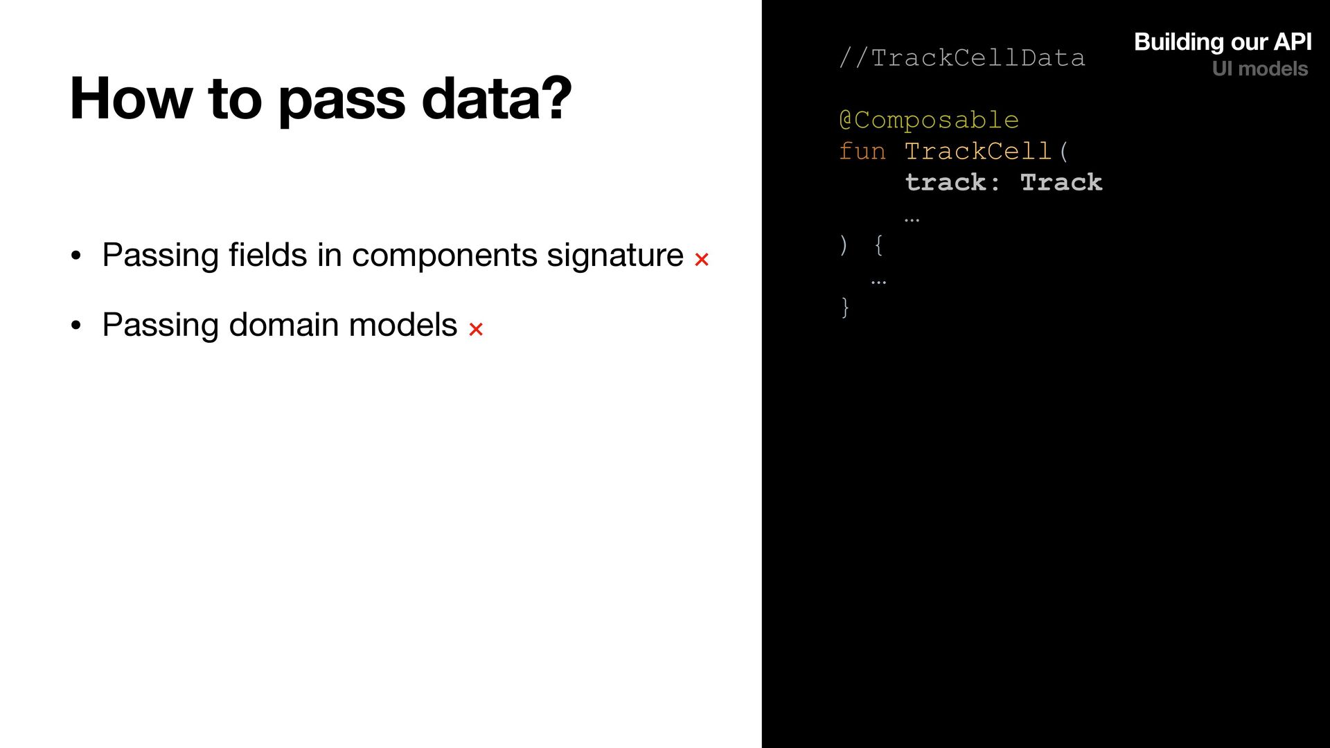
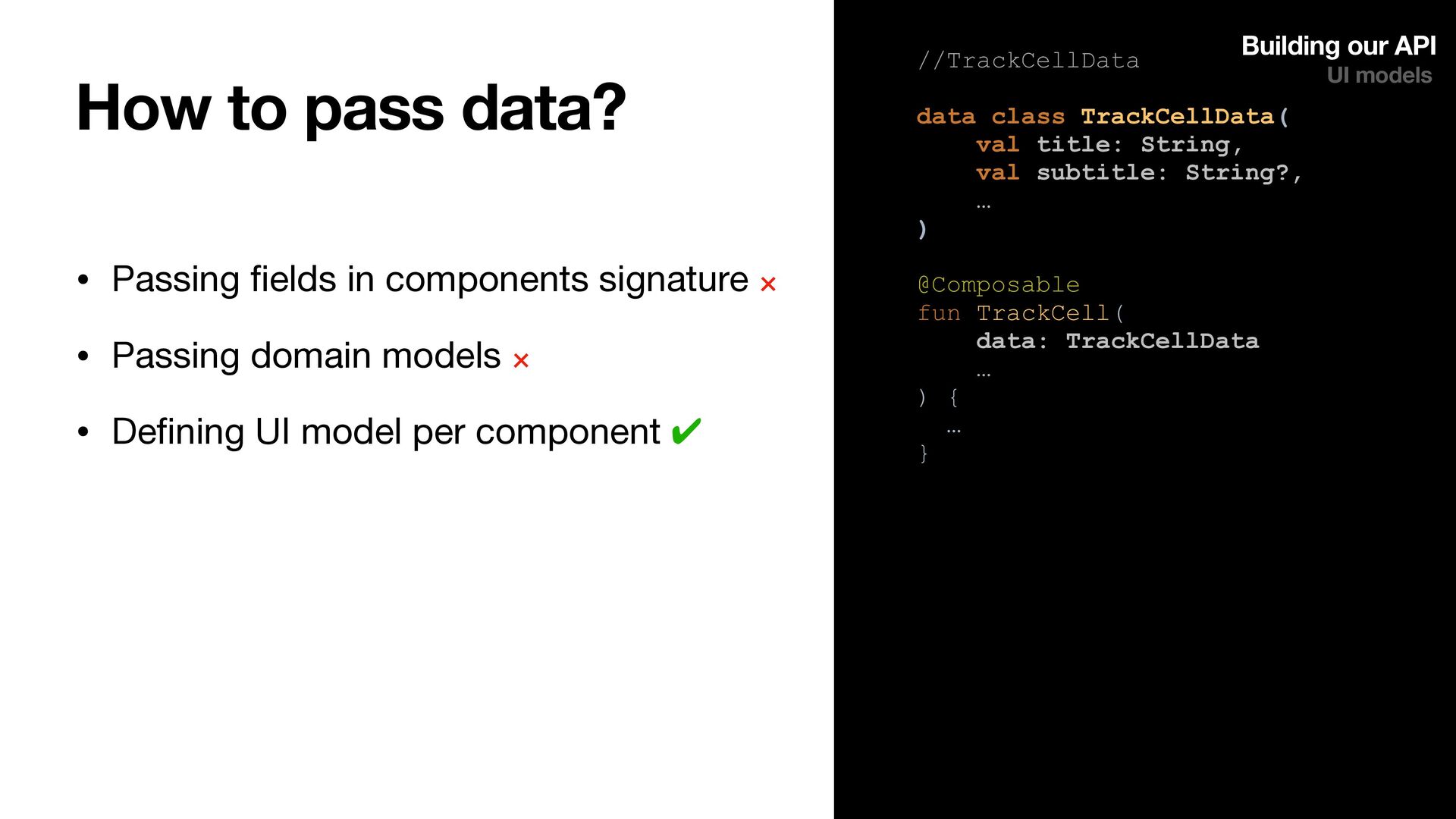
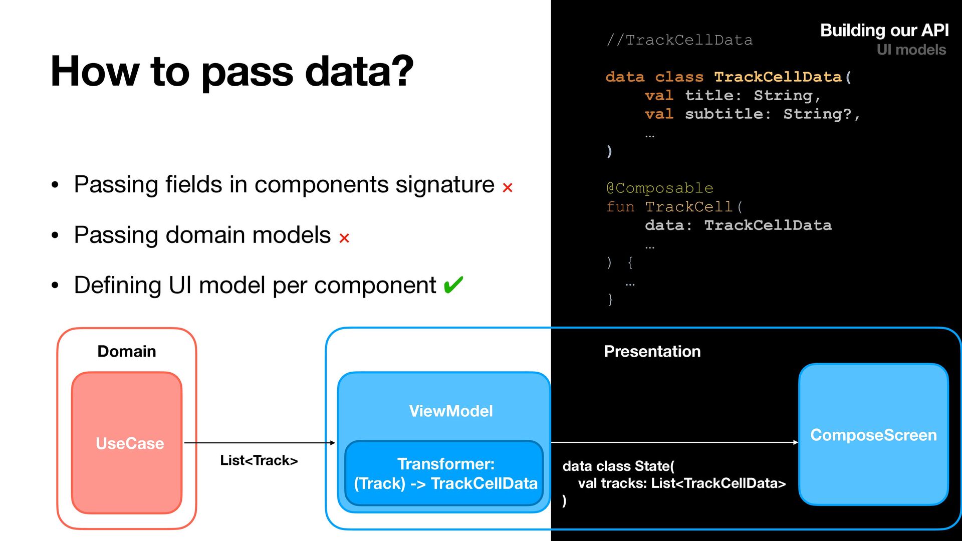
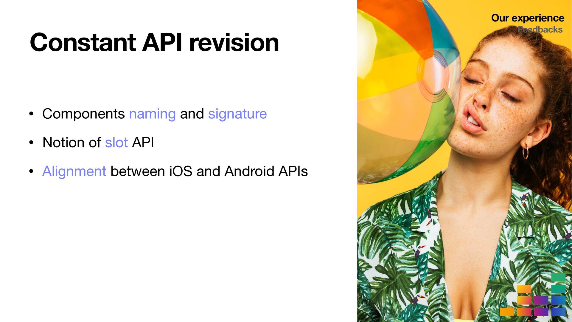
Designing our components API to foster reusability and flexibility, for instance by using slot APIs and UI components models
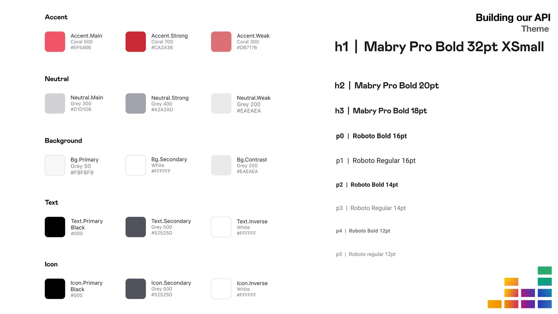
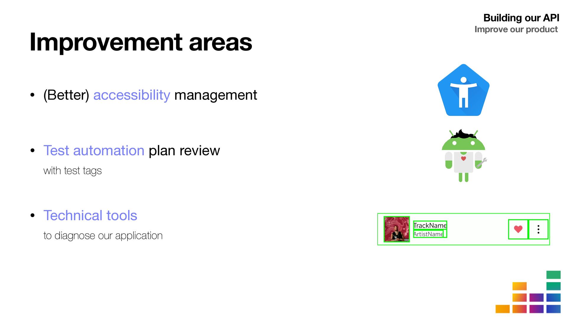
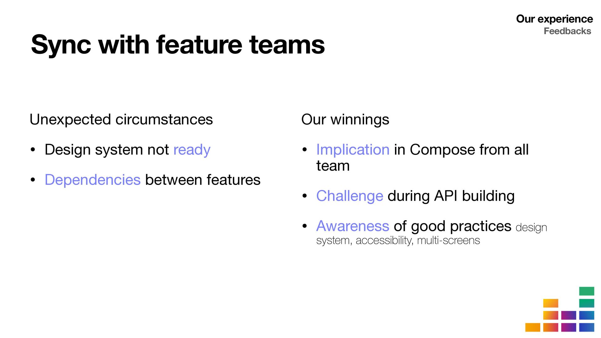
Specifying shared guidelines and standards for both our new Design System and Compose developments

Our return on experience will help you discover possible solutions, better understand the pitfalls to avoid (as we fell into some of them) and see what strategy you could apply to migrate your own apps to Compose.

Jean-Baptiste VINCEY

April 27, 2023
Tweet

Transcript

  1. Compose-ing a Design
    System at Deezer
    Jean-Baptiste Vincey
    Julie Gléonnec

    View Slide

  2. Jean-Baptiste Vincey
    @jbvincey
    Julie Gléonnec
    julie.gleonnec
    @juliegleonnec

    View Slide

  3. View Slide

  4. Design System
    • Shared language

    • Guidelines

    • Components

    View Slide

  5. View Slide

  6. Deezer
    Design System
    Tempo

    View Slide

  7. Why migrating to Compose?
    • Less code: do more with less code and avoid entire classes of bugs, so code is simple and easy to maintain.

    • Intuitive: just describe our UI, and Compose takes care of the rest. As app state changes, your UI automatically updates.

    • Accelerate development: compatible with all your existing code so you can adopt when and where you want. Iterate fast with live
    previews and full Android Studio support.

    • Powerful: create beautiful apps with direct access to the Android platform APIs and built-in support for Material Design, Dark theme,
    animations, and more.

    • New: as developers, we always jump right away on what’s new, don’t we? OK, actually Compose is not “so” new anymore, as it has been
    stable for more than 1.5 year
    • Trendy: we can’t count the number of posts, talks and meetup about Compose. It might even be the most trendy topic for a few years
    now!
    • No choice: we actually don’t really have a choice, do we? The former toolkit is being deprecated is will receive less and less support
    • Lorem ipsum: lorem ipsum dolor sit amet, consectetur adipiscing elit, sed do eiusmod tempor incididunt ut labore et dolore magna aliqua.
    Ut enim ad minim veniam, quis nostrud exercitation ullamco laboris nisi ut aliquip ex ea commodo consequat. Duis aute irure dolor in
    reprehenderit in voluptate velit esse cillum dolore eu fugiat nulla pariatur. Excepteur sint occaecat cupidatat non proident, sunt in culpa qui
    o
    ffi
    cia deserunt mollit anim id est laborum.

    View Slide

  8. • Migration strategy


    • Design System API


    • Our experience

    View Slide

  9. Migration strategy

    View Slide

  10. Migration strategy
    Approaches

    View Slide

  11. Solutions
    • By component
    • Pick a component

    • Review of all app screens
    Migration strategy
    Approaches

    View Slide

  12. Solutions
    • By screen
    • Pick a whole screen

    • Rebuild all UI components
    Migration strategy
    Approaches

    View Slide

  13. Migration of a whole screen!
    We choose…
    Migration strategy
    Approaches

    View Slide

  14. Migration strategy
    Migration steps

    View Slide

  15. Migration steps
    Migration strategy
    Step 1
    • Pick one existing screen

    • Representative of the product


    • Wide range of common elements
    • Our candidate : the album page
    Migration steps
    Migration strategy

    View Slide

  16. • Create from scratch UI when
    preserving model

    • Keep both screen versions with
    remote switch
    Step 2 Migration steps
    Migration strategy

    View Slide

  17. • Create the Compose component
    Step 3
    Design System
    Migration steps
    Migration strategy

    View Slide

  18. Step 3
    • Create the Compose component
    • Integrate it in target page
    Design System
    Migration steps
    Migration strategy

    View Slide

  19. Step 3
    • Repeat!
    Design System
    Migration steps
    Migration strategy

    View Slide

  20. Step 3
    • Repeat!
    Design System
    Migration steps
    Migration strategy

    View Slide

  21. Step 3
    • Repeat!
    Design System
    Migration steps
    Migration strategy

    View Slide

  22. Step 3
    • Repeat!
    • Until the screen is complete
    Design System
    Migration steps
    Migration strategy

    View Slide

  23. Tokens

    Colors, typographies, shapes…
    Follow Atomic Design Principle
    Migration strategy
    Migration steps

    View Slide

  24. Follow Atomic Design principle
    Tokens

    Colors, typographies, shapes…
    Atoms

    Buttons, icons, switches, progress bars…
    Migration steps
    Migration strategy
    Migration steps

    View Slide

  25. Follow Atomic Design principle
    Tokens

    Colors, typographies, shapes…
    Atoms

    Buttons, icons, switches, progress bars…
    Migration steps
    Molecules

    Cells, cards…
    Migration strategy
    Migration steps

    View Slide

  26. Follow Atomic Design principle
    Tokens

    Colors, typographies, shapes…
    Atoms

    Buttons, icons, switches, progress bars…
    Migration steps
    Molecules

    Cells, cards…
    Organisms

    Pagers, expanded headers…
    Migration strategy
    Migration steps

    View Slide

  27. • Continuous API building and evolution

    And after?
    • Next, all new features will use the new API
    Migration steps
    Migration strategy
    Migration steps

    View Slide

  28. Migration strategy
    Test our components

    View Slide

  29. Design System app
    • Have a dedicated application for Design System

    Agnostic from your features
    • Acts as

    • Catalog of your components

    • Playground for testing components capabilities
    Migration strategy
    Test our components

    View Slide

  30. Catalog demonstrator
    Migration strategy
    Test our components
    Design System app

    View Slide

  31. Component con
    fi
    gurator
    Migration strategy
    Test our components
    Design System app

    View Slide

  32. Building our API

    View Slide

  33. Building our API
    Theme

    View Slide

  34. Material Theme
    Colors Shapes
    Typography
    Custom


    System
    Building our API
    Theme

    View Slide

  35. Colors Shapes
    Typography
    Custom


    System
    Material Theme
    Custom


    Typography
    Custom Theme
    Building our API
    Theme

    View Slide

  36. Custom


    Colors
    Custom


    Shapes
    Custom


    System
    Custom


    Typography
    Custom Theme
    Building our API
    Theme

    View Slide

  37. Building our API
    Theme

    View Slide

  38. Custom


    Colors
    Custom


    Shapes
    Custom


    System
    Custom


    Typography
    Custom Theme
    Building our API
    Theme

    View Slide

  39. //Theme object


    Colors
    Custom Theme
    Building our API
    Theme

    View Slide

  40. //Generic theme


    Colors

    View Slide

  41. //Generic theme


    Colors

    View Slide

  42. //Defining a specific theme


    Colors

    View Slide

  43. //Usage


    View Slide

  44. Building our API
    Slot API

    View Slide

  45. The cell example
    Building our API
    Slot API

    View Slide

  46. Building our API
    Slot API

    View Slide

  47. data class AsyncImageIllustration(val url: Url, val shape: Shape)


    View Slide

  48. data class MediaContent(


    View Slide

  49. //Typed API


    View Slide

  50. Building our API
    Slot API

    View Slide

  51. //Slot API: Generic cell


    View Slide

  52. //Slot API: Sub components


    View Slide

  53. //Slot API: Let’s compose a TrackCell


    View Slide

  54. //Slot API: or …


    View Slide

  55. //Slot API: an ConcertCell


    View Slide

  56. Building our API
    2 levels of Design System

    View Slide

  57. Playlist Album Search

    View Slide

  58. Shared library DS
    Deezer App DS AnOtherApp by Deezer DS
    Building our API
    2 levels of Design System

    View Slide

  59. Building our API
    UI models

    View Slide

  60. How to pass data?
    Building our API
    UI models

    View Slide

  61. • Passing
    fi
    elds in components signature
    𐄂
    Building our API
    //TrackCellData


    View Slide

  62. • Passing
    fi
    elds in components signature
    𐄂


    • Passing domain models
    𐄂
    Building our API
    //TrackCellData


    View Slide

  63. • Passing
    fi
    elds in components signature
    𐄂


    • Passing domain models
    𐄂
    • De
    fi
    ning UI model per component ✔
    Building our API
    //TrackCellData


    View Slide

  64. • Passing
    fi
    elds in components signature
    𐄂


    • Passing domain models
    𐄂
    • De
    fi
    ning UI model per component ✔
    Building our API
    //TrackCellData


    View Slide

  65. Building our API
    Improve our product

    View Slide

  66. Improvement areas
    • (Better) accessibility management
    • Test automation plan review

    with test tags
    • Technical tools

    to diagnose our application
    Building our API
    Improve our product

    View Slide

  67. • Support for large screens
    Building our API
    Improve our product
    Improvement areas

    View Slide

  68. Our experience

    View Slide

  69. Our experience
    Outcome

    View Slide

  70. What did we create?
    • A new design system totally in Compose and SwiftUI
    • Tokens 100 %


    • Atoms 80 %


    • Molecules 55 %


    • Organisms 35 %
    • 2 UI-dedicated applications
    Our experience
    Outcome

    View Slide

  71. What is our status?
    • Album screen migration

    • Status in QA !

    • About 4 months for 2 developers
    • + all new features starting 2023!
    Our experience
    Outcome

    View Slide

  72. Our experience
    Feedbacks

    View Slide

  73. Constant API revision
    • Components naming and signature

    • Notion of slot API

    • Alignment between iOS and Android APIs
    Our experience
    Feedbacks

    View Slide

  74. Sync with feature teams
    Unexpected circumstances

    • Design system not ready

    • Dependencies between features
    Our winnings

    • Implication in Compose from all
    team

    • Challenge during API building

    • Awareness of good practices design
    system, accessibility, multi-screens
    Our experience
    Feedbacks

    View Slide

  75. Takeaways
    • Migration strategy

    • Component versus screen

    • Design System with atomic design approach
    • Design System API

    • Theme material versus custom


    • API building Slot API versus typed API


    • 2 levels Design System generic and app

    • Further improvements accessibility, UI tests and
    large screens

    View Slide

  76. Thanks !
    Compose-ing a Design System
    at Deezer
    QR code

    View Slide