Upgrade to Pro — share decks privately, control downloads, hide ads and more …

Responsive Javascript

Responsive Javascript

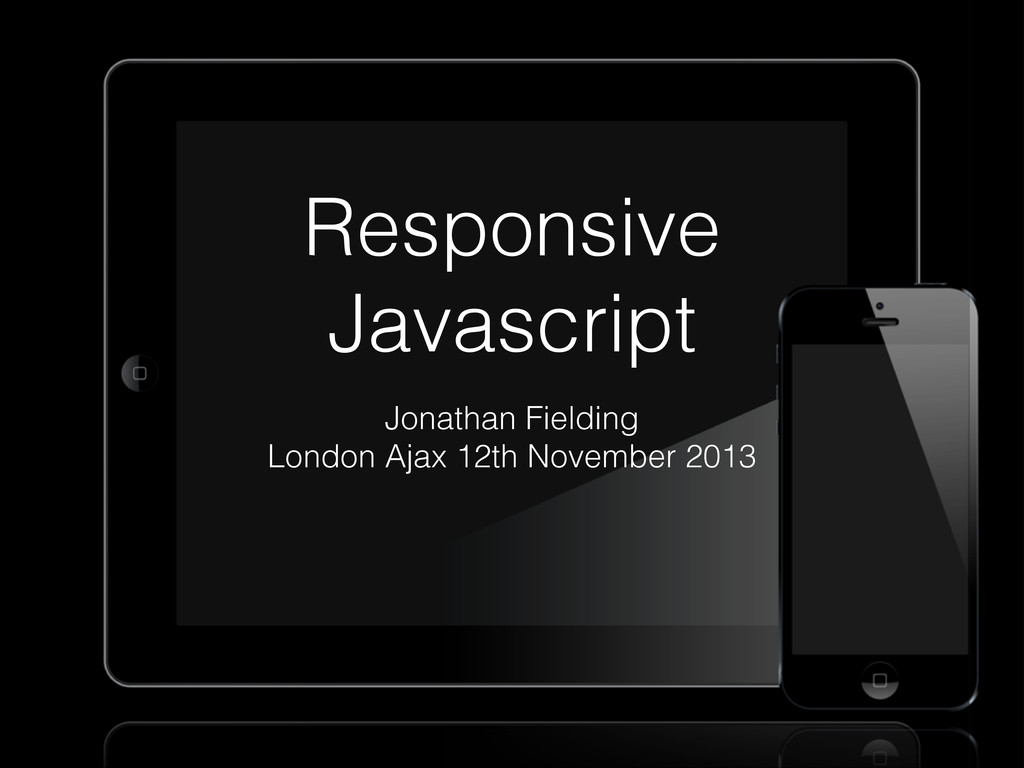
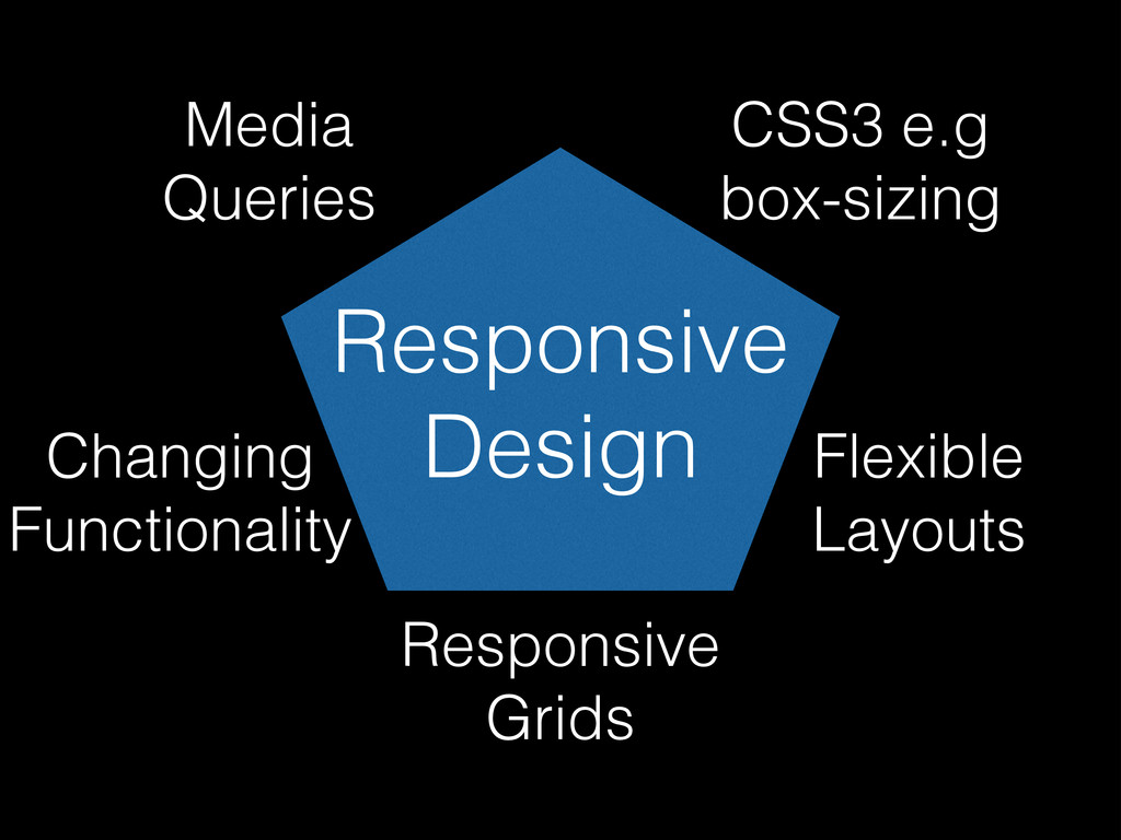
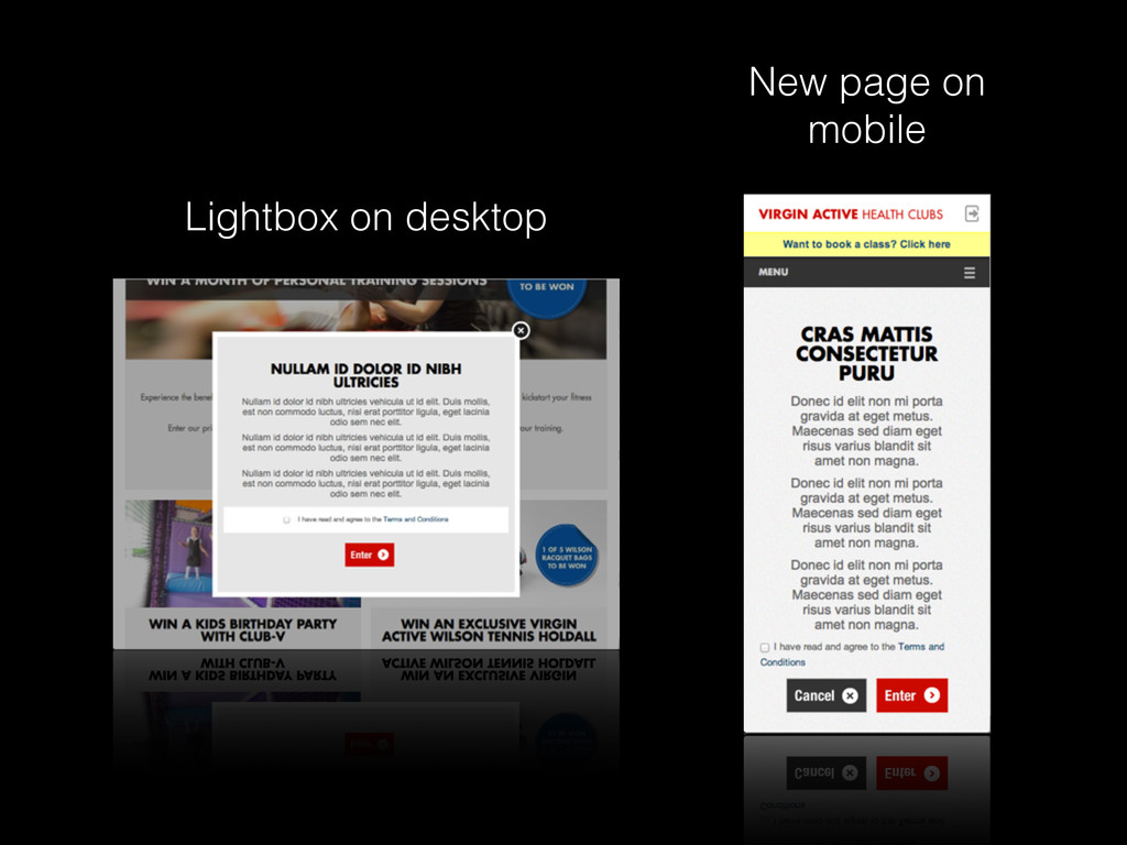
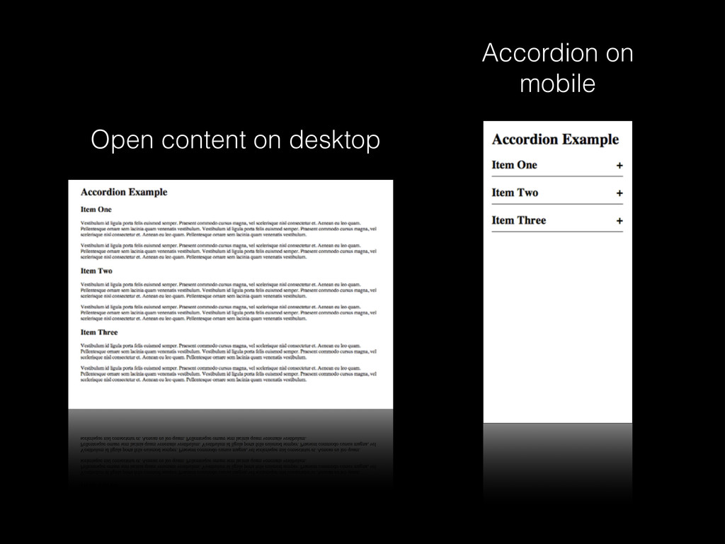
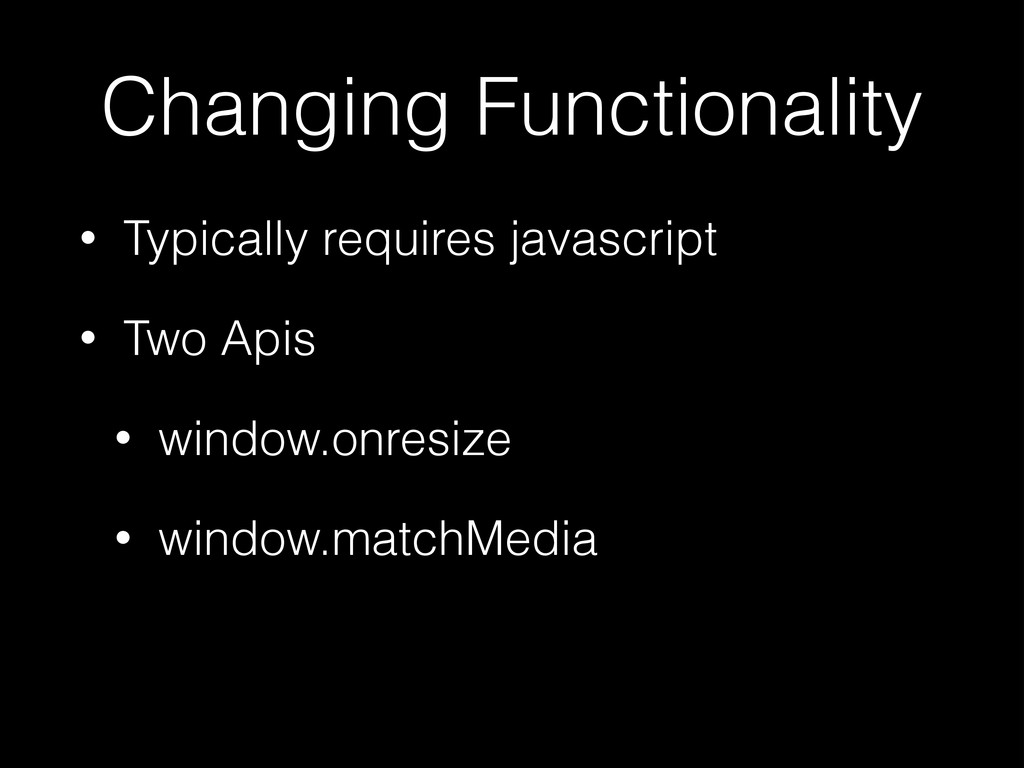
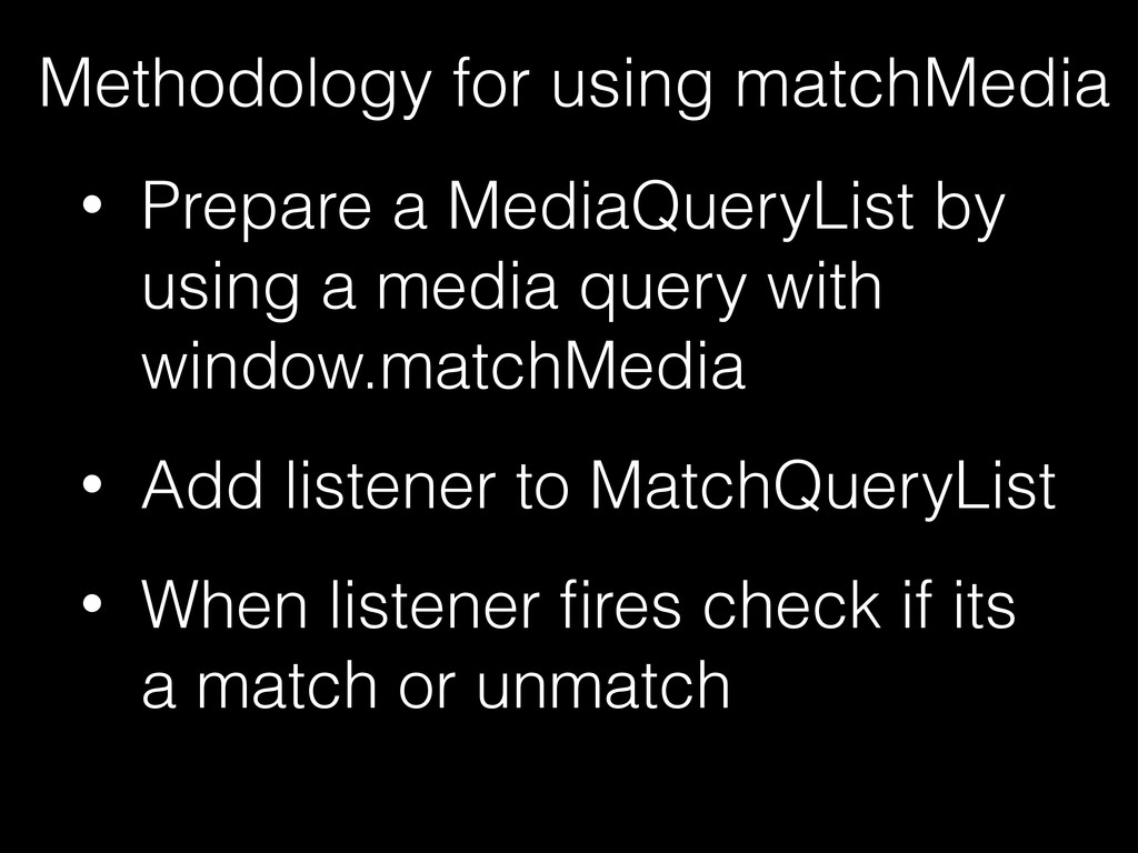
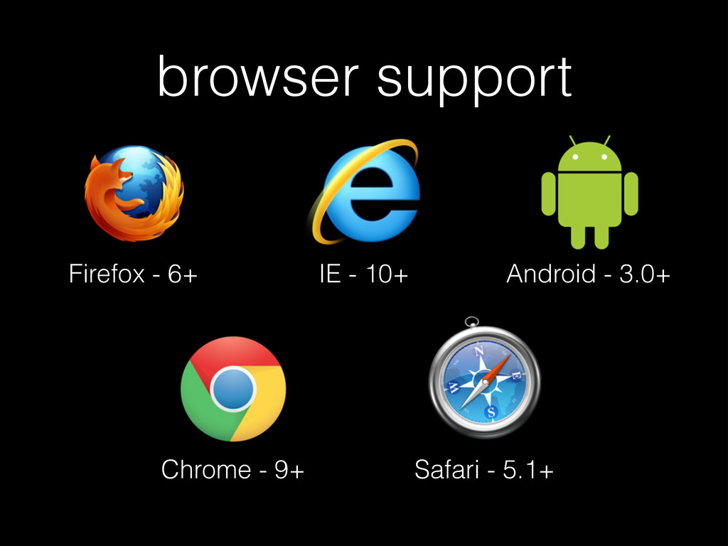
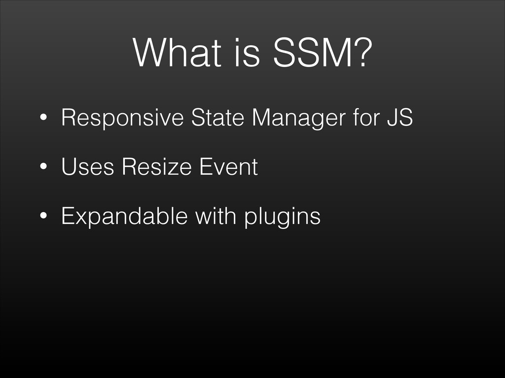
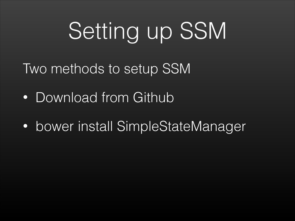
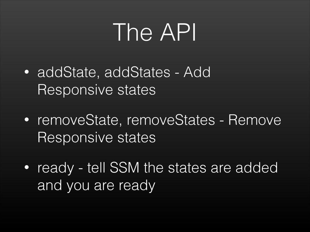
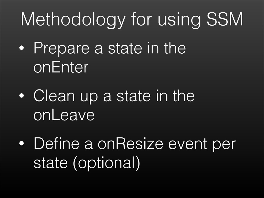
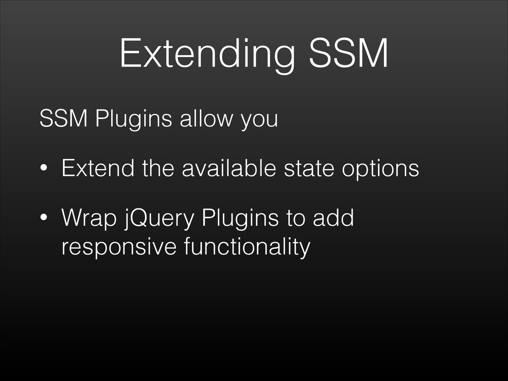
Talk about Responsive Javascript - how we can change functionality across devices using the built in API's and Libraries

Jonathan Fielding

November 12, 2013
Tweet

More Decks by Jonathan Fielding

Other Decks in Technology

Transcript

  1. Responsive
    Javascript
    Jonathan Fielding
    London Ajax 12th November 2013

    View Slide

  2. What do you think of
    when you think
    responsive design?

    View Slide

  3. Responsive
    Design
    CSS3 e.g
    box-sizing
    Media
    Queries
    Flexible
    Layouts
    Responsive
    Grids
    Changing
    Functionality

    View Slide

  4. Responsive
    Design
    CSS3 e.g
    box-sizing
    Media
    Queries
    Flexible
    Layouts
    Responsive
    Grids
    Changing
    Functionality

    View Slide

  5. Changing Functionality
    Why change functionality
    • Offer a tailored experience regardless
    of the device
    • Potentially decrease bounce rate

    View Slide

  6. Examples of changing
    functionality

    View Slide

  7. New page on
    mobile
    Lightbox on desktop

    View Slide

  8. Accordion on
    mobile
    Open content on desktop

    View Slide

  9. single col on
    mobile
    equal columns on desktop

    View Slide

  10. simple scrollable
    content on mobile
    parallax on desktop

    View Slide

  11. How to change
    functionality

    View Slide

  12. Changing Functionality
    • Typically requires javascript
    • Two Apis
    • window.onresize
    • window.matchMedia

    View Slide

  13. window.onresize

    View Slide

  14. Methodology for using onresize
    • Add event to window.onresize
    • Use conditional statements to
    detect current width of
    browser
    • Add debounce to resize event
    to prevent it firing excessively

    View Slide

  15. Example
    //debounce missing to keep example short
    $(window).on('resize', function(){
    if ($('body').width() < 768) {
    console.log('mobile');
    }
    });

    View Slide

  16. Could get messy
    • Lots of code simply placed in an on
    resize event could potentially be
    messy
    • Not a clear logical separation of
    different states

    View Slide

  17. Build a state manager
    var stateManager = (function () {
    var state = null;
    var resizePage = function () {
    if ($('body').width() < 768) {
    if (state !== "mobile") { displayMobile(); }
    resizeMobile();
    }
    else {
    if (state !== "desktop") { displayDesktop(); }
    resizeDesktop();
    }
    };
    var displayMobile = function () {
    state = "mobile";
    console.log("enter mobile");
    };
    var displayDesktop = function () {
    state = "desktop";
    console.log("enter desktop");
    };
    var resizeMobile = function () {
    console.log("resizing mobile");
    };
    var resizeDesktop = function () {
    console.log("resizing desktop");
    };
    return {
    init: function () {
    resizePage();
    $(window).on('resize', resizePage);
    }
    };
    } ());

    View Slide

  18. Find it on github
    https://github.com/jonathan-fielding/
    Responsive-Javascript-Examples

    View Slide

  19. browser support
    IE
    Chrome
    Firefox
    Safari
    Android
    All Major Browsers Support
    window.onresize

    View Slide

  20. matchMedia

    View Slide

  21. Methodology for using matchMedia
    • Prepare a MediaQueryList by
    using a media query with
    window.matchMedia
    • Add listener to MatchQueryList
    • When listener fires check if its
    a match or unmatch

    View Slide

  22. Code example
    var mql = window.matchMedia("(max-width:768px)");
    mql.addListener(function(e){
    if(e.matches){
    console.log('enter mobile');
    }
    });

    View Slide

  23. browser support
    IE - 10+
    Chrome - 9+
    Firefox - 6+
    Safari - 5.1+
    Android - 3.0+

    View Slide

  24. real world usage
    74.22%
    of users have a browser
    that supports
    matchMedia

    View Slide

  25. View Slide

  26. Two Main Libraries

    View Slide

  27. SimpleStateManager!
    (aka SSM)

    View Slide

  28. What is SSM?
    • Responsive State Manager for JS
    • Uses Resize Event
    • Expandable with plugins

    View Slide

  29. Setting up SSM
    Two methods to setup SSM
    • Download from Github
    • bower install SimpleStateManager

    View Slide

  30. The API
    • addState, addStates - Add
    Responsive states
    • removeState, removeStates - Remove
    Responsive states
    • ready - tell SSM the states are added
    and you are ready

    View Slide

  31. Methodology for using SSM
    • Prepare a state in the
    onEnter
    • Clean up a state in the
    onLeave
    • Define a onResize event per
    state (optional)

    View Slide

  32. Adding a state
    ssm.addState({
    maxWidth: 767,
    onEnter: function(){
    console.log(‘enter mobile’);
    }
    }).ready();

    View Slide

  33. Removing a state
    ssm.removeState('mobile');

    View Slide

  34. Extending SSM
    SSM Plugins allow you
    • Extend the available state options
    • Wrap jQuery Plugins to add
    responsive functionality

    View Slide

  35. DEMO

    View Slide

  36. SSM Summary
    In summary SSM allows you to
    • Create responsive states with
    predefined rules of when it should be
    active
    • Add onEnter, onLeave and onResize
    events to a state

    View Slide

  37. View Slide

  38. What is EnquireJS?
    • Awesome Media Queries in
    JavaScript
    • Uses matchMedia API
    • Manages registering and
    unregistering

    View Slide

  39. Setting up Enquire.js
    Two methods to setup Enquire.js
    • Download from Github
    • bower install enquire

    View Slide

  40. The API
    • register - registers a media query
    attaching it to a handler
    • unregister - unregisters a media query

    View Slide

  41. Methodology for using
    Enquire.js
    • Register a media query with a handler
    • Handler will fire when media query
    matches
    • Unregister unneeded handlers

    View Slide

  42. Registering a query
    enquire.register("(max-width: 767px)", {
    match : function() {
    console.log("enter mobile");
    },
    });

    View Slide

  43. Unregistering a query
    enquire.unregister("(max-width: 767px)");

    View Slide

  44. Demo

    View Slide

  45. Enquire.js Summary
    In summary Enquire.js allows you to
    • Create listeners for media queries
    • Attach match and unmatch methods
    to your listeners

    View Slide

  46. SSM vs Enquire.js
    SimpleStateManager Enquire.js
    method onresize matchMedia
    browser
    support
    IE7+, FF, O, C, S IE10+, FF, O, C, S
    API
    events
    Enter, Leave, Resize Enter, Leave
    Plugin
    Library
    yes no

    View Slide

  47. Further Resources
    MDN - Testing Media Queries - mzl.la/18r5yGi
    MDN – MediaQueryList - mzl.la/1bxbbZJ
    MDN – Window.matchMedia - mzl.la/19qc3Yk
    SimpleStateManager – simplestatemanager.com
    Enquire.js - wicky.nillia.ms/enquire.js/
    MatchMedia Polyfill - github.com/paulirish/matchMedia.js/
    Jonathan Fielding’s Blog - jonathanfielding.com
    !

    View Slide

  48. Thanks
    Labtocat Image - https://github.com/
    JohnCreek
    Any Questions?

    View Slide