Upgrade to Pro — share decks privately, control downloads, hide ads and more …

What does Responsive Web Design mean in 2016

What does Responsive Web Design mean in 2016

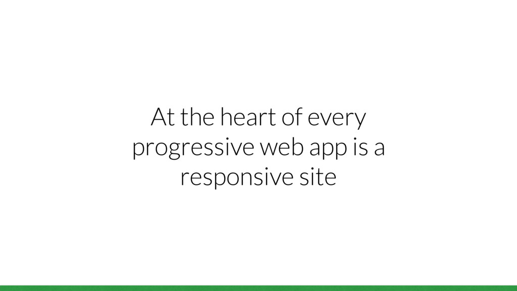
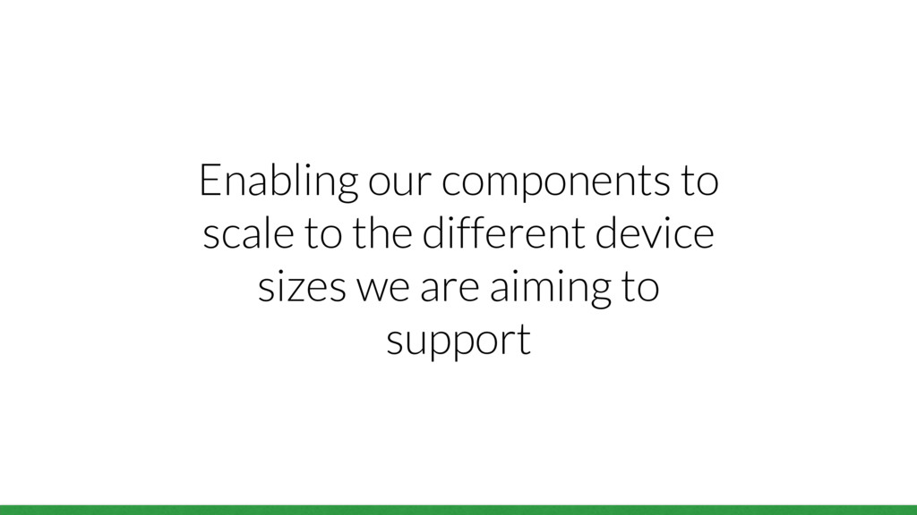
At the heart of every progressive web app is a responsive site, built to be mobile first.

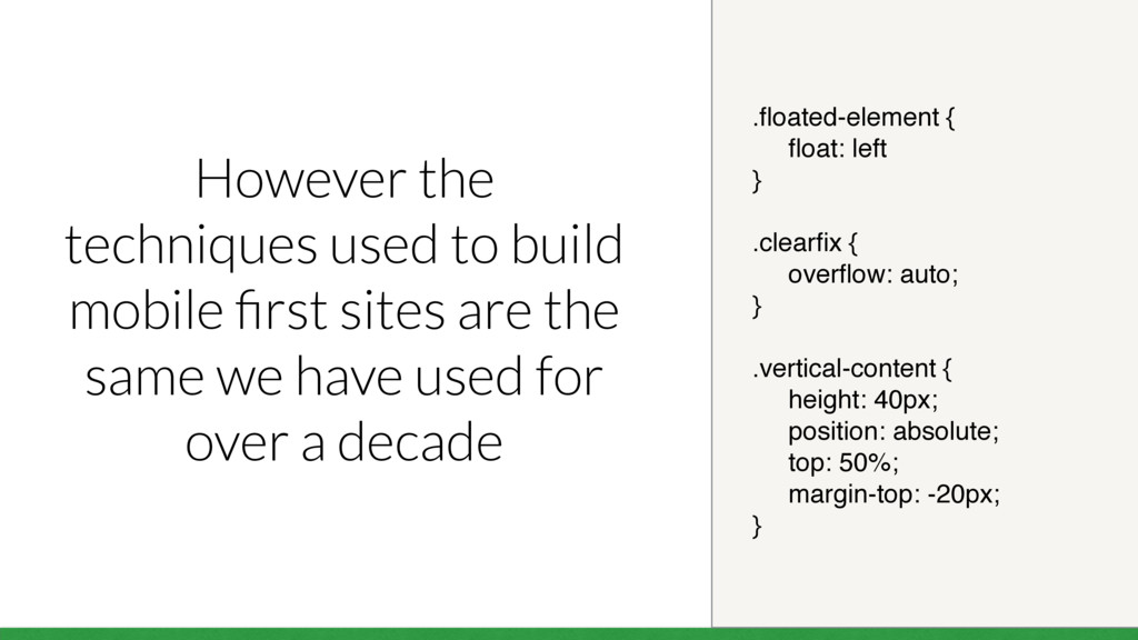
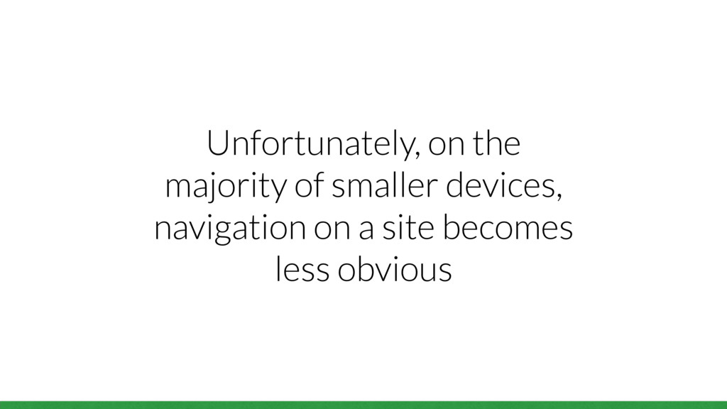
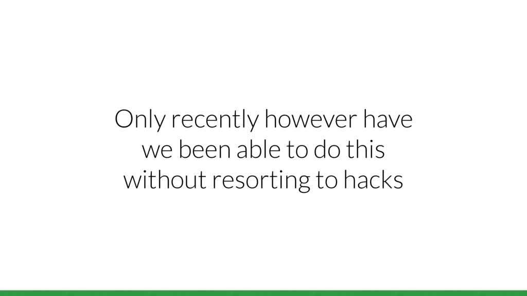
Unfortunately the techniques used to build mobile first sites are the same we have used for over a decade. Thankfully, browsers have been busy implementing new features that enable us to build better sites and have more fun while doing it!

So today we are going to look at ways we can build better responsive sites in 2016 using these new features

Jonathan Fielding

May 09, 2016
Tweet

More Decks by Jonathan Fielding

Other Decks in Programming

Transcript

  1. A bit about me… • Technical Architect at Beamly •

    Author of Beginning Responsive Design • Regular contributor to open source, including SimpleStateManager, Echo.js, CriticalJS, FT’s Polyfill Service, Doccy among many projects • Lover and user of ‘the Twitter’
  2. .floated-element { float: left } .clearfix { overflow: auto; }

    .vertical-content { height: 40px; position: absolute; top: 50%; margin-top: -20px; } However the techniques used to build mobile first sites are the same we have used for over a decade
  3. Browsers have been busy implementing new features that enable us

    to build better sites and have more fun while doing it!
  4. Bobby Anderson Everyday Designer “Content is king, it always has

    been and always will be. Content is why users visit your site, subscribe to your newsletters and follow you on social media. Content is the single most important aspect of your website...” http://everydaydesigner.net/design/change-your-focus-and-design-content-first
  5. An audit of your content is simply an inventory of

    what you want to include in your page
  6. Jeremy Girard UXPin “Starting a website design without content is

    like creating packaging design without the product. You can do your best, but who knows if the end content or product will truly fit into what you create?” https://studio.uxpin.com/blog/a-better-responsive-web-design-process-for-2016/
  7. Example: Different content priorities for a restaurant Small devices Large

    devices Phone number Atmosphere Directions Menu Booking Booking Menu Phone number Atmosphere Directions
  8. To reorder content based on the type of device we

    can use CSS Flexbox to handle the ordering and target the device based on the screen size
  9. <div class="wrapper"> <div class="better-content-for-mobile"> I am more important on mobile

    </div> <div class="better-content-for-desktop"> I am more important on desktop </div> </div>
  10. @media only screen and (min-width: 768px) { .wrapper { display:

    flex; flex-direction: column; } .better-content-for-desktop { order: 1; } .better-content-for-mobile { order: 2; } }
  11. Larger devices also have more space for content but don’t

    hide content completely on small devices
  12. Instead think of ways in which you can change the

    functionality to better suit the device
  13. <div class="input-wrap"> <input class="input-wrap__field"> <button class="input-wrap__button"> Go </button> </div> .input-wrap

    { display: flex; } .input-wrap__field { flex: 1; /* field styles */ } .input-wrap__button { /* item styles */ } HTML CSS
  14. <div class="aligner"> <div class="aligned-content"> <h3>I'm Centered!</h3> <p> This box is

    vertically and horizontally centered </p> </div> </div> .aligner { display: flex; align-items: center; justify-content: center; } .aligned-content { max-width: 50%; } HTML CSS
  15. <body class="site"> <header>...</header> <main class="site-content">...</main> <footer>...</footer> </body> .site { display:

    flex; min-height: 100vh; flex-direction: column; margin: 0; } .site-content { flex: 1; } HTML CSS
  16. <div class="grid"> <div class="grid-cell">...</div> <div class="grid-cell">...</div> <div class="grid-cell grid-cell-half”> ...

    </div> </div> .grid { display: flex; } .grid-cell { flex: 1; } .grid-cell-half { width: 50% } HTML CSS
  17. Page load performance - The time it takes to fully

    load a page and be fully interactive
  18. A responsive site is expected to work on a wide

    variety of internet connections
  19. Google found an extra 500ms delay in loading of search

    results decreased traffic by 20%
  20. Average page weight has been increasing year on year Average

    Page Size (kB) 0 575 1150 1725 2300 April 2013 April 2014 April 2015 April 2016 Data from http://httparchive.org/interesting.php
  21. Scripts Fonts Video Images Stylesheets HTML Other 0 350 700

    1050 1400 4 56 69 1,350 209 107 354 Data from http://httparchive.org/interesting.php
  22. The average time to start rendering is also increasing Render

    start (ms) 0 1150 2300 3450 4600 March 2014 August 2014 March 2015 August 2015 Data from http://httparchive.org/interesting.php
  23. Tim Kadlec “The purpose of a performance budget is to

    make sure you focus on performance throughout a project. The reason you go through the trouble in the first place though is because you want to build a site that feels fast for your visitors.” http://www.timkadlec.com/2014/11/performance-budget-metrics/
  24. At the start of your project you need to understand

    the metrics you want to achieve
  25. As we are building a responsive site, today’s example will

    aim to start rendering in 5 seconds on a slow 3G connection
  26. If we then decide we want to add web fonts

    to our website we then adjust our budget
  27. These figures seem very ambitious when we compare them against

    the industry averages but they are achievable
  28. To use the picture element on your site you will

    need to include the polyfill which is called “picturefill”
  29. In cases where loading assets was deferred, it is important

    to ensure a suitable placeholder is in place
  30. In deferring the loading of our content only those images

    immediately visible to our users contribute to our page budget
  31. The content is the heart of our site but not

    all content is created equal
  32. The biggest danger of deferring content is that if JavaScript

    fails to load the content that is deferred will not be loaded
  33. The biggest advantage of deferring content is that we are

    able to reduce the size of what we initially deliver to our users
  34. Building a responsive site is about much more than building

    a site that works across mobile, tablet and desktop
  35. It’s about adapting the user experience of a site so

    that regardless of the device the user still gets the best experience possible
  36. Full examples of everything we have talked about can be

    found at www.jonathanfielding.com/talks/ responsive-design-in-2016/
  37. Flexbox examples based upon Solved by Flexbox by Philip Walton

    https://philipwalton.github.io/solved-by-flexbox/
  38. A special thanks goes out to to Charlie Fielding, Kate

    Montgomery and everyone at Beamly who helped me with putting these slides together.