Upgrade to Pro
— share decks privately, control downloads, hide ads and more …
Speaker Deck
Features
Speaker Deck
PRO
Sign in
Sign up for free
Search
Search
Web Cross Device
Search
Jacopo Rabolini
May 23, 2015
Programming
69
0
Share
Embed
Copy iframe code
Copy JS code
Copy link
Start on current slide
Web Cross Device
Presentazione relativa al workshop tenuto alla Wired Next Fest 2015.
Jacopo Rabolini
May 23, 2015
More Decks by Jacopo Rabolini
See All by Jacopo Rabolini
A Community of Communities
kingfelix
0
46
Other Decks in Programming
See All in Programming
Vite+ Unified Toolchain for the Web
naokihaba
0
420
20260623_Loop Engineeringで自分の分身の問い合わせBotを作る
ryugen04
0
110
SREは、MCPとSRE Agentをこう使え!
kazumax55
0
130
正しくソフトウェアを作る、前提を疑うための認知の視点 / doubt-premise
minodriven
21
7.2k
エージェンティックRAGにAWSで入門しよう!
har1101
9
1.9k
Contextとはなにか
chiroruxx
1
390
なぜ関数型プログラミングで「型」と「証明」が語られるのか #fp_matsuri
kajitack
0
330
関数型プログラミングのメリットって何だろう?
wanko_it
0
120
Dataformのリポジトリを立ち上げるときにまずやること / dataform-day0-2026
snhryt
0
210
過去最大のMCPアップデート! 2026-07-28 RC版の謎に迫る
licux
6
440
Snowflake Summitでの新機能 CoCo / CoWork / snowflake-summit-2026-overall-what-new-coco
tatsuhiro
1
210
AIキャラアプリkaiwaの低遅延音声通話基盤をどう作ったか - AWS Gravitonで支える低遅延・低コストAI Agent基盤
mogamit
0
150
Featured
See All Featured
Git: the NoSQL Database
bkeepers
PRO
432
67k
I Don’t Have Time: Getting Over the Fear to Launch Your Podcast
jcasabona
34
2.8k
Noah Learner - AI + Me: how we built a GSC Bulk Export data pipeline
techseoconnect
PRO
0
210
Designing for humans not robots
tammielis
254
26k
The Hidden Cost of Media on the Web [PixelPalooza 2025]
tammyeverts
2
340
How to Align SEO within the Product Triangle To Get Buy-In & Support - #RIMC
aleyda
2
1.6k
A Guide to Academic Writing Using Generative AI - A Workshop
ks91
PRO
1
340
Typedesign – Prime Four
hannesfritz
42
3.1k
The Illustrated Children's Guide to Kubernetes
chrisshort
51
52k
How to Get Subject Matter Experts Bought In and Actively Contributing to SEO & PR Initiatives.
livdayseo
0
150
Bridging the Design Gap: How Collaborative Modelling removes blockers to flow between stakeholders and teams @FastFlow conf
baasie
0
610
The Psychology of Web Performance [Beyond Tellerrand 2023]
tammyeverts
49
3.5k
Transcript
Web Cross Device GDG Milano @ Wired Next Fest 2015
gdgmilano.org / jacoporabolini.com
“Il web è progettato per essere universale: per includere tutto
e tutti.” - Tim Berners-Lee
C’era una volta... image: http://bradfrost.com/blog/web/responsive-web-design-missing-the-point/
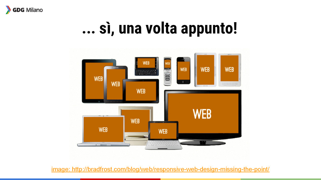
... sì, una volta appunto! image: http://bradfrost.com/blog/web/responsive-web-design-missing-the-point/
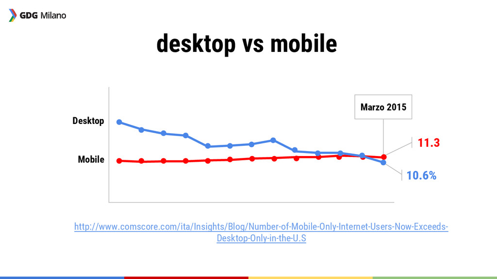
desktop vs mobile Marzo 2015 Desktop Mobile 10.6% 11.3 http://www.comscore.com/ita/Insights/Blog/Number-of-Mobile-Only-Internet-Users-Now-Exceeds-
Desktop-Only-in-the-U.S
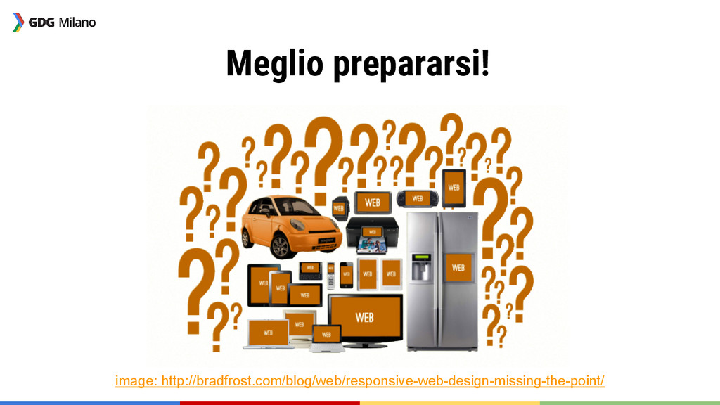
Meglio prepararsi! image: http://bradfrost.com/blog/web/responsive-web-design-missing-the-point/
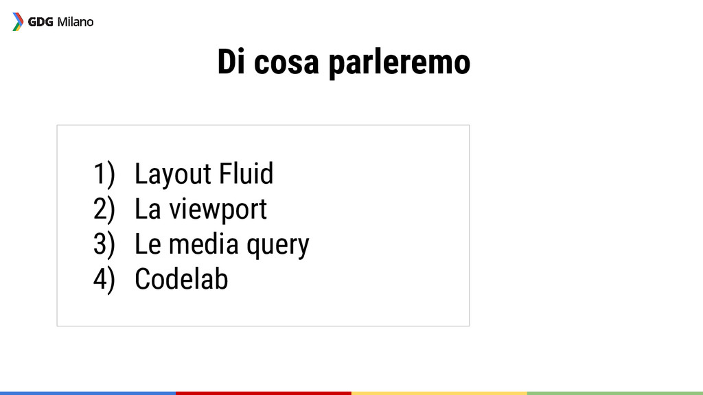
Di cosa parleremo 1) Layout Fluid 2) La viewport 3)
Le media query 4) Codelab
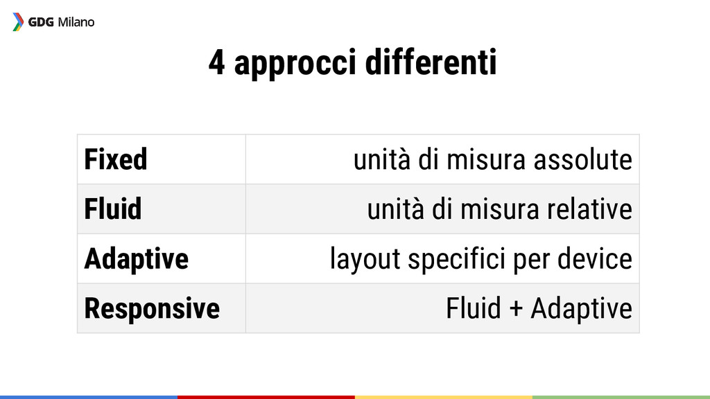
4 approcci differenti Fixed unità di misura assolute Fluid unità
di misura relative Adaptive layout specifici per device Responsive Fluid + Adaptive
Layout Fluid
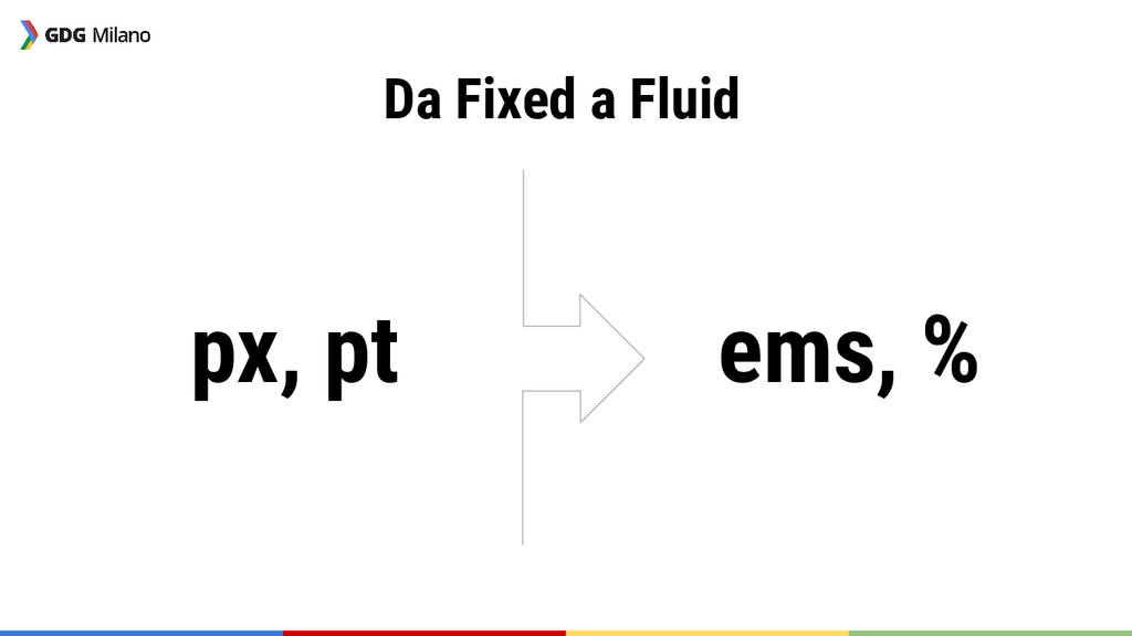
px, pt ems, % Da Fixed a Fluid
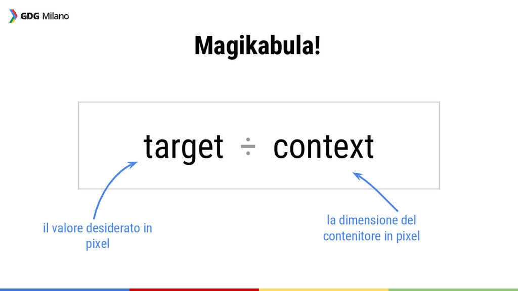
Magikabula! target ÷ context il valore desiderato in pixel la
dimensione del contenitore in pixel
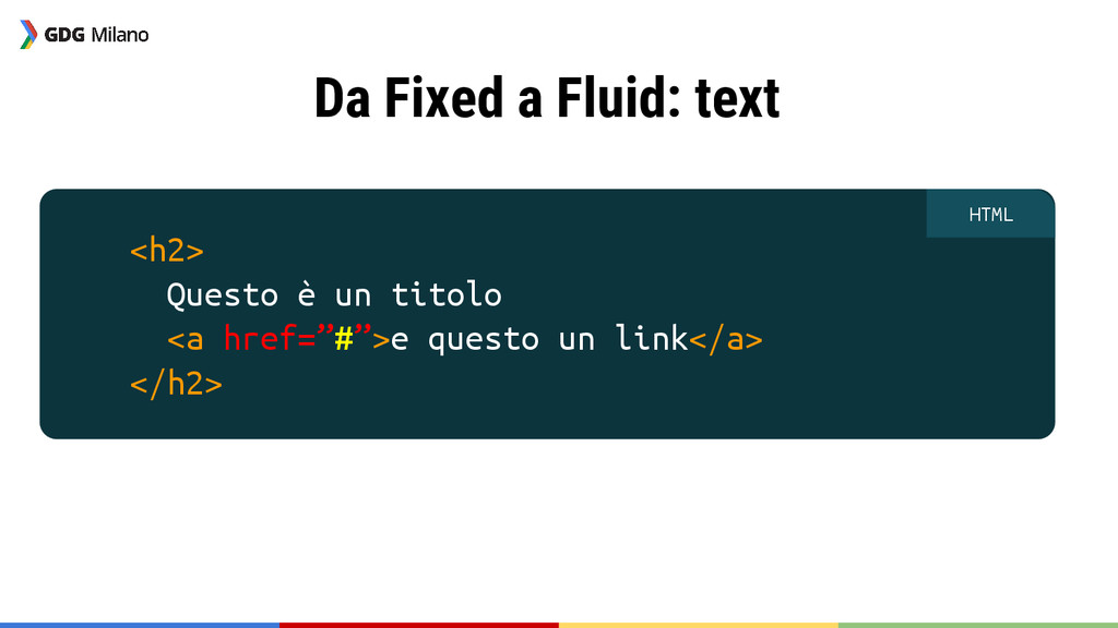
Da Fixed a Fluid: text <h2> Questo è un titolo
<a href=”#”>e questo un link</a> </h2> HTML
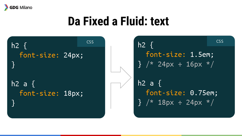
h2 { font-size: 24px; } h2 a { font-size: 18px;
} h2 { font-size: 1.5em; } /* 24px ÷ 16px */ h2 a { font-size: 0.75em; } /* 18px ÷ 24px */ CSS CSS Da Fixed a Fluid: text
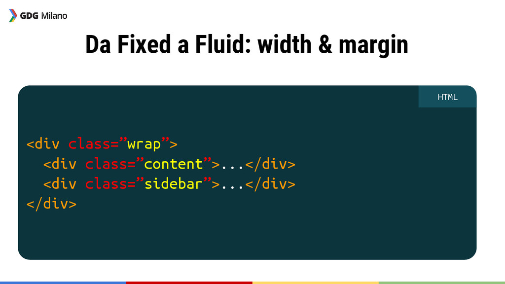
<div class=”wrap”> <div class=”content”>...</div> <div class=”sidebar”>...</div> </div> HTML Da Fixed
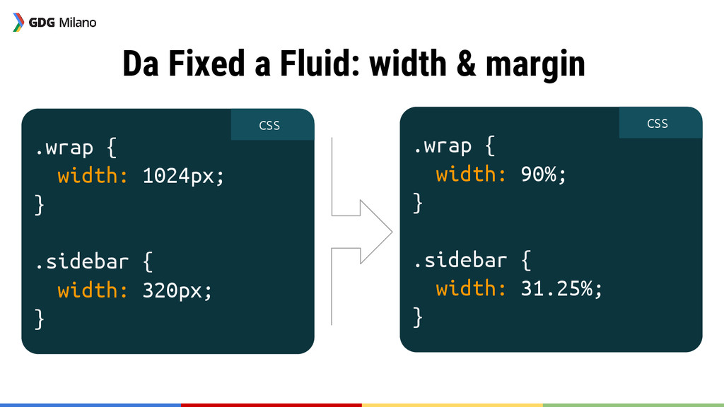
a Fluid: width & margin
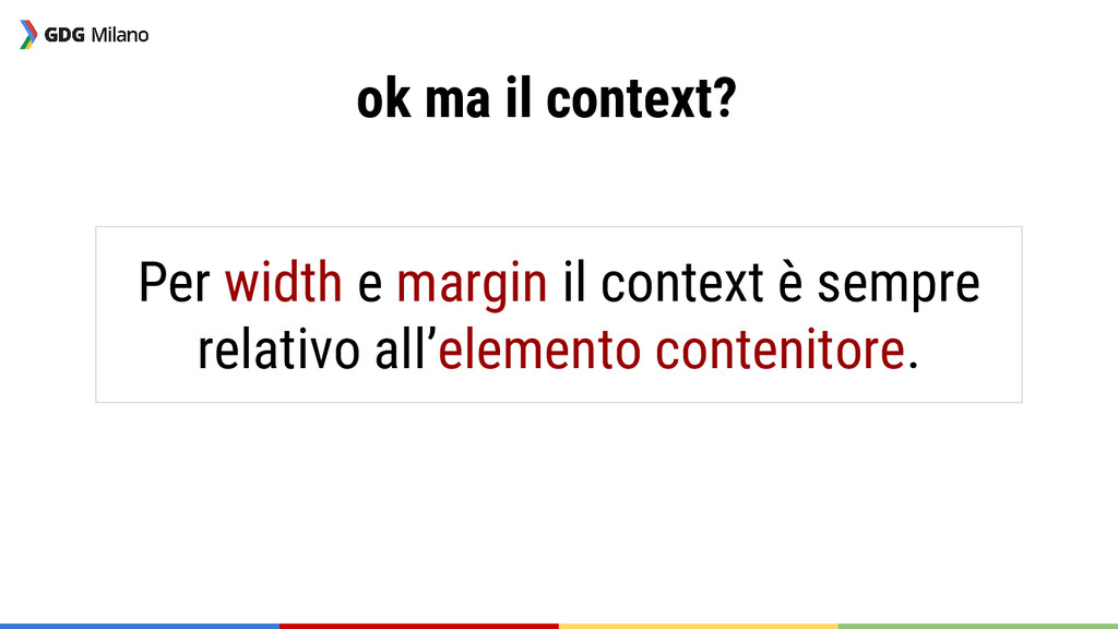
ok ma il context? Per width e margin il context
è sempre relativo all’elemento contenitore.
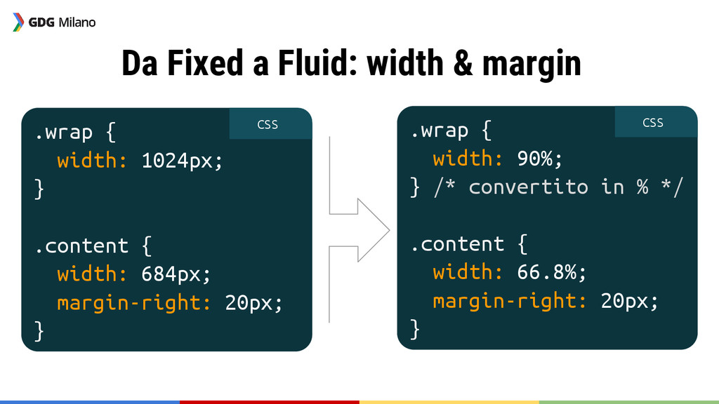
.wrap { width: 1024px; } .content { width: 684px; margin-right:
20px; } .wrap { width: 90%; } /* convertito in % */ .content { width: 66.8%; margin-right: 20px; } CSS CSS Da Fixed a Fluid: width & margin
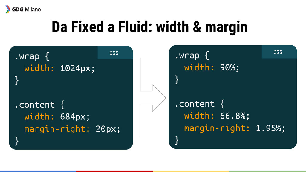
.wrap { width: 1024px; } .content { width: 684px; margin-right:
20px; } .wrap { width: 90%; } .content { width: 66.8%; margin-right: 1.95%; } Da Fixed a Fluid: width & margin CSS CSS
.wrap { width: 1024px; } .sidebar { width: 320px; }
.wrap { width: 90%; } .sidebar { width: 31.25%; } CSS CSS Da Fixed a Fluid: width & margin
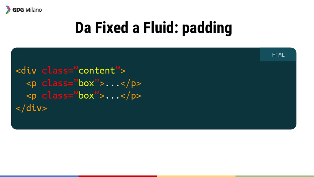
<div class=”content”> <p class=”box”>...</p> <p class=”box”>...</p> </div> HTML Da Fixed
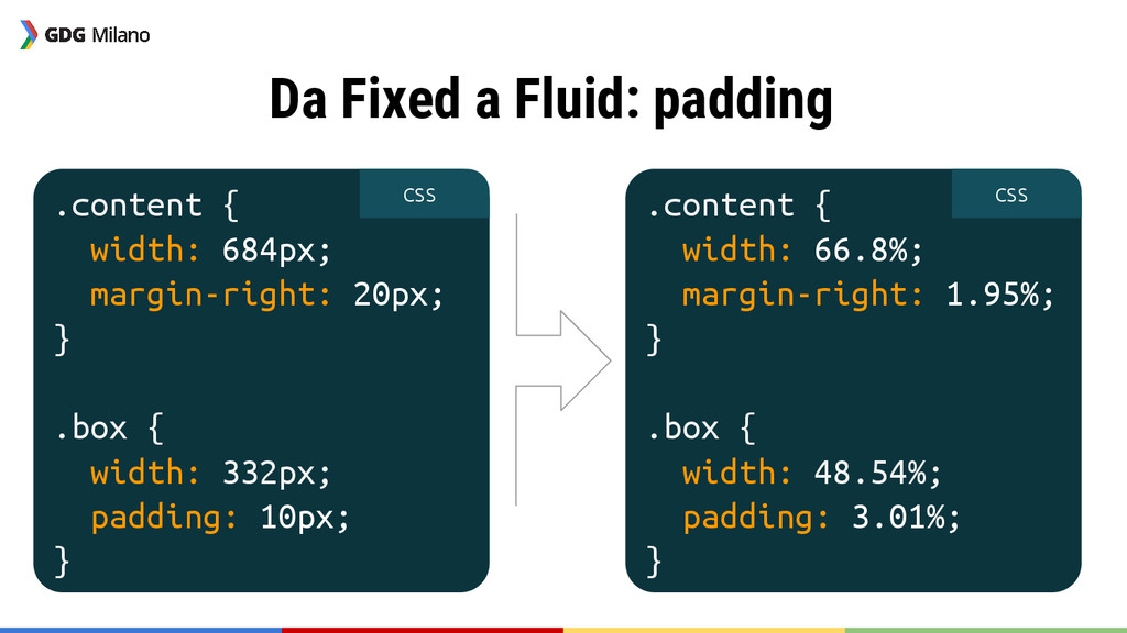
a Fluid: padding
Attenzione al context! Per il padding il context è sempre
relativo all’elemento stesso.
.content { width: 684px; margin-right: 20px; } .box { width:
332px; padding: 10px; } CSS .content { width: 66.8%; margin-right: 1.95%; } .box { width: 48.54%; padding: 3.01%; } CSS Da Fixed a Fluid: padding
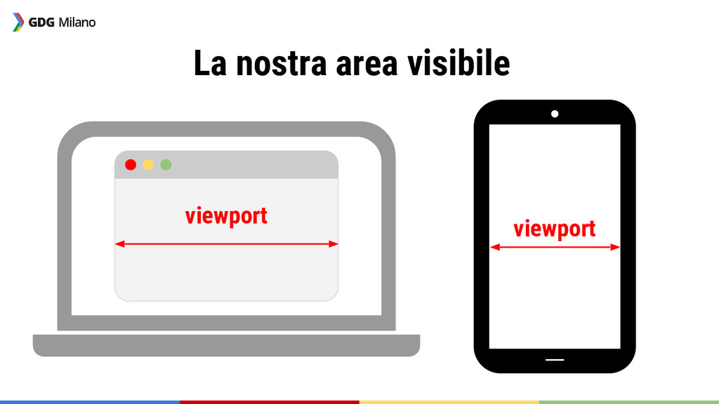
La viewport
La nostra area visibile viewport viewport
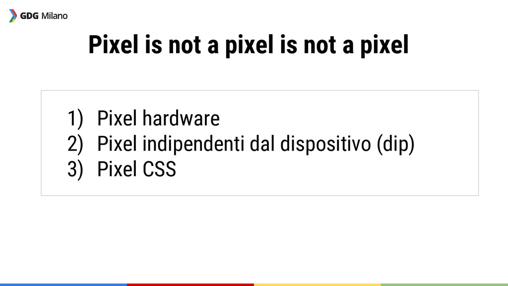
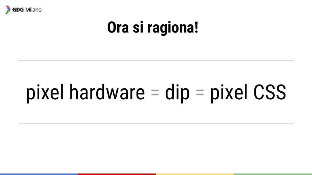
Pixel is not a pixel is not a pixel 1)
Pixel hardware 2) Pixel indipendenti dal dispositivo (dip) 3) Pixel CSS
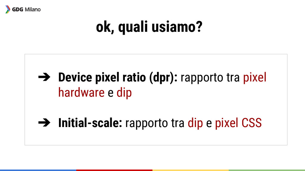
ok, quali usiamo? ➔ Device pixel ratio (dpr): rapporto tra
pixel hardware e dip ➔ Initial-scale: rapporto tra dip e pixel CSS
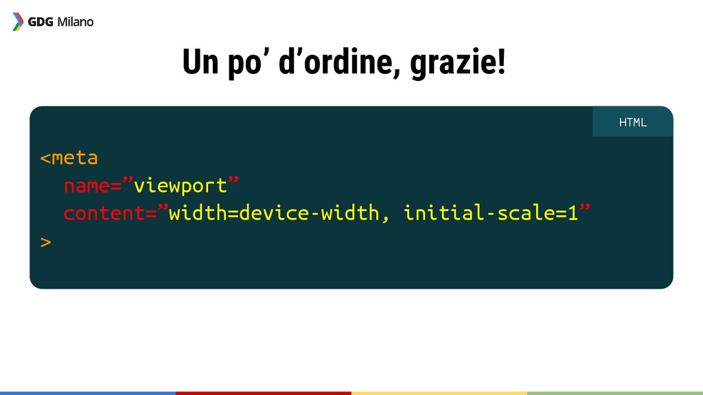
Un po’ d’ordine, grazie! <meta name=”viewport” content=”width=device-width, initial-scale=1” > HTML
Ora si ragiona! pixel hardware = dip = pixel CSS
Le media query
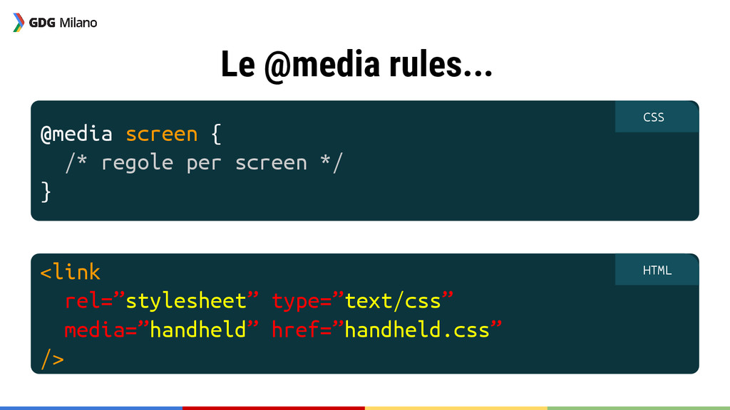
Le @media rules... @media screen { /* regole per screen
*/ } CSS <link rel=”stylesheet” type=”text/css” media=”handheld” href=”handheld.css” /> HTML
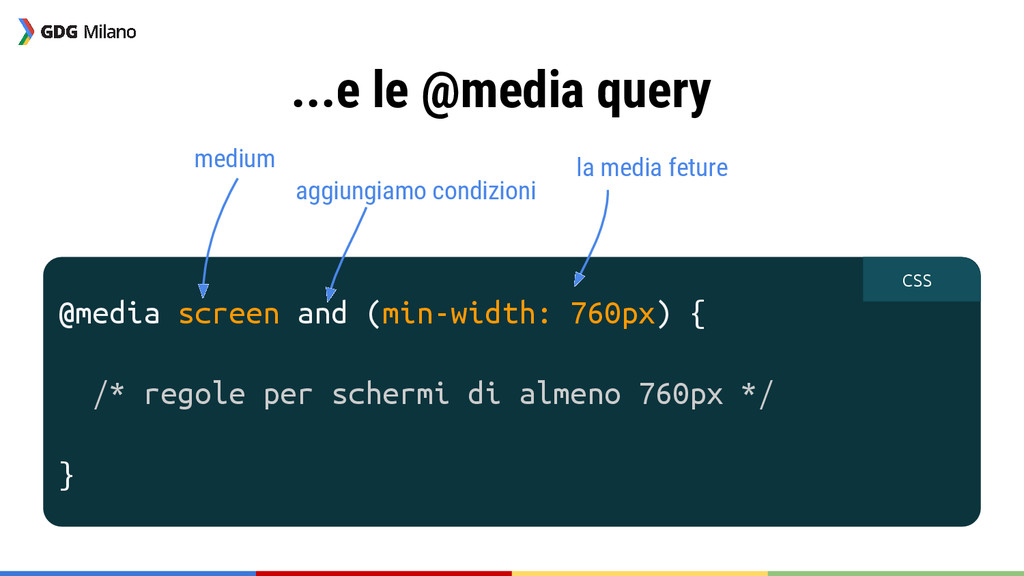
...e le @media query @media screen and (min-width: 760px) {
/* regole per schermi di almeno 760px */ } CSS medium aggiungiamo condizioni la media feture
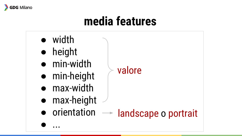
media features • width • height • min-width • min-height
• max-width • max-height • orientation • ... valore landscape o portrait
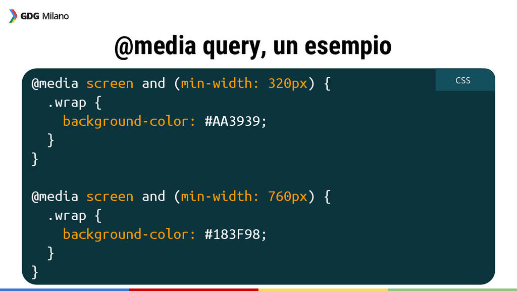
@media query, un esempio @media screen and (min-width: 320px) {
.wrap { background-color: #AA3939; } } @media screen and (min-width: 760px) { .wrap { background-color: #183F98; } } CSS
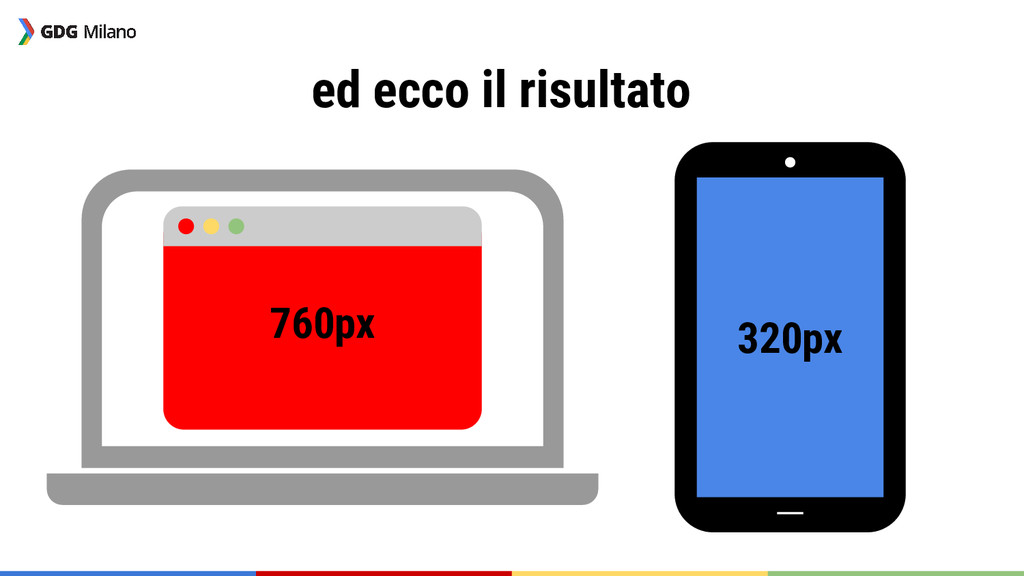
ed ecco il risultato 760px 320px
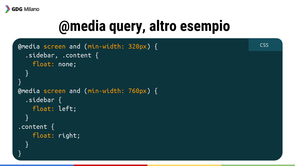
@media query, altro esempio @media screen and (min-width: 320px) {
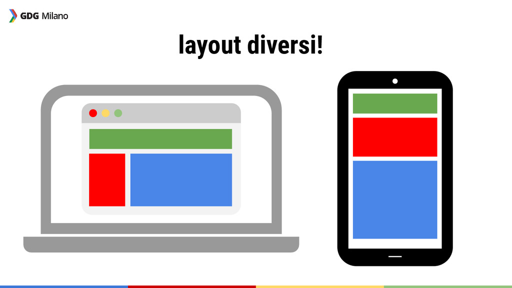
.sidebar, .content { float: none; } } @media screen and (min-width: 760px) { .sidebar { float: left; } .content { float: right; } } CSS
layout diversi!
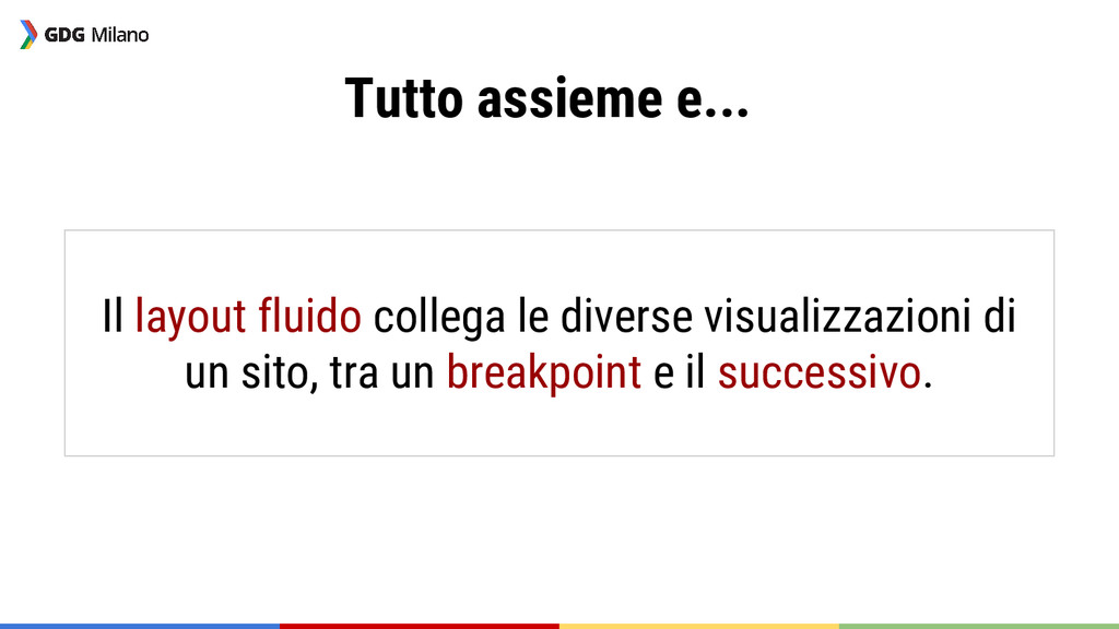
Tutto assieme e... Il layout fluido collega le diverse visualizzazioni
di un sito, tra un breakpoint e il successivo.
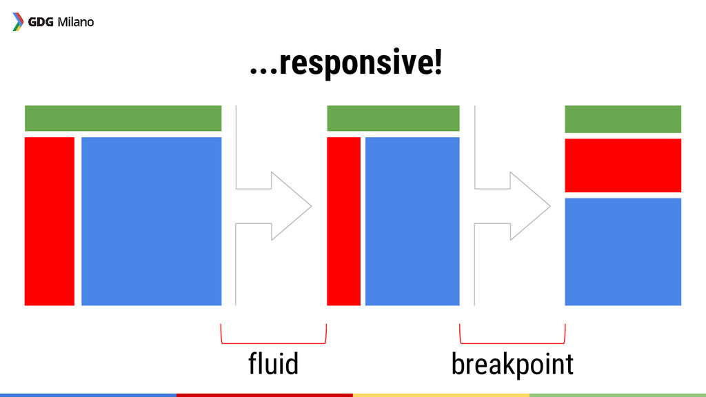
...responsive! fluid breakpoint
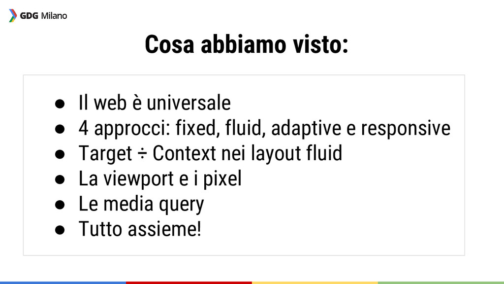
Cosa abbiamo visto: • Il web è universale • 4
approcci: fixed, fluid, adaptive e responsive • Target ÷ Context nei layout fluid • La viewport e i pixel • Le media query • Tutto assieme!
Domande?
Codelab :)
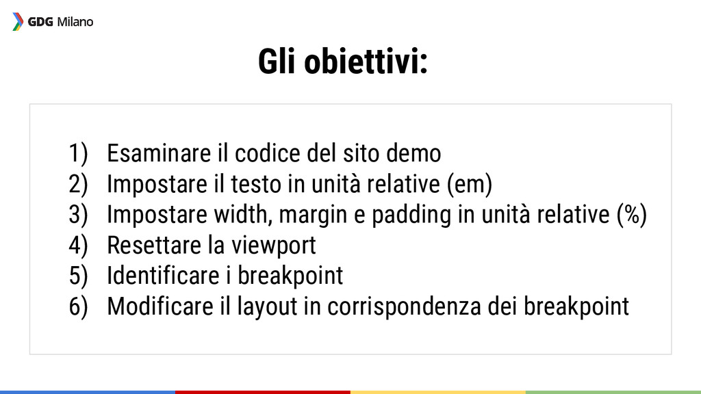
Gli obiettivi: 1) Esaminare il codice del sito demo 2)
Impostare il testo in unità relative (em) 3) Impostare width, margin e padding in unità relative (%) 4) Resettare la viewport 5) Identificare i breakpoint 6) Modificare il layout in corrispondenza dei breakpoint
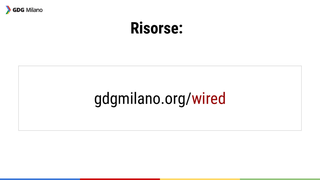
Risorse: gdgmilano.org/wired
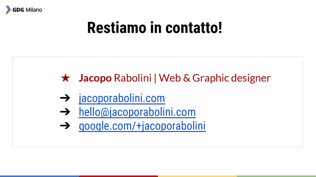
Restiamo in contatto! ★ Jacopo Rabolini | Web & Graphic
designer ➔ jacoporabolini.com ➔
[email protected]
➔ google.com/+jacoporabolini
Grazie!
 kingfelix
 naokihaba
 ryugen04
 kazumax55
 minodriven
 har1101
 chiroruxx
 kajitack
 wanko_it
 snhryt
 licux
licux
 tatsuhiro
 mogamit
 bkeepers
 jcasabona
 techseoconnect
 tammielis
 tammyeverts
 aleyda
 ks91
ks91
 hannesfritz
 chrisshort
 livdayseo
 baasie