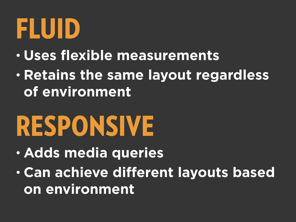
This one-day, hands-on workshop is for those that are ready to start building responsively or are having trouble integrating responsive techniques into their workflow. They're convinced of the benefits of a fluid, device agnostic web and believe in mobile first as a best practice, but need a helping hand in breaking free of old build habits.
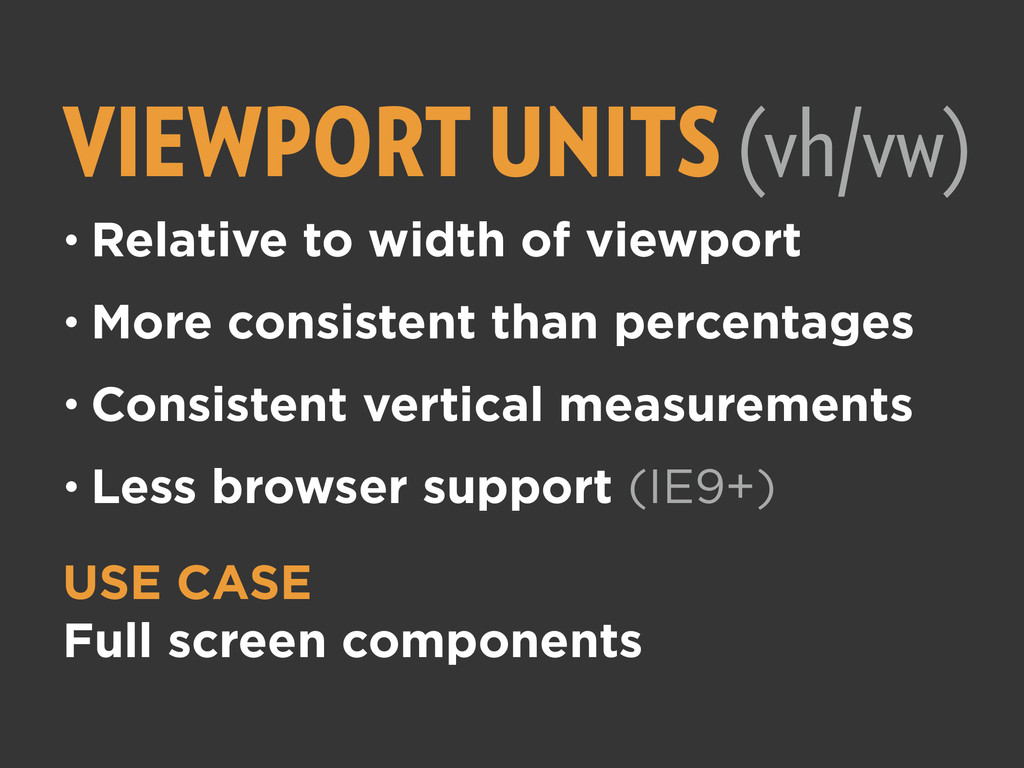
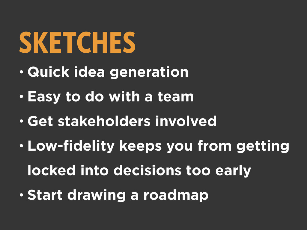
This workshop will make the connection between best practice and actual workflow through a mixture of tutorials, examples, exercises, discussion and pair programming that will be crafted to make the connection between responsive best practices and real-world projects. Together we'll begin the day with a static site design and work through the day so you can take home HTML and CSS that translates the design into a device-agnostic responsive page that will load in whatever browser you desire. In the process we'll explore the intersection of best practice and project compromise in a way that will make it easier for us all to make better decisions as we continue to build the responsive web.
 lovehasnologic
 centou
 garyuten
 kintone
 takaikanako
 hiro93n
 gfht1
gfht1
 sevendex
 designer_no_pon
 saka2jp
 connecre
 securecat
 lynteo
 portentint
 pauljervisheath
 afnizarnur
 bkeepers
 sarafernandez
 ryanjones
 cargoodrich
 inesmontani
 skipperchong
 bluesmoon
 aki_iinuma
 codingconduct