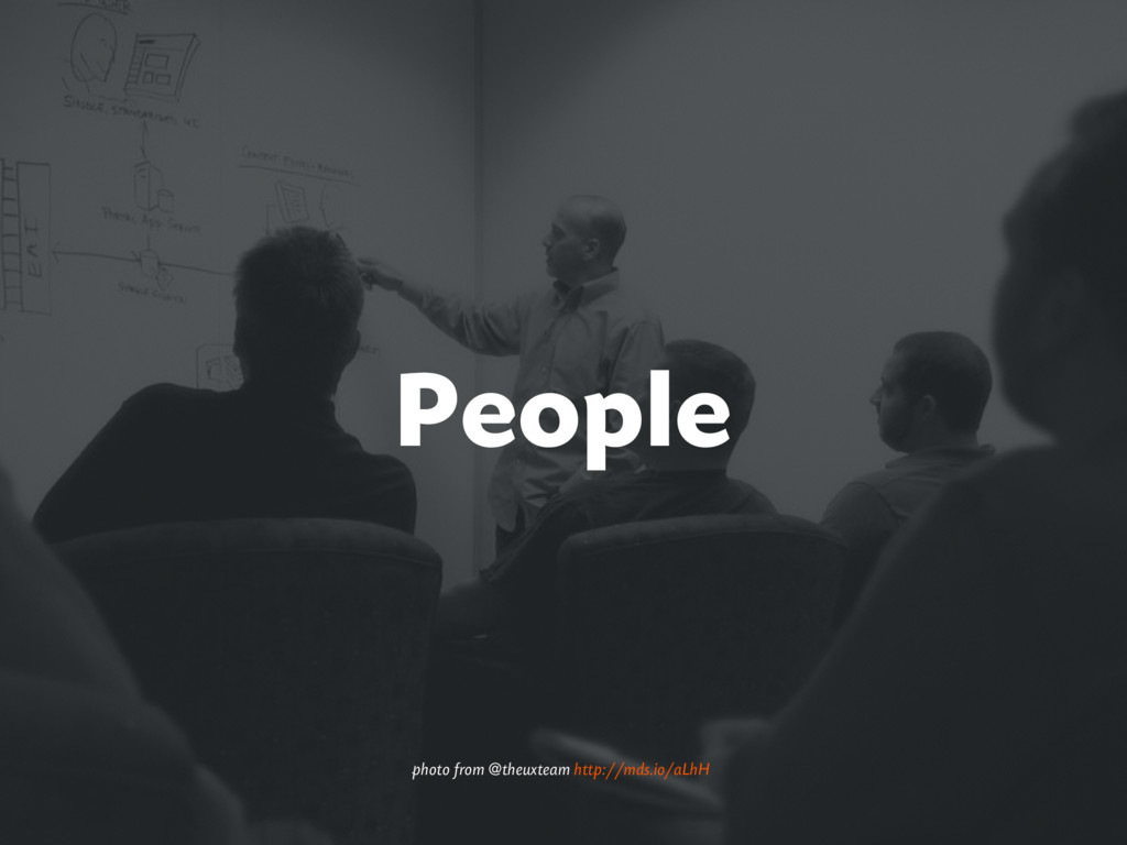
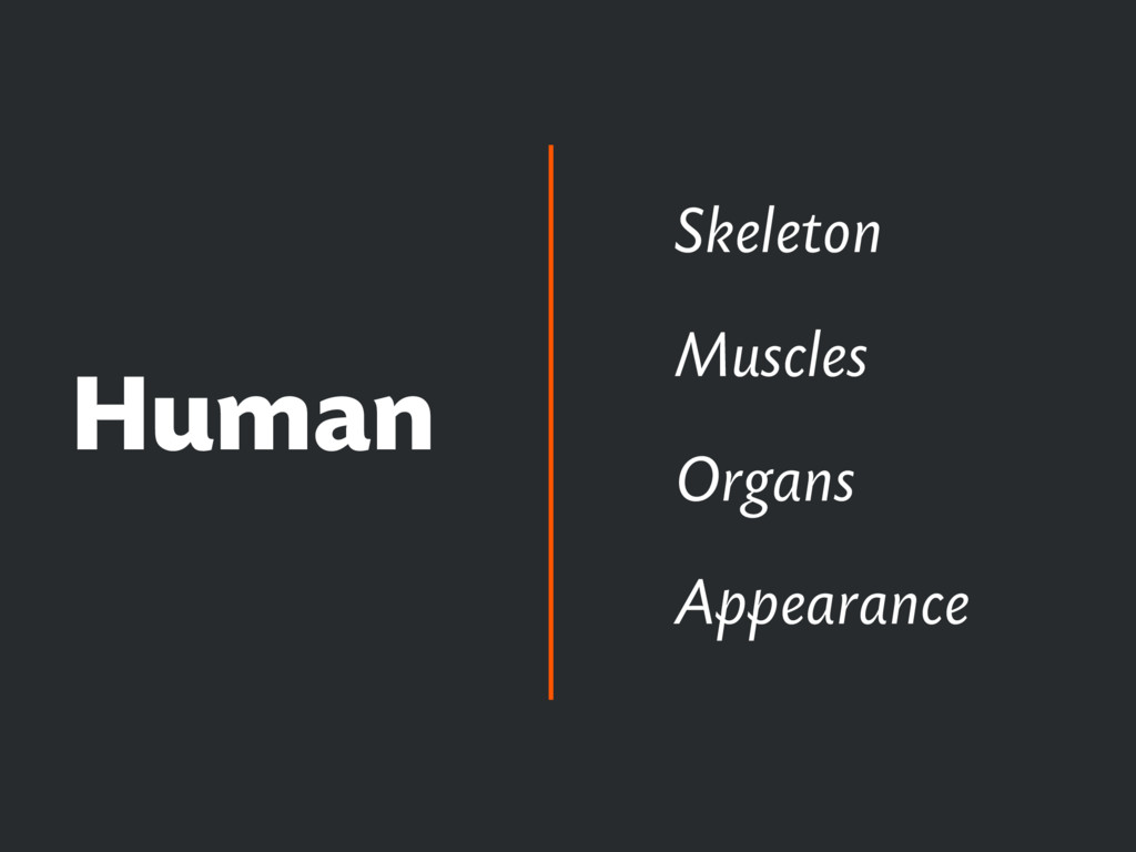
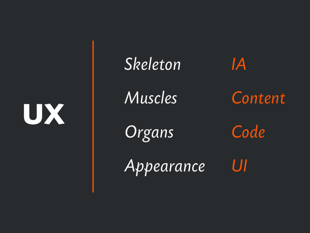
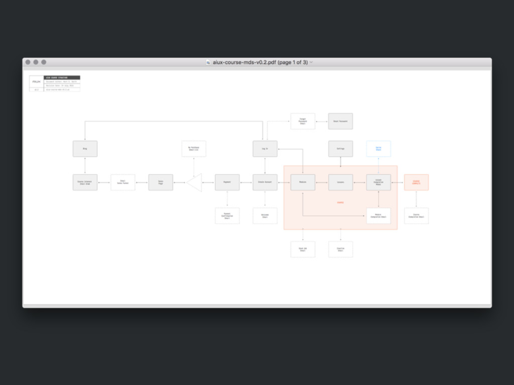
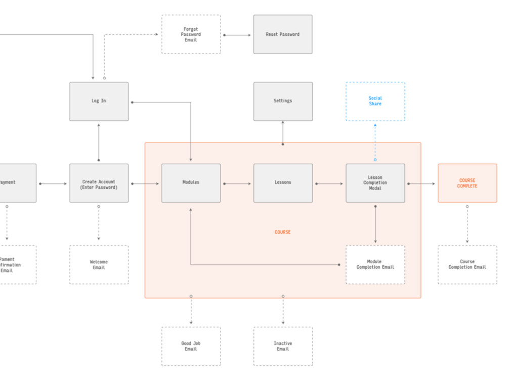
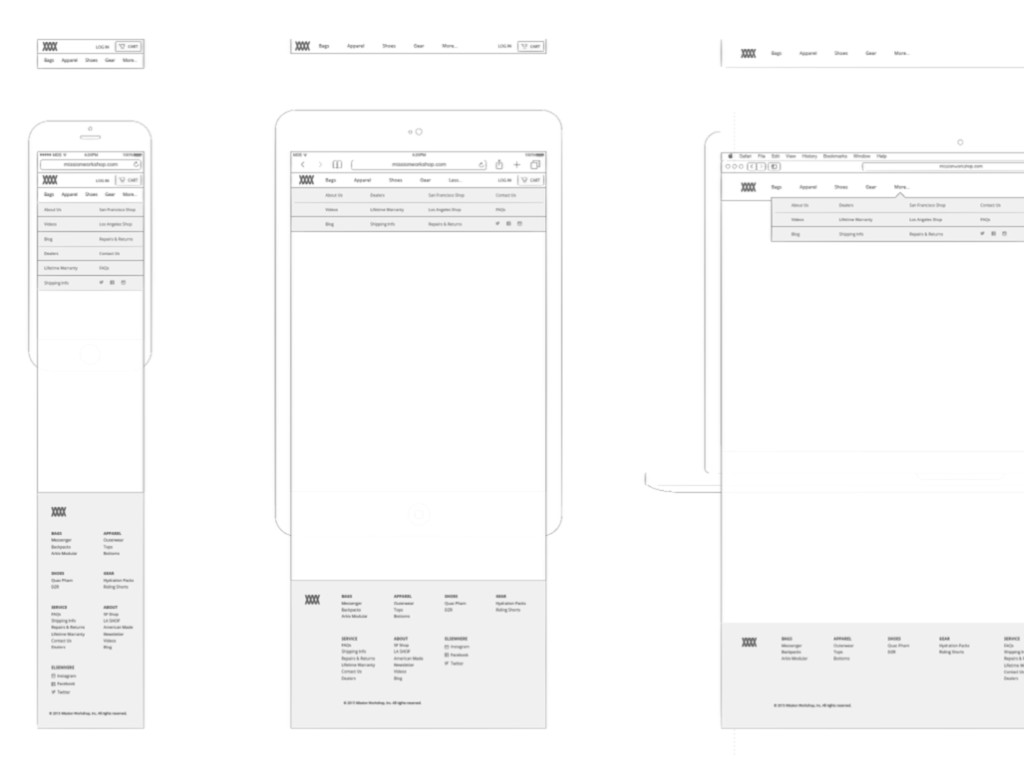
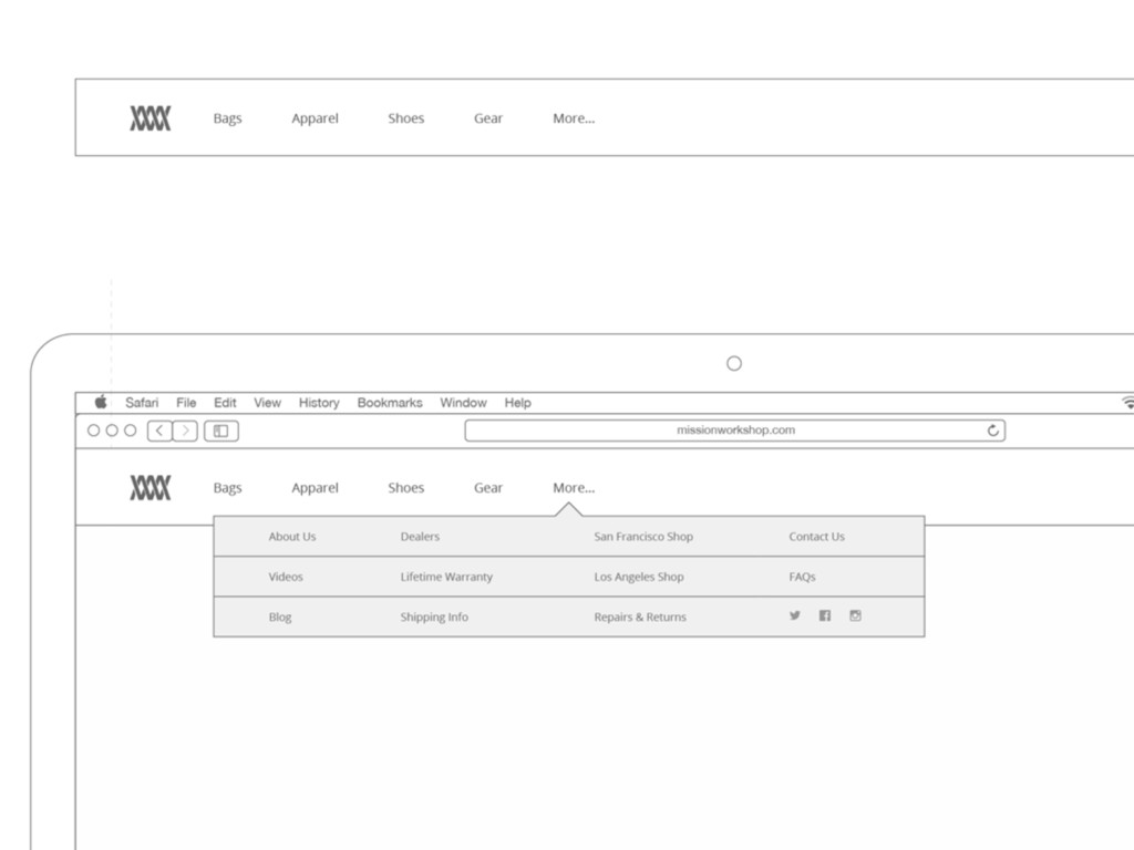
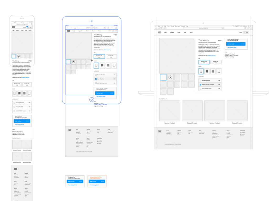
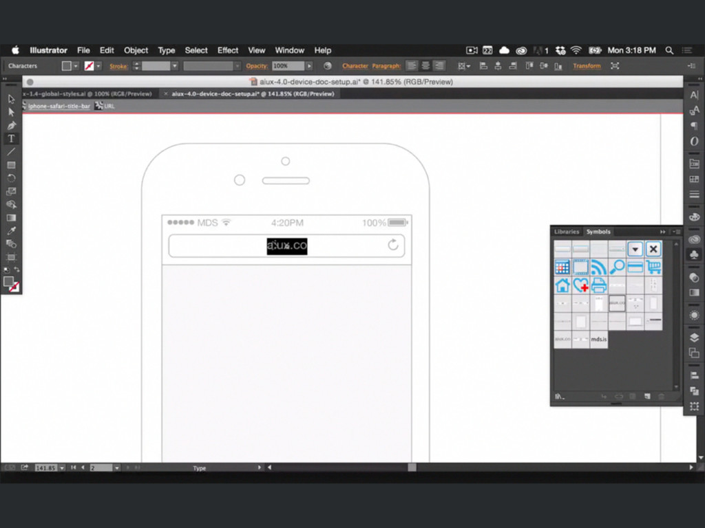
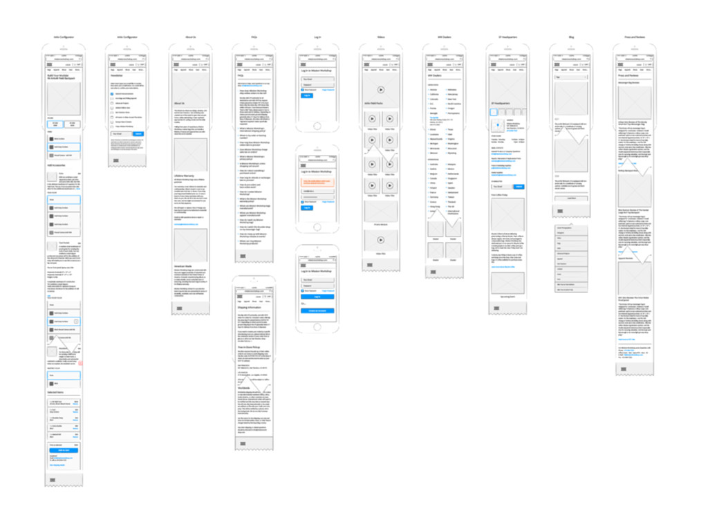
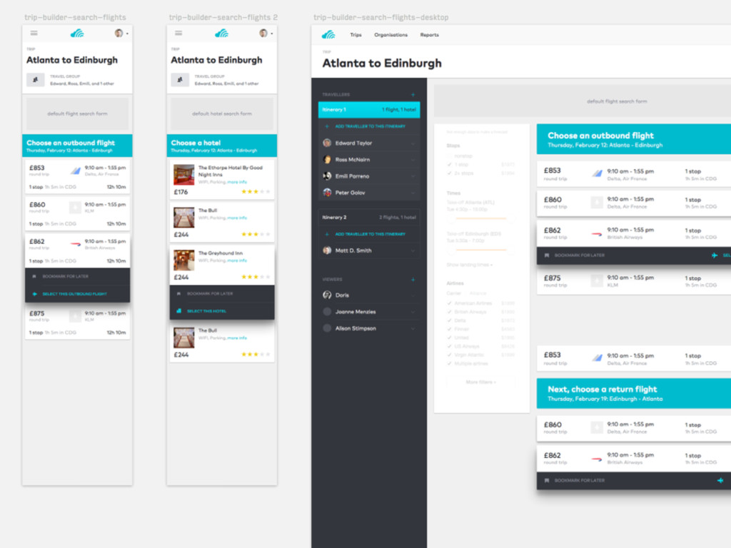
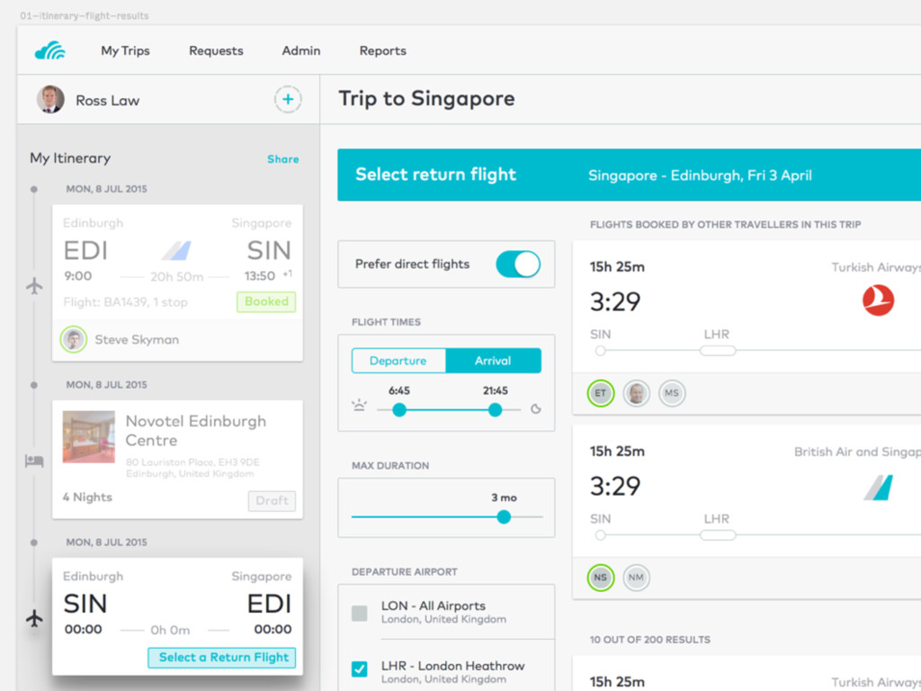
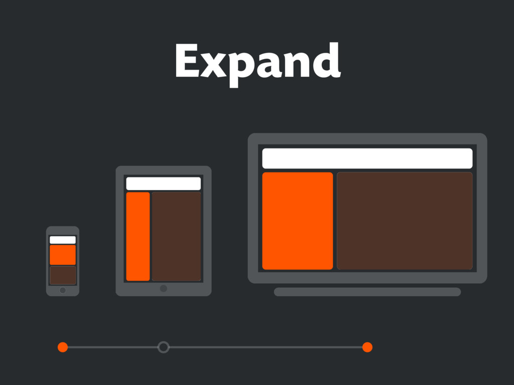
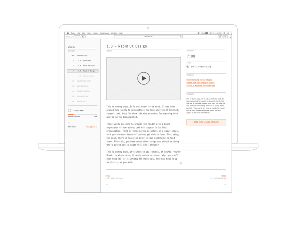
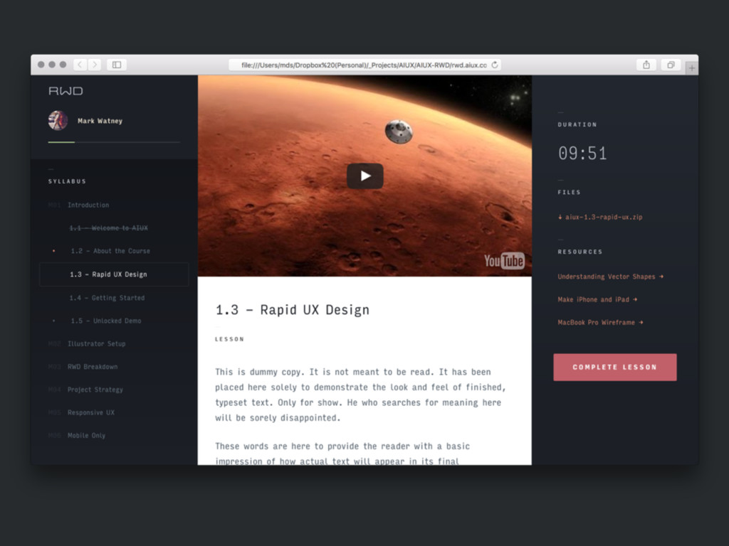
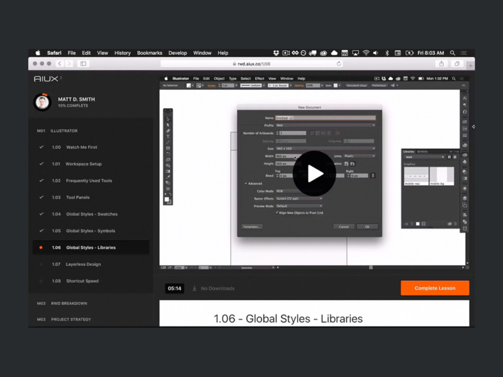
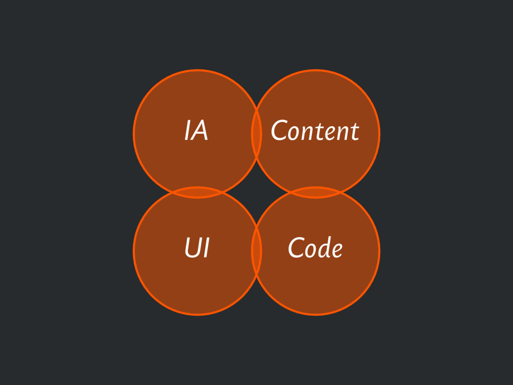
Making responsive websites is hard. Throw a bunch of opinionated people in the mix and it can feel nearly impossible. Let’s dig into what it takes to handle the pixels and the people really well. From beginning to end, we’ll walk through a solid, designer-focused process to make your next project a success.
 so_kotani
 happy_ferret153
 tararira
 chorkaichan
 kumanoayumi
 hicard
 mhand01
 shoko_seven11
 visional_engineering_and_design
 kamechi7222222
 saki822
 a2k
a2k
 philnash
 cargoodrich
 seathinner
 csswizardry
 tmiket
 chriscoyier
 cassininazir
 samlambert
 denniskardys
 baasie
 twada
twada
 aleyda