themes will be using the toolkit, either now or in the future • Different people or teams will be building the toolkit than those who are building the site • You’re looking to build out UX ahead of site development • If there’s a 1:1 toolkit to site relationship, and you’re the developer for both • If you’re not specifically tied to Storybook, you could consider an alternative with native Twig support (Fractal, for example)
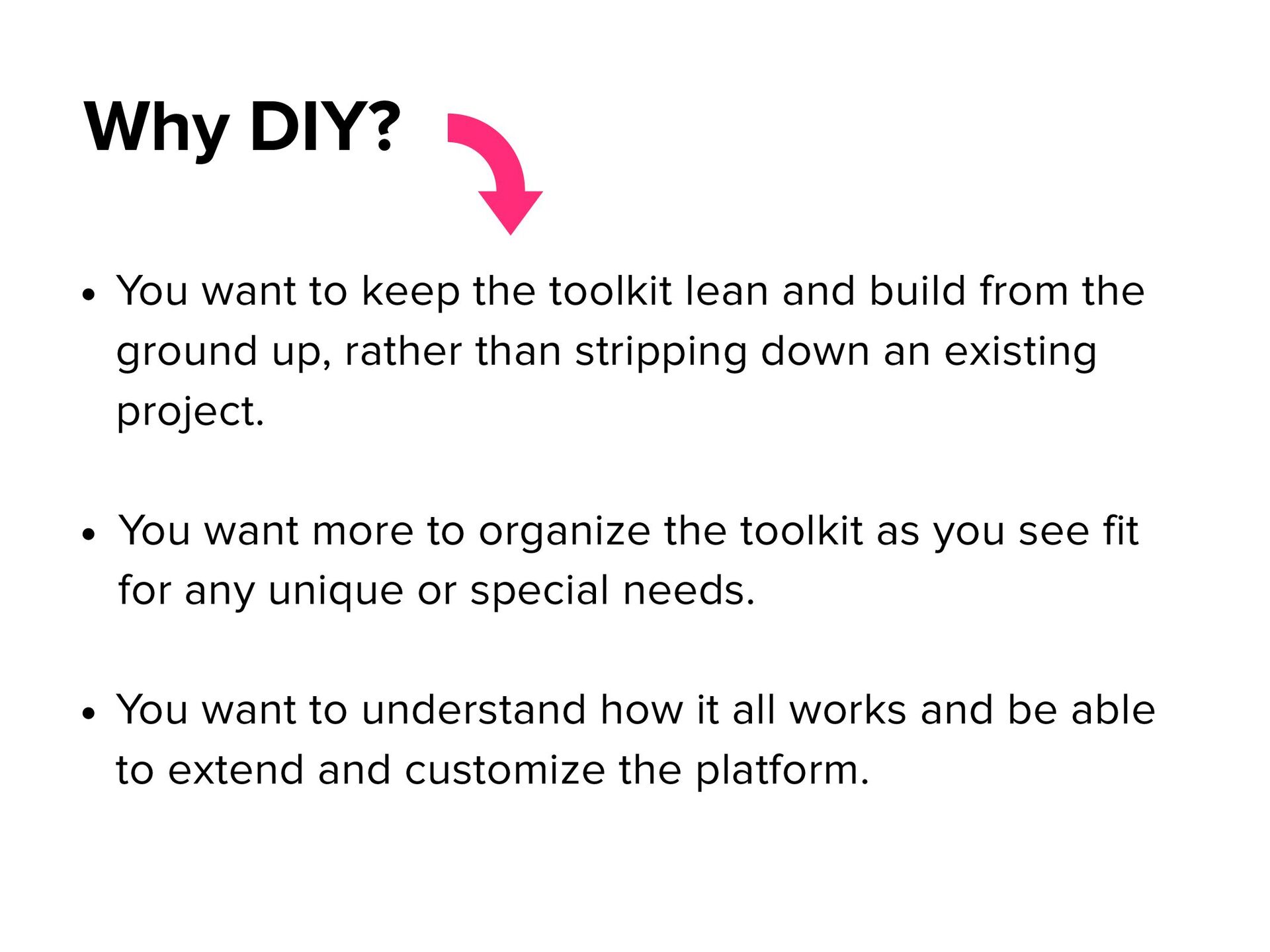
from the ground up, rather than stripping down an existing project. • You want more to organize the toolkit as you see fit for any unique or special needs. • You want to understand how it all works and be able to extend and customize the platform. Why DIY?
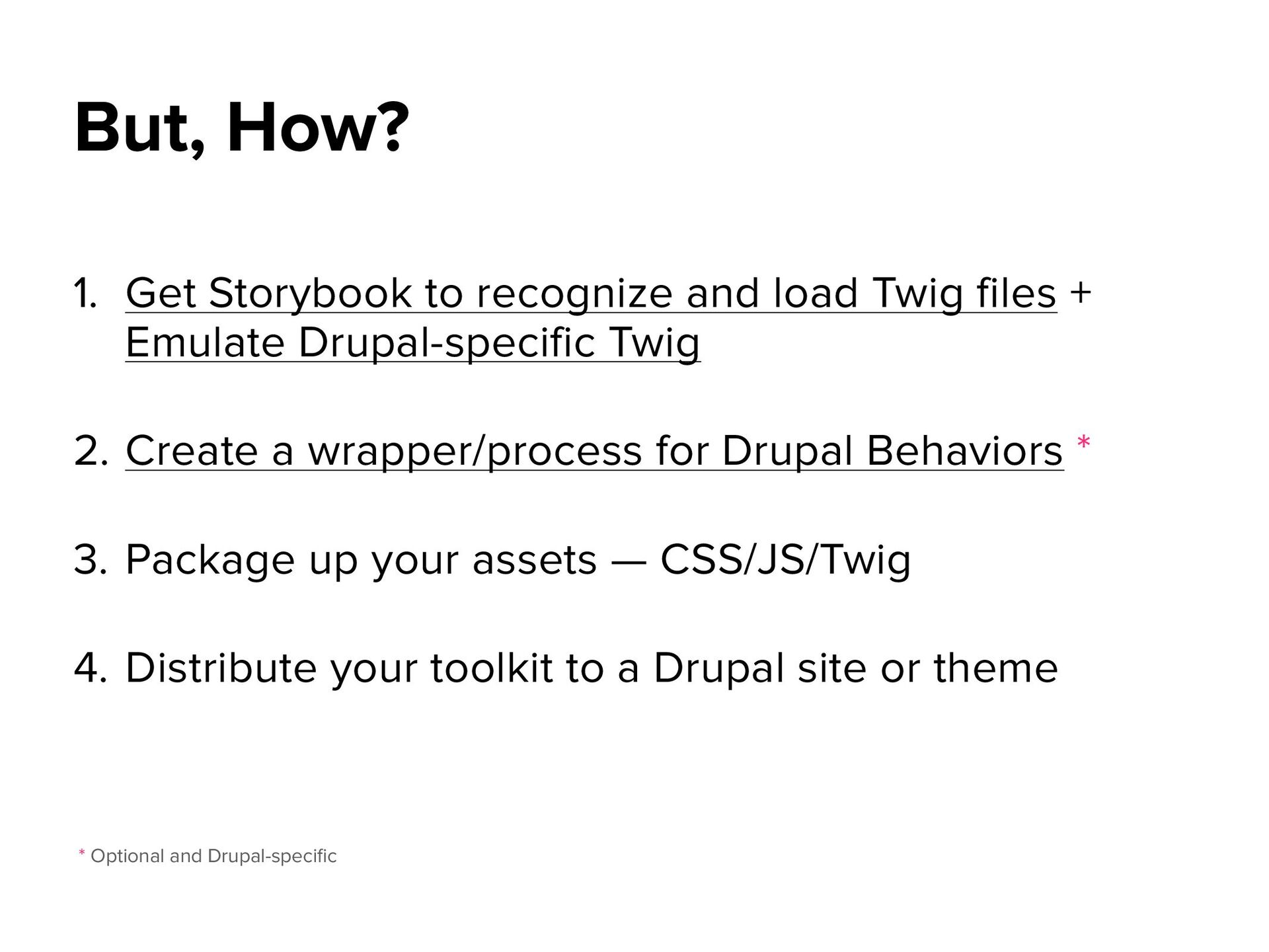
Emulate Drupal-specific Twig 2. Create a wrapper/process for Drupal Behaviors * 3. Package up your assets — CSS/JS/Twig 4. Distribute your toolkit to a Drupal site or theme But, How? * Optional and Drupal-speci fi c
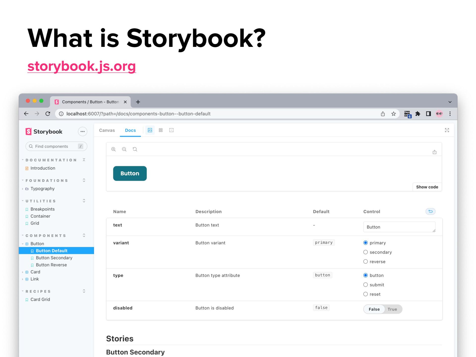
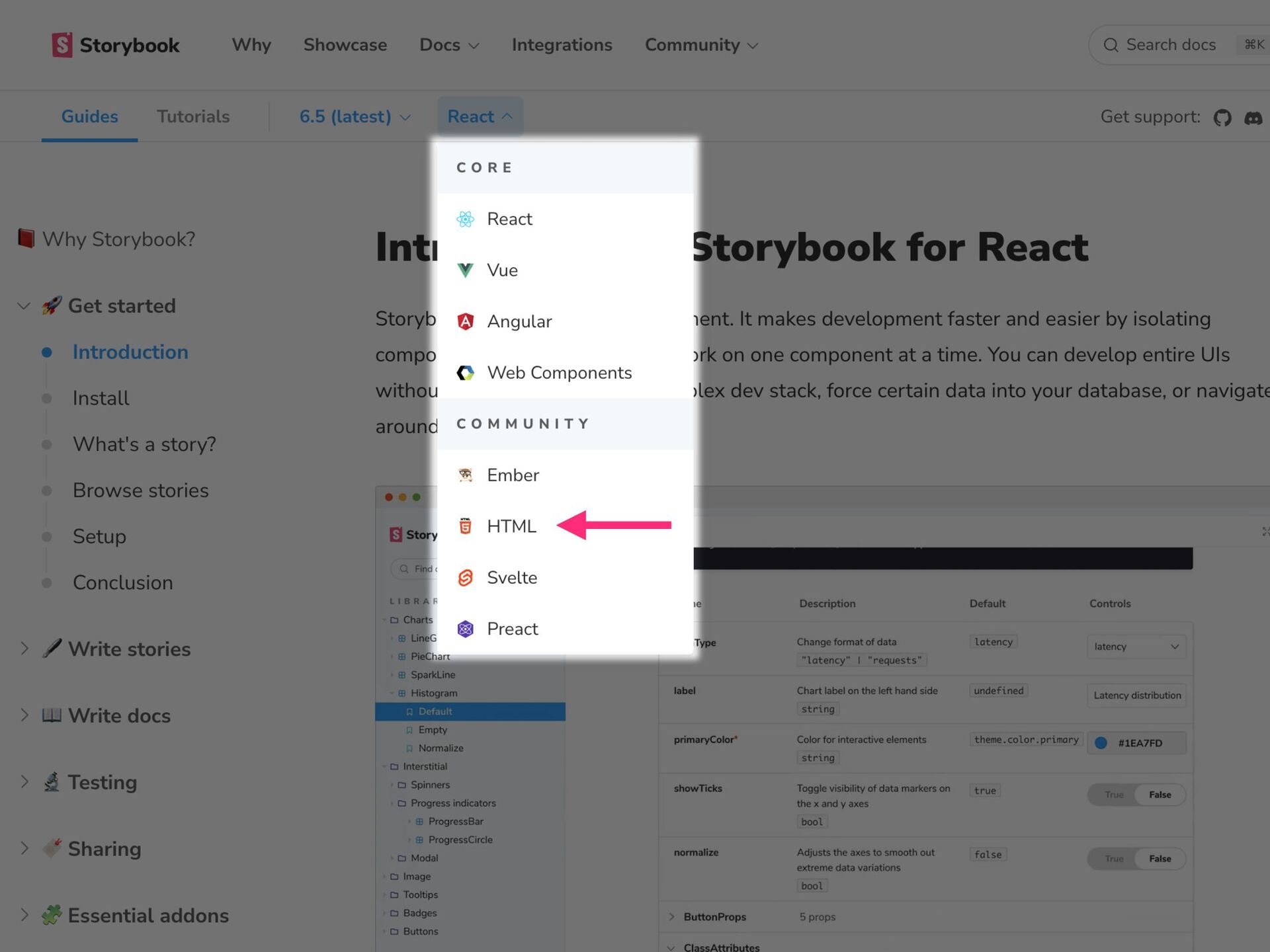
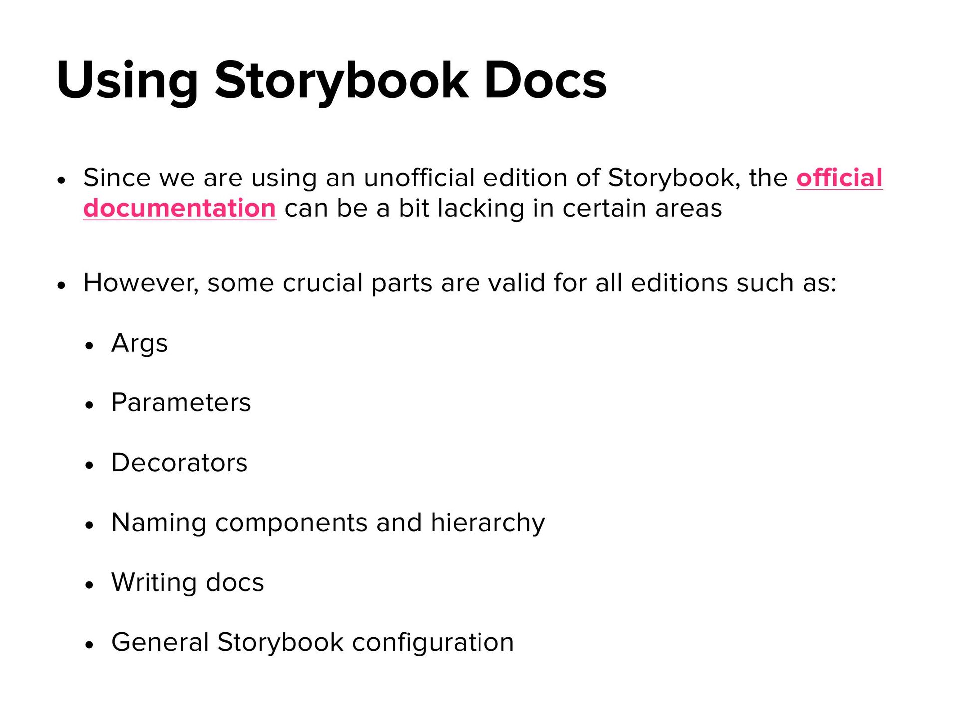
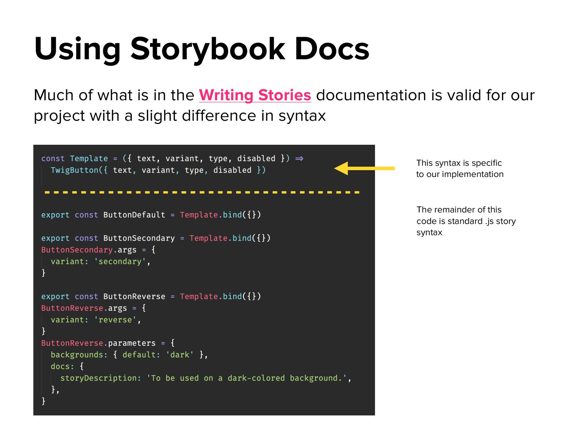
the official documentation can be a bit lacking in certain areas • However, some crucial parts are valid for all editions such as: • Args • Parameters • Decorators • Naming components and hierarchy • Writing docs • General Storybook configuration Using Storybook Docs
valid for our project with a slight difference in syntax Using Storybook Docs This syntax is speci fi c to our implementation The remainder of this code is standard .js story syntax
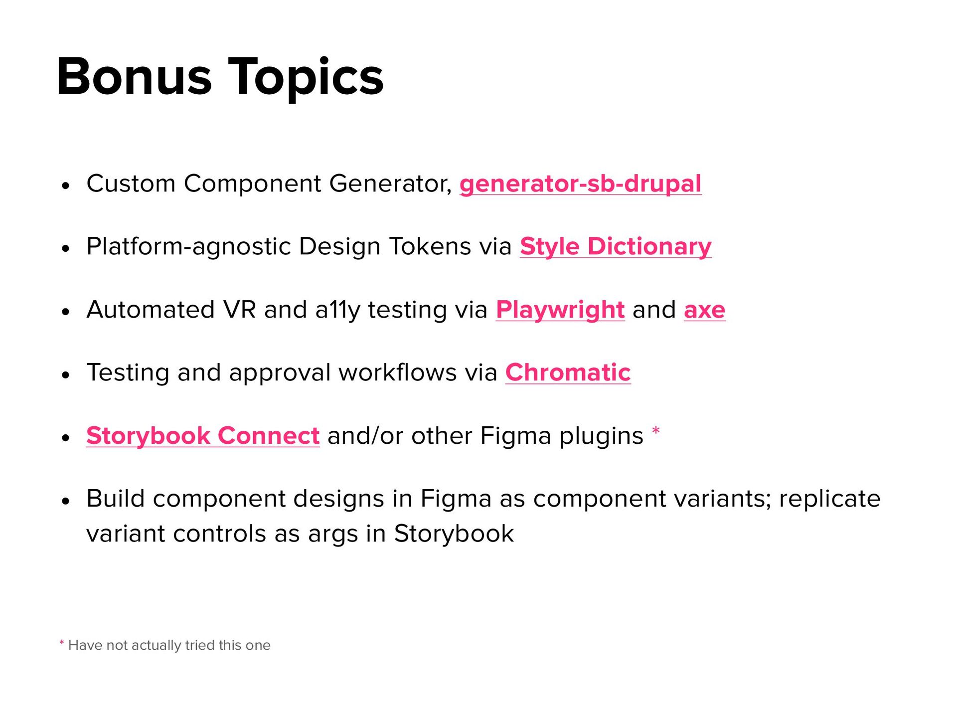
Style Dictionary • Automated VR and a11y testing via Playwright and axe • Testing and approval workflows via Chromatic • Storybook Connect and/or other Figma plugins * • Build component designs in Figma as component variants; replicate variant controls as args in Storybook Bonus Topics * Have not actually tried this one
 Your Podcast. Everywhere. Effortlessly.
 melmiller
 jct
jct
 akihiro_kokubo
 frankvandijk
 livdayseo
 nikkihalliwell
 marktimemedia
 kneath
.png) helenjbeal
helenjbeal
 ipullrank
 tammyeverts
 jmmastey
 khoart