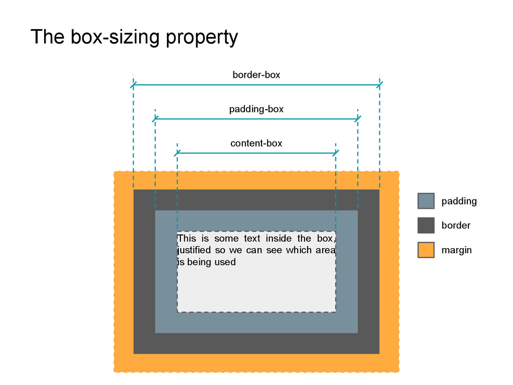
A deep understading on how Bootstrap's grid system works, presented in a trial/error way. After digging into all the tips & tricks grid systems use, it will be easier to hack it in the future.
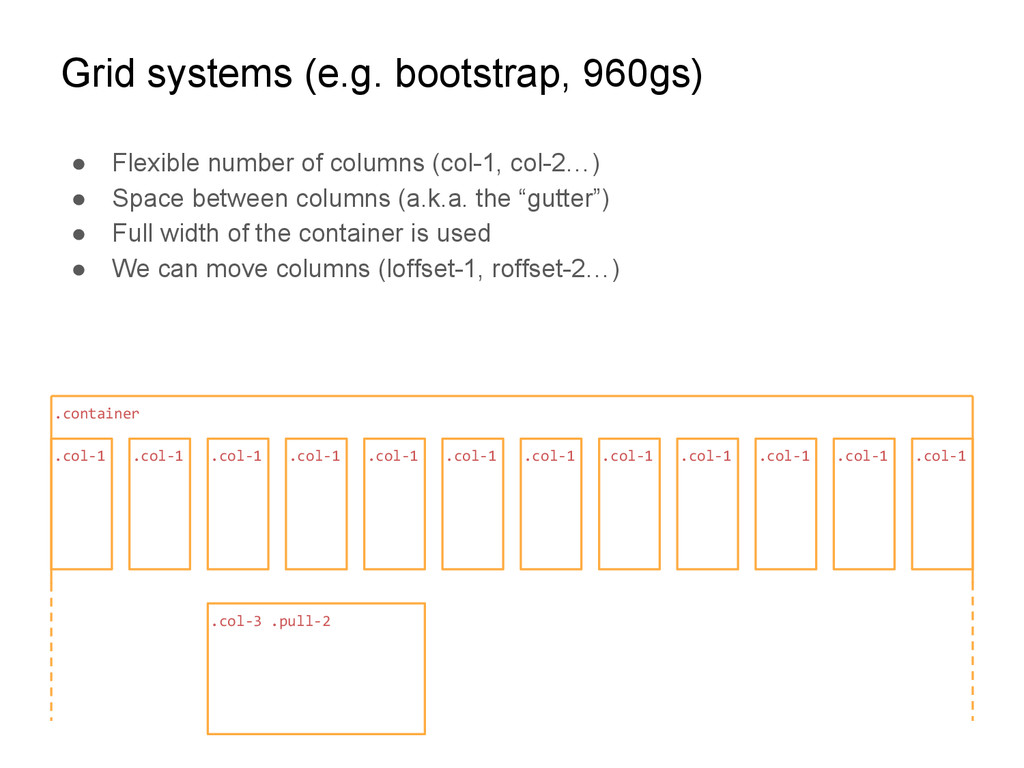
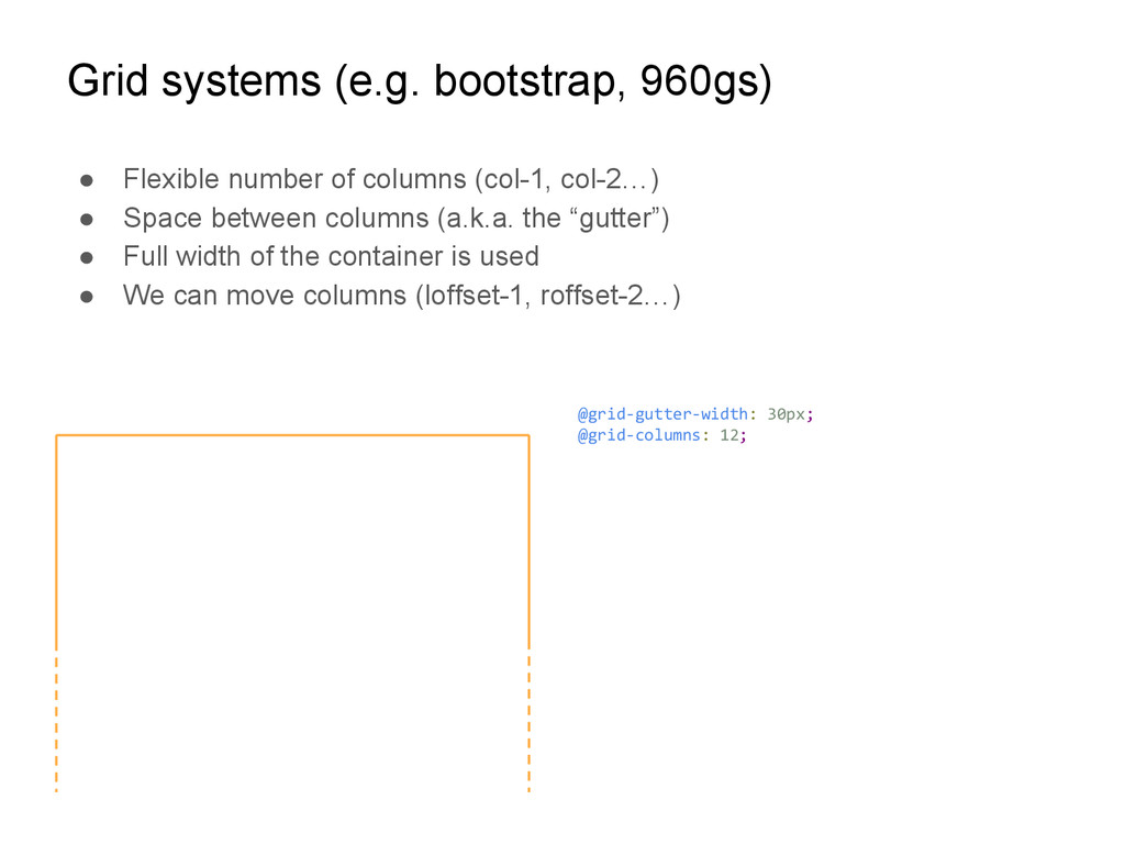
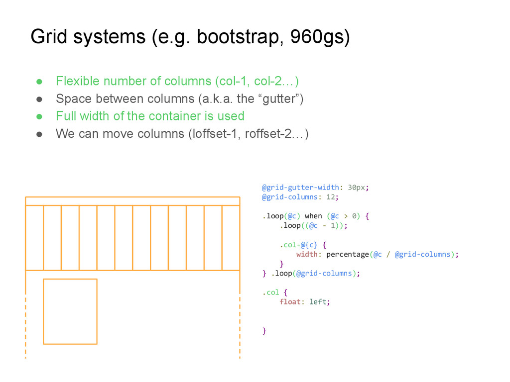
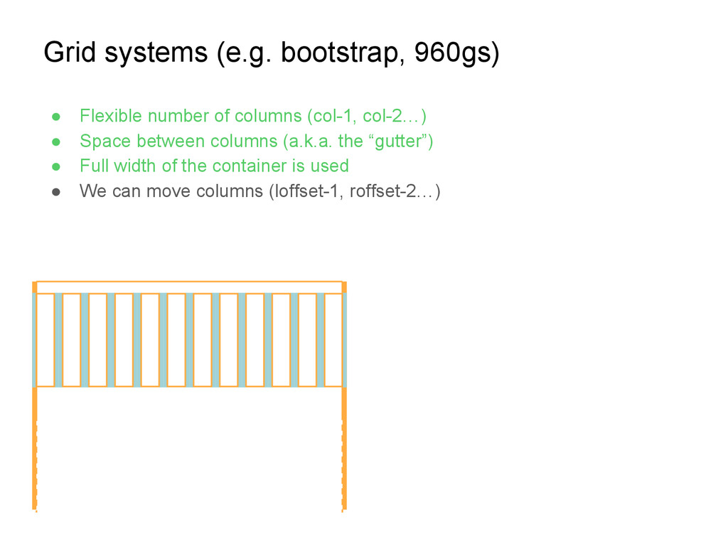
(col-1, col-2…) • Space between columns (a.k.a. the “gutter”) • Full width of the container is used • We can move columns (loffset-1, roffset-2…) .col-1 .col-1 .col-1 .col-1 .col-1 .col-1 .col-1 .col-1 .col-1 .col-1 .col-1 .col-1 .container .col-3 .pull-2
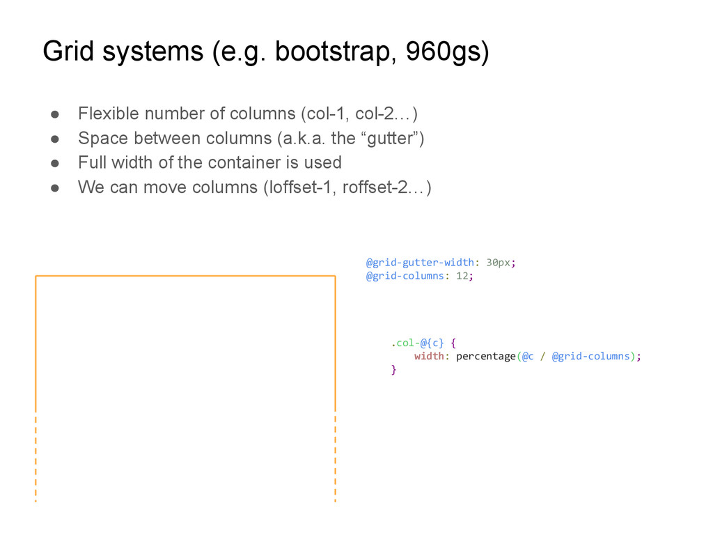
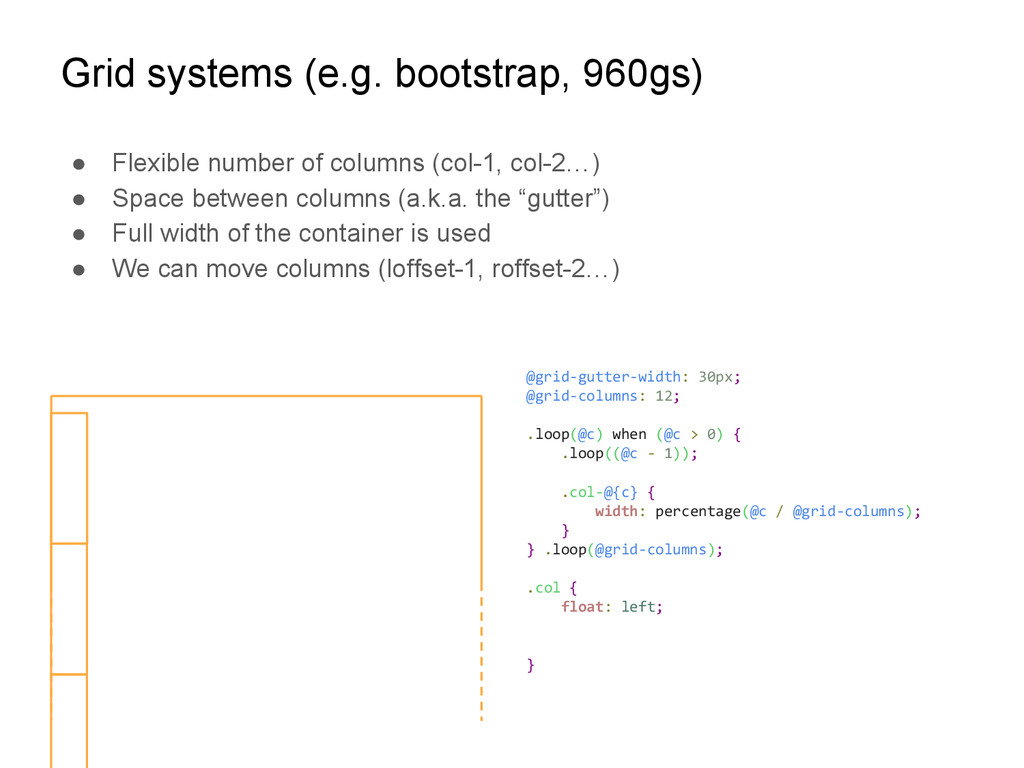
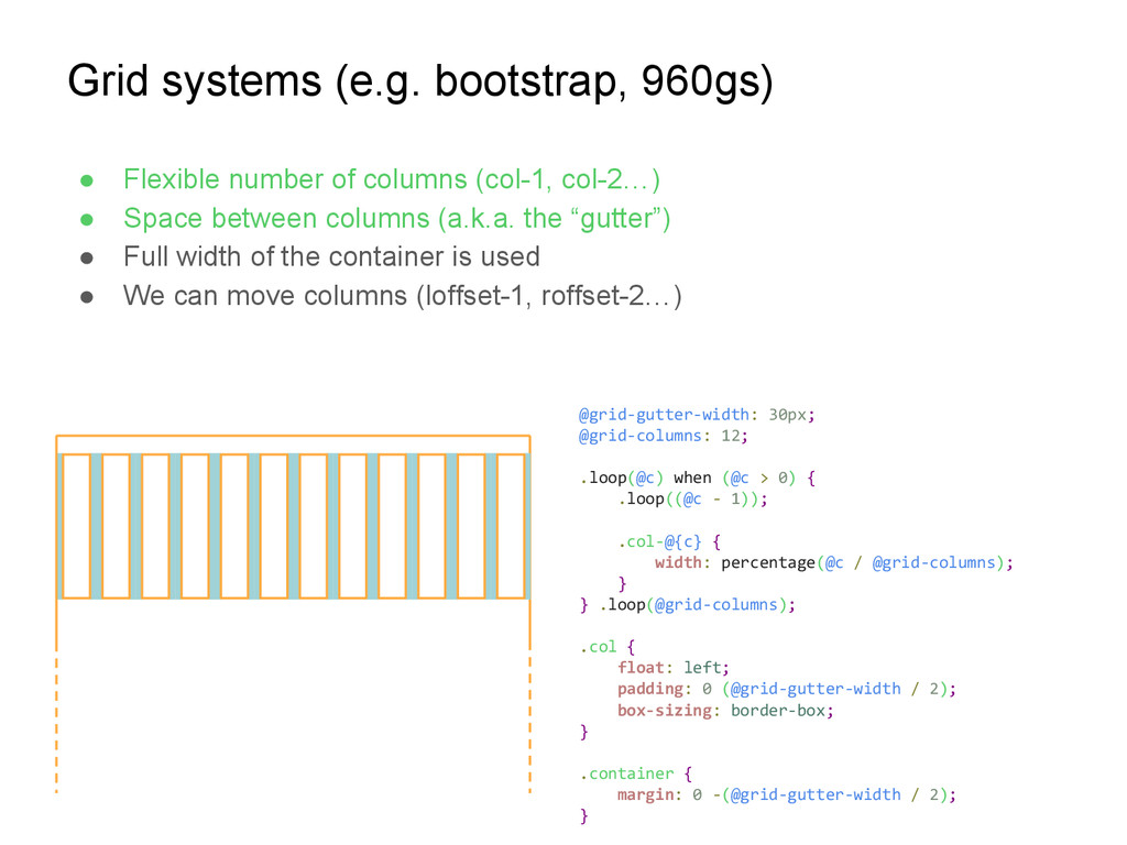
(col-1, col-2…) • Space between columns (a.k.a. the “gutter”) • Full width of the container is used • We can move columns (loffset-1, roffset-2…) @grid-gutter-width: 30px; @grid-columns: 12;
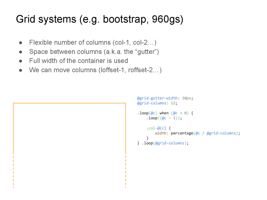
(col-1, col-2…) • Space between columns (a.k.a. the “gutter”) • Full width of the container is used • We can move columns (loffset-1, roffset-2…) @grid-gutter-width: 30px; @grid-columns: 12; .col-@{c} { width: percentage(@c / @grid-columns); }
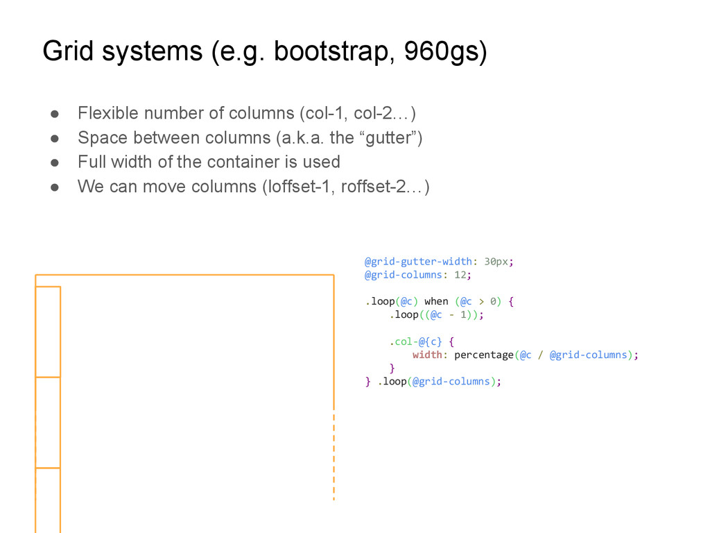
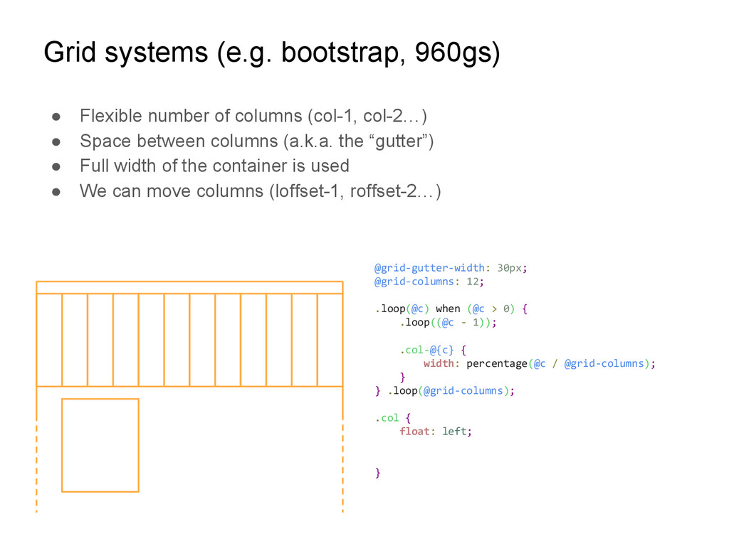
(col-1, col-2…) • Space between columns (a.k.a. the “gutter”) • Full width of the container is used • We can move columns (loffset-1, roffset-2…) @grid-gutter-width: 30px; @grid-columns: 12; .loop(@c) when (@c > 0) { .loop((@c - 1)); .col-@{c} { width: percentage(@c / @grid-columns); } } .loop(@grid-columns);
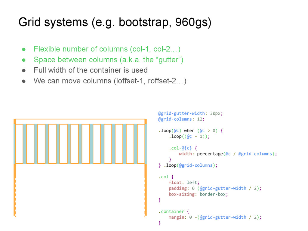
(col-1, col-2…) • Space between columns (a.k.a. the “gutter”) • Full width of the container is used • We can move columns (loffset-1, roffset-2…) @grid-gutter-width: 30px; @grid-columns: 12; .loop(@c) when (@c > 0) { .loop((@c - 1)); .col-@{c} { width: percentage(@c / @grid-columns); } } .loop(@grid-columns);
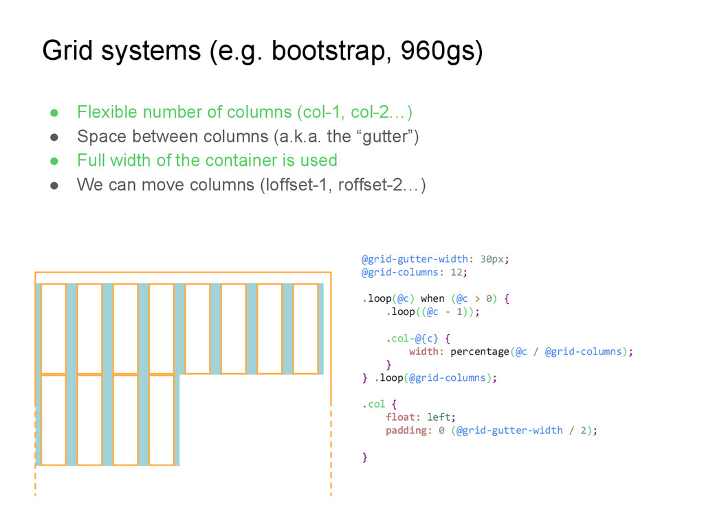
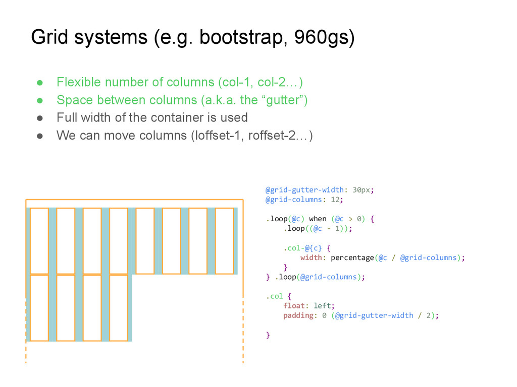
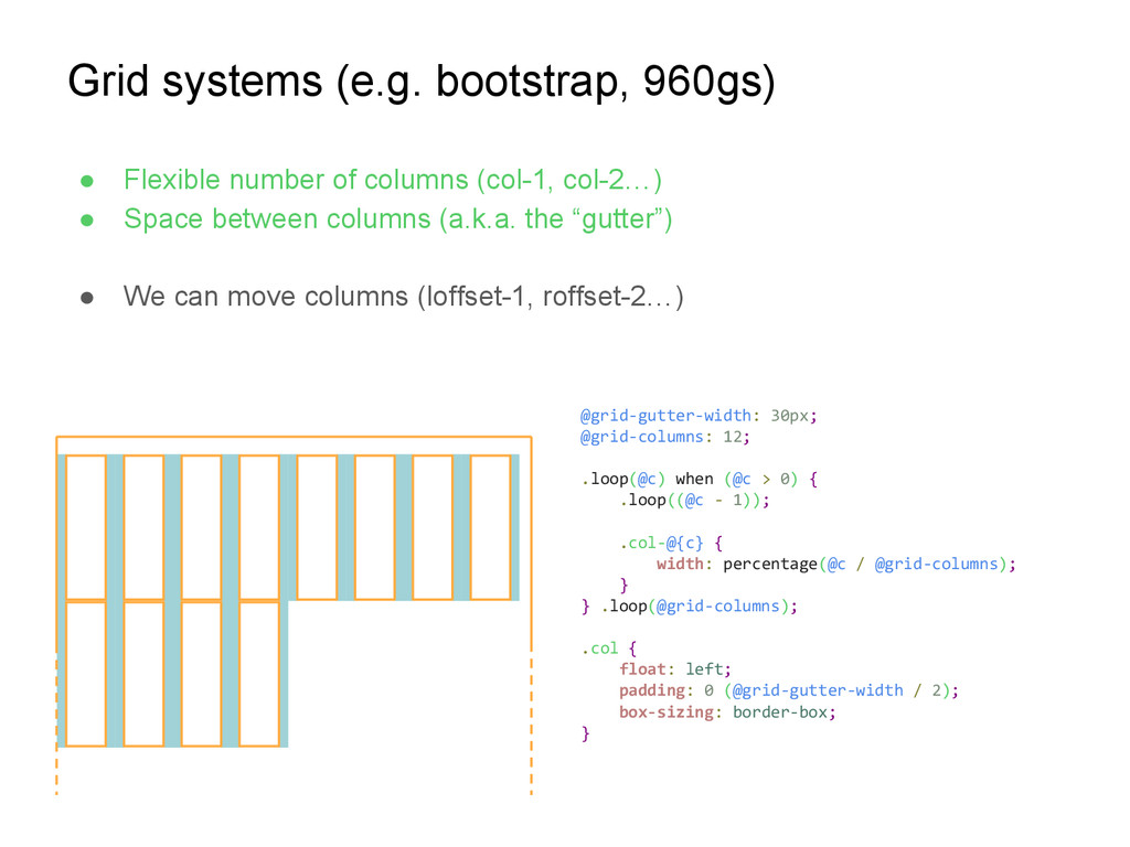
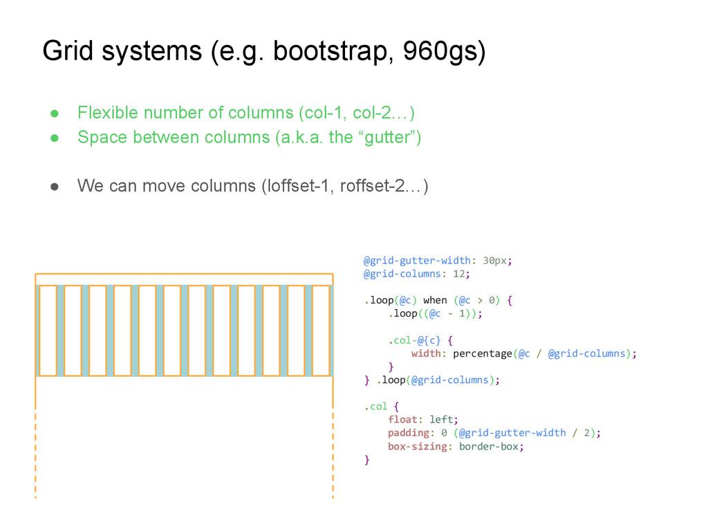
(col-1, col-2…) • Space between columns (a.k.a. the “gutter”) • Full width of the container is used • We can move columns (loffset-1, roffset-2…) @grid-gutter-width: 30px; @grid-columns: 12; .loop(@c) when (@c > 0) { .loop((@c - 1)); .col-@{c} { width: percentage(@c / @grid-columns); } } .loop(@grid-columns); .col { float: left; }
(col-1, col-2…) • Space between columns (a.k.a. the “gutter”) • Full width of the container is used • We can move columns (loffset-1, roffset-2…) @grid-gutter-width: 30px; @grid-columns: 12; .loop(@c) when (@c > 0) { .loop((@c - 1)); .col-@{c} { width: percentage(@c / @grid-columns); } } .loop(@grid-columns); .col { float: left; }
(col-1, col-2…) • Space between columns (a.k.a. the “gutter”) • Full width of the container is used • We can move columns (loffset-1, roffset-2…) @grid-gutter-width: 30px; @grid-columns: 12; .loop(@c) when (@c > 0) { .loop((@c - 1)); .col-@{c} { width: percentage(@c / @grid-columns); } } .loop(@grid-columns); .col { float: left; }
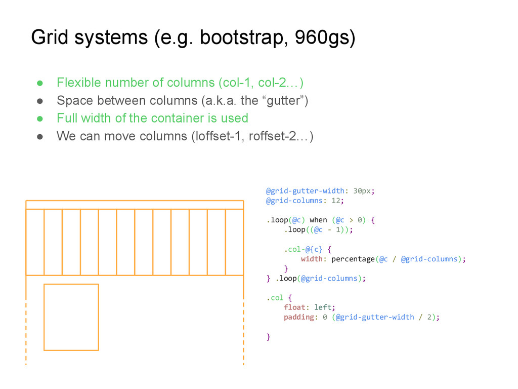
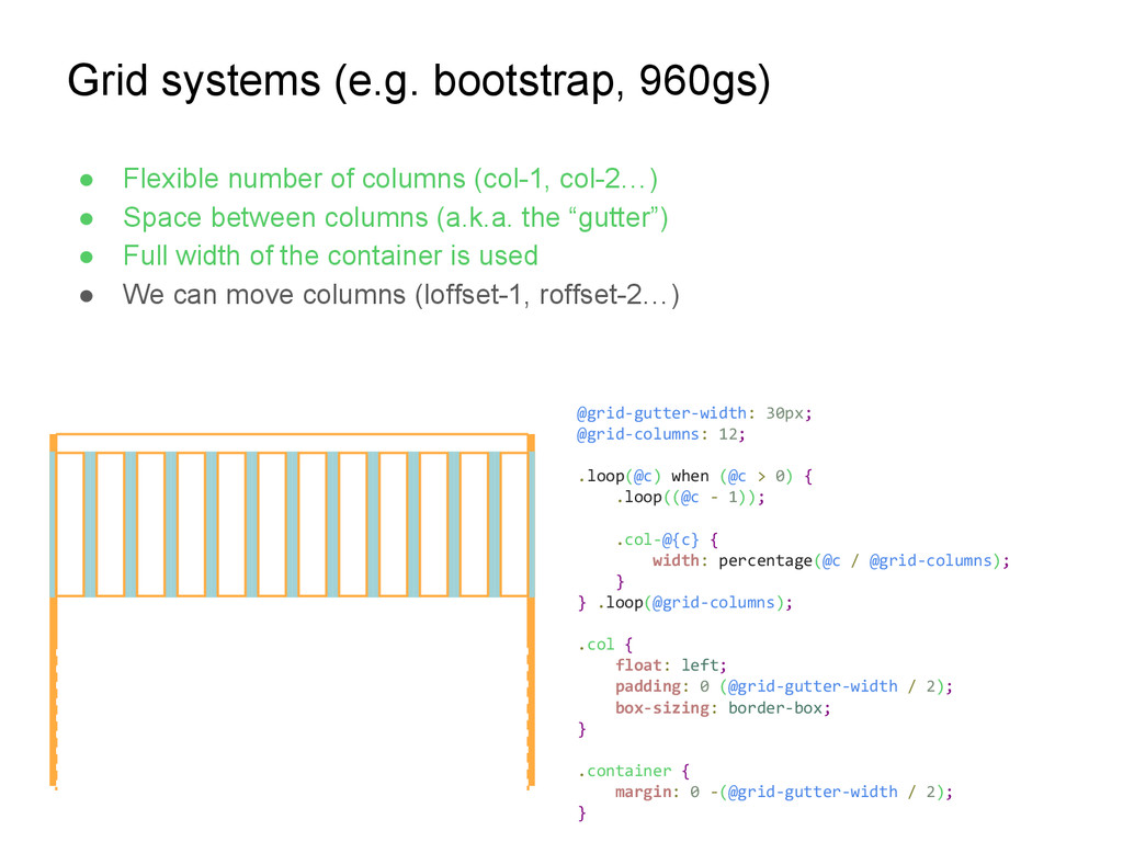
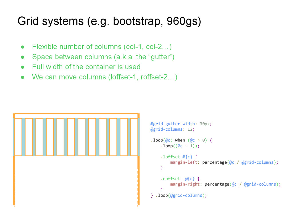
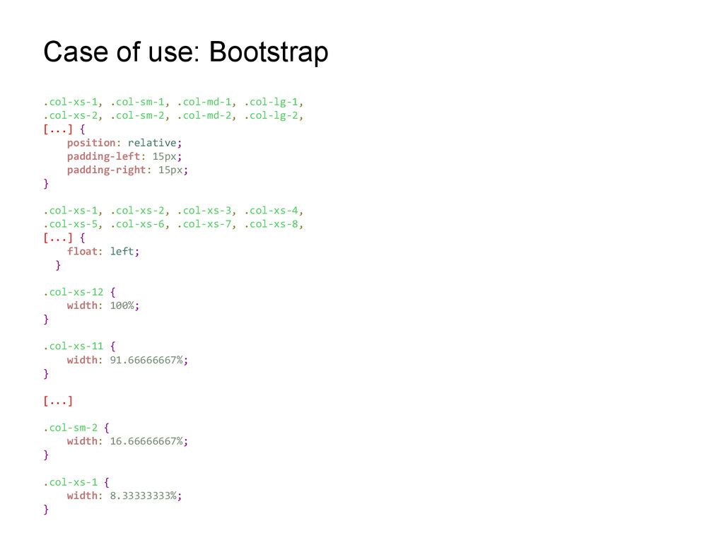
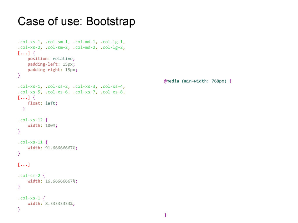
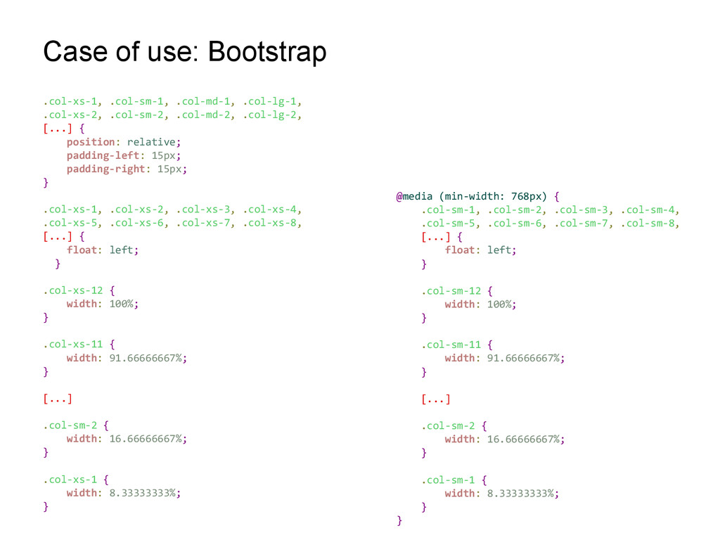
(col-1, col-2…) • Space between columns (a.k.a. the “gutter”) • Full width of the container is used • We can move columns (loffset-1, roffset-2…) @grid-gutter-width: 30px; @grid-columns: 12; .loop(@c) when (@c > 0) { .loop((@c - 1)); .loffset-@{c} { margin-left: percentage(@c / @grid-columns); } .roffset--@{c} { margin-right: percentage(@c / @grid-columns); } } .loop(@grid-columns);
 mjesun
 ioki
ioki
 andpad
 danielsogl
 contour_gara
 ming_ayami
 jnchito
 nagise
 simotin13
 kn_to_maxpno
 manfredsteyer
 har1101
 x5gtrn
 kristinabergwall1
 ianozsvald
 shlominoach
 katarinadahlin
 akademiya2063
 erikaheidi
 deanohume
 madoxten
 rocio
rocio
 jonoalderson
 ipullrank
 mongodb