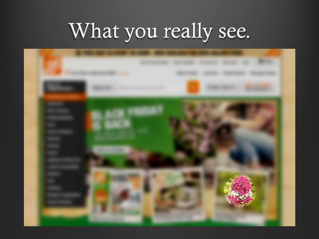
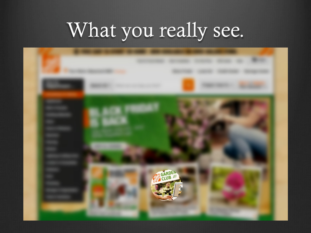
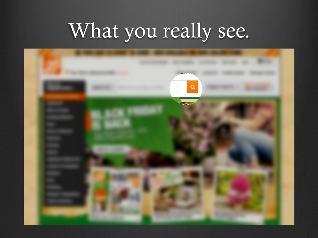
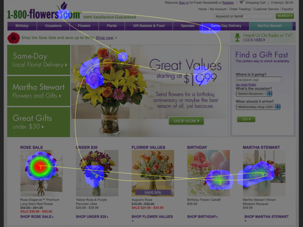
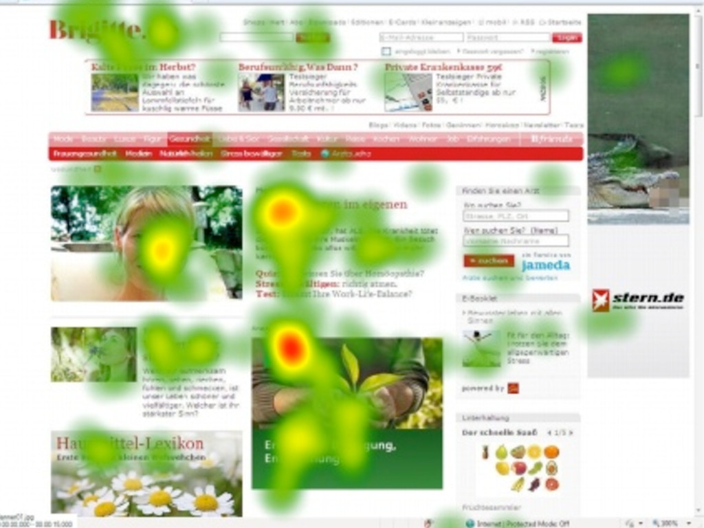
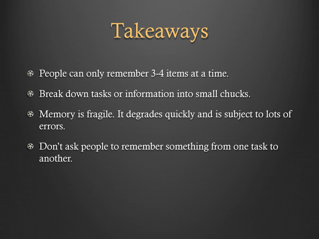
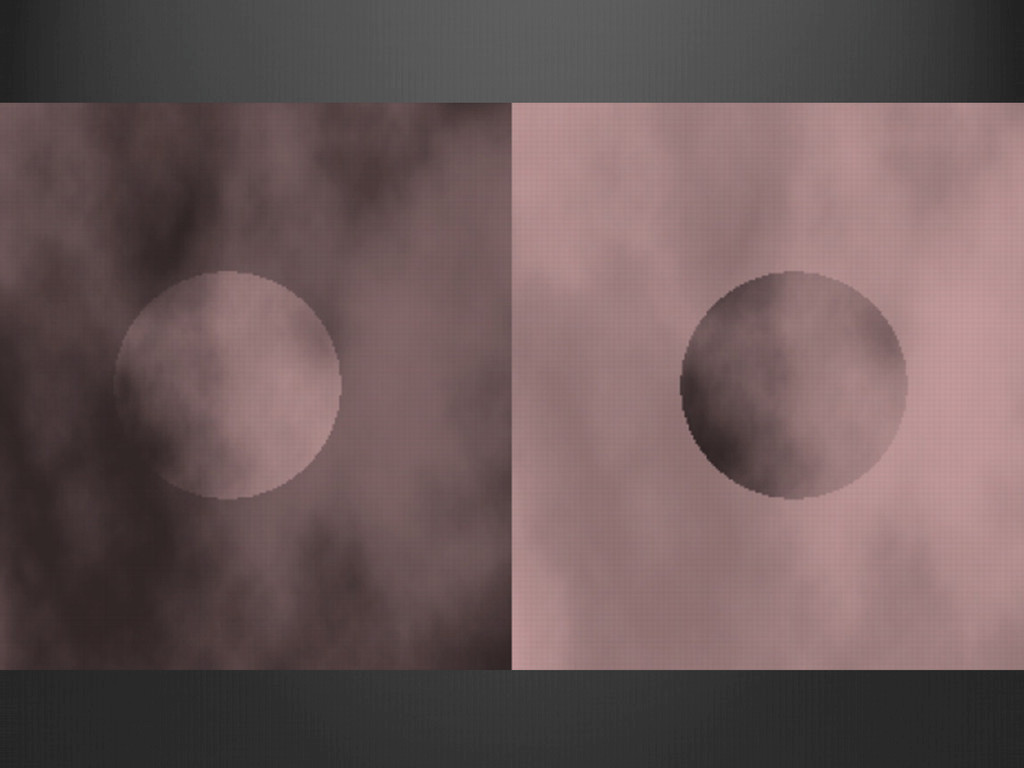
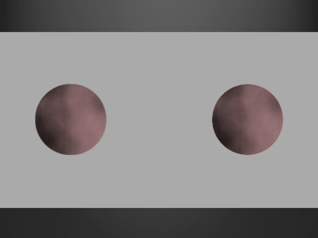
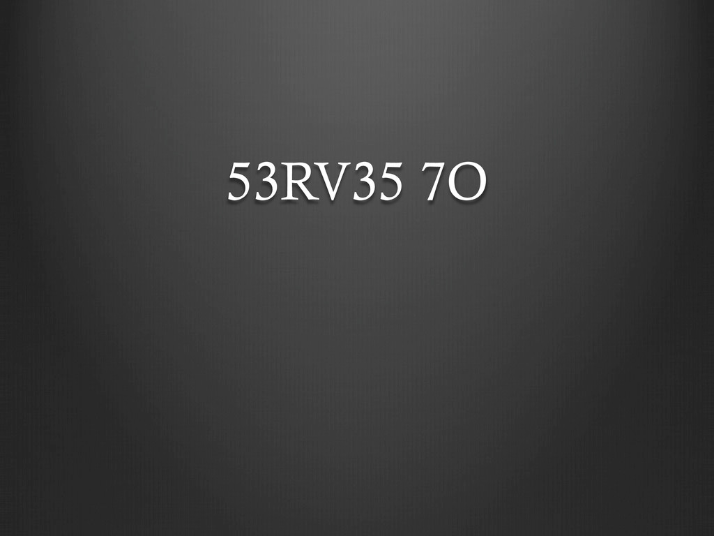
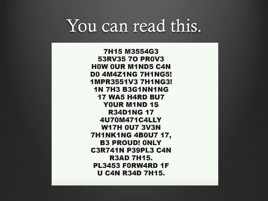
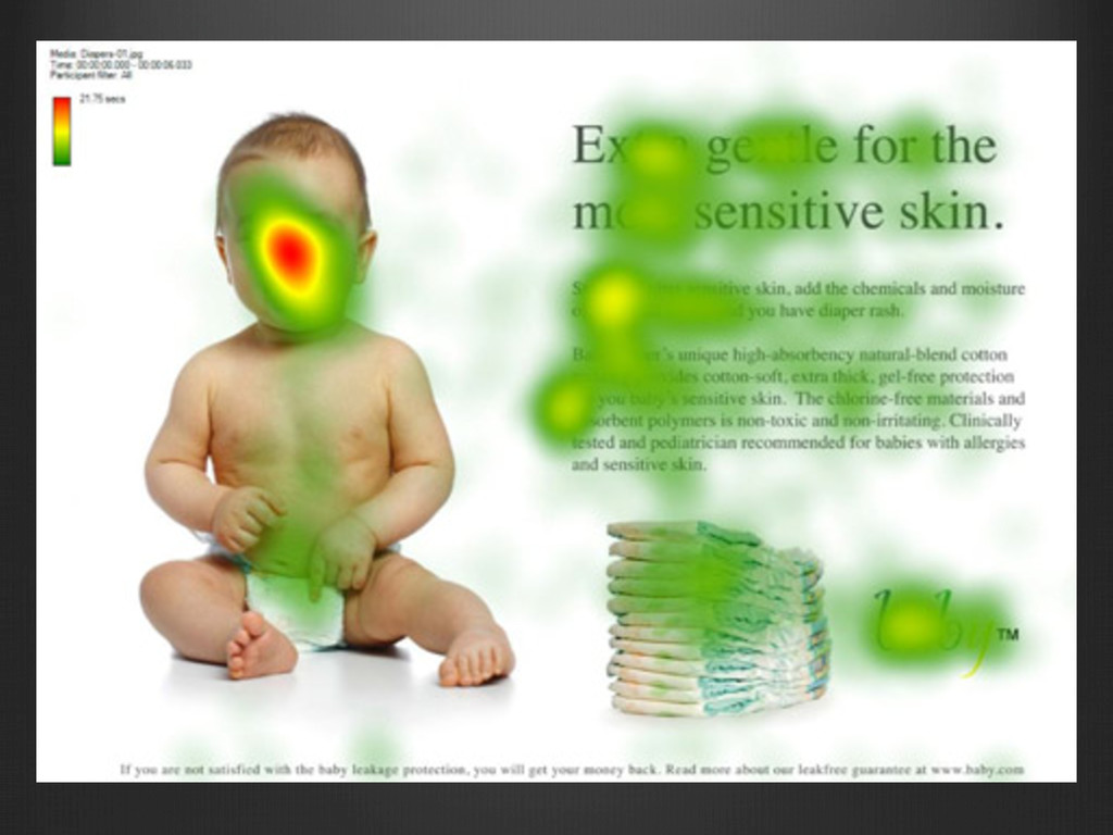
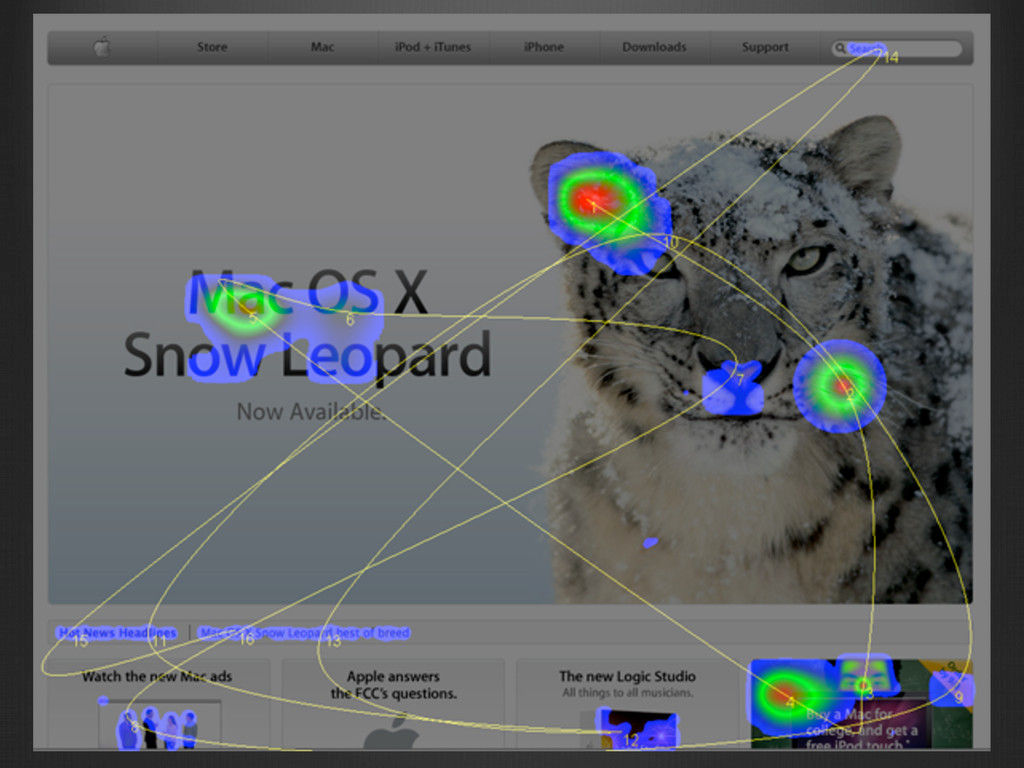
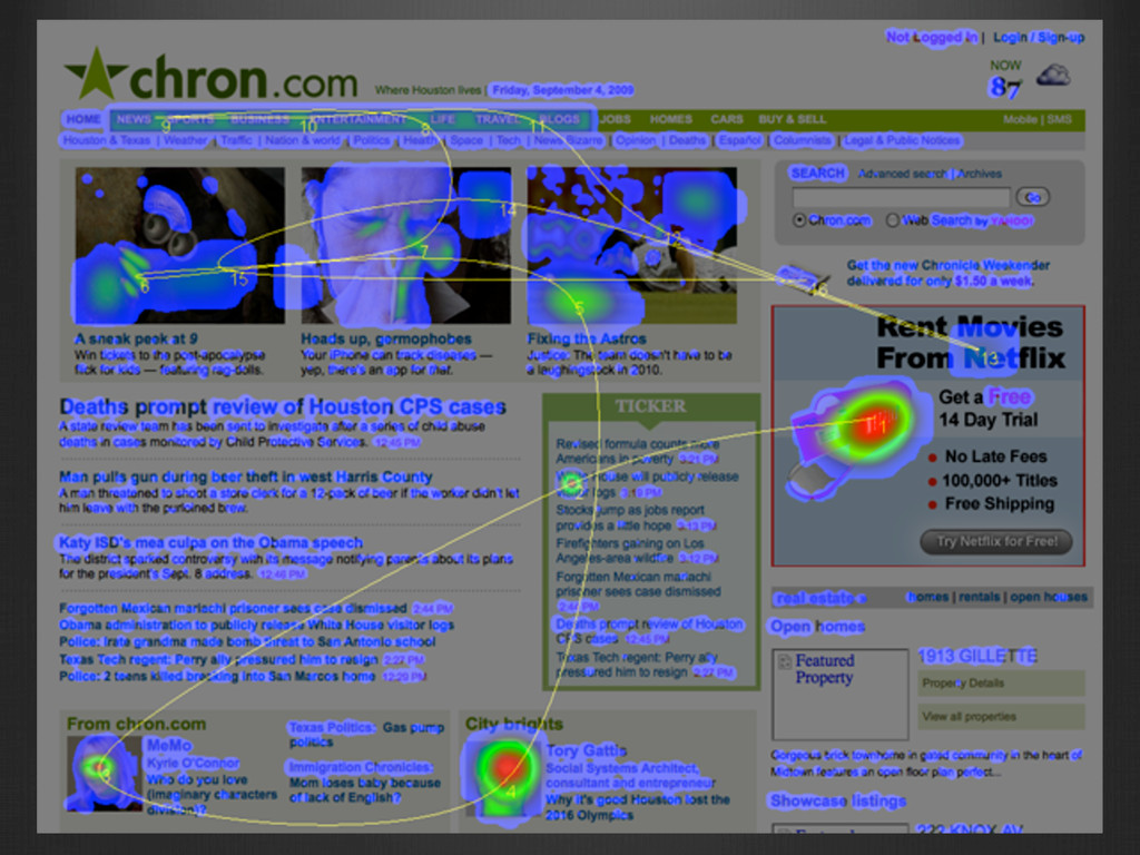
Take a journey into the darkness of the human mind. Have you ever wonder why users do what they do? Why they don’t see instructions or why they have such a hard time filling out a form? Learn about the real science and research that is used to study human behavior and how that research informs good UI design. Gain a whole new understanding of how humans see and how the brain processes information. This session will give practical and simple examples to help you improve your UI designs and the reasons behind it.