Upgrade to Pro — share decks privately, control downloads, hide ads and more …

Engineering Beautiful and Accessible Text

Engineering Beautiful and Accessible Text

AppDevCon
24 June 2022

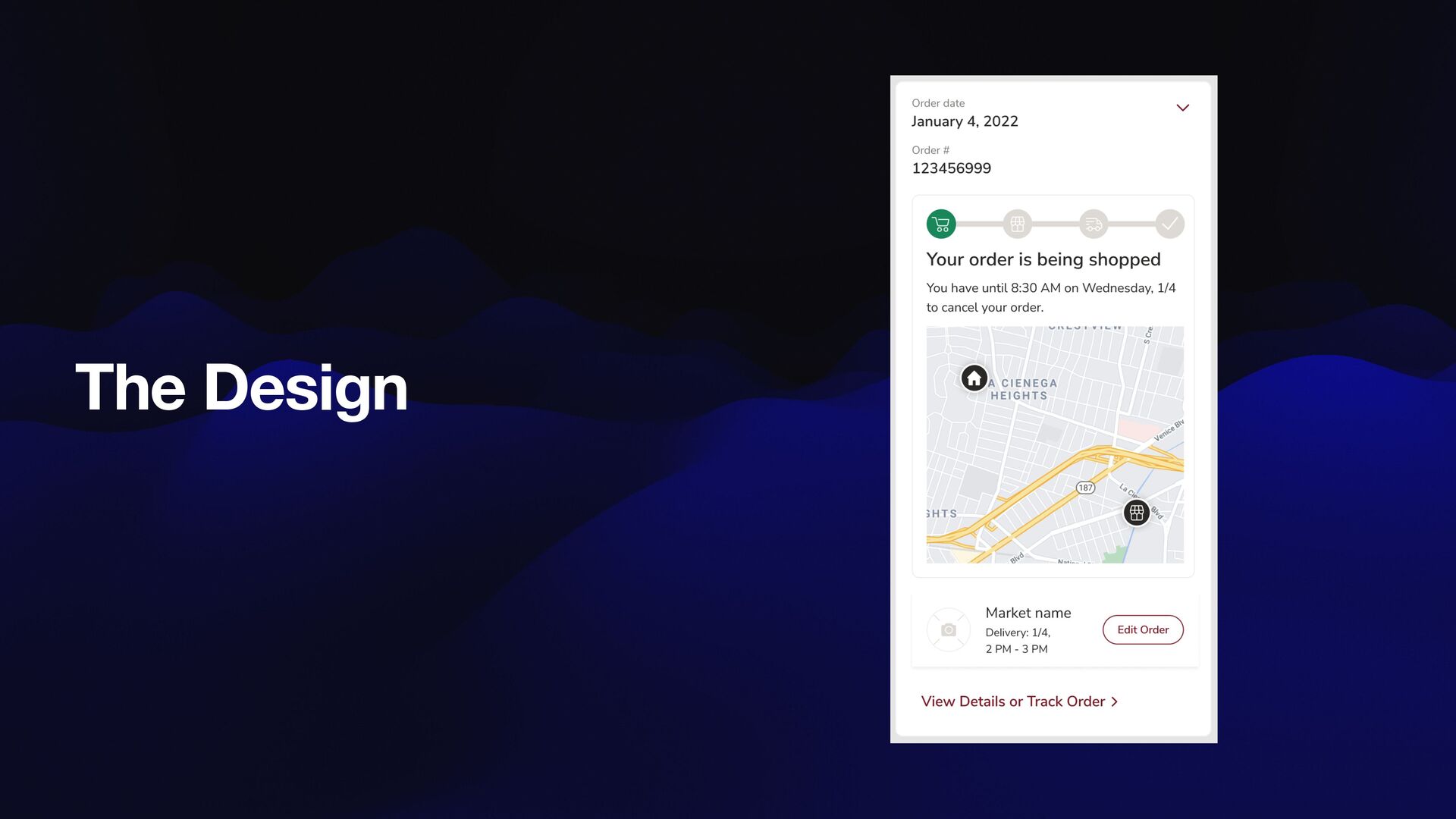
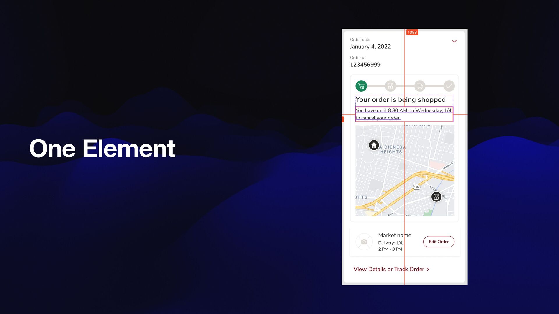
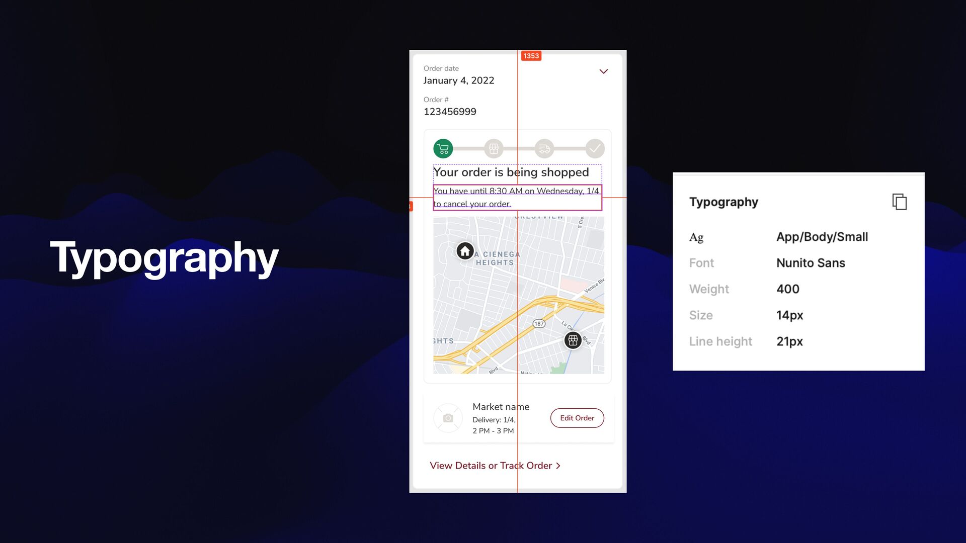
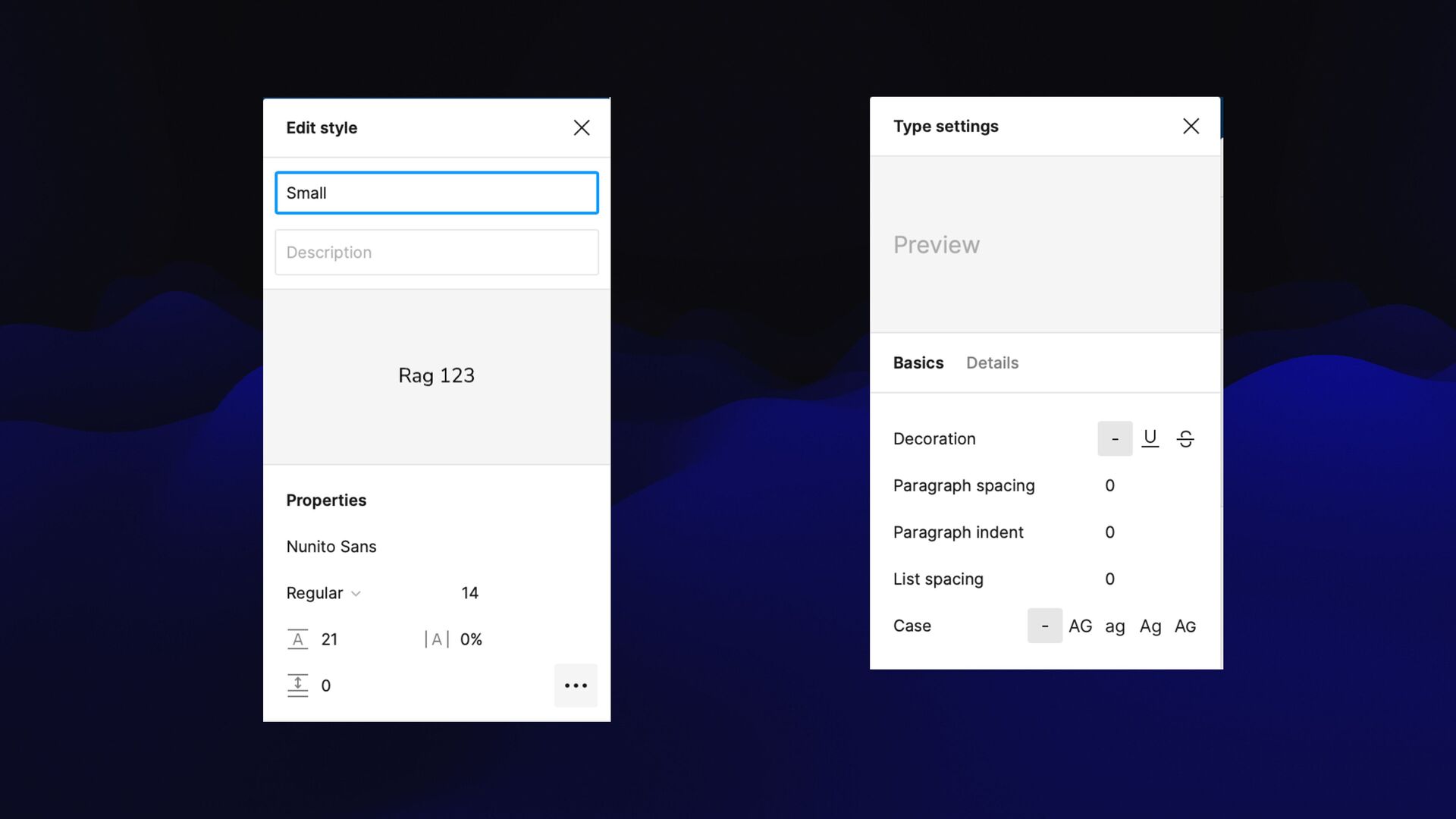
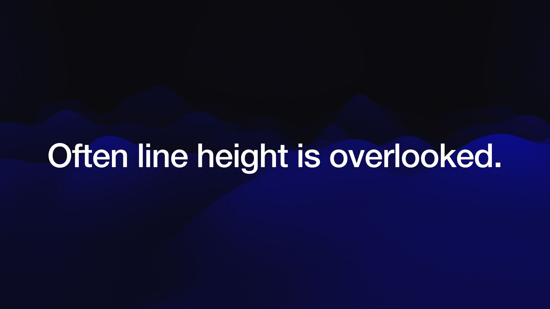
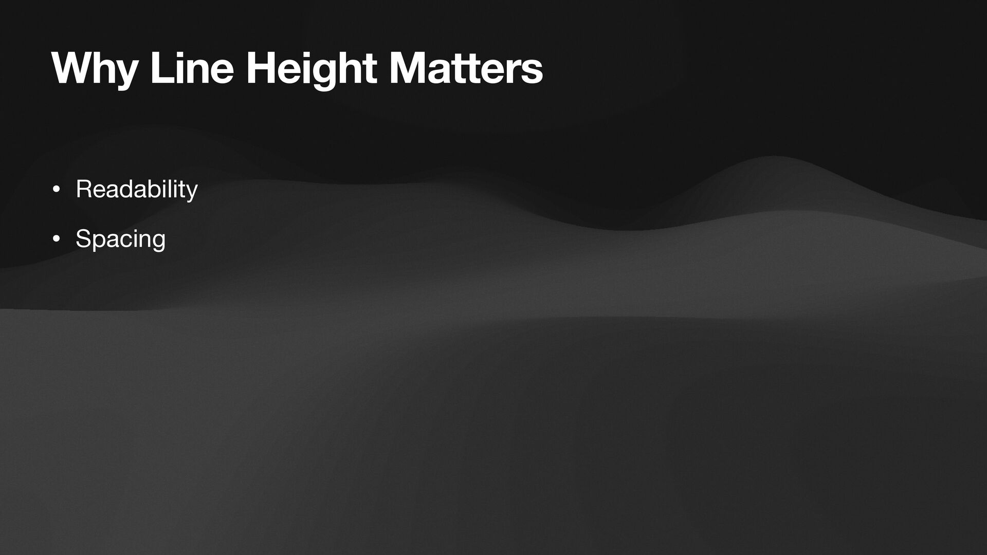
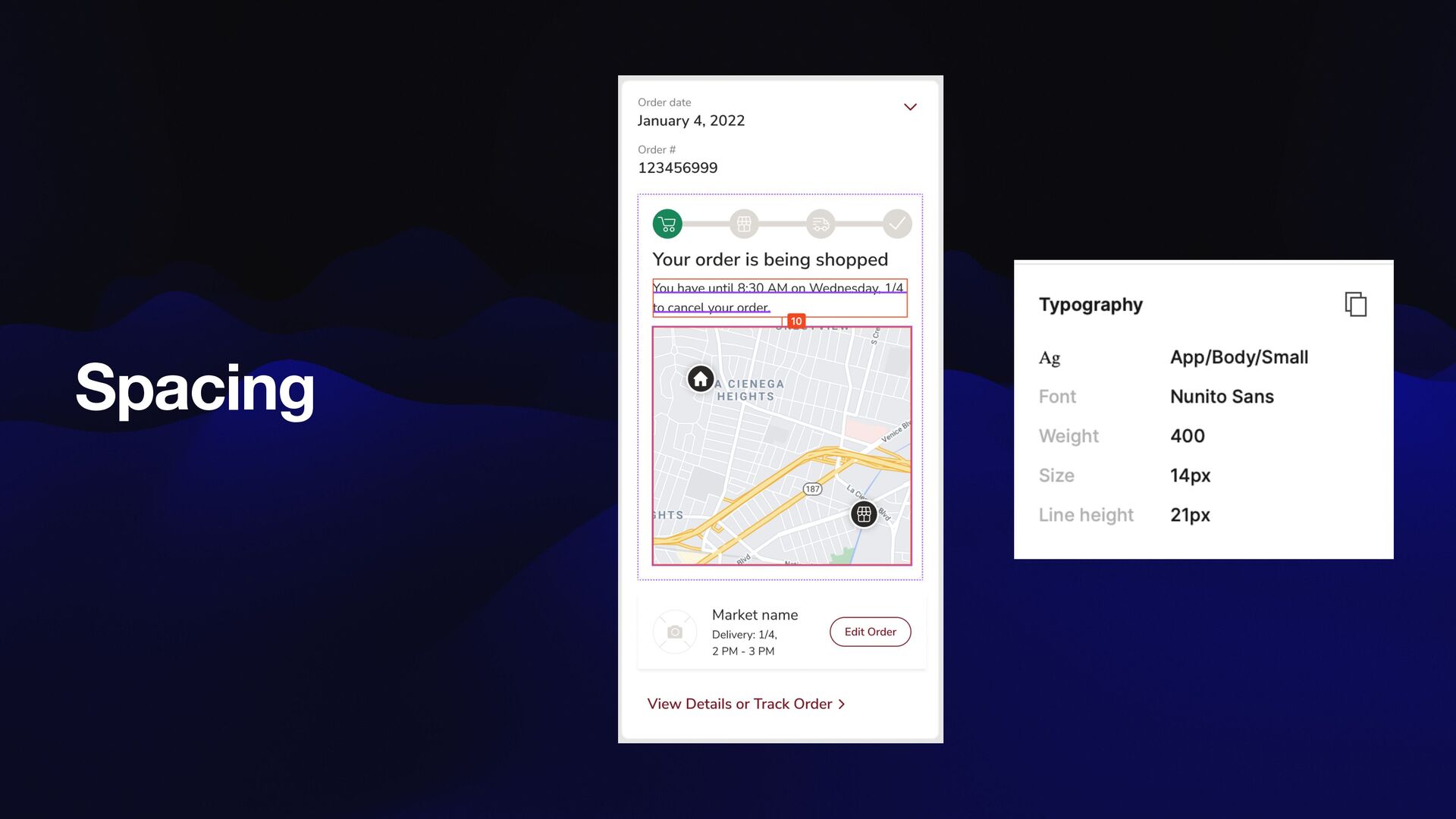
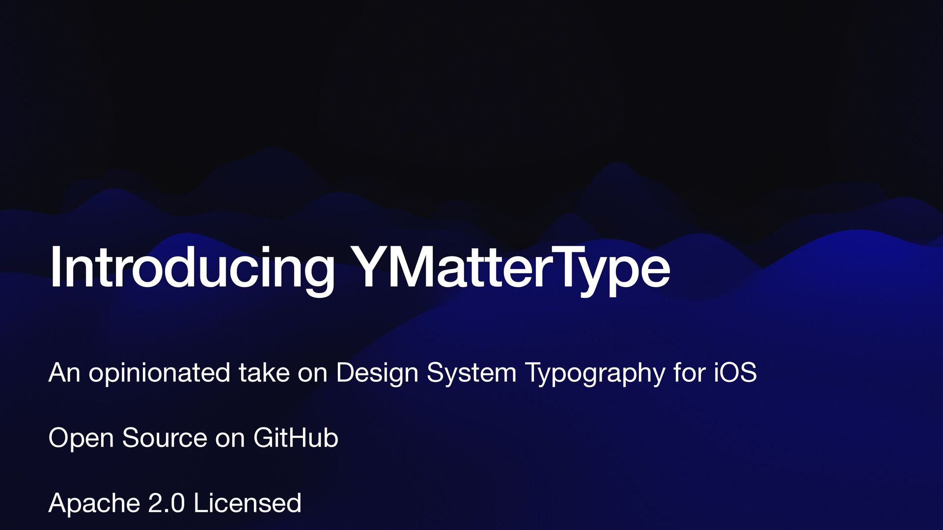
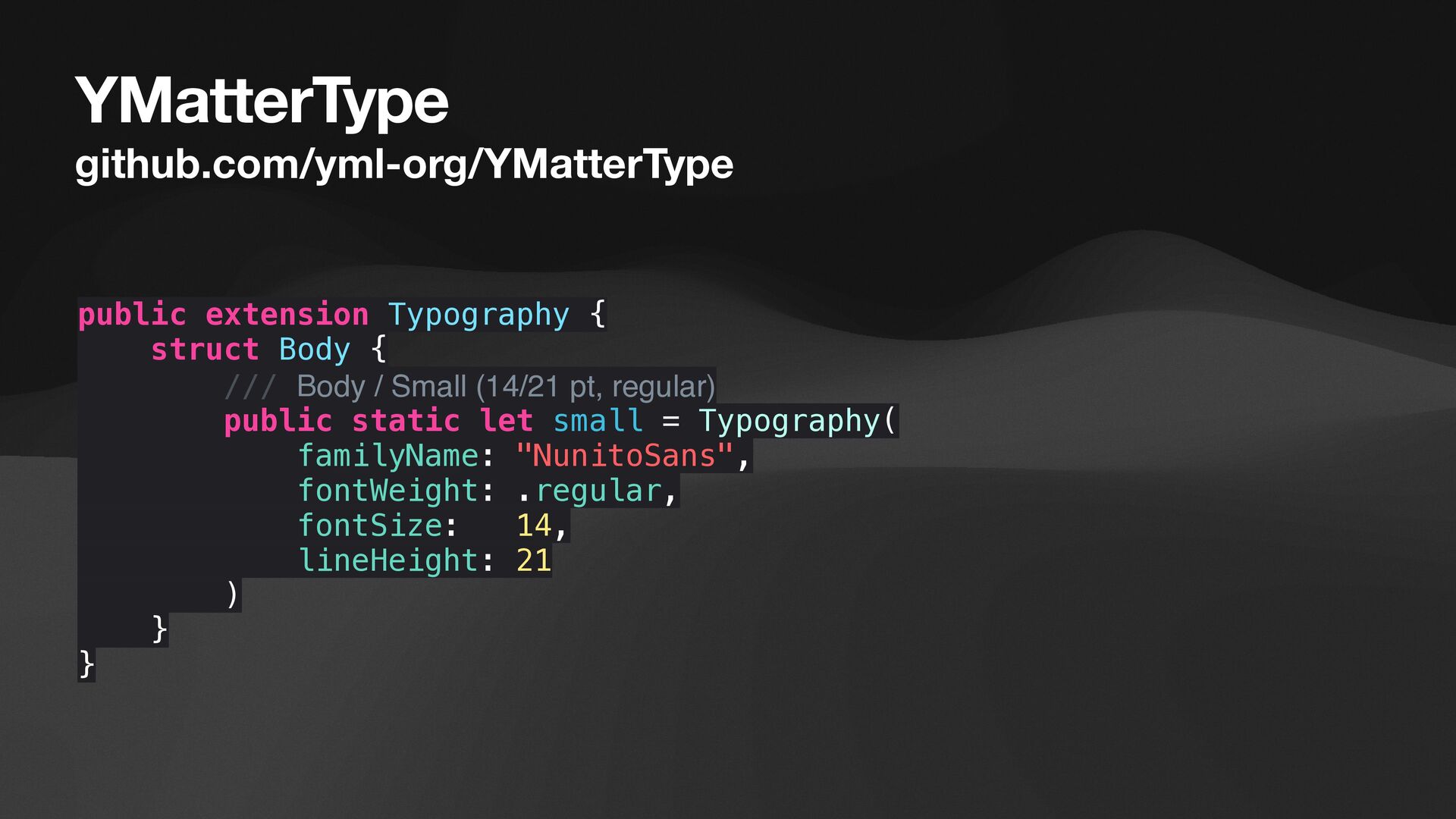
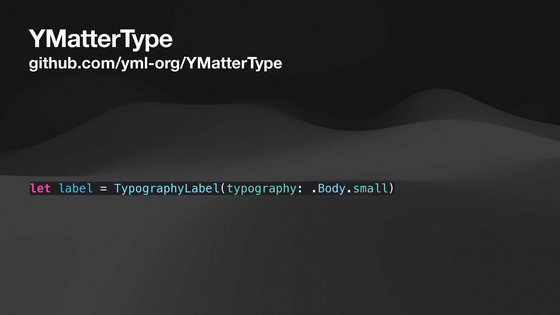
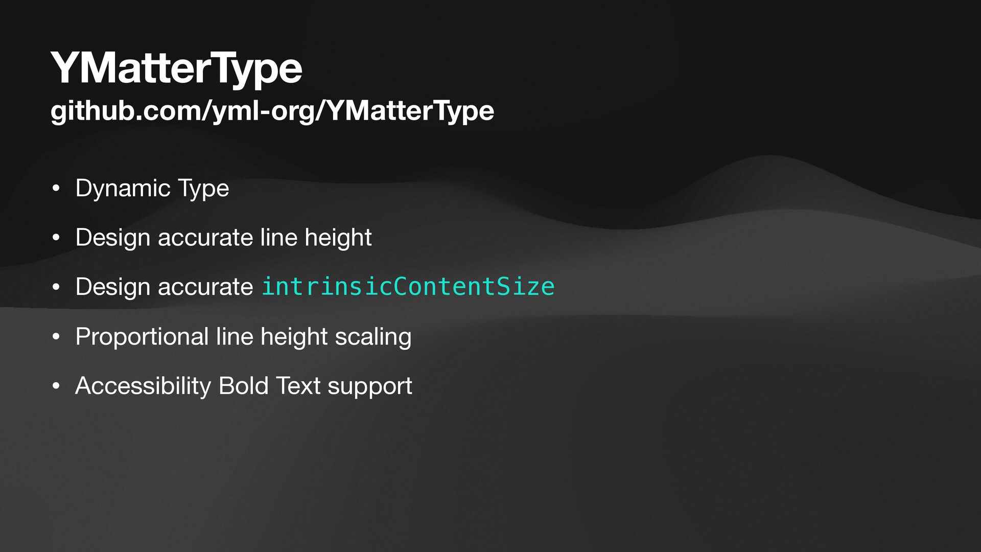
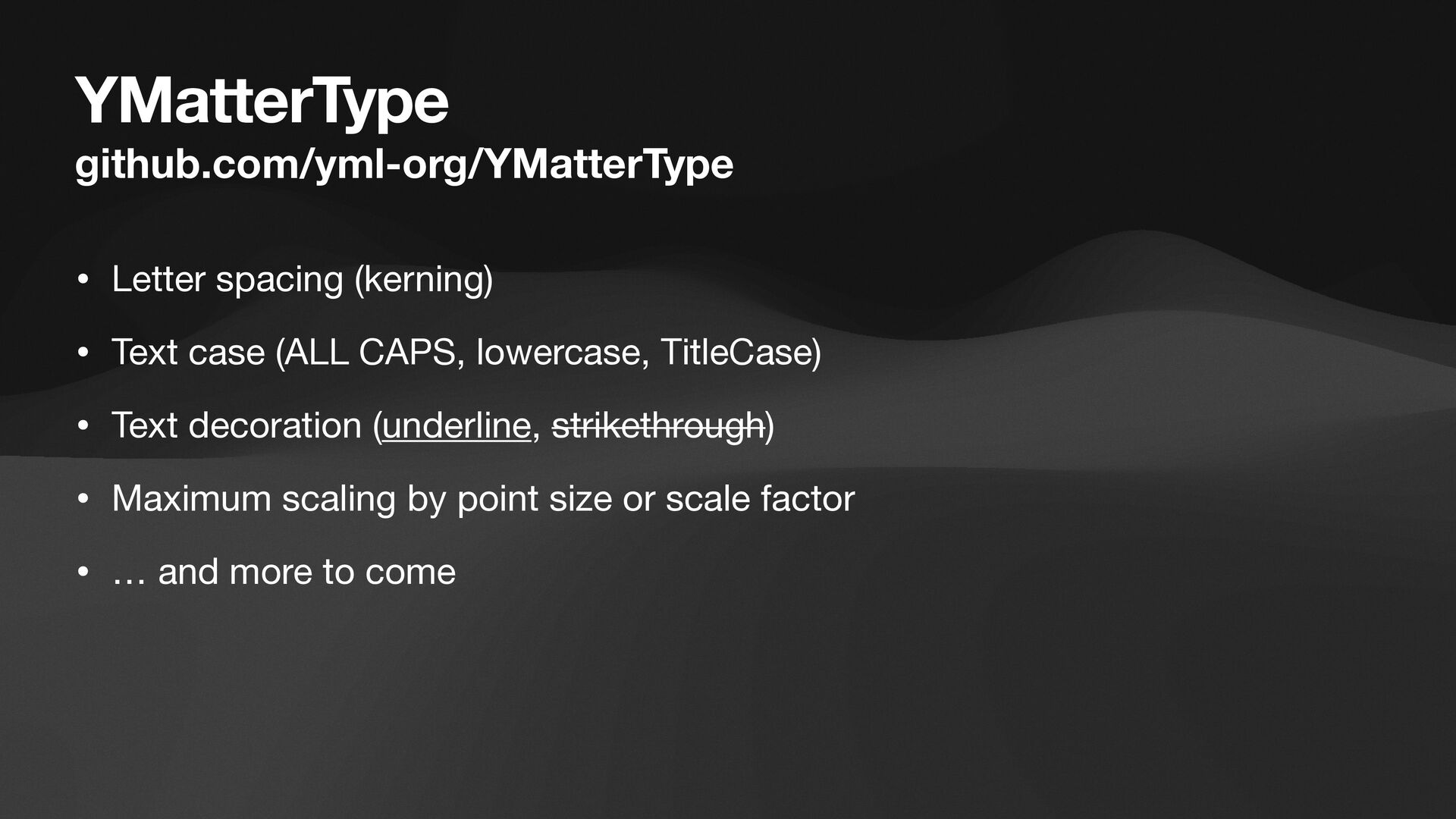
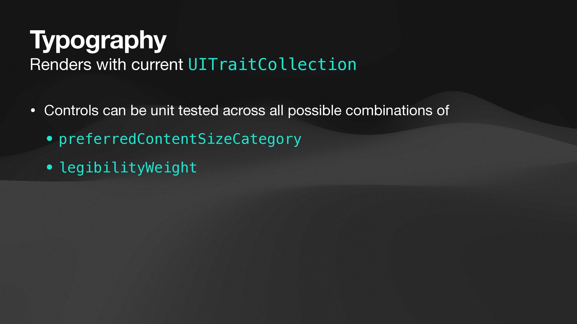
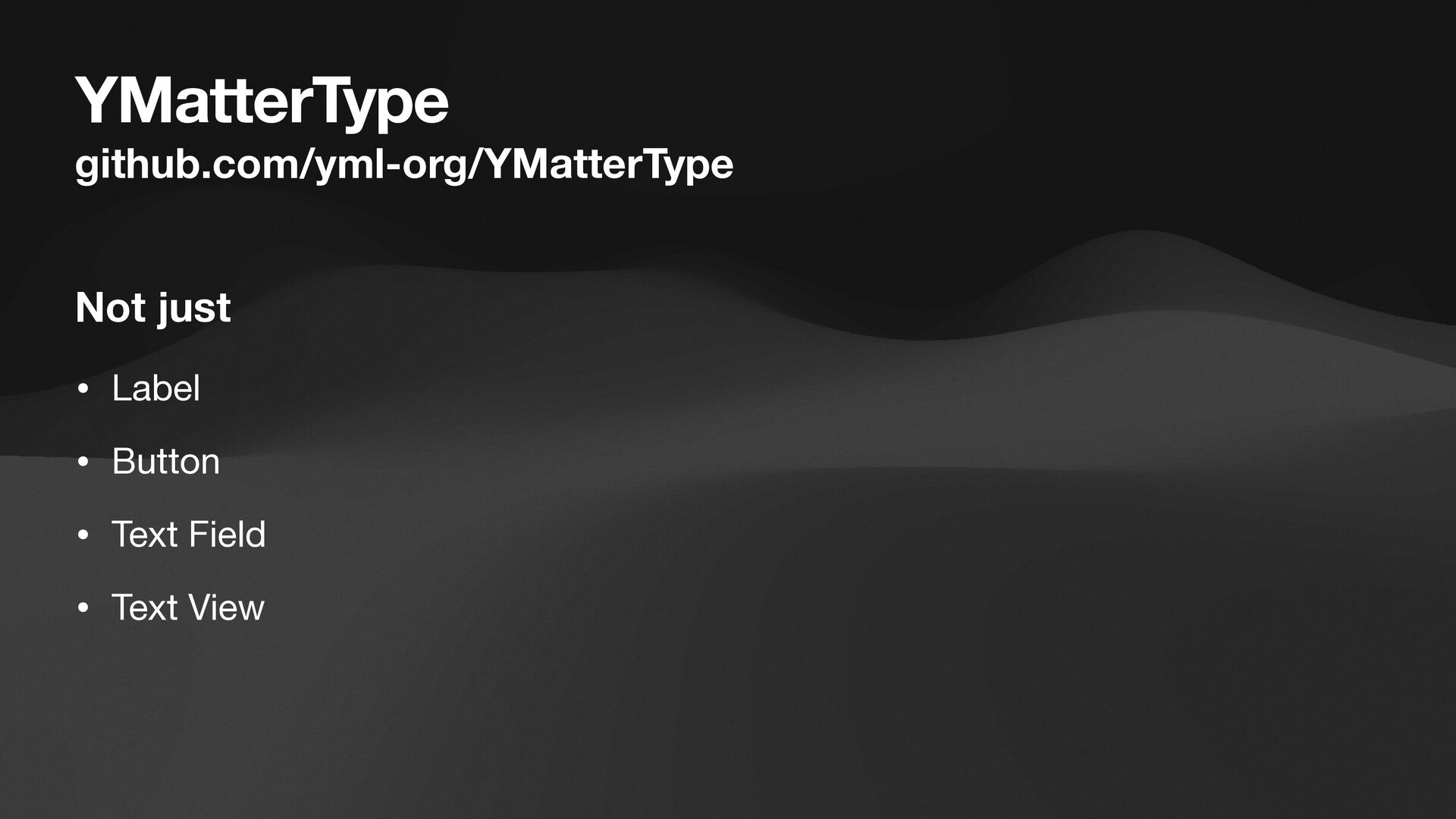
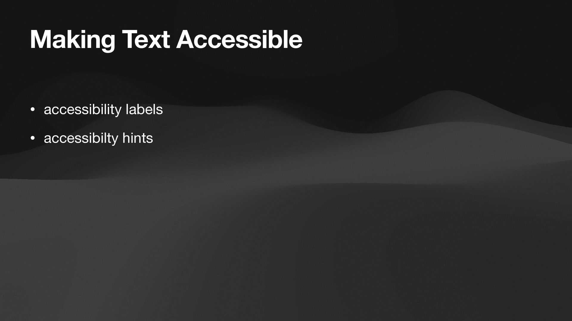
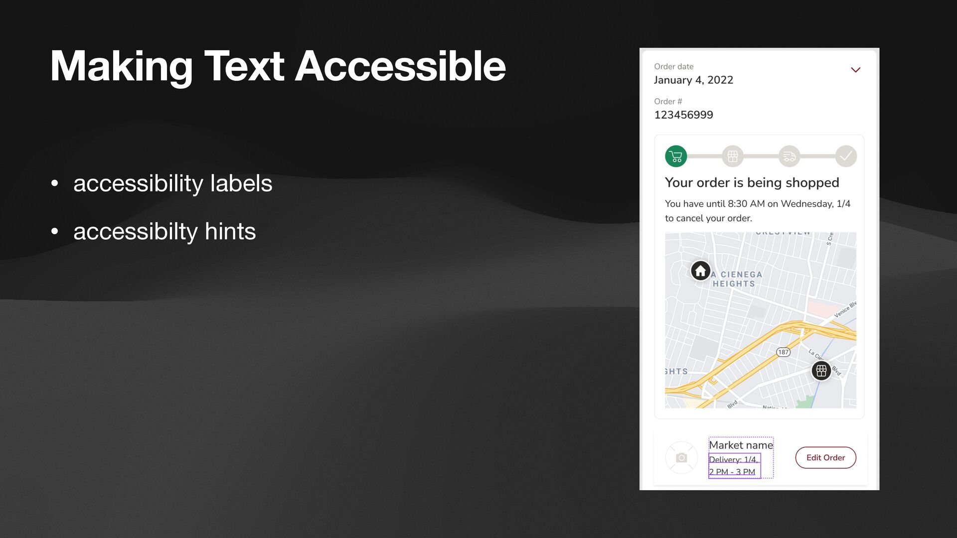
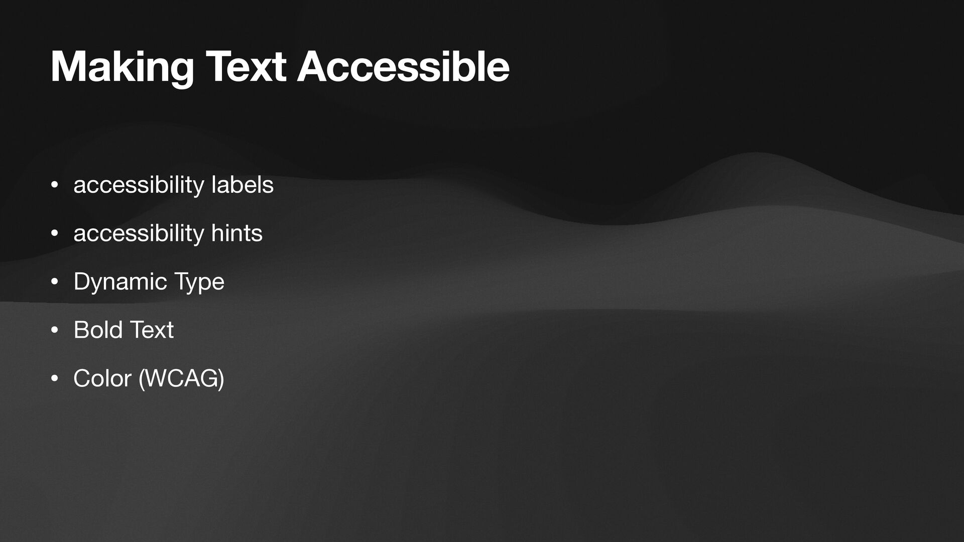
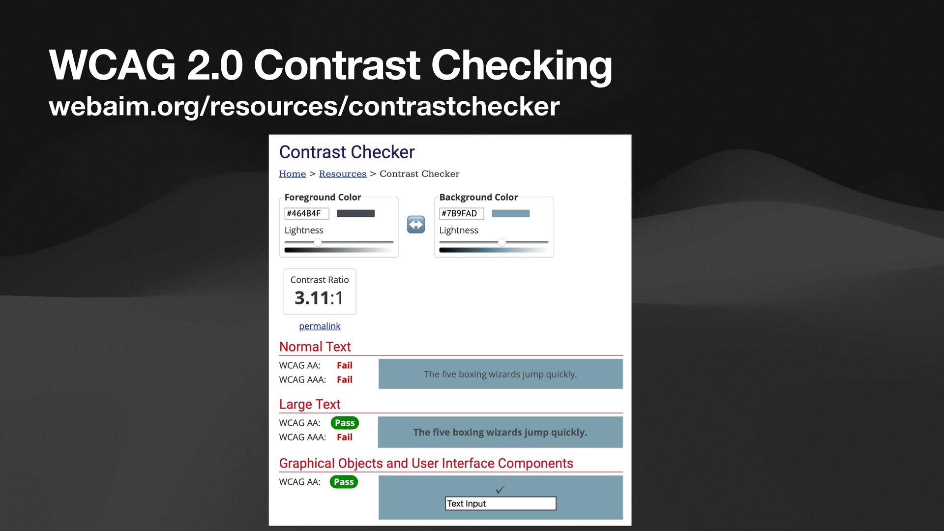
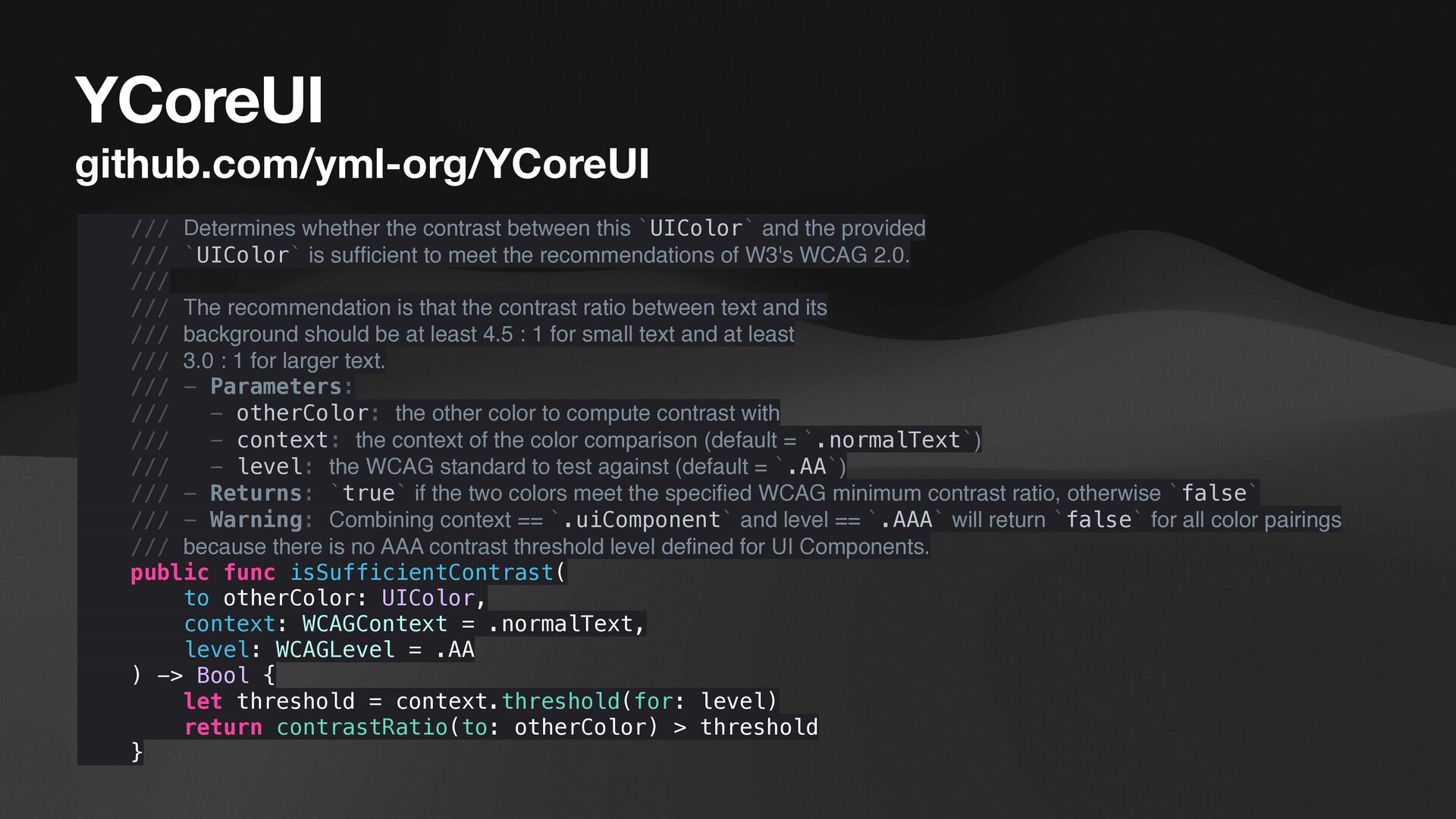
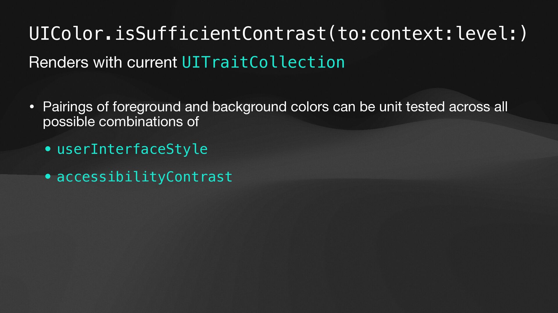
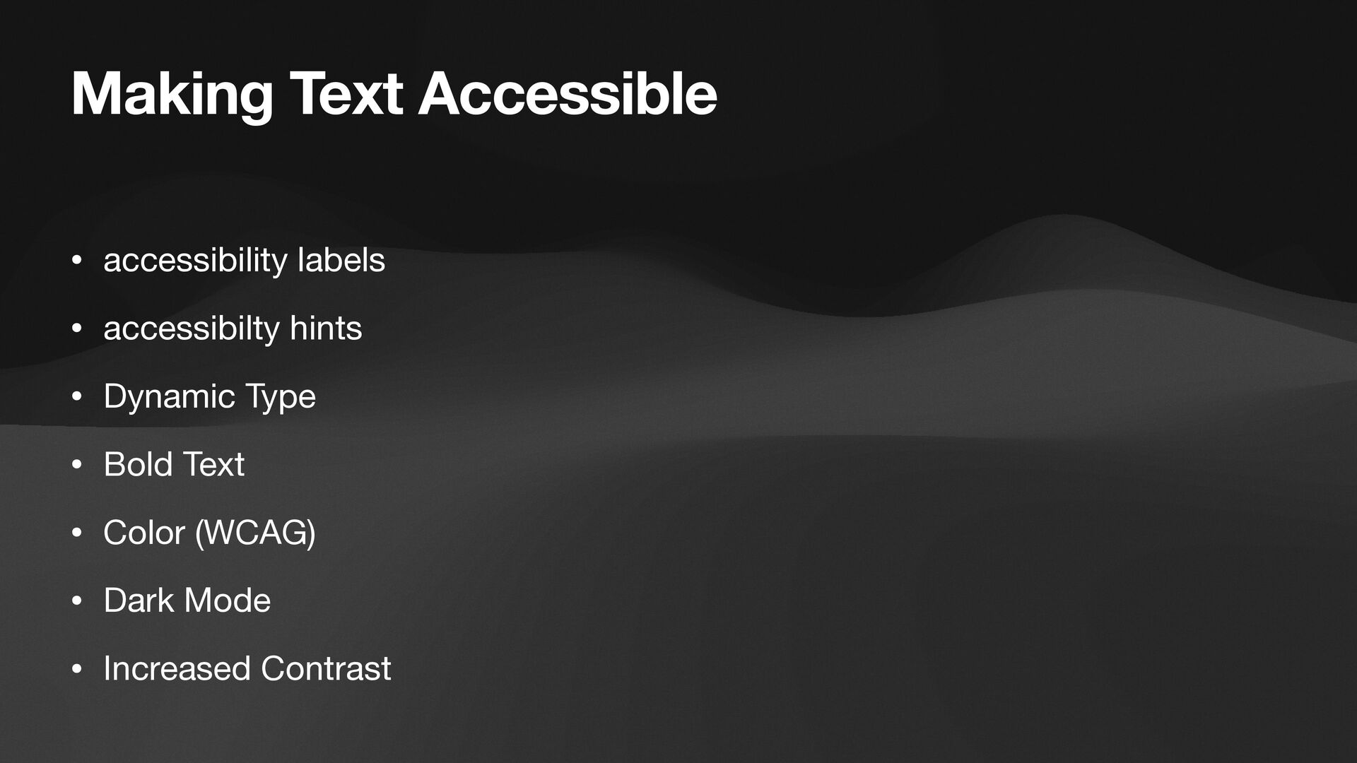
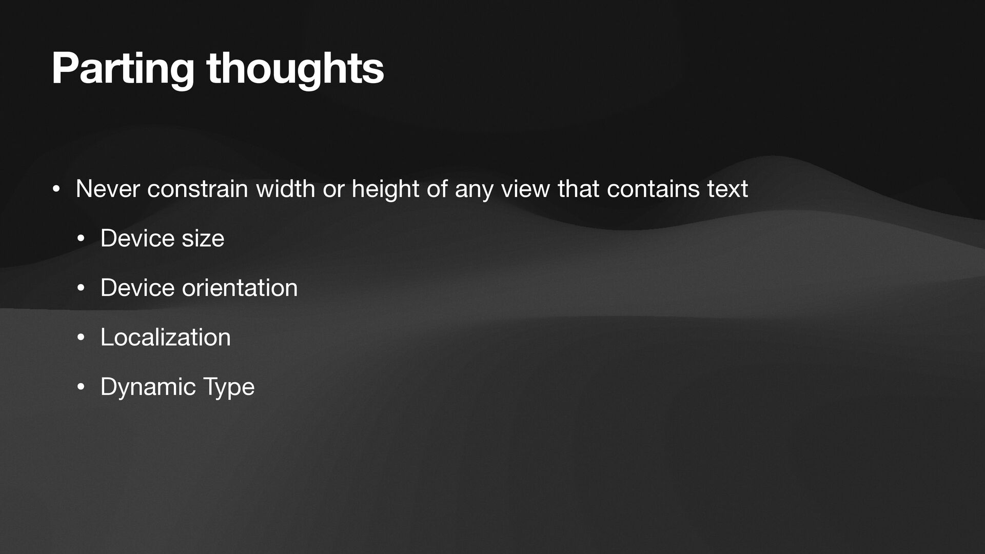
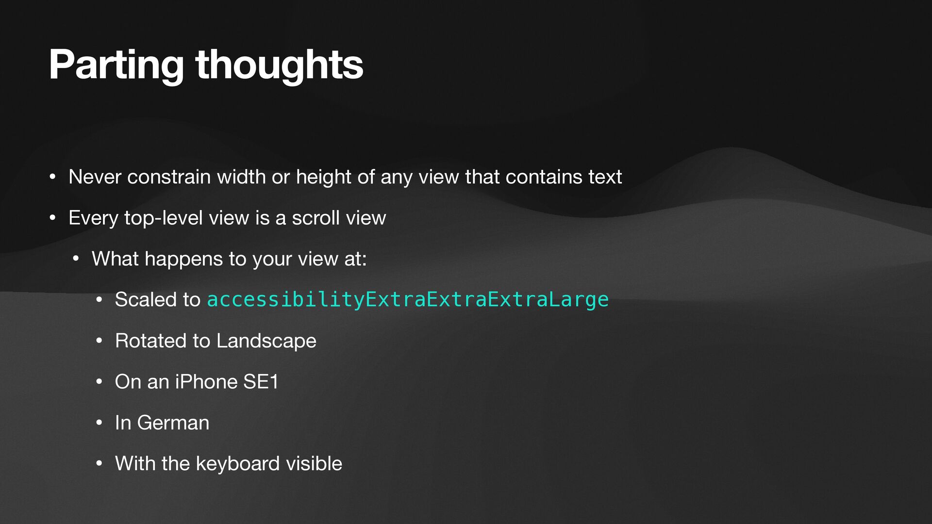
An integral part of design systems and style guides is typography. Typography declares how text will appear in your product by specifying the font family, size, weight, line height, etc. While much of our focus on design goes towards colors, icons, and images, text is the primary way users interact with the majority of apps. Learn how to implement typography in your apps in a way that is accurate to the source designs, fully accessible, and that makes assembling pixel perfect implementations of the source designs a breeze.

Mark Pospesel

July 01, 2022
Tweet

More Decks by Mark Pospesel

Other Decks in Programming

Transcript

  1. YMatterType github.com/yml-org/YMatterType public extension Typography { struct Body { ///

    Body / Small (14/21 pt, regular) public static let small = Typography( familyName: "NunitoSans", fontWeight: .regular, fontSize: 14, lineHeight: 21 ) } }
  2. YMatterType github.com/yml-org/YMatterType • Dynamic Type • Design accurate line height

    • Design accurate intrinsicContentSize • Proportional line height scaling • Accessibility Bold Text support
  3. YMatterType github.com/yml-org/YMatterType • Letter spacing (kerning) • Text case (ALL

    CAPS, lowercase, TitleCase) • Text decoration (underline, strikethrough) • Maximum scaling by point size or scale factor • … and more to come
  4. Typography Renders with current UITraitCollection • Controls can be unit

    tested across all possible combinations of • preferredContentSizeCategory • legibilityWeight
  5. YCoreUI github.com/yml-org/YCoreUI /// Determines whether the contrast between this `UIColor`

    and the provided /// `UIColor` is suf fi cient to meet the recommendations of W3's WCAG 2.0. /// /// The recommendation is that the contrast ratio between text and its /// background should be at least 4.5 : 1 for small text and at least /// 3.0 : 1 for larger text. /// - Parameters: /// - otherColor: the other color to compute contrast with /// - context: the context of the color comparison (default = `.normalText`) /// - level: the WCAG standard to test against (default = `.AA`) /// - Returns: `true` if the two colors meet the speci fi ed WCAG minimum contrast ratio, otherwise `false` /// - Warning: Combining context == `.uiComponent` and level == `.AAA` will return `false` for all color pairings /// because there is no AAA contrast threshold level de fi ned for UI Components. public func isSufficientContrast( to otherColor: UIColor, context: WCAGContext = .normalText, level: WCAGLevel = .AA ) -> Bool { let threshold = context.threshold(for: level) return contrastRatio(to: otherColor) > threshold }
  6. UIColor.isSufficientContrast(to:context:level:) Renders with current UITraitCollection • Pairings of foreground and

    background colors can be unit tested across all possible combinations of • userInterfaceStyle • accessibilityContrast
  7. Making Text Accessible • accessibility labels • accessibilty hints •

    Dynamic Type • Bold Text • Color (WCAG) • Dark Mode • Increased Contrast
  8. Parting thoughts • Never constrain width or height of any

    view that contains text • Device size • Device orientation • Localization • Dynamic Type
  9. Parting thoughts • Never constrain width or height of any

    view that contains text • Every top-level view is a scroll view • What happens to your view at: • Scaled to accessibilityExtraExtraExtraLarge • Rotated to Landscape • On an iPhone SE1 • In German • With the keyboard visible
  10. Engineering Beautiful and Accessible Text 24 June 2022 • Mark

    Pospesel • @mpospese • Feedback appreciated! • Repos: • github.com/yml-org/YMatterType • github.com/yml-org/YCoreUI