Upgrade to Pro
— share decks privately, control downloads, hide ads and more …
Speaker Deck
Sign up for free
Menu
Search
Features
All features
Private URLs
Password Protection
Custom URLS
Scheduled publishing
Remove Branding
Restrict embedding
Deck Collections
Notes
Features
All features
Private URLs
Password Protection
Custom URLS
Scheduled publishing
Remove Branding
Restrict embedding
Deck Collections
Notes
Explore
Featured decks
Featured speakers
Programming
Technology
Storyboards
Explore
Featured decks
Featured speakers
Programming
Technology
Storyboards
Pricing
Search
Sign in
Sign up for free
Responsive Web Design, oh my Glob!
Search
Sponsored
·
SiteGround - Reliable hosting with speed, security, and support you can count on.
→
Lucifero Von Nachtosphere
September 11, 2014
Programming
190
1
Share
Embed
Copy iframe code
Copy JS code
Copy link
Start on current slide
Responsive Web Design, oh my Glob!
Hopefully I'll update it later with some very useful links.
Lucifero Von Nachtosphere
September 11, 2014
Other Decks in Programming
See All in Programming
Simple Storage Service(S3) is not simple
iwatsukayura
0
290
npm との違いを手がかりにGo の依存管理を理解したい
optim
0
310
複雑なUIコンポーネントとの ⻑い付き合い⽅:波及するバグからテスト戦略を経て、安全な再設計へ
mixplace
0
410
Augmenting AI with the Power of Jakarta EE
ivargrimstad
0
190
Herb in Rails 8.2: Your ERB views, now HTML-aware @ Rails World 2026, Austin, Texas
marcoroth
0
220
作って学ぶSpring BootのAuto Configuration / JJUG Night Seminar 2026-10-19
rshindo
0
150
外から家のPCの電源入れたい!をPHPで解決する
kawashimo0
1
130
残高管理から台帳サービスへの進化
artoy
1
200
sbt 2.0: takeoff
eed3si9n
0
160
iOS 27でニュースアプリはどう変わる!? 〜日経電子版の新機能対応と、開発事例から〜
lynnswap
7
13k
Atomic Design, Enforced: Scaling Mobile Design Systems (next.app devCon / droidCon Berlin 2026)
steliosf
PRO
0
170
[Rails World 2026] Durable orchestration on Rails: from continuation to workflow
palkan
1
750
Featured
See All Featured
More Than Pixels: Becoming A User Experience Designer
marktimemedia
3
560
Building a A Zero-Code AI SEO Workflow
portentint
PRO
0
780
HDC tutorial
michielstock
2
960
Side Projects
sachag
456
43k
Heart Work Chapter 1 - Part 1
lfama
PRO
10
37k
Leadership Guide Workshop - DevTernity 2021
reverentgeek
1
400
Building Applications with DynamoDB
mza
96
7.2k
The Web Performance Landscape in 2024 [PerfNow 2024]
tammyeverts
12
1.3k
Lightning talk: Run Django tests with GitHub Actions
sabderemane
0
300
WENDY [Excerpt]
tessaabrams
14
40k
Keith and Marios Guide to Fast Websites
keithpitt
413
23k
Why You Should Never Use an ORM
jnunemaker
PRO
61
10k
Transcript
Responsive Web Design, Oh my Glob! Lucifero Von Nachtosphere, Product
Designer @nobilelucifero on Twitter
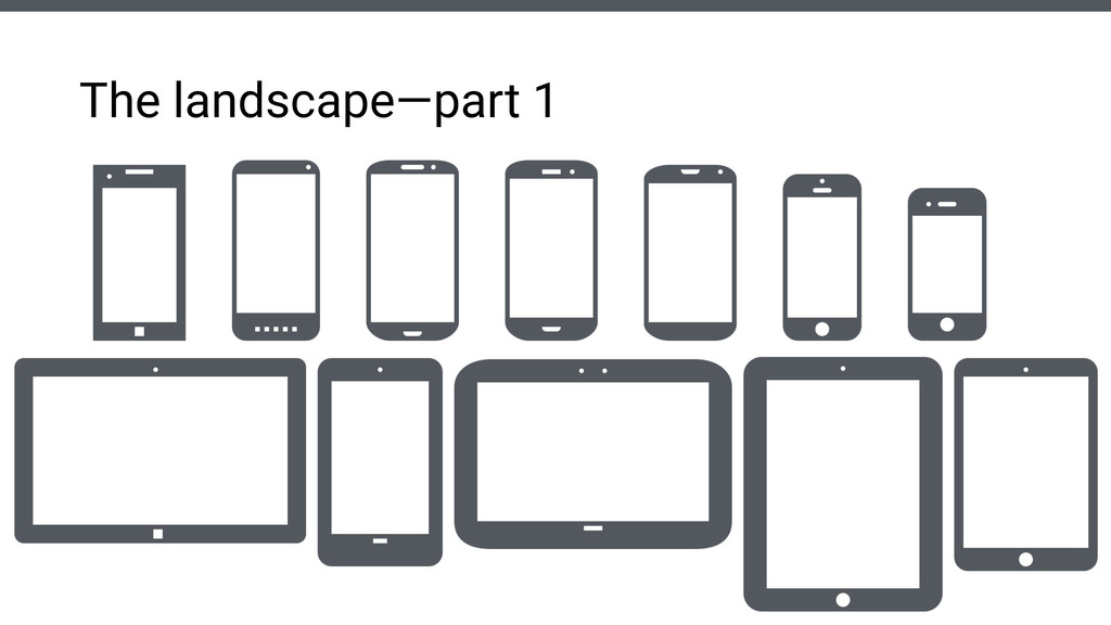
The landscape—part 1
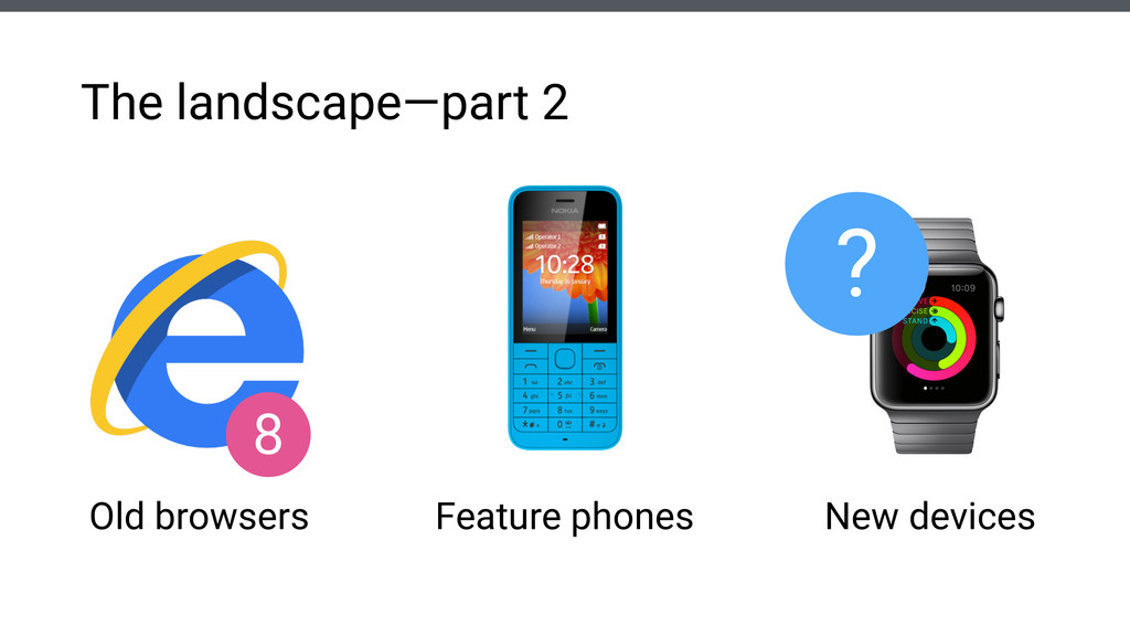
The landscape—part 2 Old browsers Feature phones New devices ?
8
Responsive Web Design is a combination of technologies and strategies
aimed at creating Websites and Web-apps providing an optimal viewing experience across the entire spectrum of digital devices. ! Partially a philosophy that ultimately boils down to a collection of Web best practices. What’s RWD then?
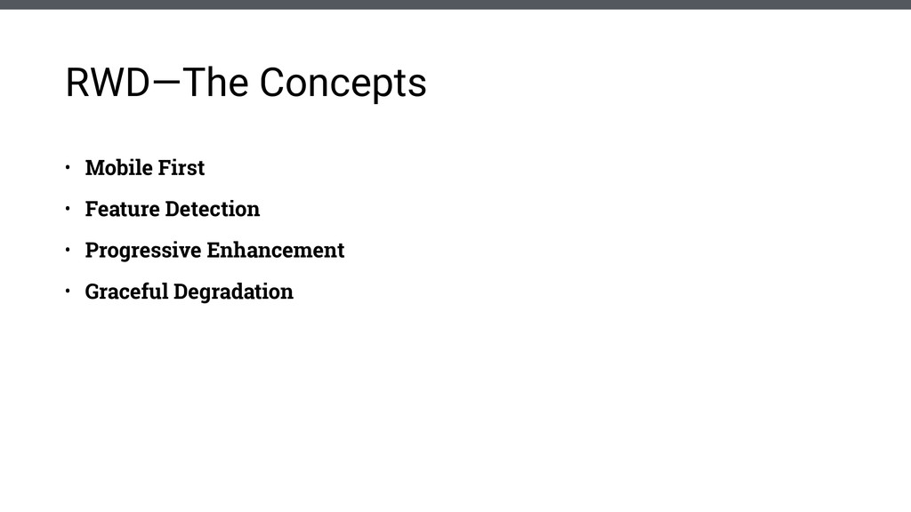
• Mobile First • Feature Detection • Progressive Enhancement •
Graceful Degradation RWD—The Concepts
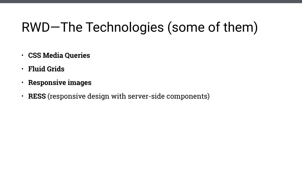
• CSS Media Queries • Fluid Grids • Responsive images
• RESS (responsive design with server-side components) RWD—The Technologies (some of them)
Media Queries
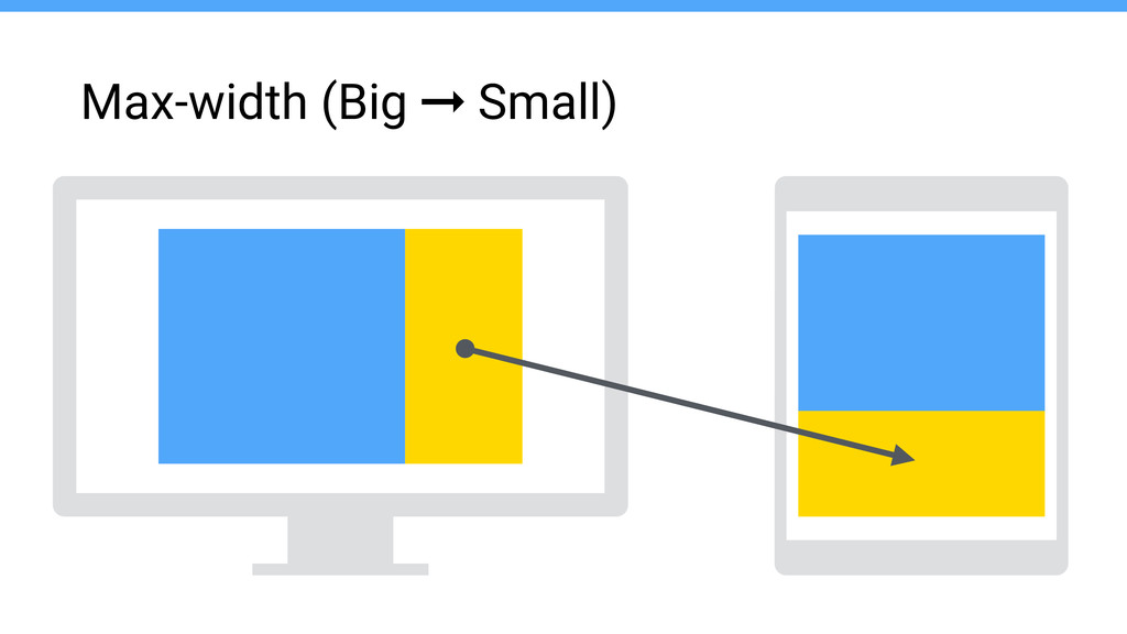
Max-width (Big ➞ Small)
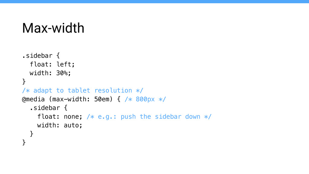
Max-width .sidebar { float: left; width: 30%; } /* adapt
to tablet resolution */ @media (max-width: 50em) { /* 800px */ .sidebar { float: none; /* e.g.: push the sidebar down */ width: auto; } }
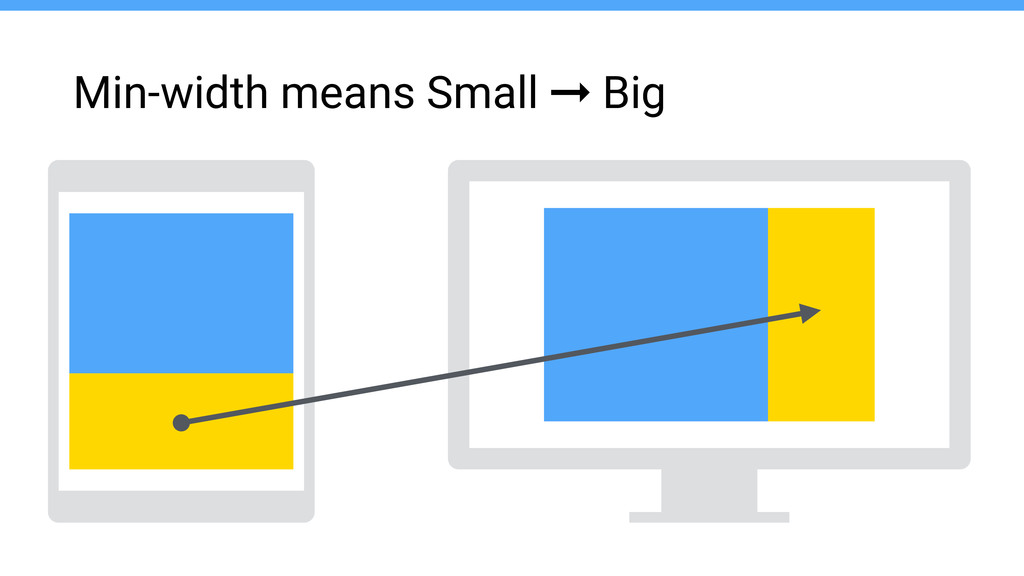
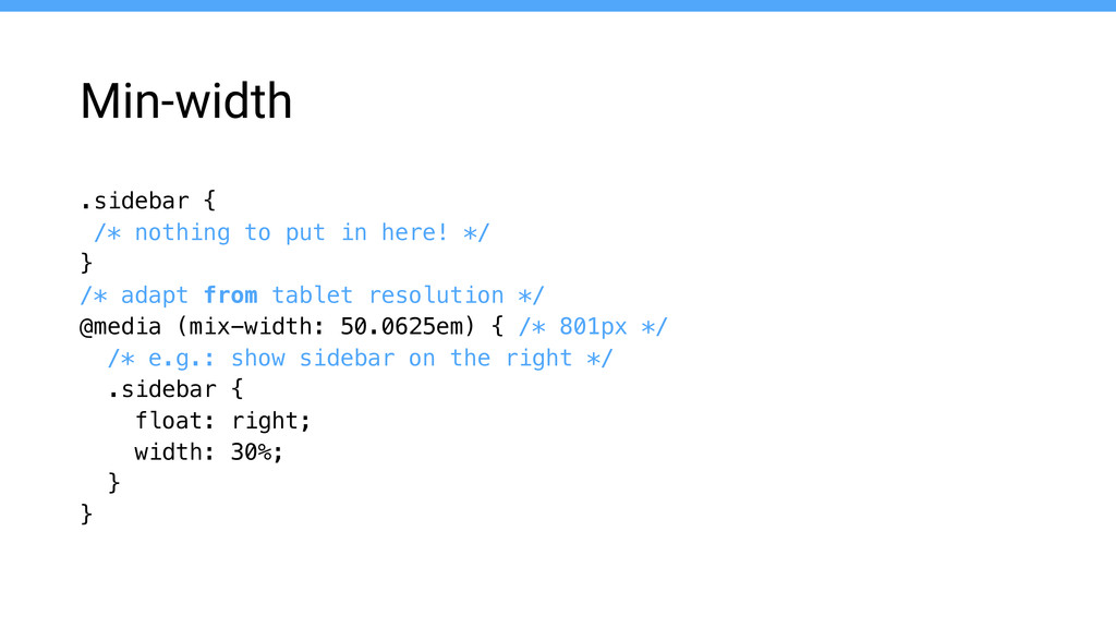
Min-width means Small ➞ Big
Min-width .sidebar { /* nothing to put in here! */
} /* adapt from tablet resolution */ @media (mix-width: 50.0625em) { /* 801px */ /* e.g.: show sidebar on the right */ .sidebar { float: right; width: 30%; } }
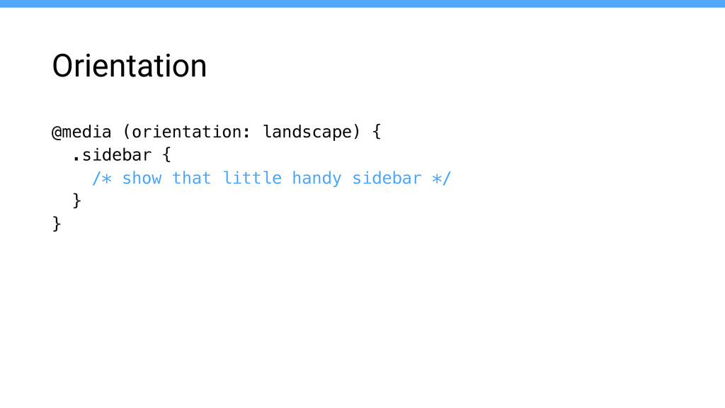
Orientation @media (orientation: landscape) { .sidebar { /* show that
little handy sidebar */ } }
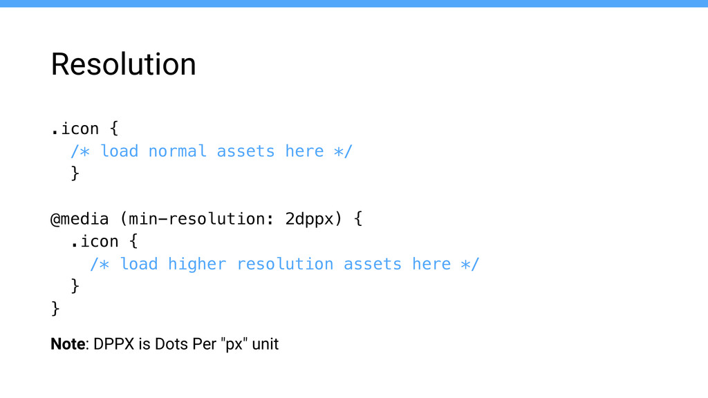
Note: DPPX is Dots Per "px" unit Resolution .icon {
/* load normal assets here */ } ! @media (min-resolution: 2dppx) { .icon { /* load higher resolution assets here */ } }
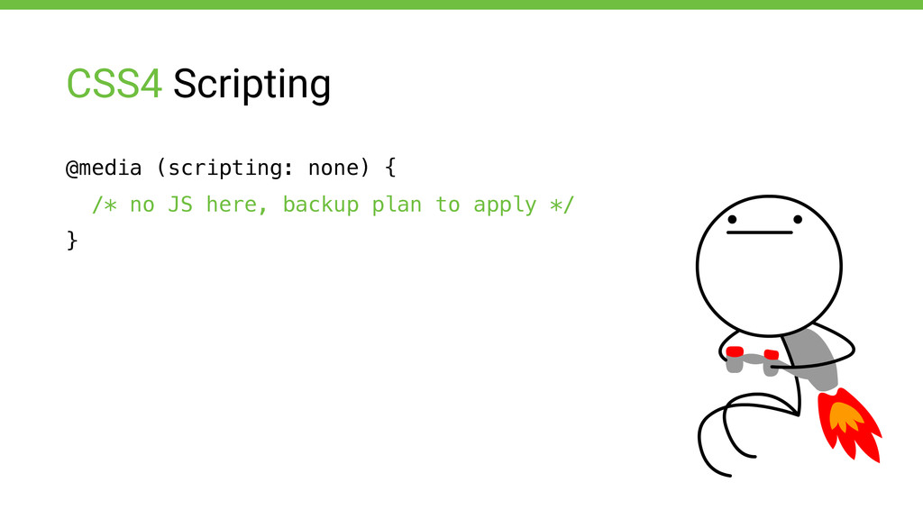
CSS4 Scripting @media (scripting: none) { /* no JS here,
backup plan to apply */ }
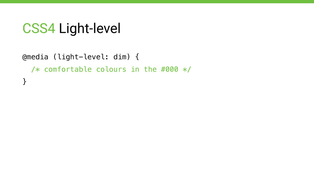
CSS4 Light-level @media (light-level: dim) { /* comfortable colours in
the #000 */ }
Think fluid
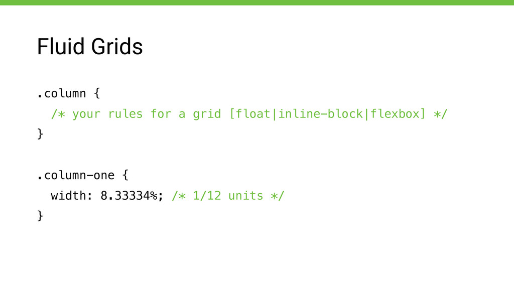
Fluid Grids .column { /* your rules for a grid
[float|inline-block|flexbox] */ } ! .column-one { width: 8.33334%; /* 1/12 units */ }
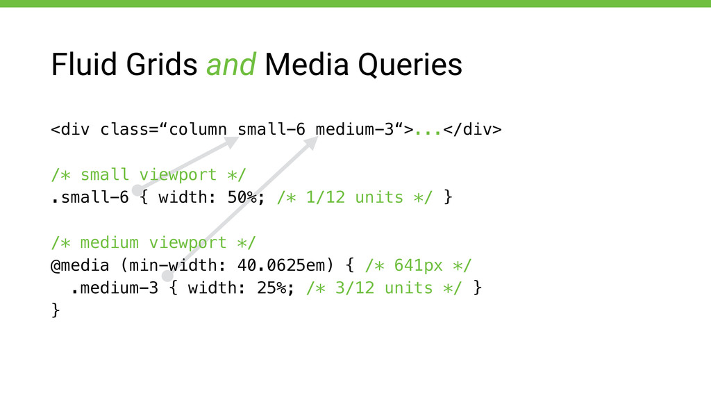
Fluid Grids and Media Queries <div class=“column small-6 medium-3“>...</div> !
/* small viewport */ .small-6 { width: 50%; /* 1/12 units */ } ! /* medium viewport */ @media (min-width: 40.0625em) { /* 641px */ .medium-3 { width: 25%; /* 3/12 units */ } }
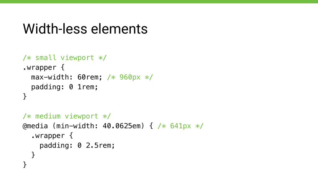
Width-less elements /* small viewport */ .wrapper { max-width: 60rem;
/* 960px */ padding: 0 1rem; } ! /* medium viewport */ @media (min-width: 40.0625em) { /* 641px */ .wrapper { padding: 0 2.5rem; } }
Images
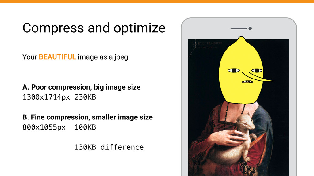
Compress and optimize Your BEAUTIFUL image as a jpeg !
! A. Poor compression, big image size 1300x1714px 230KB ! B. Fine compression, smaller image size 800x1055px 100KB ! 130KB difference
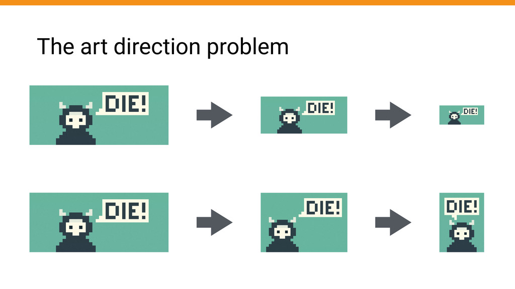
The art direction problem
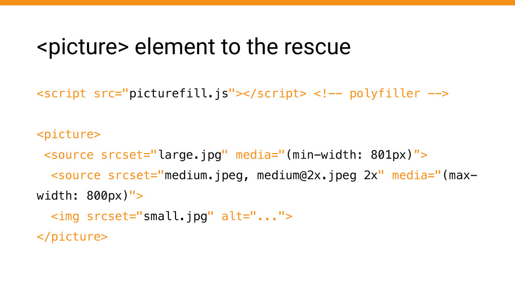
<picture> element to the rescue <script src="picturefill.js"></script> <!-- polyfiller -->
! <picture> <source srcset="large.jpg" media="(min-width: 801px)”> <source srcset="medium.jpeg,
[email protected]
2x" media="(max- width: 800px)"> <img srcset="small.jpg" alt="..."> </picture>
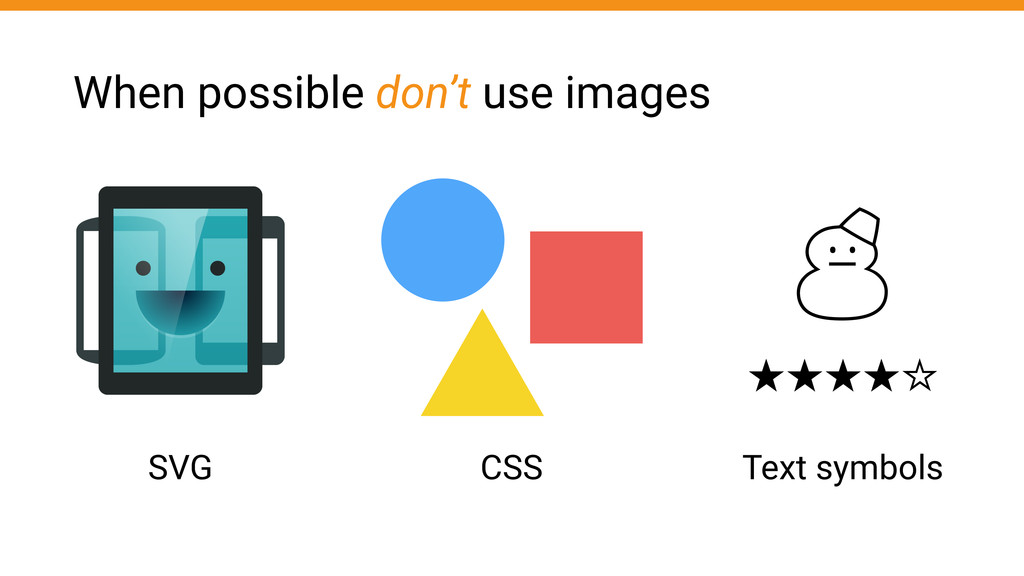
When possible don’t use images SVG CSS Text symbols ‚
★★★★☆
Useful Tools
• iOS Simulator • Android Emulator • Device inspection •
Chrome Emulate feature Testing & Debugging Apps
Bonus: Javascript!
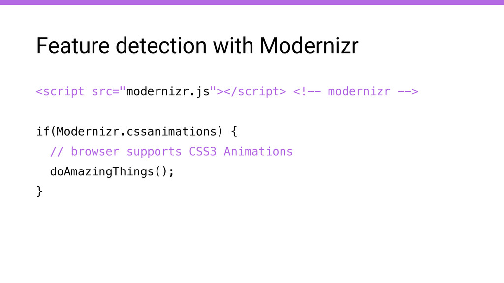
<script src="modernizr.js"></script> <!-- modernizr --> ! if(Modernizr.cssanimations) { // browser
supports CSS3 Animations doAmazingThings(); } Feature detection with Modernizr
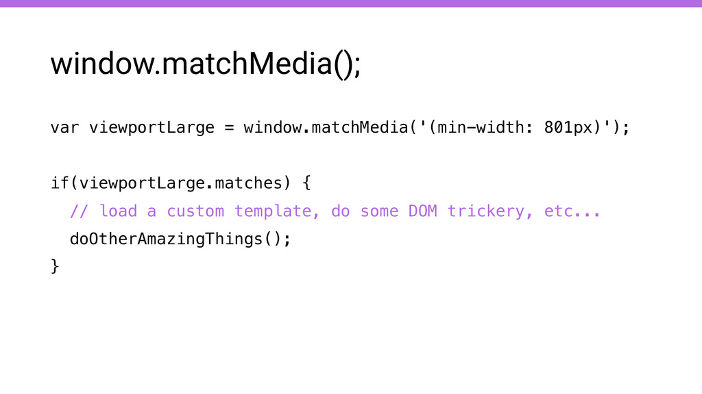
var viewportLarge = window.matchMedia('(min-width: 801px)'); ! if(viewportLarge.matches) { // load
a custom template, do some DOM trickery, etc... doOtherAmazingThings(); } window.matchMedia();
Thank you! bit.ly/rwdomg @nobilelucifero

 SiteGround - Reliable hosting with speed, security, and support you can count on.


 iwatsukayura
 optim
 mixplace
 ivargrimstad
 marcoroth
 rshindo
 kawashimo0
 artoy
 eed3si9n
 lynnswap
 steliosf
 palkan
 marktimemedia
 portentint
 michielstock
 sachag
 lfama
 reverentgeek
 mza
 tammyeverts
 sabderemane
 tessaabrams
 keithpitt
 jnunemaker