Upgrade to Pro
— share decks privately, control downloads, hide ads and more …
Speaker Deck
Features
Speaker Deck
PRO
Sign in
Sign up for free
Search
Search
Exploring The Digital Frontier: CSS Grid & Flexbox
Search
Natasha Carlyon
February 21, 2020
Programming
34
0
Share
Embed
Copy iframe code
Copy JS code
Copy link
Start on current slide
Exploring The Digital Frontier: CSS Grid & Flexbox
A presentation on CSS Grid & Flexbox
Natasha Carlyon
February 21, 2020
More Decks by Natasha Carlyon
See All by Natasha Carlyon
Upping_Your_Interviewing_Game.pdf
nscarlyon
0
56
DevOps
nscarlyon
0
26
Where's Waldo: Building Better APIs with Swagger
nscarlyon
0
39
ng g talk-on-angular-console
nscarlyon
0
140
Alexa, what is 2 + 2?
nscarlyon
0
110
Mob Programming
nscarlyon
0
310
Other Decks in Programming
See All in Programming
DynamoDBには集計系のクエリがないけどなんとかしたい
musan
1
130
Developing with AI Agents — Codex, Claude Code & Cowork Practical Guide
x5gtrn
PRO
0
1.3k
スマートグラスで並列バイブコーディング
hyshu
0
120
New "Type" system on PicoRuby
pocke
1
830
3Dシーンの圧縮
fadis
1
740
A2UI という光を覗いてみる
satohjohn
1
130
Vite+ Unified Toolchain for the Web
naokihaba
0
280
不変条件と整合性境界—ビジネスが決める設計判断と実現パターン / Invariants and Consistency Boundaries
nrslib
13
3.6k
IBM Bobを活用したレガシーアプリの最新化
oniak3ibm
PRO
1
190
Signal Forms: Beyond the Basics @ngBaguette 2026 in Paris
manfredsteyer
PRO
0
240
[2026年度第1回ORセミナー] 計画最適化ベンチャーと競技プログラミング人材
terryu16
0
260
JavaDoc 再入門
nagise
0
320
Featured
See All Featured
Beyond borders and beyond the search box: How to win the global "messy middle" with AI-driven SEO
davidcarrasco
3
160
Measuring Dark Social's Impact On Conversion and Attribution
stephenakadiri
2
220
Creating an realtime collaboration tool: Agile Flush - .NET Oxford
marcduiker
35
2.5k
Groundhog Day: Seeking Process in Gaming for Health
codingconduct
0
200
16th Malabo Montpellier Forum Presentation
akademiya2063
PRO
0
140
Building Applications with DynamoDB
mza
96
7.1k
SEOcharity - Dark patterns in SEO and UX: How to avoid them and build a more ethical web
sarafernandez
0
200
AI Search: Where Are We & What Can We Do About It?
aleyda
0
7.6k
HU Berlin: Industrial-Strength Natural Language Processing with spaCy and Prodigy
inesmontani
PRO
0
410
Design in an AI World
tapps
1
240
Skip the Path - Find Your Career Trail
mkilby
1
140
The Hidden Cost of Media on the Web [PixelPalooza 2025]
tammyeverts
2
330
Transcript
Exploring The Digital Frontier: CSS Grid & Flexbox Natasha Carlyon
Full Stack Software Developer @nscarlyon
[email protected]
My Journey
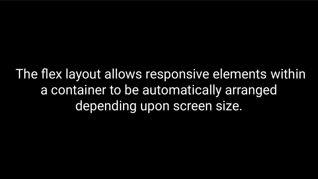
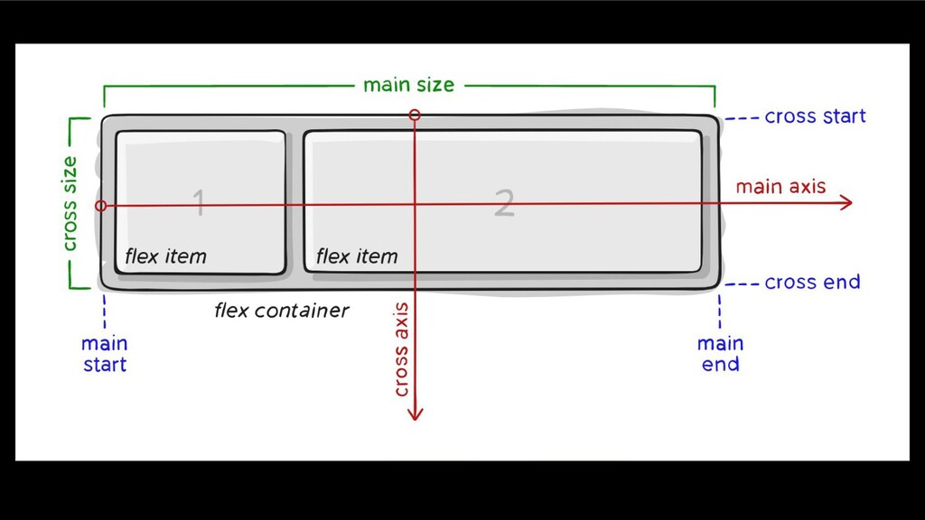
Flexbox
The flex layout allows responsive elements within a container to
be automatically arranged depending upon screen size.
None
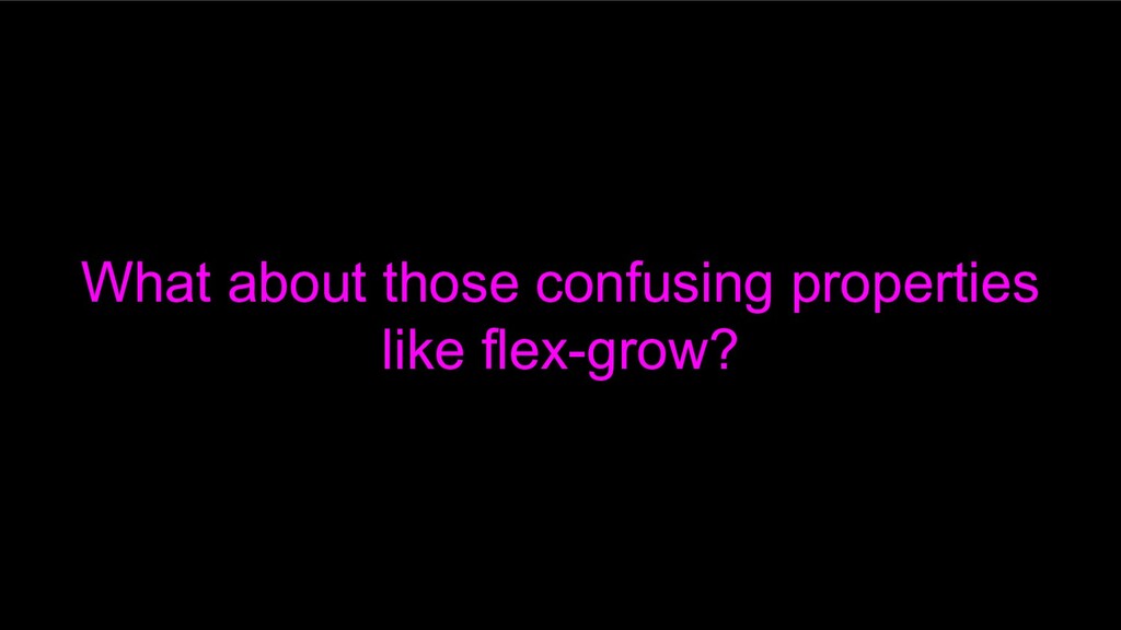
What about those confusing properties like flex-grow?
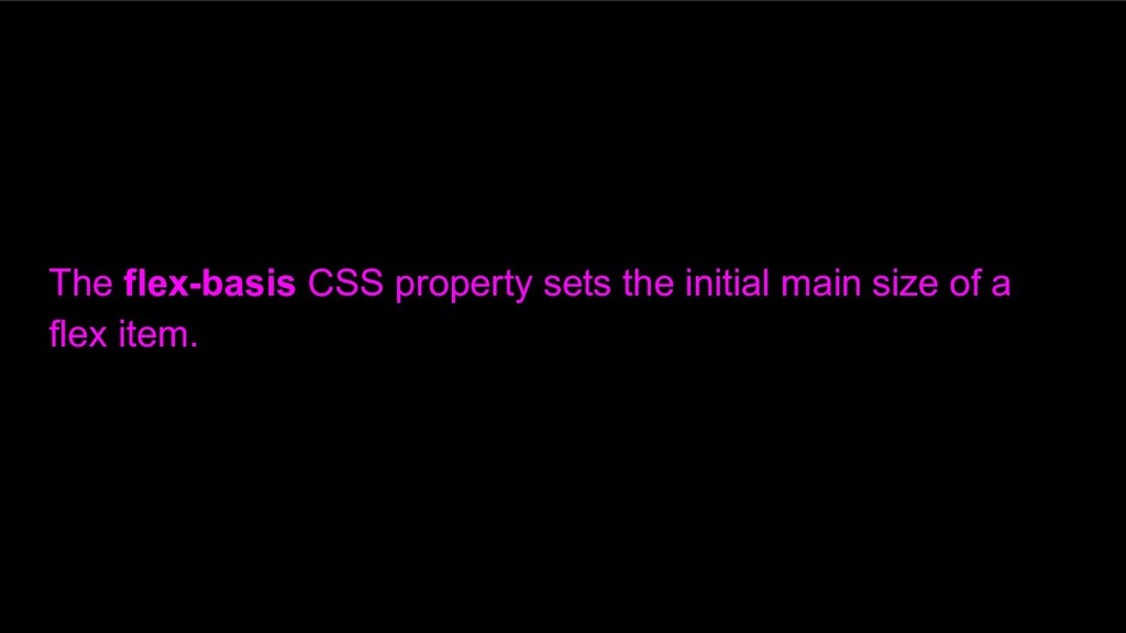
The flex-basis CSS property sets the initial main size of
a flex item.
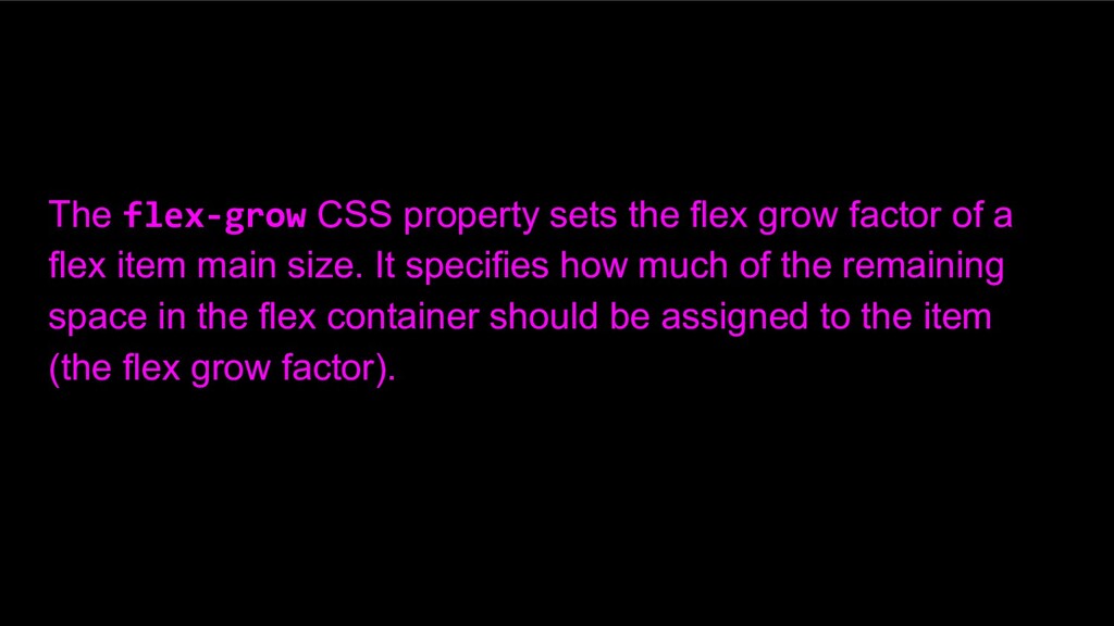
The flex-grow CSS property sets the flex grow factor of
a flex item main size. It specifies how much of the remaining space in the flex container should be assigned to the item (the flex grow factor).
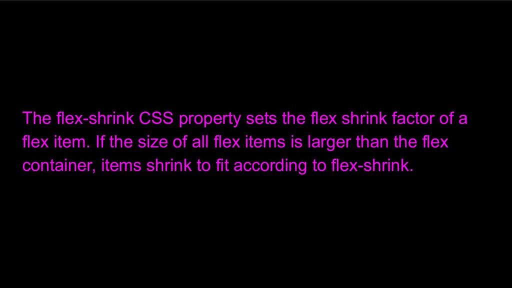
The flex-shrink CSS property sets the flex shrink factor of
a flex item. If the size of all flex items is larger than the flex container, items shrink to fit according to flex-shrink.
CSS Grid
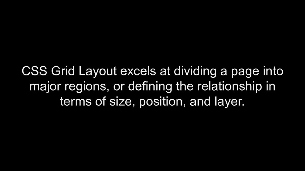
CSS Grid Layout excels at dividing a page into major
regions, or defining the relationship in terms of size, position, and layer.
Flexbox vs CSS Grid
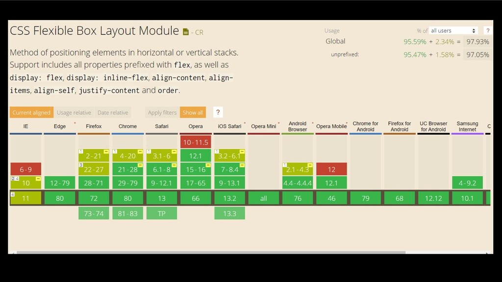
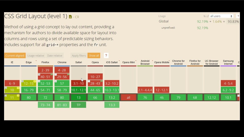
Browser Support
None
None
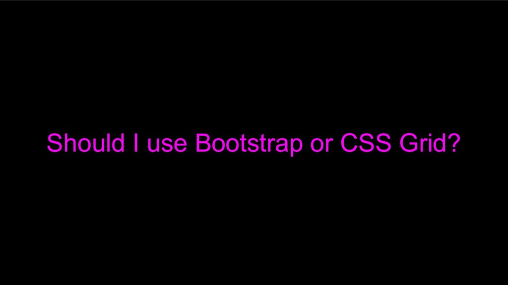
Should I use Bootstrap or CSS Grid?
Bootstrap
It depends
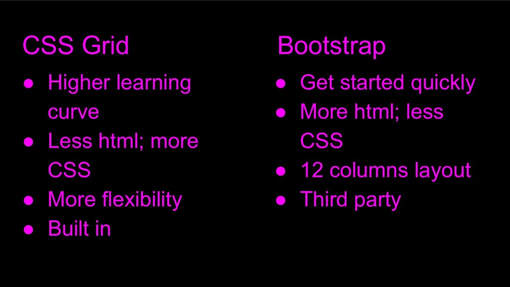
CSS Grid Bootstrap • Higher learning curve • Less html;
more CSS • More flexibility • Built in • Get started quickly • More html; less CSS • 12 columns layout • Third party
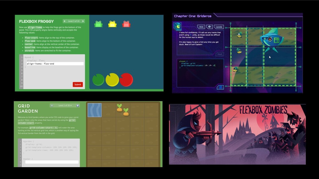
How do I get better?
How do I get better?
Deliberate practise!
None
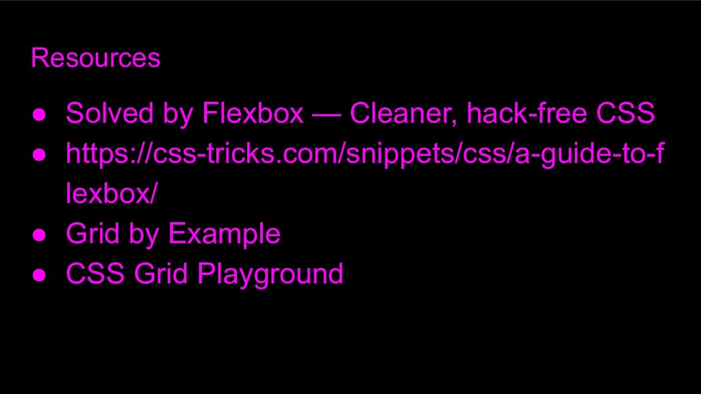
Resources • Solved by Flexbox — Cleaner, hack-free CSS •
https://css-tricks.com/snippets/css/a-guide-to-f lexbox/ • Grid by Example • CSS Grid Playground
 nscarlyon
 musan
musan
 x5gtrn
 hyshu
hyshu
 pocke
pocke
 fadis
fadis
 satohjohn
 naokihaba
 nrslib
 oniak3ibm
 manfredsteyer
 terryu16
 nagise
 davidcarrasco
 stephenakadiri
 marcduiker
 codingconduct
 akademiya2063
 mza
mza
 sarafernandez
 aleyda
 inesmontani
 tapps
tapps
 mkilby
 tammyeverts