 Ship Features Fearlessly
Designing sites that adapt, in some form, to a users device is not a new thing – Wikipedia lists Audi.com‘s 2001 redesign as the first major instance of such a site.
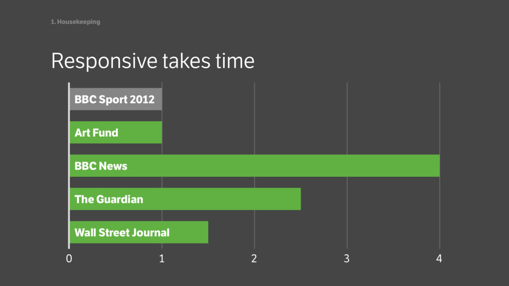
By contrast, the processes, work flows and tools to cope with the demands of designing for an infinite number of devices are things that we’re collectively only just making a start on.
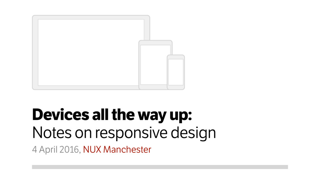
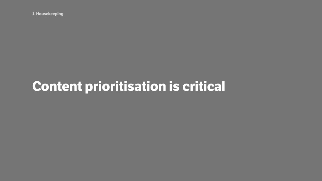
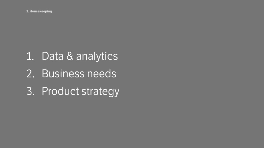
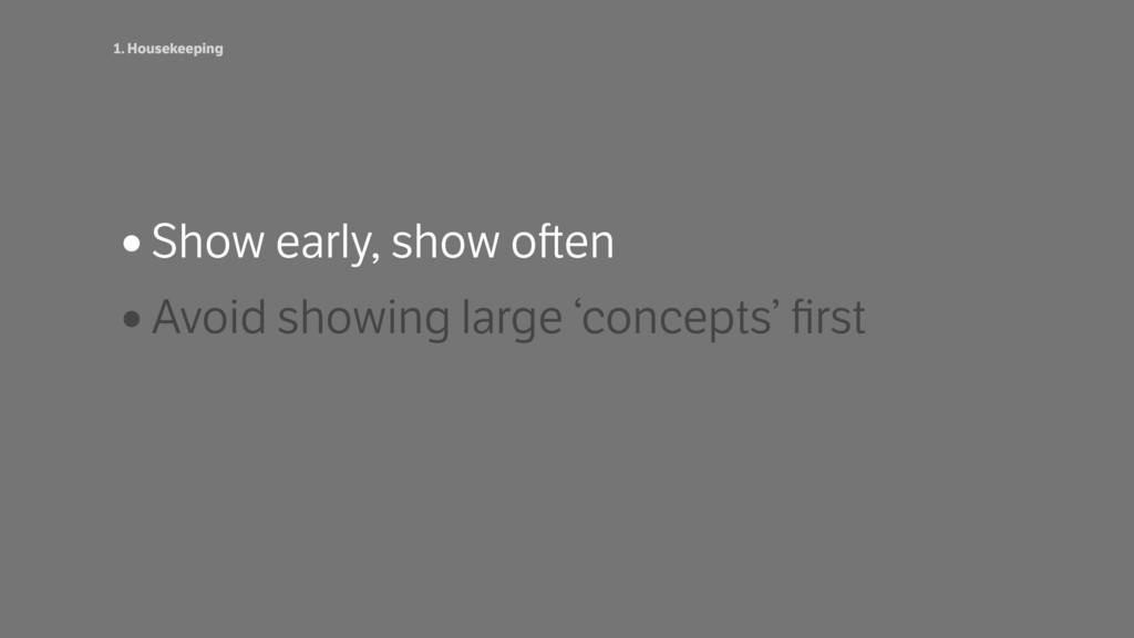
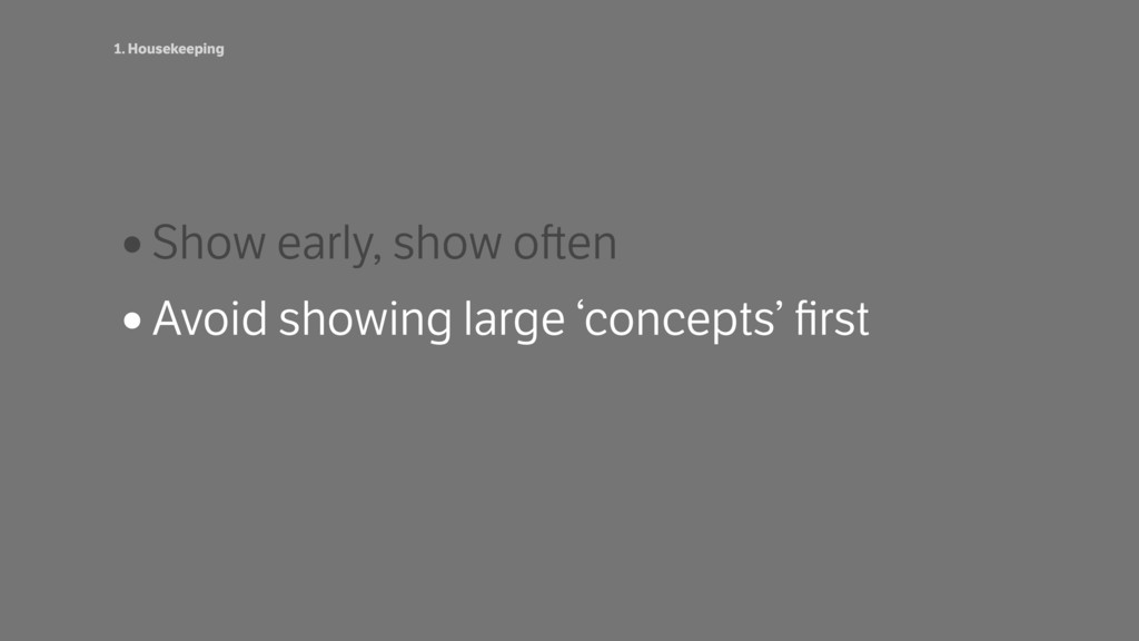
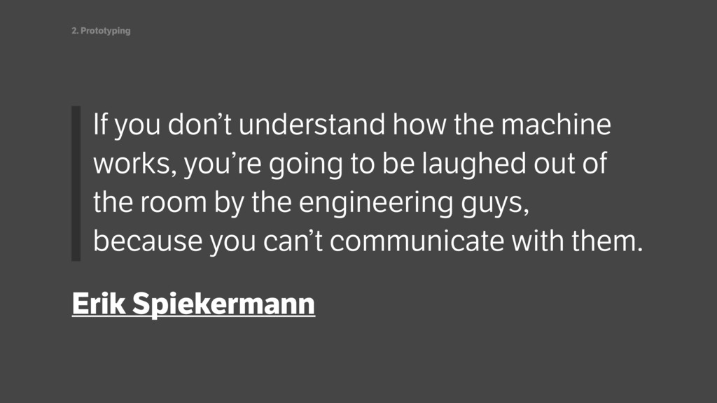
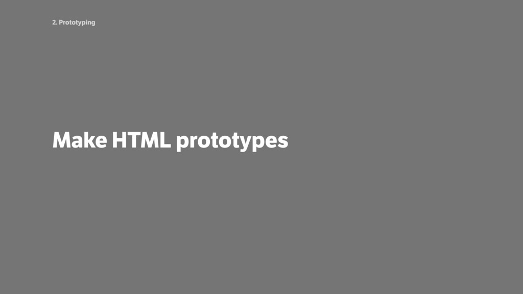
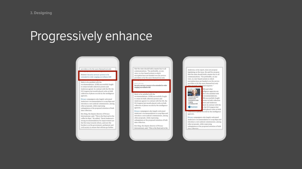
From stakeholder management to prototyping in HTML to designing for performance (and a few things in between), this talk, an adaptation of a one day workshop, shares real world experiences – both good and bad – gained from working on several large responsive projects.
 stmn
stmn
 klemens
 yuri_ohashi
 mhand01
 bebe
bebe
 garyuten
 root_recruit
.jpg) rwang05
rwang05
 kenichiota0711
 calpin
 hilokifigma
 inesmontani
 smashingmag
 scottboms
 kimpetersen
 sergeychernyshev
 baasie
 michaelherold
 katarinadahlin
 aleyda
 rkendrick25
 ipullrank
 minecr