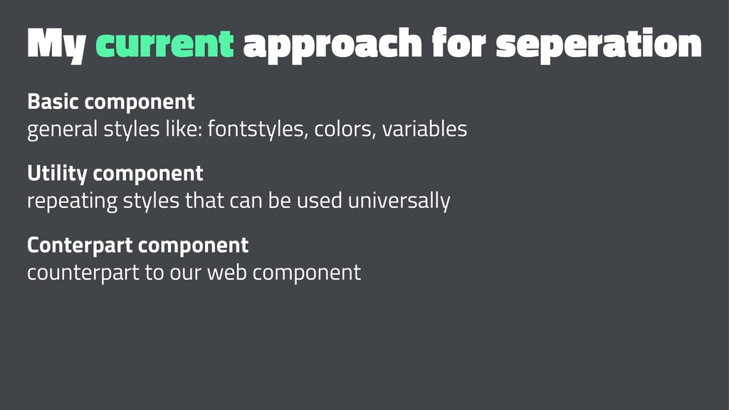
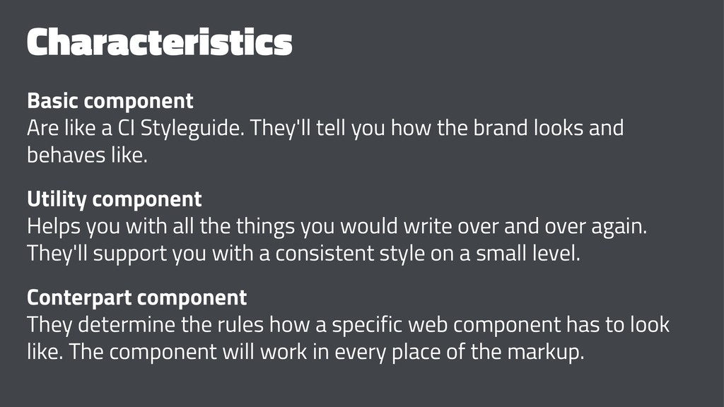
you how the brand looks and behaves like. Utility component Helps you with all the things you would write over and over again. They'll support you with a consistent style on a small level. Conterpart component They determine the rules how a specific web component has to look like. The component will work in every place of the markup.
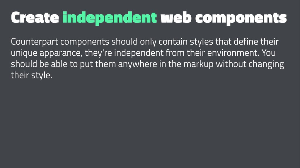
that define their unique apparance, they're independent from their environment. You should be able to put them anywhere in the markup without changing their style.
on the side, think about a useful architecture for your project • plan your "CI styleguide" carefully • use and adapt the styleguide • commit to and write down naming rules • refactor early and often - CSS grows rampart if you don't look at it for, like, 5 minutes
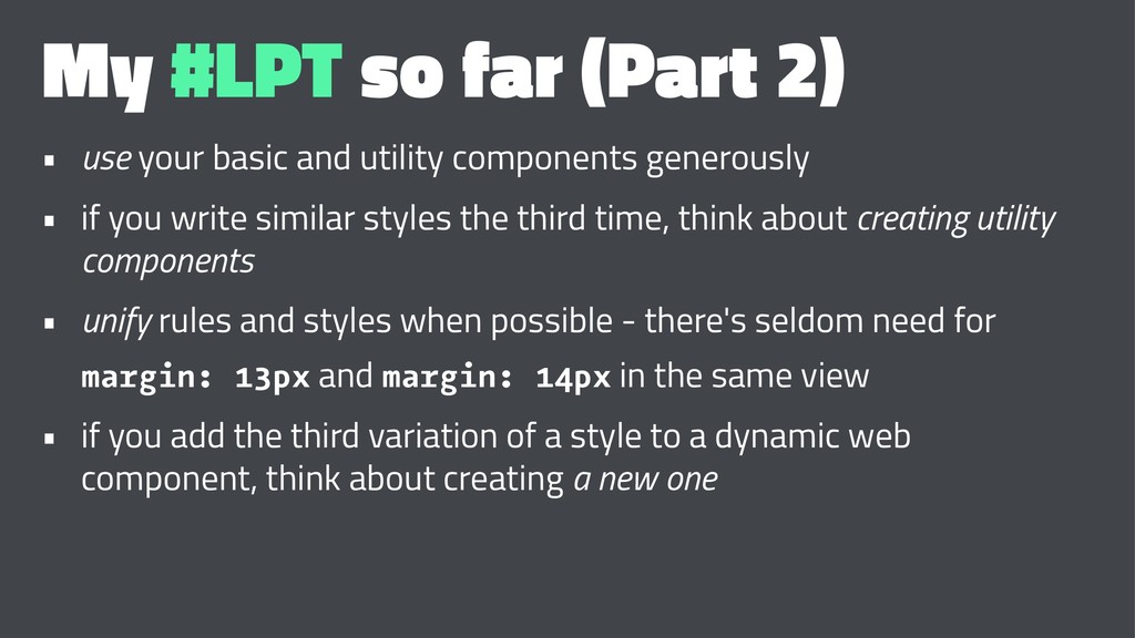
and utility components generously • if you write similar styles the third time, think about creating utility components • unify rules and styles when possible - there's seldom need for margin: 13px and margin: 14px in the same view • if you add the third variation of a style to a dynamic web component, think about creating a new one
 programmiri
 suguruooki
 j5ik2o
 wemra
wemra
 suikabar
 16bitidol
 kkamegawa
 syumai
 broadleaf
 yaotti
 snhryt
 yug1224
 katarinadahlin
 tomoyanonymous
 shlominoach
 marketingsoph
 tmiket
 samanthasiow
 lara
lara
 inesmontani
 cassininazir
 orderedlist
 axbom
axbom