Upgrade to Pro — share decks privately, control downloads, hide ads and more …

My approach to a component-based CSS

My approach to a component-based CSS

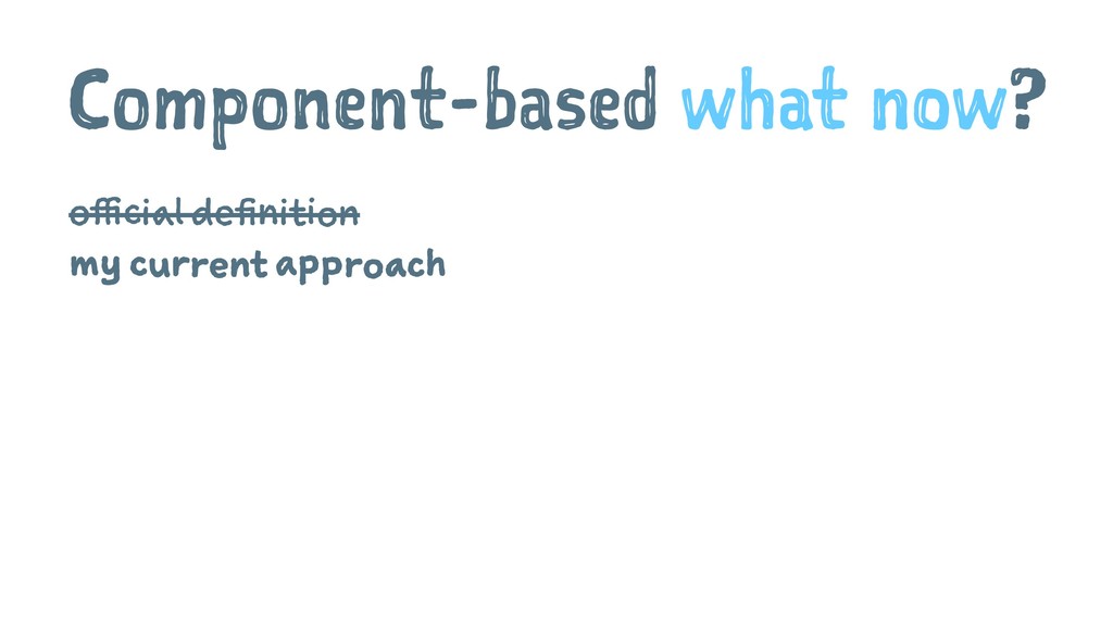
Slides to my talk at the Think About! Community meetup in Cologne (https://www.meetup.com/de-DE/Think-About-about-Tech-Design-and-their-impact-on-Society/)

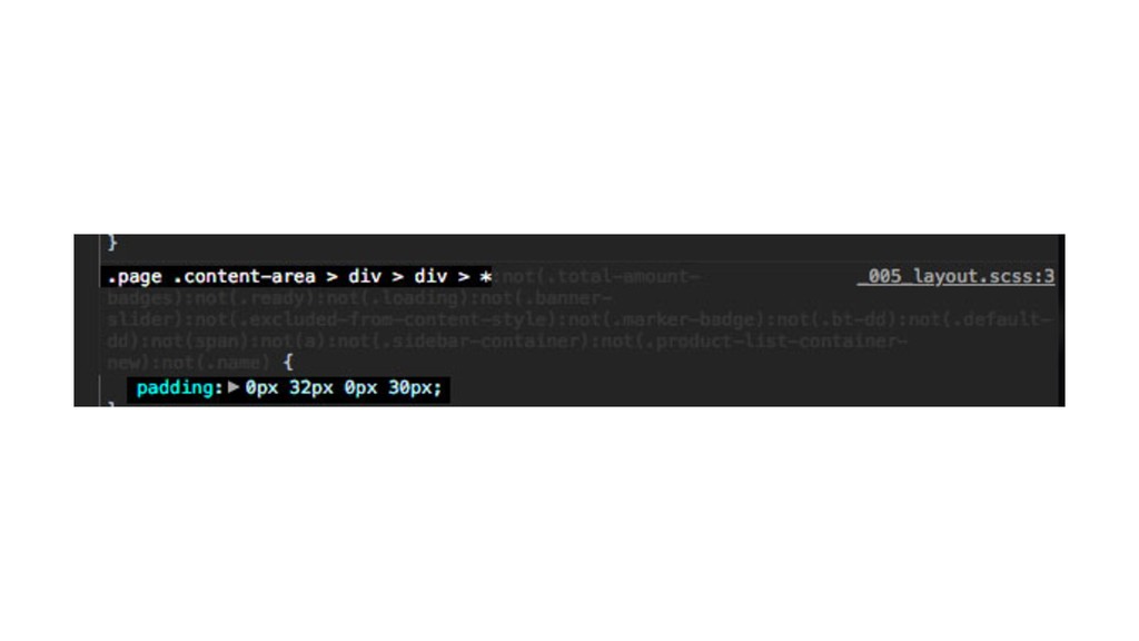
You can find the examples and a list with links at my github repo: https://github.com/programmiri/component-based-functional-css-examples

Mirjam Aulbach

August 08, 2019
Tweet

More Decks by Mirjam Aulbach

Other Decks in Programming

Transcript

  1. My approach to a
    Component-based CSS

    View Slide

  2. Frontend Developer
    With a special
    !
    for JavaScript and a
    healthy fear of unorganized CSS.

    View Slide

  3. DAE?

    View Slide

  4. It's just about making
    things look pretty.
    Right?

    View Slide

  5. How we handle CSS

    View Slide

  6. 1. Methology
    ... BEM
    & OOSCSS
    & SMACSS
    & DRY CSS
    & ACSS
    & ...

    View Slide

  7. 2. Pre Processors
    ... SASS
    & SCSS
    & Stylus
    & ...

    View Slide

  8. 3. Just don't write CSS
    CSS-in-JS:
    ... JSS
    & Styled Components
    & Emotion
    & Radium
    & ...

    View Slide

  9. The C in CSS stands for "Calm down"
    ¯\_(ϑ)_/¯

    View Slide

  10. Component-based CSS

    View Slide

  11. Component-based what now?
    official definition
    my current approach

    View Slide

  12. Better description
    4 Functional Component-based CSS
    4 Component-based functional CSS
    !

    View Slide

  13. We’re not designing pages,
    we’re designing systems of
    components.1
    1
    Stephen Hay
    1 From his book "Responsive Design Workflow".

    View Slide

  14. Components let you split
    the UI into independent,
    reusable pieces, and think
    about each piece in
    isolation.2
    2 https://reactjs.org/docs/components-and-props.html

    View Slide

  15. Style every component separately
    4 components are easily reusable
    4 easy to delete components
    4 no side-effects when adding or removing styles

    View Slide

  16. . NICE!

    View Slide

  17. . NICE! BUT...

    View Slide

  18. .component-one {
    position: relative;
    font-family: 'Fancy Font';
    font-weight: 500;
    font-size: 20px;
    color: var(--color-blue);
    margin-bottom: 2rem;
    padding: 1rem 1.5rem;
    background-color: var(--color-black);
    }
    .component-two {
    position: relative;
    font-family: 'Fancy Font';
    font-weight: 700;
    font-size: 15px;
    color: var(--color-blue);
    margin-top: 2rem;
    padding: 1rem 1.5rem;
    background-color: var(--color-black);
    }

    View Slide

  19. What about
    repetition?

    View Slide

  20. Style every component separately

    View Slide

  21. Functional CSS
    to the rescue!

    View Slide

  22. .arial {
    font-family: Arial;
    }
    .font-1rem {
    font-size: 1rem;
    }
    .font-1.5rem {
    font-size: 1.5rem;
    }
    .font-color-primary {
    color: var(--color-primary)
    }
    .font-color-highlight {
    color: yellow;
    }
    Headline

    View Slide

  23. . NICE!

    View Slide

  24. . NICE! BUT...

    View Slide

  25. What about
    redesigns?

    View Slide

  26. Style everything with functional
    classes

    View Slide

  27. We need a compromise

    View Slide

  28. Separation of concerns
    does not really work with
    CSS anyways.

    View Slide

  29. First try: content-specific classes
    Component based approach

    I'm Mirjam and I'm a cat AND dog person!

    .profil-lead {
    font-size: 150%;
    color: yellow;
    }

    View Slide

  30. Second try: style-specific classes
    Functional CSS approach

    I'm Mirjam and I'm a cat AND dog person!

    .text-big {
    font-size: 150%;
    }
    .text-highlight {
    color: yellow;
    }

    View Slide

  31. So, what to do?

    View Slide

  32. My current approach for separation
    Basic
    general styles like: font styles, colors
    Utility (functional) classes
    repeating styles that can be used universally
    CSS Component
    Counterpart to our website component

    View Slide

  33. Basic - Characteristics
    4 They are like a styleguide.
    4 They tell you how your brand looks and behaves.

    View Slide

  34. Basic - Example

    View Slide

  35. :root {
    --font-headline: 'Domine', serif;
    --font-standard: 'Roboto', sans-serif;
    }
    html {
    font-size: 16px;
    }
    body {
    font-family: var(--font-standard);
    font-weight: 200;
    }
    h1,h2,h3,h4,h5,h6 {
    font-family: var(--font-headline);
    }
    .h1 {
    font-size: 3.5rem;
    }

    View Slide

  36. Utility - Characteristics
    4 They help you with all styles you would write over
    and over again.
    4 They support you - and your team! - with a
    consistent style.

    View Slide

  37. Utility - Example

    View Slide

  38. .display-flex {
    display: flex;
    }
    .display-inline-flex {
    display: inline-flex;
    }
    .flex-direction-row {
    flex-direction: row;
    }
    .flex-direction-column {
    flex-direction: column;
    }
    .text-center {
    text-align: center;
    }
    .text-left {
    text-align: left;
    }

    View Slide

  39. .margin-0 {
    margin: var(--spacer-0);
    }
    .margin-1 {
    margin: var(--spacer-1);
    }
    .margin-2 {
    margin: var(--spacer-2);
    }
    .padding-bottom-0 {
    padding-bottom: var(--spacer-0);
    }
    .padding-bottom-1 {
    padding-bottom: var(--spacer-1);
    }
    .padding-bottom-2 {
    padding-bottom: var(--spacer-2);
    }

    View Slide

  40. CSS Component - Characteristics
    4 They determine the rules how a specific website
    component has to look like.
    4 This component style will work in every place of the
    markup.

    View Slide

  41. CSS Component - Example

    View Slide

  42. .Button {
    display: inline-block;
    font-weight: 500;
    text-align: center;
    vertical-align: middle;
    border: 1px solid transparent;
    padding: 0.375rem 0.75rem;
    font-size: 1rem;
    line-height: 1.5;
    border-radius: 0.25rem;
    transition: color 0.15s ease-in-out, background-color 0.15s ease-in-out,
    border-color 0.15s ease-in-out, box-shadow 0.15s ease-in-out;
    }
    .Button:hover {
    border: 1px solid var(--color-black);
    }
    .Button.Button-primary {
    background-color: var(--color-primary);
    }
    .Button.Button-secondary {
    color: var(--color-white);
    background-color: var(--color-secondary);
    }

    View Slide

  43. General Rules

    View Slide

  44. 1. Use classes
    4 use classes to define styles
    4 use styles on elements very carefully
    4 don't use IDs to style

    View Slide

  45. 2. Naming: consistent and clear
    4 use speaking, semantic class names in basic and
    utility classes
    .text-lg {
    font-size: 150%;
    }
    .d-flex {
    display-flex;
    }
    .background-warning {
    background-color: var(--color-warning)
    }
    // ( ᐛ )و

    View Slide

  46. Keep in mind: don't generate unexpected results (side
    effects)!
    .background-red {
    background-color: var(--color-warning); // var(--color-warning)= orange;
    font-weight: bold;
    }
    // <(ҹ^´)>

    View Slide

  47. 2. Naming: consistent and clear
    Naming approach for the CSS Components
    4 mirror the website component name
    Text
    .Quote {
    width: 75%;
    margin-left: auto;
    margin-right: auto;
    }

    View Slide

  48. 4 add classes with a prefix to style nested elements


    Imagine a inspirational quotes about dogs here. It's a really nice
    one and gives you a warm and fuzzy feeling, I promise!

    Mirjam


    .Quote .Quote-text {
    margin-top: 2rem;
    margin-bottom: 2rem;
    border-left: 10px solid var(--color-primary);
    padding-top: 1rem;
    padding-bottom: 1rem;
    padding-left: 2rem;
    font-size: 1.25rem;
    }

    View Slide

  49. How to use it

    View Slide

  50. That's how it looks
    4 A lot of compositions to define appearance.
    4 CSS Components whenever it makes sense.


    Lorem ipsum dolor sit amet, consetetur sadipscing elitr, sed diam
    nonumy eirmod tempor invidunt ut labore et dolore magna aliquyam erat,
    sed diam voluptua.

    Get the Thing!

    View Slide

  51. "display-flex align-items-center justify-content-center padding-3 background-primary"
    Embrace compositions! ❤

    View Slide

  52. Build CSS components when it's useful
    4 its style can't be accomplished easily with utility and
    basic classes
    4 it's is a piece of content
    4 it will be used in the same manner at least thrice

    View Slide

  53. Build independent components
    Style components should only contain styles that define
    their unique appearance. They're independent from
    their environment. You should be able to put them
    anywhere in the markup.

    View Slide

  54. Example

    Get the Thing!

    View Slide

  55. How to use it - summary
    4 Use compositions
    4 Duplication cheaper than wrong abstraction
    4 Discipline!

    View Slide

  56. There is a big No-Go

    View Slide

  57. Nest components, not styles
    Components can be nested in other components, but
    never nest CSS components to overwrite styles.


    Lorem ipsum dolor sit amet, consetetur sadipscing elitr, sed diam
    nonumy eirmod tempor invidunt ut labore et dolore magna aliquyam erat,
    sed diam voluptua.

    Lorem ipsum some more.
    Get the Thing!


    View Slide

  58. .Card-primary {
    .Button-primary {
    font-size: 0.8rem;
    }
    }
    // ( ಠ ಠ )

    View Slide

  59. View Slide

  60. View Slide

  61. View Slide

  62. View Slide

  63. View Slide

  64. The End
    Examples: github.com/
    programmiri
    /component-based-
    functional-css-examples
    See, that's kinda too long for a good name.
    Twitter: @mirjam_diala
    Github: programmiri
    Web: programmiri
    .de

    View Slide