Upgrade to Pro — share decks privately, control downloads, hide ads and more …

Lebara Mobile Website review

Lebara Mobile Website review

This is one of the initial presentations I gave during my period doing some design consultancy at Lebara.

Manolo Recio Sjögren

December 03, 2012
Tweet

More Decks by Manolo Recio Sjögren

Other Decks in Design

Transcript

  1. Visual design and branding to be revisited Weak brand implementation

    Muted looking visual design with no visual hierarchy Site failing to convey a memorable brand experience. Friday, 14 December 12
  2. The home screen feels busy, unfocused and almost unbranded Muted

    design that doesn’t reach its full potential Friday, 14 December 12
  3. User Interface to be refocused “The UI is the brand

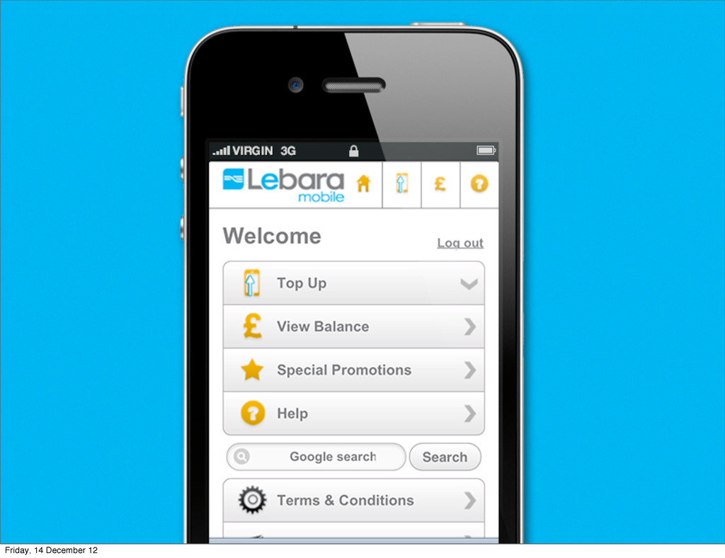
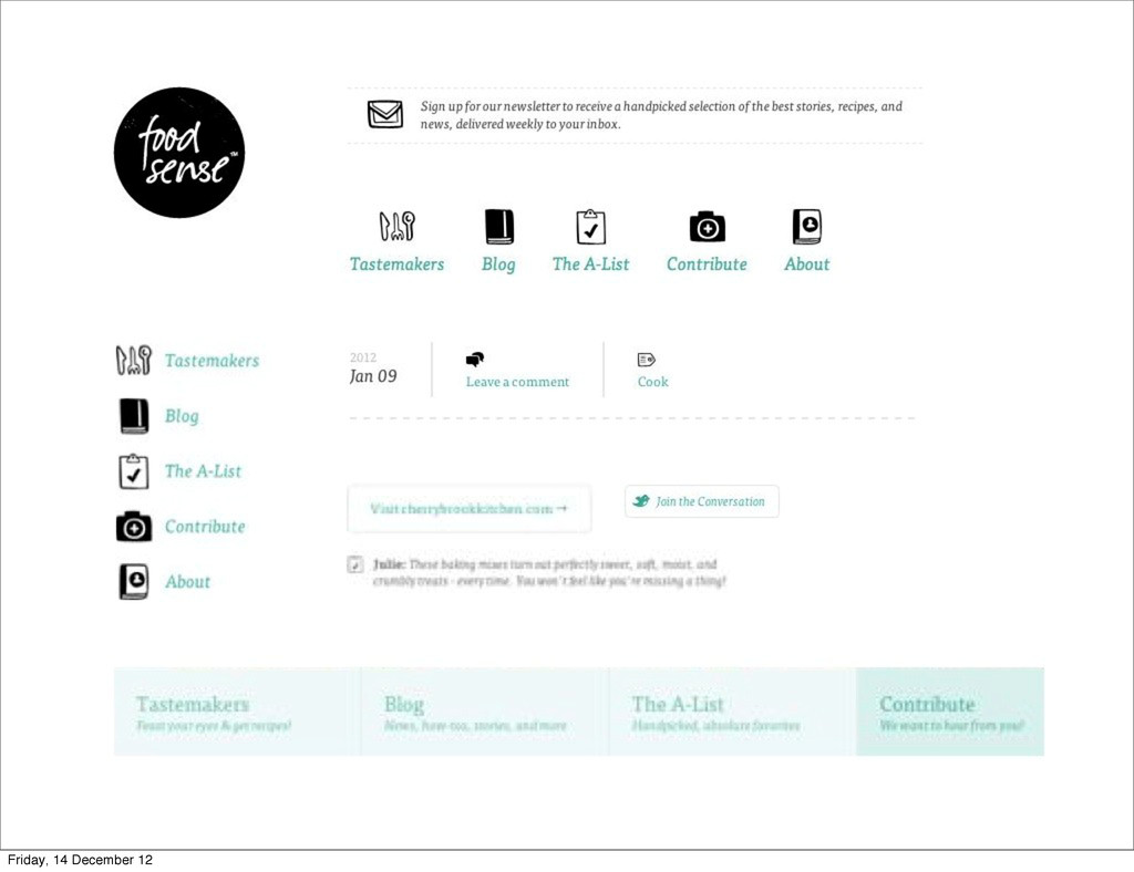
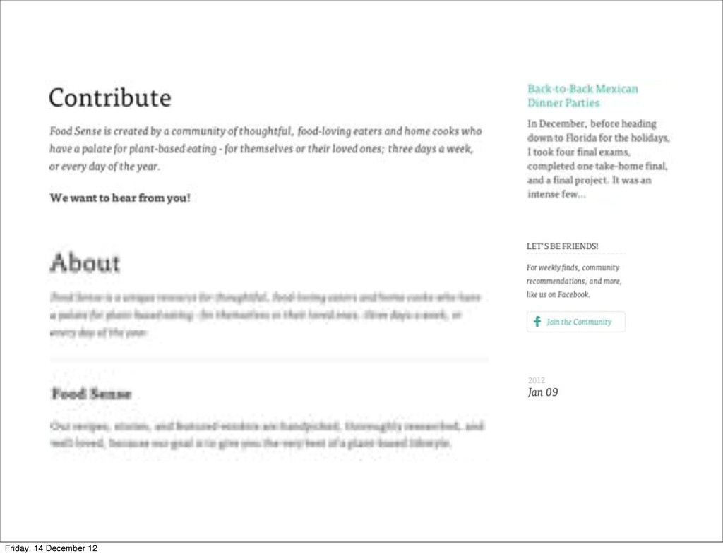
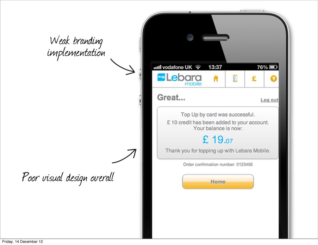
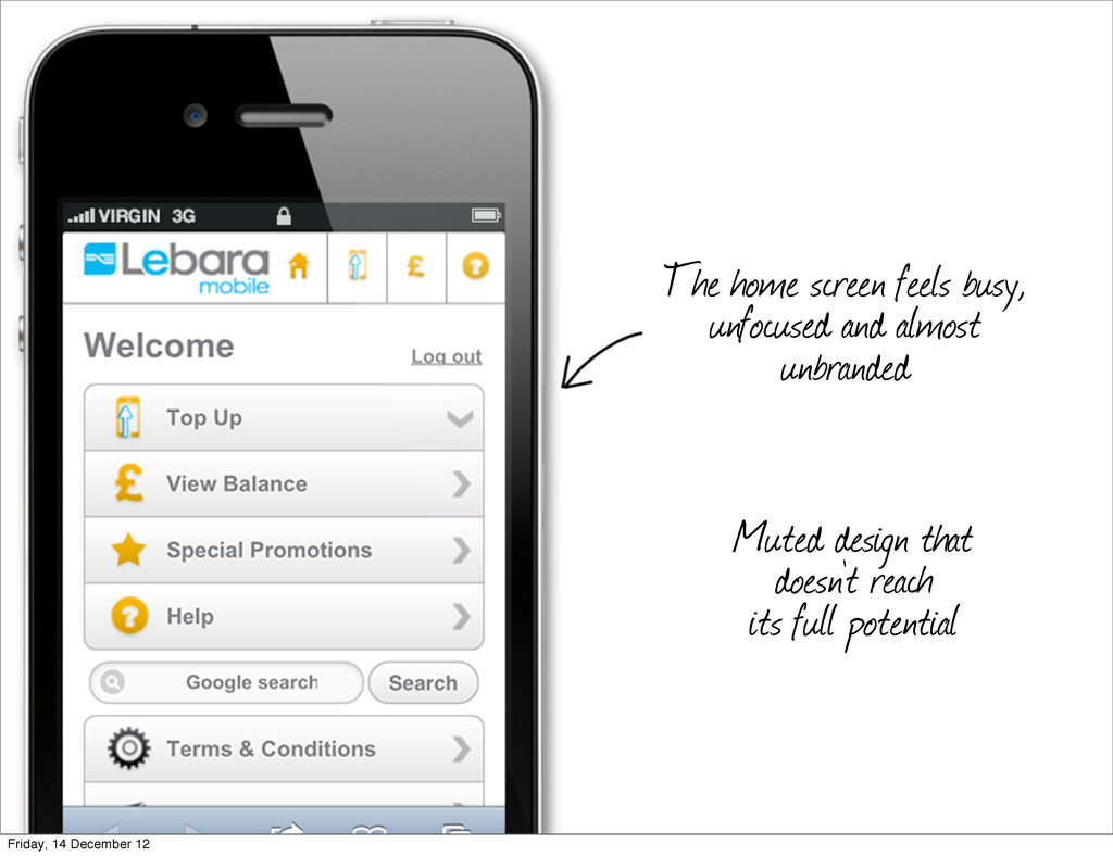
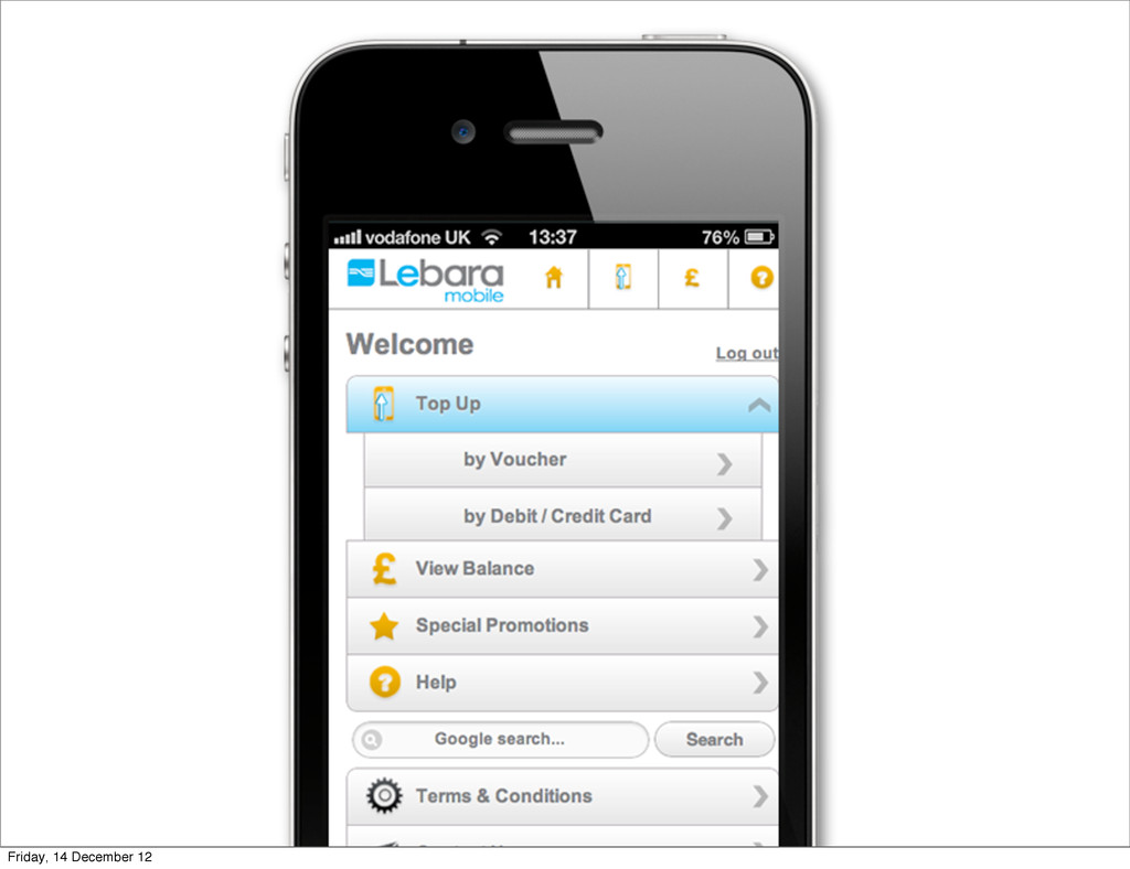
    on small screens” Home screen feels busy and unfocused — Too many choices without a visual hierarchy UI elements need to be prioritised based on user goals and business goals. Friday, 14 December 12
  4. Navigation items repeated at top and on the body Visual

    weight of actions need to be curated Friday, 14 December 12
  5. No content = huge missed opportunity Lebara voice andpersonality is

    completely missing We can make room to convey some of the organisation values Friday, 14 December 12
  6. User journeys to be streamlined Core actions to be identified

    and prioritised Broken experience. From mobile to desktop Shallow and dispersed architecture Friday, 14 December 12
  7. Understand what would our users like to do on our

    mobile site Prioritise main actions accordingly Friday, 14 December 12
  8. Split/broken experiences Users are taken to the desktop site on

    their hand devices Friday, 14 December 12
  9. The need to revisit some assumptions Ill-devised catchphrase: “mobile means

    less” 4 Ferraris sold in the US on mobile devices every month Mobile is not just ‘on the go’ — Current user contexts? Friday, 14 December 12
  10. Mobile means more Mobile brings with it exciting capabilities we

    can take advantage of Mobile extends our capabilities Mobile browsers leave PC-based web browsers behind Friday, 14 December 12
  11. Create meaningful content There’s an opportunity to get the organisation

    values across Well-structured content as an essential part of art direction Friday, 14 December 12
  12. Be future-friendly There is an ever-increasing number of devices. We

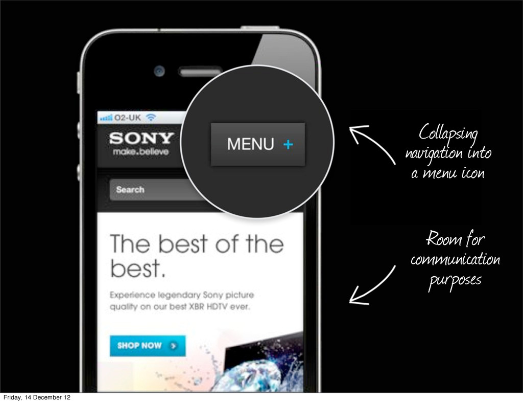
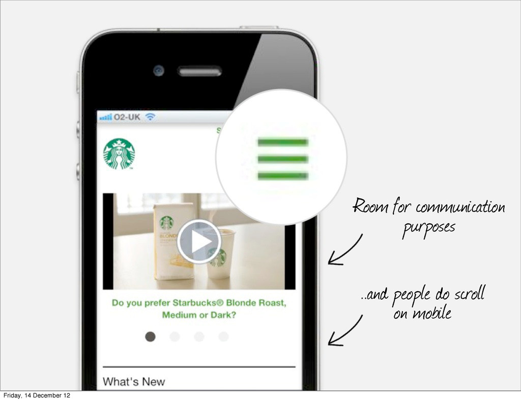
    can’t be all things on all of them Progressively enhance our experience being mindful of the device constraints and capabilities Create a functional, and hopefully optimal, experience Friday, 14 December 12