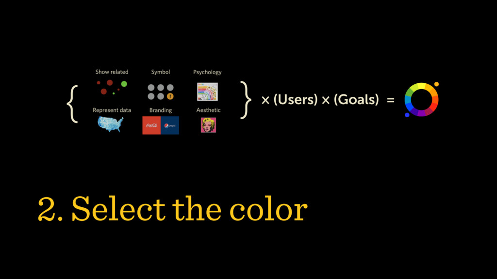
Picking colors is often frustrating: so many options! Art history, cultural differences, color theory, brand guidelines, and usability inform our decisions.
This presentation offers a systematic approach to color for UX design. Based on value contrast first, we will approach color selection as a system, rather than a series of unrelated choices.