Upgrade to Pro — share decks privately, control downloads, hide ads and more …

User Experience: It's for Everyone (2019 edition)

User Experience: It's for Everyone (2019 edition)

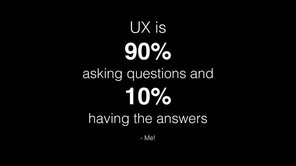
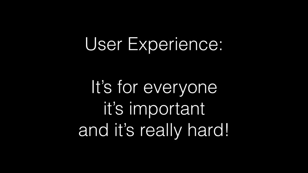
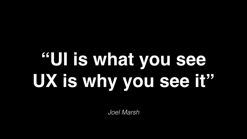
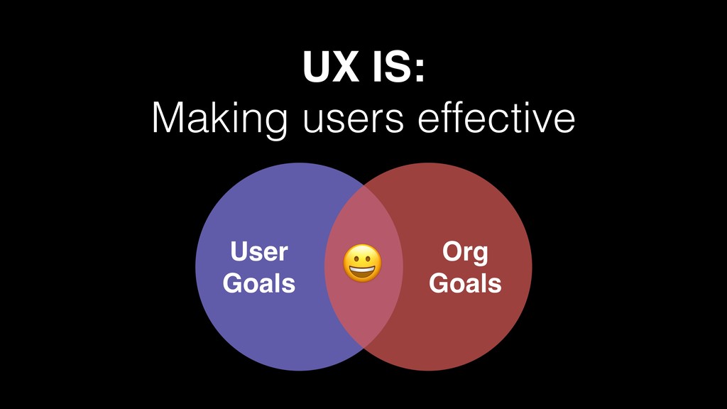
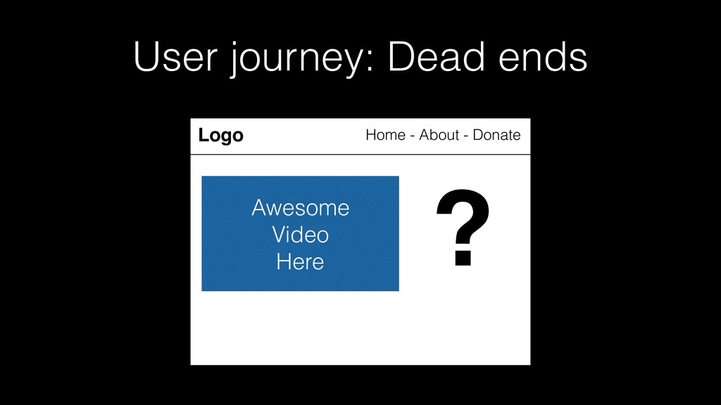
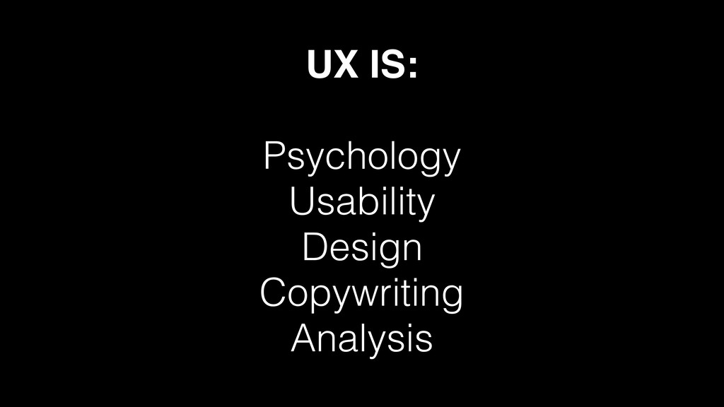
Not sure what user experience (UX) is? (Neither am I). Or whether it matters to you? (It TOTALLY does!) Or why it’s important? (Let’s find out!). I’m not a UX expert, but I don’t think you have to be: we should all be thinking about how people interact with the things that we make.

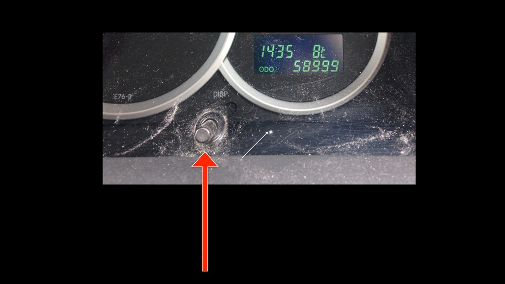
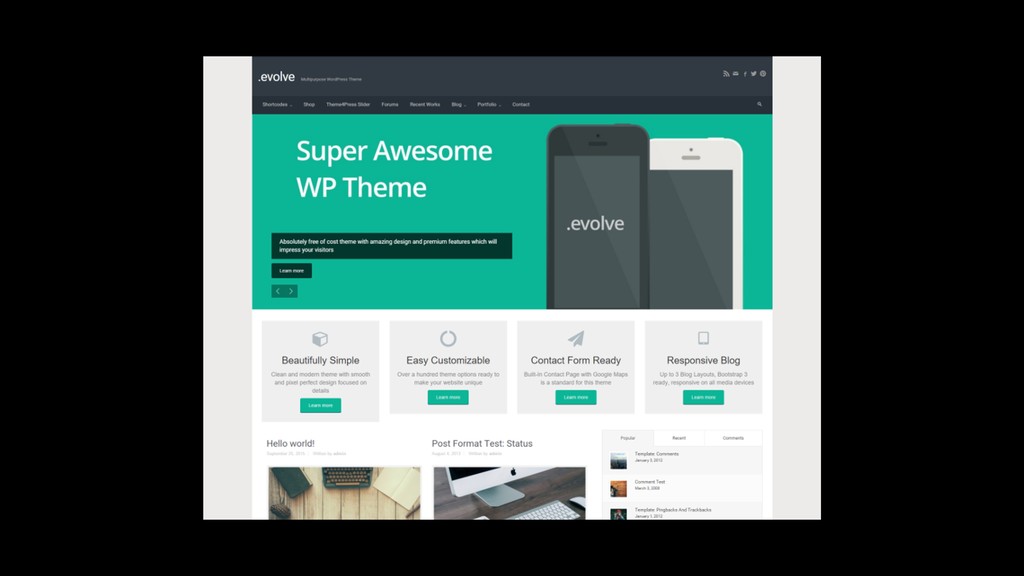
We'll take a really (really!) simple web app, tear it apart, and realise that UX is hard, very important, and definitely worth thinking about. Expect tips, links, resources, door handles, cars, and of course a little WordPress.

Ross Wintle

March 20, 2019
Tweet

More Decks by Ross Wintle

Other Decks in Technology

Transcript

  1. User Experience:
    It’s for everyone…
    …and it’s some other things too!

    View Slide

  2. Ross Wintle
    Software Developer
    Technology Consultant
    @magicroundabout

    View Slide

  3. UX Designer

    View Slide

  4. My UX Journey

    View Slide

  5. UX is
    90%
    how you think
    10%
    what you design

    - Joel Marsh: UX for Beginners

    View Slide

  6. UX is
    90%
    asking questions and
    10%
    having the answers

    - Me!

    View Slide

  7. Q & A

    View Slide

  8. Q & Eh?

    View Slide

  9. User Experience:

    It’s for everyone
    it’s important
    and it’s really hard!

    View Slide

  10. What is

    UX?

    View Slide

  11. UX
    UXD
    UI
    User eXperience
    User eXperience
    Design
    User Interface

    View Slide

  12. UI is what you see

    UX is how you feel

    View Slide

  13. Joel Marsh
    “UI is what you see

    UX is why you see it”

    View Slide

  14. “The best UX will
    often be no UI at all”
    Havoc Pennington

    http://blog.ometer.com/2016/01/26/the-dangerous-ui-team/

    View Slide

  15. View Slide

  16. My UX Journey
    with thanks to Innocent Drinks

    View Slide

  17. UX IS:
    Making users effective
    User

    Goals
    Org

    Goals

    View Slide

  18. UX IS:

    User journeys

    View Slide

  19. View Slide

  20. !
    "

    #

    $

    %

    &

    

    (

    )

    ⋆

    +


    View Slide

  21. !
    "

    #

    $

    %

    &

    

    (

    )

    ⋆

    +

    ?

    View Slide

  22. User journey: Dead ends
    Logo Home - About - Donate
    Awesome

    Video

    Here

    View Slide

  23. User journey: Dead ends
    ?
    Logo Home - About - Donate
    Awesome

    Video

    Here
    ?

    View Slide

  24. UX IS:

    A process!

    View Slide

  25. UX IS:

    Psychology
    Usability
    Design
    Copywriting
    Analysis

    View Slide

  26. UX is
    for everyone

    View Slide

  27. We all have
    experiences as users

    View Slide

  28. View Slide

  29. We can send a 1-ton
    rover vehicle to Mars
    and land it using a
    hovering, rocket-
    powered crane…
    But we still can’t make
    a printer work nicely!
    - Me

    View Slide

  30. We all create
    experiences

    View Slide

  31. UX is for…
    managers
    and
    consultants

    View Slide

  32. UX is for…
    designers

    View Slide

  33. UX is for…
    implementors

    View Slide

  34. UX is for…
    developers

    View Slide

  35. UX is for…
    copywriters

    media editors

    content creators

    View Slide

  36. UX is for…
    everyone!

    View Slide

  37. UX is
    important

    View Slide

  38. UX can…
    make a difference


    (positive and negative)

    View Slide

  39. https://twitter.com/Una/status/698003448323641344

    View Slide

  40. UX can…
    increase sales

    View Slide

  41. –Greg Linden - Make Data Useful - 2006


    https://sites.google.com/site/glinden/Home/StanfordDataMining.2006-11-28.ppt
    Every 100ms delay
    costs 1% of sales

    View Slide

  42. –Adam Silver 


    https://medium.com/simple-human/embracing-simplicity-
    cf9ca9fe6a9e#.xpwld4p72
    Just Eat removed a fancy, JS
    accordion form and replaced it with
    a multi-page form.
    “…this resulted in almost 2 million
    extra orders per year.”

    View Slide

  43. UX can…
    raise more
    money

    View Slide

  44. –Steve Guy - British Heart Foundation


    https://www.youtube.com/watch?v=EIR2BamKwl8
    The BHF simplified a
    form and raised an
    extra £2m per year

    View Slide

  45. UX can…
    make people
    smile

    View Slide

  46. –Lots of people


    https://twitter.com/slacklovetweets
    “We love @SlackHQ…”

    View Slide

  47. UX can…
    change the
    world?

    View Slide

  48. UX is
    important

    View Slide

  49. UX is
    hard

    View Slide

  50. View Slide

  51. UX is
    hard

    View Slide

  52. Should I have a home
    link in my navigation?

    View Slide

  53. No, people know that
    they click the logo.
    Should I have a home link in
    my navigation?

    View Slide

  54. Yes, people don’t
    know to click the logo.
    Should I have a home link in
    my navigation?

    View Slide

  55. No, people use
    breadcrumbs
    Should I have a home link in
    my navigation?

    View Slide

  56. No, people use the
    back button
    Should I have a home link in
    my navigation?

    View Slide

  57. Yes, people expect it.
    Should I have a home link in
    my navigation?

    View Slide

  58. It depends.
    Should I have a home link in
    my navigation?

    View Slide

  59. What about on mobile
    with collapsed nav?
    Should I have a home link in
    my navigation?

    View Slide

  60. Have you considered
    the user journey?
    Should I have a home link in
    my navigation?

    View Slide

  61. Test it
    Should I have a home link in
    my navigation?

    View Slide

  62. I tested it!

    (and people do crazy things)
    Should I have a home link in
    my navigation?

    View Slide

  63. YOU’RE
    NOT
    NORMAL!

    View Slide

  64. UX is
    hard

    View Slide

  65. https://twitter.com/rUv/status/695055910683615232

    View Slide

  66. https://twitter.com/lionelrudaz/status/695147236670455808

    View Slide

  67. UX is
    hard

    View Slide

  68. The Simplest

    Web App

    In The

    World
    Case Study

    View Slide

  69. View Slide

  70. View Slide

  71. View Slide

  72. User journey
    • Discovery
    • Arrival (at homepage?)
    • Sign up / create account
    • Log in
    • Change status

    View Slide

  73. User journey
    • Discovery
    • Arrival (at homepage?)
    • Sign up / create account
    • Log in
    • Change status
    • Push notifications?

    View Slide

  74. Acquisition is
    hard

    View Slide

  75. Homepage
    How did the user get
    here?

    View Slide

  76. Homepage
    How can I get more
    people here?

    View Slide

  77. Navigation is
    hard

    View Slide

  78. Homepage
    What should be in
    my navigation?

    View Slide

  79. Homepage
    What should NOT
    be in my
    navigation?

    View Slide

  80. Homepage
    What about when
    logged in?

    View Slide

  81. Homepage
    Should I have a
    home link?

    View Slide

  82. Calls to action are
    easy
    (mostly)

    View Slide

  83. Homepage
    What might the user
    want to do next?

    View Slide

  84. Homepage
    Can I easily take
    action on mobiles?

    View Slide

  85. Homepage
    Can I simplify by
    limiting the number of
    choices?

    View Slide

  86. Homepage
    Should the action
    change when logged
    in?

    View Slide

  87. Copywriting is
    hard

    View Slide

  88. Homepage
    How can I simplify/
    edit this?

    View Slide

  89. Homepage
    What DO I need to
    say.

    View Slide

  90. Homepage
    What DON’T I need to
    say.

    View Slide

  91. Homepage
    Have I clearly and
    succinctly explained
    what this is in a way
    that a new visitor will
    understand?

    View Slide

  92. Homepage
    Do I need to explain
    this to new users? Or
    is some prior
    knowledge assumed?

    View Slide

  93. Homepage
    Is my page too long?
    Or too short?

    View Slide

  94. Homepage
    Are my lines too
    wide? Or too narrow?

    View Slide

  95. Mobile-friendly is
    hard

    View Slide

  96. Homepage
    Responsive!

    View Slide

  97. Forms are
    REALLY
    hard

    View Slide

  98. Sign up
    How can I make it
    easy?

    View Slide

  99. Sign up
    What data do I need
    to collect?

    View Slide

  100. Sign up
    What data don’t I
    need to collect?

    View Slide

  101. Sign up
    Do users need
    usernames? Or will
    email addresses do?

    View Slide

  102. Sign up
    What needs
    explaining, and what
    doesn’t?

    View Slide

  103. Sign up
    What do I need to do
    about data protection
    and legal stuff?

    View Slide

  104. Sign up
    Should people set a
    password? Or should
    I send one?

    View Slide

  105. Sign up
    Should I enforce
    complex passwords?

    View Slide

  106. Sign up
    What validation do I
    need to do?

    View Slide

  107. Sign up
    How do I display
    validation errors?

    View Slide

  108. Sign up
    Should I do fancy JS/
    AJAX validation in
    real time?

    View Slide

  109. Sign up
    Should this be a one
    page or multi-page
    form?

    View Slide

  110. Sign up
    Would social media
    logins be easier?

    View Slide

  111. User journeys are
    hard

    View Slide

  112. Thanks!
    What happens now?
    What screen do users
    go to?

    View Slide

  113. Thanks!
    Should the user be
    logged in?

    View Slide

  114. Thanks!
    Do they get an email?

    View Slide

  115. Thanks!
    Does an admin get
    an email?

    View Slide

  116. Log in
    How long are people
    logged in for?


    (This is critical!)

    View Slide

  117. Log in
    What screen is shown
    after login?

    View Slide

  118. Log in
    What does a user do
    if they’ve forgotten
    their login?

    View Slide

  119. Log in
    Is social media
    linking/logging in
    helpful?

    View Slide

  120. Change status
    What is the button
    feedback?

    View Slide

  121. Change status
    What else happens
    after pressing the
    button?

    View Slide

  122. Change status
    Should I congratulate
    the user?

    View Slide

  123. Change status
    Should people be
    allowed to upload a
    photo or note?

    View Slide

  124. Change status
    Should people be
    allowed to change
    colour (as they now
    know the gender)?

    View Slide

  125. Change status
    Should I offer sharing
    on social media…


    …or by email?

    View Slide

  126. Change status
    Should there be an
    “oops” or “undo”
    option?

    View Slide

  127. Change status
    What’s the balance of
    more options vs
    getting out of the
    way?

    View Slide

  128. The Simplest

    Web App

    In The

    World
    Case Study

    View Slide

  129. 2 actions
    Case Study

    View Slide

  130. 46 questions
    Case Study

    View Slide

  131. UX is
    hard

    View Slide

  132. Which way now?

    View Slide

  133. Beg, steal, borrow
    Resource:
    http://www.goodui.org

    View Slide

  134. Ask questions
    Resource:
    Your brain

    View Slide

  135. Test and Observe
    Resource:
    Your mum, dad, grandma, cat

    View Slide

  136. Track and Analyse
    Resource:
    Analytics (Event Tracking)

    View Slide

  137. Change and test
    Resource:

    Google Experiments, Optimizely, InVision

    View Slide

  138. Think outside

    the screen
    Resource:

    Your own experiences

    View Slide

  139. Ask, Discuss, Learn
    Resource:

    Each other

    View Slide

  140. Other Resources
    • Psychology - Laws of UX: https://lawsofux.com/
    • UX Myths: https://uxmyths.com/
    • InVision “Principles of UX Design” course:

    https://www.invisionapp.com/ecourses/principles-
    of-ux-design (free)
    • Inspiration: https://www.reallygoodux.io/

    View Slide

  141. Questions?
    (But not necessarily answers)
    Ross Wintle

    @magicroundabout
    oikos.digital

    View Slide