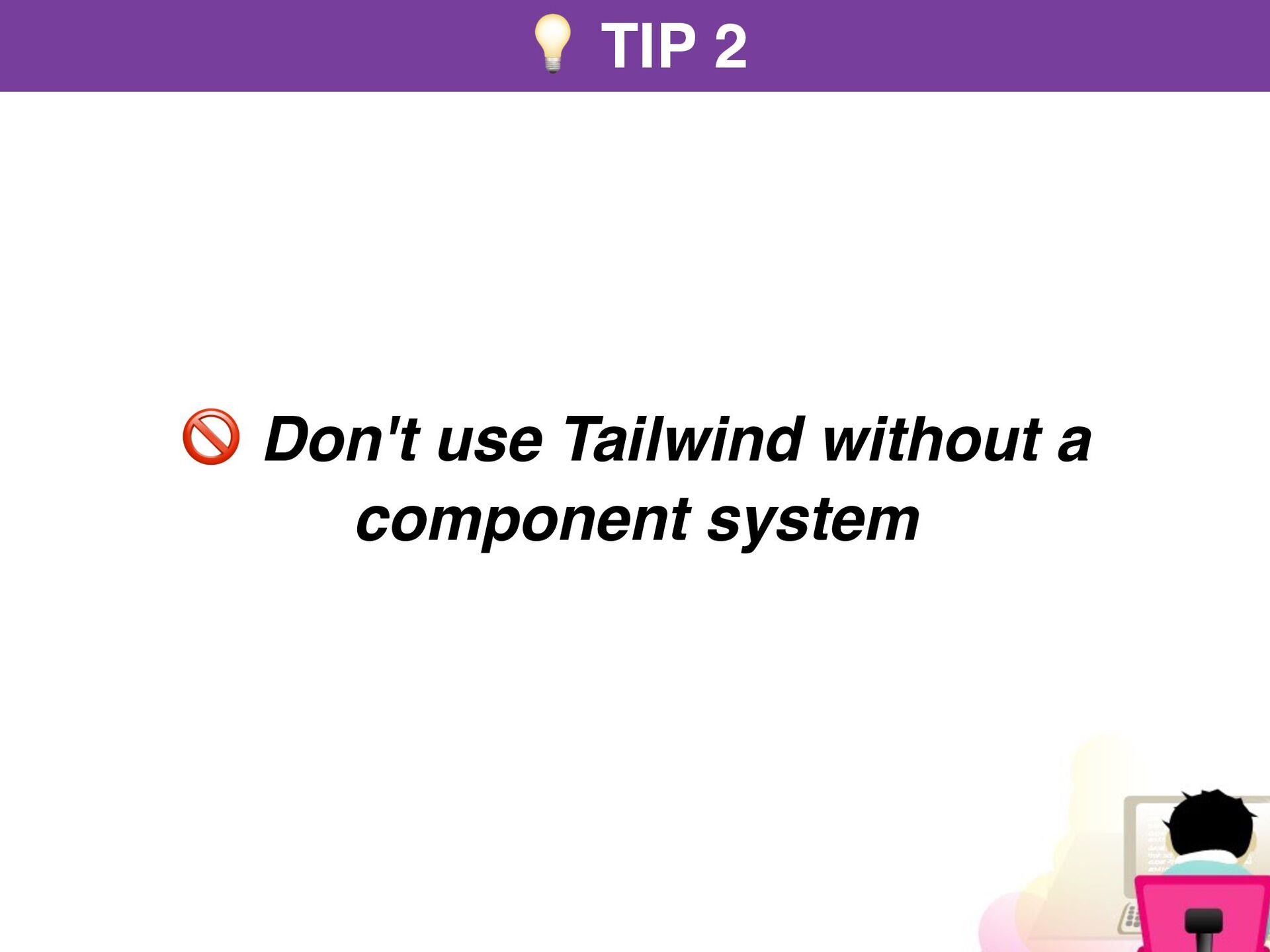
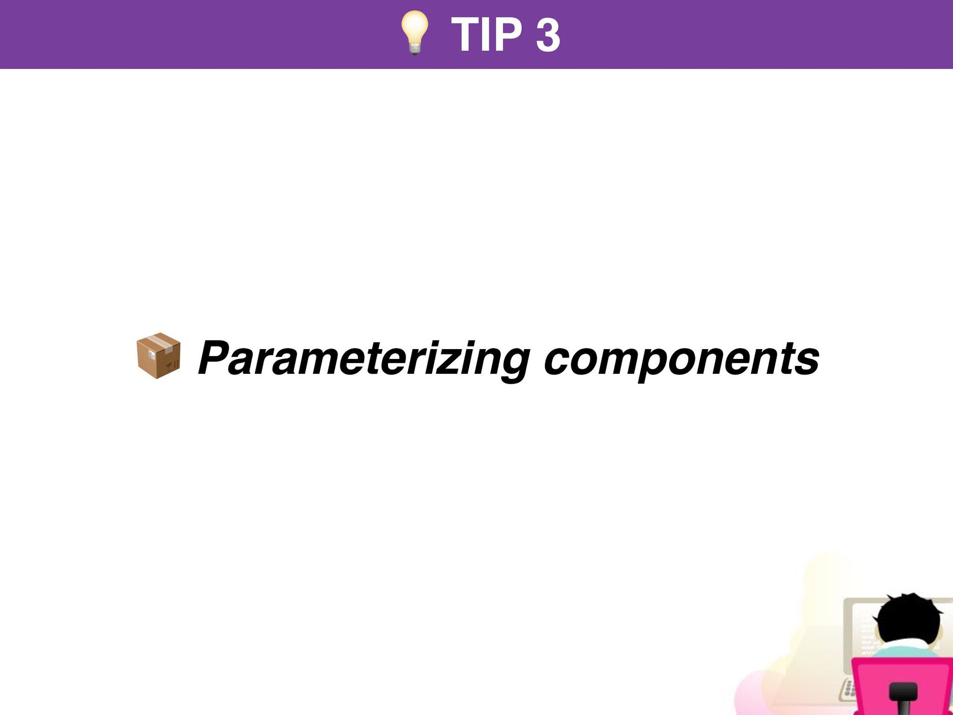
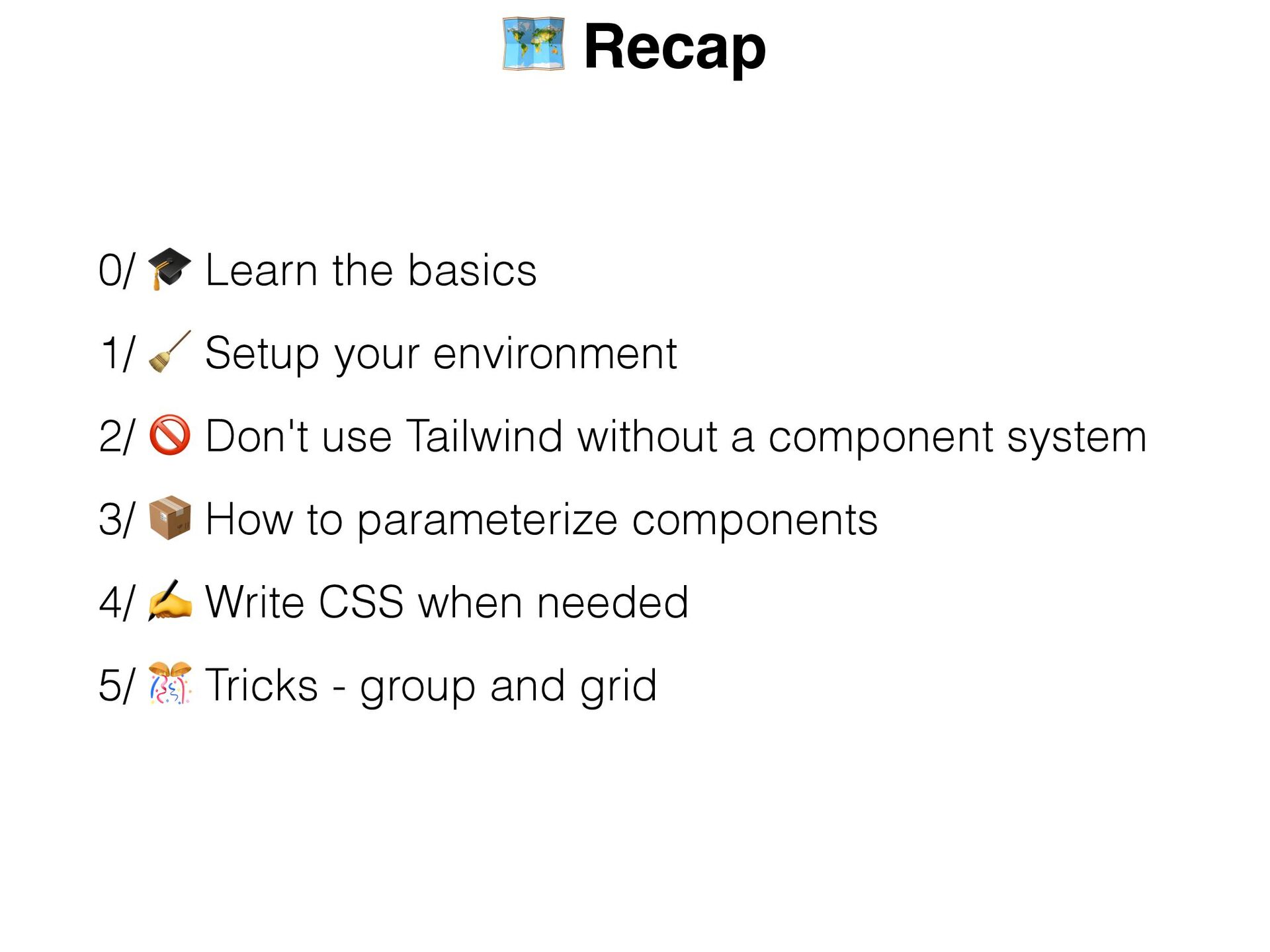
Tips
https://tips.rstankov.com/p/tips-for-tailwind-css
Links
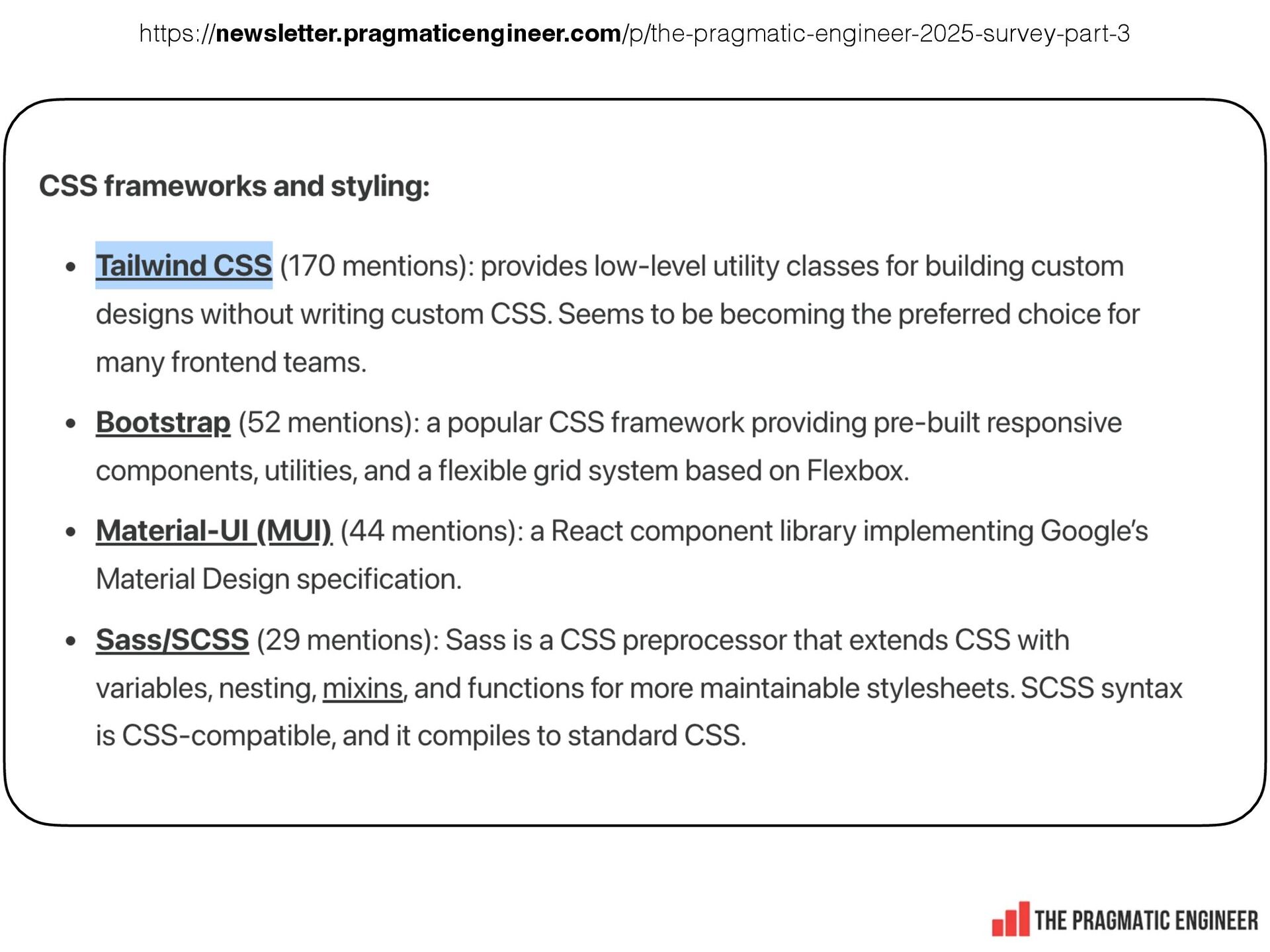
https://newsletter.pragmaticengineer.com/p/the-pragmatic-engineer-2025-survey-part-3
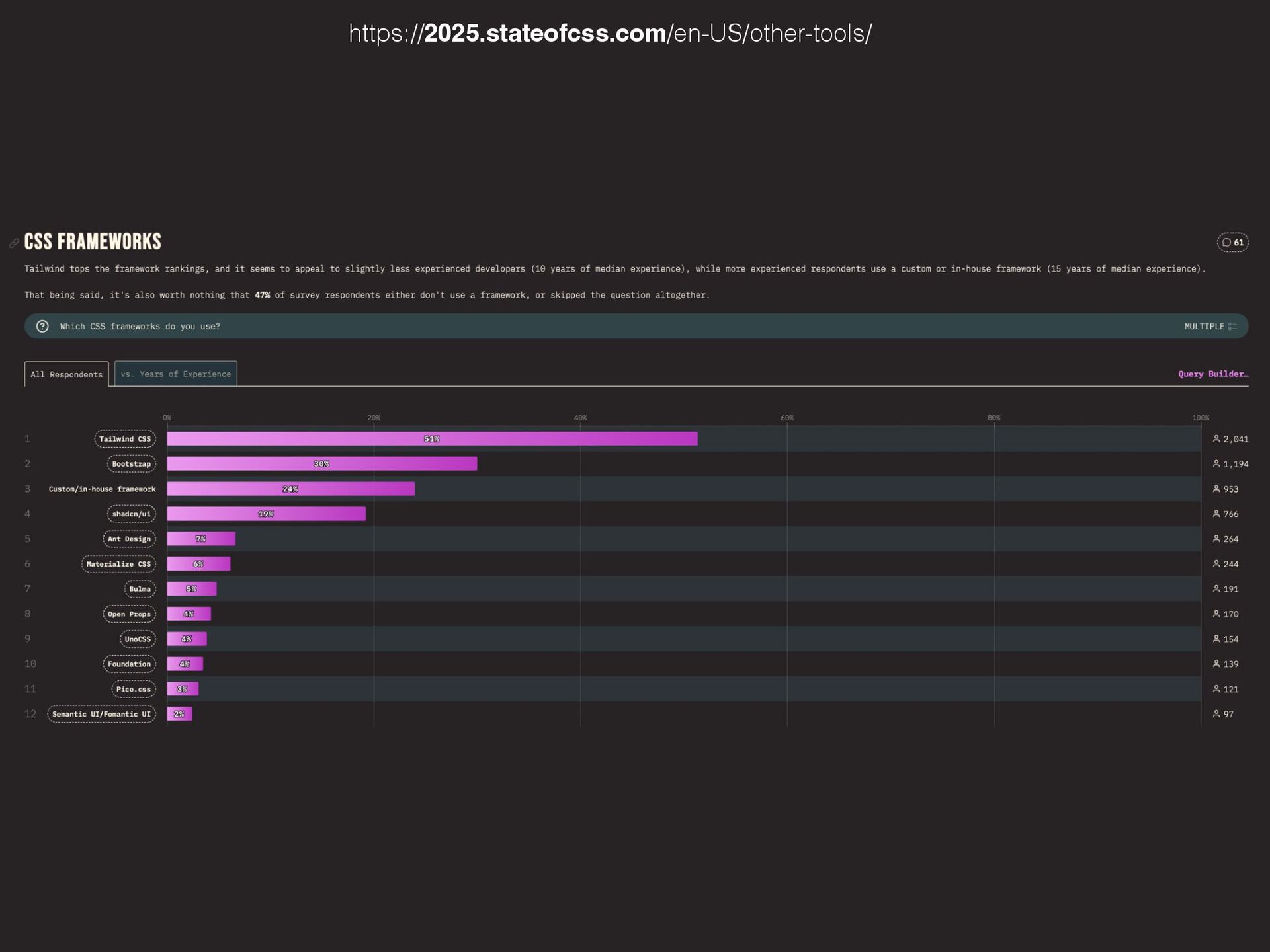
https://2025.stateofcss.com/en-US/other-tools/
https://www.youtube.com/watch?v=TNXM4bqGqek
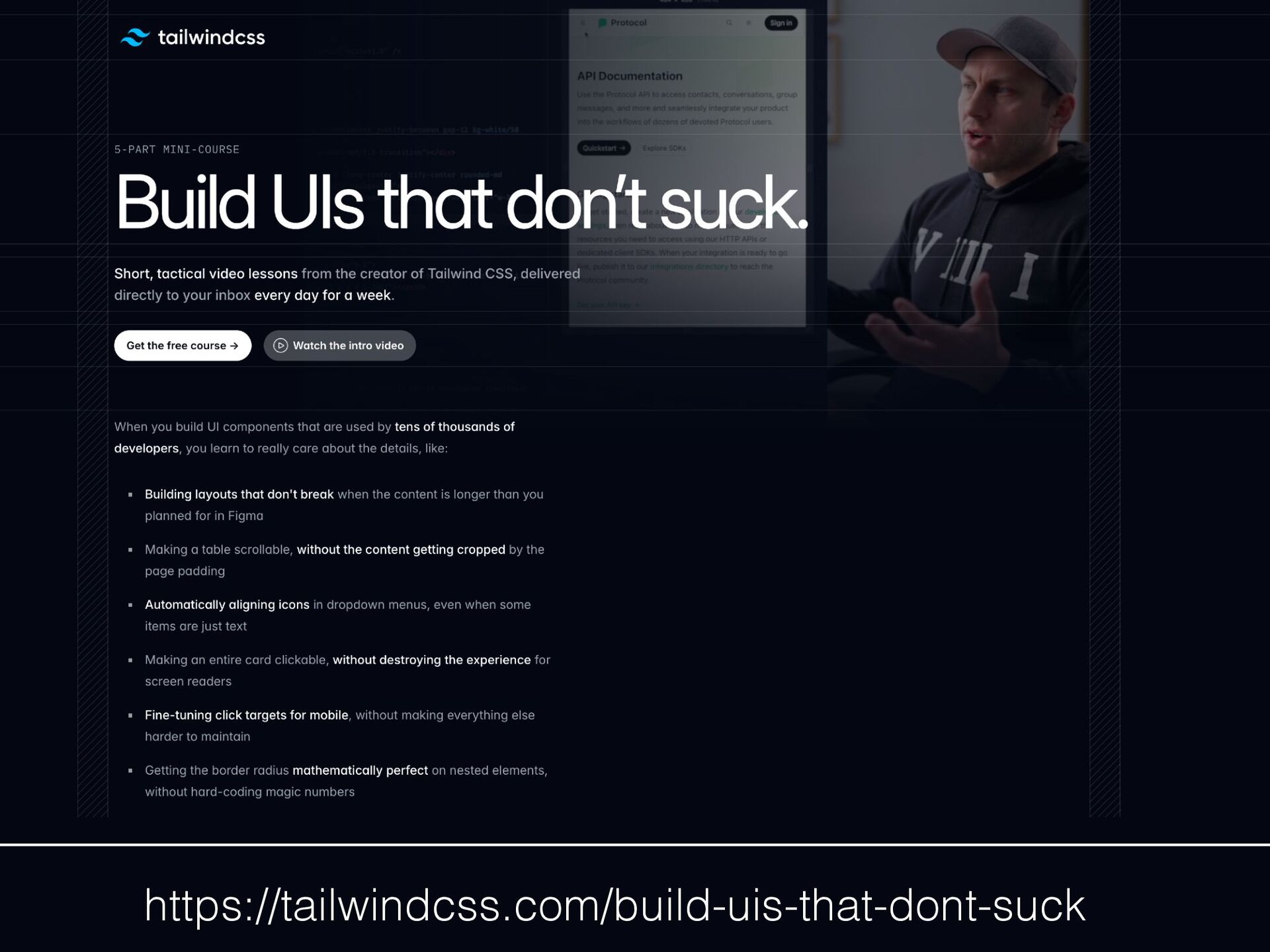
https://tailwindcss.com/build-uis-that-dont-suck
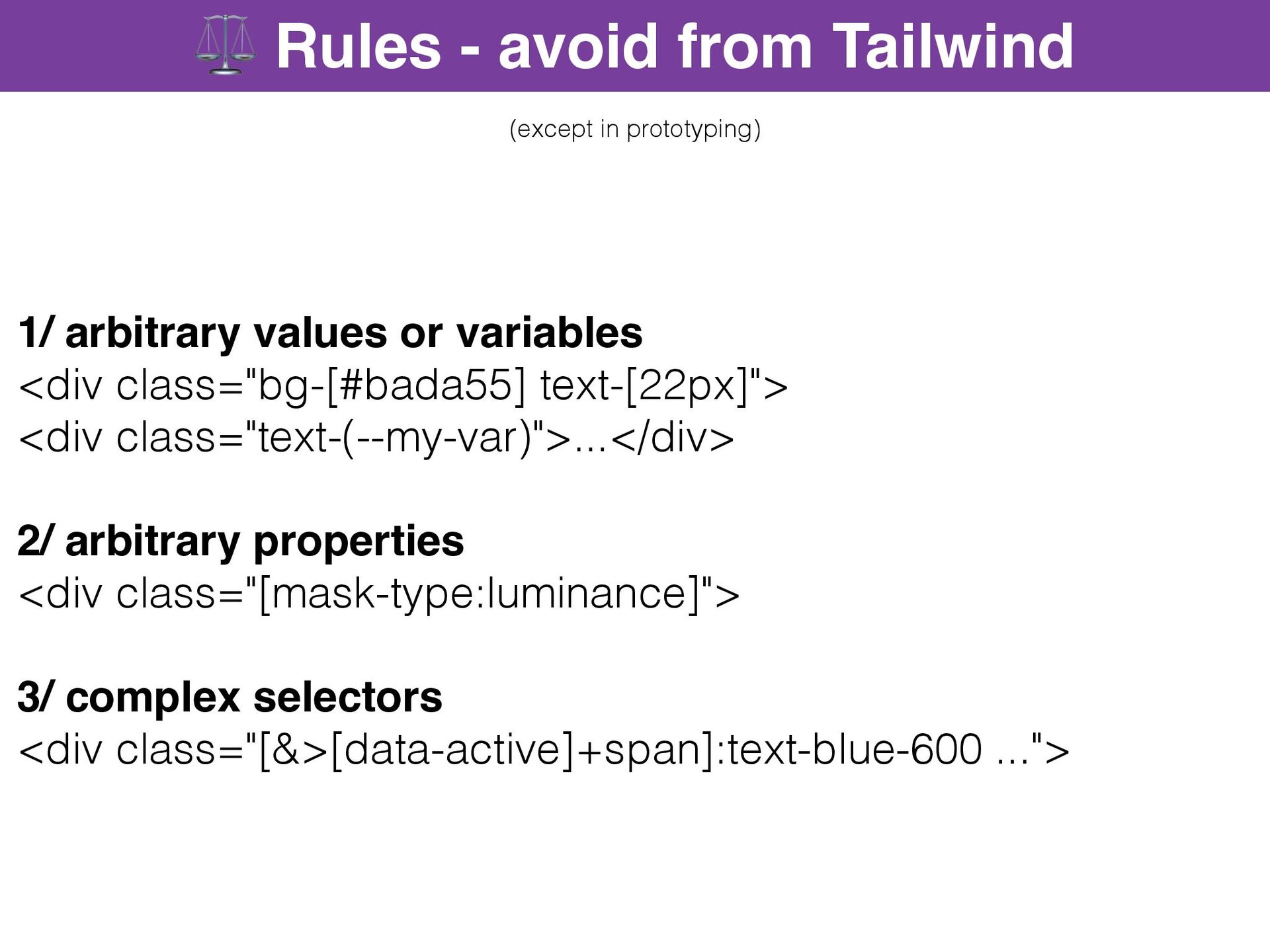
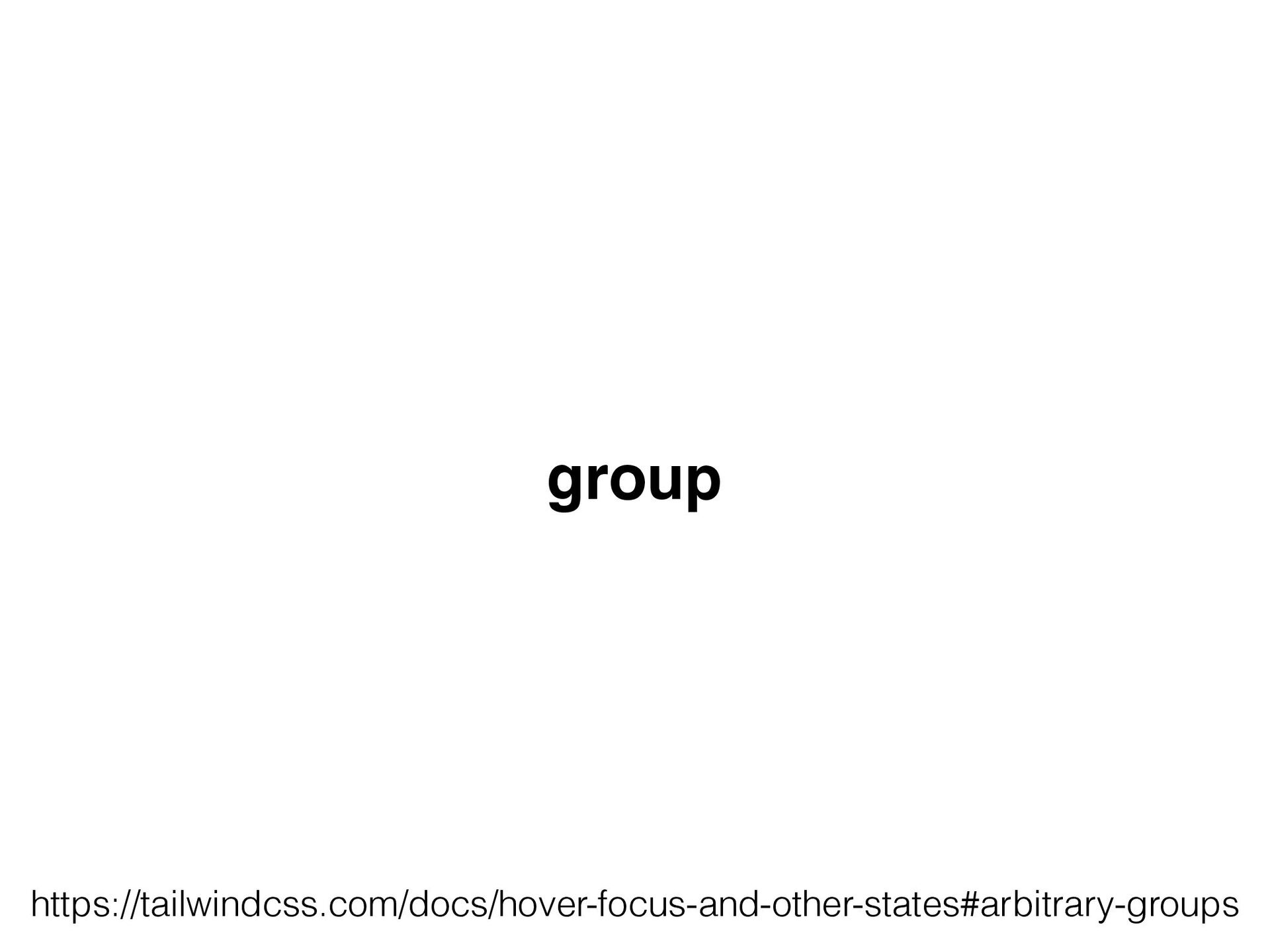
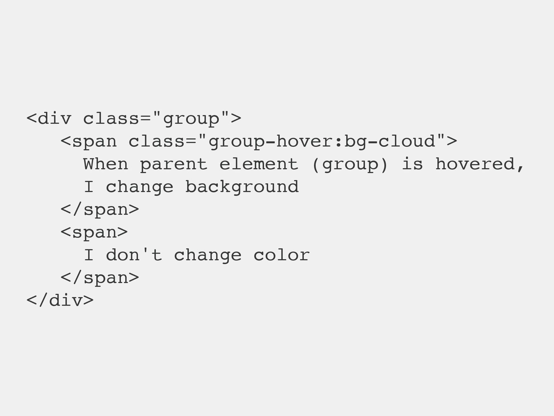
https://tailwindcss.com/docs/hover-focus-and-other-states#arbitrary-groups
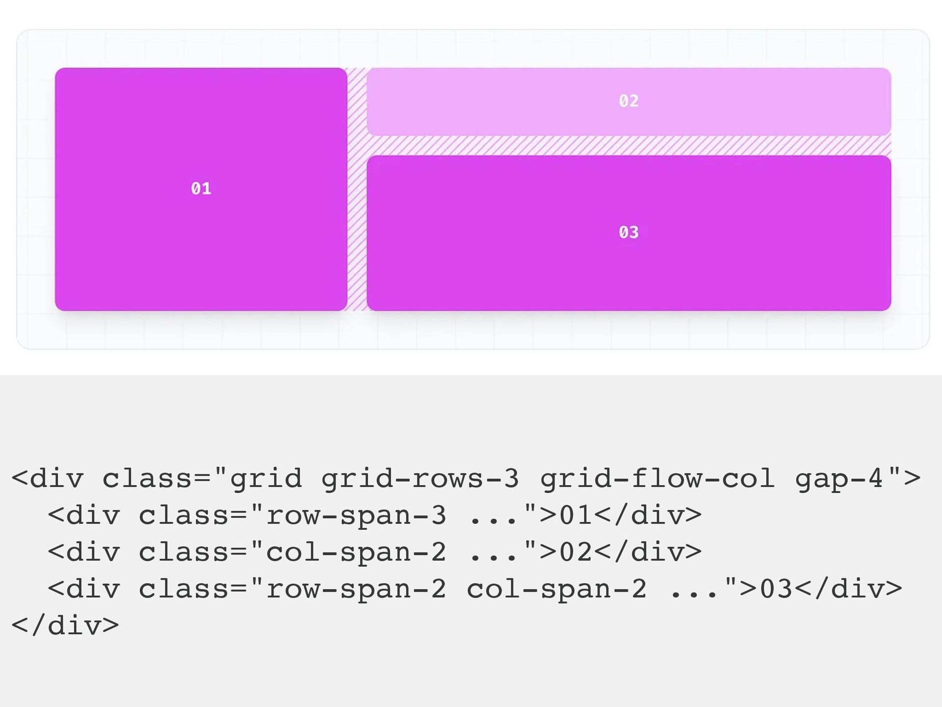
https://tailwindcss.com/docs/grid-template-columns
 rstankov
 trishagee
 afnizarnur
 bryan
bryan
 aleyda
 cassininazir
 apolaine
 greggifford
 eileencodes
 techseoconnect
 raygrieselhuber
 tapps
tapps
 nmsamuel
![function MyButton() { const [isHovered, setIsHovered] = useState(false); const className](https://files.speakerdeck.com/presentations/bc478d20964d451486a0b414cd63b998/slide_41.jpg)