Upgrade to Pro
— share decks privately, control downloads, hide ads and more …
Speaker Deck
Features
Speaker Deck
PRO
Sign in
Sign up for free
Search
Search
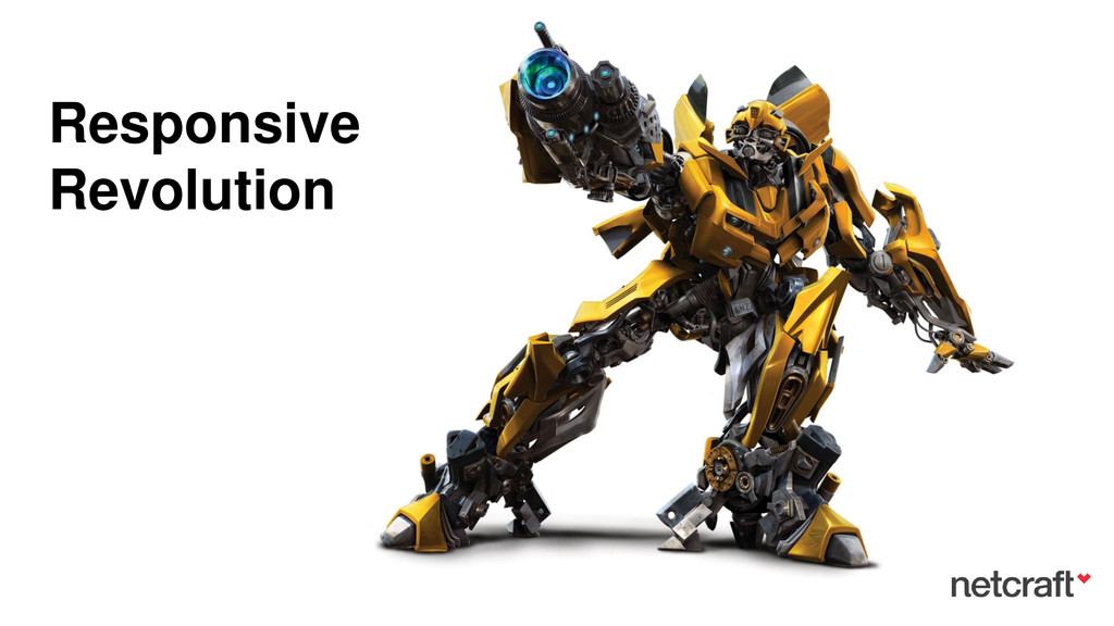
Responsive Revolution
Search
serge lerner
November 13, 2013
Technology
120
2
Share
Embed
Copy iframe code
Copy JS code
Copy link
Start on current slide
Responsive Revolution
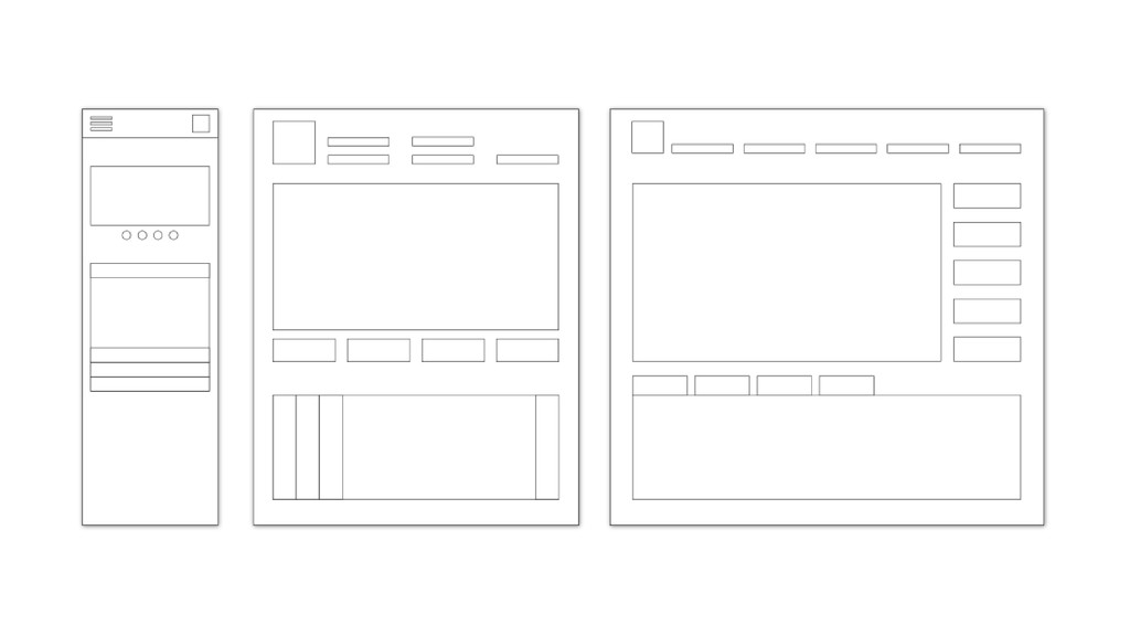
Points to keep in-mind while (and before) developing a responsive web project.
serge lerner
November 13, 2013
Other Decks in Technology
See All in Technology
プロダクトだけじゃない、社内プロセスにおける自動化・省力化ノススメ
kakehashi
PRO
1
2.8k
最近評価が難しくなった
maroon8021
0
260
AI時代のエンジニアキャリアについて今一度考える
sakamoto_582
2
1.3k
はじめてのWDM
miyukichi_ospf
1
120
Text-to-SQLをAgentCoreで実現し、生成されるSQLの精度を定量的に評価する
yakumo
2
670
脱金融のフューチャー・デザイン / Future Design Beyond Finance
ks91
PRO
0
140
Baseline対応のDOMの型定義を作った
uhyo
3
720
20260702_生成AIはどこまで成長するのか_チャットだけじゃない世界
doradora09
PRO
0
110
記録をかんたんに、提案をパーソナルに ── AIであすけんが目指すもの
oprstchn
0
170
Compose 新機能総まとめ / What's New in Jetpack Compose
yanzm
0
150
SRE歴2ヶ月でも開発6年の知見を活かして、チームで止まっていた環境改善を前に進めた話
a_ono
1
220
Amazon EVS で VCF 9.0 / 9.1 のサポート開始まとめ
mtoyoda
0
280
Featured
See All Featured
Testing 201, or: Great Expectations
jmmastey
46
8.2k
Building Better People: How to give real-time feedback that sticks.
wjessup
370
20k
Impact Scores and Hybrid Strategies: The future of link building
tamaranovitovic
0
330
Making Projects Easy
brettharned
120
6.7k
Site-Speed That Sticks
csswizardry
13
1.2k
Public Speaking Without Barfing On Your Shoes - THAT 2023
reverentgeek
1
460
Making the Leap to Tech Lead
cromwellryan
135
10k
[SF Ruby Conf 2025] Rails X
palkan
2
1.1k
Pawsitive SEO: Lessons from My Dog (and Many Mistakes) on Thriving as a Consultant in the Age of AI
davidcarrasco
0
180
Everyday Curiosity
cassininazir
0
250
How to Ace a Technical Interview
jacobian
281
24k
Abbi's Birthday
coloredviolet
3
8.5k
Transcript
Responsive Revolution
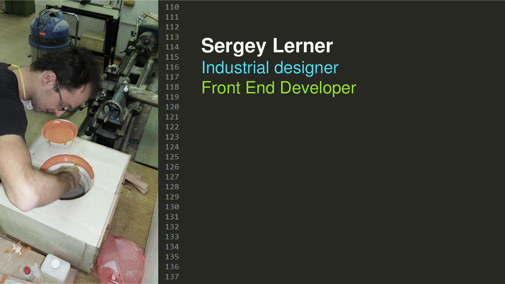
Sergey Lerner Industrial designer Front End Developer
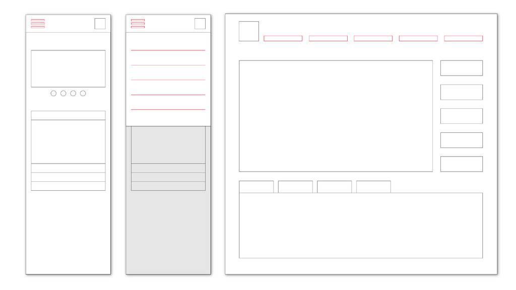
STOP for a moment!
Think like Gary
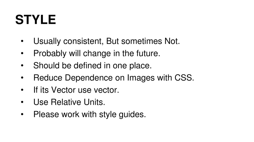
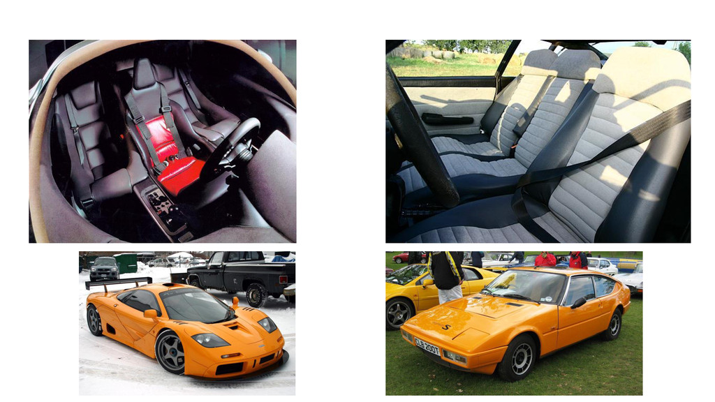
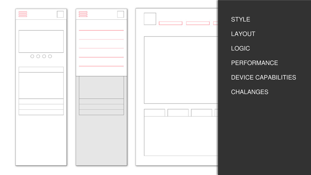
STYLE
None
STYLE • Usually consistent, But sometimes Not. • Probably will
change in the future. • Should be defined in one place. • Reduce Dependence on Images with CSS. • If its Vector use vector. • Use Relative Units. • Please work with style guides.
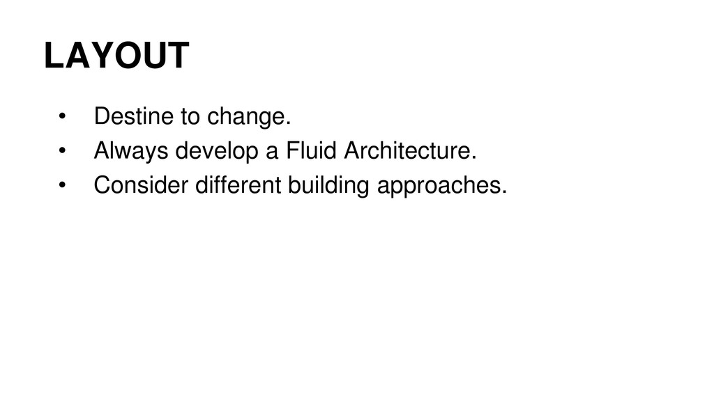
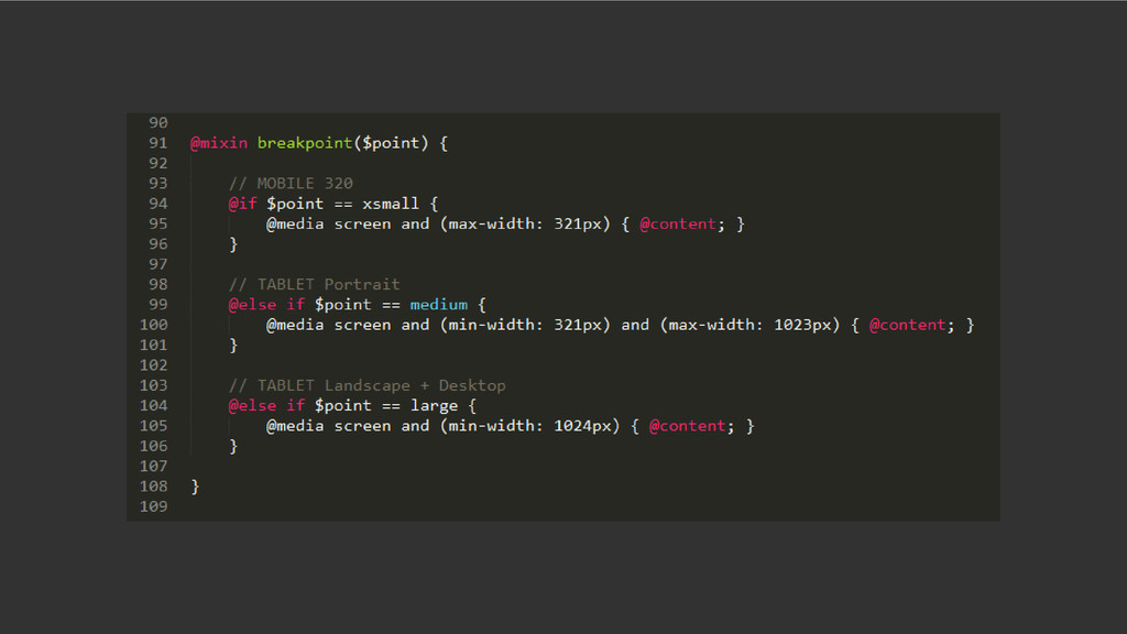
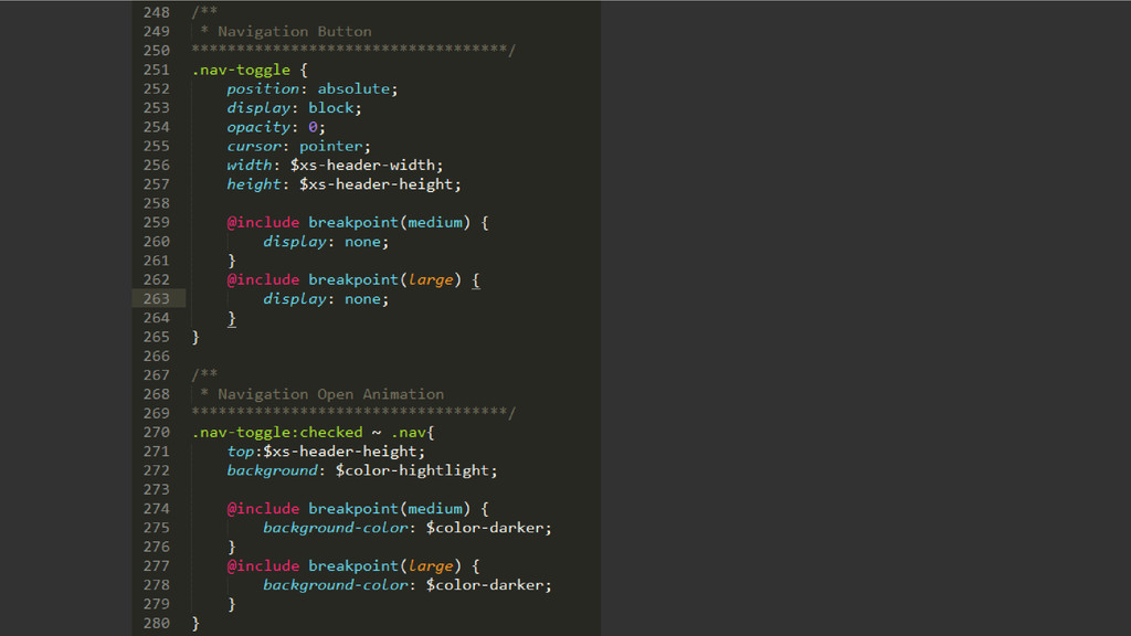
LAYOUT
None
LAYOUT • Destine to change. • Always develop a Fluid
Architecture. • Consider different building approaches.
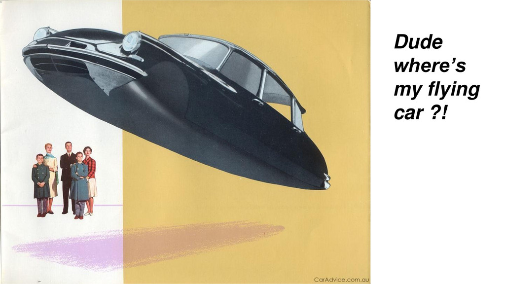
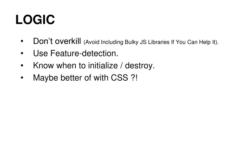
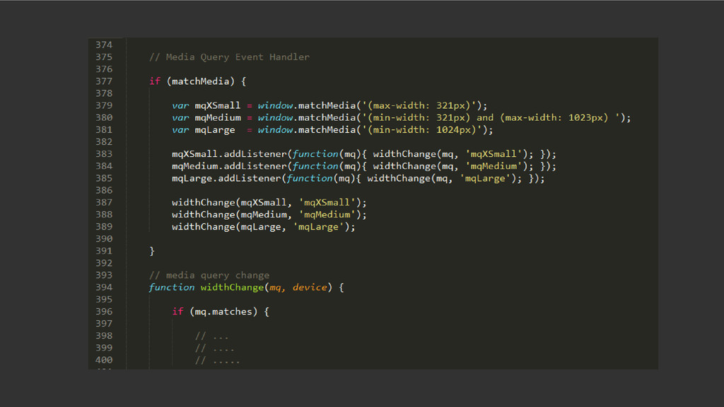
Dude where’s my flying car ?! LOGIC
Dude where’s my flying car ?!
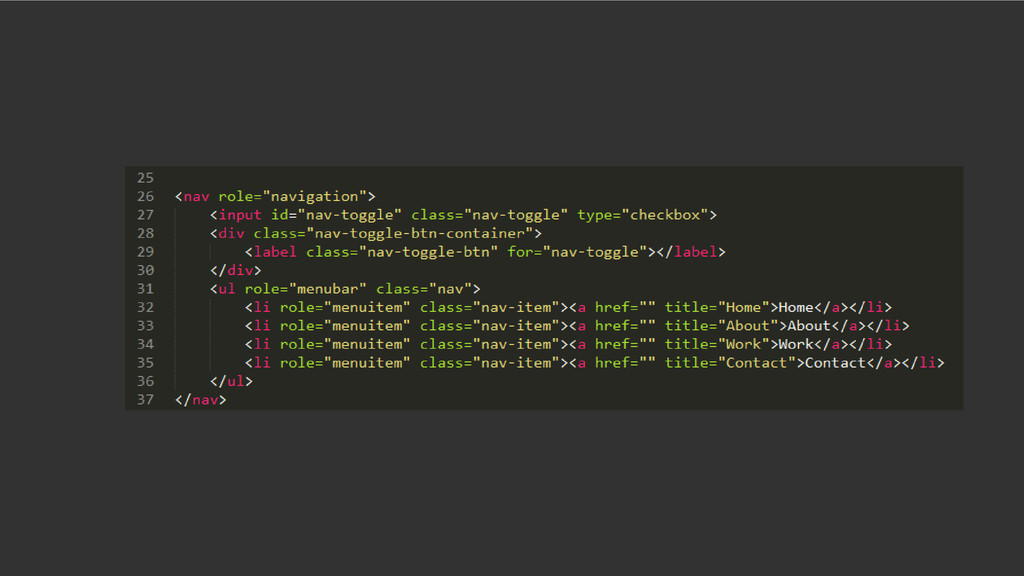
LOGIC • Don’t overkill (Avoid Including Bulky JS Libraries If
You Can Help It). • Use Feature-detection. • Know when to initialize / destroy. • Maybe better of with CSS ?!
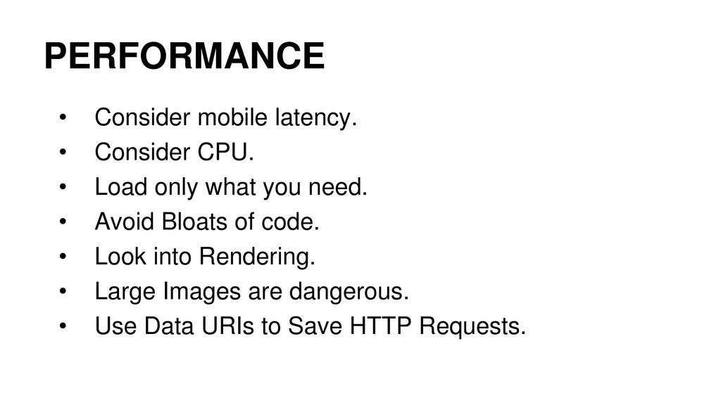
PERFORMANCE
None
PERFORMANCE • Consider mobile latency. • Consider CPU. • Load
only what you need. • Avoid Bloats of code. • Look into Rendering. • Large Images are dangerous. • Use Data URIs to Save HTTP Requests.
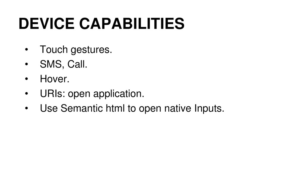
DEVICE CAPABILITIES
None
DEVICE CAPABILITIES • Touch gestures. • SMS, Call. • Hover.
• URIs: open application. • Use Semantic html to open native Inputs.
CHALLENGES
None
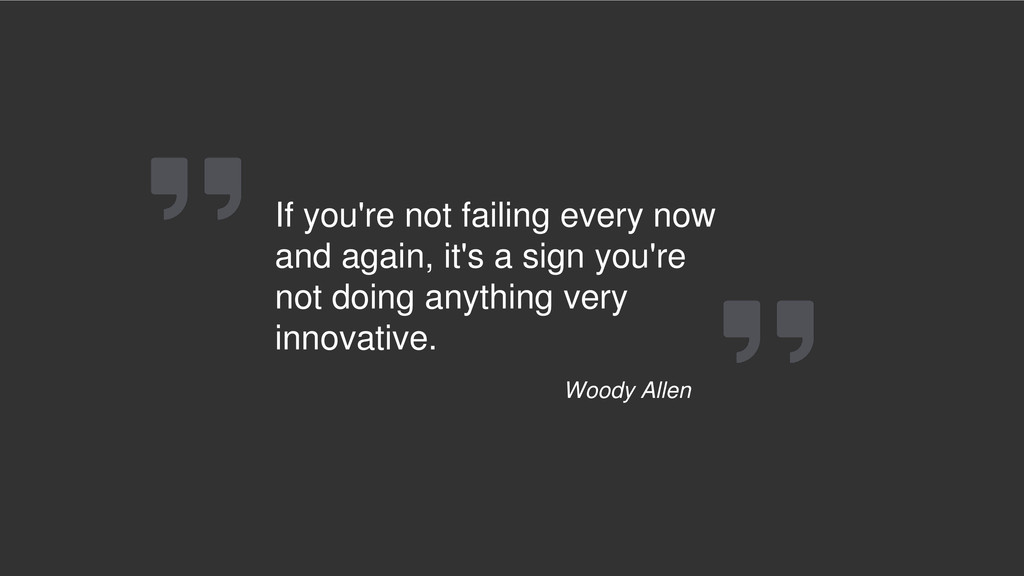
If you're not failing every now and again, it's a
sign you're not doing anything very innovative. Woody Allen
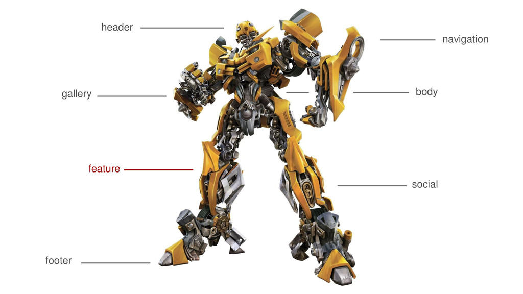
header footer body social gallery navigation feature
None
None
STYLE LAYOUT LOGIC PERFORMANCE DEVICE CAPABILITIES CHALANGES
None
None
None
None
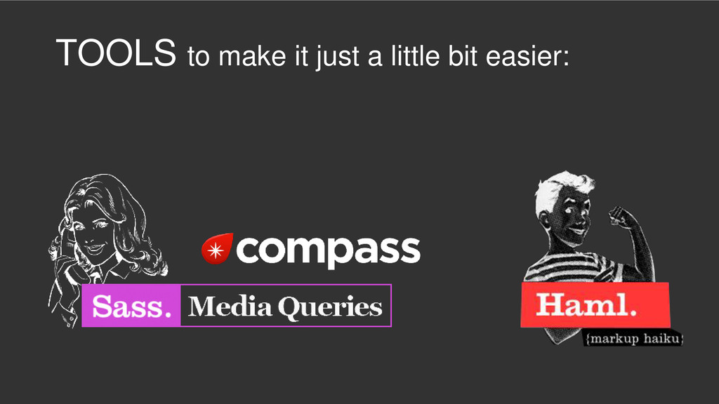
TOOLS to make it just a little bit easier:
Thank You
 kakehashi
 maroon8021
 sakamoto_582
 miyukichi_ospf
 yakumo
 ks91
ks91
 uhyo
uhyo
 doradora09
 oprstchn
 yanzm
yanzm
 a_ono
a_ono
 mtoyoda
 jmmastey
 wjessup
 tamaranovitovic
 brettharned
 csswizardry
 reverentgeek
 cromwellryan
 palkan
 davidcarrasco
 cassininazir
 jacobian
 coloredviolet