Upgrade to Pro — share decks privately, control downloads, hide ads and more …

Website_Navigation_Trends__Best_Practices_And_Bold_New_Designs.pdf

Shakuro
February 24, 2022

 Website_Navigation_Trends__Best_Practices_And_Bold_New_Designs.pdf

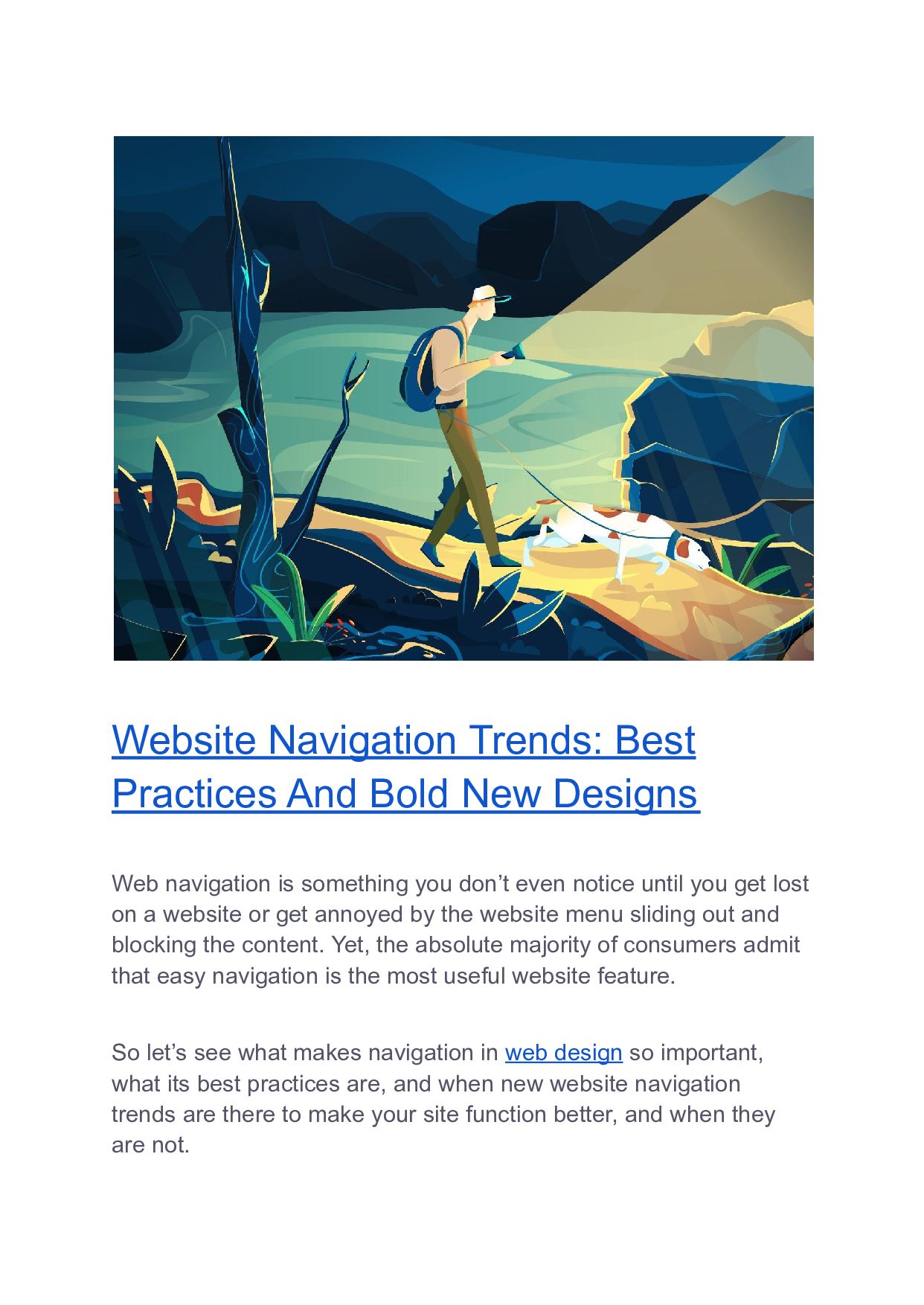
Design is cyclical, but new trends in web navigation design come every year.

What is web navigation? It allows visitors to flow from one page to another without frustration. Many underestimate its power. Sometimes people who plan on making a business website, concentrate mainly on the content. But the truth is, most of today’s users are not looking for content. They’re using your website to swiftly navigate to the products or services they want.

The best website navigation designers follow these simple rules:

- They stay consistent in the design throughout the whole site,
- They often opt for the hamburger menu,
- They create simple and concise navigation,
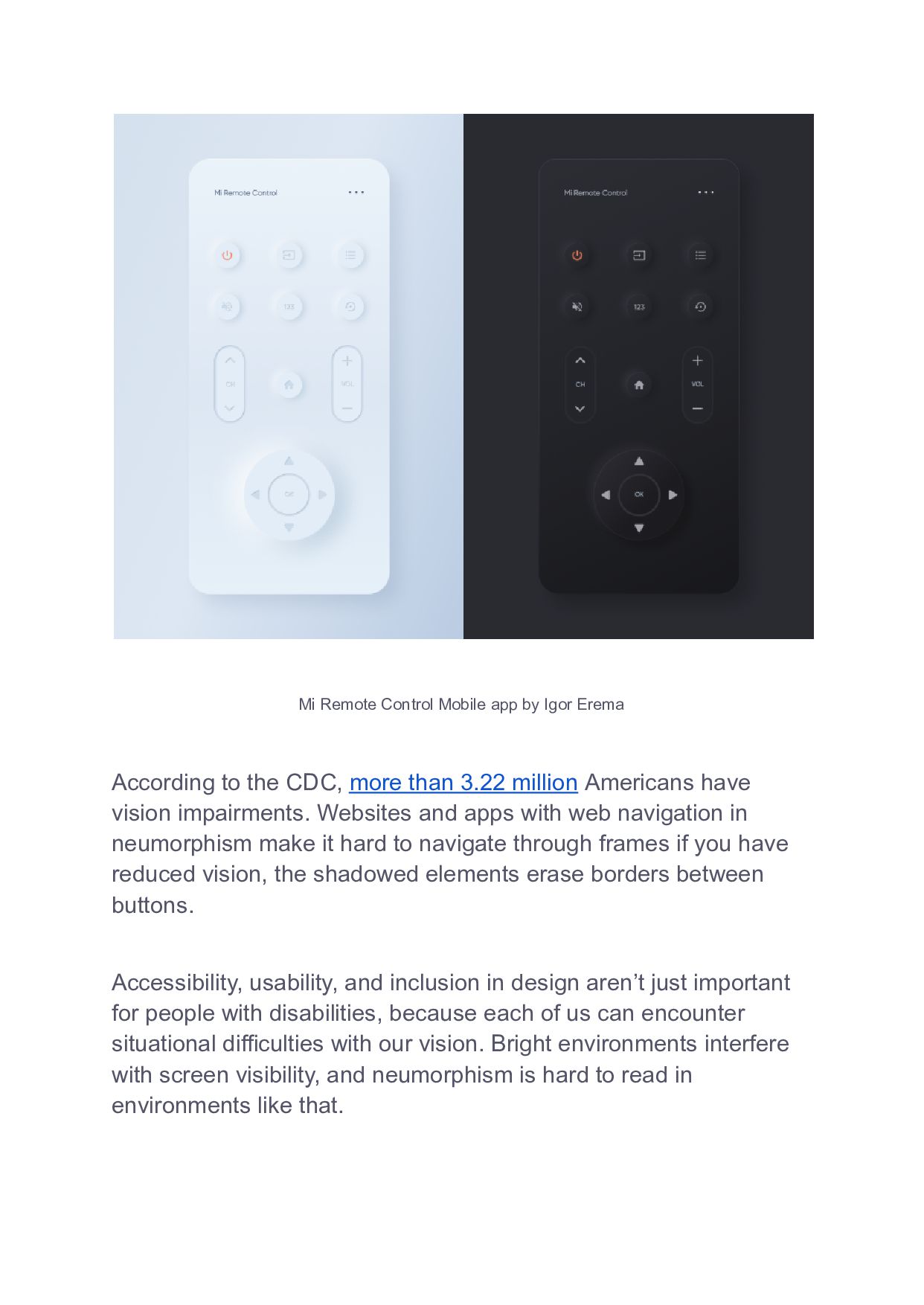
- They make designs that are accessible, usable, and inclusive,
- They create patterns to make users more comfortable.

Design is important in life because it’s an incredibly powerful force, forever changing and being changed. This is why website navigation design has to be impeccable. There’s no other way around it. Learn the best trends in web navigation setup for your mobile and desktop sites to transform your UX and boost business. Head out to our free article:

Shakuro

February 24, 2022
Tweet

More Decks by Shakuro

Other Decks in Design

Transcript

  1. Website Navigation Trends: Best Practices And Bold New Designs Web

    navigation is something you don’t even notice until you get lost on a website or get annoyed by the website menu sliding out and blocking the content. Yet, the absolute majority of consumers admit that easy navigation is the most useful website feature. So let’s see what makes navigation in web design so important, what its best practices are, and when new website navigation trends are there to make your site function better, and when they are not.
  2. Why web navigation matters so much in design What is

    web navigation? Everyone knows it, but many underestimate it. Sometimes people who plan on making a business website, concentrate mainly on the content. But the truth is, most of today’s users are not looking for content. They’re using your website to swiftly navigate to the products or services they want. There I was choosing some cat food on the local pet shop website. Okay, Cat => Dry Food => Choosing a brand => Out of stock => OK, back => A pop-up banner with some special deal => Click on Conditions => Shipping and delivery… How did I end up here and where the hell was I supposed to go? And the logo didn’t even lead to the front page! Image via giphy.com
  3. That’s one of the natural consequences of bad site navigation

    design. The ultimate goal of any page is to turn leads into customers. That is why navigation mistakes are expensive. Poor web navigation will result in fewer users. Website navigation is fundamental to UX design. Good navigation amplifies usability. As stated in a survey done by Tony Haile at Chartbeat, a striking 55% of users spend fewer than 15 seconds actively on a page. Not much time to engage a user! Arm yourself with the knowledge to avoid making common mistakes and revitalize your website to compete with others. This article will show you some fresh designs and web navigation ideas and also cases when you’d be better off not using them.
  4. Best practices of website navigation A website that’s easy to

    browse provides users with quicker and more efficient access to the content they want. People like spending their time on a website with an unambiguous menu structure that makes it easy to maneuver between pages without straining their brains and eyesight. They might even enjoy it. Here are the safest navigation principles and elements you might want to consider before deciding which new pattern to choose. Consistency The menu should be present on every page and in the same place so your users would be able to find their way around with ease, no matter the subject. As stated in the survey done by Hubshout, 33% of users will leave a site that is difficult to navigate. That’s a bummer. A consistent navigation system helps navigate the website, even if it is in Chinese. See the familiar pattern below?
  5. Shanghai Vive cosmetics company Hamburger menu Yes, we all well

    remember the Hamburger menu controversy from the distant 2014. Like it or not, ‌ the hamburger menu is a useful instrument. It makes the UI cleaner. It’s recognizable (remember those two or three lines in the corner of the screen which when clicked will provide you with a menu? This is it). It presents users with direct access to the pages they want without proceeding through all the stages in some predefined order.
  6. Hamburger Side Menu by Lukas Majzlan Simplicity and conciseness The

    more concise your navigation is, the more home page authority will flow to interior pages. It makes them more likely to rank well in the search engines. In other words, it’s good for your website’s SEO. In a study conducted by BrightEdge, they found out that 51% of all website traffic comes from organic search. That’s 51% of your potential customers.
  7. Also, being the engine that drives your website, your navigation

    should be predictable and simple. Navigation is like your site’s skeleton. It better be strong and healthy. Accessibility, usability, and inclusion Accessibility, usability, and inclusion are key principles if you want to show appreciation to all categories of your users through web navigation design. Inclusive design, closely related to human-centered design, means creating web platforms that work for everyone. Accessibility, usability, and inclusion goals, approaches, and guidelines overlap significantly. We recommend addressing them together when designing and developing websites and applications. In 2022, these 3 principles will conquer neumorphism, a new interpretation of skeuomorphism in design, once and forever. Neumorphism, a minimalist style of web navigation, lacks contrast and differentiation. It makes web platforms almost impossible to navigate. Just look at this:
  8. Mi Remote Control Mobile app by Igor Erema According to

    the CDC, more than 3.22 million Americans have vision impairments. Websites and apps with web navigation in neumorphism make it hard to navigate through frames if you have reduced vision, the shadowed elements erase borders between buttons. Accessibility, usability, and inclusion in design aren’t just important for people with disabilities, because each of us can encounter situational difficulties with our vision. Bright environments interfere with screen visibility, and neumorphism is hard to read in environments like that.‍
  9. Check out this work to get a better understanding of

    accessibility. Ranjith Manoharan decided to add labels to icons for old-timers and first-time phone users: “It would be helpful to show them the intended functionalities of the menu icons at-least for the first time.” Patterns Originality is great but be wary on this point when you design a navigation structure. You don’t want to reinvent the wheel here. At least, not too much. There are certain web conventions and the
  10. reason they exist is that they work. People are used

    to them. As Steve Krug once said, “Don’t Make Me Think”. Don’t make your users think too much and get frustrated. Then again, it’s a great idea to sometimes go against the flow when done right. The reason for this article’s existence is to entertain this possibility. Decor Systems – Mega menu on Awwwards “I may not have gone where I intended to go, but I think I have ended up where I needed to be.”
  11. ― Douglas Adams, The Long Dark Tea-Time of the Soul

    It’s your tricky job to locate an exact point where the two intentions connect. Users ending up exactly where they feel like they need to be and where you need them to be to reach your goals in business.
  12. Edgy navigation trends (with examples) Now let’s see what the

    current website navigation trends are and what features can you use to freshen up your website and make it more functional. Fixed web navigation bars This is a type of site navigation where the menu bar is “glued” to some part of the screen (usually the top, though there are also some sticky footers out there). It doesn’t disappear when you’re scrolling down and provides access to the menu at all times. This type of navigation is universal and well-liked by users of all ages. It’s accessible from anywhere and increases brand awareness if it contains the company’s logo, and improves SEO as users tend to view more pages for a single visit. It also grants visitors an ability to move around the website quicker and easier which is also good for them and as a result, for your website’s rankings in Google. What can go wrong Sticky navigation is fine but make sure it doesn’t block any content, especially on mobile. It also isn’t the right fit for websites where there isn’t much scrolling to be done in the first place.
  13. Ascensión Latorre Furniture Vertical sliding navigation As opposed to the

    horizontal one, vertical navigation is better for phones and tablets and gives more free space for the menu. The expandable nature of this type of navigation menu makes it a perfect choice for e-commerce websites. It also can make something of a difference if your competitors all sport horizontal navbars and may provide an easier, more scannable way of perceiving info for the audience used to the F-shaped reading pattern. What can go wrong If the menu or even some of its title options are too long, some parts of it may get cut off or it can happen to occupy too much screen space. Users of laptops and desktop computers may
  14. potentially get tired of moving to and fro from the

    scroll-bar for the menu across the screen. Also, vertical menus get less attention and clicks in comparison to horizontal ones. Sokruta Interior Design Studio Fullscreen navigation Make navigation a design element by itself? It can be a cool and stylish choice, taking into account the popularity of the large typography trend in web design. It’s great for mobile, it very clearly defines the main sections of a website, it’s straightforward and creative at the same time. What can go wrong
  15. Navigation so large has to be hidden behind a click

    which is an additional hurdle on a user journey. EAGLE FILMS Subtle animation This point is about visual appeal and elegance, and not usability (though beauty can be practical too, a lot. Check this article on functional aesthetics). Look at how this motif works in the good website navigation example below. That’s like adding a carefully selected accessory to your usual look. It adds glamor and charm and also makes the whole concept more lively and fun.
  16. What’s more, it draws a visitor’s eye exactly where you

    want it to be. A simple yet very powerful technique of attention control. What can go wrong “Subtle” is the key! When not done properly, animation can distract users and even prevent them from navigating your site. Before adding an animation, ask yourself if it serves a purpose on the page. Here are some useful thoughts on the subject of meaningful animation. Tab Bar Animation by Hoang Nguyen
  17. This or that/Four corners This is a clean and beautiful

    idea. Try to divide users’ attention in two or four directions. It’s simple and a user doesn’t get dumped with a gazillion options to choose from. By limiting your user’s choices, you can make your website easier to use and promote its conversions. What can go wrong This may only be a viable option for websites with limited content. What’s more, users are not very well accustomed to this kind of navigation yet and might get confused and distracted. Gothamsiti Digital Agency
  18. Single page navigation This web navigation trend is among the

    most popular nowadays. It’s great for websites with lots of visual content, it grabs attention, it’s great for phones (it owes its popularity to the rising usage of mobile phones in the first place), it lets you control the narrative. And scrolling is easier than clicking. You don’t have to worry about overcomplicating things if you choose a single page option for your website. Some designers even call it “no navigation”. What can go wrong Single pages have some drawbacks with SEO – they are generally supposed to be designed around one main concept, which limits your ability to rank for a wide variety of keywords. It also gives less freedom for the user as they are stuck with the necessity to get the information only in some particular predefined order.
  19. Web and interaction design by Vilius Vaicius Bottom navigation This

    is another part of the thumb-friendly web navigation trend. Well, not just any trend. In 2021 it’s essential. It became just as important as responsive design. Bottom navigation is easier to reach with your thumb, it’s clean and leaves more space for the content What can go wrong
  20. The bar takes up too much space on the screen.

    The other problem stems from the previous one. As a workaround, designers can make the text too small and indiscernible. Bottom navigation is also something the majority of your users won’t expect on desktop, which may add to their confusion. Designed by Women Fat footer Another bottom of the screen element. A standard footer usually contains a small amount of information like contacts, copyright notice, social media icons, a few links. A fat footer contains far more useful information. It can sometimes serve as a secondary or even primary menu giving users hints as to where to go next, extending the website’s functionality. A fat footer is also an excellent
  21. opportunity to showcase more of your brand’s distinctiveness in website

    navigation design. What can go wrong Actually, few people ever notice footers. More content also means more time for page load. Cahn Wilson Experimental navigations As a web design agency, we’ve found out that going against the trend can become a UI/UX trend itself. Experiments of all kinds are in vogue and becoming more and more popular. Designers make web navigation the main part of website design and its focal point. Even going as far as to make it represent the design itself. This kind
  22. of navigation guarantees a well-defined page structure and gives a

    lot of free space for creative ideas. On top of that, it is mobile-friendly. What can go wrong Again, use originality with caution, users may not be prepared for some of the most modern design ideas. Besides, it lowers loading time. Polymachine 3D architectural visualization and rendering studio
  23. In conclusion There are over 1.5 billion sites on the

    web today. And although only 10-15% of them are active, the number is still massive. In today’s global marketplace, it’s not enough to have a presence on the web. To capitalize on this opportunity and get real customers, a website must offer an engaging and robust user experience. The website navigation design has to be impeccable. There’s no other way around it. Implementing the right navigation setup for your mobile and desktop sites can transform your UX and boost business. So great and well-thought-through web navigation is a way to avoid major UX troubles afterward. Still, apart from making it sound, you can also spice it up a little with some trending flares of modern web navigation listed above. The important thing is to make sure it fits. If you have any questions on the subject of trends in web navigation design (or any other design-related subject for that matter), don’t hesitate to get in touch with a professional and experience-backed team of designers. * * * This article about the latest website navigation trends was originally published in October 2019 and was updated in February 2022 to make it more relevant and comprehensive.