Upgrade to Pro — share decks privately, control downloads, hide ads and more …

iOS Conf SG 2017 - One Blind Weekend

Jinny Wong
October 19, 2017

iOS Conf SG 2017 - One Blind Weekend

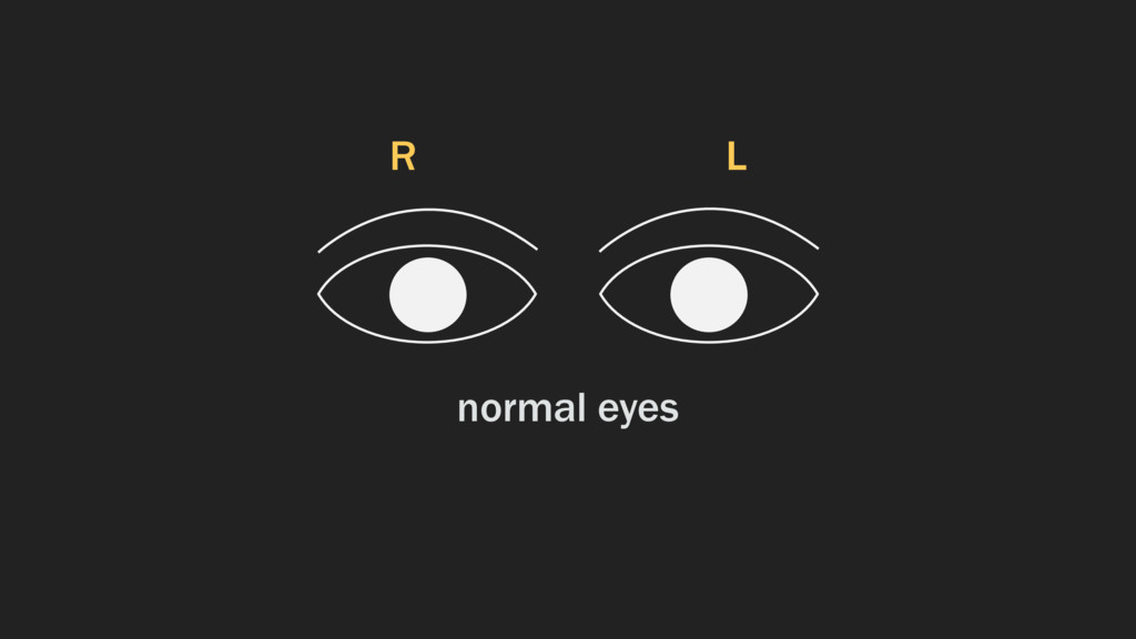
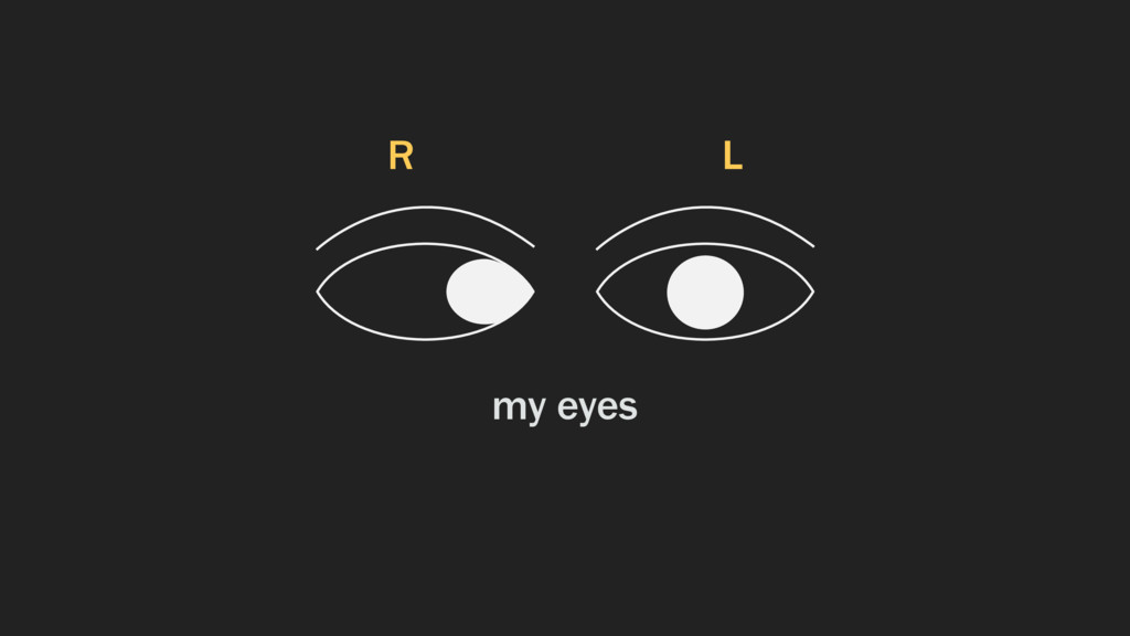
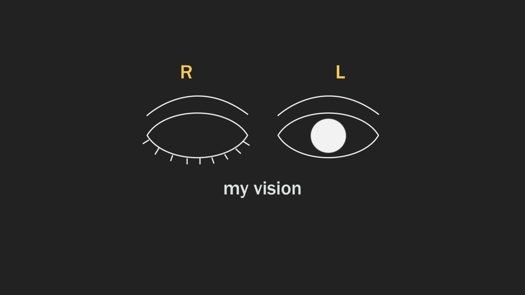
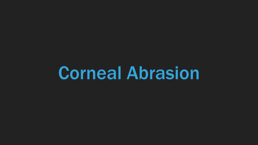
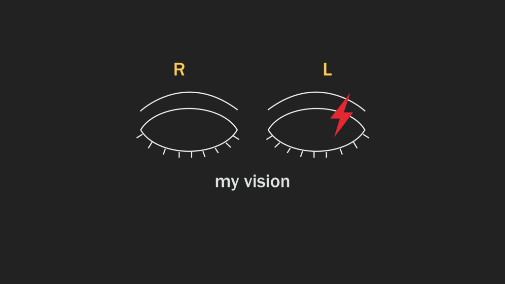
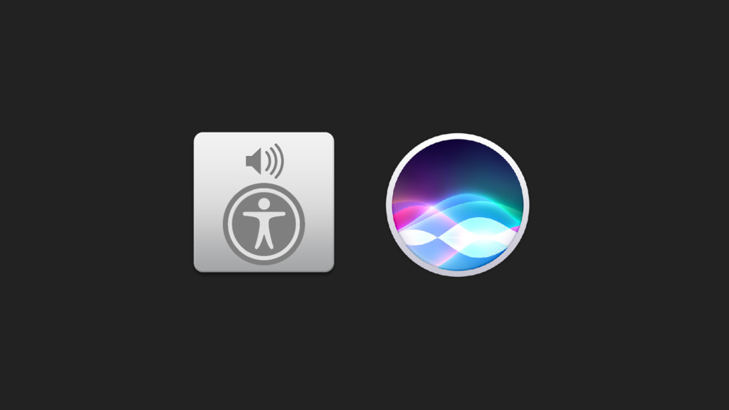
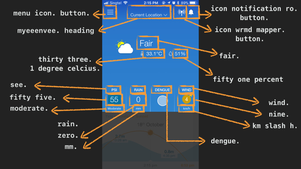
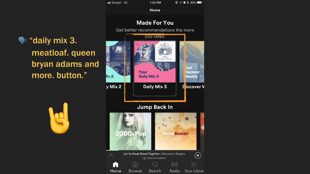
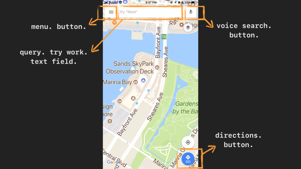
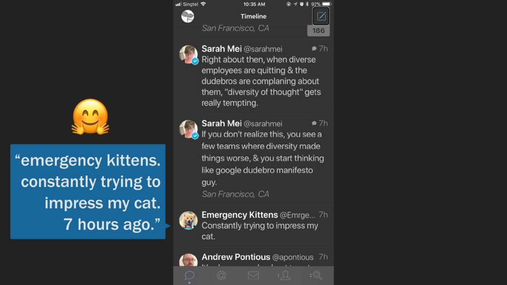
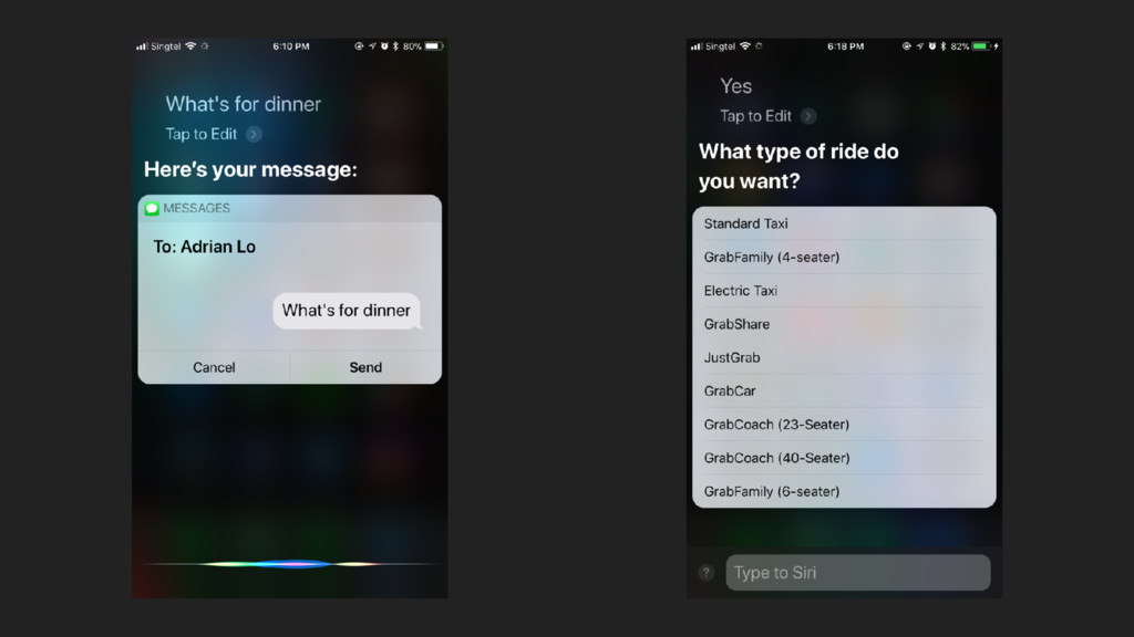
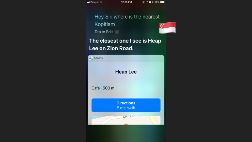
This talk is about the time I was temporarily blind for a weekend, and how I had to rely on Siri and VoiceOver on my phone to survive the weekend.

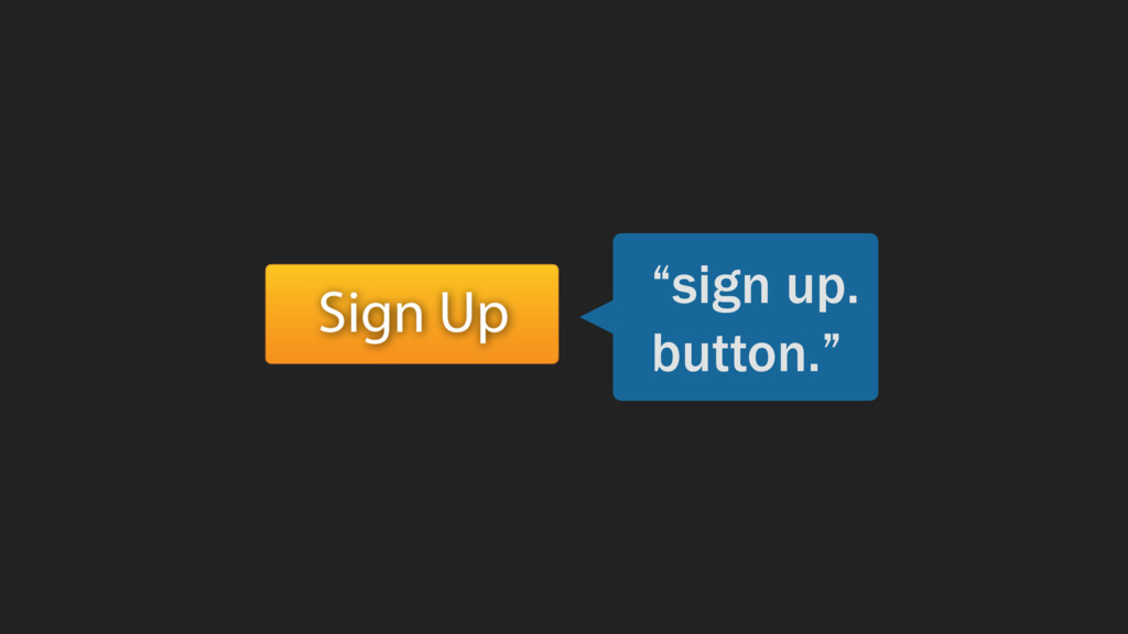
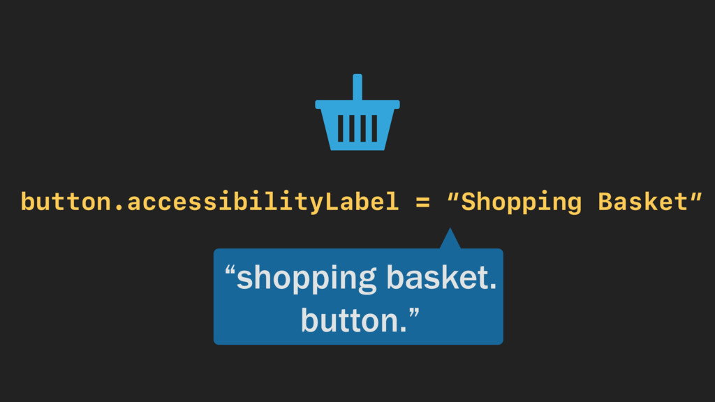
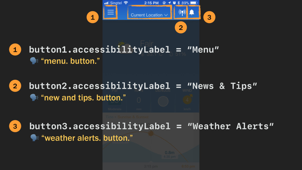
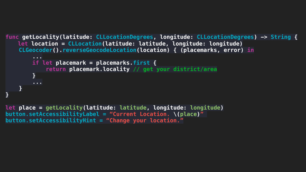
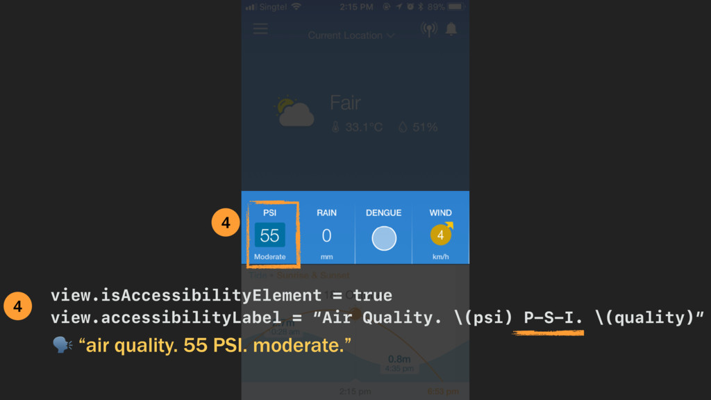
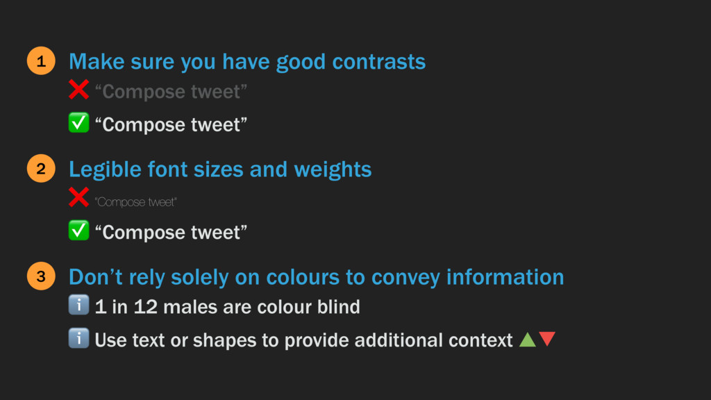
I share here what I experienced while “blind”, and tips on how you can improve your app accessibility for people with visual disabilities.

Jinny Wong

October 19, 2017
Tweet

More Decks by Jinny Wong

Other Decks in Technology

Transcript

  1. “button.” “browse collection. page one of fourteen. adjustable.” “water. efficient.

    seven dot o nine.” “fifty four percent.” “see.” “parents, babies & kids.” Air quality app: PSI Utilities bill app: Water: Efficient - 7.09 (dollar icon visually visible) Special Collections in buy/sell app. Scrolling view of images Compose tweet Weather app: 54% humidity (humidity icon visually visible) Buy/sell app: name of a browsing category
  2. menu icon. button. myeeenvee. heading icon wrmd mapper. button. icon

    notification ro. button. fair. thirty three. 1 degree celcius. fifty one percent see. fifty five. moderate. rain. zero. mm. dengue. wind. nine. km slash h.
  3. 1 2 3 “menu. button.” button1.accessibilityLabel = “Menu” 1 button2.accessibilityLabel

    = “News & Tips” “new and tips. button.” 2 button3.accessibilityLabel = “Weather Alerts” “weather alerts. button.” 3
  4. func getLocality(latitude: CLLocationDegrees, longitude: CLLocationDegrees) -> String { let location

    = CLLocation(latitude: latitude, longitude: longitude) CLGeocoder().reverseGeocodeLocation(location) { (placemarks, error) in ... if let placemark = placemarks.first { return placemark.locality // get your district/area } ... } } let place = getLocality(latitude: latitude, longitude: longitude) button.setAccessibilityLabel = “Current Location. \(place)” button.setAccessibilityHint = “Change your location.”
  5. Omit describing what an element is 1 ❌ “Compose tweet

    button” ✅ “Compose tweet” Keep it short and succinct 2 ❌ “Compose a new tweet” ✅ “Compose tweet” Don’t describe what action the user can take 3 ❌ “Tap to compose tweet” ✅ “Compose tweet”
  6. Make sure you have good contrasts 1 ❌ “Compose tweet”

    ✅ “Compose tweet” Legible font sizes and weights 2 ❌ “Compose tweet” ✅ “Compose tweet” Don’t rely solely on colours to convey information 3 ℹ 1 in 12 males are colour blind ℹ Use text or shapes to provide additional context ▲▼
  7. +

  8. Is this design accessible? How can I make it more

    accessible? Is there a feature I can build to improve accessibility for our users? legible content proper labels and hints dynamic type responsive autolayout smart invert contextual information prioritise most used functions SiriKit haptic feedback UI sounds