Shifting Focus: Why Personalized Interfaces Matter in Micropayments
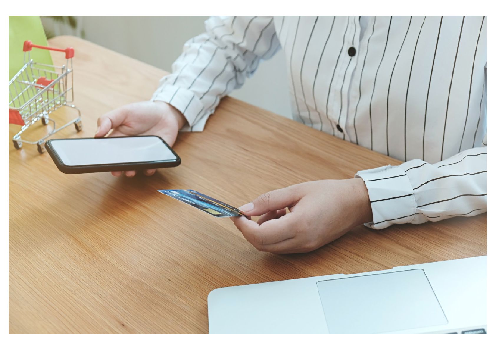
Micropayment systems have evolved beyond simple payment buttons. In today’s mobile-first economy, where a cup of coffee, an online article, or even a gaming skin can be bought with a single tap, the role of interface design has taken center stage. Personalized user interfaces (UIs) have become essential in ensuring not only usability but also emotional trust.
When we talk about user-centered micropayment UIs, we’re referring to how systems present information, simplify decisions, and provide feedback at each stage of the payment flow. And here’s where the trend becomes clear: interfaces are no longer one-size-fits-all. They’re adapting based on behavior, context, and preferences. This shift is not cosmetic. It’s foundational to user satisfaction and system security.
What We Mean by User-Centered UI in Micropayments
User-centered design in micropayments is about crafting digital environments that:
Adapt to context (location, device, time of day)
Learn from habits (frequent purchases, favorite items)
Respond to feedback (errors, abandoned transactions)
A simple example: If a user frequently pays for subway tickets with their phone at 8 AM, a smart system will pre-load that screen or suggest it proactively. This creates a seamless interaction that feels almost predictive.
Smart Interface Trends You Should Know in 2025
Let’s dive into what’s changing:
Minimalist Navigation: Simpler pathways with fewer taps, optimized for small screens.
Biometric-First Entry: Payment confirmations via fingerprint or facial recognition.
Real-Time Feedback: Instant haptic, audio, or visual signals confirming every interaction.
Dark Mode Defaults: For battery conservation and eye comfort during night-time usage.
Predictive Shortcuts: AI-based predictions offering one-tap choices based on past behavior.
Micro-Animation Guidance: Visual cues that guide the eye subtly without distractions.
Localized Personalization: Adjustments for cultural preferences in color, iconography, and text.
At the core, these innovations aim to reduce cognitive load—making micropayment decisions as frictionless as possible.
Where UI Meets Security
There’s a critical connection between smart interfaces and user safety. A well-designed UI can:
Prevent fraud by clearly displaying transaction summaries before confirmation.
Reduce errors through auto-filled, contextual fields.
Build trust with consistent, transparent interactions.
In fact, misuse of interfaces is a growing vector for fraud. For instance, tricking users into tapping payment buttons via misleading design (“dark patterns”) is a real risk. Thus, ethical design has become part of the security conversation.
In the middle of this ecosystem, we also find mechanisms related to “정보이용료 현금화 장단점”, or small-scale purchase processing, where misuse can lead to serious exploitation. Services centered on 소액결제 현금화 종류 (translated as 'types of micropayment cashing out') often exploit vulnerabilities in the user interface, especially when transactions occur rapidly or without proper visual confirmation.
How to Build Interfaces that Work: A Walkthrough
Understand Your Users: Use analytics, feedback, and interviews to build real user personas.
Map Micro Journeys: Break down payment into moments—browsing, selecting, confirming, paying.
Use Wireframes with Focus Points: Highlight key actions and reduce unnecessary clicks.
Apply Accessibility Principles: Ensure high contrast, text-to-speech, and gesture support.
Integrate ML for Prediction: Recommend preferred payment options, saved cards, or schedules.
Test for Errors and Abuse: Use red team simulations to detect UI abuse or confusion.
Common Challenges and How to Solve Them
Challenge
Suggested Approach
Users drop off before final payment
Simplify the steps and preload expected options
High error rates during input
Use auto-complete and real-time error detection
Confusion over transaction cost
Always show a final summary in bold, readable text
Fraud attempts via misclicks
Use double-confirmation for sensitive actions
Low trust in new features
Launch tooltips and explainers for each update
Real Examples from the Field
Asian Mobile Wallets: KakaoPay and PayPay apply adaptive UIs with cultural elements, reducing friction for elderly users.
E-Commerce Apps: Amazon One-Click and Apple Pay utilize predictive behavior and biometric confirmation to streamline UI.
Smart Transit Systems: Japan’s Suica mobile integrates touchless payment with location-aware screen prompts.
Quick FAQ
Q1: What’s the biggest UI mistake in micropayments? A1: Overcomplication. Too many options confuse users. Streamline.
Q2: Can personalization backfire? A2: Yes. Overly aggressive predictions may seem invasive. Let users customize what’s suggested.
Q3: Is one-tap payment safe? A3: With proper biometric or behavioral verification, yes. But users must be clearly informed.
Pro Tips for Smarter UI in Micropayments
Prioritize clarity over novelty.
Offer opt-outs for predictive features.
Track where users abandon payment flows.
Provide transaction logs with easy dispute links.
Allow language and currency preference settings.
Final Thought: Where We Go from Here
As micropayments become the financial glue in digital lifestyles, designing interfaces that are both delightful and defensible is no longer optional. In 2025 and beyond, it will be the interface—not just the technology under the hood—that defines trust, speed, and satisfaction.
When systems begin to feel like they "know" the user, not just serve them, micropayment platforms can truly transform commerce as we know it.