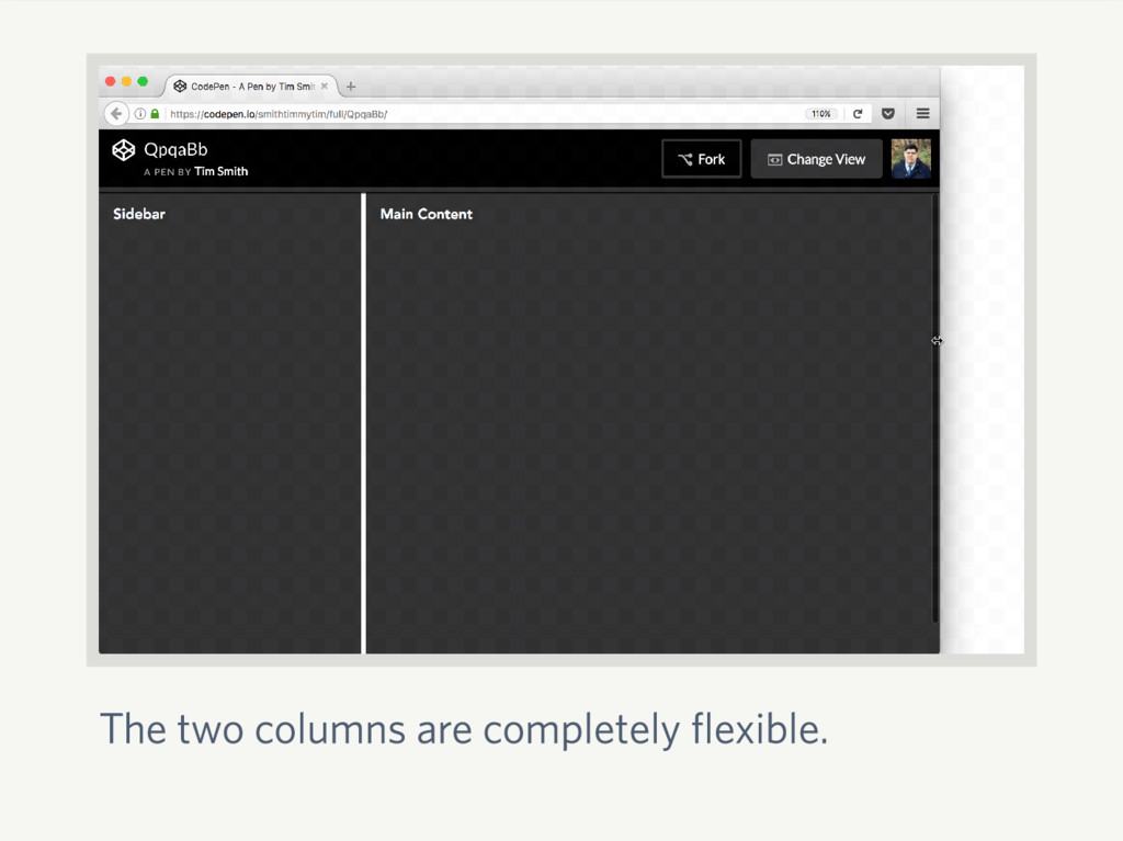
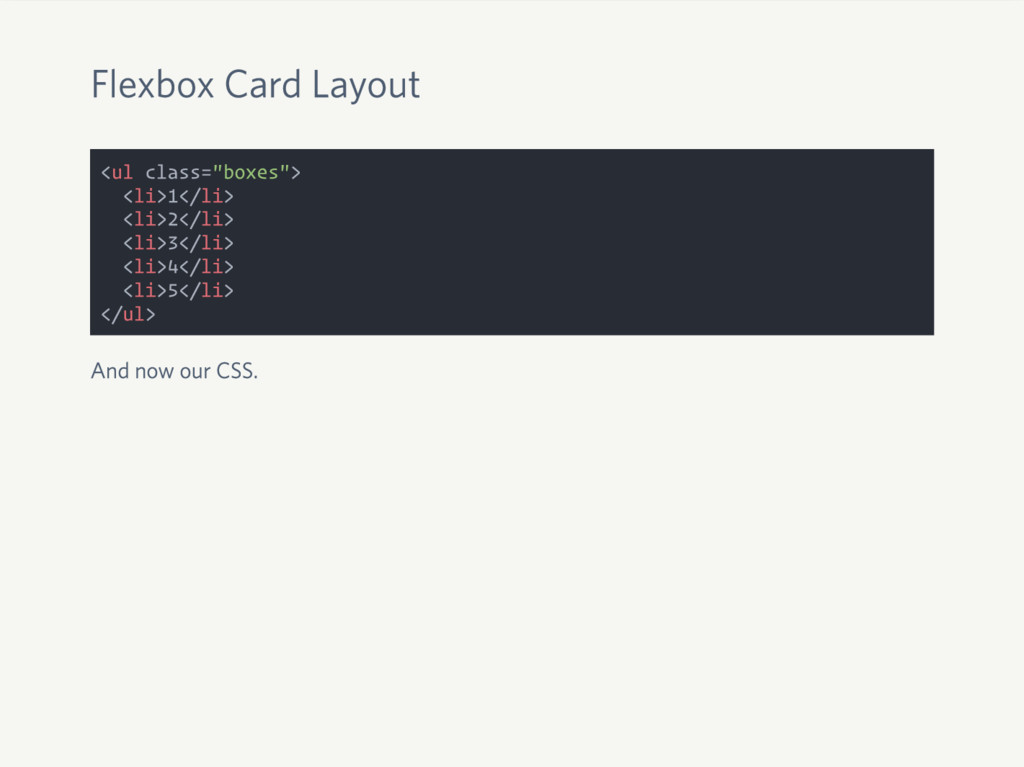
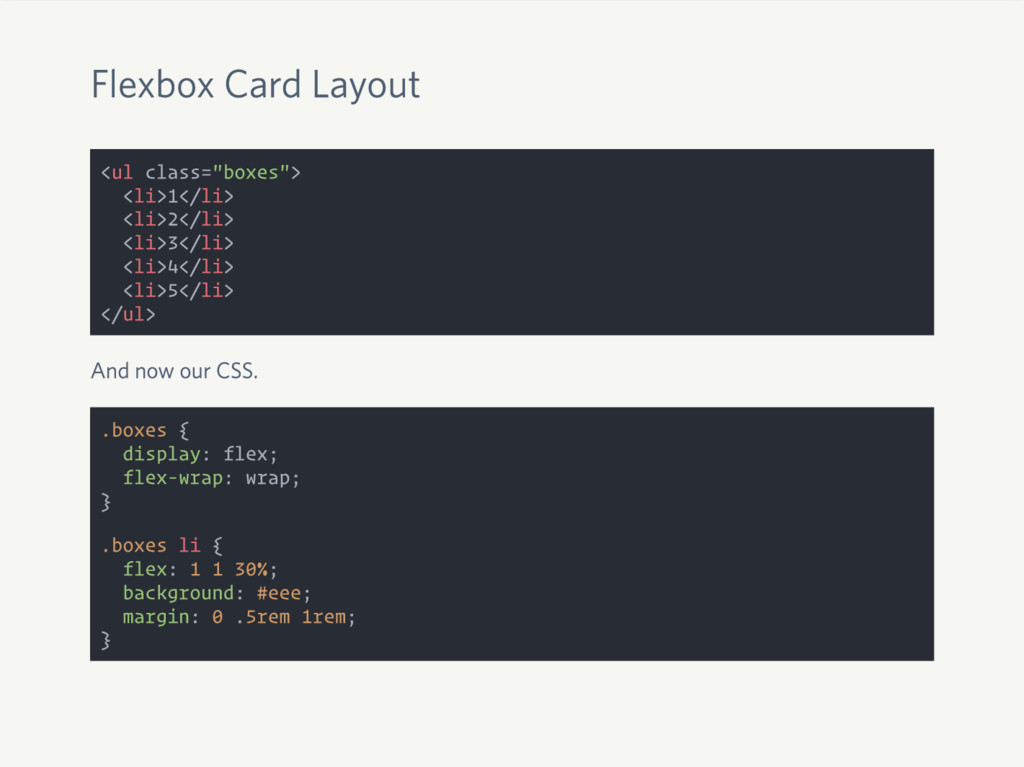
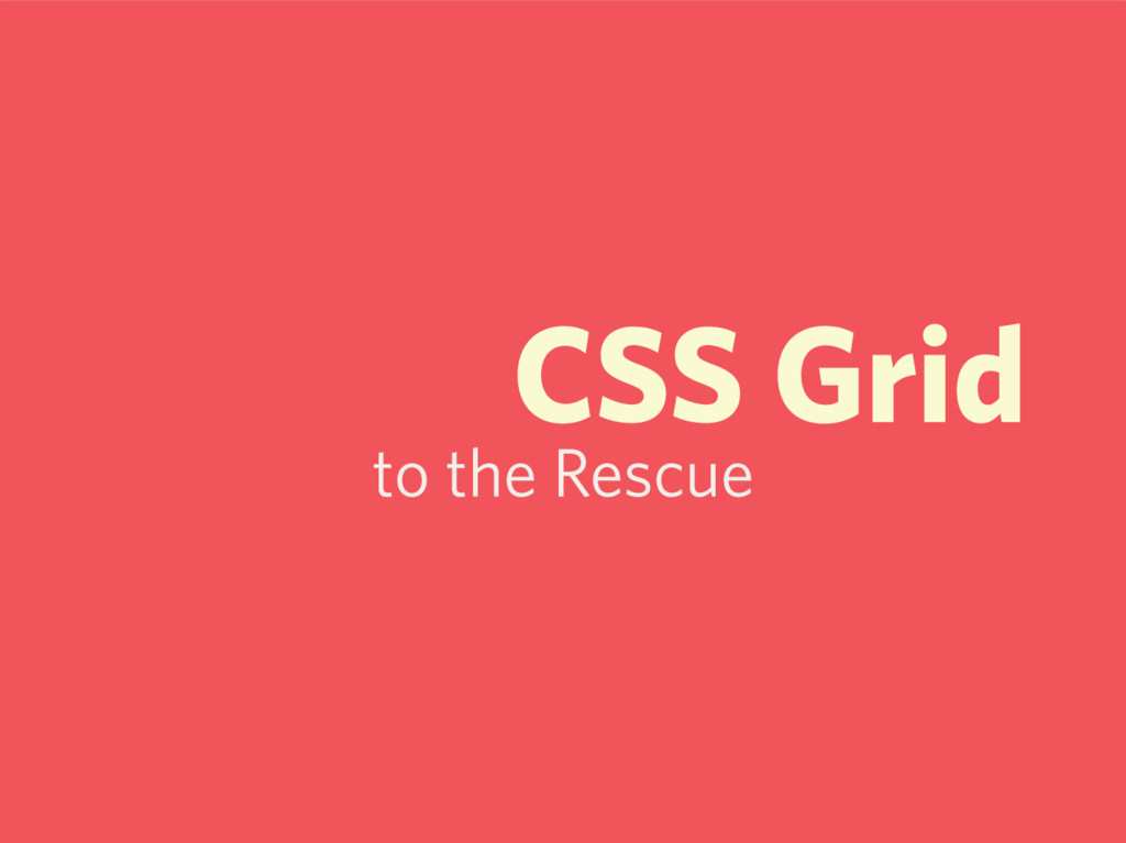
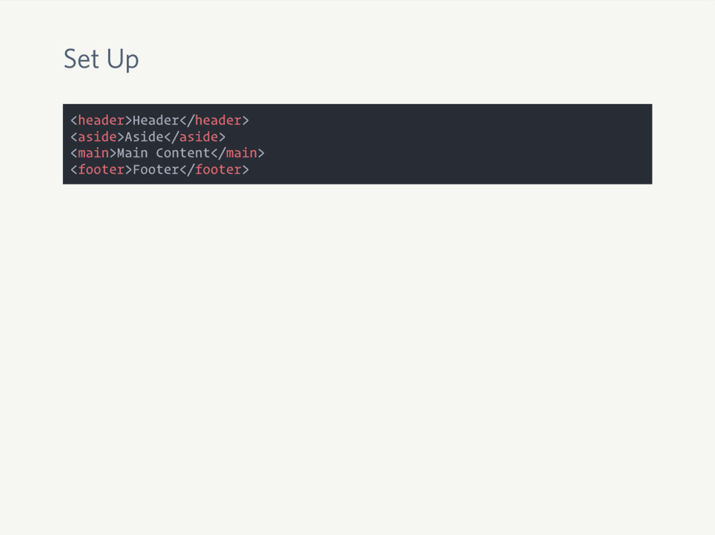
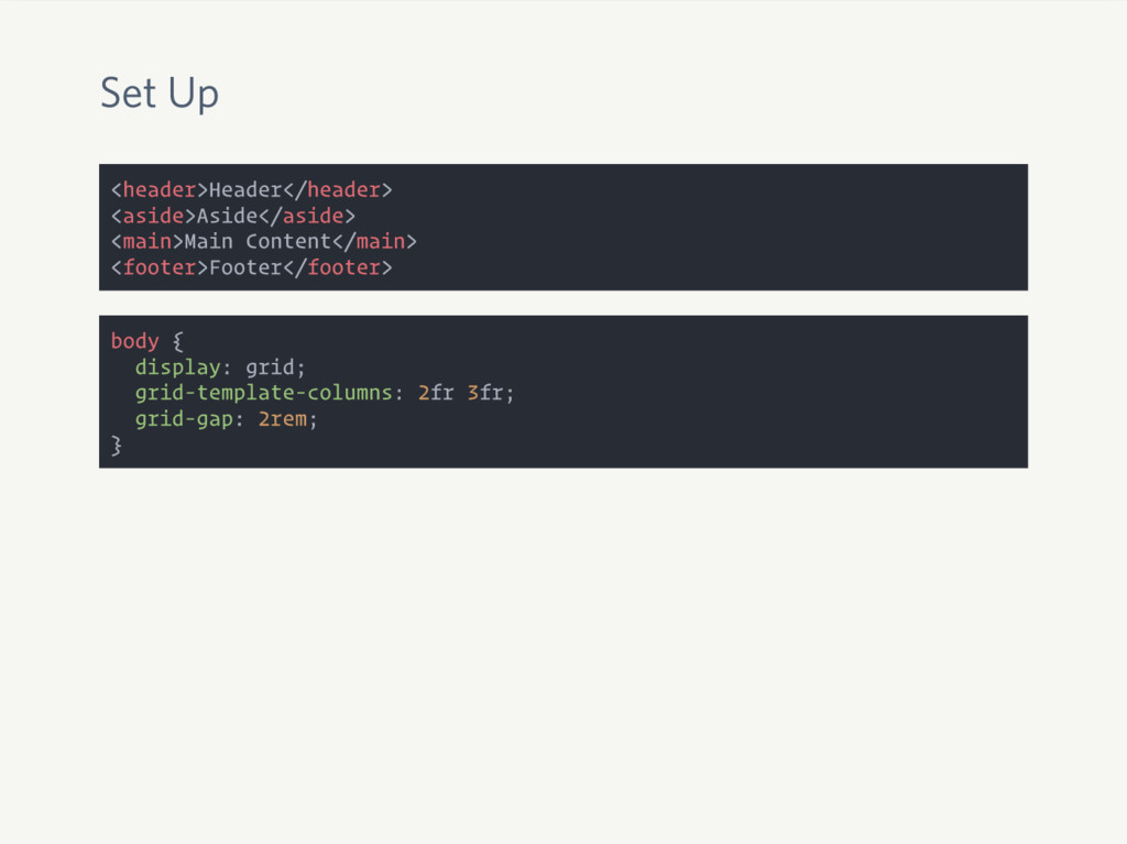
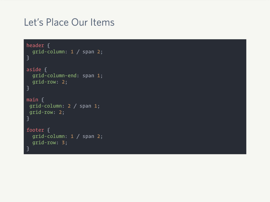
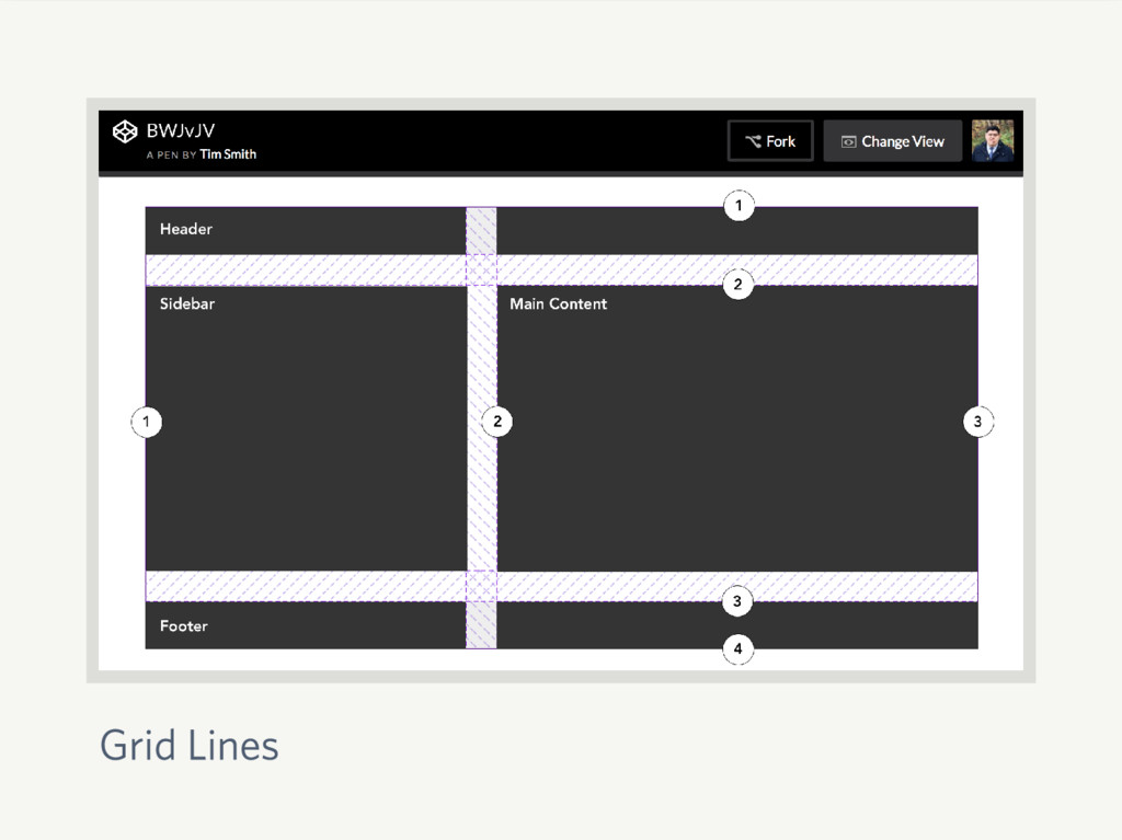
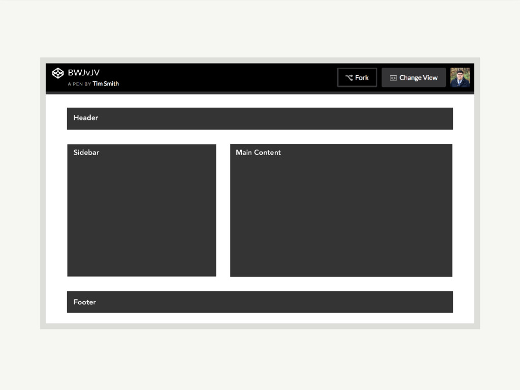
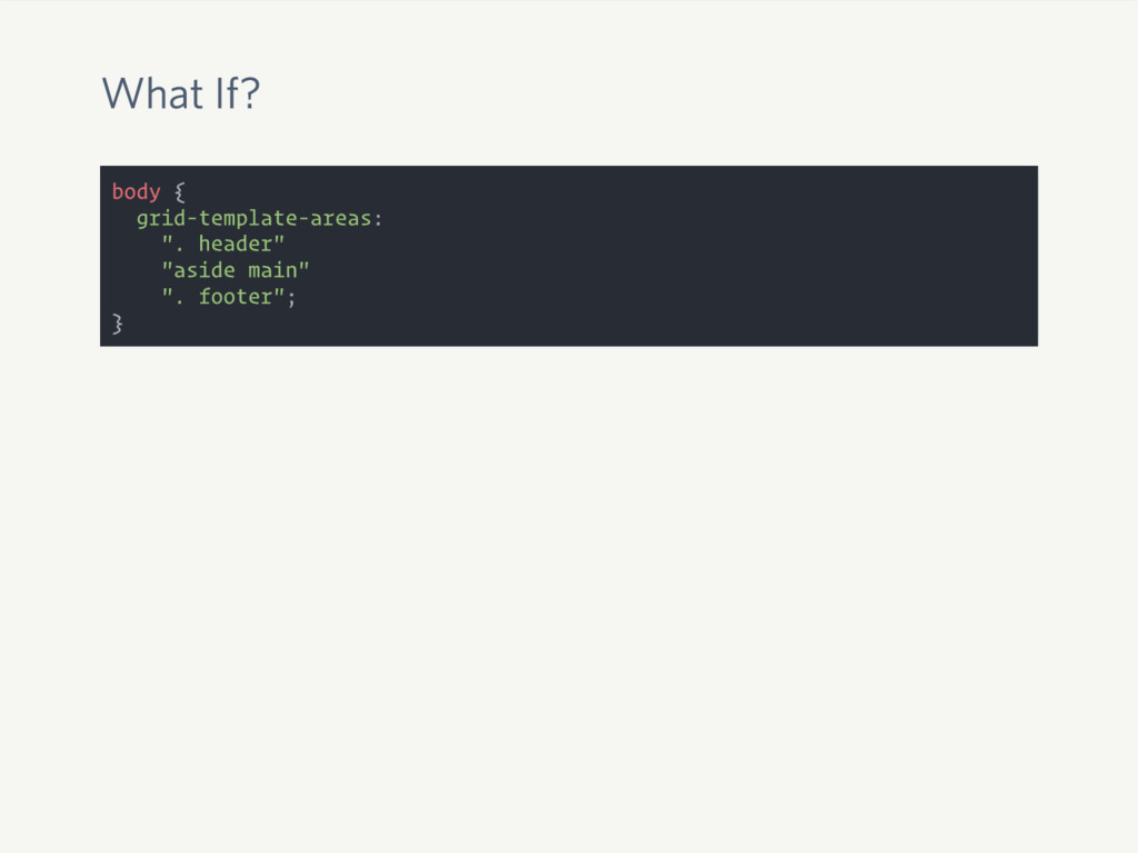
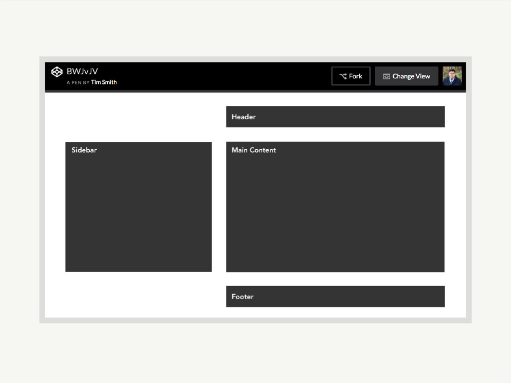
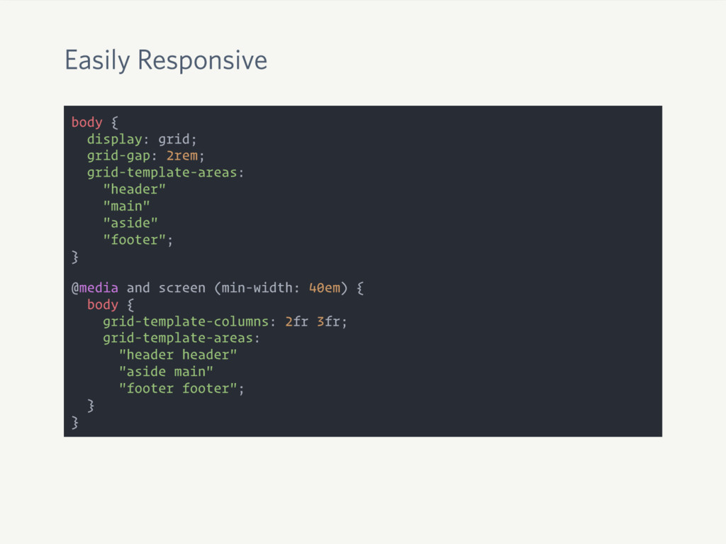
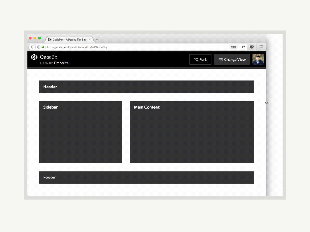
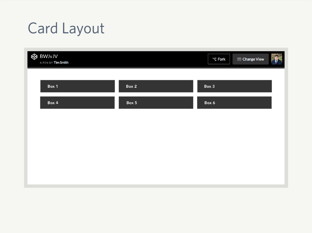
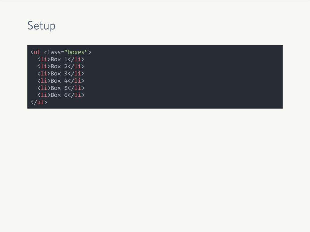
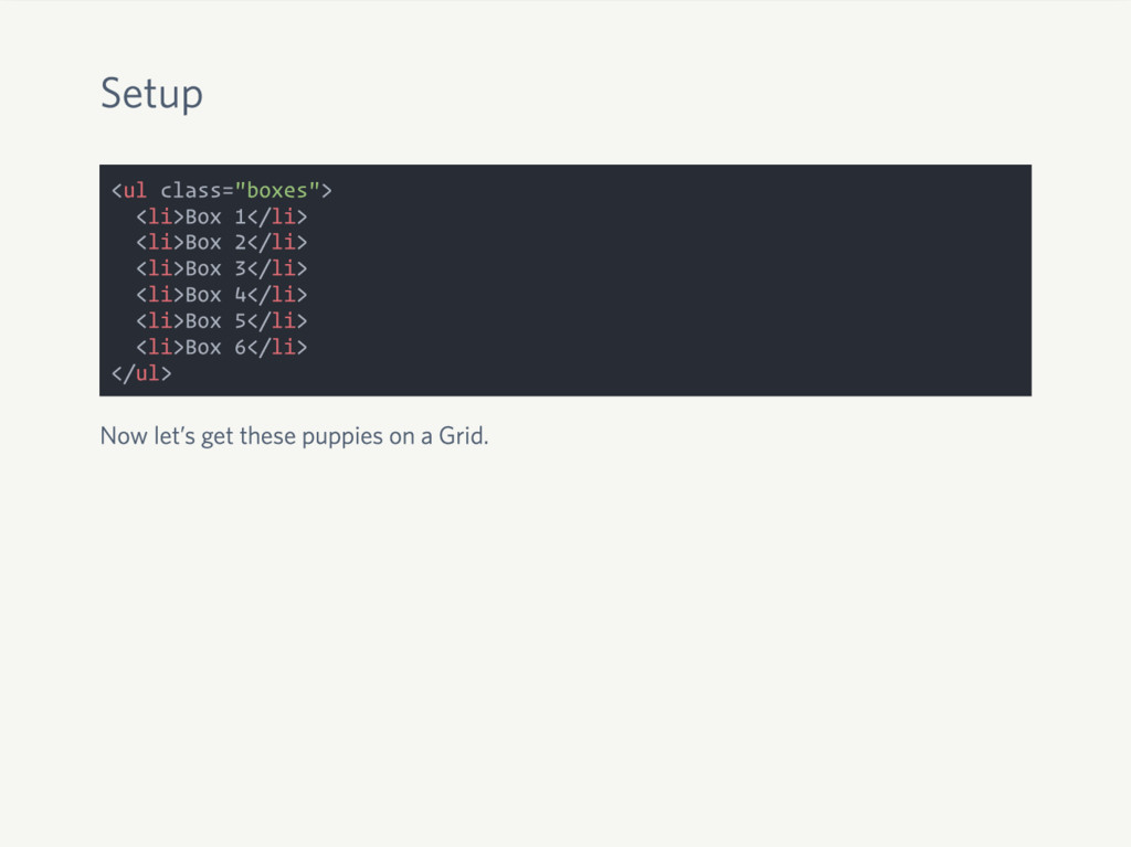
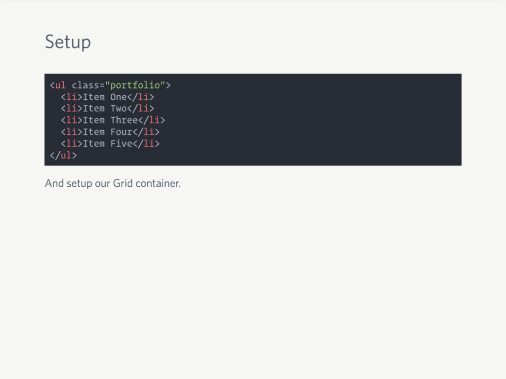
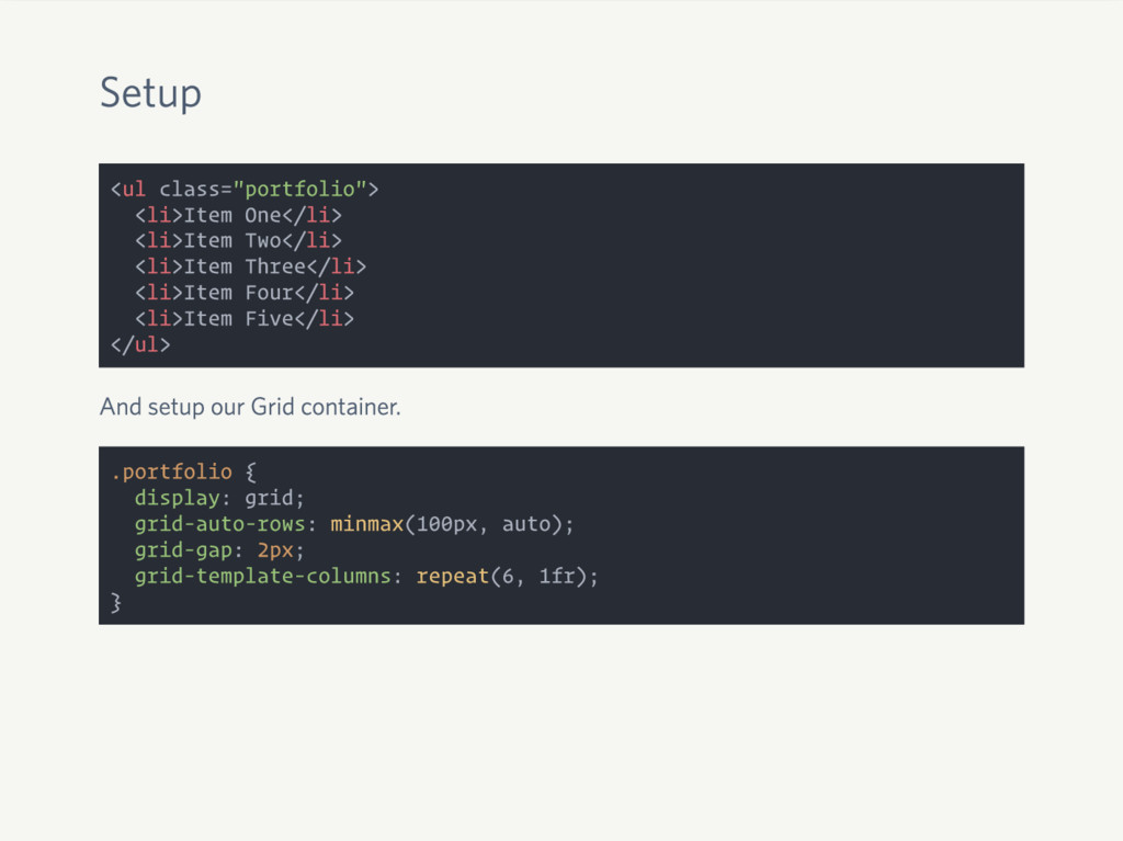
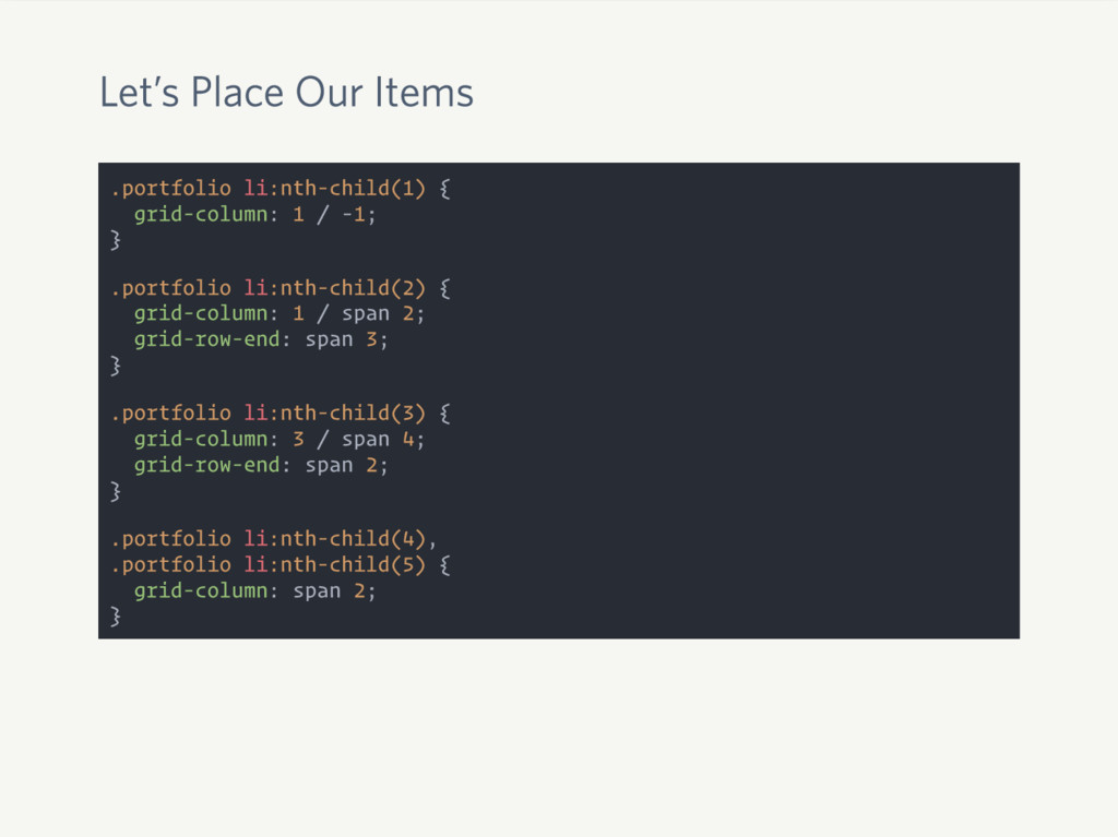
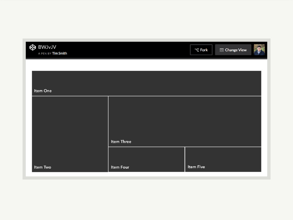
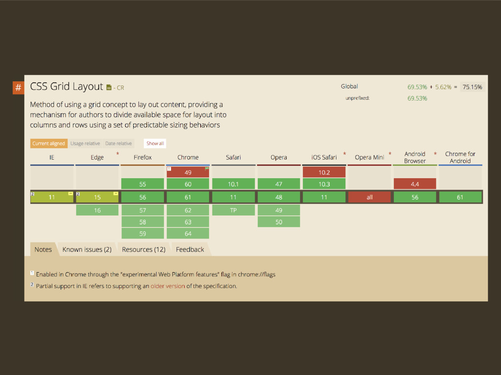
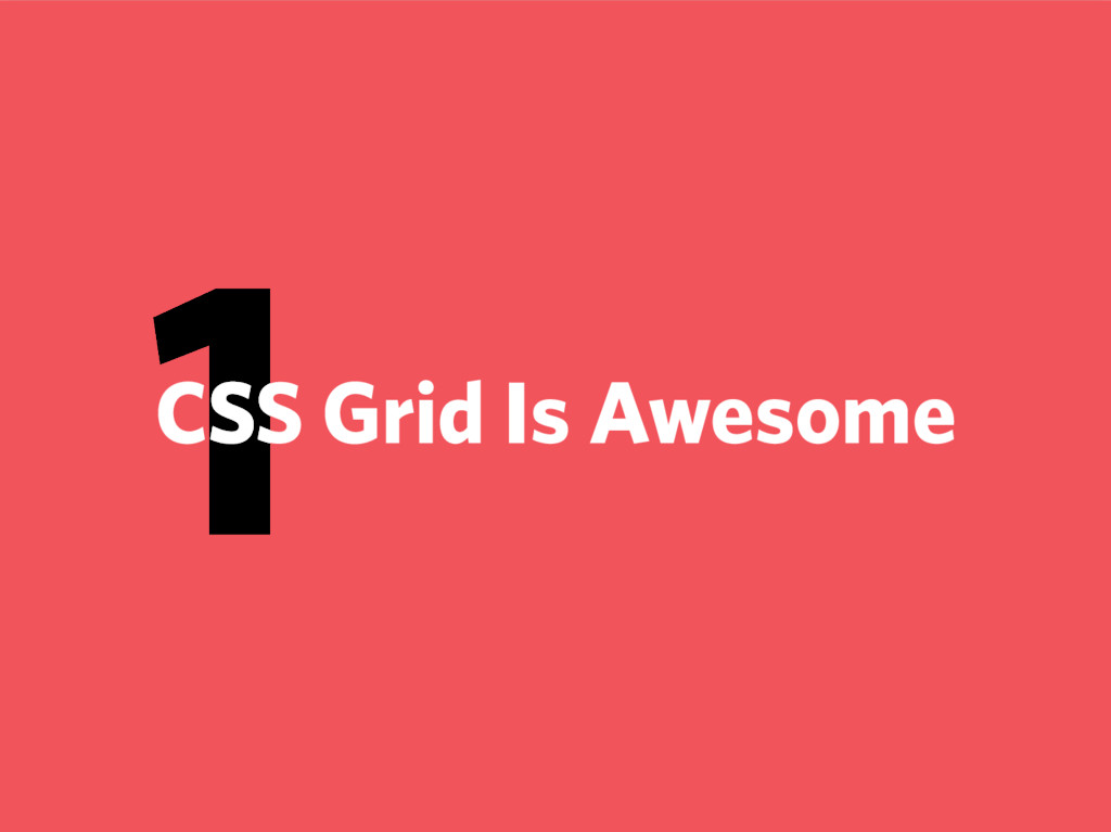
CSS Grid Layout is gaining more browser support everyday! But what is it? How does it work? Why should you use it? And what are some practical ways you can incorporate it into your project? I'll show you how CSS Grid solves layout problems we've had for years, and how it's a great compliment to the other layout tools we have.
 ttimsmith
 koyaman
 nishame
 nttcom
 shotamatsuo
 keita_yoshikawa
 moco1013
 klemens
 kumanoayumi
 hicard
 karad
karad
 saka2jp
 pkshadeck
 oripsolob
 skipperchong
 cassininazir
 jonoalderson
 malarkey
 lara
lara
 paigeccino
 chrisshort
 zakiyama
 emna__ayadi
 aleyda