Upgrade to Pro
— share decks privately, control downloads, hide ads and more …
Speaker Deck
Features
Speaker Deck
PRO
Sign in
Sign up for free
Search
Search
Let's Learn CSS Grid - FEDC
Search
Sponsored
·
Your Podcast. Everywhere. Effortlessly.
Share. Educate. Inspire. Entertain. You do you. We'll handle the rest.
→
Tim Smith
April 27, 2018
Design
180
0
Share
Embed
Copy iframe code
Copy JS code
Copy link
Start on current slide
Let's Learn CSS Grid - FEDC
Tim Smith
April 27, 2018
More Decks by Tim Smith
See All by Tim Smith
Let’s Learn CSS Grid - EE Conf
ttimsmith
1
240
Let's Learn CSS Grid - BeerCityCode
ttimsmith
2
220
Let's Learn CSS Grid
ttimsmith
1
340
Become a Better Designer with Side Projects - Blend Conf
ttimsmith
6
680
Become a Better Designer with Side Projects
ttimsmith
5
880
Work to Live, Don't Live to Work
ttimsmith
0
380
Other Decks in Design
See All in Design
染み出し好きの、 染み出しコントロール論
mukai_takeru
0
200
PAMPHLET.pdf
mhand01
0
1k
「親切なオンボーディング」 が招く罠 ー AI時代のUXデザイン
godlingkogami
1
140
AIでデザインをつくる:基礎編
kenichiota0711
4
3.2k
Of Ordination and Rebellion exploration sketches
rezaline
0
170
「ツール」から「パートナー」へ。AI伴走時代のUXデザインとは?~操作を減らし、成果を最大にするための設計~
ncdc
1
700
JBUG大阪#9_登壇資料_引き継ぎで困らないためのBacklogWikiの整え方_ミスと属人化を防ぐために、 “次の人が動ける状態”をどう残すか
webnaut
1
190
test deck title
shotamatsuo
0
1.5k
言幹と言葉(Stems & Leaves)
kakukoki
0
150
社長の宿題への回答 「新卒×AI」が生み出す価値
saki822
2
180
AIスライドデザインを生成する仕組みを社内共有する
kenichiota0711
7
5.7k
CULTURE DECK/Creative Director
mhand01
0
1.3k
Featured
See All Featured
How Fast Is Fast Enough? [PerfNow 2025]
tammyeverts
3
660
Mind Mapping
helmedeiros
PRO
1
280
How to Create Impact in a Changing Tech Landscape [PerfNow 2023]
tammyeverts
55
3.4k
Navigating Weather and Climate Data
rabernat
0
370
How to make the Groovebox
asonas
2
2.3k
Agile Leadership in an Agile Organization
kimpetersen
PRO
0
190
Statistics for Hackers
jakevdp
799
230k
Bridging the Design Gap: How Collaborative Modelling removes blockers to flow between stakeholders and teams @FastFlow conf
baasie
0
610
Kristin Tynski - Automating Marketing Tasks With AI
techseoconnect
PRO
0
290
Chrome DevTools: State of the Union 2024 - Debugging React & Beyond
addyosmani
10
1.3k
Optimizing for Happiness
mojombo
378
71k
How to Align SEO within the Product Triangle To Get Buy-In & Support - #RIMC
aleyda
2
1.7k
Transcript
LET’S LEARN CSSGRID
Hi there! I’m Tim Smith
None
YouTube Channel youtube.com/smithtimmytim
Thank You
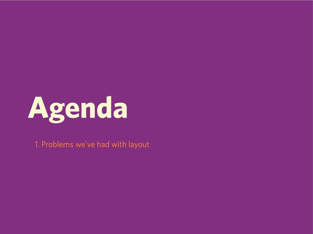
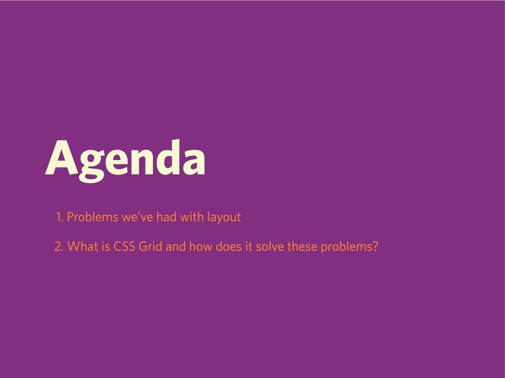
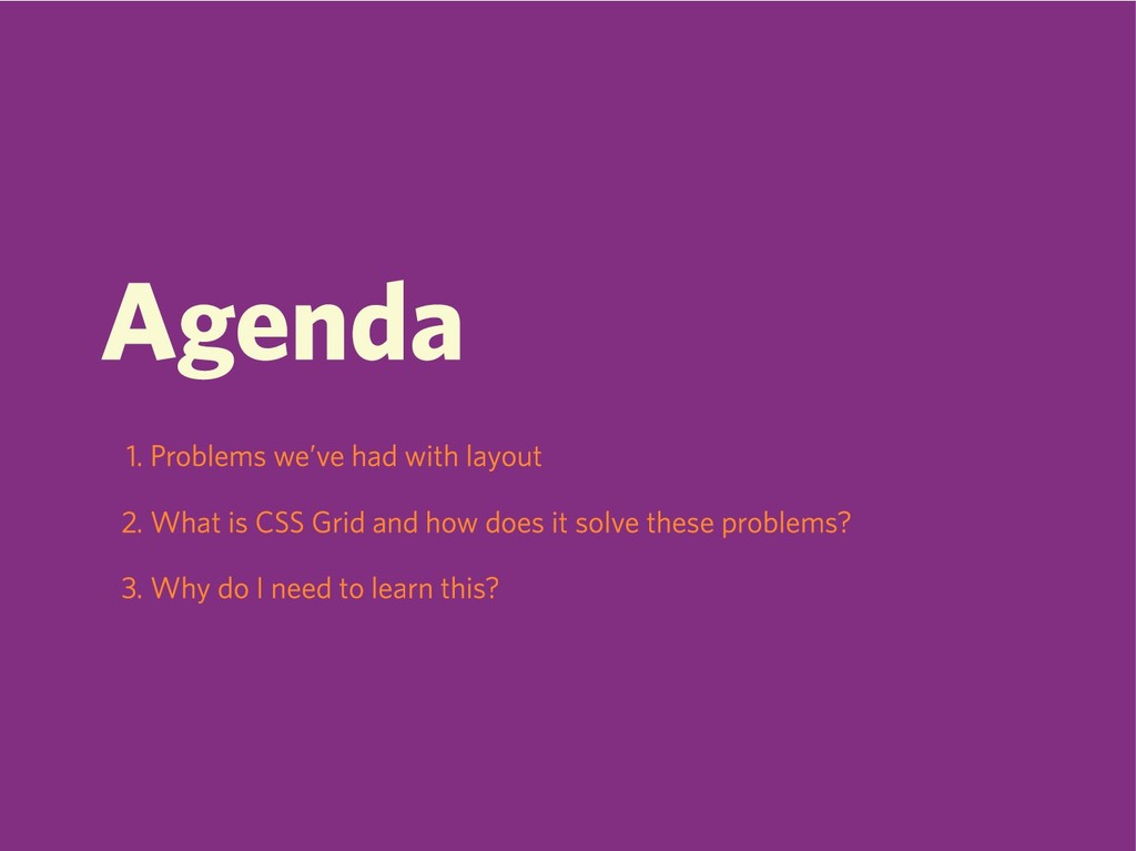
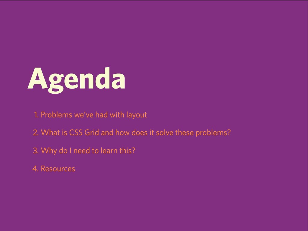
Agenda
Agenda 1. Problems we’ve had with layout
Agenda 1. Problems we’ve had with layout 2. What is
CSS Grid and how does it solve these problems?
Agenda 1. Problems we’ve had with layout 2. What is
CSS Grid and how does it solve these problems? 3. Why do I need to learn this?
Agenda 1. Problems we’ve had with layout 2. What is
CSS Grid and how does it solve these problems? 3. Why do I need to learn this? 4. Resources
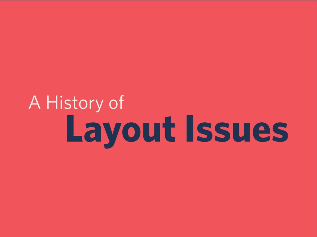
A History of Layout Issues
Floats
Floats Suck
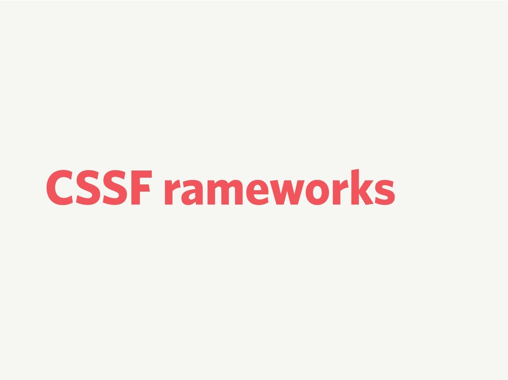
CSS Frameworks
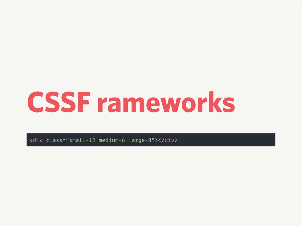
CSS Frameworks <div class="small-12 medium-6 large-8"></div>
Separation of Concerns
Floats Aren’t Bad
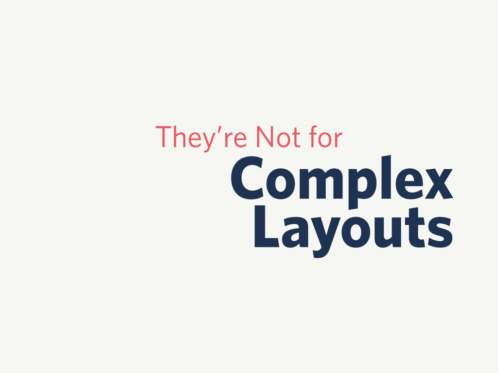
They’re Not for Complex Layouts
Why?
None
Flexbox
Flexbox is Flexible
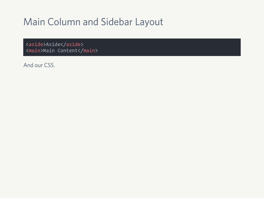
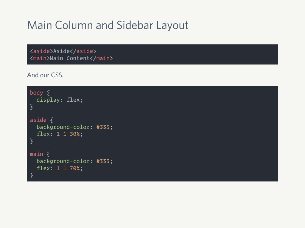
Main Column and Sidebar Layout <aside>Aside</aside> <main>Main Content</main>
Main Column and Sidebar Layout <aside>Aside</aside> <main>Main Content</main> And our
CSS.
Main Column and Sidebar Layout <aside>Aside</aside> <main>Main Content</main> And our
CSS. body { display: flex; } aside { background-color: #333; flex: 1 1 30%; } main { background-color: #333; flex: 1 1 70%; }
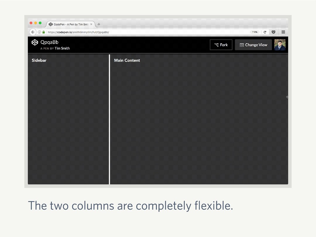
The two columns are completely flexible.
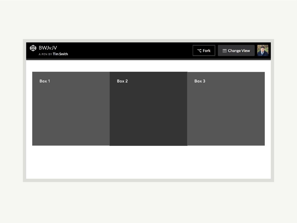
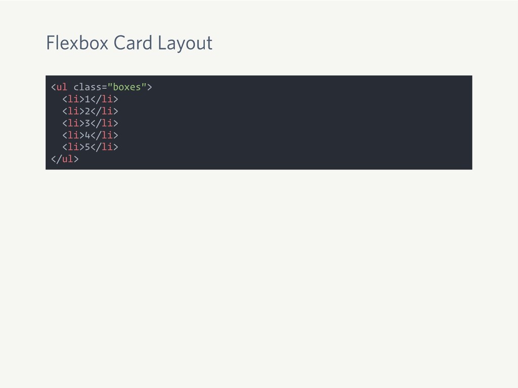
Flexbox Card Layout <ul class="boxes"> <li>1</li> <li>2</li> <li>3</li> <li>4</li> <li>5</li>
</ul>
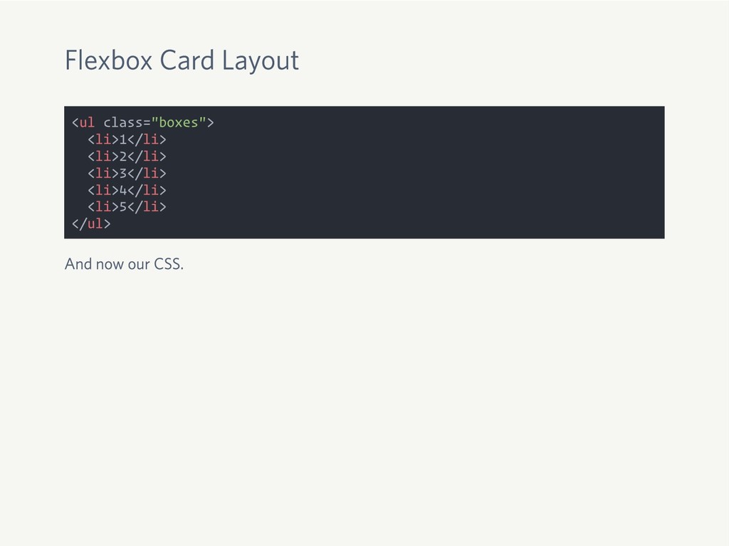
Flexbox Card Layout <ul class="boxes"> <li>1</li> <li>2</li> <li>3</li> <li>4</li> <li>5</li>
</ul> And now our CSS.
Flexbox Card Layout <ul class="boxes"> <li>1</li> <li>2</li> <li>3</li> <li>4</li> <li>5</li>
</ul> And now our CSS. .boxes { display: flex; flex-wrap: wrap; } .boxes li { flex: 1 1 30%; background: #333; margin: 0 .5rem 1rem; }
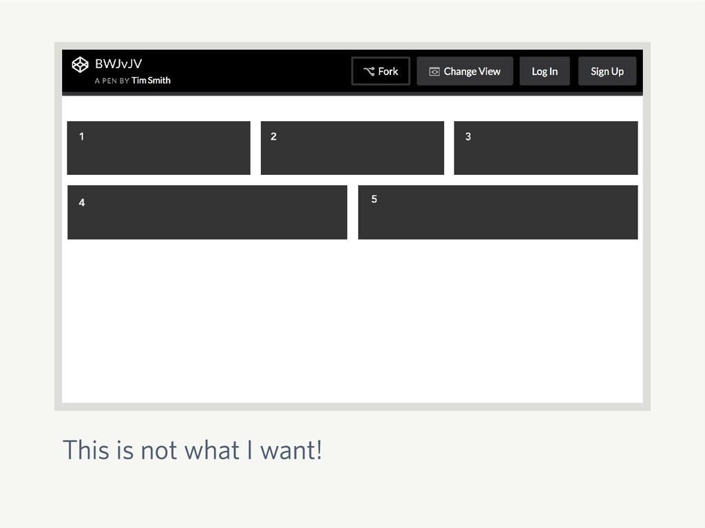
This is not what I want!
Math
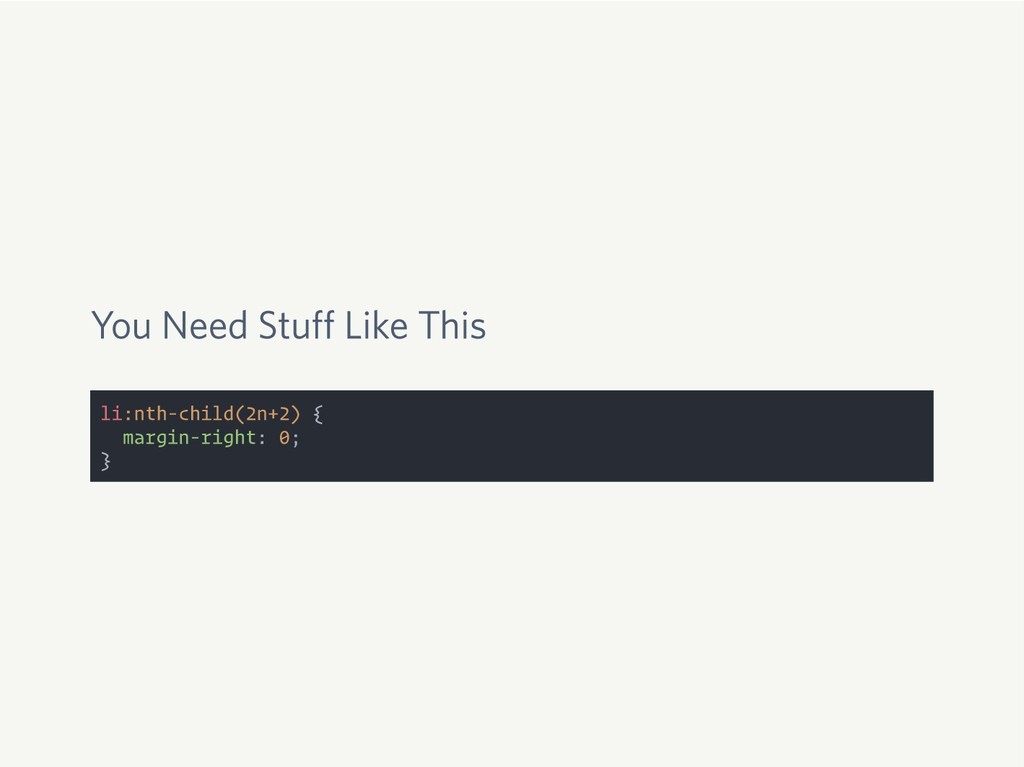
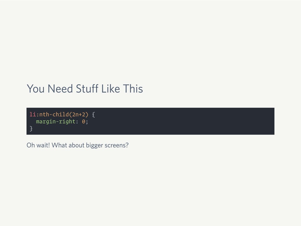
You Need Stuff Like This li:nth-child(2n+2) { margin-right: 0; }
You Need Stuff Like This li:nth-child(2n+2) { margin-right: 0; }
Oh wait! What about bigger screens?
You Need Stuff Like This li:nth-child(2n+2) { margin-right: 0; }
Oh wait! What about bigger screens? @media screen and (min-width: 40em) { li:nth-child(2n+2) { margin-right: 1.5rem; } li:nth-child(3n+3) { margin-right: 0; } }
None
Flexbox Is Awesome
Vertical Align!
We’re Using Flexbox Wrong
CSS Grid to the Rescue
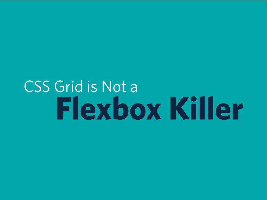
CSS Grid is Not a Float Killer
CSS Grid is Not a Flexbox Killer
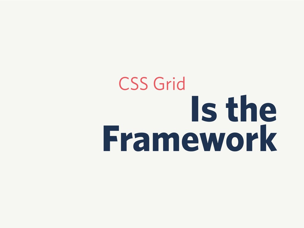
You Don’t Need a Framework
CSS Grid Is the Framework
CSS Grid is Friendly
Great Use of Flexbox
Great Use of Floats
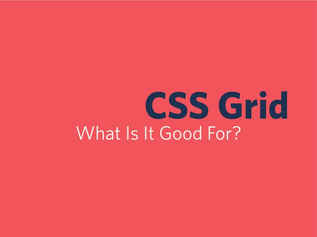
CSS Grid What Is It Good For?
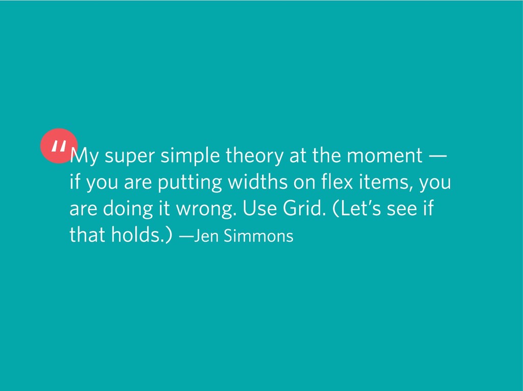
“My super simple theory at the moment — if you
are putting widths on flex items, you are doing it wrong. Use Grid. (Let’s see if that holds.) —Jen Simmons
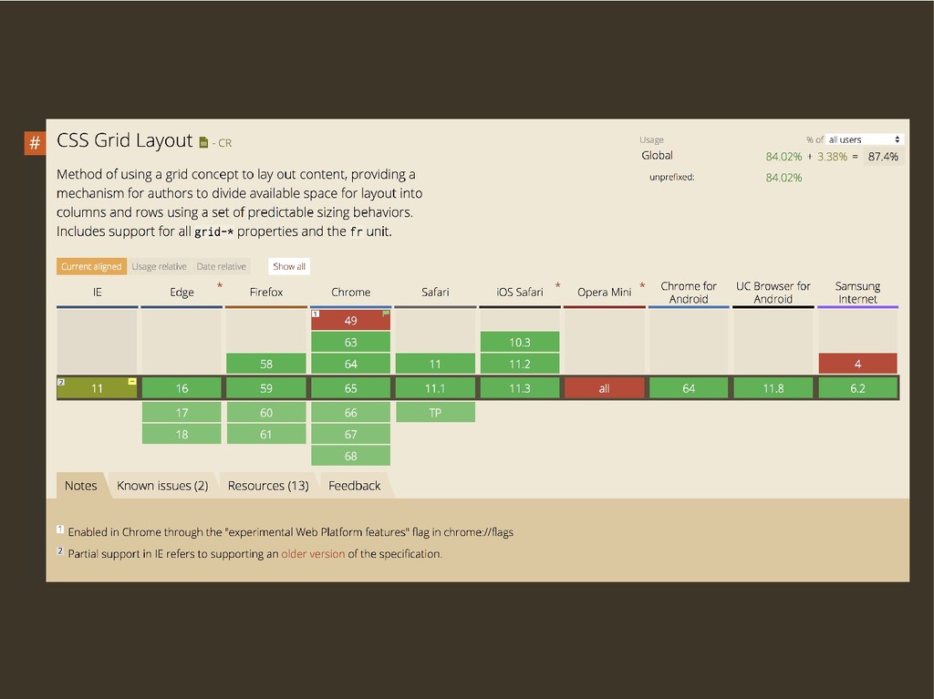
CSS Grid Basics
display: grid;
grid-template-columns
fr
grid-gap
Let’s See It in Action
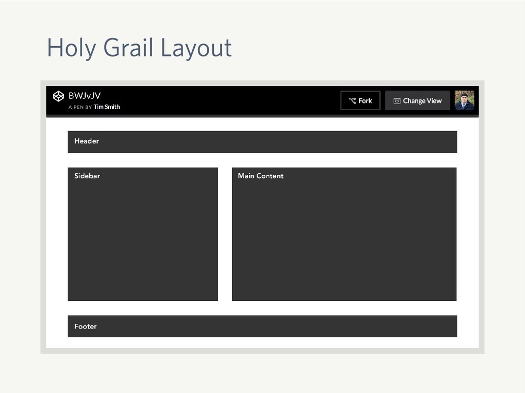
Holy Grail Layout
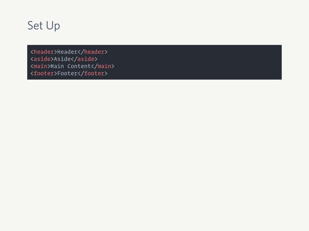
Set Up <header>Header</header> <aside>Aside</aside> <main>Main Content</main> <footer>Footer</footer>
Set Up <header>Header</header> <aside>Aside</aside> <main>Main Content</main> <footer>Footer</footer> body { display:
grid; grid-template-columns: 2fr 3fr; grid-gap: 2rem; }
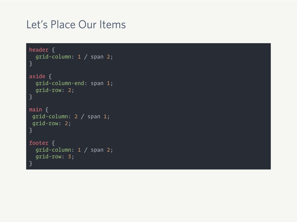
Let’s Place Our Items header { grid-column: 1 / span
2; } aside { grid-column-end: span 1; grid-row: 2; } main { grid-column: 2 / span 1; grid-row: 2; } footer { grid-column: 1 / span 2; grid-row: 3; }
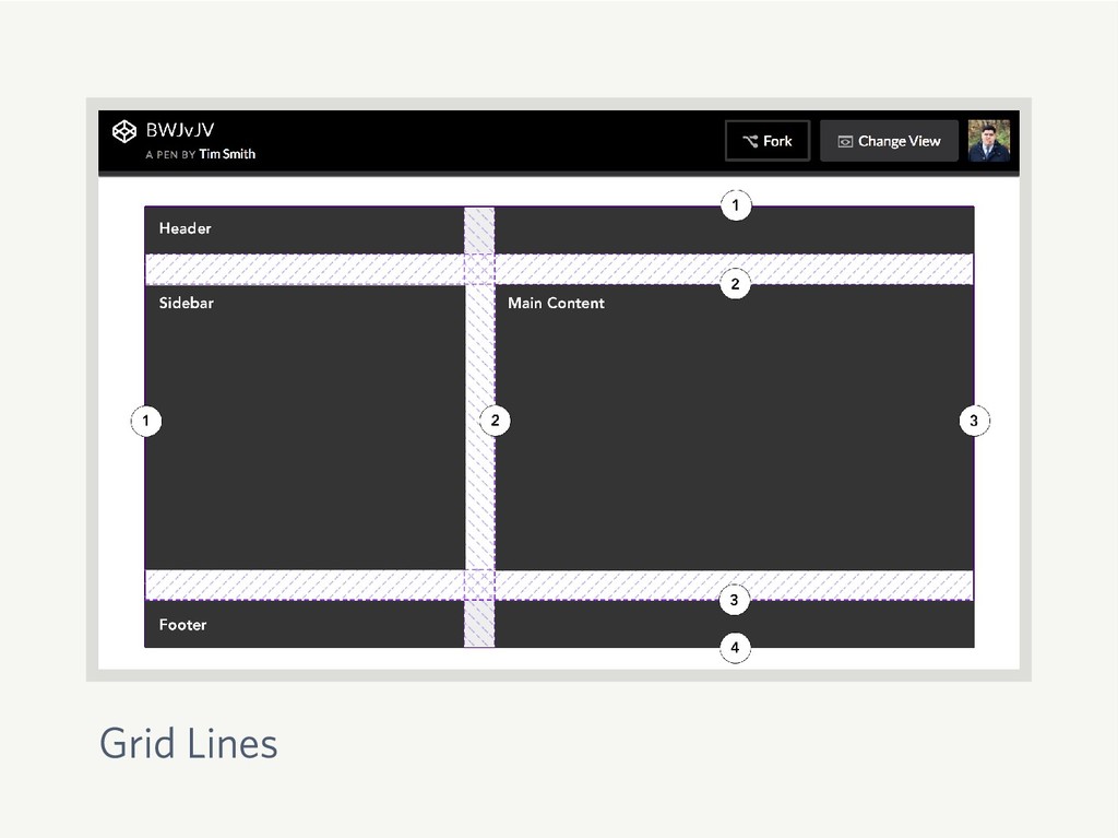
Grid Lines
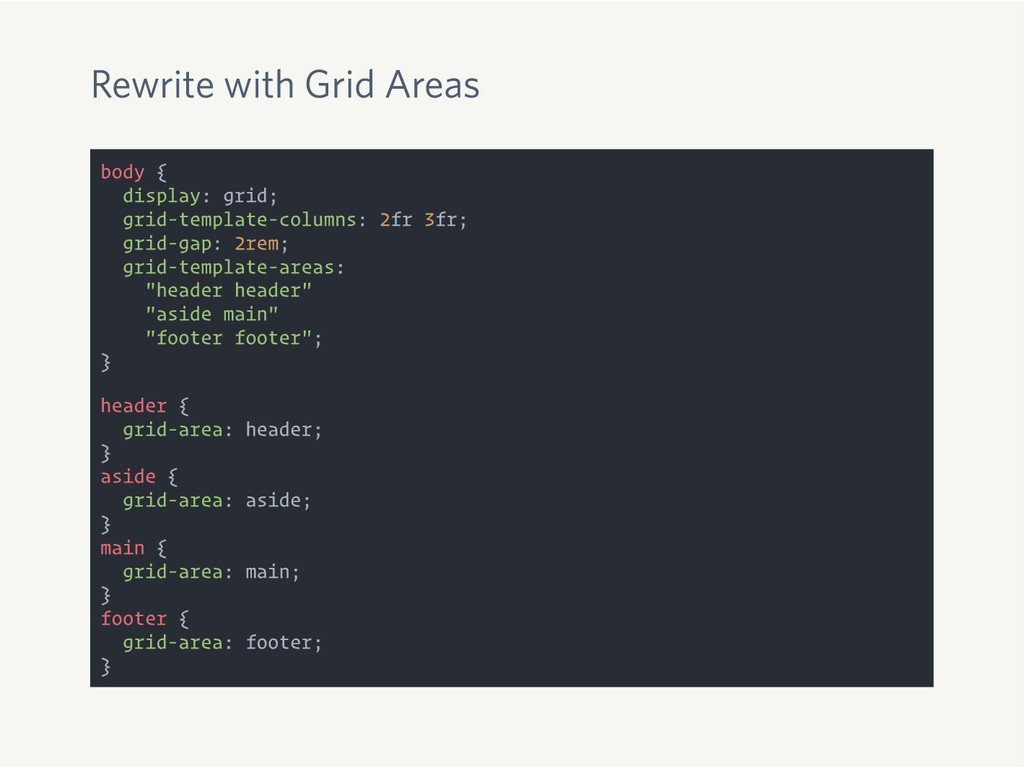
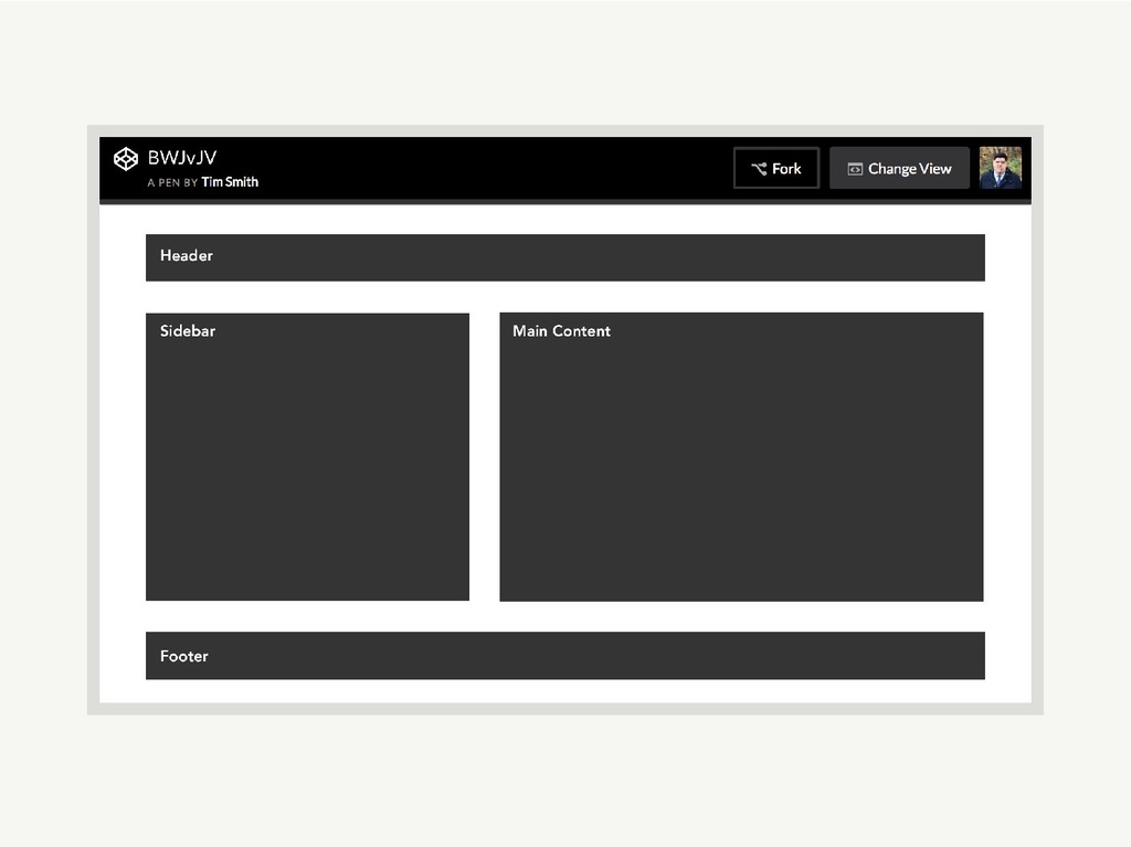
Rewrite with Grid Areas body { display: grid; grid-template-columns: 2fr
3fr; grid-gap: 2rem; grid-template-areas: "header header" "aside main" "footer footer"; } header { grid-area: header; } aside { grid-area: aside; } main { grid-area: main; } footer { grid-area: footer; }
None
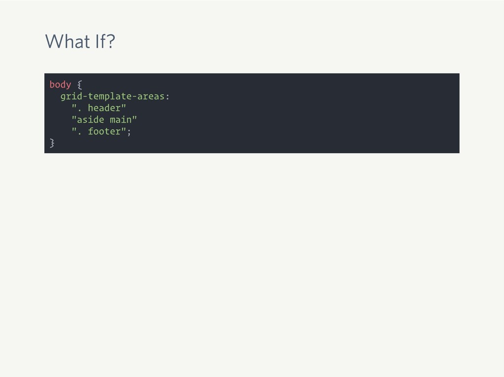
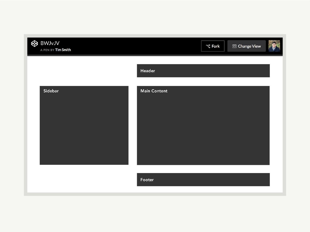
What If? body { grid-template-areas: ". header" "aside main" ".
footer"; }
None
None
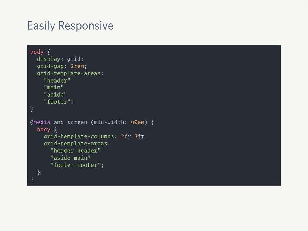
Easily Responsive body { display: grid; grid-gap: 2rem; grid-template-areas: "header"
"main" "aside" "footer"; } @media and screen (min-width: 40em) { body { grid-template-columns: 2fr 3fr; grid-template-areas: "header header" "aside main" "footer footer"; } }
None
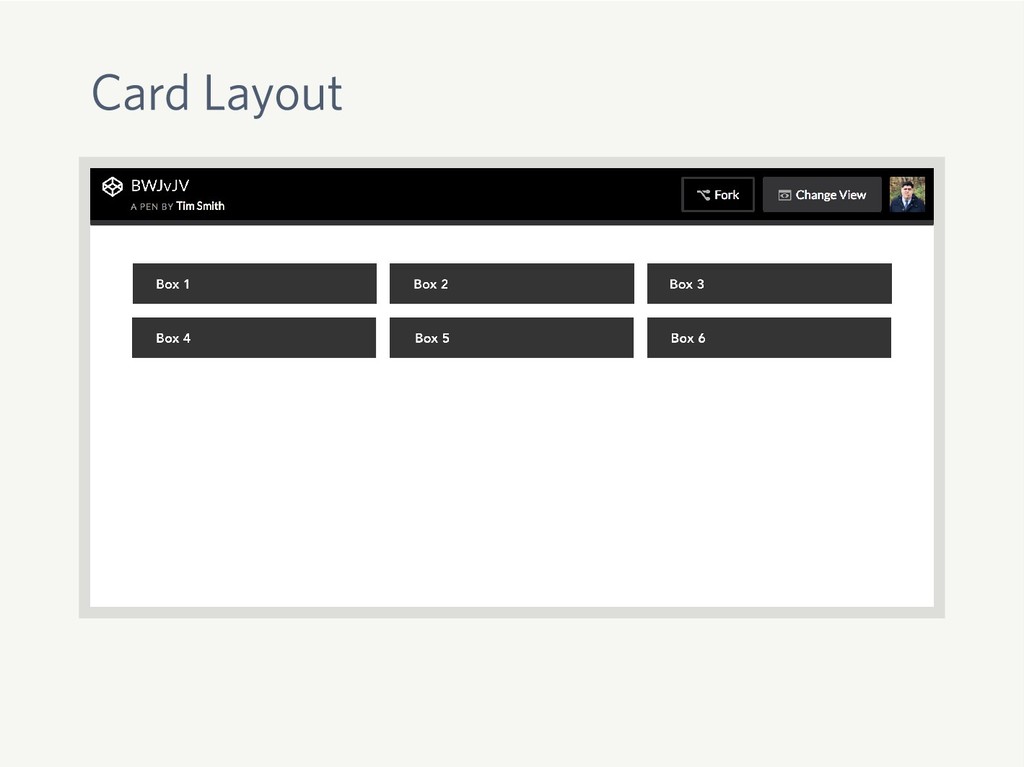
Card Layout
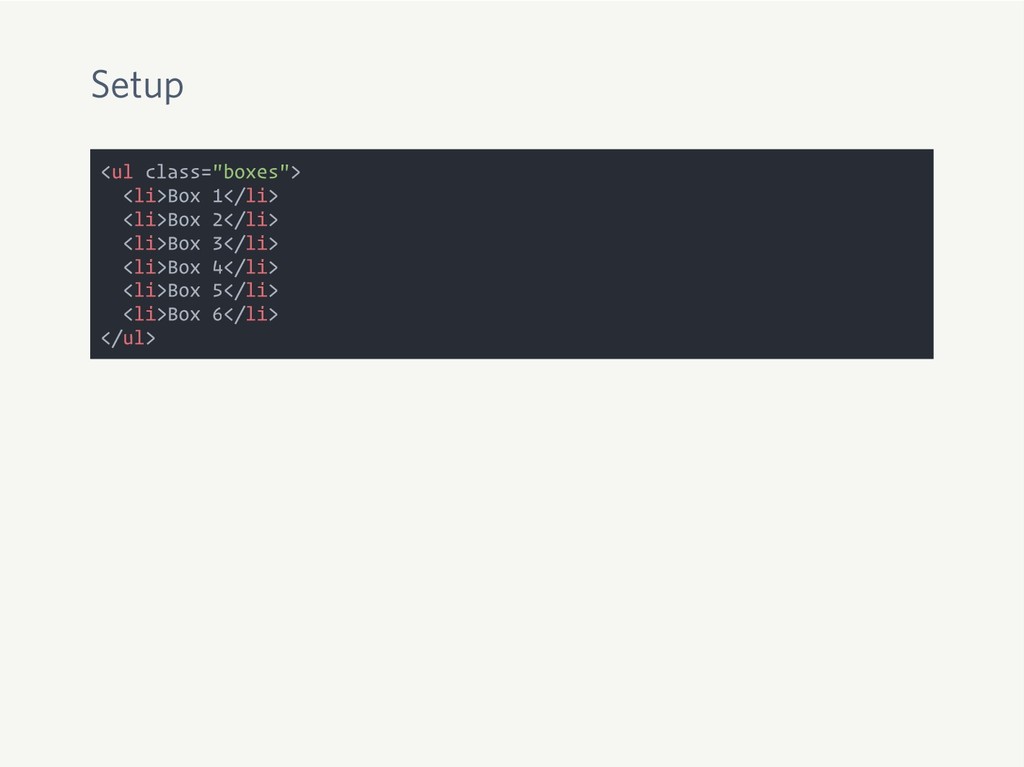
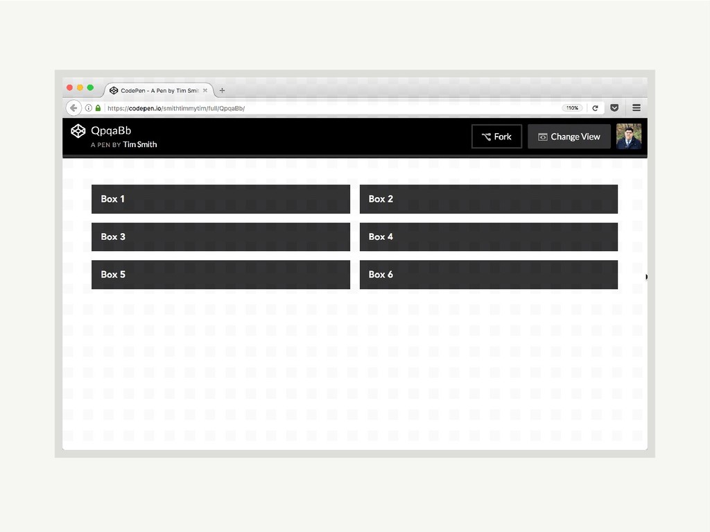
Setup <ul class="boxes"> <li>Box 1</li> <li>Box 2</li> <li>Box 3</li> <li>Box
4</li> <li>Box 5</li> <li>Box 6</li> </ul>
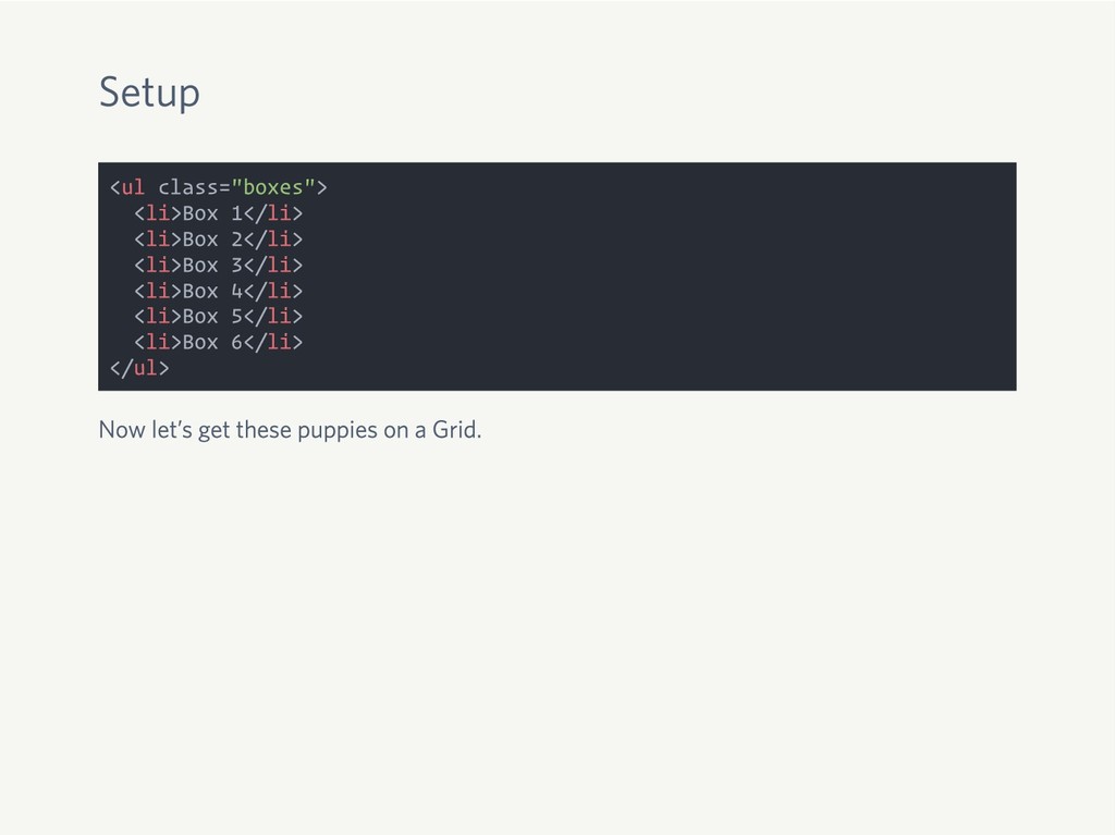
Setup <ul class="boxes"> <li>Box 1</li> <li>Box 2</li> <li>Box 3</li> <li>Box
4</li> <li>Box 5</li> <li>Box 6</li> </ul> Now let’s get these puppies on a Grid.
Setup <ul class="boxes"> <li>Box 1</li> <li>Box 2</li> <li>Box 3</li> <li>Box
4</li> <li>Box 5</li> <li>Box 6</li> </ul> Now let’s get these puppies on a Grid. .boxes { display: grid; grid-template-columns: repeat(auto-fill, minmax(300px, 1fr)); grid-gap: 1rem; }
Whoa! Hold Up.
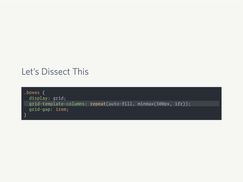
Let’s Dissect This .boxes { display: grid; grid-template-columns: repeat(auto-fill, minmax(300px,
1fr)); grid-gap: 1rem; }
None
Mind. Blown.
Special Portfolio-Inspired Layout
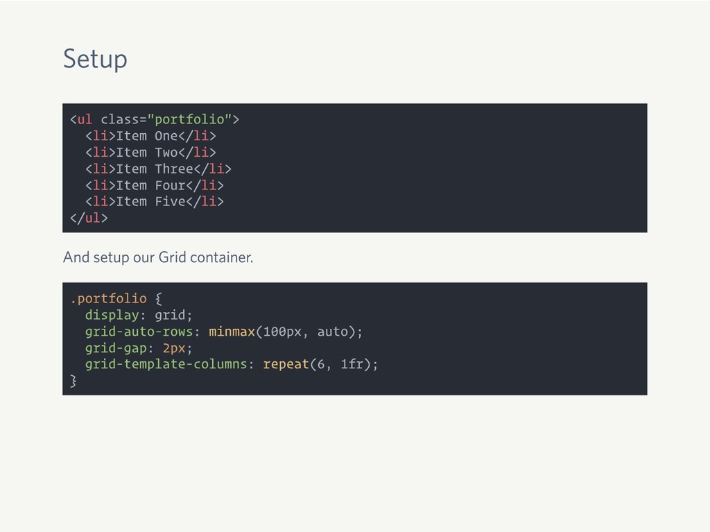
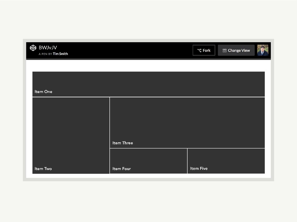
Setup <ul class="portfolio"> <li>Item One</li> <li>Item Two</li> <li>Item Three</li> <li>Item
Four</li> <li>Item Five</li> </ul>
Setup <ul class="portfolio"> <li>Item One</li> <li>Item Two</li> <li>Item Three</li> <li>Item
Four</li> <li>Item Five</li> </ul> And setup our Grid container.
Setup <ul class="portfolio"> <li>Item One</li> <li>Item Two</li> <li>Item Three</li> <li>Item
Four</li> <li>Item Five</li> </ul> And setup our Grid container. .portfolio { display: grid; grid-auto-rows: minmax(100px, auto); grid-gap: 2px; grid-template-columns: repeat(6, 1fr); }
grid-auto-rows
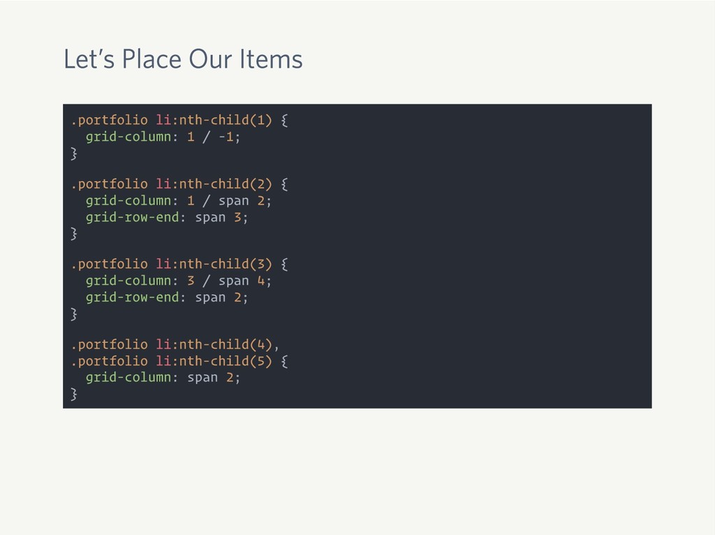
Let’s Place Our Items .portfolio li:nth-child(1) { grid-column: 1 /
-1; } .portfolio li:nth-child(2) { grid-column: 1 / span 2; grid-row-end: span 3; } .portfolio li:nth-child(3) { grid-column: 3 / span 4; grid-row-end: span 2; } .portfolio li:nth-child(4), .portfolio li:nth-child(5) { grid-column: span 2; }
None
Holy Jack City, Batman
The Power of CSS Grid
None
The Time is Now
Simpler Code
New Amazing Layouts
I Delayed Learning Flexbox and Regret It
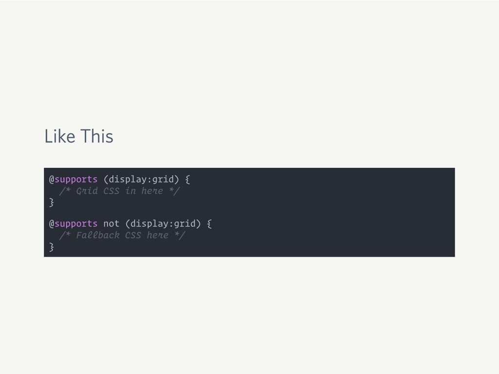
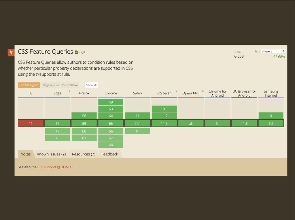
Feature Queries
Like This @supports (display:grid) { /* Grid CSS in here
*/ } @supports not (display:grid) { /* Fallback CSS here */ }
None
Browsers Ignore CSS They Don’t Understand
What Did We Learn?
1 CSS Grid Is Awesome
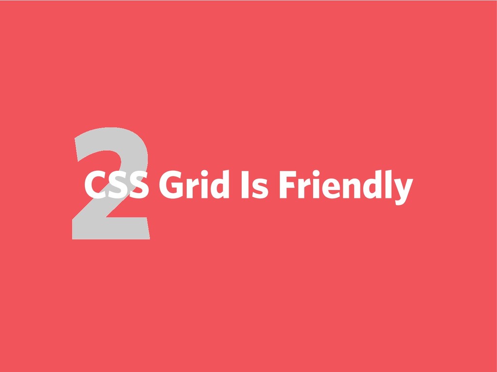
2 CSS Grid Is Friendly
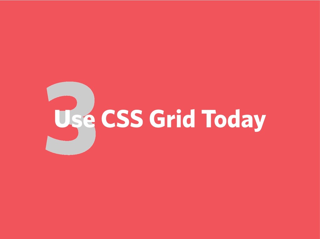
3 Use CSS Grid Today
Only the Beginning
Rachel Andrew gridbyexample.com
Jen Simmons labs.jensimmons.com
Mozilla Developer Network developer.mozilla.org
Read The Spec w3.org/TR/css-grid-1/
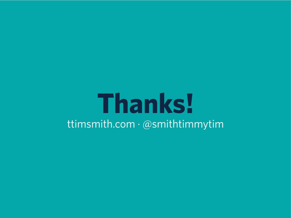
Thanks! ttimsmith.com · @smithtimmytim
 Your Podcast. Everywhere. Effortlessly.
 ttimsmith
 mukai_takeru
 mhand01
 godlingkogami
 kenichiota0711
 rezaline
 ncdc
ncdc
 webnaut
 shotamatsuo
 kakukoki
 saki822
 tammyeverts
 helmedeiros
 rabernat
 asonas
 kimpetersen
 jakevdp
 baasie
 techseoconnect
 addyosmani
 mojombo
 aleyda