Upgrade to Pro
— share decks privately, control downloads, hide ads and more …
Speaker Deck
Features
Speaker Deck
PRO
Sign in
Sign up for free
Search
Search
d3.js + mobile
Search
Sponsored
·
Your Podcast. Everywhere. Effortlessly.
Share. Educate. Inspire. Entertain. You do you. We'll handle the rest.
→
binx
August 10, 2012
11
4.4k
d3.js + mobile
binx
August 10, 2012
Tweet
Share
More Decks by binx
See All by binx
On the Importance of Iteration
binx
0
120
Designing for Spacecraft Operations
binx
2
630
Place and Space
binx
0
540
Error: Success
binx
0
540
Peak Visualization?
binx
1
610
The Data Visualization Hustle
binx
2
470
People, Not Users
binx
2
260
Data Collection and Memory
binx
1
240
The Road To Code
binx
1
410
Featured
See All Featured
DBのスキルで生き残る技術 - AI時代におけるテーブル設計の勘所
soudai
PRO
64
52k
Principles of Awesome APIs and How to Build Them.
keavy
128
17k
I Don’t Have Time: Getting Over the Fear to Launch Your Podcast
jcasabona
34
2.7k
What does AI have to do with Human Rights?
axbom
PRO
1
2k
Making Projects Easy
brettharned
120
6.6k
Hiding What from Whom? A Critical Review of the History of Programming languages for Music
tomoyanonymous
2
590
[RailsConf 2023 Opening Keynote] The Magic of Rails
eileencodes
31
10k
The Power of CSS Pseudo Elements
geoffreycrofte
82
6.2k
Claude Code どこまでも/ Claude Code Everywhere
nwiizo
64
54k
Design and Strategy: How to Deal with People Who Don’t "Get" Design
morganepeng
133
19k
Reflections from 52 weeks, 52 projects
jeffersonlam
356
21k
What the history of the web can teach us about the future of AI
inesmontani
PRO
1
490
Transcript
d3.js + mobile Rachel Binx, Stamen Design
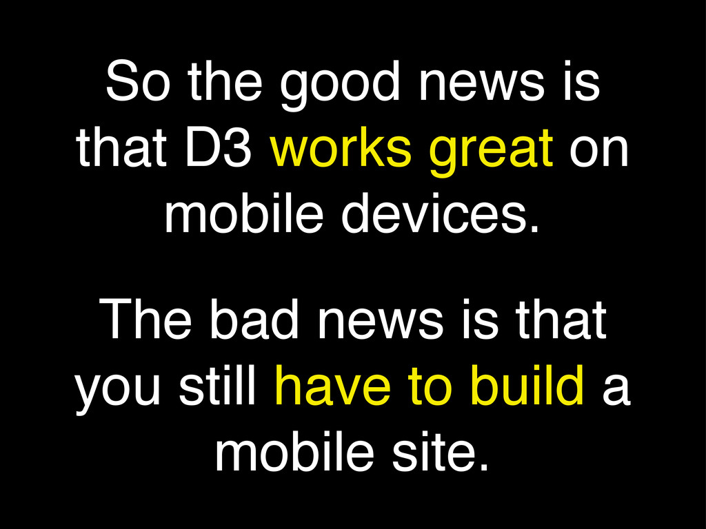
So the good news is that D3 works great on
mobile devices. The bad news is that you still have to build a mobile site.
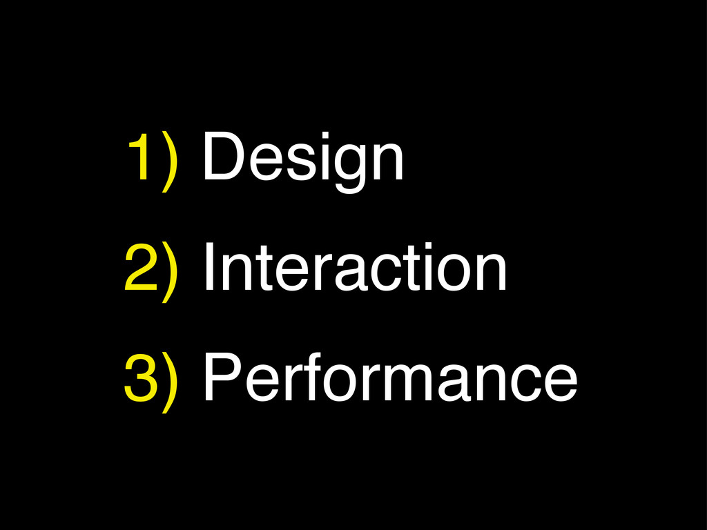
1) Design 2) Interaction 3) Performance
Tools of the Trade
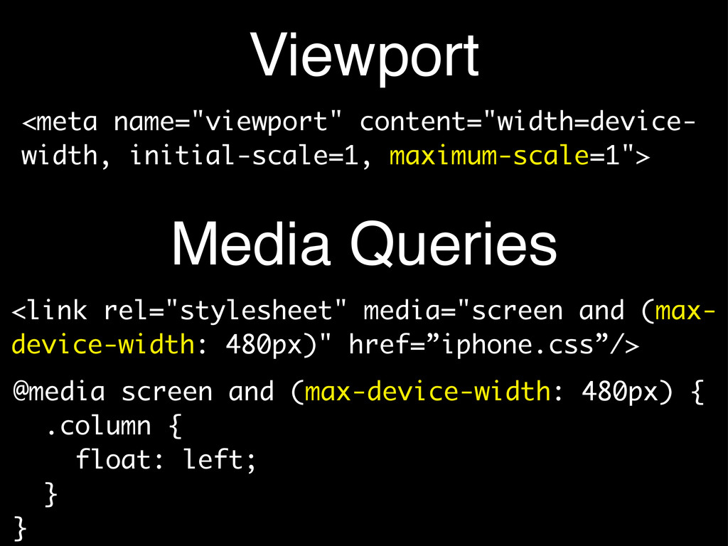
Viewport <link rel="stylesheet" media="screen and (max- device-width: 480px)" href=”iphone.css”/> <meta
name="viewport" content="width=device- width, initial-scale=1, maximum-scale=1"> @media screen and (max-device-width: 480px) { .column { float: left; } } Media Queries
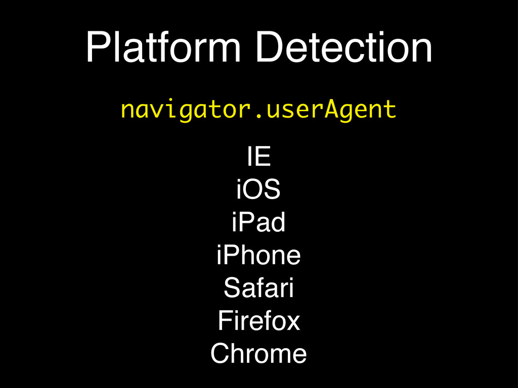
Platform Detection navigator.userAgent IE iOS iPad iPhone Safari Firefox Chrome
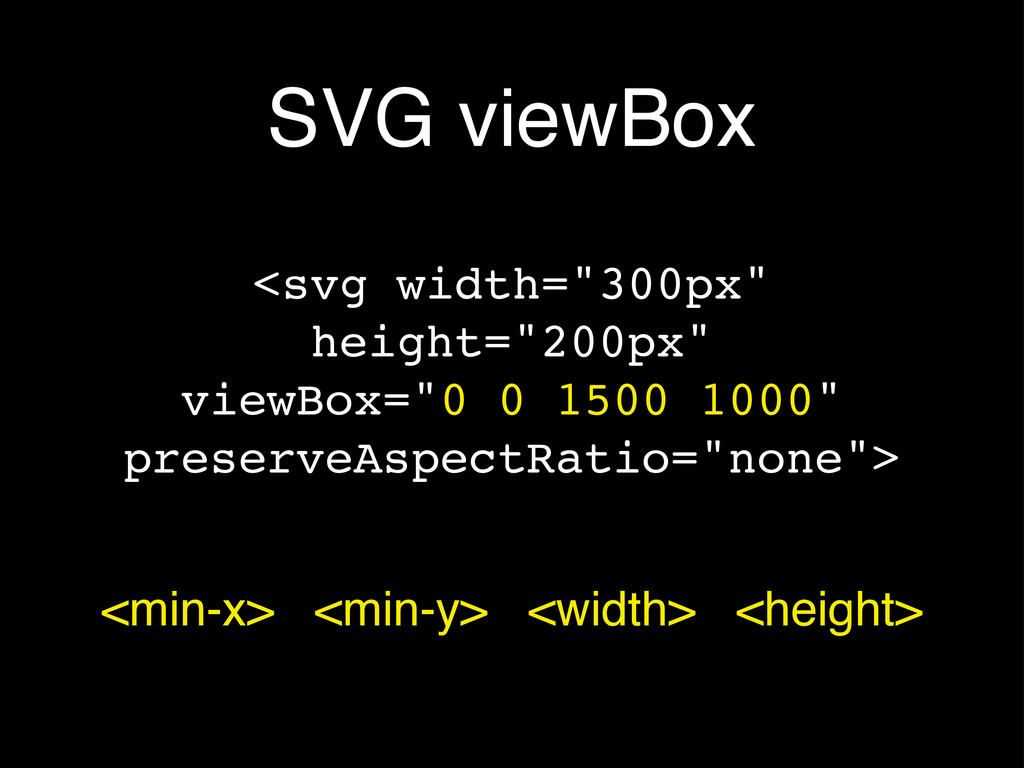
SVG viewBox <svg width="300px" height="200px" viewBox="0 0 1500 1000" preserveAspectRatio="none">
<min-x> <min-y> <width> <height>
Tiny Screens! • Anything interactive on your page: make it
much larger • You will not have a cursor to indicate interaction models - consider labeling everything • Quite simply: remove all subtly
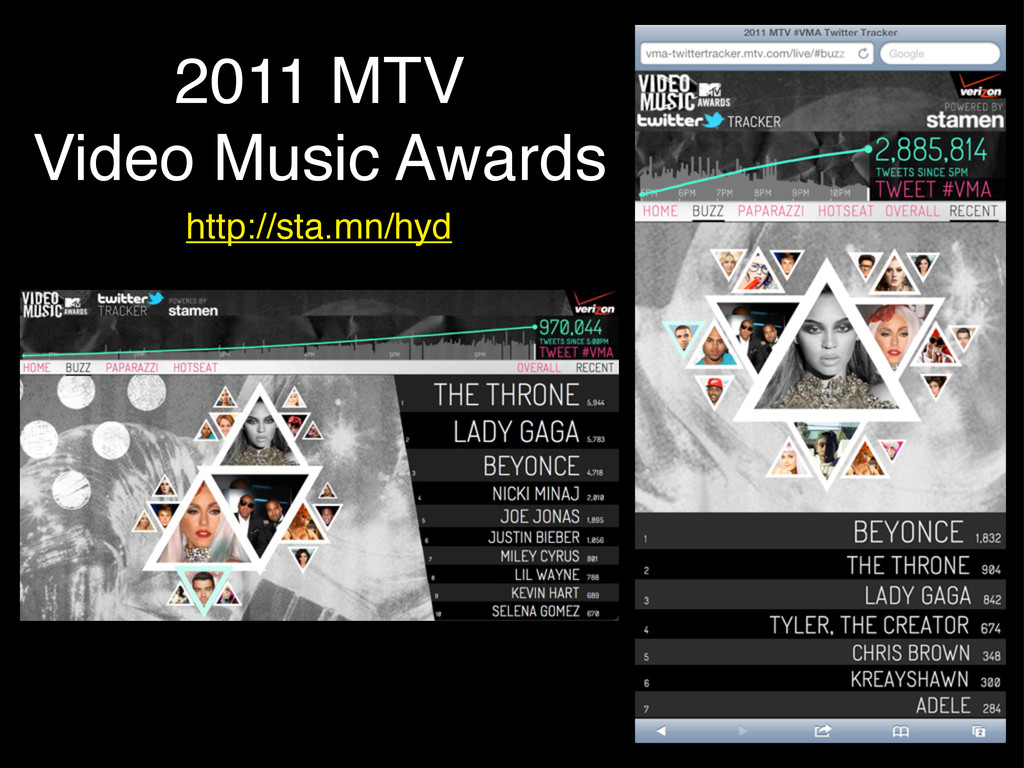
2011 MTV Video Music Awards http://sta.mn/hyd
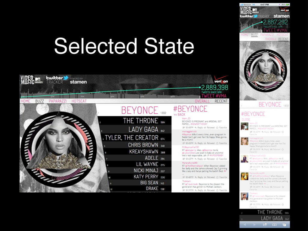
Selected State
Interaction Models
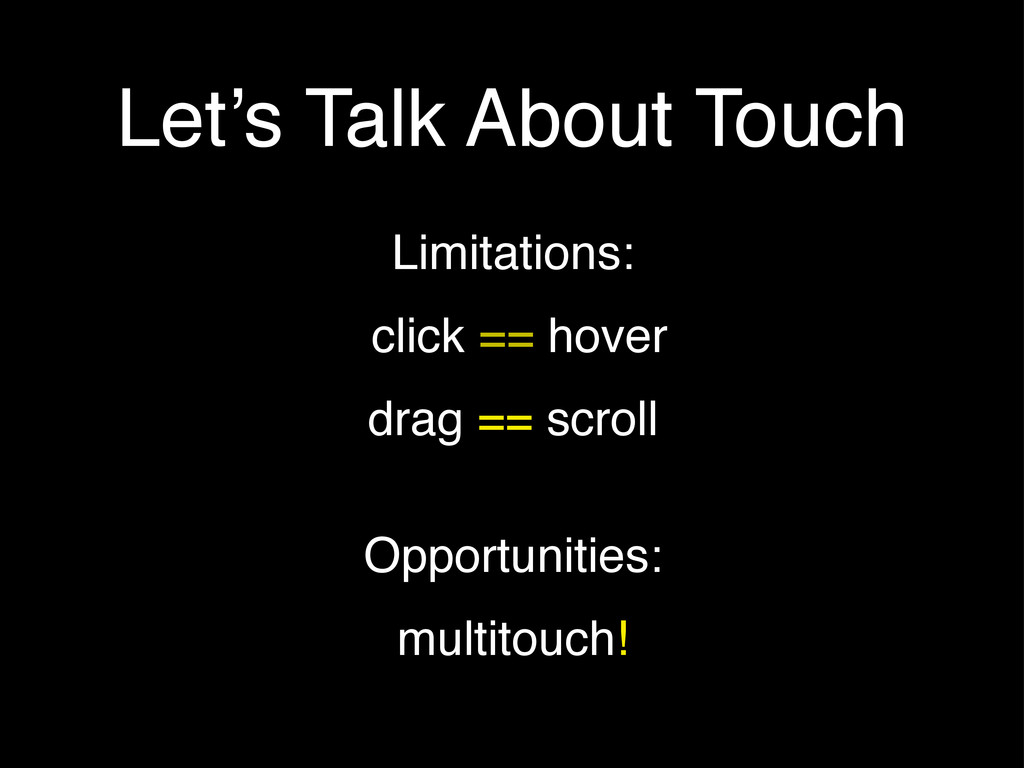
Let’s Talk About Touch Limitations: click == hover drag ==
scroll Opportunities: multitouch!
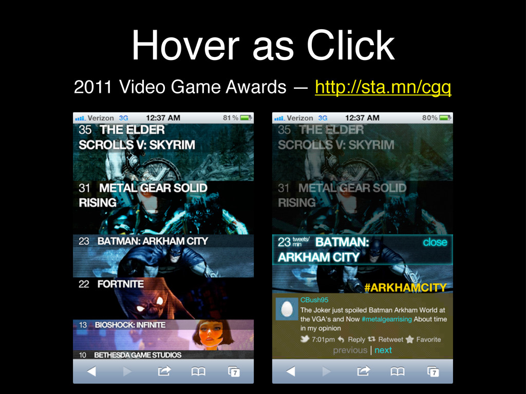
Hover as Click 2011 Video Game Awards — http://sta.mn/cgq
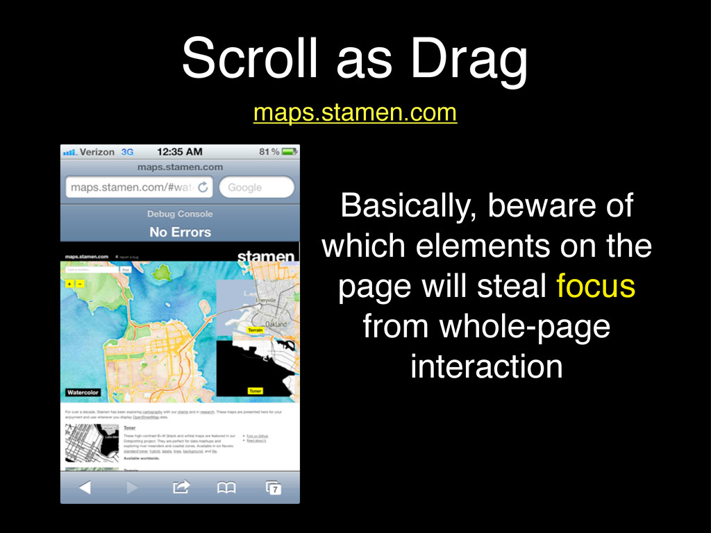
Scroll as Drag maps.stamen.com Basically, beware of which elements on
the page will steal focus from whole-page interaction
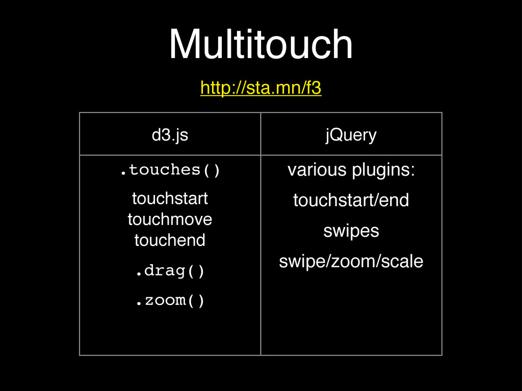
Multitouch http://sta.mn/f3 d3.js jQuery .touches() touchstart touchmove touchend .drag() .zoom()
various plugins: touchstart/end swipes swipe/zoom/scale
Saucy Animations
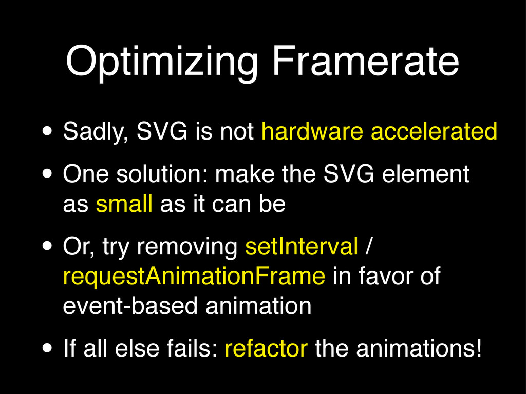
Optimizing Framerate • Sadly, SVG is not hardware accelerated •
One solution: make the SVG element as small as it can be • Or, try removing setInterval / requestAnimationFrame in favor of event-based animation • If all else fails: refactor the animations!
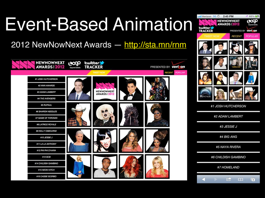
Event-Based Animation 2012 NewNowNext Awards — http://sta.mn/rnm
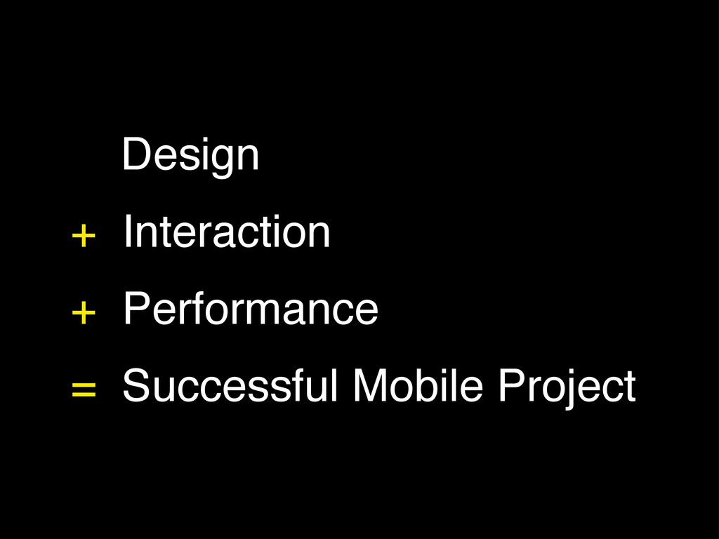
Design + Interaction + Performance = Successful Mobile Project
Thanks!
[email protected]
@rachelbinx
 binx
binx
 soudai
 keavy
keavy
 jcasabona
 axbom
axbom
 brettharned
 tomoyanonymous
 eileencodes
 geoffreycrofte
 nwiizo
 morganepeng
 jeffersonlam
 inesmontani
![Thanks! [email protected] @rachelbinx](https://files.speakerdeck.com/presentations/502563086773ba000200c6a8/slide_19.jpg)