Upgrade to Pro
— share decks privately, control downloads, hide ads and more …
Speaker Deck
Features
Speaker Deck
PRO
Sign in
Sign up for free
Search
Search
Responsive Web Design
Search
Sayanee
May 15, 2012
Technology
310
3
Share
Embed
Copy iframe code
Copy JS code
Copy link
Start on current slide
Responsive Web Design
Sayanee
May 15, 2012
More Decks by Sayanee
See All by Sayanee
Podcasting with Jekyll
sayanee
1
1k
Rails API
sayanee
5
570
Learning with Open Source
sayanee
3
330
ECMAScript 6 - part 1
sayanee
3
430
ECMAScript 6 - part 2
sayanee
1
300
Minimalist Designer behind the curious Developer
sayanee
8
450
Responsive Web Design for Beginners
sayanee
9
990
Travel to Balkans + Hungary
sayanee
2
240
Styling with SASS
sayanee
9
650
Other Decks in Technology
See All in Technology
そのドキュメント、自動化しませんか?
yuksew
1
430
AI時代の開発生産性は、個人技からチーム設計へ
moongift
PRO
5
2.6k
AI_Dev_Day_製造業領域でのAI活用から見た活用の罠と成功に導く実践知.pdf
kintotechdev
0
190
ここは地獄!つらい朝会を体験することで、チームとしてのより良い振る舞いに気づくワークショップ / The stand-up meeting from hell in the game industry
scrummasudar
0
310
AIコード生成×サプライチェーン攻撃 — PHPが直面する“二重の信頼問題
shinyasaita
0
480
全社でのソフトウェアサプライチェーン攻撃対策をやってみた with Takumi Guard
z63d
0
300
プロダクト開発組織の現在地(Ver.2026/07) / product-organization
kaonavi
0
470
データと地図で読む 大井町の「かわるもの、かわらないもの」
yoshiyama_hana
0
220
10年目を迎えた「ABEMA」がどのように AI 活用を推進して、AI 駆動開発にシフトしているのか / How ABEMA, entering its 10th year, is promoting the use of AI and shifting toward AI-driven development
miyukki
1
380
仕様駆動開発、導入半年。「本当に速くなってるの?」にデータで答える / AICon2026_hirakawa
rakus_dev
0
330
インシデント事例と パッケージの全量解析に学ぶ ソフトウェアサプライチェーンの守り方 / supply-chain-attack-defense
flatt_security
0
1k
副作用のある Lambda でも Lambda Power Tuning は使えるのか / lambda-power-tuning-side-effects
koukihosaka
2
150
Featured
See All Featured
How to Create Impact in a Changing Tech Landscape [PerfNow 2023]
tammyeverts
55
3.4k
The agentic SEO stack - context over prompts
schlessera
0
850
Reality Check: Gamification 10 Years Later
codingconduct
0
2.2k
SEO Brein meetup: CTRL+C is not how to scale international SEO
lindahogenes
1
2.8k
DevOps and Value Stream Thinking: Enabling flow, efficiency and business value
helenjbeal
1
260
Claude Code どこまでも/ Claude Code Everywhere
nwiizo
65
57k
Docker and Python
trallard
47
4k
Agile Actions for Facilitating Distributed Teams - ADO2019
mkilby
0
220
Design of three-dimensional binary manipulators for pick-and-place task avoiding obstacles (IECON2024)
konakalab
0
490
CSS Pre-Processors: Stylus, Less & Sass
bermonpainter
360
30k
Easily Structure & Communicate Ideas using Wireframe
afnizarnur
194
17k
The Illustrated Children's Guide to Kubernetes
chrisshort
51
53k
Transcript
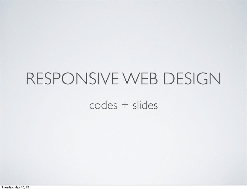
RESPONSIVE WEB DESIGN codes + slides Tuesday, May 15, 12
@sayanee_ Tuesday, May 15, 12
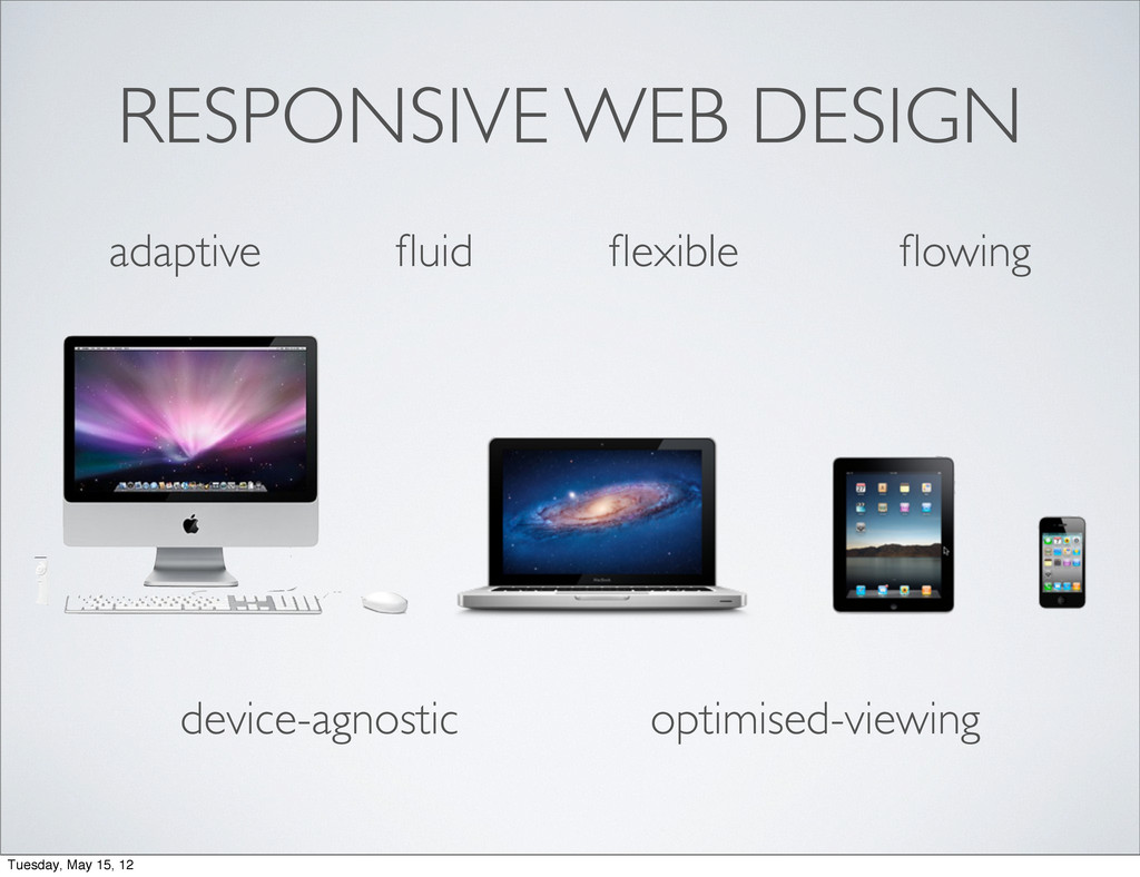
RESPONSIVE WEB DESIGN Tuesday, May 15, 12
RESPONSIVE WEB DESIGN adaptive fluid flexible flowing Tuesday, May 15,
12
RESPONSIVE WEB DESIGN adaptive fluid flexible flowing device-agnostic optimised-viewing Tuesday,
May 15, 12
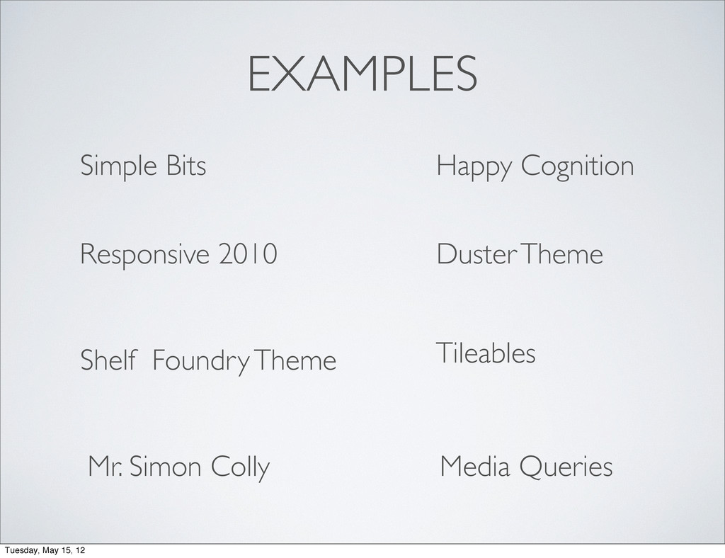
EXAMPLES Media Queries Happy Cognition Simple Bits Responsive 2010 Duster
Theme Shelf Foundry Theme Tileables Mr. Simon Colly Tuesday, May 15, 12
TOOLS Tuesday, May 15, 12
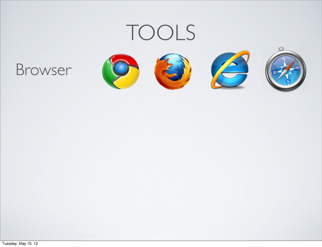
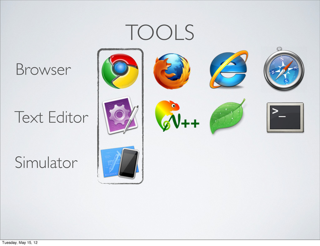
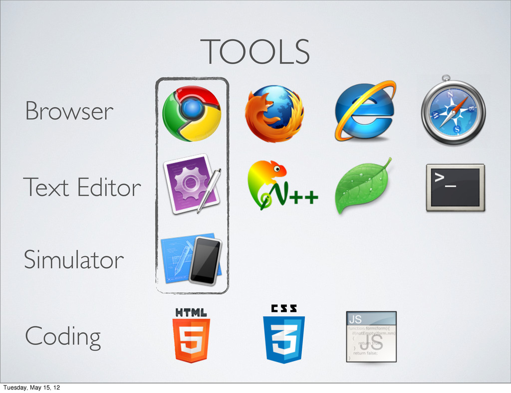
TOOLS Browser Tuesday, May 15, 12
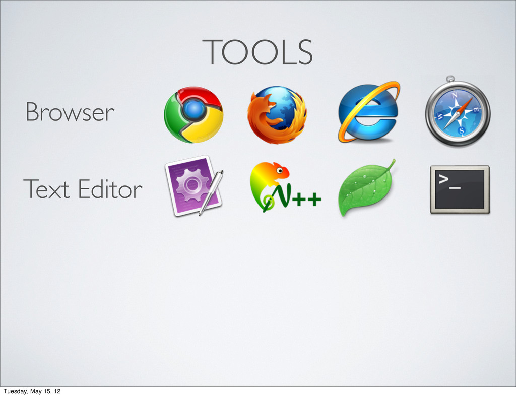
TOOLS Browser Text Editor Tuesday, May 15, 12
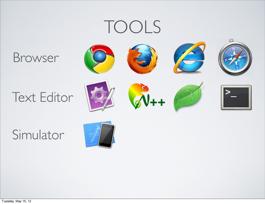
TOOLS Browser Text Editor Simulator Tuesday, May 15, 12
TOOLS Browser Text Editor Simulator Tuesday, May 15, 12
TOOLS Browser Text Editor Simulator Coding Tuesday, May 15, 12
#1 fluid layout #2 media queries #3 flexible media Tuesday,
May 15, 12
#1 fluid layout Tuesday, May 15, 12
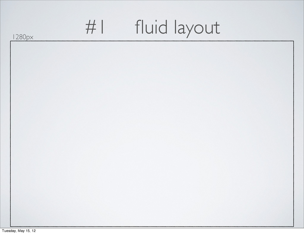
#1 fluid layout 1280px Tuesday, May 15, 12
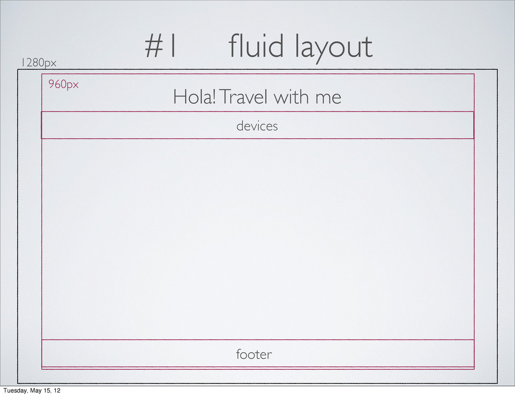
#1 fluid layout 1280px 960px Hola! Travel with me devices
footer Tuesday, May 15, 12
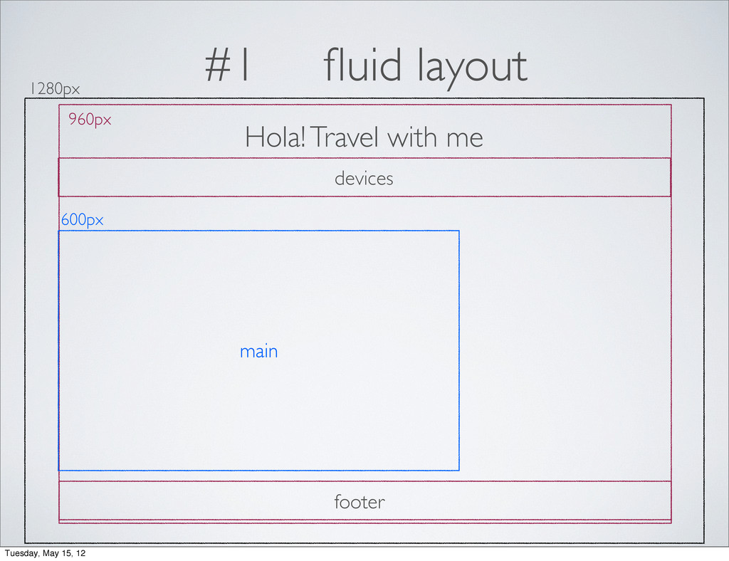
#1 fluid layout 1280px 960px Hola! Travel with me 600px
devices main footer Tuesday, May 15, 12
#1 fluid layout 1280px 960px Hola! Travel with me 600px
300px devices main sidebar footer Tuesday, May 15, 12
#1 fluid layout think in pixels percentages target / context
= result Tuesday, May 15, 12
#1 fluid layout 1280px 960px Hola! Travel with me 600px
300px devices main sidebar footer Tuesday, May 15, 12
#1 fluid layout 1280px 960px Hola! Travel with me 600px
300px devices main sidebar footer /1280px = 75% / 960px= 62.5% /960px = 31.25% 960px / 960px = 100% 960px / 960px = 100% Tuesday, May 15, 12
#2 media queries min-width landscape 1024px portrait 768px 1280px landscape
960px portrait 640px four layouts 1200px 1024px 768px 600px Tuesday, May 15, 12
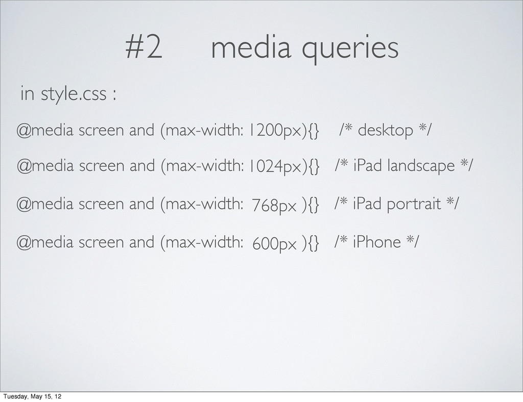
#2 media queries 1200px 1024px 768px 600px Tuesday, May 15,
12
#2 media queries 1200px 1024px 768px 600px @media screen and
(max-width: ){} /* desktop */ in style.css : @media screen and (max-width: ){} /* iPad landscape */ @media screen and (max-width: ){} /* iPad portrait */ @media screen and (max-width: ){} /* iPhone */ Tuesday, May 15, 12
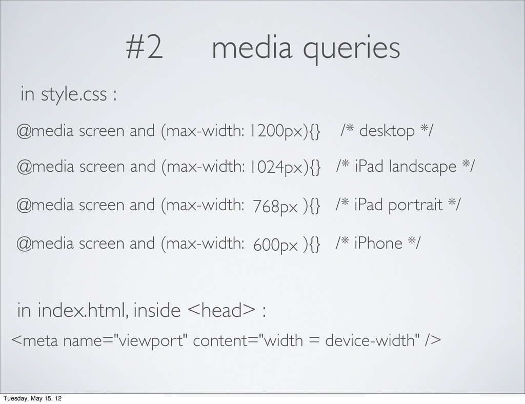
#2 media queries 1200px 1024px 768px 600px @media screen and
(max-width: ){} /* desktop */ in style.css : @media screen and (max-width: ){} /* iPad landscape */ @media screen and (max-width: ){} /* iPad portrait */ @media screen and (max-width: ){} /* iPhone */ in index.html, inside <head> : <meta name="viewport" content="width = device-width" /> Tuesday, May 15, 12
#3 flexible media img, embed, object, video { max-width:100% }
Tuesday, May 15, 12
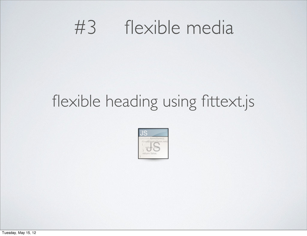
#3 flexible media flexible heading using fittext.js Tuesday, May 15,
12
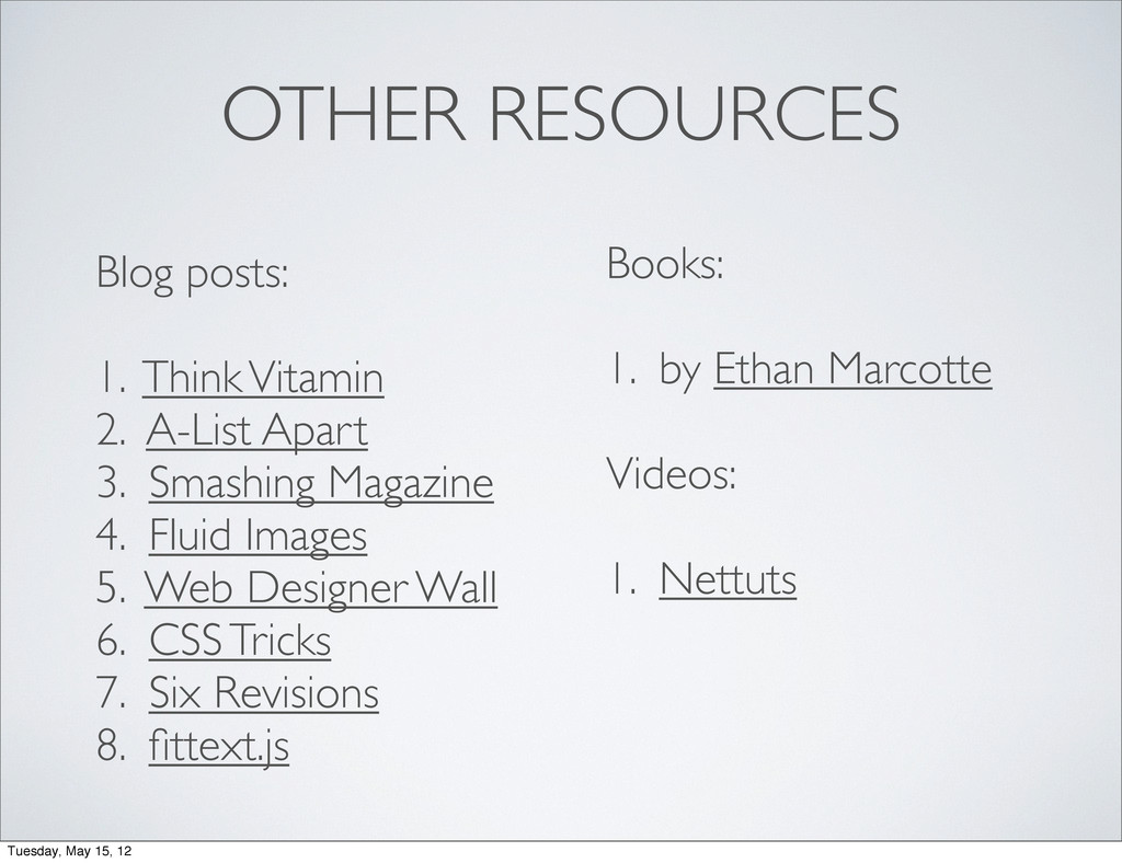
OTHER RESOURCES Blog posts: 1. Think Vitamin 2. A-List Apart
3. Smashing Magazine 4. Fluid Images 5. Web Designer Wall 6. CSS Tricks 7. Six Revisions 8. fittext.js Books: 1. by Ethan Marcotte Videos: 1. Nettuts Tuesday, May 15, 12
codes + slides Tuesday, May 15, 12
@sayanee_ Tuesday, May 15, 12
 sayanee
 yuksew
 moongift
 kintotechdev
 scrummasudar
 shinyasaita
 z63d
z63d
 kaonavi
 yoshiyama_hana
 miyukki
 rakus_dev
 flatt_security
 koukihosaka
 tammyeverts
 schlessera
 codingconduct
 lindahogenes
.png) helenjbeal
helenjbeal
 nwiizo
 trallard
 mkilby
 konakalab
 bermonpainter
 afnizarnur
 chrisshort