Upgrade to Pro — share decks privately, control downloads, hide ads and more …

Lessons Learned from a 500,000 Page Responsive Design

Seth Meranda
October 09, 2012
2.2k

Lessons Learned from a 500,000 Page Responsive Design

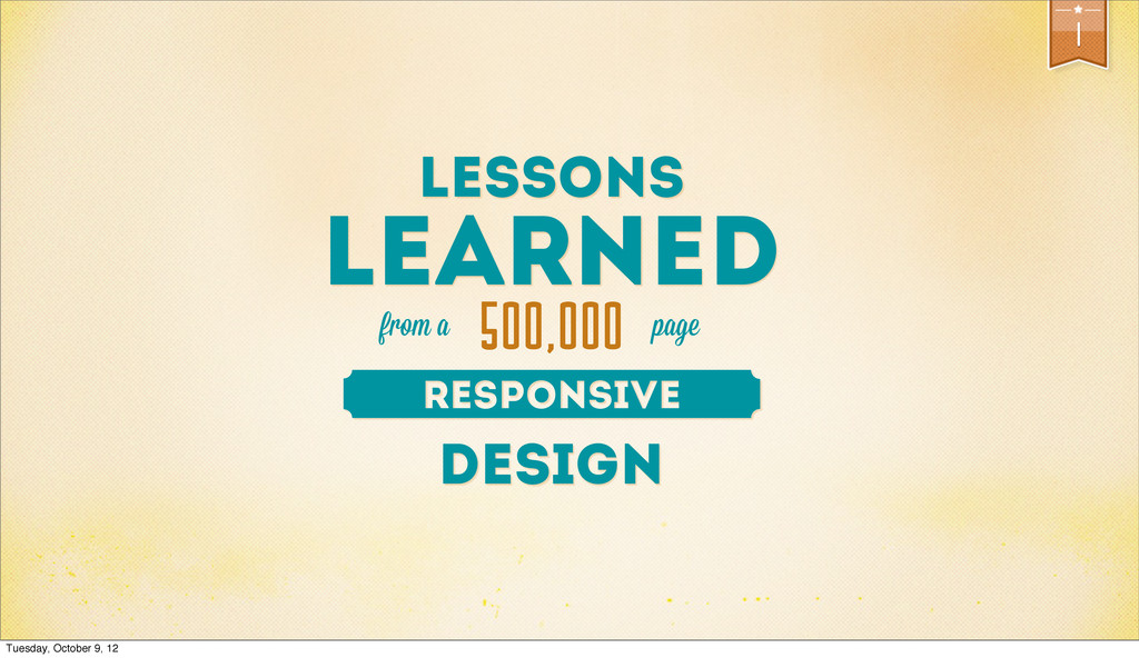
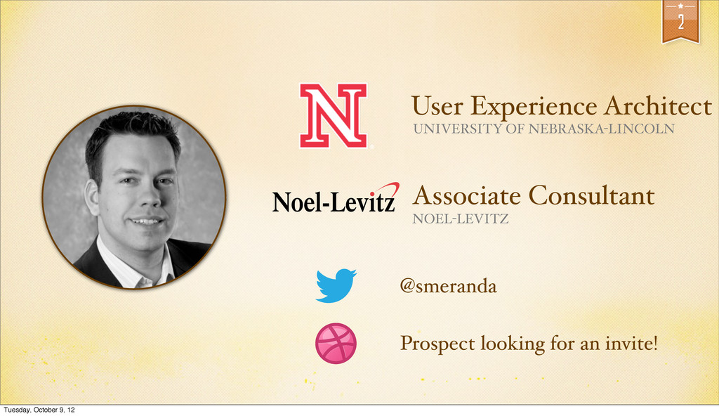
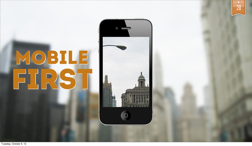
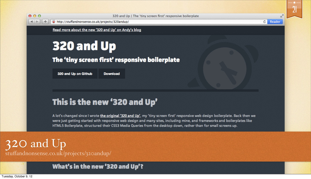
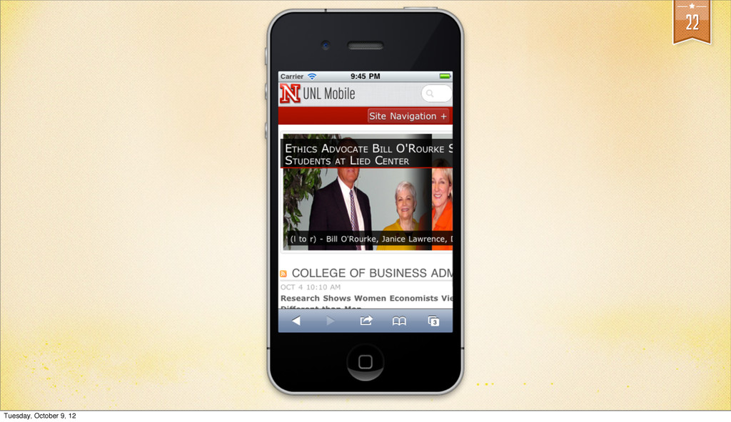
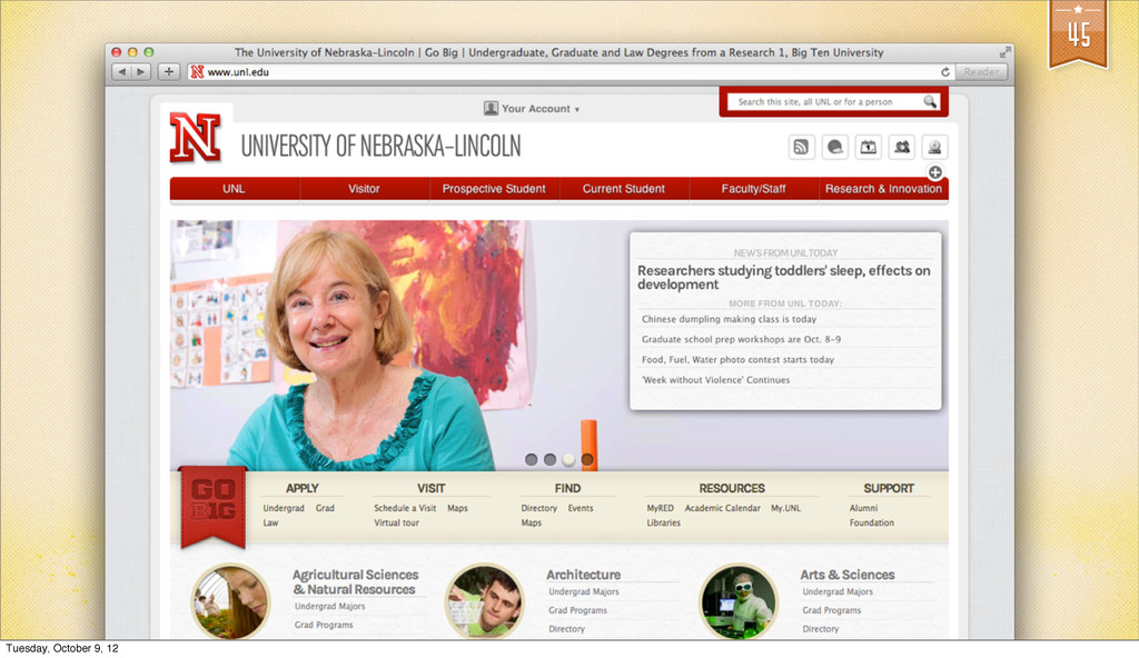
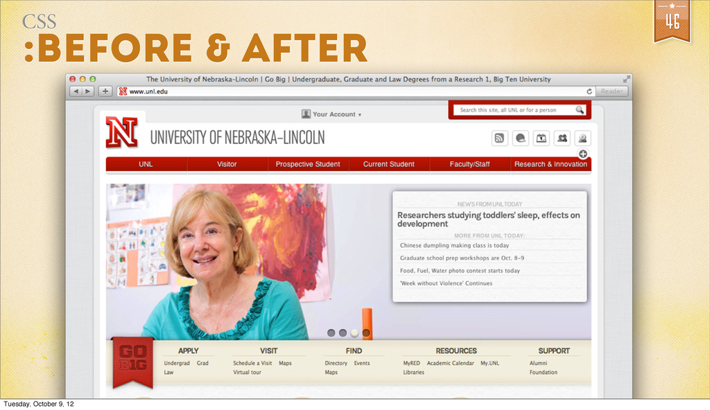
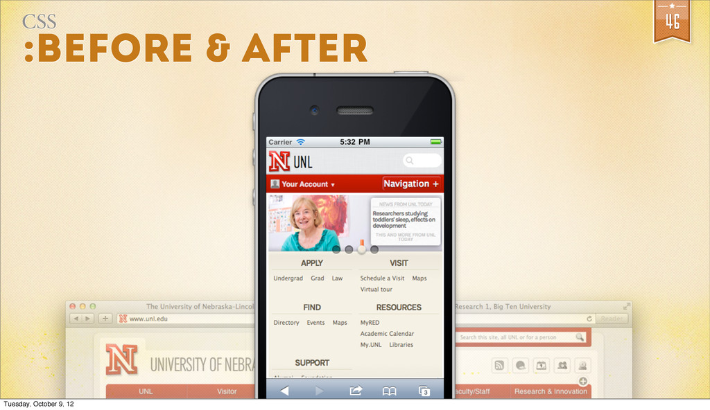
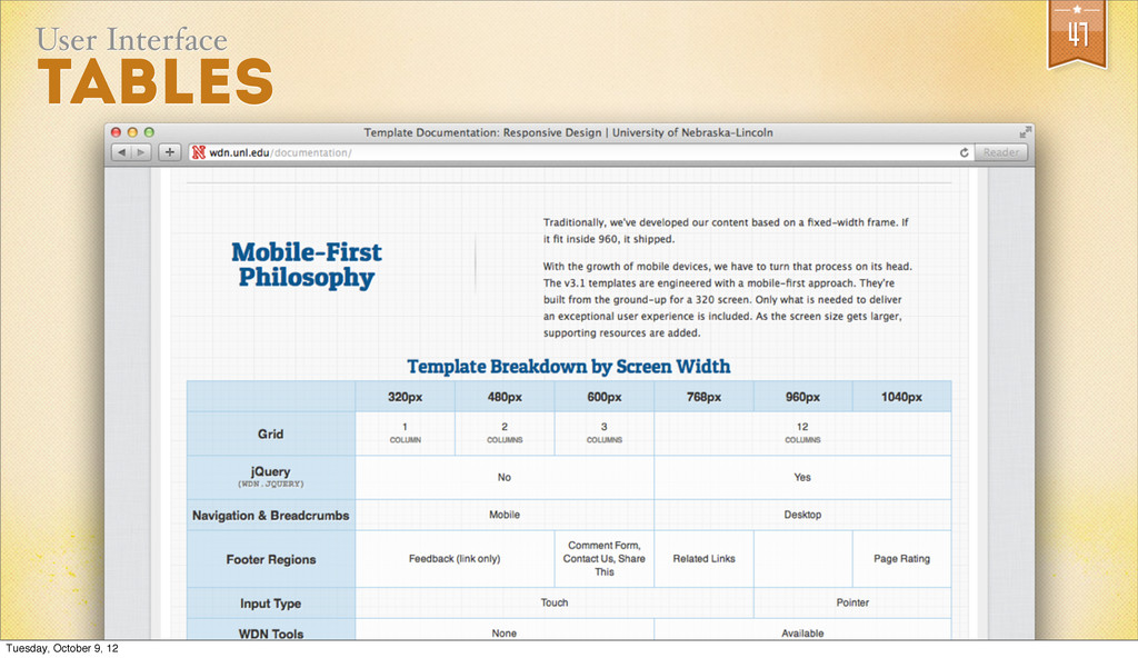
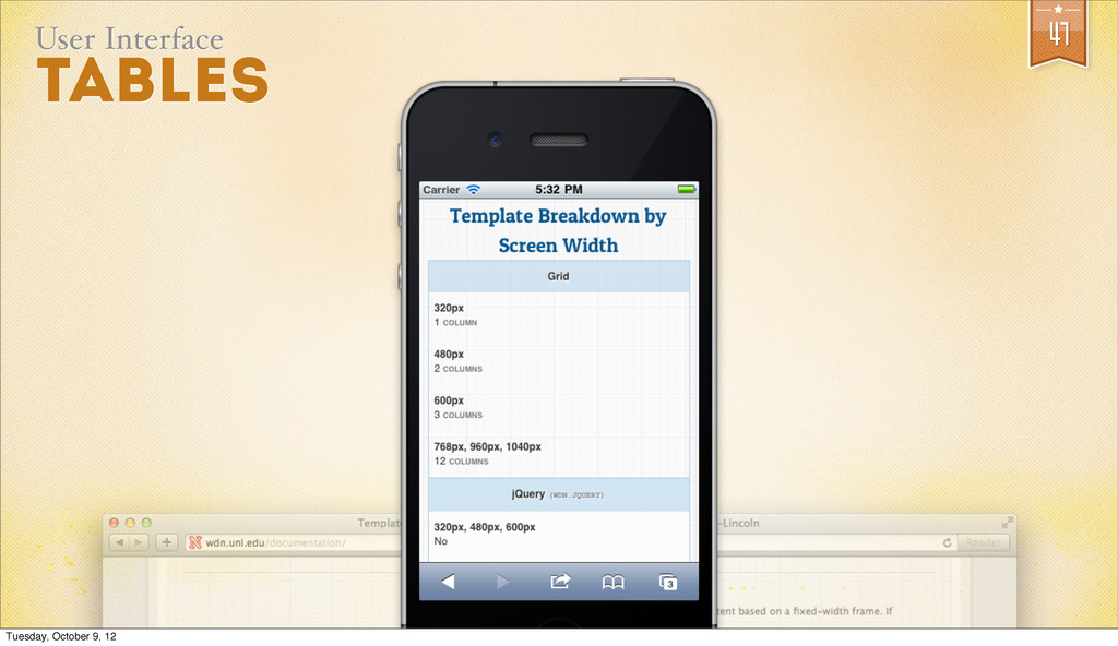
In the spring of 2012, the University of Nebraska-Lincoln converted the template powering unl.edu to a responsive design. In this presentation, Seth Meranda -- the User Experience Architect -- explores the steps taken and a few of trials and successes from the process.
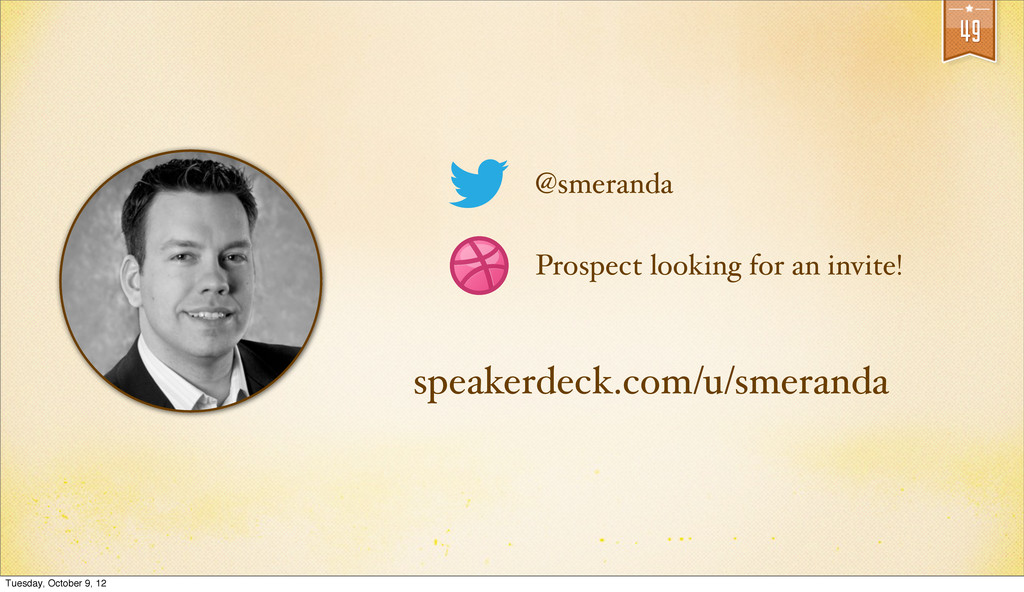
Seth Meranda

October 09, 2012
Tweet

Transcript

  1. 2 @smeranda User Experience Architect UNIVERSITY OF NEBRASKA-LINCOLN Associate Consultant

    NOEL-LEVITZ Prospect looking for an invite! Tuesday, October 9, 12
  2. 11 Those working on web pages outside of the guidance

    do no favors to themselves or this university in our efforts to build a cohesive image. “ Chancellor Perlman, 2005 Tuesday, October 9, 12
  3. 11 “ Chancellor Perlman, 2005 I will deal directly with

    units who are responsible for non-complying publications. Tuesday, October 9, 12
  4. 16 I skate to where the puck is going to

    be... W ayne Gretzky Tuesday, October 9, 12
  5. 25 @media (min-width: 320px) { rules {properties: values;} } @media

    (min-width: 600px) { rules {properties: values;} } @media (min-width: 960px) { rules {properties: values;} } gist.github.com/2026690 Tuesday, October 9, 12
  6. 26 @media (min-width: 320px) { } @media (min-width: 600px) {

    } @media (min-width: 960px) { } rules {properties: values;} rules {properties: values;} rules {properties: values;} @media (min-width: 320px) { } @media (min-width: 600px) { } @media (min-width: 960px) { } rules {properties: values;} rules {properties: values;} rules {properties: values;} @media (min-width: 320px) { } @media (min-width: 600px) { } @media (min-width: 960px) { } rules {properties: values;} rules {properties: values;} rules {properties: values;} Header Footer Navigation rules {properties: values;} rules {properties: values;} rules {properties: values;} Tuesday, October 9, 12
  7. 28 @media (min-width: 320px) { } @media (min-width: 600px) {

    } @media (min-width: 960px) { } rules {properties: values;} rules {properties: values;} rules {properties: values;} @media (min-width: 320px) { } @media (min-width: 600px) { } @media (min-width: 960px) { } rules {properties: values;} rules {properties: values;} rules {properties: values;} @media (min-width: 320px) { } @media (min-width: 600px) { } @media (min-width: 960px) { } rules {properties: values;} rules {properties: values;} rules {properties: values;} Header Footer Navigation rules {properties: values;} rules {properties: values;} rules {properties: values;} 960.css MINIFIED 600.css MINIFIED 320.css MINIFIED base.css MINIFIED Tuesday, October 9, 12
  8. 29 @import url('320.css') (min-width: 320px); @import url('480.css') (min-width: 480px); @import

    url('600.css') (min-width: 600px); @import url('768.css') (min-width: 768px); @import url('960.css') (min-width: 960px); @import url('1040.css') (min-width: 1040px); mq.css Tuesday, October 9, 12
  9. 33 Do websites need to look exactly the same in

    every browser? dowebsitesneedtolookexactlythesameineverybrowser.com Tuesday, October 9, 12
  10. 35 <link rel="stylesheet" type="text/css" media="all" href="base.css"> <link rel="stylesheet" type="text/css" media="all

    and (min-width: 320px)" href="mq.css"> <html> IE chokes on this Tuesday, October 9, 12
  11. 35 <link rel="stylesheet" type="text/css" media="all" href="base.css"> <link rel="stylesheet" type="text/css" media="all

    and (min-width: 320px)" href="mq.css"> <html> <!--[if lt IE 9]> <link rel="stylesheet" type="text/css" media="all" href="combined_widths.css" /> <![endif]--> IE chokes on this Tuesday, October 9, 12