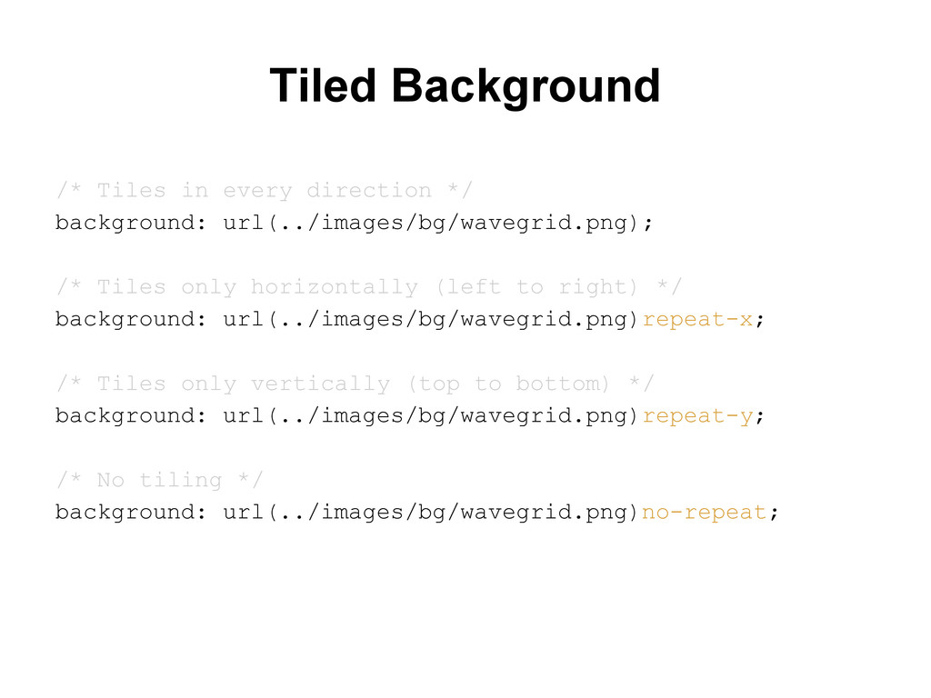
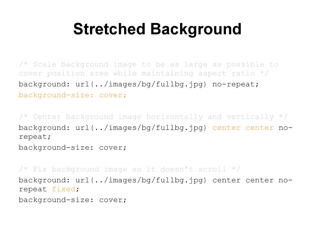
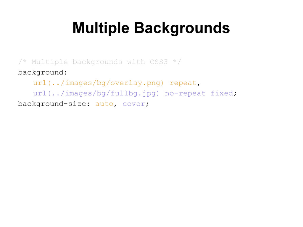
as possible to cover position area while maintaining aspect ratio */ background: url(../images/bg/fullbg.jpg) no-repeat; background-size: cover; /* Center background image horizontally and vertically */ background: url(../images/bg/fullbg.jpg) center center no- repeat; background-size: cover; /* Fix background image so it doesn't scroll */ background: url(../images/bg/fullbg.jpg) center center no- repeat fixed; background-size: cover;
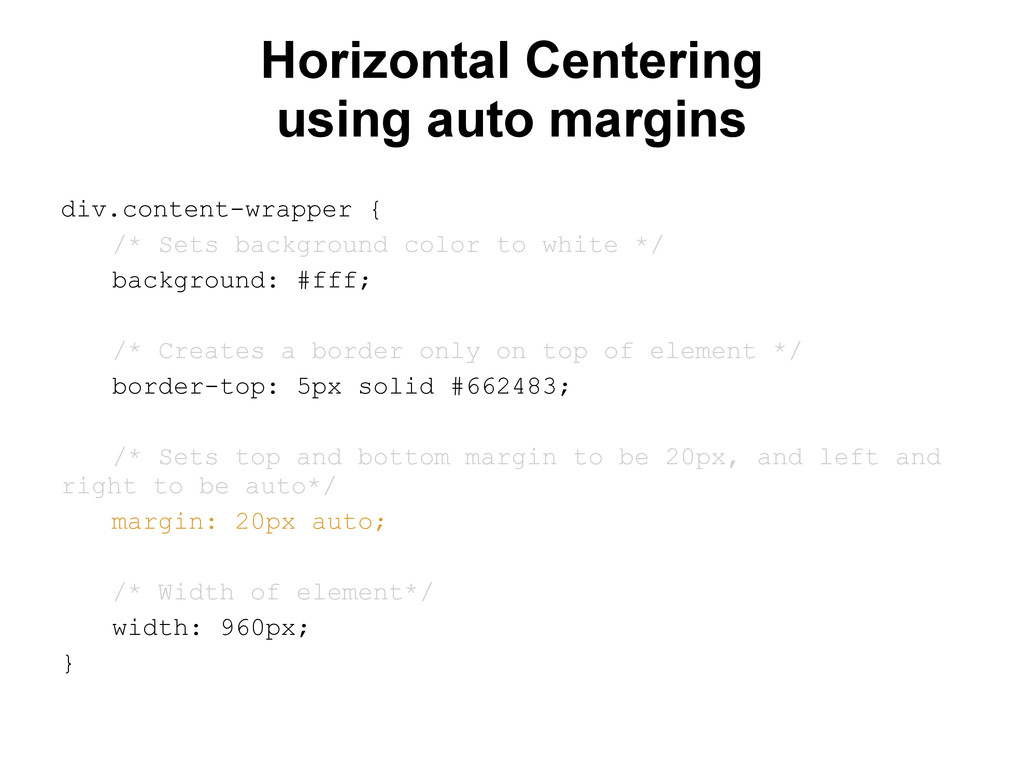
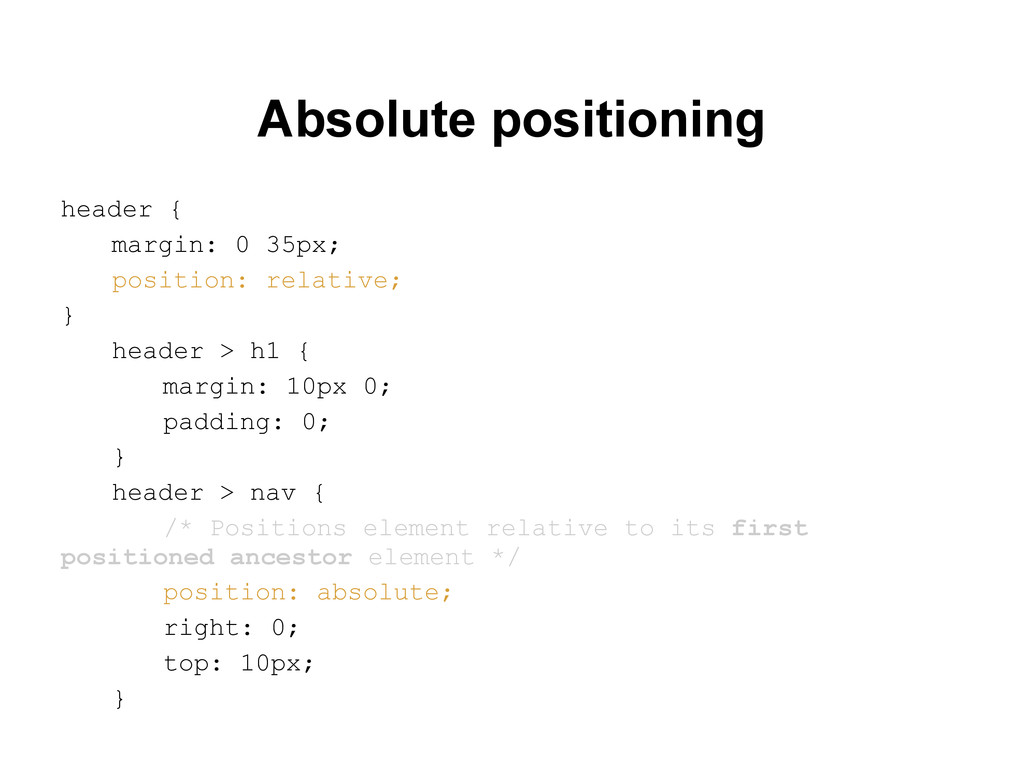
color to white */ background: #fff; /* Creates a border only on top of element */ border-top: 5px solid #662483; /* Sets top and bottom margin to be 20px, and left and right to be auto*/ margin: 20px auto; /* Width of element*/ width: 960px; }
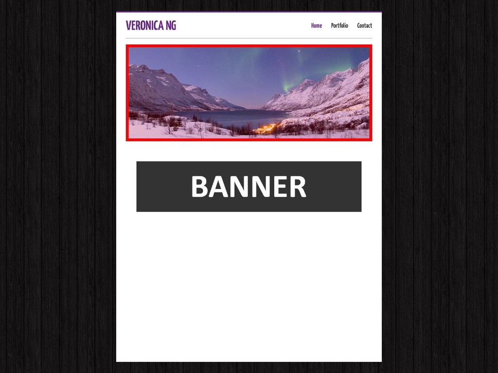
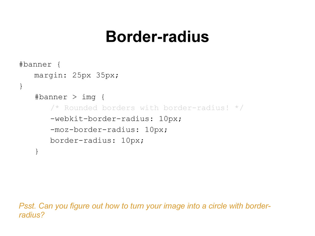
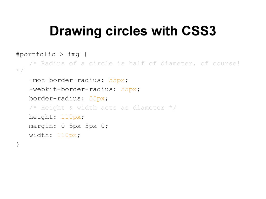
{ /* Rounded borders with border-radius! */ -webkit-border-radius: 10px; -moz-border-radius: 10px; border-radius: 10px; } Psst. Can you figure out how to turn your image into a circle with border- radius?
Box-sizing http://www.hongkiat.com/blog/css3-box-sizing/ What is Vertical-Align? http://css-tricks.com/what-is-vertical-align/ What is Vertical-Align? http://css-tricks.com/what-is-vertical-align/
of a circle is half of diameter, of course! */ -moz-border-radius: 55px; -webkit-border-radius: 55px; border-radius: 55px; /* Height & width acts as diameter */ height: 110px; margin: 0 5px 5px 0; width: 110px; }
 yusukebe
 matsuo_atsushi
 o0h
o0h
 wemra
wemra
 terryu16
 akihisaikeda
 j5ik2o
 danielsogl
 rkaga
rkaga
 yaotti
 mom0tomo
 satohjohn
 addyosmani
 eileencodes
 jeffersonlam
 chikuwait
 kastner
 ryanjones
 skipperchong
 jakevdp
 hannesfritz
 tammyeverts
 427marketing
 honzajavorek