Share
One of the Lighting Talks given during Springer IT's Event - Madrid, Spain - May 2013
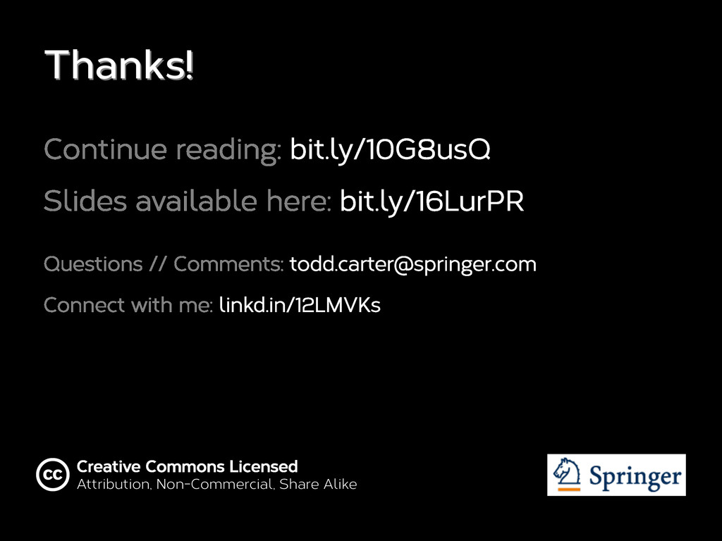
**Links in the slide deck** Continue Reading: http://bit.ly/10G8usQ Connect with me: http://linkd.in/12LMVKs
 wootfox
 uxman
uxman
 happy_ferret153
 xtone
xtone
 bebe
bebe
 lynteo
 tararira
 cyberagent_creators
 calpin
 kenichiota0711
 chiilog
 lw
lw
 cassininazir
 mlcsv
mlcsv
 lynnandtonic
 bkeepers
 axbom
axbom
 tammyeverts
 sferik
 katarinadahlin
 inesmontani
 szymonslowik
 schroneko
 lindahogenes